Top 7 Easiest Website Builders For Small Businesses
This article will delve into the easiest website builders for small businesses to simplify your decision-making process.
Shopify
As a popular e-commerce platform recognized for its user-friendly interface and comprehensive set of features, Shopify stands out as one of the easiest website builders for small businesses. It offers a straightforward setup process and a wide range of customizable templates, catering to various industries and enabling businesses to establish an online presence.
To get more detailed pricing plans, you can follow this article “Shopify Pricing Plans: How To Pick The Perfect Plan For You”
Pros & Cons
Pros
- User-friendly interface with drag-and-drop functionality
- Professional templates to fit different branding and aesthetic needs
- Integrated ecommerce tools
- SEO and Marketing tools to improve online visibility and attract customers
- Responsive customer support
Cons
- Transaction Fees on Lower Plans
- Learning Curve for Beginners
- Monthly Subscription Costs
- Limited Design Customization on Basic Plans
- Advanced Features May Require Apps
Key features
User-Friendly Interface & Customization Options
Shopify stands out for its remarkably user-friendly interface. Navigating through the dashboard and managing your online store is a breeze, even for those new to e-commerce. Users consistently praise the intuitive design, making the platform accessible for beginners.
Personally, I find the clean layout and straightforward menus to be a significant advantage, streamlining the process of setting up and maintaining an online business.
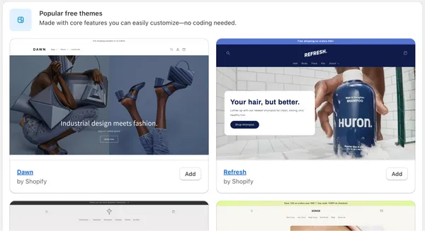
Choose your theme
Start by adding products to your store or set your site theme by clicking “Customize Theme.” Shopify provides a default theme with Shopify’s industry-leading checkout. If you prefer a different style, click “Online Store” in the left sidebar to browse free themes.
For a more unique look, visit the Theme Store to find professionally designed paid themes. Focus on the details and read reviews to select the theme that best suits your store’s needs.
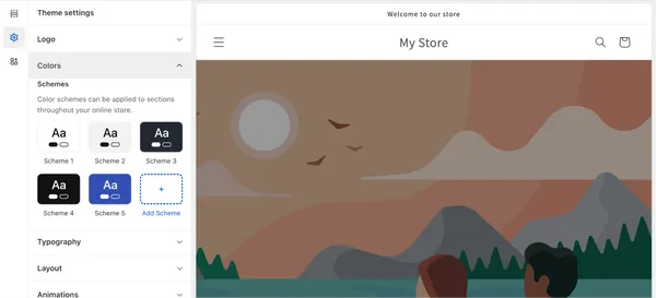
Customize your theme
When selecting a theme, to change your site’s color scheme or fonts, click “Customize” and use the menu tools to edit page “Sections” or “Theme Settings.” You can also set your logo, layout, and other features here.
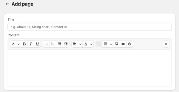
Add pages and content
Next, add pages, content, and a navigation menu to your website. You must prioritize adding content for the “About Us” and “Contact” Sections.
SEO Features
Shopify doesn’t compromise on SEO capabilities, with built-in features that simplify the optimization of online stores for search engines.
The user-friendly SEO settings provide a solid foundation for visibility on search engine results. While some users opt for third-party apps for advanced optimization, Shopify’s integrated SEO.
features make it a strong contender for those seeking a comprehensive yet straightforward approach to enhancing online discoverability.
Mobile Responsiveness
Shopify excels with its mobile-responsive design. Users appreciate themes seamlessly adapting to various devices, ensuring a consistent and engaging shopping experience. The emphasis on mobile responsiveness enhances user satisfaction and aligns with the needs of e-commerce.
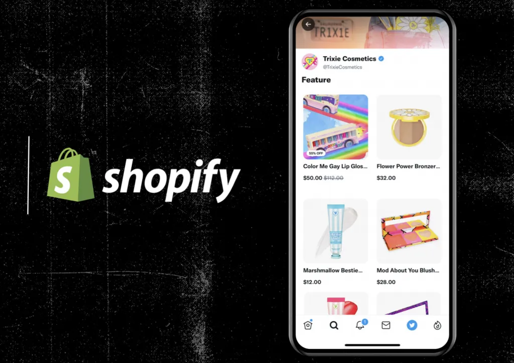
So, Shopify’s user-friendly interface, customization options, SEO features, security measures, and mobile responsiveness collectively contribute to a compelling platform for businesses seeking a reliable and adaptable online presence. The positive user feedback reflects the platform’s ability to meet diverse needs while maintaining a high standard of usability and functionality.
Case Studies
GreenHarvest Organic Market
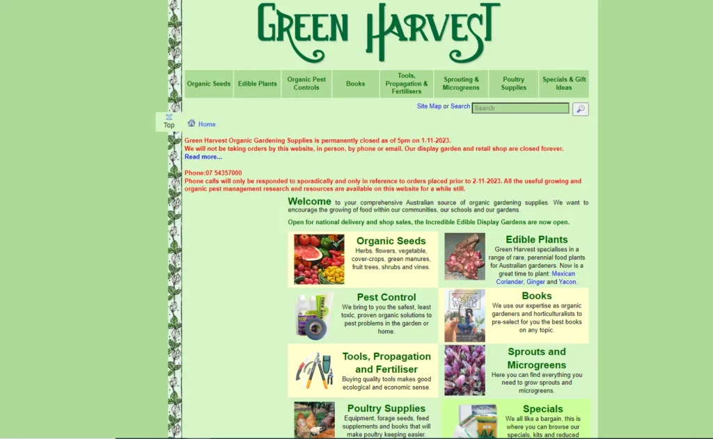
- Industry: Organic products
- Description: GreenHarvest, a small organic market, strategically chose Shopify as the easiest website builder for small businesses. With Shopify’s user-friendly interface, they effortlessly set up an online store showcasing organic and eco-friendly products. GreenHarvest’s commitment to quality and sustainability led to a solid seven-figure annual revenue, exemplifying Shopify’s effectiveness in organic and sustainable products.
TechHub Gadgets
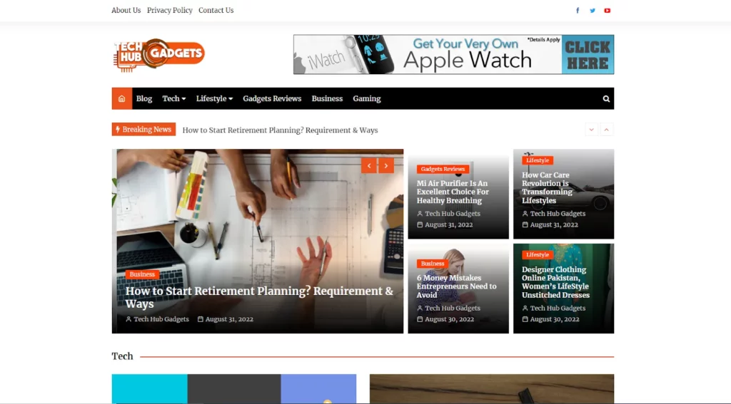
- Industry: Consumer Electronics
- Description: TechHub Gadgets, a startup in consumer electronics, efficiently established an online presence with Shopify, known as the easiest website builder for small businesses. The platform’s app ecosystem enhanced the customer experience. TechHub Gadgets’ commitment to offering competitive gadgets and Shopify’s reliability contributed to an impressive eight-figure annual revenue. This case illustrates Shopify’s effectiveness in empowering small businesses in dynamic industries like consumer electronics.
Wix
Wix is a website builder that offers both ease of use and creative flexibility. It allows users to design visually appealing websites through its drag-and-drop interface. With a variety of templates and a user-friendly design process, Wix caters to individuals and small businesses seeking a customizable online presence.

Pros & Cons
Pros
- User-Friendly Interface
- Extensive Template Collection
- Robust Design Customization
- App Market for Additional Features
- Free Plan with Wix Branding
Cons
- Ads on Free Plan
- Template Switching Limitations
- May Experience Loading Delays
- Limited E-commerce Capabilities on Free Plan
- Long-Term Cost for Premium Plans
Key features
User-Friendly Interface

Wix is widely recognized for its intuitive interface, a sentiment echoed by users who find it remarkably user-friendly. The drag-and-drop functionality simplifies website building, making it accessible for individuals and small businesses. The consensus is that navigating through Wix is a seamless experience.
Customization Options

A standout feature of Wix is its extensive customization options. Users appreciate the platform’s versatility, with a diverse range of templates and design flexibility. This allows for creative expression and tailoring websites to specific needs. The emphasis on creativity empowers users to establish a visually unique online presence.
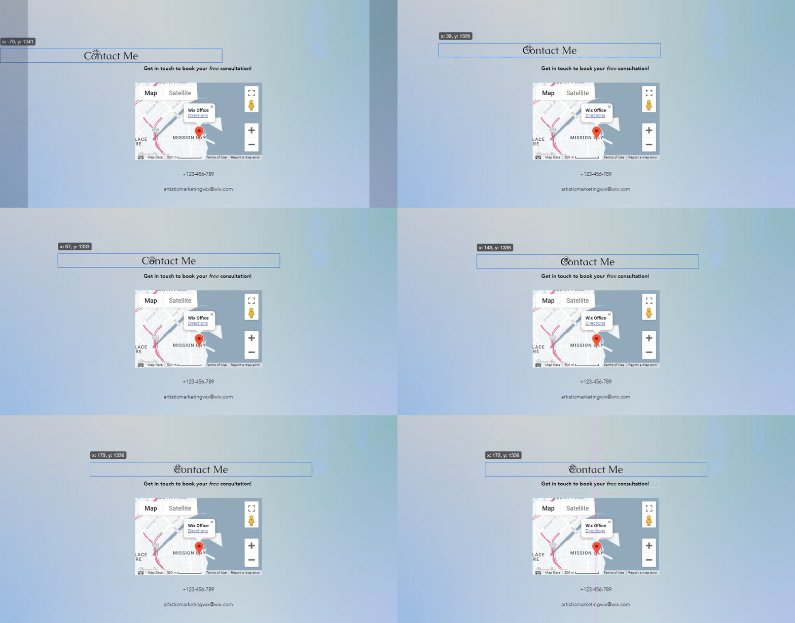
Here is how to move your elements
With Wix Editor, your elements can flexibly align with the rest of your page content through the drag-and-drop feature to move a single element freely.
- Step 1: First, click the relevant element in your Editor.
- Step 2: Click & drag the element.
- Step 3: Drop the element in the desired position.
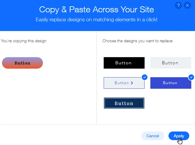
Especially if you want to copy the element’s design to another section on your website, you can handle it through three steps:
- Step 1: Right-click the desired element in the Editor and select “Copy Design”
- Step 2: Choose the designs from the right side of the panel for replacement
- Step 3: Click “Apply” to finalize the design transfer
Mobile Responsiveness
Wix ensures that websites created on its platform are mobile-responsive, a crucial factor in the current digital landscape. Users appreciate how Wix seamlessly adapts designs to various devices, enhancing the overall user experience. The commitment to mobile responsiveness underscores Wix’s adaptability to digital trends.
Case Studies
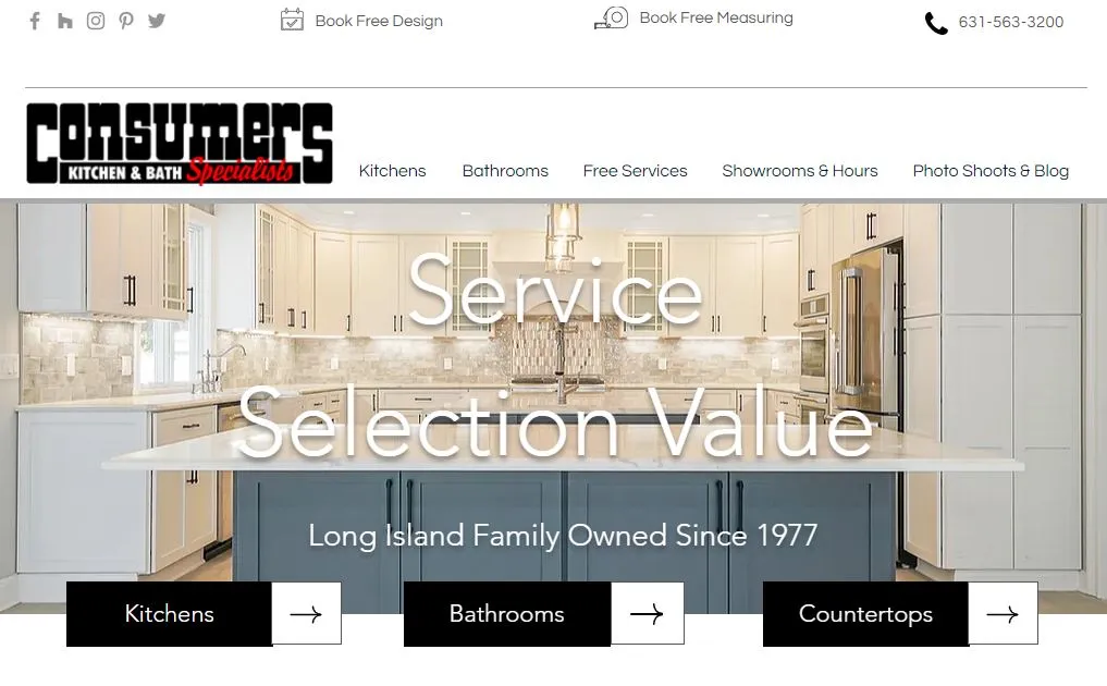
Consumers Kitchens & Baths
- Industry: Kitchenware
- Description: Consumers Kitchens & Baths, built on Wix, is your go-to destination for quality kitchen and bath solutions. The website showcases a diverse selection of products for home improvement projects, utilizing Wix’s user-friendly design to ensure a seamless and visually appealing online experience. Whether you’re planning a kitchen remodel or a bathroom upgrade, Consumers Kitchens & Baths on Wix provides a convenient platform for exploring and selecting the perfect fixtures and accessories for your home.
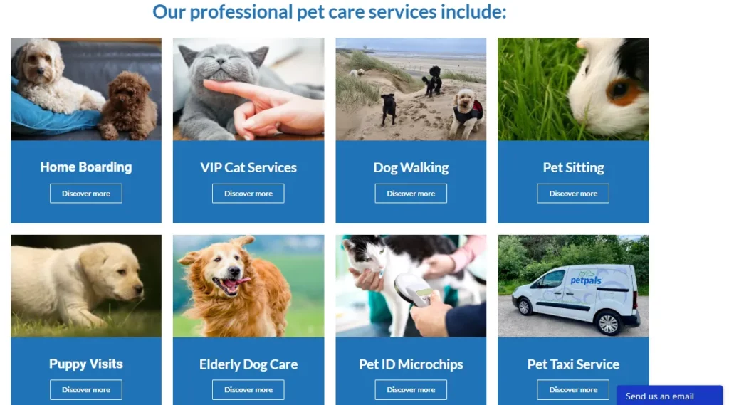
PetPals
- Industry: E-commerce for Pet Supplies
- Description: PetPals, an online pet store, selected Wix as the easiest website builder for small businesses. With Wix’s e-commerce functionalities, they created a dynamic site for seamless transactions. PetPals’ commitment to pet care contributed to an impressive seven-figure annual revenue. This case exemplifies Wix’s effectiveness in the competitive online pet supplies industry.
Duda
Duda caters to businesses aiming for a polished and professional online presence. The platform’s focus on customization allows users to tailor their websites to specific branding needs, making it a commendable choice for small businesses seeking a sophisticated look.

Pros & Cons
Pros
- Design Flexibility
- Multi-Language Support
- White Labeling for Agencies
- In-built Client Management
- Robust E-commerce Capabilities
Cons
- Limited Free Plan Features
- Learning Curve for Beginners
- Template Switching Challenges
- Design Customization Restrictions
- Advanced Features in Higher Tiers
Key features
User-Friendly Interface & Customization Options
With Duda, you can make your website look just the way you want. People like that there are many choices to design things. It works well for different types of businesses.
Adding Duda Pages
When adding a new page to your Duda website, you can find various options, with each page comes with a layout specific to its purpose. Once the page is added, you will decide whether it appears in the main navigation menu or is accessible only from other pages on your site. Here is how to add a page:
- Step 1: In the main dashboard, click the “Pages” icon near the top of the left-hand menu
- Step 2: The “Pages and Popups” menu will appear
- Step 3: Click on the “+New Page” button to create a new page
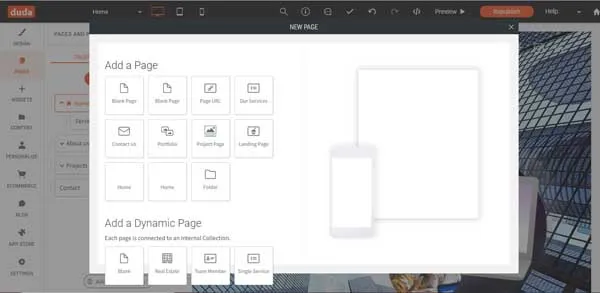
- Step 4: If you don’t want this new page in the homepage navigation menu, move to the “Pages and Popups” menu and then scroll down to your new page
- Step 5: Click the “Gear” icon to the right of the page name to open a “drop-down menu”
- Step 6: Hover over the “Hide/Show in navigation” to choose your desired specifications.
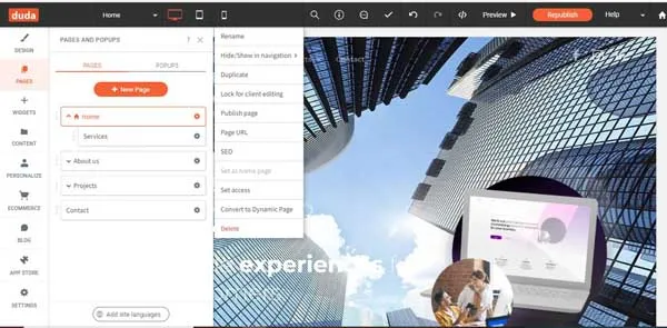
- Step 7: To restrict access to a page for only members or yourself, choose “Set access” from the same menu.
Reorganizing the Duda Navigation Menu
In the “Pages and Popups” menu, your website’s pages are listed as they appear in the homepage navigation menu. New pages are automatically added to the end of this list. To rearrange them:
- Step 1: Select the page you want to move from the “Pages and Popups” menu.
- Step 2: Drag it to the desired position in the homepage navigation menu, which will automatically update the order on your website.
Duda saves these changes; you can always reverse the order if needed.
Changing a Duda layout option
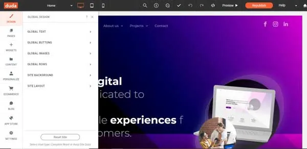
You can flexibly opt for the layout depending on your business goals. The layout will change the orientation, website’s appearance, logo’s location, and the main navigation bar.
- Step 1: In the main dashboard, select “Design” icon at the top of the left-hand
- Step 2: Click “Site Layout” in the “Global Design” menu
- Step 3: The “Site Layout” menu will open for you to organize your website
- Step 4: Click on the preferred layout, and then the Duda website builder will update your website
Mobile Responsiveness
Duda ensures mobile responsiveness for websites created on its platform. Users appreciate the seamless adaptation of designs to different devices, enhancing the overall user experience. The commitment to mobile responsiveness aligns with the current emphasis on mobile-friendly browsing, making Duda a practical choice for businesses adapting to digital trends.
Case Studies
BloomBoutique
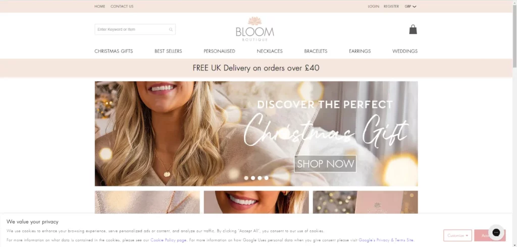
- Industry: Floristry and Flower Arrangements
- Description: BloomBoutique, a small floral studio, strategically chose Duda as the easiest website builder for small businesses. BloomBoutique crafted an elegant website showcasing floral arrangements. Their commitment to artistic flower designs and Duda’s user-friendly interface resulted in growing revenue, reaching a substantial six-figure annual mark.
Eden and Addison
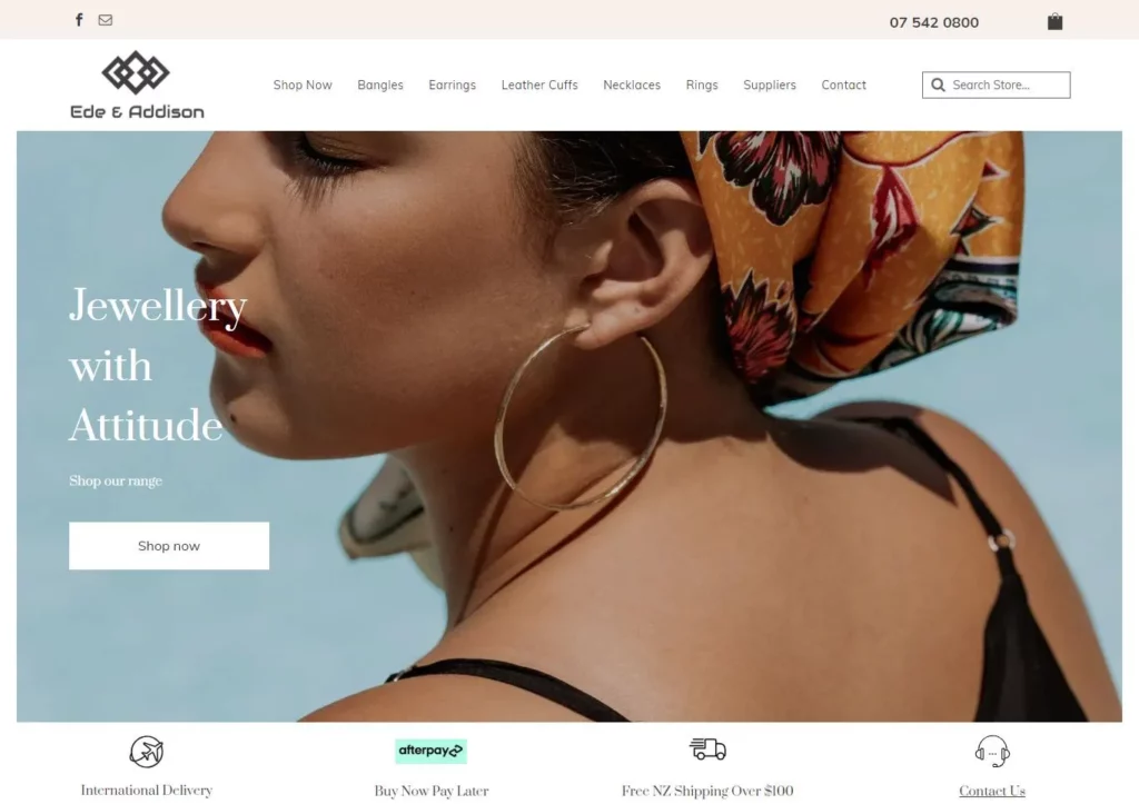
- Industry: Fashion
- Description: Eden and Addison site’s sleek design and seamless navigation present a curated collection of high-quality products, emphasizing style and accessibility. This concise example demonstrates how Duda empowers home decor brands to create visually appealing and user-friendly websites.
Hubspot
HubSpot is a website builder and an all-in-one platform for marketing, sales, and customer service. It integrates various tools, offering a comprehensive solution for small businesses managing multiple aspects of their online presence.

Pros & Cons
Pros
- Integrated Marketing Tools
- Advanced Analytics
- Seamless CRM Integration
- Content Personalization
- Mobile-Responsive Templates
Cons
- Higher Cost for Advanced Features
- Steeper Learning Curve
- Limited Design Customization
- Requires HubSpot Ecosystem Adoption
- May Be Overwhelming for Small Businesses
Key features
User-Friendly Interface & Customization Options
With HubSpot, you can make your website just the way you want. People like how you can change things and make your site unique. So in my opinion, It’s suitable for all kinds of businesses.
How To Create Pages
You need to navigate to your content:
- Website Pages: In your HubSpot account, move to Marketing => Website => Website Pages
- Landing Pages: In your HubSpot account, move to Marketing => Landing Pages
In the upper right, choose “Create” dropdown menu and then select Website Page or Landing Page
In the dialog box, specific domain or name for the page:
- Click the Website dropdown menu and select a domain for Page’s URL. If you lack connected domains, your account’s default system domain will be the only option.
- In the “Page Name” section, enter the “Internal name” for the page.
- Click “Create Page.”
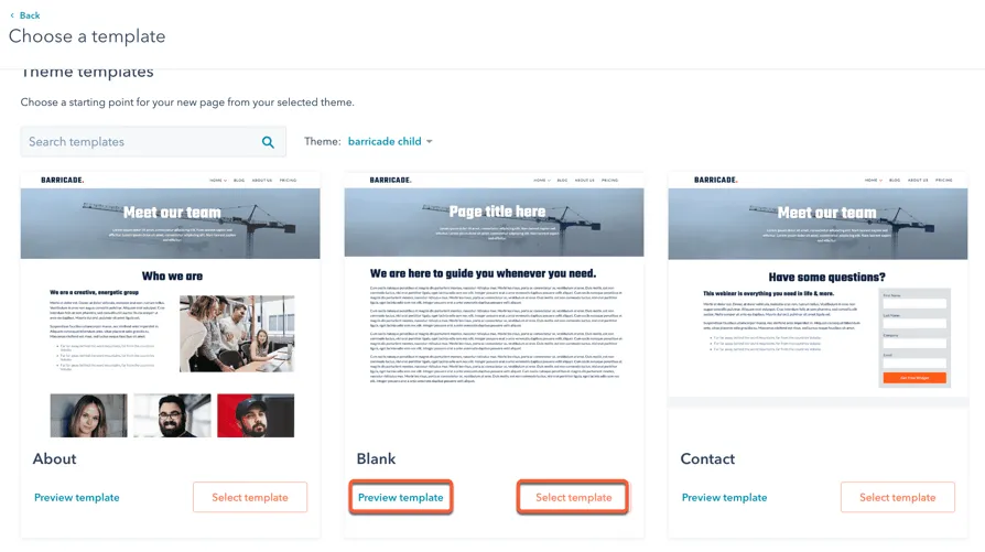
- On the template section screen, your active theme’s templates will appear at the top, while templates from other themes are in the “Other Templates” section at the bottom.
- To set a theme as active, hover over it and choose “Preview template” to open a preview or “Select template” to move forward to the content editor.
How To Customize page settings
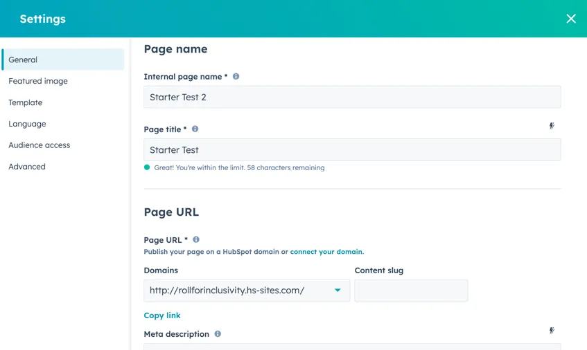
After editing your page content, you need to customize page attributes such as URL, meta description, etc.
To customize basic settings for a page on HubSpot, follow these straightforward steps:
- Step 1: First, go to your HubSpot account. If you’re working with Website Pages, navigate to Marketing > Website > Website Pages. For Landing Pages, go to Marketing > Landing Pages.
- Step 2: Next, find the page you wish to modify, hover over it, and select “Edit.”
- Step 3: Then, in the editing mode, click on the “Settings” menu and choose “General“.
- Step 4: A dialog box will appear. Start by entering a name for internal reference in the “Internal page name” field. Remember, this name won’t be visible to your visitors.
- Step 5: For the external title, input a name in the “Page title” field. When a visitor loads your page, this title will appear in the browser tab.
- Step 6: Moving to the “Page URL” section, click on the “Domains” dropdown menu to select the domain where your page will be hosted. After that, provide a URL slug in the “Content slug” field. There’s additional information available if you need help editing a page’s URL.
- Step 7: Type a brief description of your page in the “Meta description” field. This description will appear in search engine results beneath your page title.
- Step 8: Finally, to link your page with a specific campaign, click on the “Campaign” dropdown menu and choose an existing campaign. If you need to create a new campaign, select “Add new.”
How To Add a Featured Image
To add a featured image for social media sharing on your HubSpot page, follow these steps:
- Step 1: Access your content:
- For Website Pages: Go to Marketing > Website > Website Pages in your HubSpot account.
- For Landing Pages: Go to Marketing > Landing Pages in your HubSpot account.
- Step 2: Find the page you want to edit, hover over it, and click “Edit“.
- Step 3: Click the “Settings” menu and choose “Featured image“.
- Step 4: In the dialog box that appears, enable the featured image by toggling the “Enabled featured image” switch to the on position.
- Step 5: Click “Upload” to choose an image from your computer, or “Browse images” to select an image from the files tool in HubSpot.
- Step 6: For better accessibility, describe your image in the “Image alt text” field. This description should accurately convey the content and purpose of the image.
How To Change the Page Template
To change the template of a page in your HubSpot account, here’s a simple guide:
- Step 1: First, access your content. For Website Pages, go to Marketing > Website > Website Pages in your HubSpot account. For Landing Pages, navigate to Marketing > Landing Pages.
- Step 2: Then, hover over the page you want to edit and click “Edit.”
- Step 3: In the edit mode, click on the “Settings” menu and choose “Template“.
- Step 4: In the open dialog box, if you wish to use a different template, click “Use different template.” Remember, if you’re altering the template of a page that’s already published, click “Update” to publish any changes that aren’t live yet. This step is crucial to prevent losing any changes when you switch templates.
- Step 5: Next, on the theme selection screen, pick a theme that suits your needs.
- Step 6: On the template selection screen, choose your desired template.
- Step 7: Preview how your page will look with the new template before finalizing. If satisfied, click “Use template” to complete the switch. To explore more options, click “Back” to select a different template.
Mobile Responsiveness
HubSpot makes your site work well on phones and tablets. People like that their site looks good no matter what device someone uses. It’s important because many people use phones to browse websites.
Case Studies
Coca-Cola Beverages Northeast
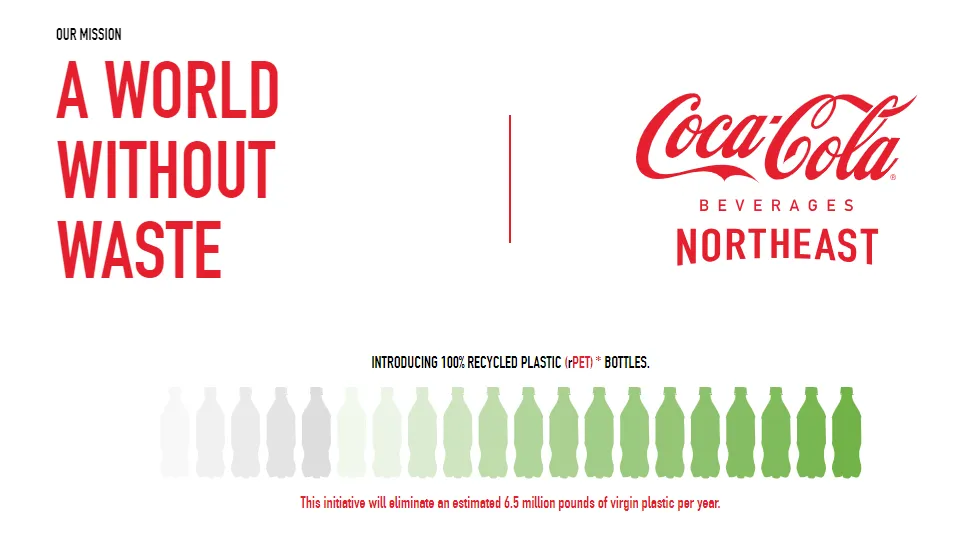
- Industry: Food & Beverage
- Description: Coke Northeast, powered by HubSpot, is a leading distributor of Coca-Cola products, ensuring seamless accessibility for businesses and retailers. The website features an efficient HubSpot-driven platform, streamlining communication and services for clients in the beverage industry. With HubSpot’s capabilities, Coke Northeast offers a user-friendly and effective online experience, facilitating smooth interactions between partners and customers.
Avast Academy

- Industry: Cybersecurity
- Description: Avast’s HubSpot-driven C-Academy is a streamlined platform offering concise and accessible cybersecurity education. The site reflects Avast’s commitment to raising awareness about online threats, utilizing HubSpot’s capabilities to provide user-friendly resources for a safer digital experience.
BigCommerce
BigCommerce is an e-commerce platform designed to facilitate online selling. It’s suitable for small businesses that may experience growth, providing a platform that can evolve with their needs. The array of customization options allows businesses to create a unique online store that reflects their brand identity, making it a reliable choice for those seeking adaptability.
Pros & Cons
Pros
- Powerful E-commerce Features
- Scalability for Growing Businesses
- Responsive Customer Support
- Built-in SEO Tools
- Secure Payment Options
Cons
- Steeper Learning Curve
- Higher Pricing Tiers
- Design Customization Complexity
- Transaction Fees on Lower Plans
- Advanced Features May Require Apps
Key features
User-Friendly Interface
BigCommerce is straightforward for everyone to use. People find it simple, and it doesn’t take much time to learn. If you don’t have more experienced, how things are set up makes it easy to build your website.
Customization Options

With BigCommerce, you get many choices to make your website look just how you want. Users appreciate the variety of design options and tools available. It’s versatile and suits different types of businesses, allowing you to personalize your online store.
Mobile Responsiveness
BigCommerce ensures that your website looks good on phones and tablets. People like that their site adapts well to different devices, providing a good experience for mobile users. A mobile-friendly website is essential, and many people use phones to browse.
Case Studies
American Apparel

- Industry: Fashion
- Description: American Apparel, using BigCommerce, is a renowned fashion brand offering timeless and stylish clothing for men and women. The website provides a seamless and user-friendly shopping experience, showcasing a diverse collection of quality wardrobe-essentials.
Cocktail Courier
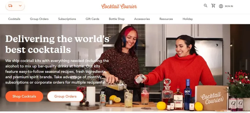
- Industry: Food & Beverage
- Description: Cocktail Courier, powered by BigCommerce, is a leading online destination for cocktail enthusiasts. The site offers curated cocktail kits and premium ingredients, providing customers a seamless and user-friendly experience to elevate their mixology skills from home.
Site123
Site123 is a straightforward website builder designed for simplicity. It offers pre-made templates and a guided setup process, making it one of the easiest website builders for small businesses.
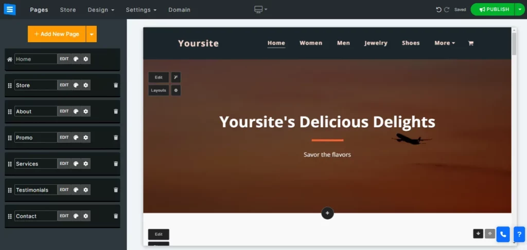
Pros & Cons
Pros
- Simple Interface
- Quick Setup
- Affordable Plans
- Mobile Responsiveness
- Built-in SEO Tools
Cons
- Limited Design Flexibility
- Less Template Variety
- Basic E-commerce Features
- Restrictive Free Plan
- Limited Blogging Capabilities
Key features
User-Friendly Interface
Users appreciate the simplicity, emphasizing that even those without technical skills can quickly create a website. The straightforward approach of Site123 streamlines the website-building process.
Customization Options
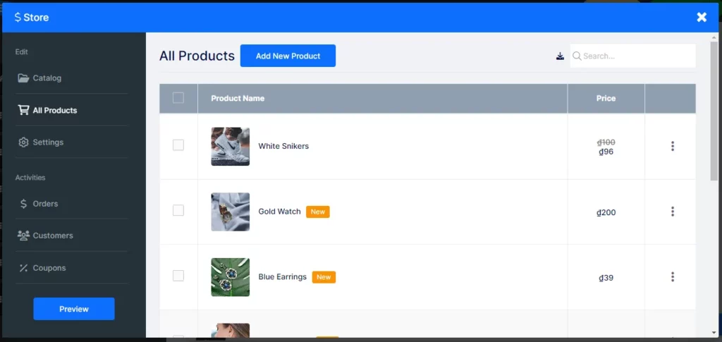
While Site123 may not have the extensive customization choices of some other builders, it stands out for its simplicity. Users who prefer a straightforward design process find Site123 a perfect fit. It caters well to those who want a clean and uncomplicated approach to building their online presence.
Mobile Responsiveness
Site123 ensures all websites look attractive on all devices, from phones and tablets to computers. Users receive a wide range of professional templates that adapt to different screen sizes throughout the drag-and-drop elements for building a mobile-friendly website.
Moreover, before publishing your website, you can use Site123’s preview and testing features to see how your site looks on different devices to ensure everything will appear smoothly.
Case Studies
Magma Surfaces
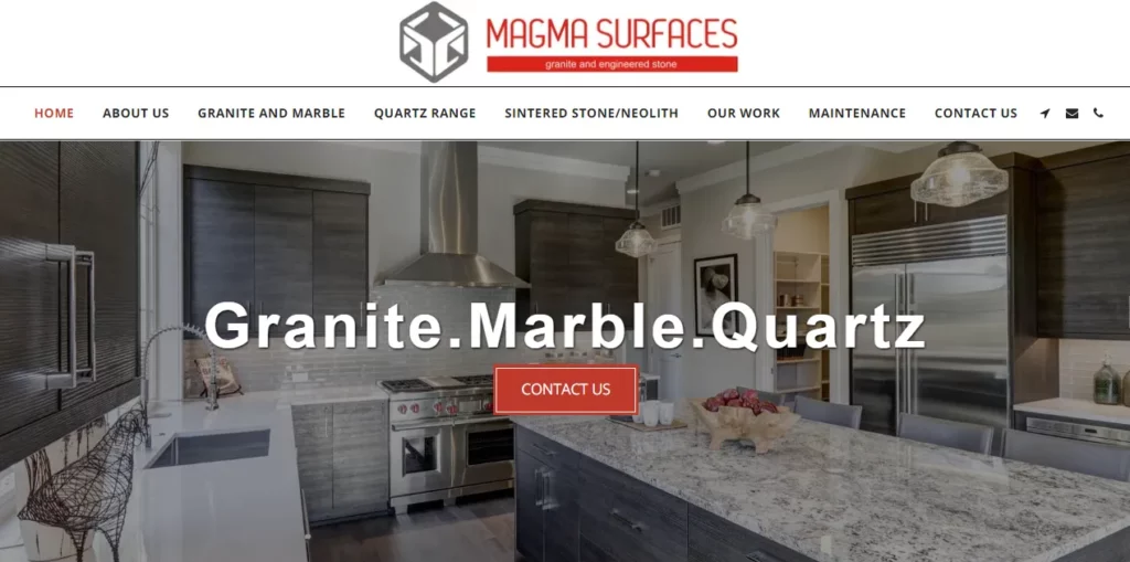
- Industry: Construction
- Description: Magma Surfaces, powered by Site123, is a leading hub for premium surface solutions in the construction industry. The website features diverse high-quality construction materials, providing a seamless and user-friendly experience for architects, builders, and customers.
My Star Fitness
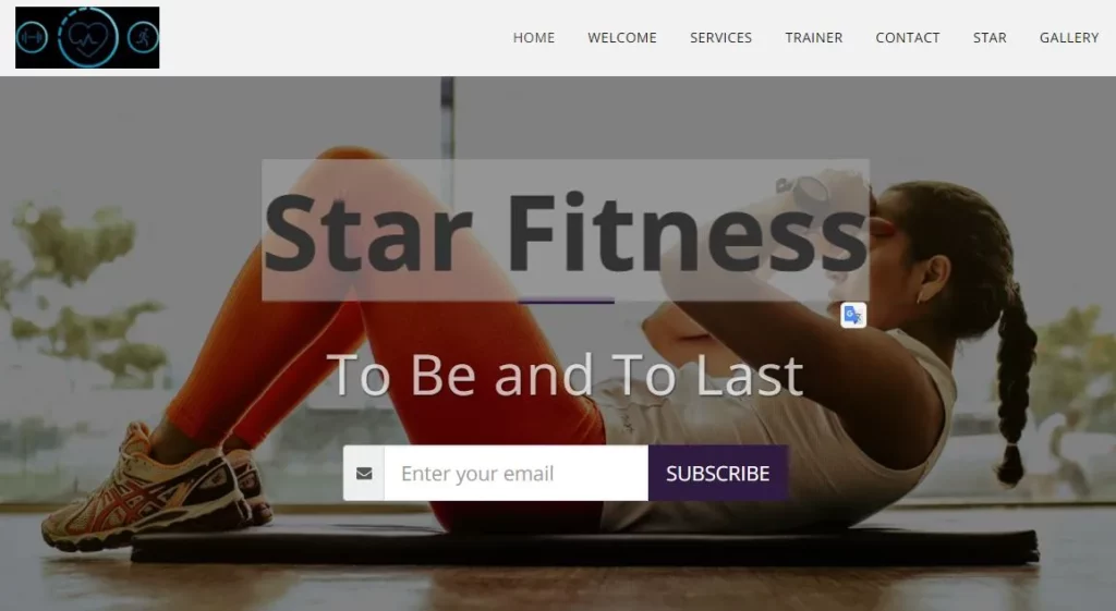
- Industry: Fitness and wellness industry
- Description: MyStar Fitness, built on the Site123 platform, is a destination for fitness enthusiasts. The website showcases advanced workout equipment, nutritional supplements, and fitness wear. Alongside these products, MyStar Fitness offers an array of personalized services, including one-on-one virtual personal training sessions, custom workout plans, and nutrition coaching tailored to individual needs and preferences. The site combines ease of use with rich content, providing visitors with informative articles, video tutorials, and interactive tools to track progress and stay motivated.
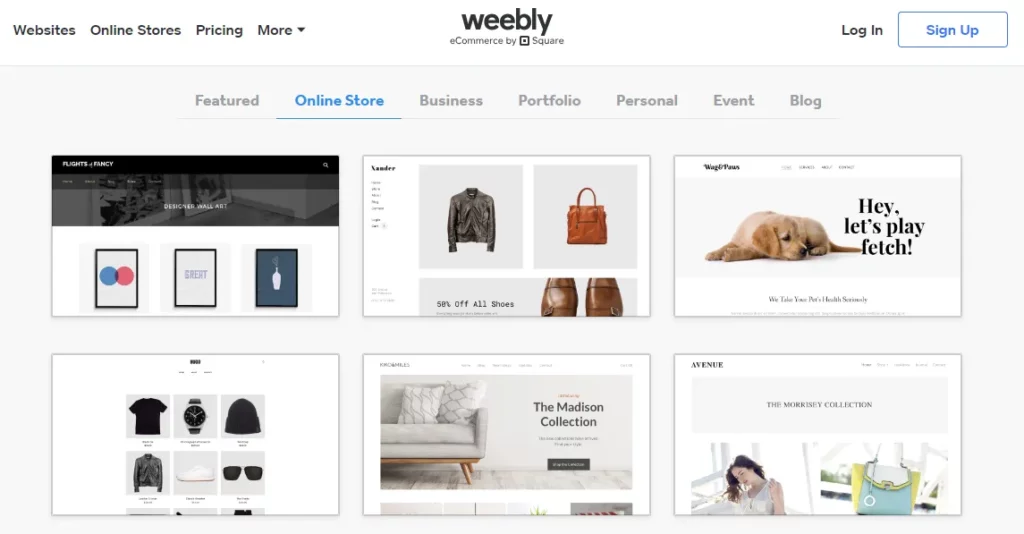
Weebly
Weebly intuitive design and user-friendly features make website building straightforward and appealing to beginners and small businesses seeking an uncomplicated approach.
Pros & Cons
Pros
- User-Friendly Interface
- Drag-and-Drop Builder
- Pre-designed Templates
- App Integration
- Responsive Design
Cons
- Design Limitations
- E-commerce Transaction Fees
- Limited Blogging Features
- Template Switching Challenges
- SEO Customization Constraints
Key features
User-Friendly Interface
Renowned for its user-friendly interface, Weebly garners praise from users who appreciate its easy navigation. The platform’s well-thought-out layout and organization are pivotal in delivering a seamless experience for building websites. The emphasis on a straightforward design is a recurring theme, catering to individuals with diverse technical abilities.
Customization Options
Weebly, known for its user-friendly website builder, offers a range of customization features that cater to beginners and more experienced users looking to design a personalized website. Its drag-and-drop editor is central to the customization experience, allowing users to effortlessly add, remove, and rearrange elements like text boxes, images, and videos on their web pages.
Additionally, Weebly offers a range of apps and integrations in its App Center, enabling users to enhance their websites with additional features like social media feeds, e-commerce tools, and marketing widgets.
Mobile Responsiveness
Weebly’s platform is notably designed for mobile responsiveness, ensuring that websites created automatically adapt to various screen sizes and devices. Weebly’s templates are built with responsive design principles, meaning they adjust their layout and content to provide an optimal viewing experience on smartphones, tablets, and desktops.
Case Studies
Caribeans
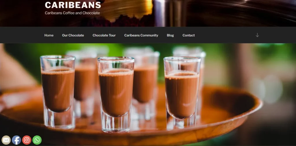
- Industry: Food & Beverages
- Description: Caribeans Chocolate, powered by Weebly, offers a unique and immersive online experience. The site likely showcases a variety of handmade chocolates, possibly including single-origin bars, flavored chocolates, and limited-edition collections. Each product might have a detailed description covering its taste profile, cocoa origin, and unique features.
Argyle Yarn Shop
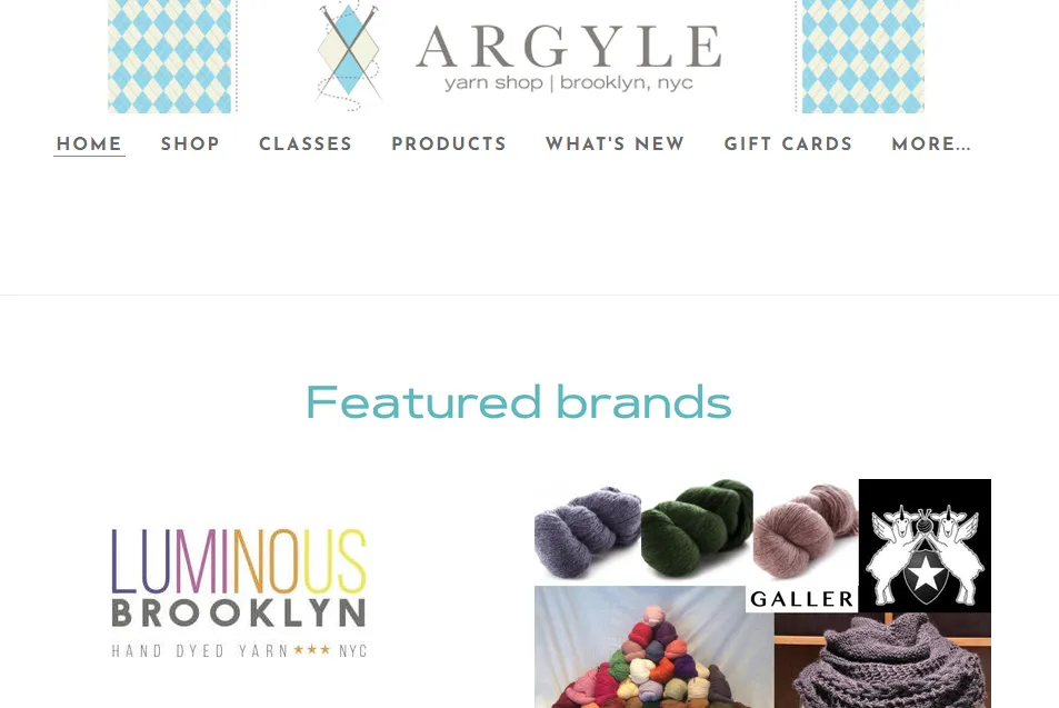
- Industry: Hospitality, and Flowers, Gifts & Specialty Stores, Retail
- Description: Argyle Yarn Shop, leveraging the Weebly platform, is your premier online destination for knitting supplies. The website showcases a curated collection of high-quality yarns and accessories, providing a seamless and user-friendly experience for knitting enthusiasts of all levels.
So, Which Website Builder Is Best For Small Businesses
Based on the information, I think the ideal website builder for small businesses varies depending on their niche needs. Here is my summary of my picked website builders tailored to these requirements:
- Shopify: Ideal for diverse e-commerce needs with a user-friendly interface for seamless setup.
- Wix: Offers versatile and customizable design options, excellent for a wide range of businesses.
- Duda: Focuses on creative entrepreneurs with a mobile-responsive platform for visual aesthetics.
- HubSpot: An integrated e-commerce and marketing platform suitable for small businesses looking for comprehensive solutions.
- BigCommerce: A robust platform for secure payments and scalable solutions for businesses of all sizes.
- Site123: Enables quick and easy setup for local services and small businesses through a simplified website-building process.
- Weebly: Provides an intuitive platform for local businesses and creative professionals, ensuring a hassle-free website-building experience.
Bottom Line
With user-friendly interfaces and versatile features, these platforms ensure simplicity without sacrificing functionality. To make the most of the easiest website builders for small businesses, choose the one that aligns best with your specific needs and ensures a seamless online presence.

