What is the Best Banner Size for BigCommerce?
Not only graphic designers but also online business owners wish to have appealing and effective banners to facilitate their marketing strategies. Especially for those using the leading e-commerce software platform of BigCommerce, you should learn to make good use of the software’s outstanding feature, which provides you with customizable pre-built site templates to create the best banners ever.
Here’s a question for you. What do you think makes a great BigCommerce banner? Is it a banner that attracts viewers and customers by its trendy and elaborate designs? However, there’s so much more than just viral trends. Another critical factor is the size of those banners. Size is considered to be one of the most pivotal elements leading to the success of clicks and sales of products or services you are offering to your clientele.
In today’s article, I will help you find out the best size for your BigCommerce banners that will ultimately boost your online store’s profit margins.
What are BigCommerce Banners?
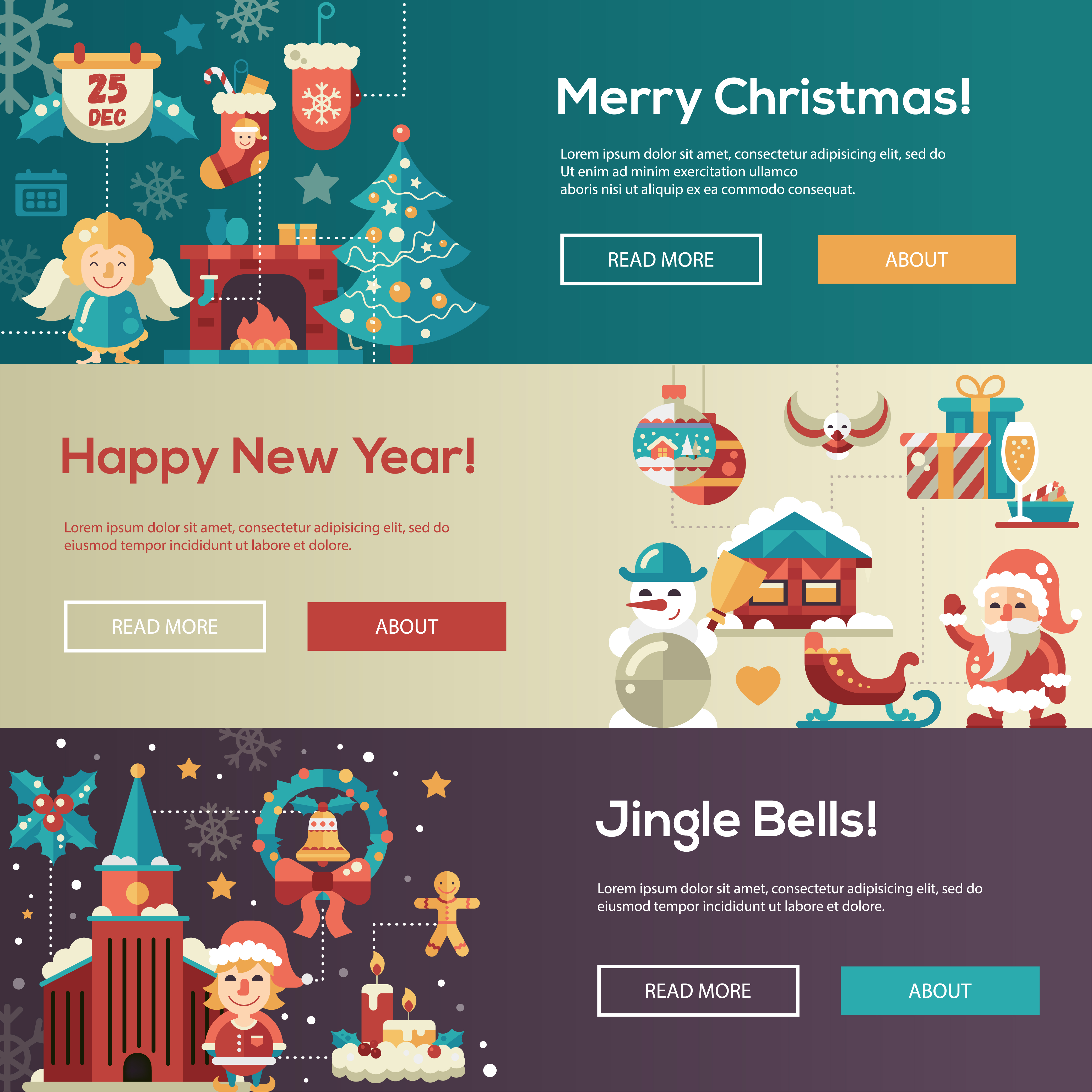
BigCommerce banners are rectangular or square, static or animated advertisements, including graphic images, slogans, logos, symbols, text, or a multimedia object.
Banners allow you to add content to the top or bottom of categories or web pages without the need for code. They’re an excellent method for advertising sales, displaying coupon codes, discounts, shipping information, and creating urgency for limited-time offers.
Basically, they aim to increase traffic to e-commerce stores, companies and draw customers’ attention to specific offerings. They are placed on the suitable and eye-catching positions of the BigCommerce website, which are typically above or below the main content blocks or in the website’s sidebars. Additionally, a banner can only be used for one page at a time in the BigCommerce platform.
Why should you choose the right size for your banners?
When it comes to e-commerce marketing, the appearance of banners matters, and size should be your top concern. Making a wrongly sized banner would ruin not only the overall look of your ad but also the graphics and images displayed in it, resulting in your ads’ bad performance.
This mistake will obviously come at the cost of your precious time and money. Moreover, getting the dimensions right will help you display the content you want to communicate with your customers most effectively.
Much essential as it is, creating a banner with the wrong size is still one of the most common mistakes in online marketing. Therefore, using the correct banner sizes can be the significant difference between a winning campaign and a failed one.
However, please keep in mind that the best banner size does not guarantee the success of an ad or marketing campaign, but it’s something to start with.
What is the best size for a BigCommerce banner?
In this part, I will walk you through some of the most effective banner sizes in 2021’s online advertising and the best sizes for BigCommerce banners in some particular themes available.
Top-performing banner sizes in general
Among plenty of common banner sizes which might get you overwhelmed and perplexed, you just need to take the following four important sizes into consideration, which could help to generate the largest amount of impressions, clicks, and conversions.
Let’s check them out.
Medium rectangle (300 pixels x 250 pixels)
With compact dimensions of 300 pixels and 250 pixels, this type of banner doesn’t take too much space on a web page. It, therefore, displays well either within the text content or at the end of an article. It is by far the most popular kind of banner and it’s partly due to its flexibility on both mobile and desktop interface.
Large rectangle (336 pixels x 280 pixels)
Since this banner is slightly larger than the medium rectangle, it has more space to illustrate images, text, or graphics. Like the previous one, this banner has the best performance when positioned within the text content or at the end of a post. However, it is considered to bring about fewer impressions to customers.
Leaderboard (728 pixels x 90 pixels)
As you can tell from the name, this type of banner is oftentimes displayed right at the top of a web page or forum site. It is especially suitable for those who want to get their ads noticeable to as many viewers as possible. What’s more is that you also get more ad inventory, more space for text, images,… to convey your message to customers.
Half-page or large skyscraper (300 pixels x 600 pixels)
Unlike its name, this banner does not take up half of a page; however, it does hold the most amount of space compared to other large banner sizes. Its shape is, indeed, comparable to that of a skyscraper. This dimension also enables you to deliver a greater amount of information and deliver them more clearly.
Nevertheless, it poses a challenge for you to create eye-catching, stunning, yet compact visuals to draw people’s attention and get them to click on the banner.
Mobile leaderboard (320 pixels x 50 pixels)
This is one of the smallest and most widely used mobile banner sizes available, and you should take advantage of this size to maximize viewers’ impressions and clicks on mobiles.
Best BigCommerce banner sizes (for specific themes)
All BigCommerce stores can create marketing banners that can be placed across the top or bottom of your site. You can set these up and edit their content on your own in the BigCommerce dashboard under the tab Marketing > Banners. You can also check out how to create and edit banners here. You can customize your banners with specific sizes under Typography using the theme editor.
BigCommerce’s current theme platform is Stencil, which has replaced the older version called Blueprint since November 2016. Stencil themes bear the latest best features of technology, design standards, conversion, and SEO built on non-proprietary, open-source code. One of the hallmarks of Stencil themes is their responsiveness. They will automatically resize images to suit the theme.
Therefore, you can take advantage of this wonderful software platform to create appealing and stunning banners with proper and ideal sizes by choosing from a wide variety of Stencil themes available. Remember that the size of images used for banners depends on the theme platform you use. Following are eight noticeable themes along with their best banner sizes.
Cornerstone
Cornerstone is BigCommerce’s most popular theme and is also mostly used by new merchants. This free theme has three variations: light, bold, warm, and is optimized for sales, discounts, large catalogs, etc.
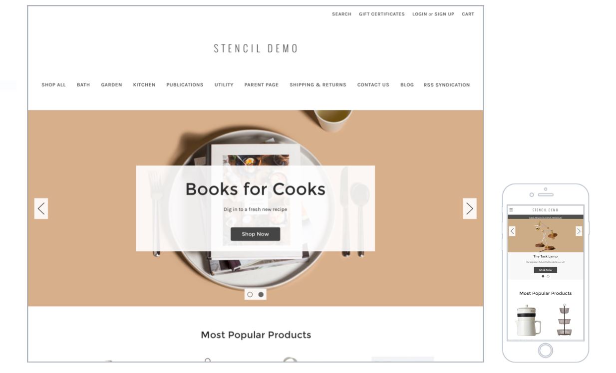
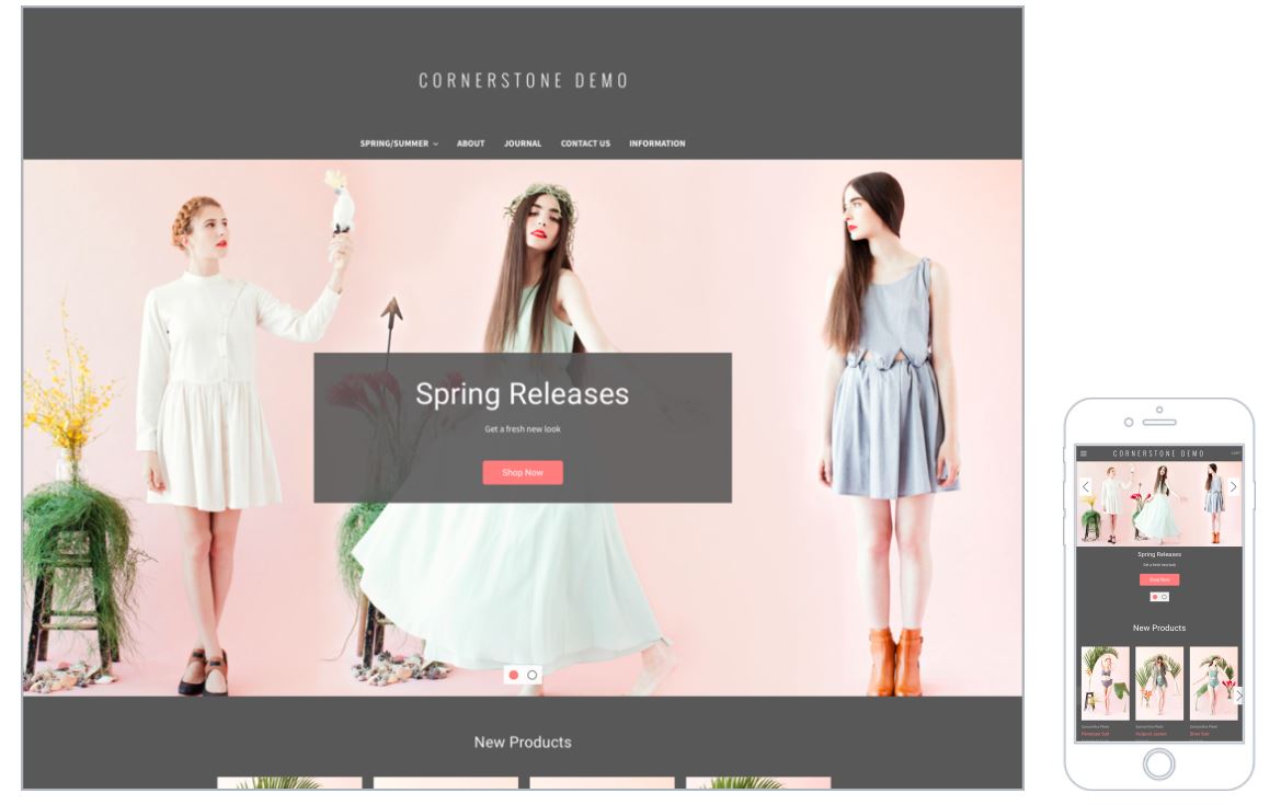
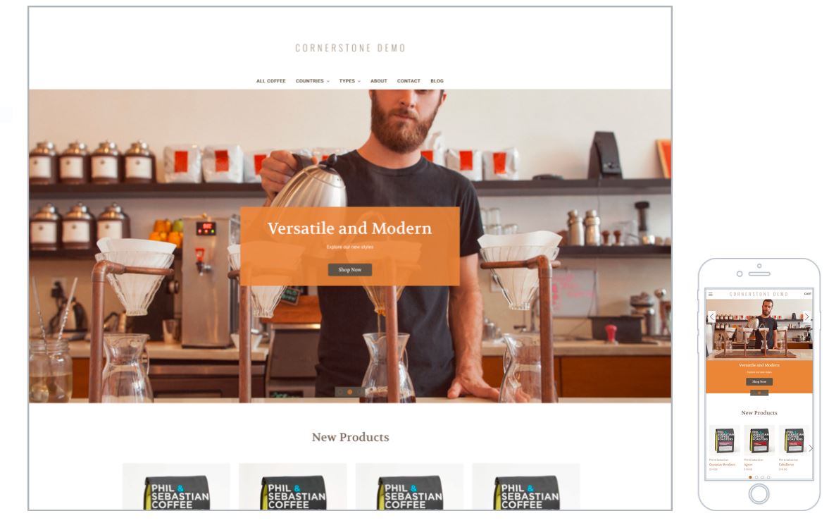
Being fully responsive, the Cornerstone theme is quite easy to use when it comes to making banners with the best sizes possible. Its scalability, along with a rich built-in and mega-site menu enables you to handle both small and large catalogs. The carousel banners in Cornerstone are recommended to be in the dimension of 1400 pixels and 600 pixels.
You may be able to get around this with customization without much tech knowledge, as BigCommerce offers an easy-to-use theme editor for making minor changes. Stencil themes bear the latest best features of technology, design standards, conversion, and SEO built on non-proprietary, open-source code.
What you need to do is to give the carousel a maximum width of 1400 pixels using CSS. You need to go to “Storefront design” in the admin panel and then click on the scripts tab. Here you can add the following:
- heroCarousel {
- margin-left: auto;
- margin-right: auto;
- max-width: 1400px;
- }
- </style>
Fortune
Fortune is a stand-out free theme for state-of-the-art online stores and is particularly suited for brands with small-to-medium-sized catalogs. There are four styles in this theme: minimal, bright, contrast, and highlight.
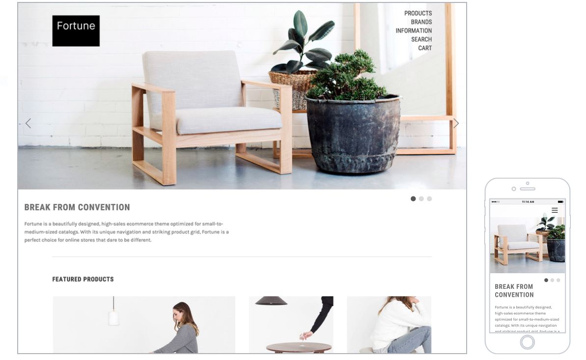
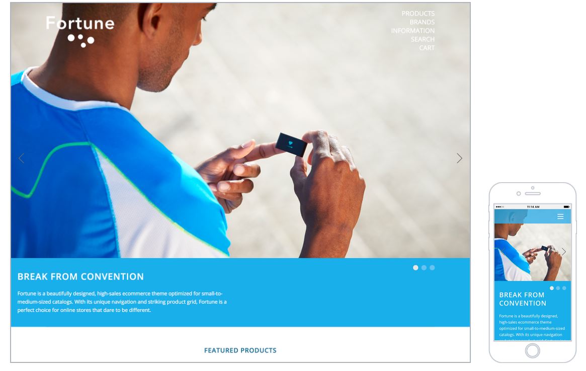
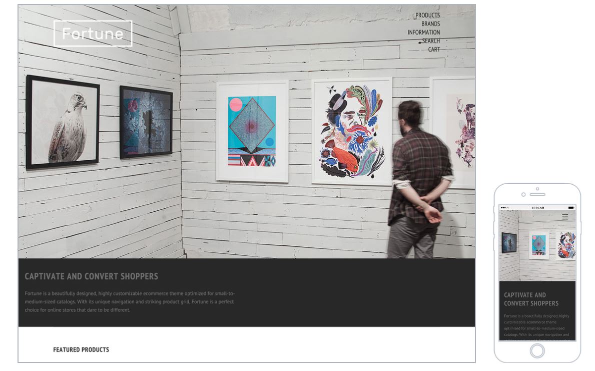
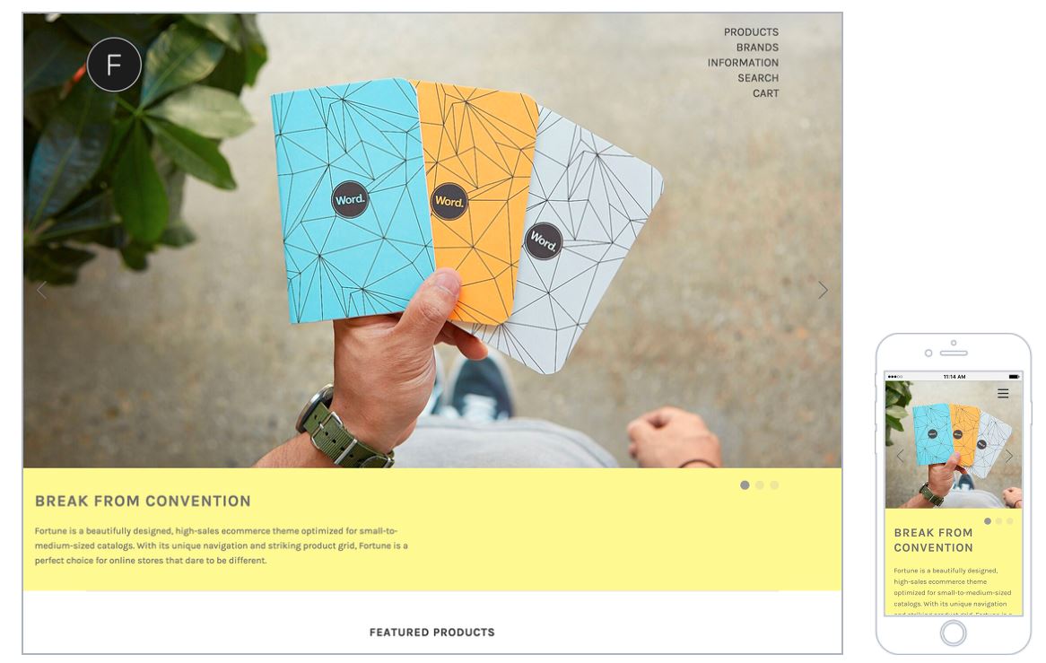
The Fortune theme allows you to display up to five images with a heading, subtitle, and a call-to-action button. You can add images here by going to Store Design > Design Options > Carousel & Social Media tab. With this theme, you are recommended to use images around 1500 x 600px or 1500 x 800px; and it is of great importance to set all images at the same dimension. In terms of the carousel image height, you can set your own preferred image height for mobile and desktop using the dropdowns provided under the Home Carousel section of the theme editor.
Vault
Vault is a free theme offering advanced design capabilities. It gives you the power and flexibility to change text, insert pictures, and add banners to your store with just a few clicks. One of the most notable features of this theme is that it allows you to add up to 6 pre-positioned images to your homepage to make such stunning home feature banners, including upper banners, mid banners, and lower banners.
This theme is perfect for stores with large menus and having both small and sizable catalogs. There are 3 different styles in this theme: cool, bright, and natural.
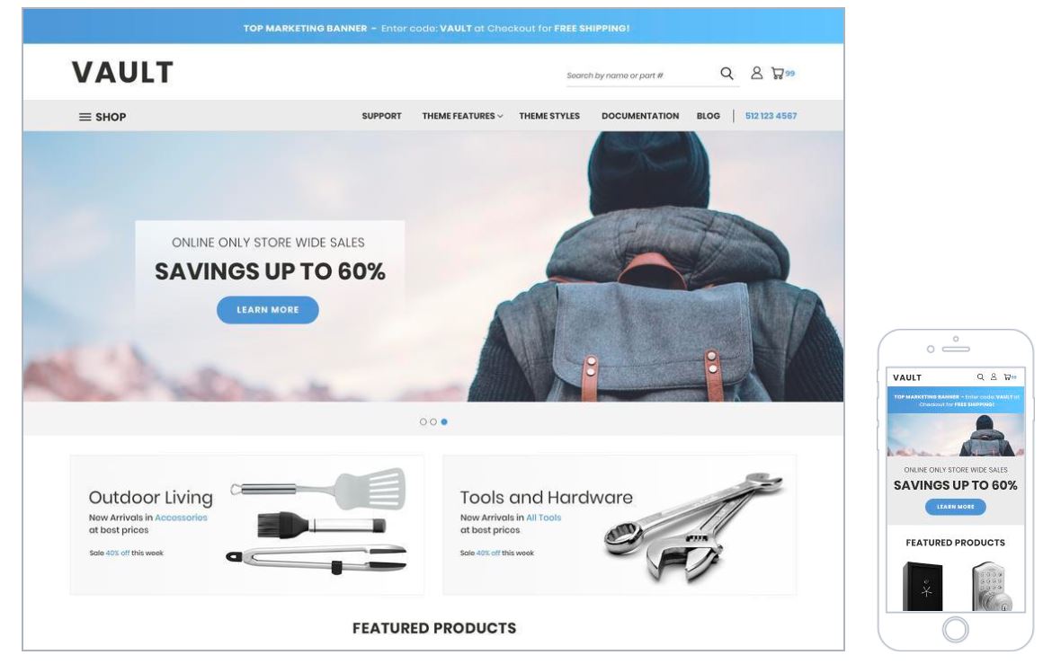
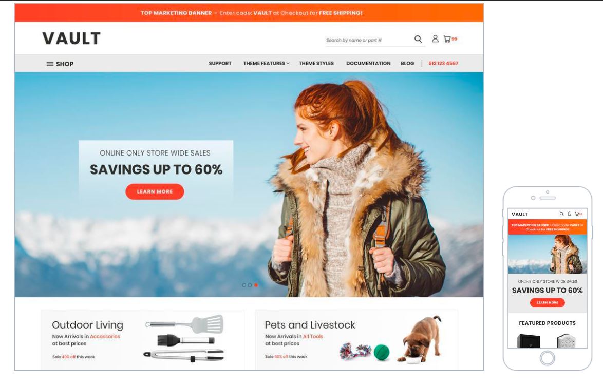
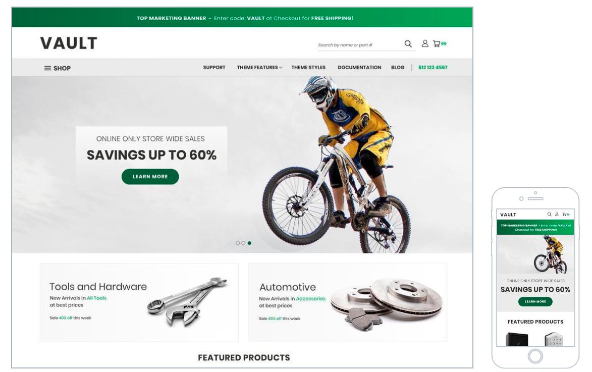
The attention-grabbing imagery and the flexibility of built-in marketing banners are the hallmarks of this high-quality free theme. Just make sure to follow the instructions, recommendations, and notes from BigCommerce to have the best result with accurately sized banners.
Moreover, you can even do some coding with HTML and CSS to change the original design to make your store look unique and bring a better customer experience.
Scales
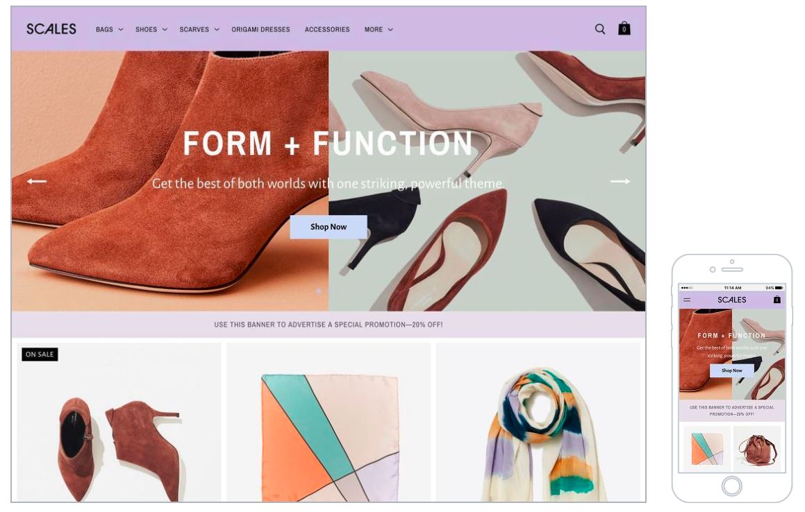
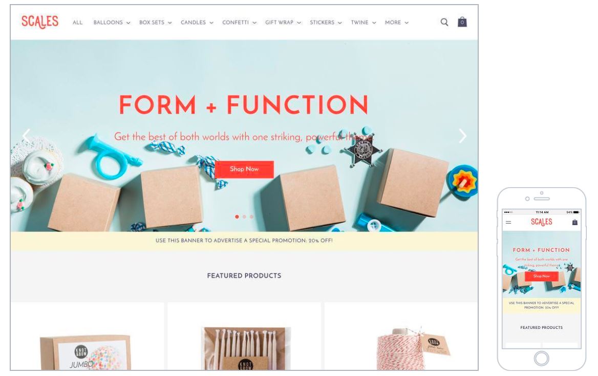
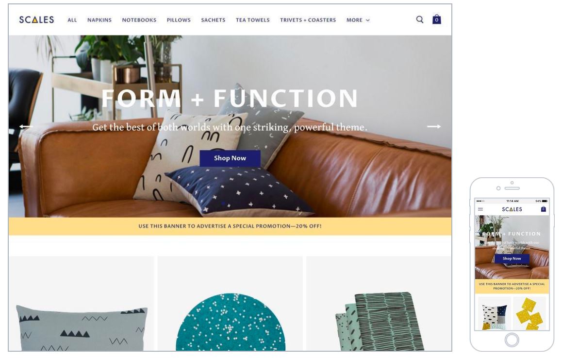
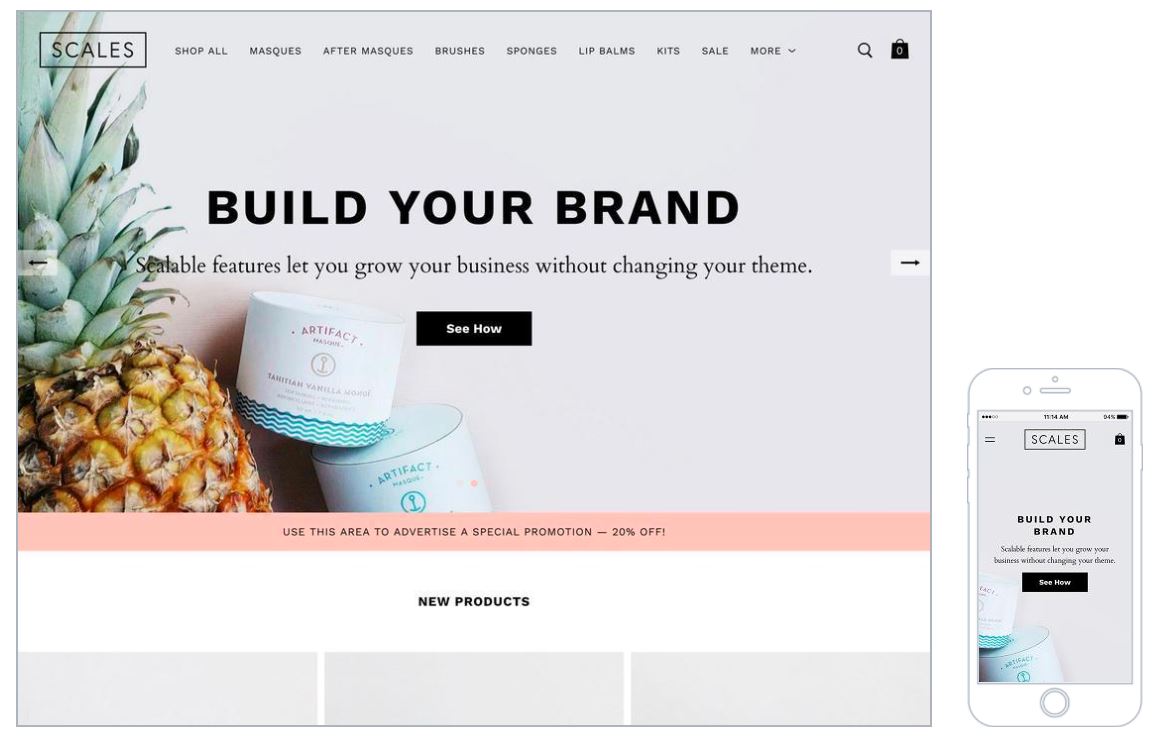
Like previous templates, all you need to remember when using templates is to apply the right sizes to banners and images based on the theme’s instructions. But one thing worth mentioning here is that this is a paid theme; therefore, it is the best fit for ambitious brands wishing to keep pace with their growing business.
Scales is known for its delicate and typical design. It provides a homepage product grid incorporated with a huge product display area. It has 4 different styles: chic, pop, modern and minimal.
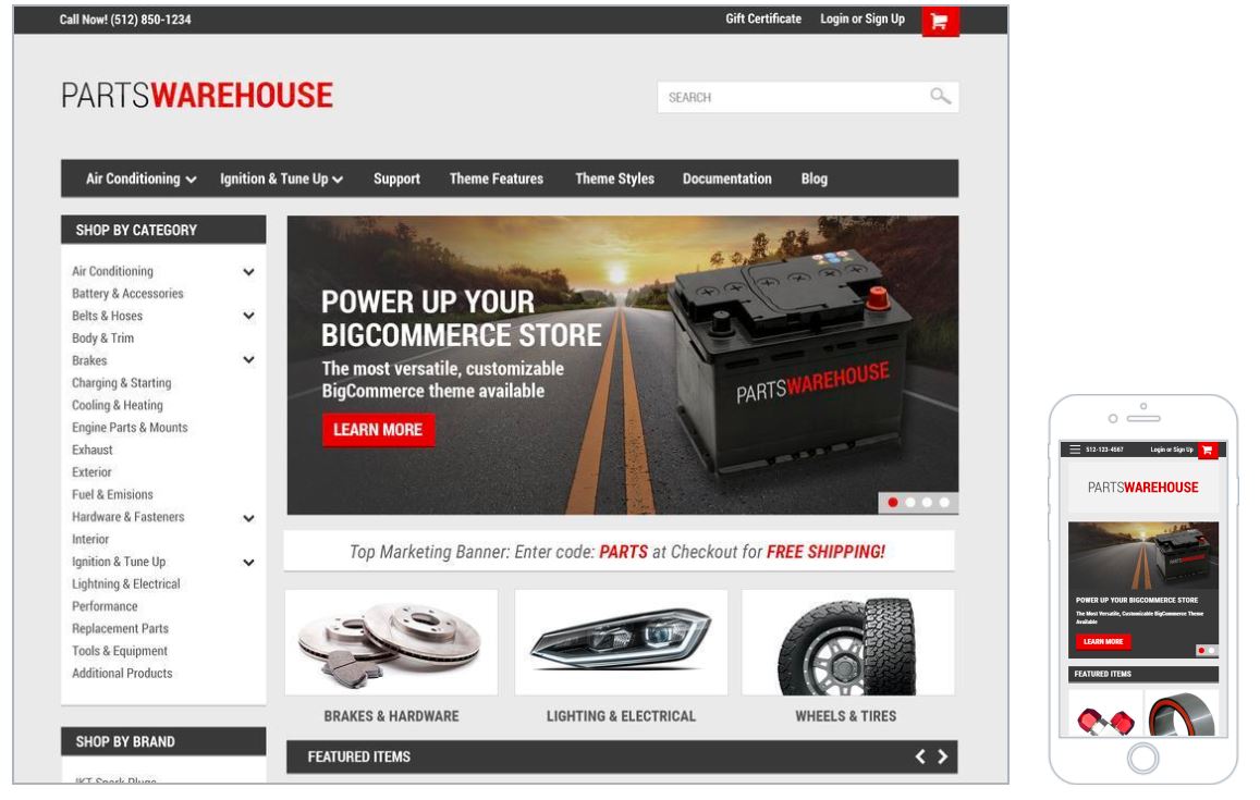
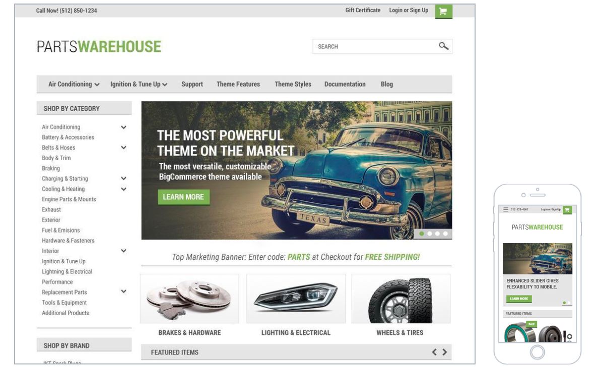
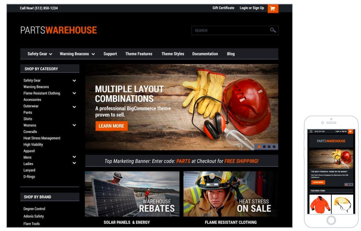
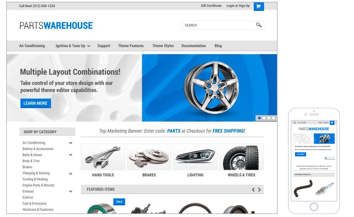
Parts Warehouse
This is another paid BigCommerce theme geared towards enterprise-level businesses. This classy theme is optimized for large catalogs and its huge menu can hold a large number of products.
Part Warehouse assists you a lot in making best-sized banners because of its great flexibility and a highly customizable theme editor of BigCommerce Stencil Themes.
This theme has 4 styles available: classic, light, dark, and champion.
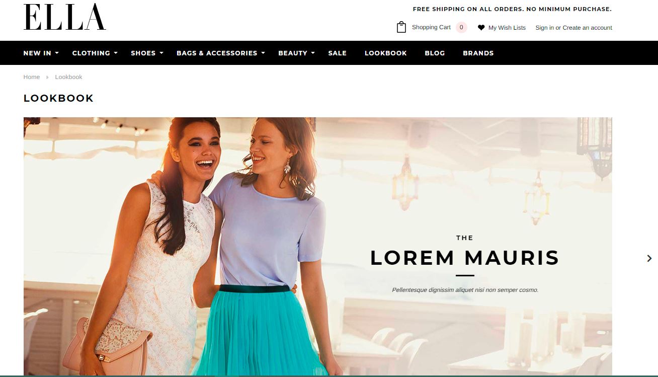
Lookbook
Lookbook allows you to set up a homepage carousel that can display up to five images with a heading, subtitle, and a call-to-action button that can link to an external site or any page within your store.
Images are recommended in the type of JPEG to facilitate the quality and loading time. More importantly, they should be at least 1200px wide and slide images should be invariably consistent in dimension.
Geneva
Geneva theme comes in 4 styles: bold, grey, pastel, and colorful. This paid theme helps showcase your top products and bring an overall striking and contemporary look.
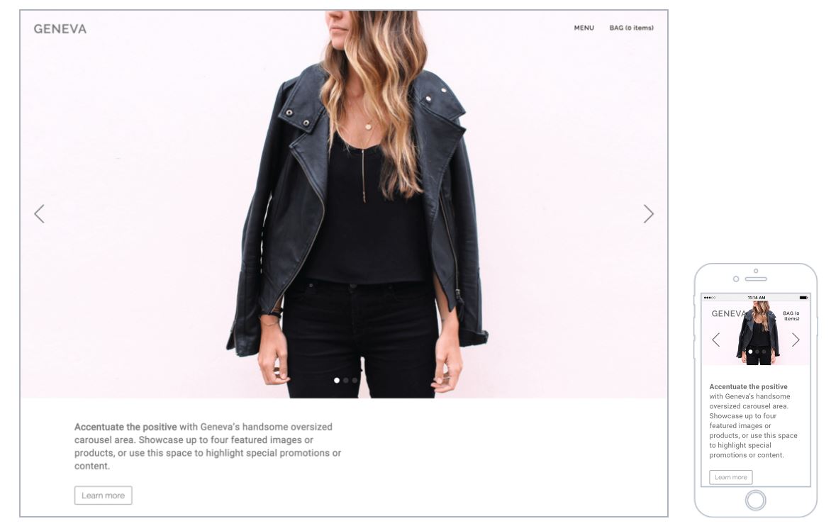
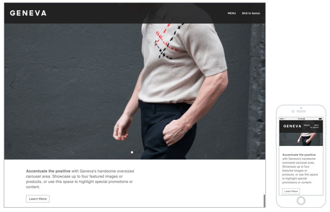
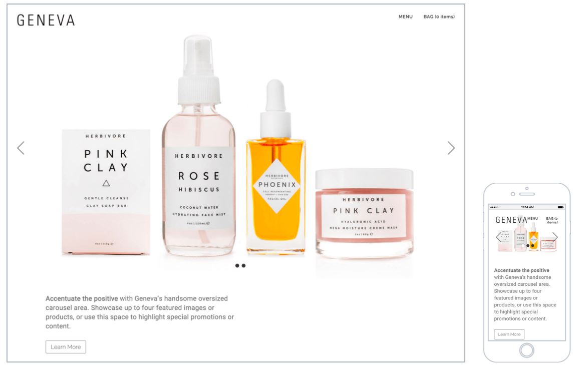
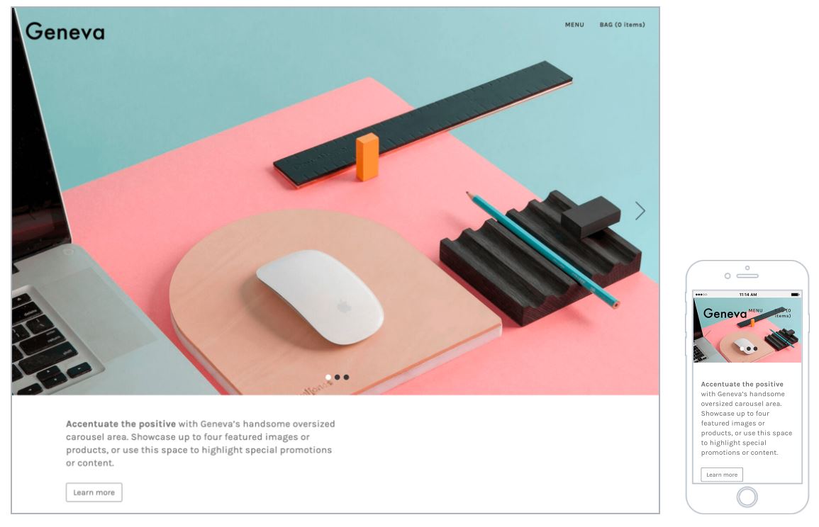
Regarding banners, as you know, banners can be added to the Homepage of Geneva theme with the size set at your preference and oftentimes recommended by BigCommerce.
Runway
A gallery theme for stores selling high-end products with remarkable style, this paid theme is available in 4 styles: bold, minimal, warm, and bright.
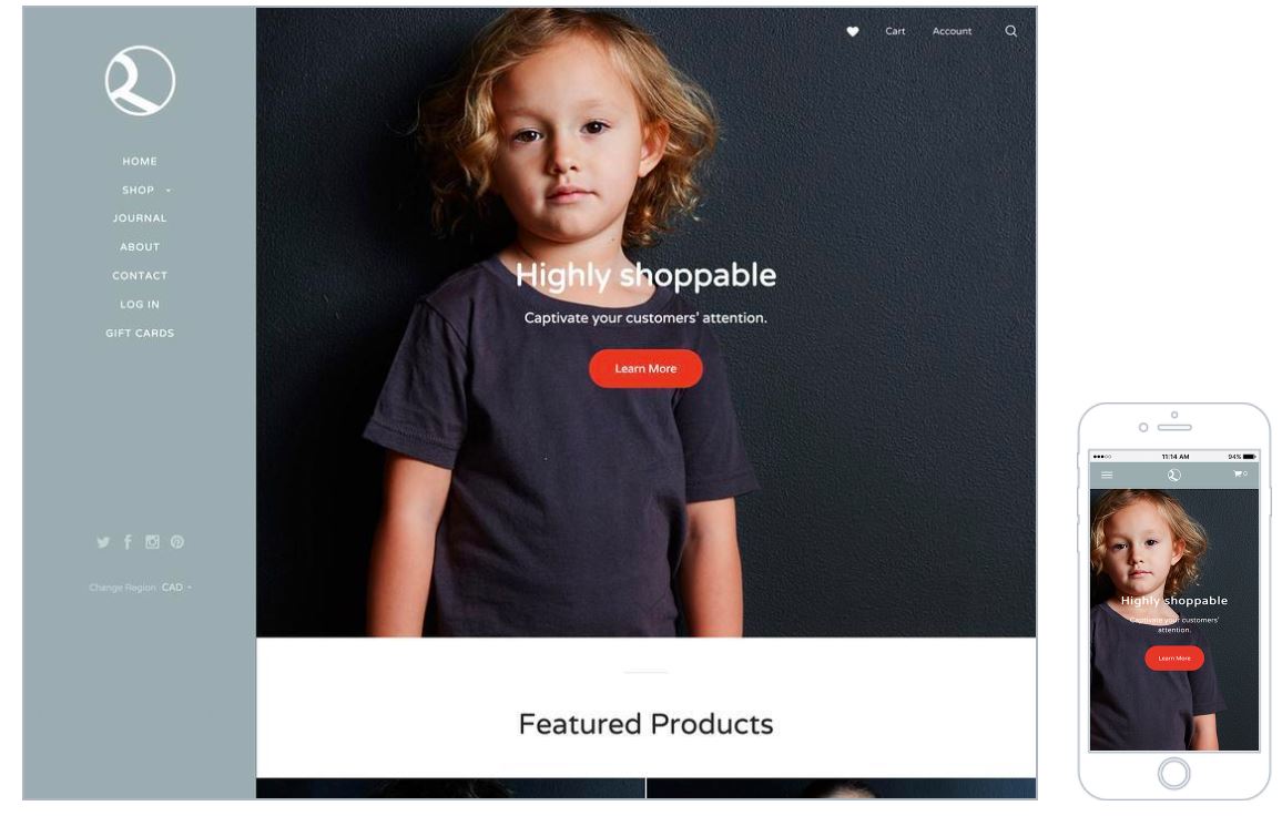
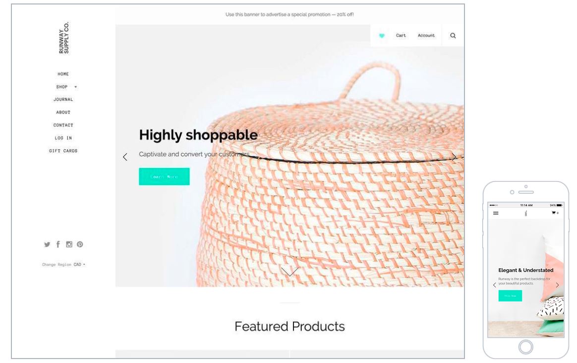
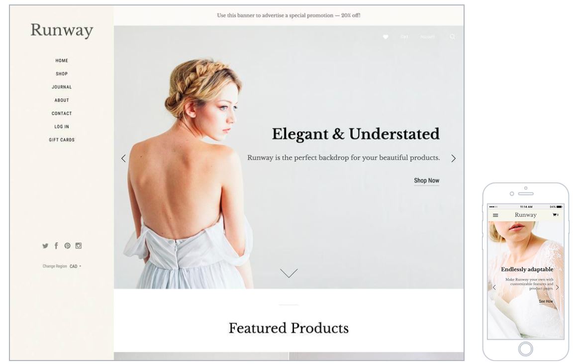
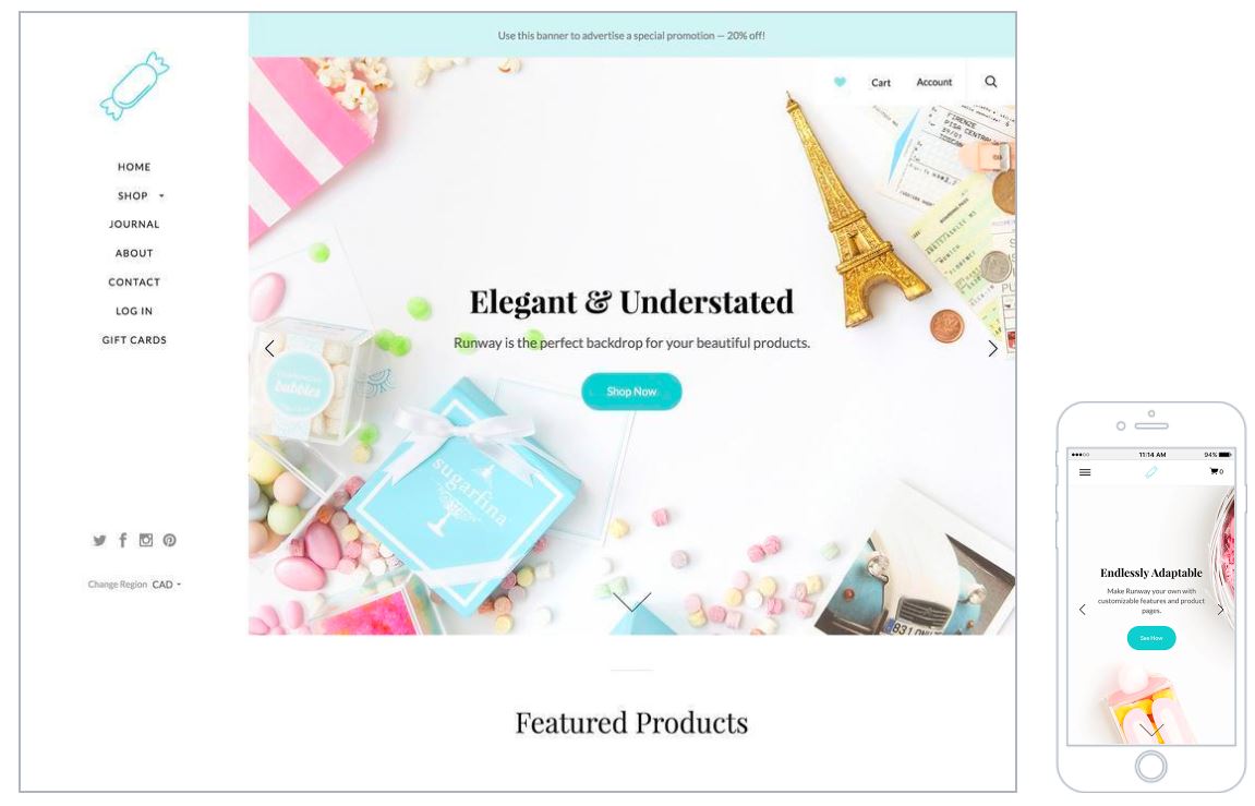
The homepage carousel can display up to five images and each image should be at least 1200px wide.
Tips for better banner performance
Simplicity
No matter the banner sizes you are choosing, please remember to avoid stuffing the ads with all sorts of content that are not really of great value and relevance to your shoppers. Images, texts, animations,… in banners should be chosen carefully and not confound viewers.
Simplicity is often the most effective, not the other way around it, especially when your top intention is to convey your message to users.
Images
We, as humans, are especially attracted to illustrations, photos, and images. Combining texts, a clear banner CTA, some easy-to-read fonts with fine images can be a great way to draw your shoppers’ attention.
CTA buttons
As you might notice from the previous tips, call-to-action buttons are of utmost importance when it comes to increasing the CTR of your stores.
Shop Now, Sign up,… are common CTA that you should keep in mind.
Specific niche
Banners are at their best performance when they are geared towards a particular niche of customers. Maybe your banners don’t speak to a wide audience but they resonate with individuals that you aim at, and that’s a success.
Final words
You’ve come to the end of this article! You can acknowledge the great significance of banner sizes in your e-commerce marketing and the positive impacts they have on your stores’ profits.
Nevertheless, the proper banner size does not always equal the success of a marketing campaign, yet it will definitely make a big difference for you in comparison with others who do not have any knowledge about banner sizes.
Also bear in mind that the knowledge and tips that we have just shared with you above are a no one-size-fits-all approach to websites and particular themes you are working on. They are the most basic and fundamental guidelines that we want to outline and remind me to take banner sizes into consideration whenever you work on your e-commerce campaign.
Do you find any information useful for you? Do you have any questions for us with regard to BigCommerce banner sizes? Feel free to share with us in the comment box below. We would love to hear from you!
