Bigcommerce Cornerstone Theme Review: Features & Guide
With BigCommerce users, Cornerstone is not a strange thing to them since when opening the theme list in BigCommerce, people will see Cornerstone Light first. It is the default theme for any BigCommerce store. Apart from Cornerstone Light, this theme also offers users two other styles, which are warm and bold. These themes are similar, but they also have some small differences suitable for different shops. Based on their demands and desires, merchants will analyze and figure out which one is suitable for them.
So, what makes Cornerstone become the flagship theme on BigCommerce? Due to its simplicity in design or anything else?
This post will help you clarify this problem and know how to set up the Cornerstone theme for your BigCommerce store, don’t miss it!
Parts of cornerstone theme
There are 7 primary components in a Cornerstone theme of a BigCommerce store which are arranged from the top to the bottom of the page. They are utility navigation, logo, main navigation, carousel, most popular products, new products, and footer.
Utility navigation
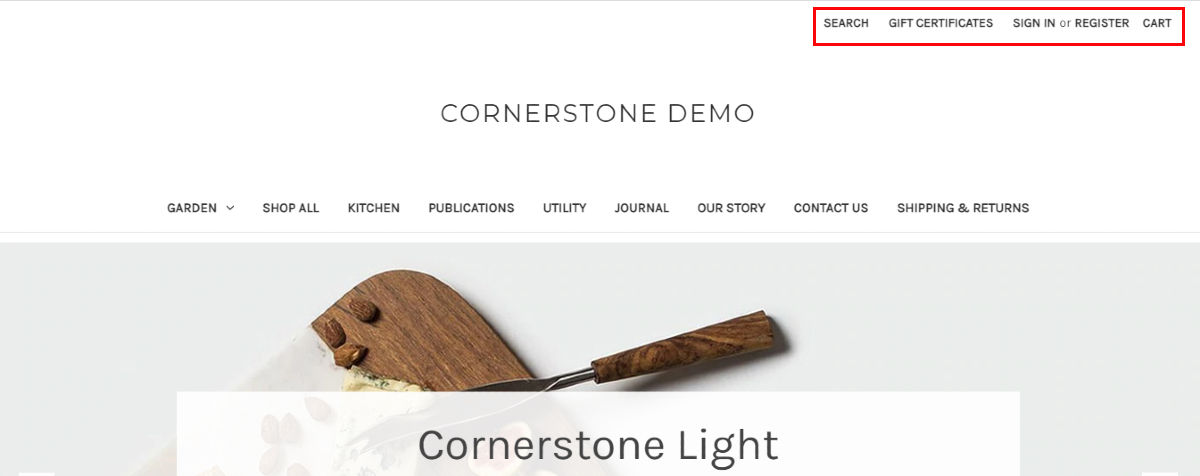
It is placed at the top of the screen which consists of such parts as:
- Search
- Gift certificate
- Sign up or log in
- Cart
This part is responsible for supporting customers in logging their account or registering a new account to start shopping. More than that, they can easily find the products they want and add them to the shopping cart in a couple of seconds.
These actions are essential to almost all visitors to your store, so by adding it at the top of the page, they can find and exploit them with ease. When customizing, merchants can edit the color of text, text hover background and border color of cart dropdown, and background color of cart counter.
Logo

BBelow the utility navigation is the store’s logo displayed in the form of text or image. With text, users can size and color the font. If it is an image, you can select the image you like to upload on your homepage. You can change the logo position (left, center, and right) and image size, but your logo picture’s perfect size is 250x100 pixels.
Main navigation

Main navigation is the bar located below the store logo. It includes:
- Shop all
- Bath
- Garden
- Kitchen
- Publications
- Utility
- Shipping & Returns
- Contact us
- Blog
They are default categories for main navigation, and users can modify them. More than that, they can choose to link their store to other websites or not.
To personalize the stores, BigCommerce enables users to change the text color, text hover color, quick search background color, background, and border color of the dropdown menu. With the dropdown menu, there are two modes available for users, which are simple and alternative. In the simple mode, the display depth will be no more than three, but in the alternative, it is unlimited.
Carousel
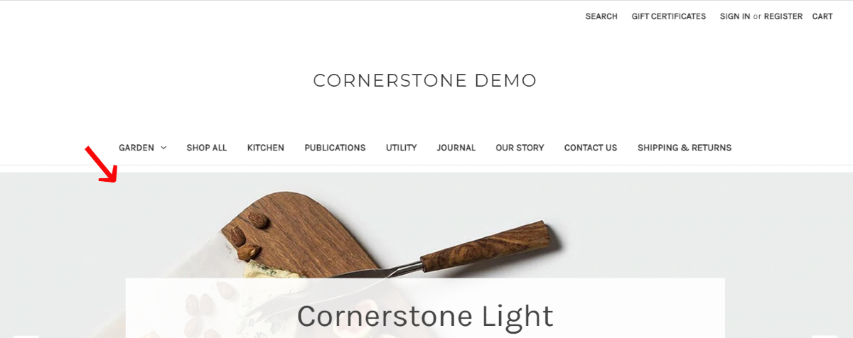
It can be denied that every place on the homepage is a valuable part of your store because it is the place that is accessed the most. Therefore, arranging your homepage suitably plays an vital role in your business success. It is also the reason why you should understand your customers deeply to leverage it.
Accounting for a large position in the homepage, carousel is a perfect part to draw your customers attention and boost sales. JPEG and GIF, and PNG are allowed in the carousel, but the most suitable type for this component is the JPEG since it is the perfect combination of image size and quality. It is said that 1400x600 pixels or 1400x800 pixels are appropriate dimensions for your images. Besides, keep in mind that all the pictures displayed in the carousel have the same size.
The majority part of each section on the carousel in the Cornerstone cannot be changed. Users can modify the color of such sections as content background, head text, description text, arrow, arrow background, and arrow border. Also, they can replace the default color of the indicator. These icons assist visitors in tracking the messages or images that have recently been seen and indicator background and indicator active by the ones they desire.
Beside the ability to change colors, this theme offers merchants three options which are:
- To stretch on large screen
- To show carousel arrow
- To show that carousel at all
Take them into consideration and choose the most suitable for your store and business campaign.
Most popular products
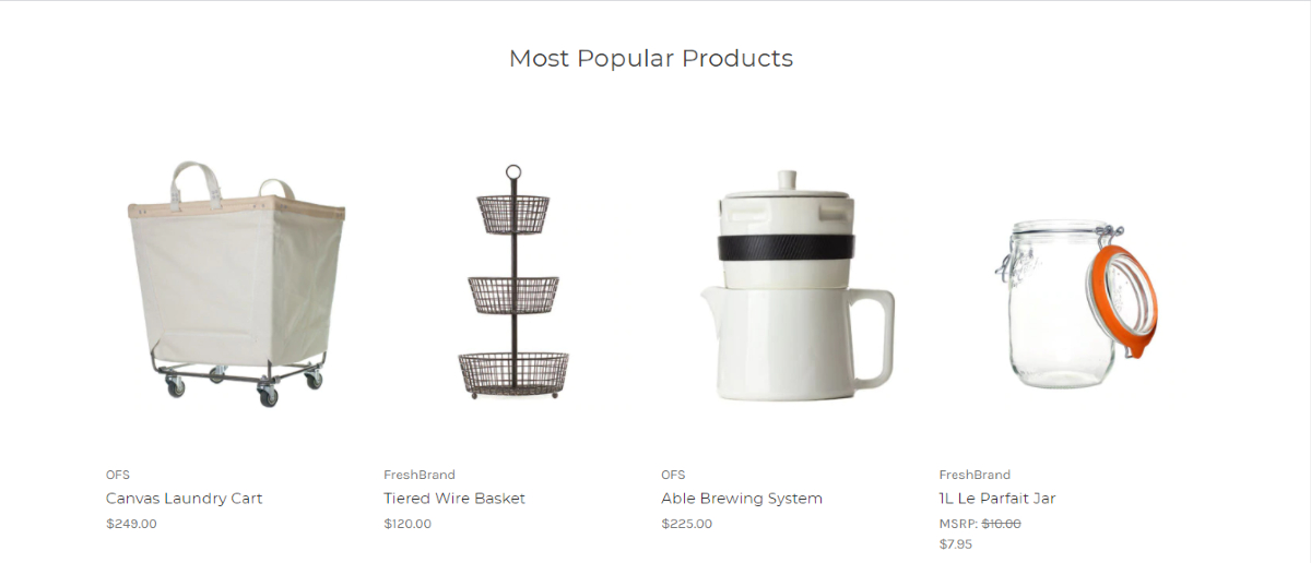
Continuing scrolling down the BigCommerce store you will see a block called Most Popular Products. The products displayed on this component can be selected manually or without human control. Of course, when choosing by yourself, it can take more time but seems to be more effective in attracting customers’ attention.
In the Cornerstone theme, the criteria for product ranking is not the quantity of orders, it is the number of units sold instead. In case the entrepreneurs possess more than one store on different platforms like Amazon, or eBay, this theme automatically calculates these units and uses this number for the rankings. Nevertheless. The orders that are cancelled, refunded or tested will not be included in the rankings. In this section, you can add up to 12 products based on your desire. Otherwise, you can disable this so the Most Popular Products will not be shown on your BigCommerce store.
New Products
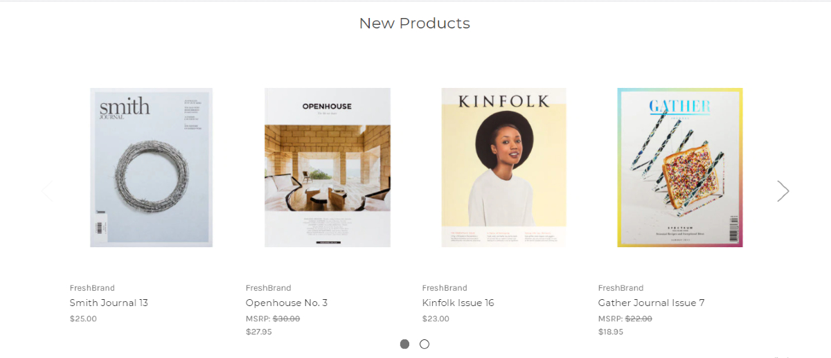
Similar to Most Popular Products, New Products consists of multiple products but rather than featured products on your store, it is the latest products that are sold on your store. You can also select to enable or disable this block and the maximum number of merchandise is 12.
Footer

As the name suggests, Footer is the lowest part of a BigCommerce homepage in which users are able to change its colors.
Also, the default footer often includes three messages: “Powered by BigCommerce”, links to several brands, and the symbol © followed by current year and store name. All these three messages can be removed from the homepage, so if you find it unnecessary, delete it in the theme design.
Yet, it is advised to keep the message “Powered by BigCommerce” in newly launched stores since it can be used as a certificate to increase the store’s credibility and attract more visitors. Of course, keeping this message forever is not a good idea because it can come to their mind that your store is just an affiliate of BigCommerce. Thus, consider removing it when your store has developed and has a certain number of loyal customers.
Besides the message, there are also logos for payment methods displayed in the footer of a homepage which are American Express, Discover, Mastercard. PayPal, Visa, Amazon Pay, and Google Pay. Merchants can select the icons of available payment options on their store to show in the footer so that customers will easily acknowledge which one can be used. Additionally, like the message “Powered by BigCommerce”, these icons also make your store be more reliable in the customer’s mind and encourage them to shop comfortably.
Features of BigCommerce cornerstone
Responsiveness

Responsiveness plays an integral part in the development of any online platform since the rapid growth of the world; if you cannot adjust to the world, you will be left behind. In 1999 when Blackberry was introduced, it was a strange thing to people, but after over 20 years, mobile phones dominate the market since surfing the Internet is now the basic demand.
Consequently, with the Cornerstone theme, your store will be automatically changed to fit the size of their devices, so whether they connect your BigCommerce via tablet, mobile phones, or desktops, they still have a seamless shopping experience. In fact, full responsiveness is the default one of the cornerstone themes so you don’t need to make any changes to get it.
Free updates
Similar to other BigCommerce stencil themes, Cornerstone empowers users to receive updates and support with no fees. However, this support excludes the help of changing the HTML or CSS code of the theme. Considered as the flagship themes on BigCommerce, whenever there is a new change in features or improvements, Cornerstone is often the first theme to get the chance to use them.
Simple checkout process

According to Baymard Institute, 18 percent of customers admitted that too long or complicated checkout process is the reason for their abandonment during checkout. This means that the more complex your checkout process is, the more likely you will lose the sales during checkout.
Therefore, a simple checkout process should be regarded as an important part of your eCommerce store. By streamlining the checkout process, the time spent on completing the orders will decrease significantly. Also, it declines the likelihood of abandoning the orders due to lower price on other stores.
Equipped with One-page checkout feature, Cornerstone enables users to complete the checkout process in only one page. Everything from contact information, shipping information, and billing information will be placed in one page so that customers can finish it rapidly and have fewer chances to change their decision.
Persistent shopping cart
Actually, people often access their shopping accounts on multiple devices like mobile phone, desktop, laptop, and more. Thus, the cases that they put a product in their shopping cart and then forget it since they are occupied with other work occur frequently.
So, how to fix it?
Using Cornerstone theme on BigCommerce! This theme possesses a persistent cart that automatically updates any changes of your customers’ cart to any devices they log in. So if they add the items on the desktop and forget it, they will see the items are already put in the cart when they visit your store on their smartphones. Hence, they can easily complete the purchase.
Image and video support
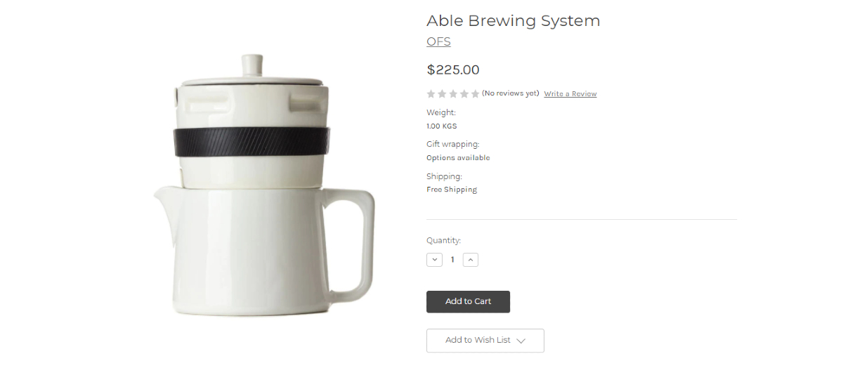
It can’t be denied that shopping online helps customers save time for moving to different stores to get items you want. It also allows you to see the inventory and shipment status in a couple of seconds.
However, there exists a great drawback of this kind of shopping. It is that customers have no chances to touch, feel, and see the products before purchasing as in traditional shopping. Hence, image and video become a crucial source for customers to decide whether buying or not. If your products have high-quality images and videos, they can increase credibility and create a good impression in the customer’s eyes.
With Cornerstone, you are able to upload large images without worrying that it will slow down your store. Also, this theme supports users in uploading and displaying videos by allowing them to embed video simply from popular video platforms like Youtube or Vimeo.
How to set up cornerstone themes on BigCommerce stores?
Step 1: Open Storefront
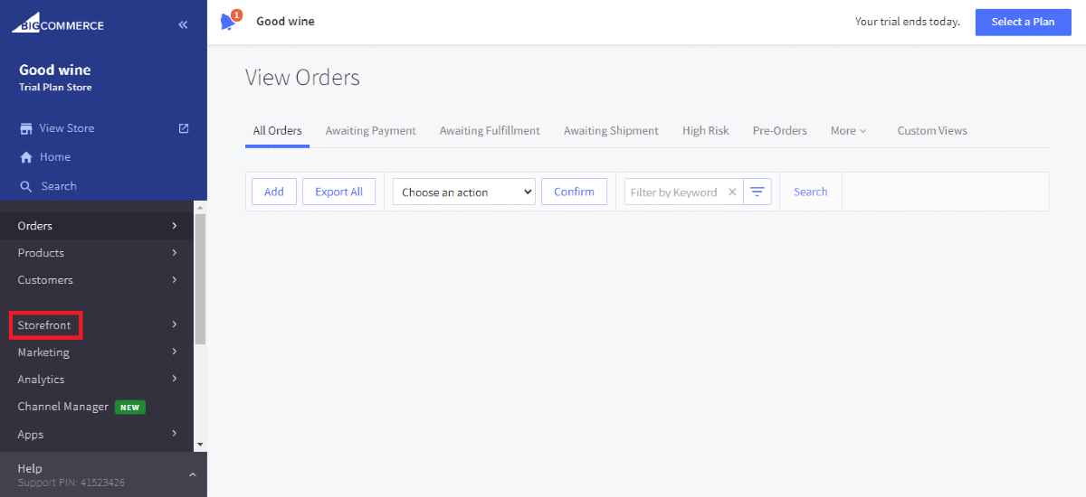
Logging in your BigCommerce account and open the admin dashboard, you will see a section named Storefront.
Click on it.
Step 2: Open My Themes
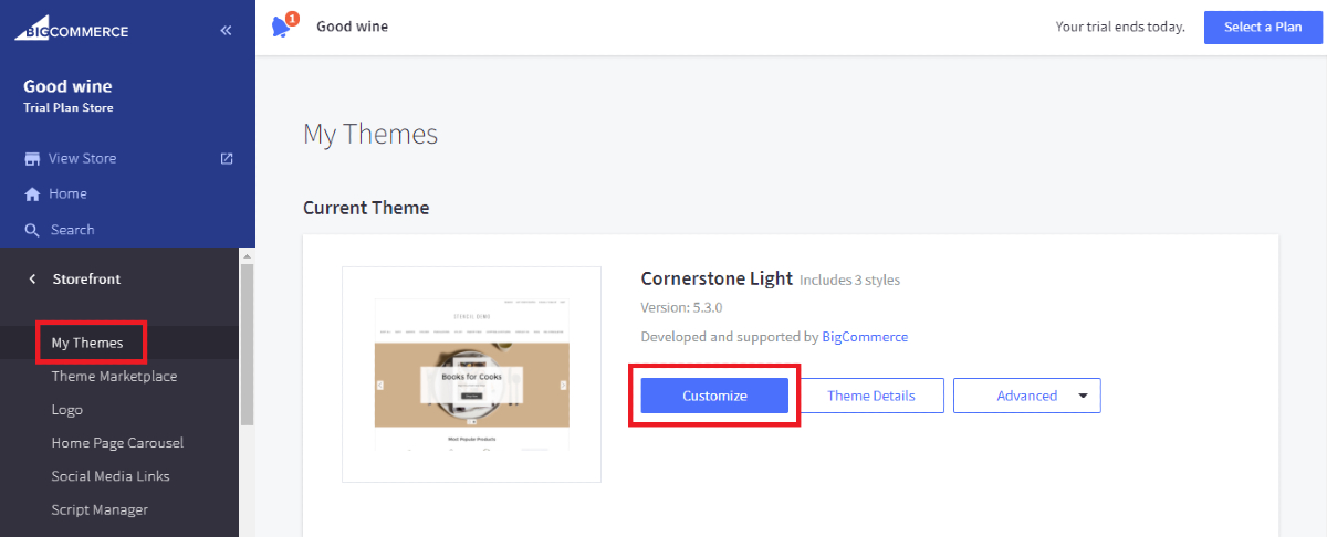
Select My Themes at the top of Storefront and you will see a block named Cornerstone Light theme since it is the default theme of BigCommerce.
Step 3: Customize the theme

In this block, select Customize to make changes to your store.
Beside the light one, there are 2 other styles of Cornerstone themes which are bold and warm. Click on theme details and you will see an overview of this theme.
Scroll down and your will see these two styles, click on the one you like and choose Customize. Now, it’s time to customize your theme as in the Cornerstone Light theme.
Step 4: Save your changes
After modifying the theme, you need to click on the Save button on the top right of the screen. Don’t forget to preview them in advance to ensure that everything looks ok.
Final thoughts
Overall, Cornerstone is a basic but useful theme for your eCommerce store. With it, you can modify your store to fit your strategy with ease. If you prefer the simplicity and convenience, Cornerstone will be an ideal choice for you.
Related Posts:

