How To Add & Customize BigCommerce Featured Products?
Product panels are a way to display items on your storefront. They’re most often used to show off the best-selling or similar goods in order to upsell and cross-sell particular product lines or brands. They’re a smart way to market new products and keep consumers up to date with what’s new. Learn more about each panel and how to incorporate it into your theme by reading on.
About Featured Products in BigCommerce Store
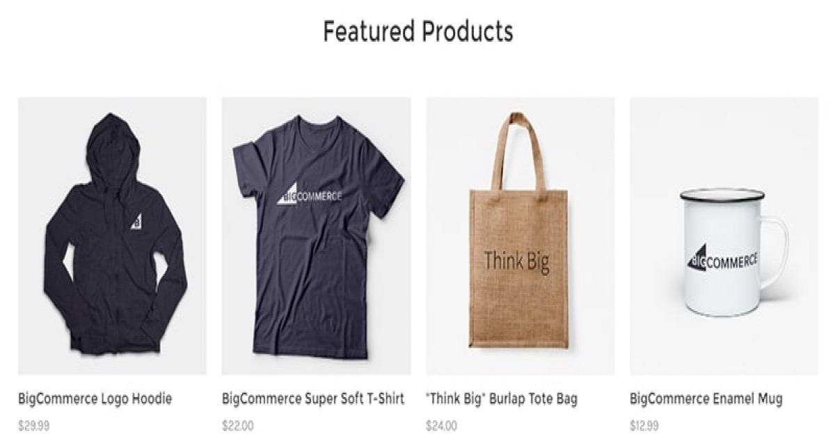
A feature called Featured products is available on BigCommerce. The wordpress website’s featured items service allows for the display of excellent products for sale. Simply put, it’s as simple as showcasing the best items and highest quality you have on your home sales website.
With Featured products, you can also display products that are receiving deals or discounts. Alternatively, you can use online stores to promote inventory items. Featured goods, on the other hand, aid in the introduction of best-selling items. Alternatively, you should suggest items that are appropriate for each situation.
How to hide BigCommerce Featured Products
The steps to delete or exclude a single or multiple categories from your BigCommerce store are outlined below.
- Go to your BigCommerce store and log in.
- Go to the product categories section in the goods section.
- Select the box on the left hand side of the category or subcategory you want to exclude.
- On the top of the menu choices, click the ‘delete’ or ‘trash can’ button.
- Delete or remove the categories/subcategories you like.
What you need to know:
There is no way to recover items or categories if a category or subcategory is removed unless you have a store backup for your online store.
When a parent category is removed, the sub-category assigned to the parent category is also deleted. If you want to get the subcategory back, make sure you reassign it to a different parent category before removing the items.
Customize BigCommerce Featured Products
If you want to customize one of the free legacy Blueprint themes that hasn’t been customized yet, you can do so by following this guide. When you need to create a specific look and feel for your categories, product pages, or web pages, you’ll need to create a custom layout. This is useful if you have a group of items that need a different layout from what you currently have. To learn how to build a custom file layout based on your default layout themes, please follow these steps.
Please go to the store front designs, then to my themes, and then to edit HTML/CSS to build the custom layout template files.
Select category.htm for a custom category layout, product.html for a custom page layout, or page.html for a custom web page layout from the list of other template files on the left side.
To edit the files, copy the entire file’s contents and paste them into a text editor on your screen, such as Notepad or textedit.
Save the file with a new name until you’ve finished making the changes that you need. The file name should begin with the letter “_” and end with the letter .html.
The new file must be uploaded using WebDAV on the BigCommerce backend. Upload your file to the template folder once you’ve linked to WebDAV.
To assign your custom layout file to a category, go to Products > Product Categories > Action > Edit to the right of the category to which you want to assign the file.
Pick your custom file from the Template Layout file dropdown and save your changes.
Steps To Add Featured Products to BigCommerce
Selecting Featured Products
- Go to your BigCommerce store and log in.
- Go to the Products section and choose View from the drop-down menu.
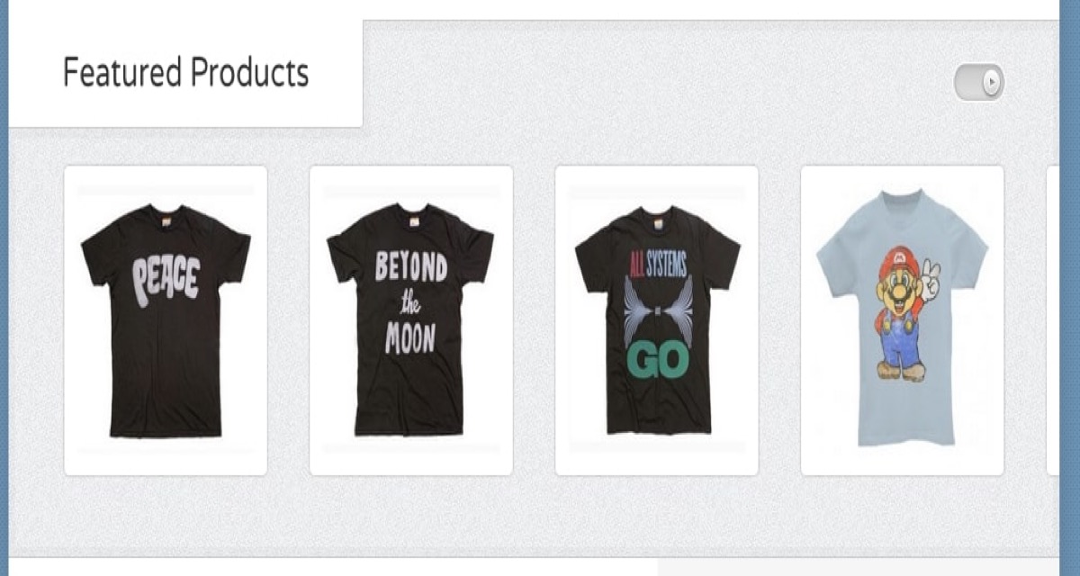
- The featured column is the one on the left-hand side of the Action column that has blank stars marked under it.
- Please check the star to allow the featured products status, and it will now appear in blue.
- If you choose to delete a featured product, simply uncheck the star mark again, and it will no longer appear in the list of featured or best-selling items.
Number Of Featured Products To Display
Depending on the theme platform you’re using, the number of featured products shown in the featured product’s panel is controlled differently (Stencil or Blueprint).
Stencil
Page Builder controls the number of featured items in stores using Stencil themes.
- Go to My Themes in the Storefront, then Customize.
- Choose Home Page from the Theme Styles menu on the left. Set the number of featured items you want to see on the home page under Products.
When you’re done, click Save and Publish.
Blueprint
The number of featured items is monitored in your store’s Display Settings for Blueprint themes.
- Choose Store Settings in Store Setup, and then to the Display tab.
- Adjust the number next to Featured Products. If this number is less than the number of products you’ve highlighted, the products that appear on the list will change as the page is refreshed.
- Save your changes.
Referencing The Object/Panel In Theme Files**
Stencil
For more information about how the featured item is referenced in Stencil themes, see our Stencil documentation.
Blueprint
HomeFeaturedProducts.html is the name of the featured products panel. It can be found in the template files’ Panels folder. Insert percent percent Panel.HomeFeaturedProducts percent percent in an HTML document to refer to the panel. This panel was created to appear on a store’s homepage; any other use would require customization.
For more detail about how the featured items panel is referenced in Blueprint themes, see our Blueprint documentation.
Tips To Have A Better BigCommerce Products Design
No matter what platform you use for your eCommerce website, design is extremely important. The design of your website should not only make it visually pleasing, but it should also guide potential customers through the site and assist them in becoming actual buyers. Although there are a lot of e-commerce platforms out there, BigCommerce stands out because of their attention to detail and commitment to building an eCommerce platform that converts.
Customers are more likely to convert if they can easily access the website, locate the items they want, quickly add them to their cart, and see all of the important details before proceeding to the checkout page. That’s why, before investing in paid ads, you should spend some time reviewing and enhancing your store’s architecture. Otherwise, no matter how much traffic you generate, all of your visitors will leave without purchasing anything.
Organizing the design clearly
Just because you have an online store doesn’t mean you can arrange your items at random. Consider the overall experience you want your BigCommerce customers to have when they visit your shop. Customers can easily see the various product styles you sell and find out which items are currently on sale if you arrange the products into proper categories.
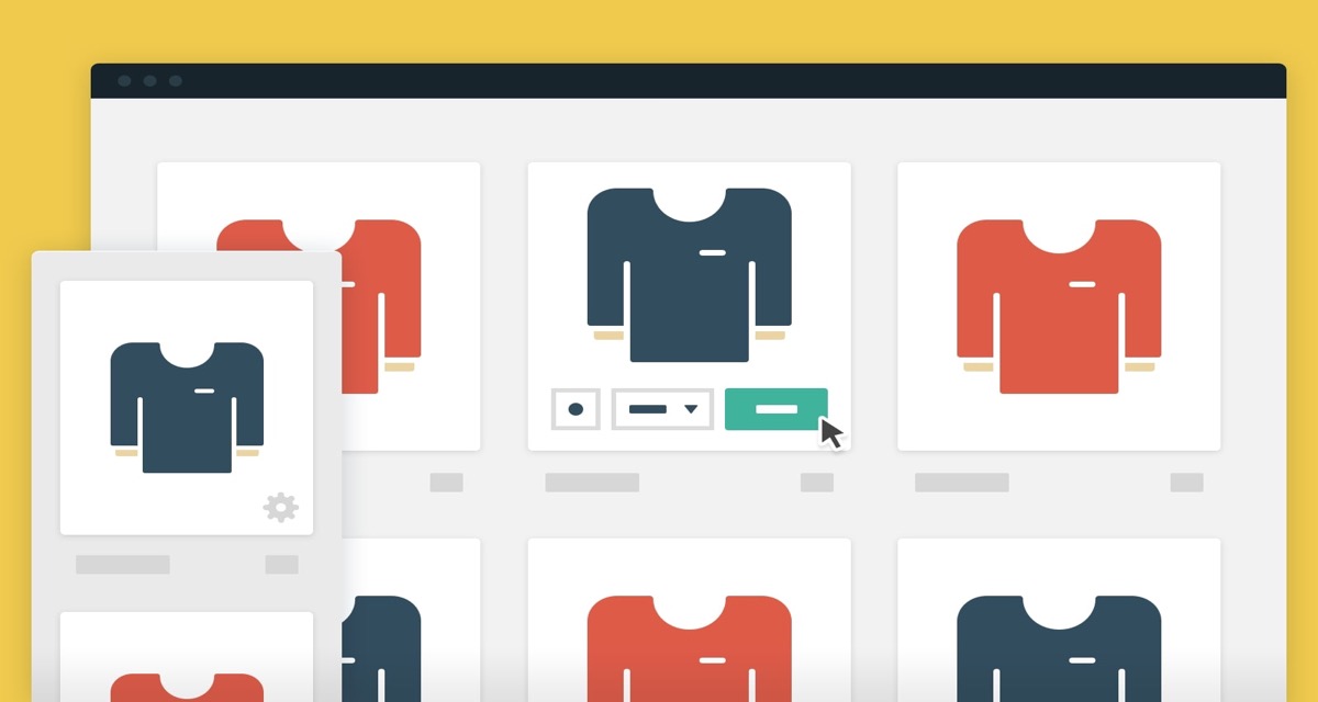
Use a grid style to keep the overall page layout looking clean and tidy, and clearly mark the product details and prices. Instead of cramming so many items into your homepage or into a single row, go for big images with less products. This will give each item more breathing space.
Simplifying the site to navigate
One of the most critical aspects of your website is the menu. It assists customers in moving from one page to the next, emphasizing the importance of a well-organized navigation menu.
Instead of cramming too many links into the main menu, consider using a drop-down or mega menu, which will enable you to add more links to different product categories. A fly-out menu that appears on hover is another useful way to make it easier to navigate around your platform.
Fortunately, many BigCommerce themes, such as Modez, come with a pre-built menu that will assist you in improving your customers’ shopping experience.
Taking it easy to keep in touch
Customers may have concerns about a particular product or approved payment methods from time to time. Ascertain that they can quickly locate your contact details and contact you. You’ll be able to answer their questions and assist them in making a purchasing decision.
Austin Bazaar, a BigCommerce-powered site, does a good job of this by prominently displaying their phone number alongside their hours of service.
Adding customers review
61 percent of online shoppers read customer feedback before purchasing a product, according to data. Customer feedback will help you improve conversion rates and drive sales. This is because prospective buyers would be more likely to purchase if they see that other consumers have had positive experiences with the same product. In reality, adding customer feedback to your website could increase your conversion rate by up to 4.6 percent.
Another BigCommerce-powered e-commerce platform, Josie Maran, shows product reviews below product details, lending credibility to both the store and the products.
Using a search bar
When they come to your site, some of your customers or guests might already have a product in mind. Visitors would want to search for that product if it isn’t instantly available on your homepage, and if they can’t find a place to search, they will go somewhere else.
Don’t leave it up to chance and hope they’ll find it using a navigation menu. They don’t want to go from one category to the next; all they want to know is whether or not you have the commodity. Make sure your website has a search bar that is always available.
Creating high-quality images
One of the most significant distinctions between a physical and an online store is that online shoppers cannot touch or try on products to get a feel for them. Instead, you must rely on product photos to express the product’s appearance.
The photographs on your website should be of good quality, with no blurriness that would detract from the overall impression. Consider building a gallery for each product so that visitors can see it from different perspectives and see it in use or when it is worn. And, ensure that your photos tell a story that is consistent with your brand and promotes sales. Learn how to set the stage for great product photography.
Simplifying the checkout process
The long and complicated checkout method is one of the leading causes of high cart abandonment rates. BigCommerce, fortunately, has a built-in one-page checkout that can dramatically improve your conversion rates. Allowing the clients to check out as guests will make the checkout process much easier.
Another way to make the checkout process go faster is to just ask for the details you need. If you’re selling digital products, don’t include fields that ask for shipping information because it’s not needed.
Enhancing the store on mobile
Another crucial point to remember is to ensure that your store is mobile-friendly. There is more than just using a sensitive theme. It entails ensuring that your pictures, as well as your form fields, scale well on smaller screens. This makes it easier for your customers to find and fill out the right area.
Make use of BigCommerce’s built-in mobile shopping features and incorporate mobile payment options into your online store. This makes it easier for customers to pay for your goods with PayPal One Touch or Apple Pay, and it can increase conversions by up to 12%.
Having a responsive theme
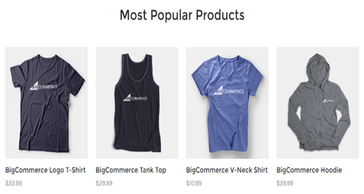
It goes without saying that your theme should be sensitive, but it should also be built with e-Commerce sites in mind, as mentioned in the previous tip. Fortunately, there are many premium BigCommerce themes available that include all of the necessary features, such as mega-menus, product previews, and filtering options.
Adding products review
Enabling product samples or fast views is a perfect way to enhance the customers’ shopping experience. This enables them to simply click on any product to see the definition, price, photos, and other product details in a pop-up image.
They don’t have to go to the product page, which saves them time, particularly if they’re in a rush and want to see what you have to offer right away.
Publishing the online store policies
Your guests want to know what your delivery and return policies are after they’ve spent some time visiting your shop and are ready to buy. They can abandon the purchase if you don’t provide them with an easy way to find the information, particularly if you make it difficult to contact you on top of that.
Solve this problem by including links in your primary navigation menu that direct visitors to a page that describes where you ship, how you ship, and how you handle returns. Consider building a FAQ page that addresses these questions instead.
Showing shipping costs upfront
According to another report, shipping costs that are shown too late are a major factor in high cart abandonment rates. Rather than showing them at the top, make sure the buyers will see the shipping expense factored into the product’s final price.
You may also include a shipping calculator below the product to enable customers to estimate the total cost before proceeding to the checkout page. This will prepare them for what to expect when they check out and will help them avoid unforeseen problems.
Taking your branding into account consistently
Be sure to integrate your branding elements into your website if you want to make your store stand out from the crowd. Start by including your store’s logo and a favicon in your website’s bookmark section or on social media so that your customers will quickly identify it.
To keep the look and feel consistent, use your primary brand color in elements like the navigation menu, buttons, and links. Customers will trust you more if they see your brand elements all over your shop.
Keeping “Add to cart” visible
The Add to Cart or Buy Now button is the most important thing on your website. It should be easily distinguishable from other elements and noticeable. Paying extra attention to the button design is worthwhile, as a better design would convert more sales.
Make the button stand out by using a contrasting shade. Also, make sure it’s big enough on all screen sizes so your mobile customers can press it without having to zoom or pinch.
Permitting customers to filter products rapidly
Allowing customers to sort through your items, particularly when it comes to sizes or colors, is another time-saving tip that will enhance the shopping experience. Filtering by product category is another perfect way to help them save time and find just what they’re looking for.
This will save them the aggravation of discovering that the product they want isn’t available in their preferred size or color until they’ve agreed to buy it and are about to check out. Almost all BigCommerce themes have product filtering options; all you have to do now is choose the one that best suits your store’s aesthetic.
Adding trust seals to the online store
When it comes to shopping online, some people are reluctant. One of their main issues is whether or not they should entrust confidential information to your website. By using confidence seals on your website, you can instantly increase your customers’ trust.
This will make them feel more relaxed about their purchases, knowing that their credit card and personal details will not fall into the hands of hackers or scammers. On eCommerce websites, logos from well-known security-oriented brands such as VeriSign, McAfee Safe, TrustE, or the Better Business Bureau are often used to increase trust. Every page on Man Crates has them in the footer.
Making the copy concise and to the point
It’s important to share information about your site in the copy on your site, but keep in mind that your customers won’t read an entire page of text. Instead, use brief paragraphs and bullet points to illustrate the most relevant aspects of the product.
This will improve the appearance of your individual product pages and enable consumers to easily find pricing details.
Conclusion
On the homepage of many eCommerce websites, featured items or best-selling products are prominently displayed. They usually support items that are new to the market, collections that have just been released, or products or collections that are on sale.
In general, the business owner has the right to select which products to display and to limit the number of featured best-selling products displayed.

