How to make your BigCommerce store Mobile friendly
By Sam Nguyen

When someone refers to mobile commerce as “the next big thing,” I always do a double-take. This says to me that mobile commerce is a fad, a transitory phenomenon that will be forgotten or replaced by something else in the near future. It isn’t the case.
For merchants, providing a good mobile eCommerce experience is no longer a choice; it’s a need. In fact, over 75% of smartphone users leave sites that aren’t mobile-friendly.
BigCommerce is the industry’s best eCommerce platform for creating a stunning mobile store. Good news! Merchants can now provide near-instant page load speeds for mobile shoppers thanks to Bigcommerce’s native support for accelerated mobile pages (AMP). This is just one of the many benefits of a mobile-friendly eCommerce store. Let us dive deeper into how to make your BigCommerce store a bit more accessible on mobile devices.
Benefits of a mobile friendly store
Every year, mobile usage increases, and with statistics that mobile eCommerce sales have hit an all time high in 2021, it’s in your best interest as a business owner to stay on top of the market. After all, it’ll eventually help you and your growing eCommerce business.
Furthermore, many firms are shifting to a mobile-first or mobile-only experience. In this case, a mobile site is designed exclusively for the mobile user, and it differs from the desktop version.
Because of the better site navigation and exceptional experience tailored for the particular browsing habits and obstacles of mobile buying, brands who do this frequently notice a rise in mobile conversion.
Optimized SEO
When customers search, Google and other search engines place a higher value on websites that provide a better mobile experience. In 2018, Google issued a statement stating that Google’s suggested design pattern favored sites that were set up for mobile and had a responsive design, implying that SEO ranks would be improved. If a site passes their mobile-friendly testing, it will eventually boost its position.
Improve conversion rate
Users may still purchase from the site if they are using a portable device, thanks to a mobile site that has been customized. While mobile conversion rates are lower than desktop, providing your customers the option to purchase from their smartphone increases the chances of a higher conversion rate.
In 2017, Monetate’s eCommerce analysis found that 2.03 percent of mobile users convert, with 4.19 percent of tablet users also converting. According to another report, 67 percent of buyers are more inclined to buy from a website that is mobile-friendly.
Plus, it’s critical to have a responsive design on your website since it adapts to the user’s behavior and surroundings based on the screen size and platform they’re using. Because your site is automatically responsive, you don’t have to worry about where your visitors are coming from. You may simply relax and take in the revenue.
Higher customer satisfaction
Customers may return or rank you as a good business to buy from if they like buying and browsing on your site. According to GoDaddy, having a responsive and mobile-friendly website is one of the greatest methods to retain clients on mobile.

How to make your BigCommerce store mobile-friendly
1. Personalize shipping experience
Local businesses are frequently sought by mobile users. According to Deloitte, 58 percent of smartphone owners have used it for store-related purchases.
This necessitates providing your users with localized information. It’s also simple to get enriched personal data and analyze user behavior on mobile. You can ask for permission to use GPS to track your customer’s position and use that information to generate a customized offer.
And, after you have the user’s location, you may show him the shipment time and other relevant information based on his location.
2. Increase your store’s loading speed
We live in an age of rapid gratification, and our drive to get what we want, when we want it, extends to the realm of eCommerce. Customers who purchase online expect the convenience and variety that eCommerce provides and for it to be delivered quickly.
The longer it takes for your store’s online pages to load, the higher the site abandonment rate. As a result, delayed page load times might result in missed revenue. Even BigCommerce shop owners should keep an eye on their site’s performance and try to improve it where they can.
The photos you use on BigCommerce might be the single most crucial thing slowing down page load speeds. Keep in mind that your photos don’t have to be billboard-sized to be successful. You may improve the speed of your website by following the instructions below:
-
1250 px – The width of your photos should not exceed 1250 pixels. That’s what BigCommerce suggests, and it’ll help your site load quicker.
-
72 dpi - This is the number of dots per inch that your photographs must have to display correctly online. To give you an example, 300 dpi is required to print a photo, but it is unneeded for the internet and will slow down your load time.
-
Instead of PNG, choose JPG — While PNG files are more visually appealing, they are quite large. Your photographs may be compressed considerably more than PNGs if you keep it simple with JPG pictures, and you won’t lose any quality.
-
Website’s responsiveness — Make sure that whichever theme you select (BigCommerce or a bespoke website) is responsive. It’s a commonplace these days, but if you’ve had your site for a long, you may not be meeting the needs of your mobile visitors. Phone and tablet consumers may abandon your business in favor of competitors that load faster if your site isn’t device-responsive. Responsive themes automatically adjust mobile users’ picture sizes.
On BigCommerce, you can select from a variety of applications to enhance your eCommerce store’s website. It’s vital to remember, too, that the more features you add to your business, the more code must be loaded with each click your clients make.
When you run a speed test on your site, you’ll be able to see which apps are the most resource-intensive. Consider uninstalling them if they aren’t essential, and make sure you assess any future apps’ weight before installing them.
A nice place to preview your results is Google’s mobile-friendly test tool. You may also use a software like Mobiletest.me to simulate your device. It simulates how your e-commerce site would be displayed on various devices.
3. Mobile SEO
Mobile searchers, according to Search Engine Land, are pretty detailed in their inquiries. As a result, based on the user’s current stage in the purchase cycle, your content should only deliver the most relevant information to them. Search engine optimization methods and best practices for helping a mobile version of a website rank on search engines are referred to as mobile SEO.
Traditional SEO methods and recommended practices are still critical, but there are components of SEO that are specially designed to aid in the ranking of mobile websites.
Google recommends implementing a mobile website in one of three ways:
-
Responsive design,
-
Dynamic serving.
-
Using separate URLs.
Google uses structured data markup to analyze a website’s content and learn more about the web and the world in general. Structured data may also improve the aesthetic of SERPs, resulting in a higher click-through rate.
Depending on the sort of website you have, there are a variety of markup options available, including:
-
Articles and more
The more data markup that is structured, the better! To get the most out of the markups, make sure they’re correctly implemented using Google’s Structured Data Testing Tool. Also, avoid using spammy markup to deceive Google. Your site may be subjected to a manual action by Google, which might harm your rankings. Google’s official structured data markup documentation can be found here.
4. Make your CTA clear
On a desktop, you have enough room to respond to your customer’s concerns. However, I recommend keeping your CTA above the fold. It’s much more vital to keep the fold in mind while using a mobile device.
Do you want a user to abandon their shopping cart? Make a bad first impression by placing the purchase button below the fold. A shopping basket at the top of the screen is one solution used by mobile e-commerce websites (right-hand corner).
It shows how many things have been put to the cart and provides a simple way for the user to check out. You may also offer a pop-up that allows the user to check out if he likes. He can also choose to continue shopping if he wants.
Mobile searchers are frequently quite specific about what they wish to do. On their laptops/desktops, they’ve most likely already read about and looked at your product description.
Pro tip: On your mobile eCommerce site, don’t try to be clever with your CTA copy. It should evoke a sense of urgency in the user and encourage them to act, such as “Buy Now” or “Add to Wishlist.”
5. Streamline user’s checkout experience
Imagine this, while checking out, the website forces you to set up a new account. This isn’t a smart practice because it means the user will have to take more effort to finish their transaction. Did you know that 23% of consumers would abandon their shopping cart if they are compelled to register?
I would recommend that you consider the user experience once again and attempt something similar to the Best Buy example below. The user is given three clickable headings at the checkout that provide him an overview of the many options.
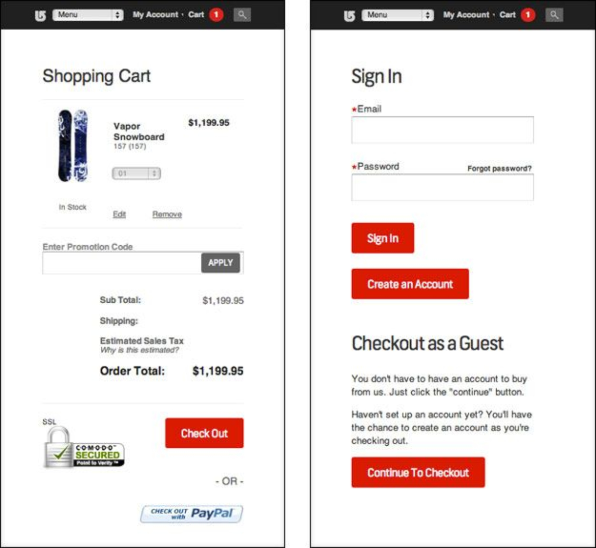
Another detail to remember is only the most important links, such as your product categories and checkout, should be shown on your e-commerce site’s mobile navigation. All other non-essential links should be pushed to the bottom of the menu bar. This is because the checkout procedure becomes tiresome and uninteresting once your consumer has made his purchasing decision.
6. Enable Mobile theme for BigCommerce
Some of BigCommerce’s older Blueprint Themes are responsive, which means they will automatically adapt your shop to accommodate any device, including desktops, laptops, tablets, and phones. BigCommerce strongly advises activating the mobile theme for non-responsive themes.
Your consumers will enjoy a sleek, mobile-friendly shopping experience that loads quickly thanks to the mobile theme. Certain desktop storefront elements, such as the home page carousel and compressed category listings, are not supported by the mobile theme in order to deliver an optimal experience. Consider moving to a responsive Stencil theme if you consider these features necessary.
To enable the mobile theme, go to Storefront > Mobile Theme Settings, then choose Yes, activate the mobile theme from the drop-down menu.
The following options will show once you’ve checked the box:
-
Download Mobile Theme — Downloads the template files for your mobile theme so you may change and re-upload them.
-
Enable on These Devices — This option lets you choose which kind of mobile devices your mobile theme should work on.
-
Mobile — Use the mobile theme when shopping from an Apple iPhone/iPod Touch, Android Phone, or Windows 8 Phone.
Conclusion
In 2017, mobile eCommerce sales accounted for 34.5 percent of all eCommerce sales, and the percentage is increasing. Even when we are at a physical brick-and-mortar store, our mobile usage is impacting our purchasing decisions. In fact, looking for more information on a product via our mobile device influences one-third of our purchasing decisions.
If we haven’t persuaded you before, a mobile-friendly website is a way to go. All you have to do is look at the numbers. There isn’t a single agency or technology firm that will tell you that being responsive is a bad idea. It’s a difficult and terrifying procedure to progress with the technology era, but it’s always in your best benefit.