Top 10 Best About Us Page Templates to make your brand loved!
When it comes to personalizing your online business, nothing is more effective than the About Us page. It is a quick summary of your company’s purpose and history while providing a clear overview of the company’s brand story. A great About Us Page can tell your brand story excitingly, establish customer loyalty, and turn your store into a beloved icon. Most importantly, it can give your customers a good reason to shop from your brand.
Unfortunately, About Us pages too often are considered an obligation instead of a valuable opportunity to connect with your customers by selling your visions, your story, your mission, and what makes you YOU. The good news is that I can show you how to make a standout About Us page.
This article will show you the different templates and tools to create a professional page about us for your online store, blog, or another website. There are guides, templates, and generators for you to create your own custom page that can represent your brand and connect with the customers.
What is an About Us page?
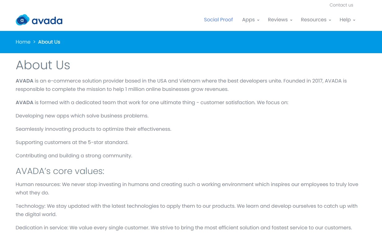
The About Us Page is a page on your company’s website that tells readers everything they need to know about you. It often includes a detailed description covering all aspects of your business and you as a founder or an entrepreneur. This may include the products or services you are providing, the way you become a business, your vision and mission, and maybe your future goals as well. Your About Us page is the perfect and rare opportunity for you to tell an engaging story about your company.
Why is an About Us page important?
The problem with many About Us pages is that they are buried in the corner of the site with some hastily written paragraphs that lack originality.
The About Us page should be a sales page with clear goals in mind - focusing on highlighting the biggest selling points of your brand and creating a strong impression on potential customers.
Your About Us page is the ideal place to achieve several goals, such as:
- Describe the target customer or the vision that your business serves.
- Communicate the story of the company and why you started it.
- Explain your business model or how products are made.
- Showcasing compelling content like explainer videos, data visualizations, or blog posts that may clutter your homepage.
- Set an image for your business, featuring the founders of the creators.
In short, your About Us page can be a home for your brand’s story, a room to show off your business victory, and a sales page that answers all the most important questions new customers have about your business. Ultimately, it will explain and show why they should buy from you.
Read more:
- Best Shopify About Us page templates
- How to Create a New Blog Template on Shopify
- Best Shopify Blog Templates to Drive Traffic for Website
- Best Shipping policy templates + Examples for Shopify
An About Us page components
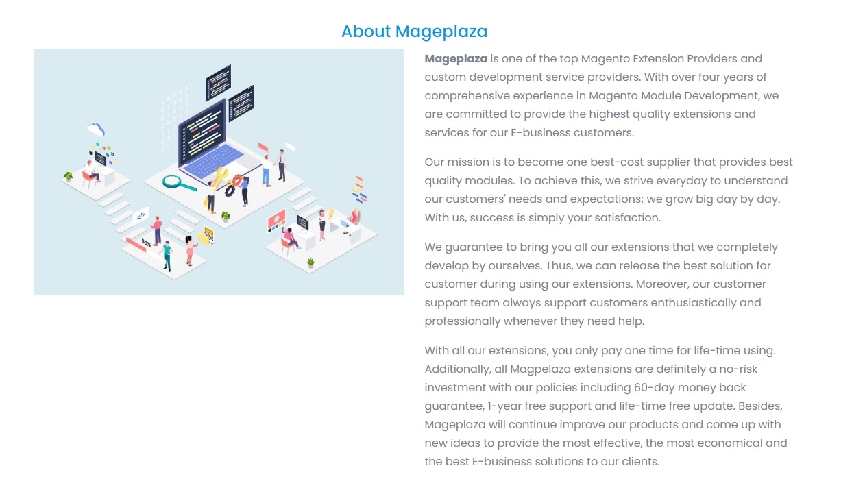
The marketing potential of the About us page is enormous. It is your chance to express your brand in the best way possible. With people coming to learn more about your company and the people behind it, your About Us page can even be the most frequently viewed page on your website.
So you need to make sure that the information on the About Us page represents your brand exactly as it is. Here is a list of the important components for you to make sure that you don’t miss anything crucial.
Vision & Mission
Start by telling customers about yourself. What is unique, what are the main, what is your mission? Try to stand out by communicating your values and culture as a brand and use this area to fully answer what your brand represents. It doesn’t have to be too long; you just need to find a comfortable way to communicate with your audience.
Brand history
Take visitors to a trip down the memory lane and give them the story behind your store. You can show them how, where, and when everything started and what your company has accomplished. This is an opportunity for you to share worth-noticing milestones and achievements. You can even present your history as a timeline, displaying large amounts of information in a visually compelling way.
Team members
Your About Us page can have an emotional element by adding details about the passionate member running your business. People often find it easier to connect with real human beings, so let your crew’s personality shine through on the About Us page.
Infographics & Multimedia
A well-built infographic can help visitors remember your business better than words. So if you think infographics work better for your brand, you can skip the long description and add an infographic to help visitors understand your company. Or you can add an interesting video about your business or your story.
About Us page generator
An automated About Us page generator will provide you with short, medium, and long versions of text that you can copy and paste directly onto your website. Just fill in the blanks on the form and get custom about us description that you can copy and paste directly onto your own website.
Volusion About Us Page Generator is the tool that you can use. It is completely free; you just need to enter your full company legal name and an email address to get started. The generator would make three versions of the About Us page with different lengths, and you can remove or edit any part as you see fit.
It is a pretty good tool with short and effective copy. But, as we discussed, you would want more uniqueness in your About Us page to make your business really stand out. Let’s find out how, in the next section.
The best About Us page templates & examples
After some research, here is a list of the best About Us page templates and examples that you can take inspiration from when creating one for your brand.
1. Tell a story
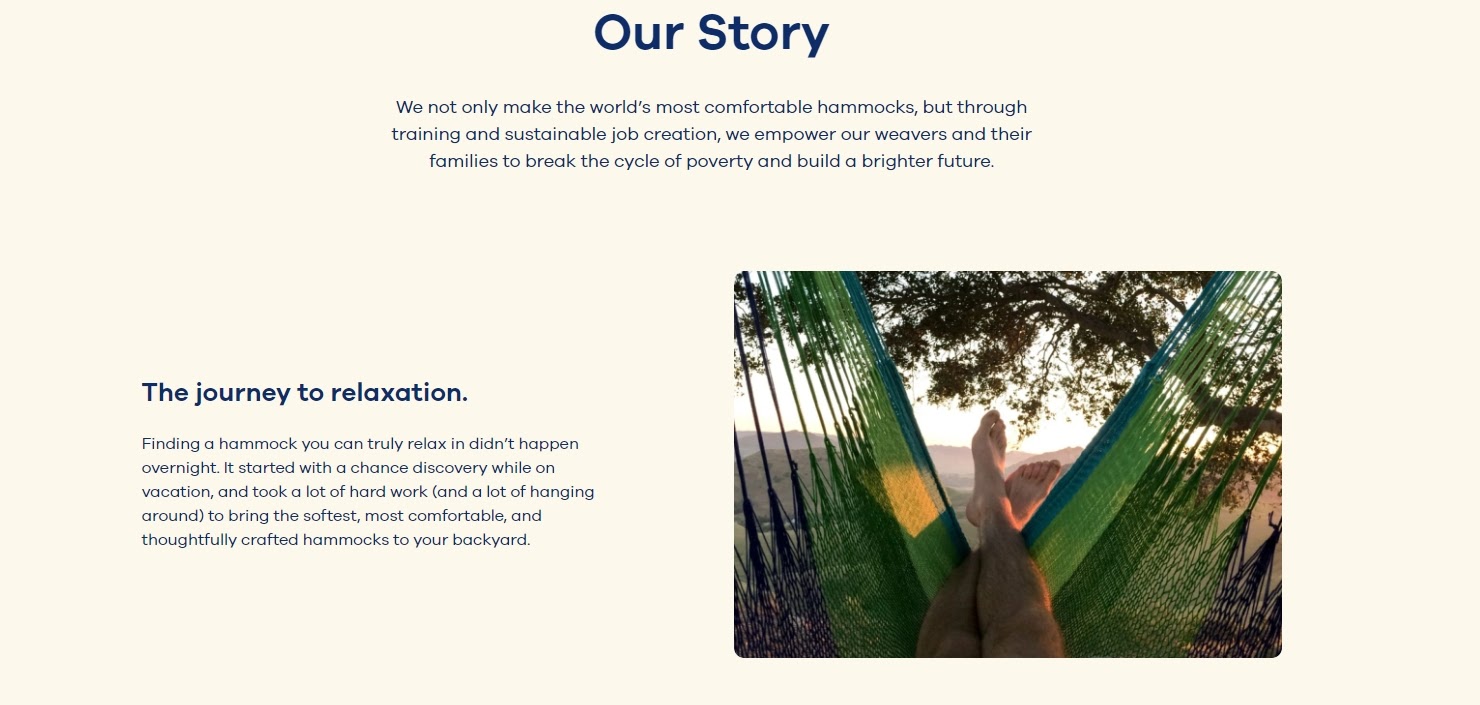
When you have an awesome story about how your company was created to change people’s lives, share it. The About Us page is a great place to bring that story up. The story would personalize your brand, provide context and meaning to your product or service. What’s more, good stories can stay in readers’ minds for a long time - meaning people are more likely to connect with your story and pass it on.
Yellow Leaf Hammock lets visitors know about their product by describing how the hammock empowers the weavers and their families. The company divided the different parts of the story into sections that are easily digestible graphics and easy-to-understand words, drawing a picture instead of large paragraphs of text. Their page with its story clearly sends out the message that Yellow Leaf Hammock cares for its workers and wants to build a brighter future.
Every company has its own unique story to tell, so use your storytelling skills and put them to work on your About Us page. Using stunning graphics and descriptive copy, you can turn the About Us page into a touching and interesting page that helps your business more than a generic page.
A simple template for you to try out:
Welcome to [STORE NAME]!
Starting as a small business in [NAME ORIGIN], we have big dreams in mind. Our passion for [PRODUCT NAME] makes us provide our customers with nothing but the highest quality of products, guaranteed to meet your needs and satisfy you!
With a motivated team, we have been in the business over [NUMBER OF YEARS]. That is why we have the experience and dedication to always look for new creative ways to bring a smile to your face.
2. Humanize your brand
People tend to think that an About Us page should be formal in order to gain trust and credibility. But most people find it easier to connect with a real human being and trust that, instead of a description that sounds like it comes from an automated machine. Trying to sound too professional on the About Us page can result in stiff copy and design, making your company a bland smoothie no one wants to try. Don’t be too safe, be human.
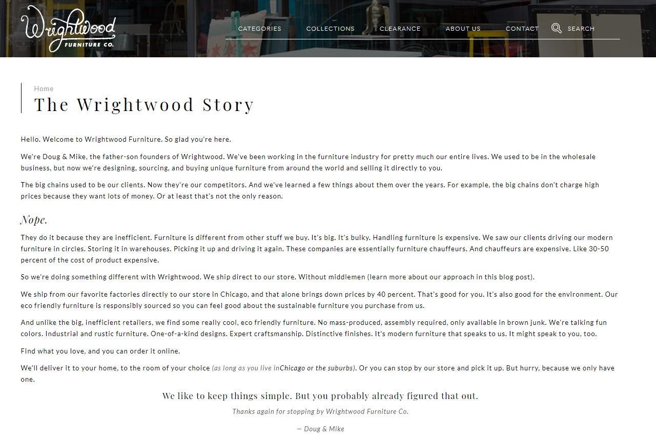
Let’s look at the Wrightwood’s About Us page. It is a simple text-centric approach to show the human elements behind your brand. As a letter to customers, Wrightwood strategically uses the format and font size to create diversity with text instead of relying on other types of media.
What it does best is telling readers its position in the furniture industry among bigger competitors and demonstrates a small business experience and passion for rising up against the status quo. They want to do something different; they want to break the chains. It is like an underdog story that we have seen countless times in movies, and we still support and cheer every time.
In the end, there was a thank you from the founders for their customers to choose to shop with them. It is indeed very much like a human.
3. Showcase the brand’s personality
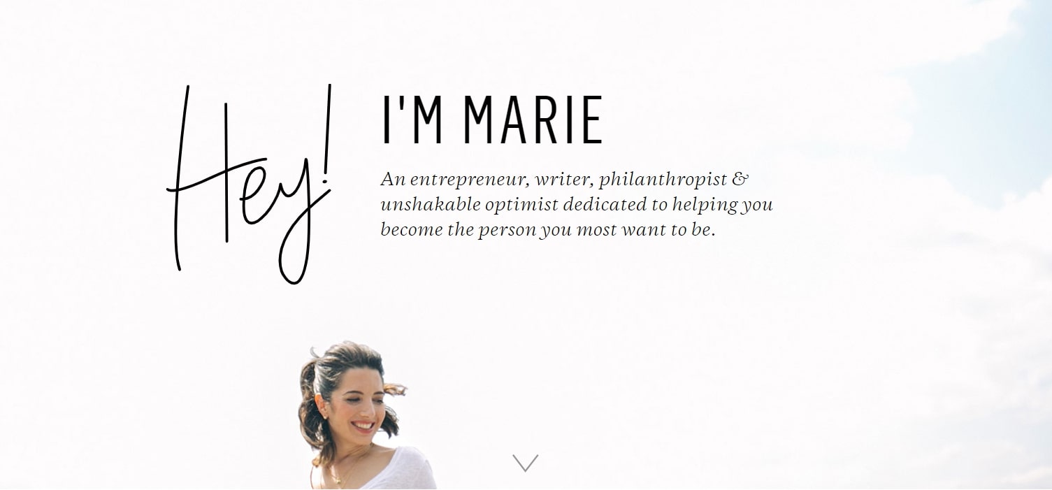
The mistake that many companies make with About Us pages is overthinking. They write a lot about the mission, philosophy, goals, etc. but they forget the simplest and most essential thing: Describing who they really are. In a way, think of an About Us page as a personal description. And, like anyone else, you would like yourself to be distinctive with a special personality.
Take Marie Forleo’s About page as an example. She structures her page like a long-form letter to the visitors. It tells her story in the form of a condensed autobiography before focusing on the reader with a cleverly titled section: “Which brings me to you.”
For entrepreneurs with a personal brand, this might be better as an About Us page. Treat your business as an important part of your life’s journey, and invite your visitors or potential customers to be a character to join in. Not only can this connect with readers through your personality, but it can also demonstrate your expertise through the experience you have.
4. Communicate in an easy-to-understand way
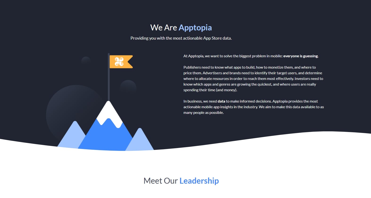
Nobody likes industry babble. If you think it makes you sound super smart, think again. People want and appreciate you being straightforward about what your business does. After all, if people can’t understand what you do, how do they know they need your product or service?
So, ignore the industry jargon. You don’t need to outline all ten company’s core values or explain how you can save the world with your technology. You just simply tell your customers who you are and what you can do. That is what Apptopia does on the About Us page.
The startup’s simple but engaging copy effectively communicates the company’s service while still allowing every reader to understand it. So, try to get rid of the complexity on your About Us page whenever possible. Short and powerful sentences are the best to explain complex products and ideas in a helpful and empathetic way.
Try this template to be crystal clear about your business:
Our company started as a small business in [NAME OF LOCATION], and our goal is to provide our customers with products that make them happy, at a price that makes them happy as well.
Our customers are our top priority, and through our products, we strive towards building lasting and meaningful relationships with them.
Our customers are our top priority and through our products, we strive towards building lasting and meaningful relationships with them.
5. Be humble
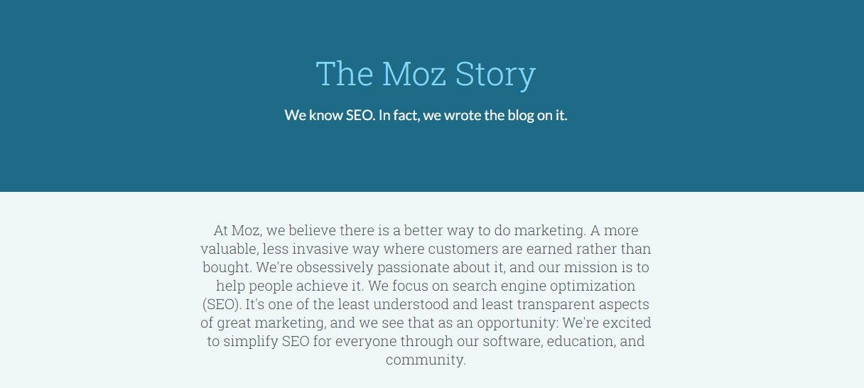
Instead of writing a few paragraphs about the company’s mission and history like everyone else, try a few different things - there are many ways to make your brand more appealing to people who don’t know about you.
Take Moz as an example. A lot had happened since 2004 - when the company was founded, so it decided to share those milestones using a clean and interesting design that has clear headers, concise paragraphs, and real pictures to deliver an enjoyable reading experience.
I especially loved the humble references on how Moz received funding, how it transformed brand positioning - and, most importantly, how it moved back to the original model. This speaks volumes about the honesty and humility of the brand because Moz did go through many changes in both philosophy and missions. So be brave and talk about your ups and downs, your potential customers will trust what you say even more.
6. Focus on the team
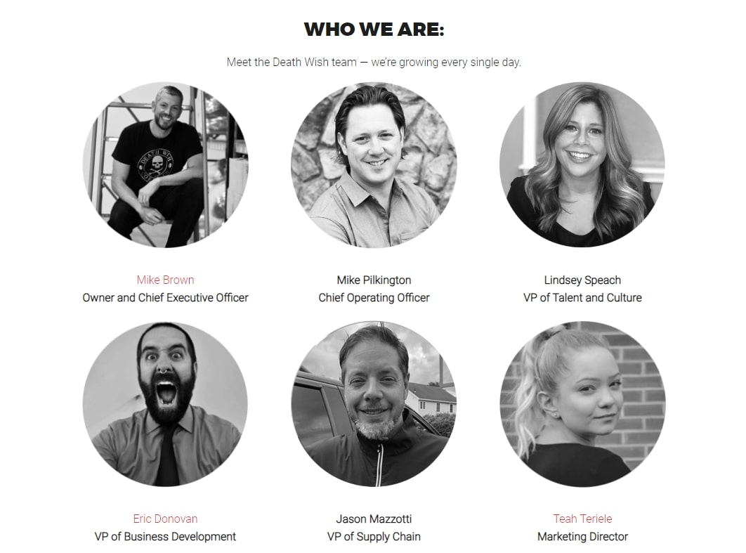
Setting a face for your brand helps to humanize it, shine a light on the people who run your business, and communicate your company’s human-centric culture. Even if you only show the founders, the About page can still be an opportunity to build your personal brand and share how your story and experience make your company a better choice for customers.
People are community creatures, so showing people who they’re working with is the quickest way to connect. Don’t be afraid to show off the people who make the products, pack the boxes, and respond to customer emails. It makes everything your company does seem more human and relatable.
People are different from machines for human connections. Give your employees the respect they deserve and make sure they are highlighted in your company’s story. You can clearly see the human behind Death Wish Coffee in their About Us page. Each employee has an avatar with their own personality, showing the diversity of characters in the company.
7. Present more data
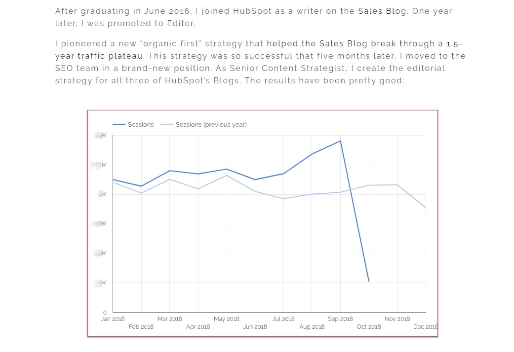
Data is everywhere nowadays, and it has become an important part of people’s decisions in buying or walking away. In this part, let’s take a look at an About Us page from a professional, Aja - an SEO strategist at HubSpot. On the About page, you can see the ingenuity she brings to the company in the form of data.
As a data expert, Aja knows her clients as freelance writers, and strategists don’t just want to see what she writes - they want to see how her content has worked the magic. With that in mind, The About page tells a story of her career development, which is shown by an impressive line chart showing the result of the SEO strategy she used for HubSpot Blog. The decline showed when she stopped collecting data.
Aside from the chart, Aja also wrote a personal note about what she does in her spare time - a good way to humanize herself in the eyes of potential customers.
8. Have multi-languages

Kero One is a DJ and hip-hop artist from San Francisco, so he wants to provide valuable information for brands that cater to a wide audience - especially if those audiences speak multi-languages.
The story of Kero One started from childhood when he was six years old and first discovered his passion for hip-hop. His sincere love for the genre adds value to his own music. While the childhood hobby helps connecting with the audience, the way he tells his story helps Kero One expand it.
His “About Me” page has his story in English, Japanese, Korean, and Chinese. Having these Asian audiences makes his brand more relevant to his target audience. If you are a company, a simple selector of languages is enough. It will help your visitors find their preferable language and see that you care for them.
9. Try being a minimalist
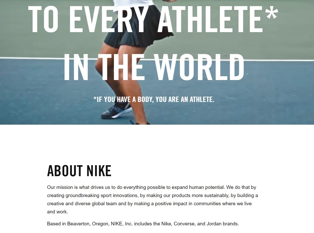
If you are looking for a minimalist approach to the About page, you can try what Nike does with theirs. Nike may seem like a company that is too big to copy, but everyone starts somewhere. Nike was created by Bill Bowerman - a track coach at the University of Oregon. His beloved quote still sits right at the front of Nike’s About page: “If you have a body, you are an athlete”.
The bold sentence sheds important light on Nike’s audience. The brand can be big, but the audience doesn’t change - Nike’s customers are still the rising stars to be discovered, who can expand human potential. Aside from the message, the page’s design is very minimalistic with black, white, and a little red.
This approach makes Nike’s message stand out even more and allow visitors to scroll through the website at ease, finding exactly what they want to find. If you want to show a minimalist approach, you should first understand your audience and make your message obvious right the moment they read your About Us page.
This is a short About Us template with a minimalist approach that you can use for your company:
Hello and welcome to the [STORE NAME], where to find the best [PRODUCT NAME] for all tastes and occasions. We carefully inspect the quality of our goods, working only with reputable suppliers to provide you with only the best products.
We at [STORE NAME] believe in high quality and great customer service. But, more importantly, we believe that shopping is a right, not a luxury, so we always try to deliver the best products at the most affordable prices and send them to you in the quickest time possible.
10. Show the city spirit

If you are proud of the company’s origin, you should see Huge Inc. and how they designed their About page. With unique designs, they created a link with Brooklyn - the New York borough where the company was founded, and showed the company information in a visualized diagram. Simple and powerful, the company perfectly showed the spirit of Brooklyn.
If your origin aligns with the personality of your brand, don’t hesitate to include it in your About Us page. After all, not many other companies dare to embrace just one location like that. But you should also try to see if that spirit is what your audience can connect with. You don’t want to be represented by a young and dynamic city while you are selling vintage disks.
Related posts:
- How to add About us page in Shopify?
- How to remove Powered by Shopify from your Shopify store
- Shipping Policy Templates & Examples
Final words
At this point, I hope that creating an About Us page doesn’t seem to be a difficult task - instead, I think you’re ready to have fun with it. Your company has a great story to tell, so use creative copy, outstanding visuals, and original elements to create a one-of-a-kind user experience.
By doing that, you can become part of the exception and stand out from a sea of mediocre About Us pages. What makes you different? Include your page in the comment section, and I look forward to learning more about you.
New Posts


