21+ Best Successful Email Marketing Campaigns
On any given day, thousands of marketers send billions of automated email newsletters into consumers’ inbox, only for many of them remain unread, unopened, and even unsubscribed. While there are so many tools to measure your email marketing’s performance, subscribers only consider your messages and how they feel about it.
So, let’s not focus on stats and data in this article. Instead, we should look at how successful companies send such good emails that not only do people read it, but they also share it and recommend it to friends. These examples will be a great inspiration source for marketers to create their best email marketing campaigns.
Read more:
- How to Create an Email Signature in Gmail?
- How Long Should A Cover Letter Be?
- 12 Mental Triggers in Email Marketing
- How to Build your Email List Fastest?
Below, you will find 21 successful email marketing campaigns with additional information on:
- Which company sent them
- What the campaign is about
- And Why is it so good!
Sounds terrific, doesn’t it? Then let’s get started.
1. Airbnb successful email marketing campaigns
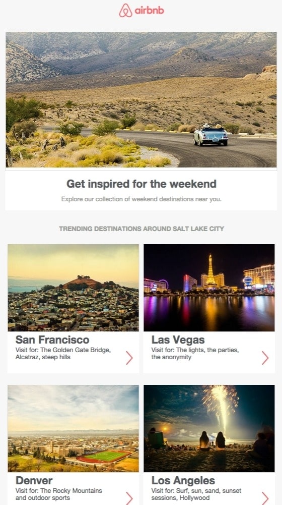
Airbnb is an online service for short-term accommodation and vacation rentals. Airbnb acts as a middleman throughout all transactions and provides the connection for a fee. Calling themselves “A community built on trust”, Airbnb has built a strong reputation supporting its claim.
Email campaigns from Airbnb are a great email example for many reasons, but what stood out the most is the use of personalization. The subject line has two personalization pieces that can call out the subscriber’s name and home city. By doing this, receivers immediately feel curious about what Airbnb has to offer and are more likely to open.
The design is good, too, with fresh colors and clear design, minimalist copy, and a clear CTA. Most importantly, the email provides useful information and insight for trending destinations around the user’s location. As newsletters or reminder emails, this approach always works.
2. Medium email marketing campaigns
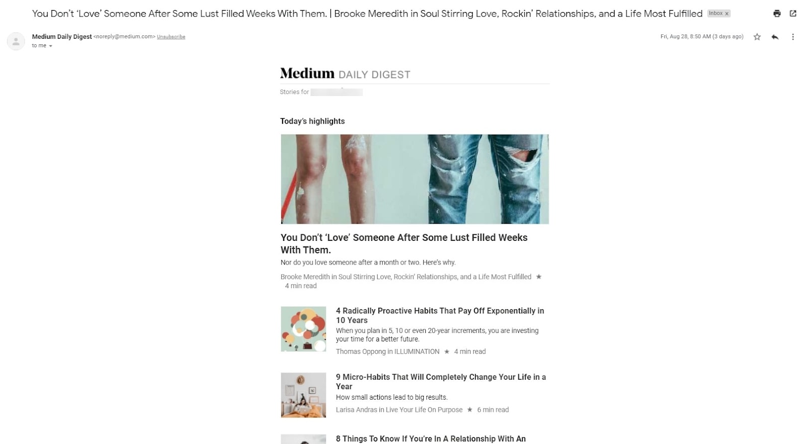
Medium is an online publishing platform that features articles about personal finance, sports, healthcare, and more. It is also a blog hosting service for users to create accounts and their content. The company optimizes its business around the number of times visitors read the website’s content - a testament to the content’s quality.
Medium’s ‘Daily Digest’ is a great email campaign to learn from that suits the brand really well.
When signing up for an account, you can choose the topics that interest you most. These interests are then used by Medium’s personalization engine to create the ‘Daily Digest’ emails - which feature daily relevant content for you. As you continue to consume content, personalization becomes better and better for your taste.
Each digest features one top story, which is included in the subject line, while the articles have an “x min read” warning for you to consider which to read. For a company that focuses on reading, Medium provides a well-thought daily email campaign to keep subscribers reading willingly.
3. Brooks Sports email marketing campaigns

When Desiree Linden won the Boston Marathon 2018, she became the first American woman to win the race in 30 years. For her sponsor, Brooks Sports, this is an opportunity to celebrate the long partnership with each other. The email campaign focuses almost entirely on the staggering performance of the Olympic marathon runner.
Email campaigns like these allow companies to show their loyalty and add value to the products with their famous user. A blue CTA button at the bottom says, “See Desiree’s go-to gear.” What better product to draw attention than the latest American legend’s choices?
After Desiree’s victory, everyone knew her. Brooks Sports struck while the iron is hot with a proud email campaign that is sure to be opened and forwarded.
4. BuzzFeed email marketing campaigns
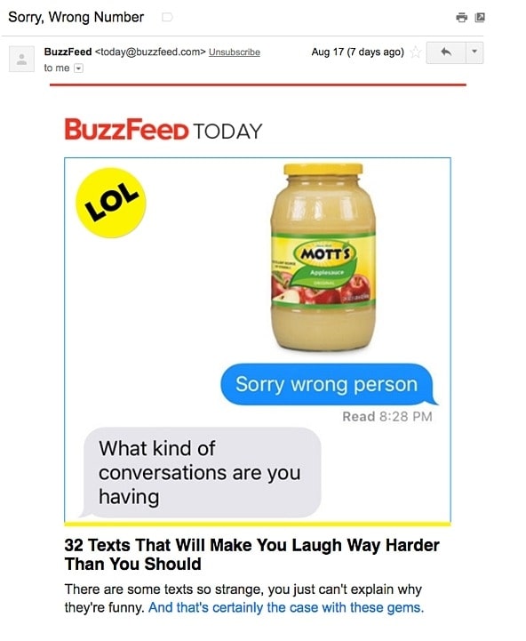
BuzzFeed’s newsletter called ‘BuzzFeed Today’ has great subject lines and preview text. Short and strong - the copy perfectly suited the rest of BuzzFeed’s content. I particularly like how the preview text accompanies the subject line. For example, if their subject line is a question, the preview text is an answer. Or if their subject line is a command, the preview text looks like the next logical thought.
When you open an email from BuzzFeed, the copy is just awesome. The email conveys what it’s supposed to convey - and looks great - whether you see the image or not. That is certainly admirable. So, if you are thinking of sending newsletters to your subscribers, think of engaging and entertaining ways to interact with them.
5. Birchbox successful email marketing campaigns
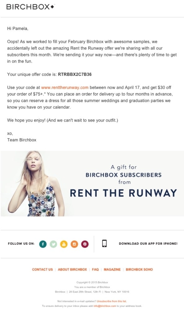
Beauty product subscription service Birchbox got people to click on their emails with the amazing subject lines. It says: “We Forgot Something in Your February Box!” Of course, if you read the email, you will know that Birchbox really didn’t forget to include that discount code - but it’s certainly a smart way to get attention.
The discount code is actually a promotional bonus for Rent the Runway, a clothing rental company that fits Birchbox customers. It’s a great email marketing partnership, which brought benefit to the receivers—thinking of a new subject line to wow your subscribers? You just got one.
6. Cook Smarts email marketing campaigns

Cook Smarts sends yummy meal plans with recipes to subscribers’ inboxes every week, which are called ‘Weekly Eats’ emails. But it is not just the delicious recipes; the design and content is also something pleasing as well. The layout is especially amazing, with three distinct sections: the menu, the kitchen guide, and the tips.
You can scroll through the email and know exactly where the interesting parts are, and also what to expect in the next email. The CTA ‘Forward to a Friend’ in the top right corner is just lovely. If you can remind your subscribers to forward your emails to lovers, family, friends, or coworkers like this, absolutely try it.
7. Uber email marketing campaigns

Uber’s email campaign is simple yet elegant. They get straight to the point in the newsletters. The text is usually very easy to understand with a clear CTA, which is perfect for subscribers who don’t have time and just want to skim the message. For people who want to learn more, there’s a link that they can follow. Uber often sends out various promotions and offers great maps of your travels, with detailed maps so you can start the journey.
8. Paperless Post successful email marketing campaigns
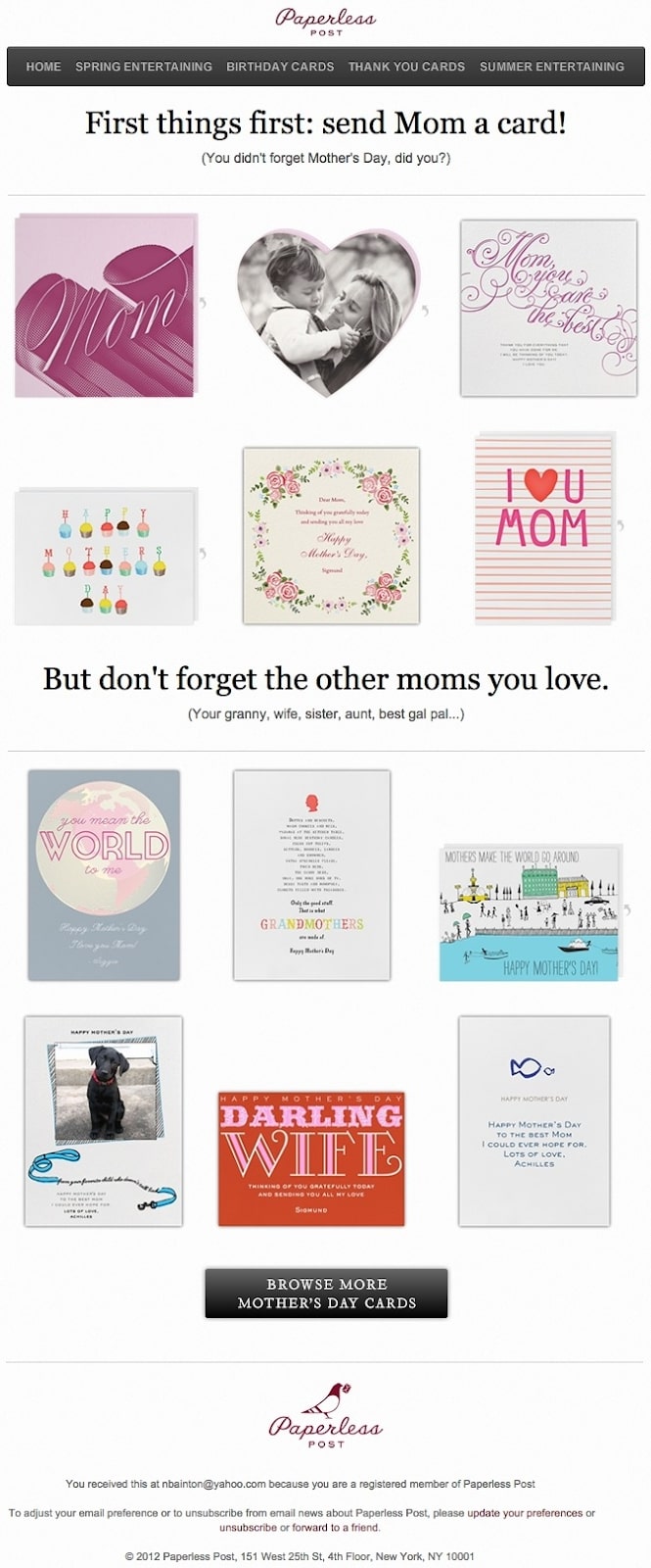
When you think of “holiday email marketing,” you may immediately think of Christmas or New Year’s Eve, but there are other holidays that stretch throughout the year that you can create email marketing campaigns around.
Take, for example, the email below from Paperless’s Mother Day campaign. The subject line provides a clear CTA that includes a sense of urgency. The subheader then raises a question that forces the subscribers to think to themselves, “Wait, when is Mother’s Day? Did I buy her something?” Below the copy, the simple grid design is easy to scan and visually appealing. Each card image is a CTA - which is clickable, and you’ll be taken to the purchase page.
9. Bookit email marketing campaigns
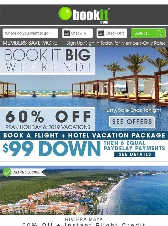
Bookit.com travel agency in the US can book great vacations for customers. Since those trips, you will frequently find emails about current deals at resorts across Mexico and various Caribbean destinations.
For already customers, Bookit found a good way through emails to make them open new deals and want to plan another exciting vacation.
The email’s subject line provides a time-based incentive, coupled with a low commitment to start. When you open the email, you can see a beautiful beach photo with a branded search box at the top. You can’t enter your info here, but the email resembles the look on the website:
Bookit also tested many different templates and elements in their email campaigns. It is a good idea to examine the impact of larger photos on CTR (clickthrough rate) or “social proof” through customer quotes. A/B testing with emails is a powerful tool to truly understand your customers’ needs and improve conversion rates.
During the pandemic, Bookit is temporarily closed, but I hope they can come back soon with more amazing emails.
10. Mint email marketing campaigns
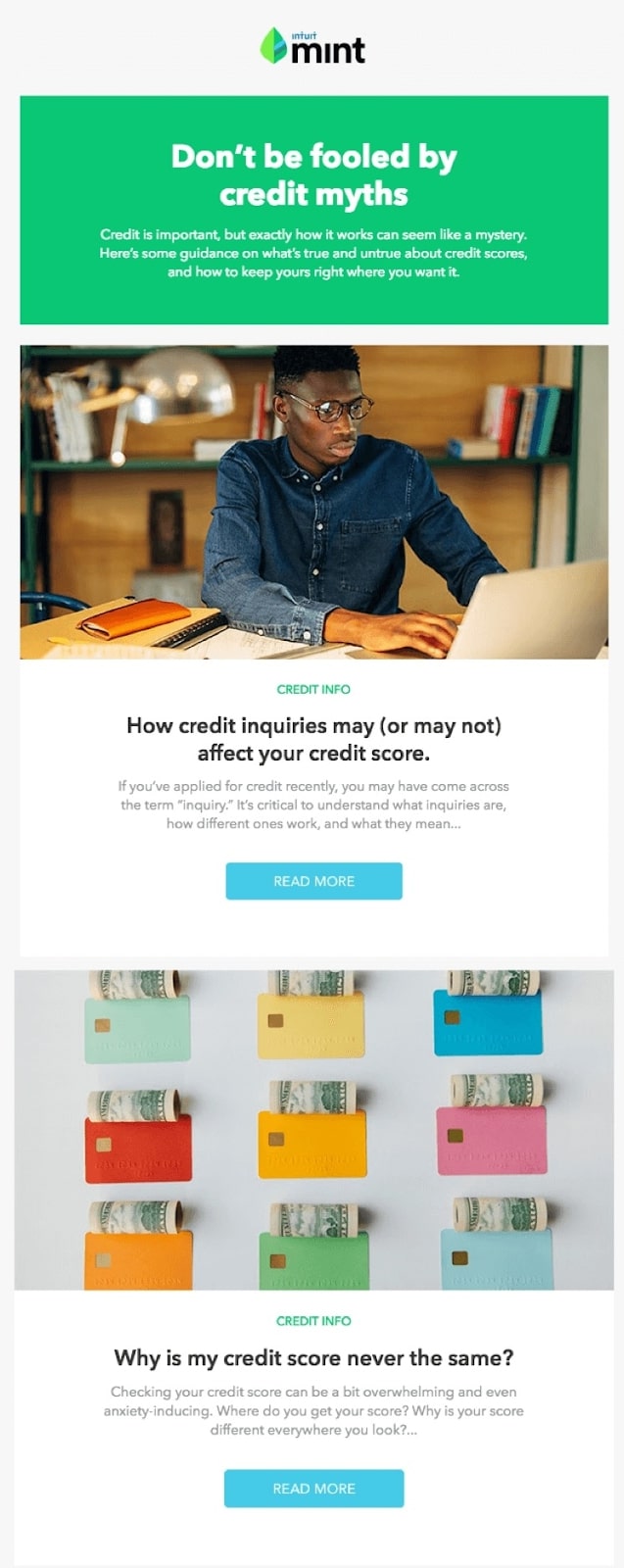
Mint is a personal finance app that offers easy budgeting, bill and payment tracking, free credit scores, and personalized advice for finance management. It is an app for you to stay on top of your money, so the emails really help bring awareness to personal finance.
Credit is a scary topic, but Mint made it more appealing with a catchy headline - which makes the readers pause to think about their own credit and continue to the content. Below, the content has a clean and simple design that represents the platform’s simplicity with simple color blocks. There is also a link for readers to provide feedback and help create better emails.
11. MVMT successful email marketing campaigns
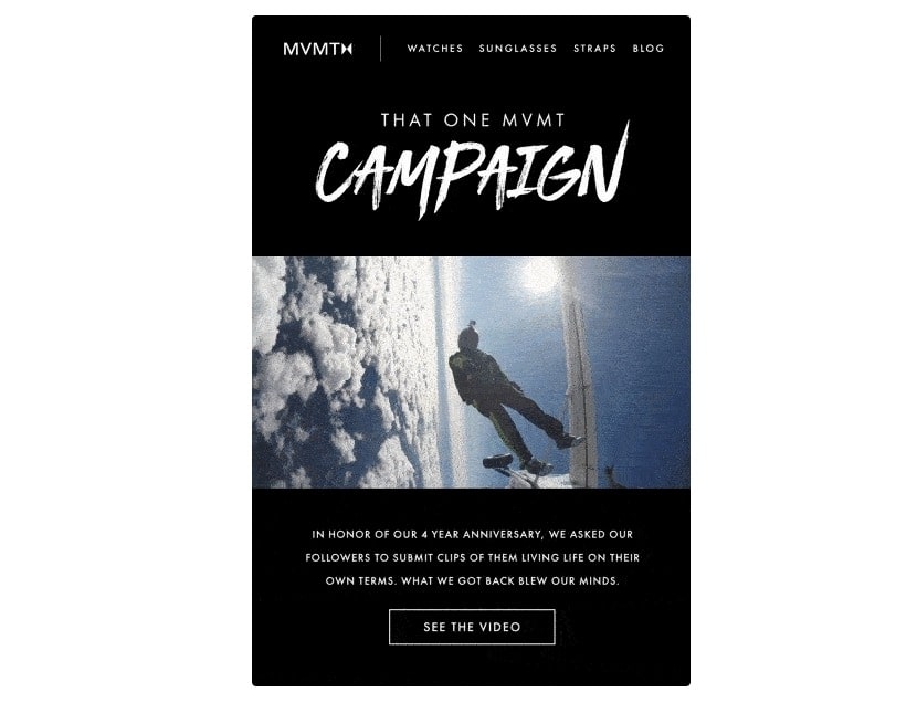
MVMT has an email marketing campaign that asks customers to submit video content and celebrate the brand’s 4th anniversary. The message starts off with an intriguing subject line about “That one time we went viral” - which got readers’ attention right the way. People would want to know why the brand went viral.
Inside, the newsletter contained an animated video with exciting pictures and a short message inviting the fans to celebrate the anniversary together. The whole email conveys a message about an exciting life and living on your own term. Users can also click to see a video showing how the brand’s customers live their best lives.
12. Dropbox email marketing campaigns
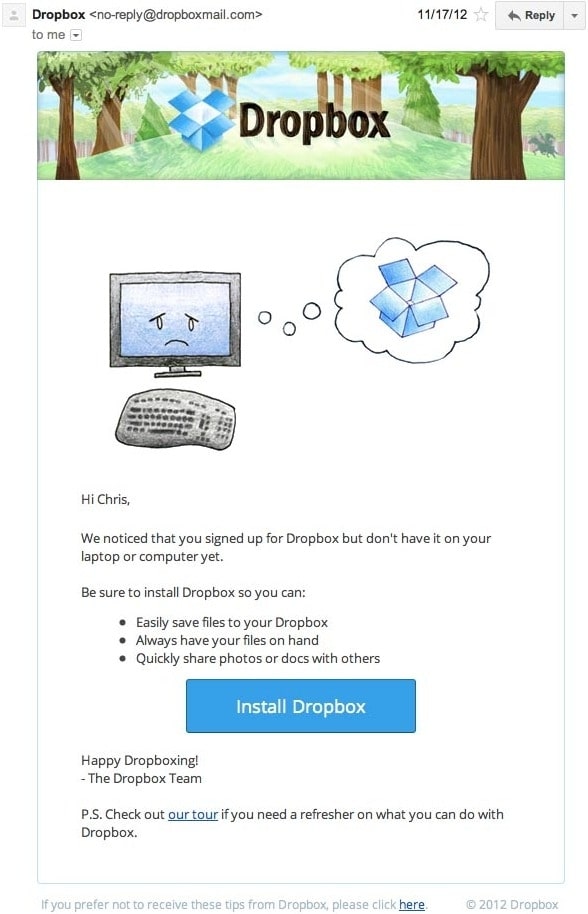
You might think it’s hard to fall in love with an email from a company whose product you haven’t used yet. But Dropbox found a great way to make its user re-engagement campaign cute and fun, thanks to a pair of cool cartoons and an emoji.
Plus, the email is kept short and sweet to emphasize the message that Dropbox doesn’t want to annoy subscribers - it just wants to remind that the brand exists and why it can be useful. When sending these types of emails, you may include an incentive for recipients to return to your service, such as a coupon.
13. Yelp email marketing campaigns
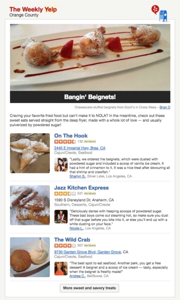
There are two things that almost certainly catch users’ attention: witty creativity and delicious, eye-catching desserts. Yelp, a top customer review site, managed to incorporate the two into one of the newsletters they send to subscribers. This Yelp’s weekly newsletter was titled, “Bangin ‘Beignets!” drew attention with funny copy and persuaded recipients to try the powdered sugar delights near them.
This type of newsletter works because it is personalized based on the user’s location. It also has a well-balanced image to text ratio, followed with creative copy that tells the message right the way. If you want to draw someone’s attention, tell things in a way they have never heard before.
14. Casper email marketing campaigns
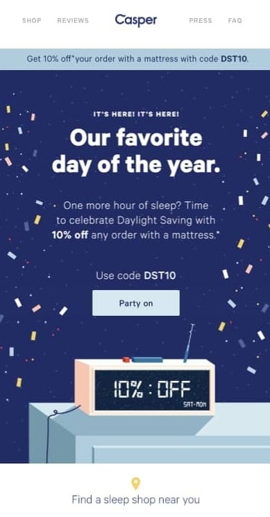
Speaking of humor, Casper is on top of the game with their email marketing campaigns. Blowout sales don’t impress anyone. It is used too much by brands. The campaign made by Casper is different, which celebrates Daylight Savings Day, a day most people just sleep through.
And that is what the brand suggests, that you should sleep soundly on a Casper mattress to celebrate. The overall design with the subject line is short and sweet, with a perfect CTA of ‘Party On’. Everything fits perfectly for users to save 10% on their next purchase.
15. Warby Parker email marketing campaigns
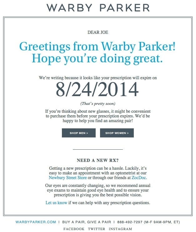
What’s better with a new prescription than a new pair of glasses? The people at Warby Parker made that connection very clear in their email back in 2014. It’s still a good example of email marketing personalization that I have to put it in here.
The subject line is: “Uh-oh, your prescription is about to expire”. It is a smart email trigger as a reminder that your prescription needs to be updated. Speaking of which, check out the smart marketing section at the bottom of the email: If you don’t know where to renew your subscription, the information you need is right in the email. Now there’s no reason not to shop for new glasses!
16. Artifact Uprising email marketing campaigns

Artifact Uprising is a high-quality, custom photo printing company that is professional in everything they do, from photos to the printing material. Their marketing emails support their profession very well with original style and mesmerizing design. The email is so tranquil that it speaks for the brand with the fonts and imagery.
The copy is descriptive that accentuates the style, with each section of copy complementing the photo it goes with. The CTAs are well-placed, too, with ‘Get The Guide’ at the top and the following ‘Start Here’ as a way to keep readers’ eyes navigate down. The final CTA is, in the end, to keep inviting subscribers to take action in a not pushy nor repetitive way.
17. Poncho email marketing campaigns

Some of the best emails combine super simple design with a smart, concise copy. And the daily emails from Poncho - which sends customizable weather forecasts every morning - make the best example.
Poncho emails come in a variety of colors, use interesting images and GIFs, and are easy to scan. The copy is short but smart with some great puns, and it fits the brand perfectly. Check the copy near the bottom of the request “Hang out outside of email”. A clever copy with design really better communicate Poncho’s message.
18. Headspace email marketing campaigns
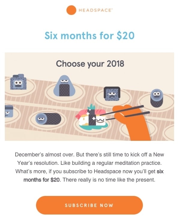
Headspace is an app for guided meditation. Have you seen the pictures they send to the subscribers? The design is really cute and makes you want to do whatever they ask for! Their newsletter structure is great for people who don’t have time to scroll down long emails. The whole thing is short and simple that you can immediately know what the brand has to offer.
19. RedBubble email marketing campaigns
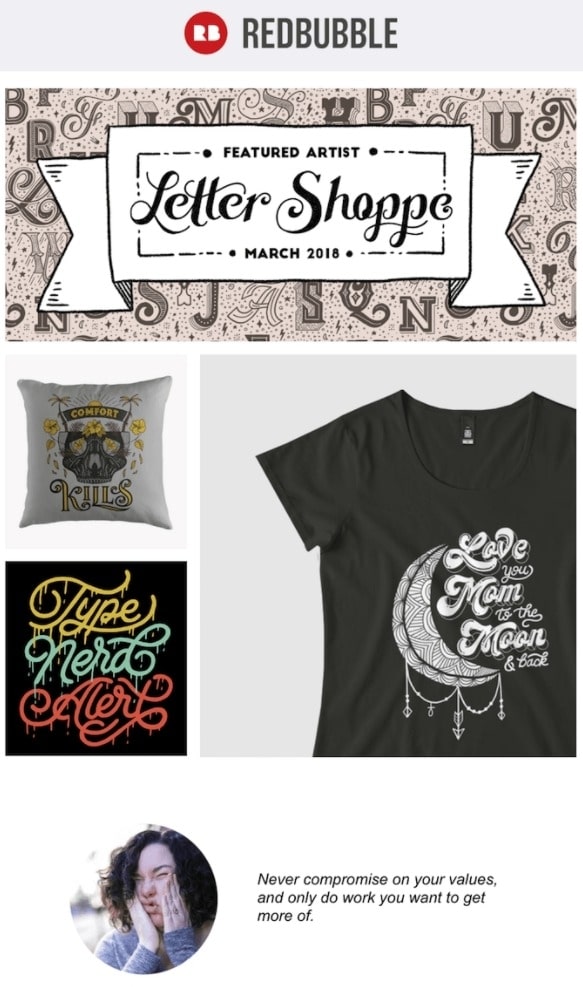
This email marketing campaign from RedBubble is really cool for many reasons.
First, the design is super eye-catching with no clutter, and the artwork is user generated. The company sells designer merchandise from around the world. The email presents a golden opportunity to showcase popular posts on the RedBubble community. The example below introduces artwork from “Letter Shoppe”, and when the artist sees the email, she’s more likely to forward it to her friends and colleagues.
Second, the email included a lovely quote by the Featured Artist - which RedBubble customers are very likely to agree - and open other emails for more inspirational quotes from fellow artists. If you have user-generated content to send emails, this is the way to do it.
20. Autopilot successful email marketing campaigns
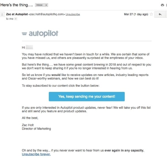
Time is a precious thing. But what does an email marketer do with recipients saying they want to receive emails (by subscribing) but then dark?
Engage them with a re-engagement email! Autopilot created a cliffhanger subject line to keep recipients wanting for more and open the email. Beware of being considered a clickbait if you use this though. The email is plain text, but it still has a personal approach by addressing the recipient by name and seems like a friend’s email. The deal is pretty good too with offers on new articles, leading reports, and webinars.
21. TheSkimm successful email marketing campaigns
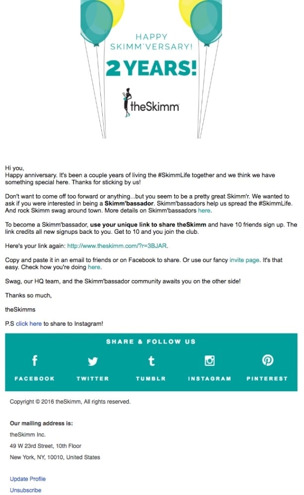
TheSkimm’s daily newsletter is great with its clean design and short, catchy copy. But newsletters aren’t their only strength when it comes to email. Check out the engagement email below, which rewarded a subscriber for signing up for two years.
Emails that represent a milestone, such as anniversaries and birthdays are relevant because people like to celebrate special occasions. Anniversary emails don’t require the subscriber to enter any additional data and can work with multiple senders. In addition, the time frame can be modified based on the business model.
Here, TheSkimm went one step further by asking the subscriber if she wanted to earn the title of a brand ambassador as a loyal subscriber - this would only require her to share the email with ten friends. And she can brag about her achievements later.
Related posts:
- 10 Awesome Shopify Abandoned Cart Email Templates
- 101 Killing Email Headlines Examples
- Constant Contact vs Mailchimp
- Klaviyo vs Mailchimp
Final words
If you are here, it means you have seen my list of 21 successful email marketing campaigns. Some had great design, witty copy, or were just so entertaining that subscribers just had to click open and take action. That said, your audience will need your own approach. Tak time learning about them and checking analytics reports; then you can make a successful email marketing campaign for your brand.
With these examples above as an inspiration, I hope you can keep optimizing your emails to see the best possible results. Thanks for reading, and best of luck sending your emails away!
New Posts

