37+ Best Personal Website Examples For You to Learn
If you’re a pupil or a professional wanting to go ahead, it’s necessary to have a website. It’s your opportunity to set an online home base, impress recruiters, and offer something that makes you different from other applicants.
However, building your own website can be tough. It’s a good idea to take a look at several examples of what other people are doing. That way, as you build your site, you’ll know what to do to make sure your site doesn’t look like it’s from 2000.
That’s why today we show you a list of 30+ Best Personal Website Examples for You to Learn. The list promises to create some inspiration for you to make your own website quickly and easily.
Why do you need to create your personal website?

Your resume should be a single, no frills page that shows your work experience. And whereas being brief is good, there’s very little chance to deliver your uniqueness.
A resume is often an unchanging document. Meanwhile, with a personal website, you can freely customize and update the site based on what you’re working on, or what you would like to highlight.
However, you should not scrub the Internet of everything about you. Employers are looking you up online. To make yourself different from other candidates, creating a personal website that shows the story you would like to tell is a good choice.
Types of personal websites you can create

- Resume - to seek job opportunities
- Blog - to share design inspiration, to interact with people
- Portfolio - like Dribbble or Behance, perform the work of designer
- Personal brand - to get noticeable, get well-known, and get more chances
- Online shop - for commercial
- Gallery - a collection of designer’s work or writing stuff
30+ Best personal website for your inspiration

1. Gary Sheng
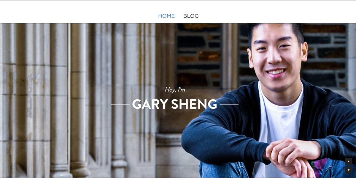
Different from a standard resume document, Sheng’s website allows him to add logos and accessible links that can emphasize on his software engineering and web development skills.
Browsers can decide to scroll down his page to view all the categories of the site or go to a certain page using the top navigation.
The “My System” section operates like a company mission statement. This personal touch is to help humanize his work and make people remember more about him.
2. Raf Derolez
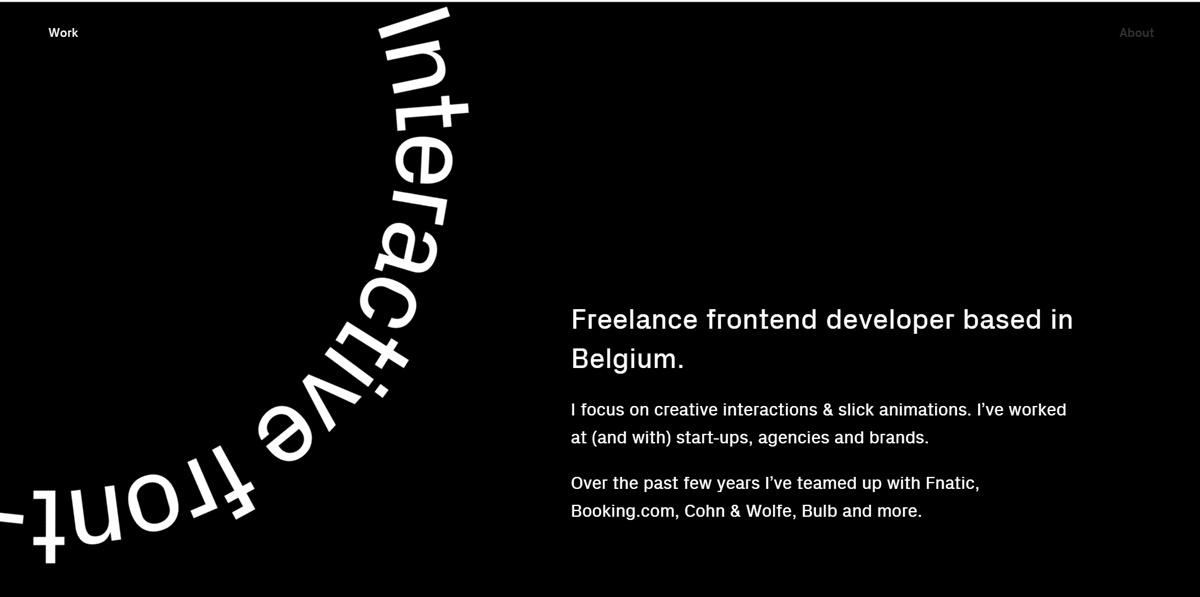
This is a modern, marvelous and informative website. It simply tells about his personality, branding, and developing skills. With the use of impressive fonts and geometric overlays, he makes his name become appealing in the visitors’ eyes.
If you want to reach Derolez, click on the CTA at the bottom of the site to open an email that’s already addressed to him. Or you can choose one of the social media links to get in touch with him on platforms such as Twitter - where the appearance and feel of the visual assets are suitable with the branding of his site.
3. Pascal van Gemert
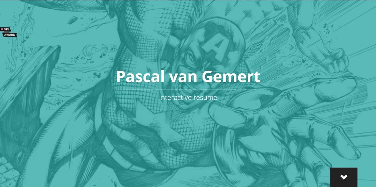
The personal website of Pascal van Gemert shows that you can add a large amount of information on a single site if it’s well organized.
The more work experience you have, the more of it you can share with recruiters. On Pascal’s resume website, he takes advantage of an expanded scroll bar to help browsers learn about him without navigating to another page. Besides, he makes his career more visual in a variety of ways between “Profile”, “Experience”, “Skills” and “Projects”, while getting a consistent teal color to gather all of his resume information under one brand.
4. Brandon Johnson
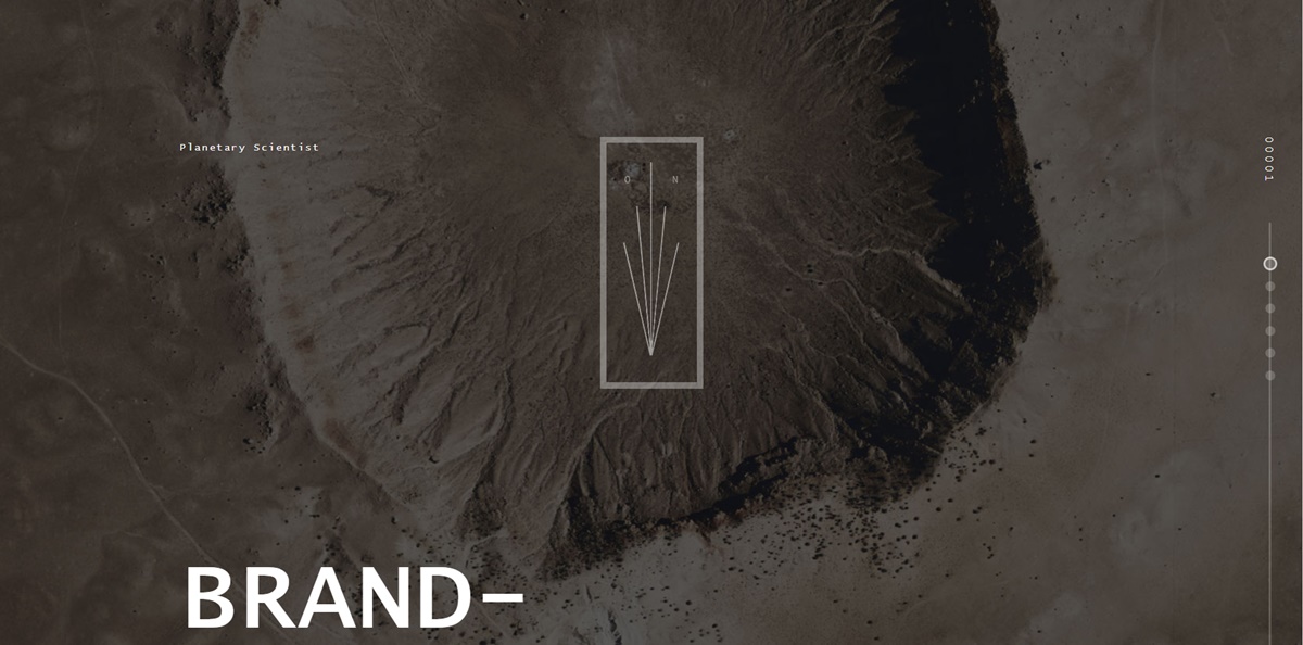
Johnson’s personal resume website is so amazing. He uses brilliant photos of planets in order to complement his background on planetary science. The use of animations also helps his resume become an experience, rather than just a document.
Regarding design, the two-dimensional page is added some depth thanks to the textured, multi-layered background. That increases feelings of space and the planetary systems which Johnson’s work concentrates on.
5. Quinton Harris
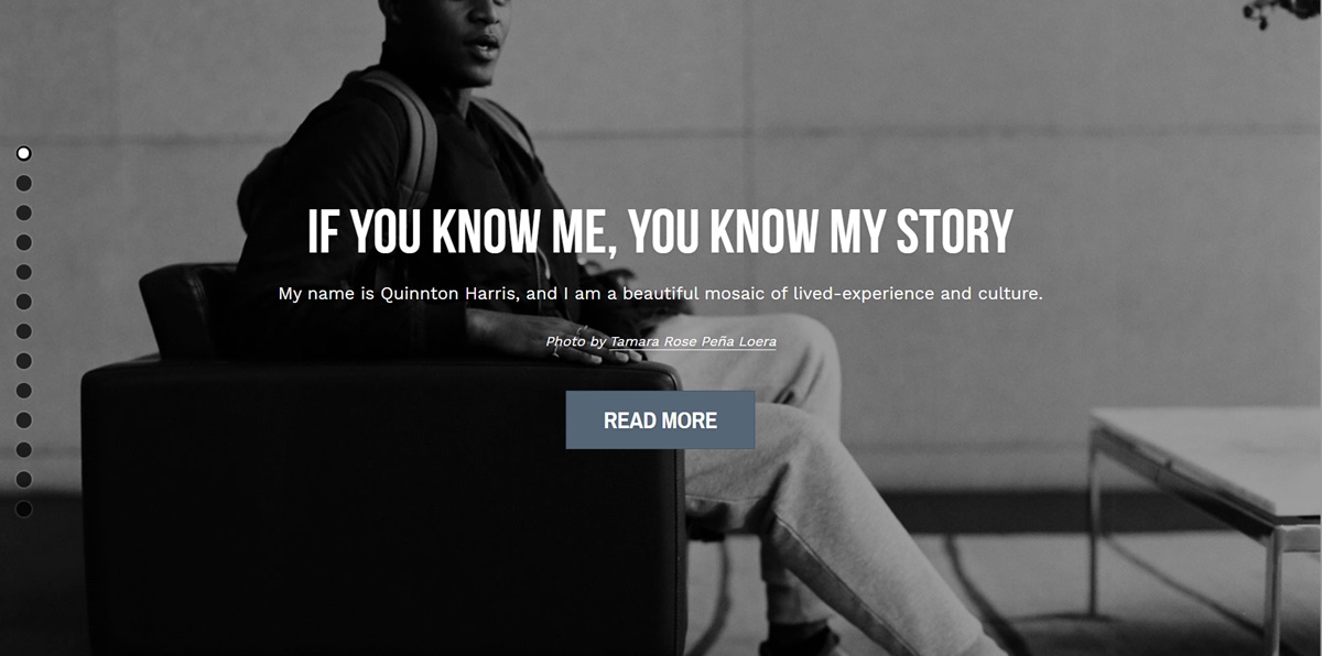
In his resume website, Harris tells his personal story by using a lot of images. That looks like an incredible digital scrapbook. It includes all the basic things of a resume, and covers everything related to his educational background, work experience, and skills.
The copy is so amazing. It’s obvious that Harris spent time on picking up the most appropriate words to describe every step of his personal and professional journey.
Lastly, at the last navigational point (there’re scrolling circles located on the left-hand side of the webpage), visitors are linked to quintonharris.com, where he continues to tell the details of the story.
6. Sean Halpin
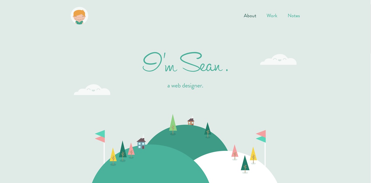
The resume of Sean Halpin is concise, sweet and targeted, which is fitted to his voice and personal branding shown on the website. The white space makes room for his designs and copy to appear and attract the viewer’s attention, which can enhance readability - particularly on mobile devices.
7. Tony D’Orio

It’s essential to simplify the design of your visual portfolio to let photos catch browsers’ attention. And D’Orio does thit by showing bold images front-and-center on his personal site. He keeps his logo and navigation menu very clear and separated from his work. His website allows potential customers to download his work without any fee.
If you want to try, go to the hamburger menu in the top left corner, choose Create a PDF to choose as many photos as you want to download.
When you open the PDF, you’ll see there’s already D’Orio’s business card as the cover in case you need it.
8. Verena Michelitsch
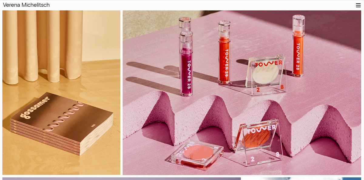
If you’re a designer, you should not use any pixel on your personal website. The portfolio of Verena Michelitsch is fully packed with art. From her huge library of work, she decided to exhibit various colors, styles, and dimensions so browsers can see how much range she possesses as a designer.
9. Gari Cruze

Gari Cruze is a copywriter. But by converting his site into a portfolio covered with photos from various campaigns he’s been through, he makes employers learn more about him. Moreover, there’s a strong call to action located at the top of the site that takes browsers to his newest blog post.
His website is full of humorous copy, particularly in the “Oh Yes, They’re Talking” and “17 Random Things” sections. That can both display his skills and make him become more memorable. These pages make it easy for visitors to connect and communicate with Cruze by providing his contact details on the right-hand side.
10. Melanie Daveid
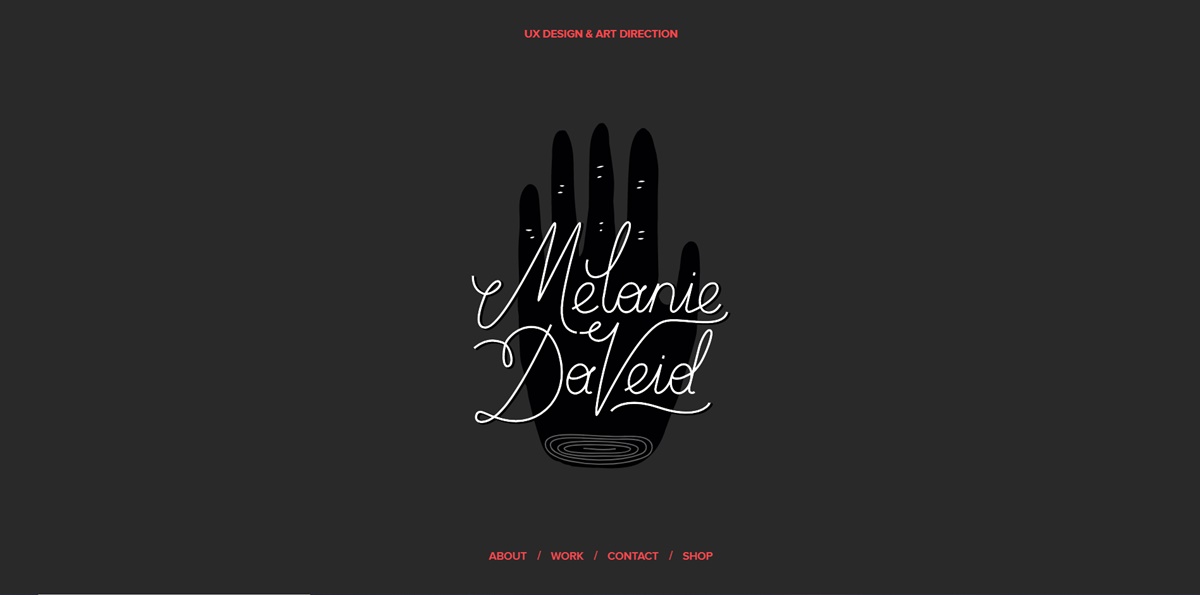
This personal website is an excellent example of “less is more”. Daveid’s portfolio displays a clear and well-branded imagery of strategies and apps that he worked on. Her coding skills are also shown off as you click through to view her work in more detail.
Whereas it might seem to be quite minimal to add three examples of her work, Daveid turns her portfolio into a service by adding her best, most significant campaigns. At the end of the day, a few examples of excellence is much better than multiple examples of mediocrity.
11. Beast Is Back
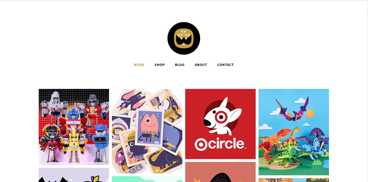
The portfolio of Christopher Lee is so busy and colorful. When you learn more about Lee on his website, you’ll see that a fun and vibrant webpage is excellent for a toy designer and an illustrator.
“The Beast is Back” is his brand name. Lee’s portfolio emphasizes appealing designs with noticeable brands, such as Mario and Target, in addition to links to buy his work. This is a gallery-style portfolio with various colors, that makes it fun, unique and memorable.
12. Daniel Grindrod
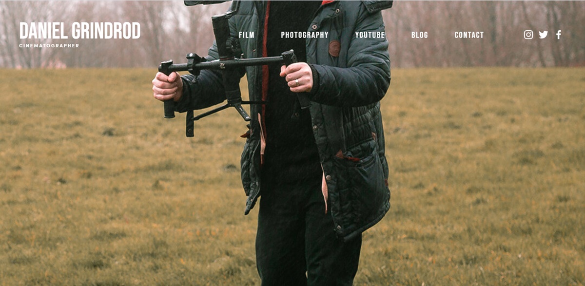
In his seek portfolio, Daniel organizes the multiple types of media he’s worked on into different categories, which makes his potential customers keep learning about him. The opening video spot on the homepage named “Daniel Grindrod 2018”, as displayed on the still picture, also tells his site browsers that he’s making an effort to create fantastic work.
13. The Everywhereist
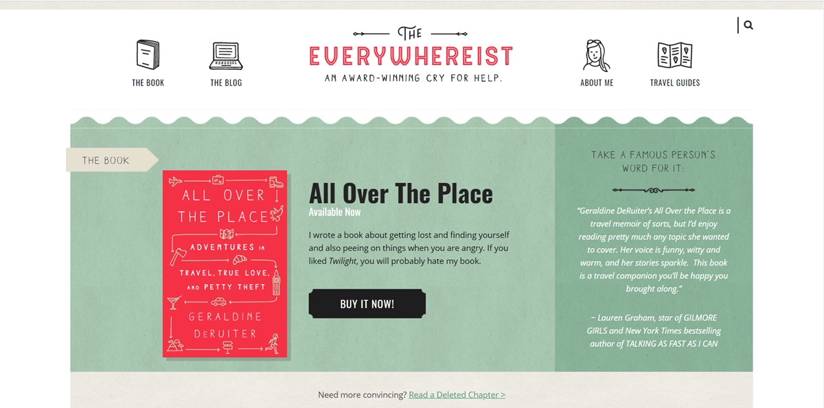
The site seems to be a bit busier. But browsers can simply navigate the blog by its consistent branding. Thanks to globe iconography, this travel blog can move browsers around the site, allowing them to discover sections beyond the blog.
This blog of Geraldine DeRuiter also provides a “Best Of” section that enables new browsers to learn about what the blog is about to get acclimated. The dominant color is warm, neutral and no excess clutter.
14. Hustle Nation

Side Hustle Nation is the business blog of an advisor, Nick Loper whose website provides a wide range of worthy financial advice for individual business owners. A lighthearted but passionate tone is set up for his visitors on the homepage. It proposes you’ll receive friendly content all targeted to a single goal: financial freedom. The green CTA “Start Here” makes it easy for first-time readers to navigate the website.
There are two unique sorts of content on Nick’s blog: “My Podcast Production Process” and “Quarterly Progress Report”. The former shows how Nick creates content that helps enhance his business, while the latter ensures his readers catch up with his blog’s growth over time. These sorts of content offer people a peek behind your operation, telling them you do what you say and your insight is tried and true.
15. fifty coffees
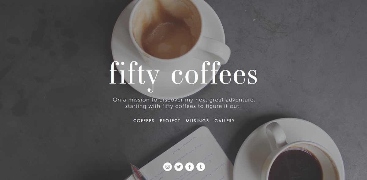
The website “fifty coffees” records the author’s series of coffee meetings when she’s looking for the next job opportunity. She takes advantage of photography and visuals to tell her lengthy stories.
What is noticeable? Every post ends with numbered takeaways from her conferences, making it easy to understand. The high quality images used assist her a lot in the telling of her stories.
16. Smart Passive Income
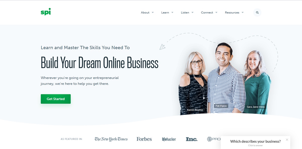
This is Pat Flynn’s personal website, a center for financial advice for anyone who wants to run their own business. His homepage allows readers to know precisely who’s creating the content and what his mission is for the content he’s providing visitors.
His blog page also offers a unique navigational tool, which is not classified by subject but what the viewer wants to accomplish. The structure of the website can customize the viewer’s experience, which means you do not force them to merely guess at which posts are going to address their issue. This aims to retain visitors on your site for longer and grow your blog’s traffic in the long run.
17. Minimalist Baker
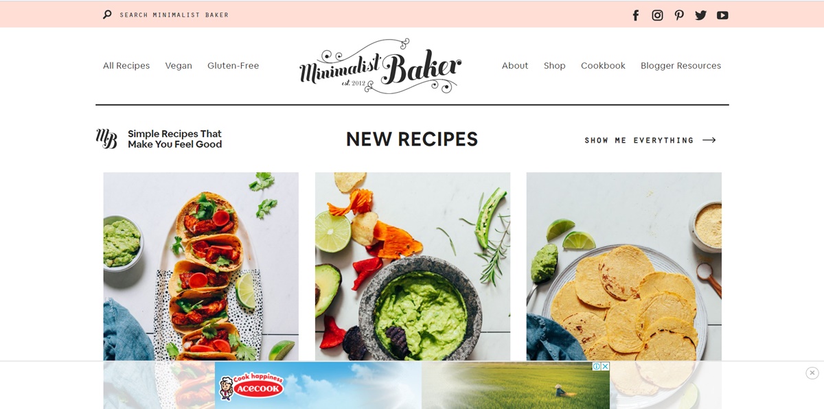
This is a food blog of Dana. The use of a simple white background makes her food pictures pop and outstanding. Her blog uses unique branding to make her memorable, mini-bio to customize her personal website.
18. Kendra Schaefer
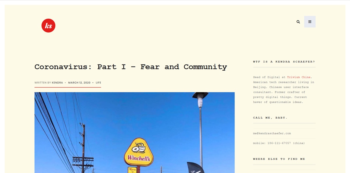
Kendra’s blog is fully packed with information about her daily life, background, and professional experience. However, she uses a light background to dodge overwhelming browsers and organizes her blog’s modules to lessen clutter. She also offers links to some writing examples, which can improve her writing authority and credibility.
19. Mr. Money Mustache
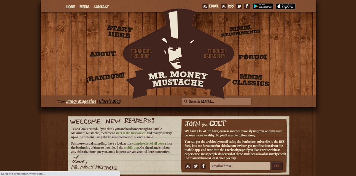
Mr. Money Mustache is a funny, browsable financial blog that provides deep insight into money management for the layperson. While his personal stories increase the legitimacy of his advice, the navigation links around his logo can take visitors to his content immediately.
20. Albino Tonnina
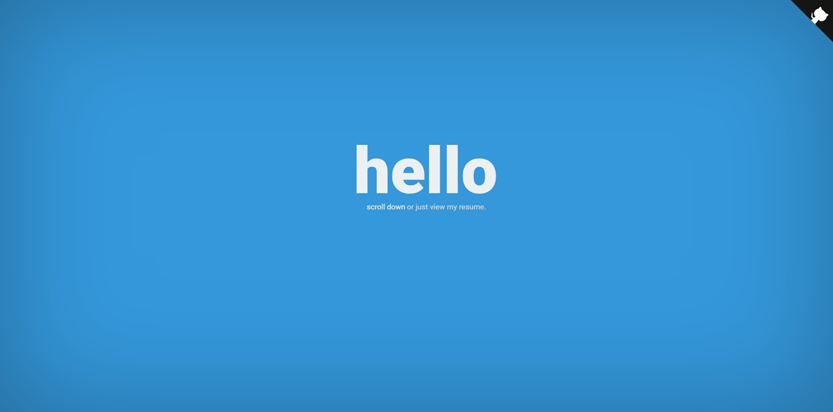
This website shows off Tonnina’s advanced and complex web development skills. The photographs and icons are used in a way that is very clear and simple to comprehend. Besides, he also provides an option to see his resume at the beginning of the website, for those who don’t have time scrolling through the animation.
21. Robby Leonardi
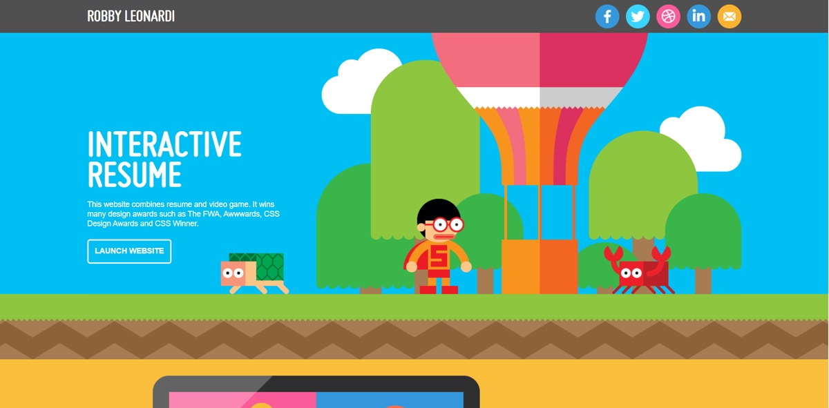
This is an incredible demo website owned by Leonardi. He converts his portfolio and resume into a video game for web browsers by using animation and web development skills. This impressive way of sharing stories makes sure that he is more memorable to browsers.
22. Samuel Reed
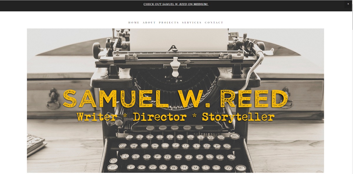
Reed displays his person site as an end-to-end demo of how to code a website. His website begins as a blank white page and ends as an informative site that browsers can see how he codes. This creative factor makes his page more memorable and makes his skills become noticeable.
23. Devon Stank
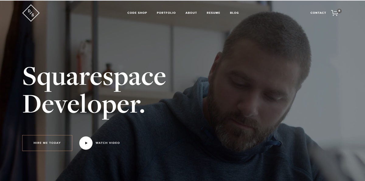
This demo site not only shows that he owns the web design chops but shares with browsers about him, his agency and his passions. That makes a demo and a mini-resume in a greate balance.
24. Nia Shanks
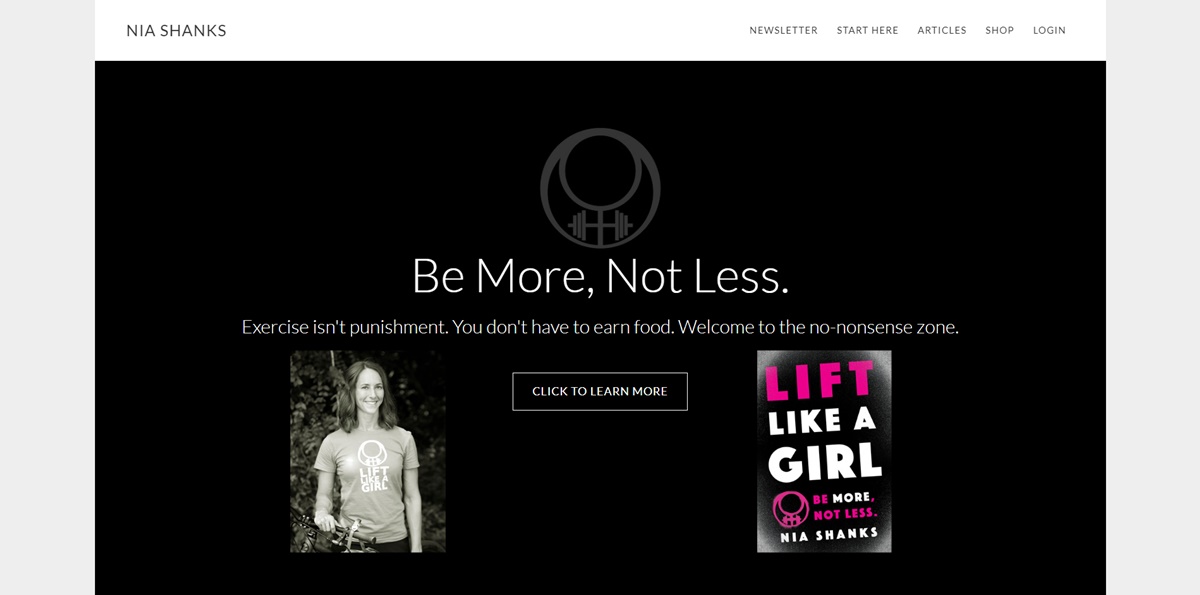
The design of this personal website is beautiful, clean and follows a minimal style. The headline on the homepage is so targeted and direct, which conveys value and information quickly. Moreover, Nia also makes use of the top navigation to take new browsers to the right direction for whatever they want to view. There’s not much noise with this example and that’s something we suggest you apply to your own website.
25. Simon Sinek
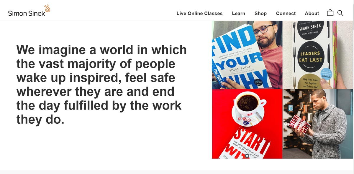
This site’s design is so brilliant, making it among the best personal website examples that people should learn from. He has good use of whitespace. The typography is clear and clean with eye-catching colors. The button located on the top right of the site is a great example of a CTA.
Simon offers a wide range of content on his website and different initiatives he’s going to promote but web visitors around very efficiently. Sometimes, there’re many projects it can be difficult to handle all of them on your page without making a mess. So this is a good example of how to do that effectively you can learn from.
26. Ellen Skye Riley
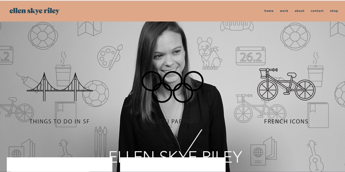
This is considered one of the best personal websites. Riley does a good job at showing her amazingly talented design skills. Her website is very informative and fun to browse. When a visitor loves browsing through your site, you know you’re on the right way to generate some more customers.
27. Tim Harford
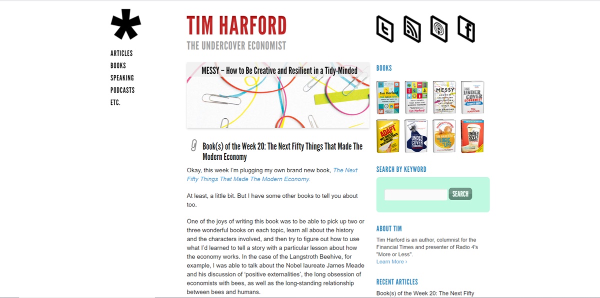
His way of using whitespace on the page is so fantastic. It takes the viewers to the main column where the content is the point. He uses a good call to action to redirect browsers to his featured book but not take them far away from the overall experience. You often see that people take things too far and include banners all over their personal sites so as to encourage customers to make a purchase. While you’ll certainly have to market yourself, learn from this example of how to do that without not affecting the primary aim of the site. In this case, Time can make browsers well aware of his work and maintain the look and feel of a content-driven website.
28. Joshua McCartney
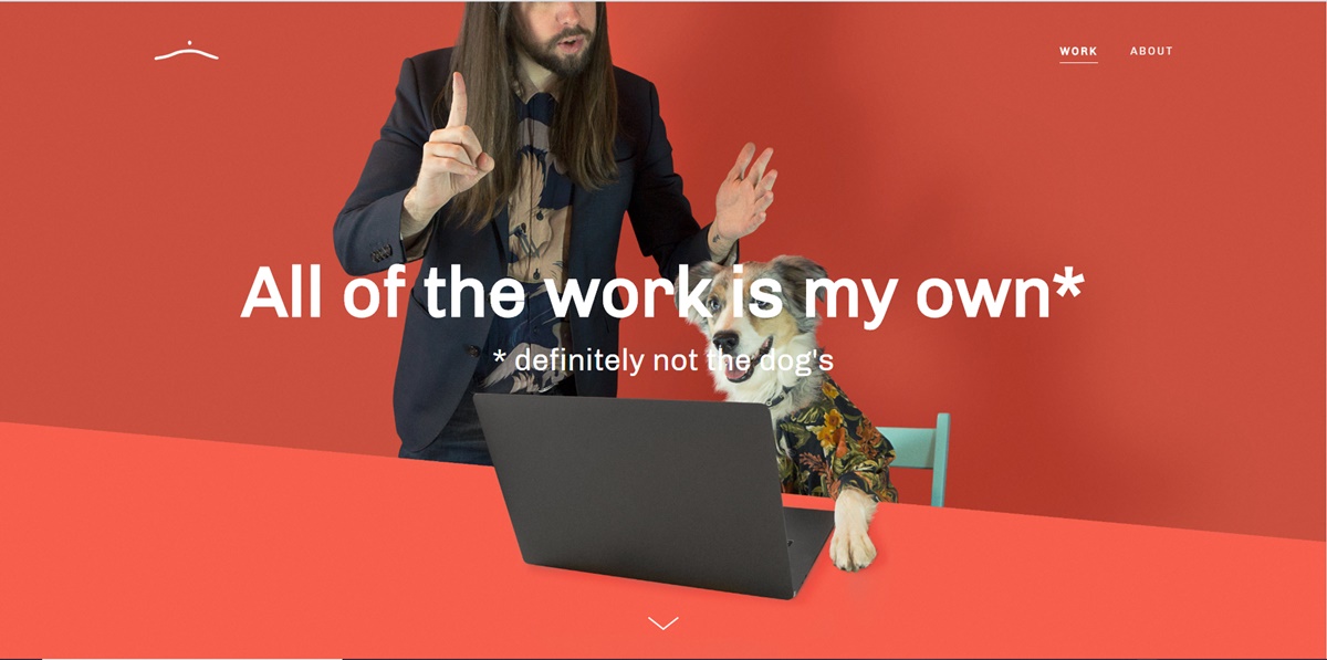
The site of McCartney catches your attention instantly when you see it. It does a really good job at showcasing McCarney’s skill. His putting a large amount of content into two simple pages helps to create a great blend of quality content that doesn’t sound cluttered.
29. Hope Reagan
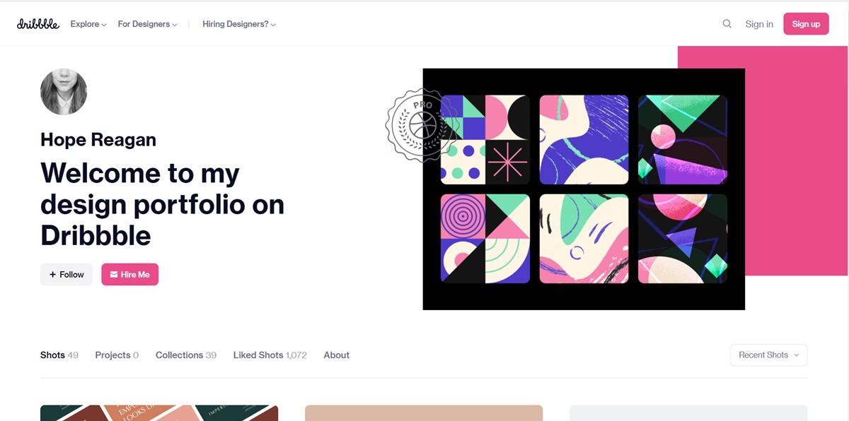
Sometimes, you may want an online presence where visitors can contact or interact with you but you’re not engrossed in owning a fleshed out personal site. So you should take a look at Reagan’s site. She is excellent at forming the structure of a good looking homepage. The site is very clear, simple and stylish and is linked to her work.
30. Seth Godin
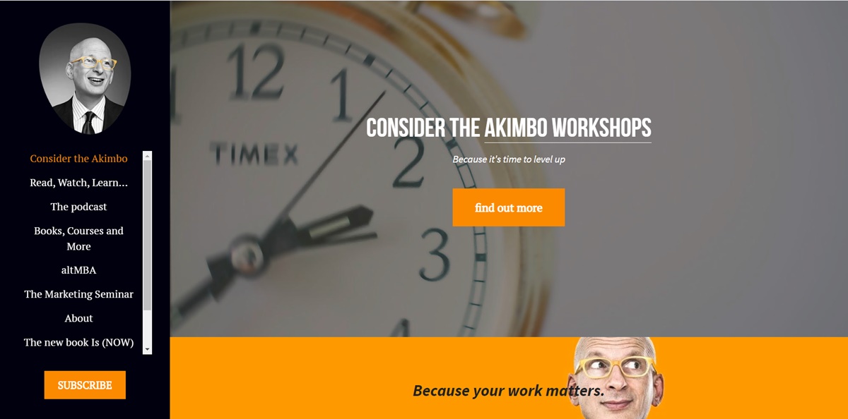
One of the most exciting things about this website is the big subscribe button that you should not miss. That’s the most significant action that Seth wants his viewers to take. The color used well interrupts the blog and makes him pop. This is a great personal site because it organizes many things perfectly without trying to be something it’s not. The content on the site also enhances his branding a lot.
31. Ximena N. Larkin
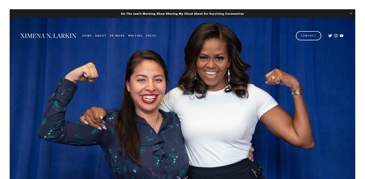
Larkin does an excellent job at fulfilling her goal of promoting her work and becoming connected with potential customers. There appears a really beautiful pop up as you go to the site. The way she designs her page is very useful. The webpage makes it easy and simple for visitors to better reach the work or Larkin.
32. Charlie Waite
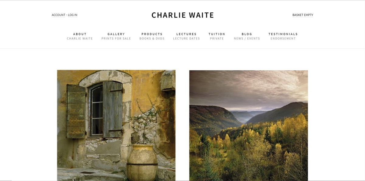
The personal website of Waite is a good example of sleek design and personality. He includes a mobile screenshot, which shows his love of being a parent and his joy of life. The same joy is expressed in the color of the site, which indicates an attention to detail that should come from a designer.
33. Tim Ferriss
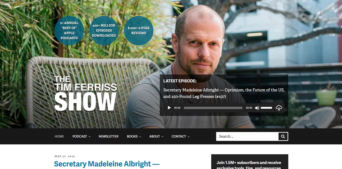
Tim is considered a master of promotion. This is the person you should learn from if you want to get browsers to do what you want. He typically uses his person site as a feed for his newest podcast posts with some nice calls to action. The big header and the “click to listen” are very effective. He makes use of his main menu navigation to take browsers to his books, podcasts and shows. Moreover, a huge overlay is also used to earn more newsletter subscribers. Some may think it’s a little bit too aggressive but these people probably do not make as good sales as Tim.
34. Anna Santos
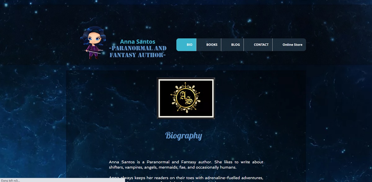
Santos’s site is friendly and eye-catching. You can feel the warm of her professional sprite when visiting this website. She offers a great number of sources to keep you up with what she’s been doing. The website is a good example of using pop ups in a nice way that doesn’t make the homepage become cluttered.
35. Kevin Koeshartono
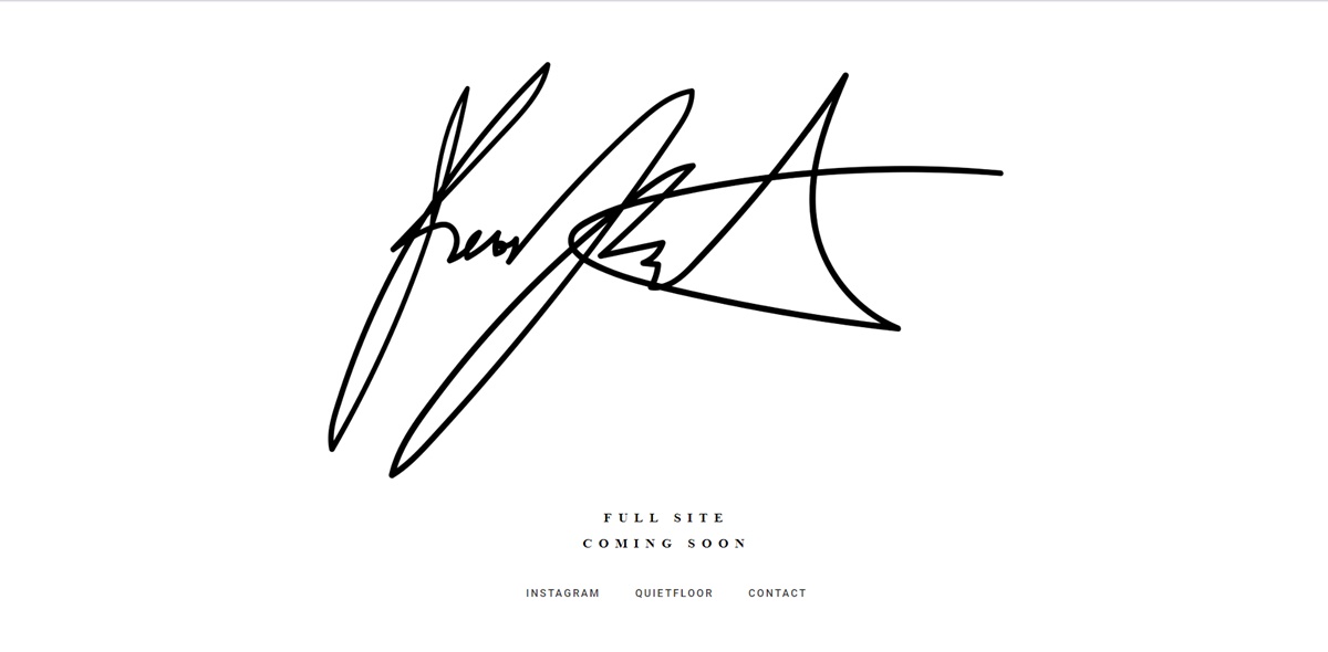
Kevin’s site does an impressive job at mixing fantastic design with a user-friendly webpage. The design is young, clean and modern. It makes it easy for visitors to reach his social profile on the homepage. The copy is fun, the color scheme is appealing, and the addition of video and slideshow can show one’s web development skills very well through their personal site.
36. Joe Mcnally
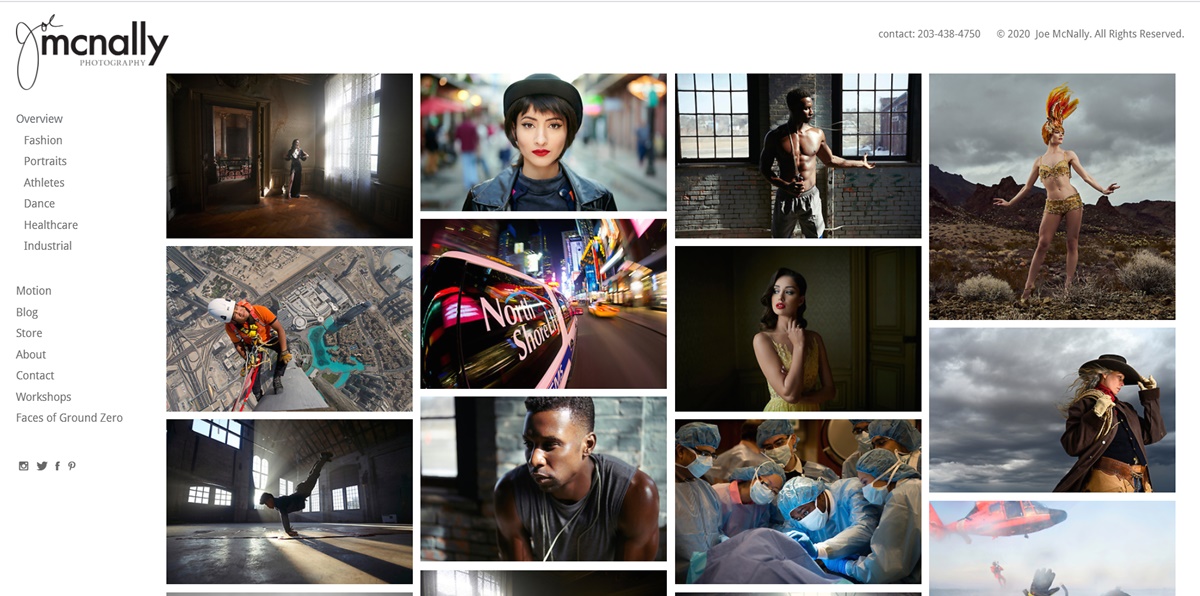
Brilliant website that goes straight to the point. The site shows off Mcnally’s amazing photography skills. It is also well organized for customers to make a purchase. Looking for an aesthetically appealing ecommerce sight can be hard, but Mcnally has the perfect blend of design and demand.
37. Geraldine DeRuiter
This site is really good at self-promotion. Besides, it’s considered among the best personal website examples of someone using a smart name as a pseudonym. This site does a good job at promoting Geraldine’s book and adventures while still keeping a personal feel.
Summary
Nobody can create a great one right away. Trends come and go, you should spend time on leveraging them. The success of those websites mentioned above is that they are able to stand the test of time although they are very incredible and modern in the current generation’ eyes.
A good personal website is informative, inspiring and very eye-catching. Keep trying and learning from the Best Personal Website Examples, we bet that you can own a really unique and stellar homepage soon.
Drop any question you have in the comment section. We’ll assist you as soon as possible. Thank you all for reading!
New Posts

