55+ Best Brand Guidelines Examples to Learn
When launching a startup business, every entrepreneur should spend time building customer recognition. As you can see, almost all successful global brands have their memorable brand guidelines that are stick closely to our minds. Brand guidelines are more than logos or icons but colors, types, images, taglines, patterns, and more. The more one brand guidelines repeat, the more reliable and secure it becomes
In this article, we will bring you 55+ Best brand guidelines examples for you to learn. Moreover, we also give you the true definition of brand guidelines. From that, you can get some tips on how to create a strong brand guideline of your own. Famous brand guidelines mentioned below will surely encourage you to start compiling your style guides right away.
Related posts:
- What is Co-Branding?
- What is Personal Branding?
- How to Start a Clothing Brand?
- 23 Tips to Build a Direct-to-consumer Brand
Let’s dive in!
What exactly are brand guidelines?
Brand guidelines, also known as a brand style guide, is vital for companies to make their brands remain consistent in customer’s minds anywhere they show up. It is an arrangement of design and instruction on how to communicate the brand. Brand guidelines include the content of logos, websites, blogs, ads, or other sales collateral.
A recognizable brand guideline seems to be cohesive with colors reflected across the messaging, which makes it not rigid but easy to read, understand, and memorize. In a brand style guide, every component, like the company’s voice, tone, or target messages are also indicated.
Here are five types of guidelines and their influences on each part of a brand.
Mission Statement
A mission statement is like the main goal to which every content you create for your brand is working. It is crucial for a business or a single marketing strategy to include a mission statement in its brand guide style. Having the same goal means that your company is striving to solve one target problem for your customers.
Mission statement you build should govern your blog content, website content, sponsored content, advertising copy, visual media, slogan, or tagline
Buyer Persona
A buyer persona is defined as an imagined representation of your target customer. It includes every detail connected to your customer’ characteristics such as age, gender, professions, professional challenges, needs, etc. Therefore, it is understandable that a buyer persona should be included in your brand style guide, which means it will spell out the subjected customers your brand’s content will publish for.
A buyer persona will guide your blog content, ad copy, and visual media.
Color Palette
A color palette is an association of many colors that businesses use to create their brand. Color palettes govern many types of content and especially visual media. The color palette depends on you. It can be dark or bright, elaborate, or straightforward as long as you make sure all pieces of content for your brand do not go away from this palette.
Color palettes often include various colors which dedicate specific colors for specific types of marketing. For example, the first three colors of the palette are used for logo while the next two ones may govern your website or blog content, and the three last colors may support your printed branding materials.
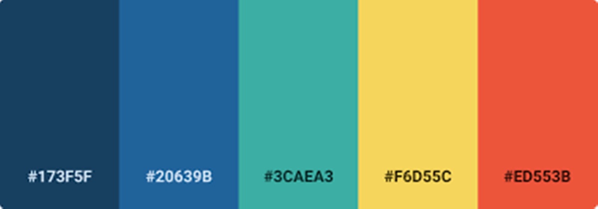
As we mentioned above, choosing specific colors in one palette base on you and the objectives of your company. However, the colors you use, you need to identify their HEX or RGB (Red-Green-Blue) codes. These codes consist of numbers, letters, and signals, which allow you to call up the right shade, brightness, contrast, and hue you used to design your brand’s content. Multiple apps are helping you identify these codes correctly. You can also find color codes by using the photo editor or designing software from your computers or smartphones.
As you can see, your color palette will decide the content of your logo, website design, printed advertisements, and event collateral.
Editorial Style Guide
Recently, an editorial style guide is such the most necessary element of the brand guidelines for authoritative brands. This component indicates your PR staff and those responsible for the content writing of articles, scripts, blog posts, and website copy for your company.
An editorial guideline is to carry out an editorial stylebook where readers can know how to phrase products or present the topics that the brand writes about or even other companies the brand mentions. On the other hand, an editorial style guide of a brand can reveal customer characteristics (their preferences to read, where they read it or their levels of reading, etc.
To sum up, an editorial style guide will govern your blog content, website content, video scripts, landing page copy, PR talking points, knowledge background from the customer service team, and sponsored content.
Typography
It is the same type as the color palette, which is also a visual element of a brand style guide. However, it is not about the color but the text. In general, it is far more than the font you use in your company’s logo or other content. The typography of your brand guidelines will decide the font you publish articles in your blog design, the links and copy of your website, or a tagline going with the company’s logo.
As you can see, a brand style guide is generally to form all elements of a business and gather them to spell out the entire brand as it’s recognized. Developing a strong brand guideline takes much time and effort, but it’s worthwhile to generate brand familiarity, reliability, and loyalty.
Now, let’s discover nearly 60 companies with their killer brand guidelines.
55+ brand guidelines compilation for you to learn
Google - Brand Guidelines
The first company of this compilation is a giant brand which people all over the world know. Their visual content is so detailed and meticulous, which covers all bases. That’s the reason why Google uses the term “pixel perfect” to describe their icons. Also, it is what they carry out.
Sony - Brand Guidelines
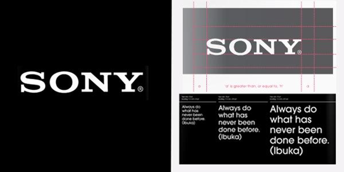
Sony is just another brand focus on every detail of a guideline. Similar to Google, Sony is a perfectionist brand with a style guide dedicated to its tagline known as like.no.other. Instead of focusing on space between symbols, positioning, size, background, and color palette, Sony attracts people by its impressive details on each part of the tagline, especially structure and display. Check out Sony’s guidebook if you are about to search for any brands that are painstaking in building guidelines.
Twitter - Brand Guidelines
It is a controversial topic of whether printed brand manuals are a failure or not. Each side has its own strong and weak points. However, some brands still choose digital and publically versions. Twitter is a typical example whose style guide accessible to every Internet user. Although their brand is not always applied correctly, it is such a smart move on Twitter since everyone worldwide can approach it, and Twitter offers its brand rules to create a higher chance of having it presented correctly.
Walmart - Brand Guidelines
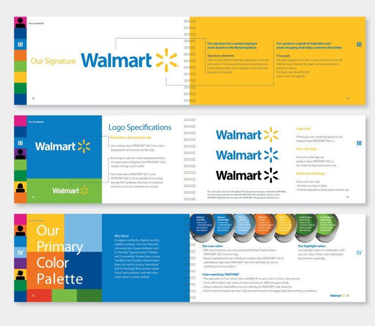
Walmart is a great example of combining the fun and trustworthy line in its brand guideline. Using bright colors, Walmart’s style guide is dynamic enough to attract users and make itself memorable while it remains the original vibe of professional and reliable. It must have inspired any startups before launching by its amazing brand guideline, including all the bases of Walmart’s content as well as signature colors and types of the brand.
Sushi & Co - Brand Guidelines
Different from Walmart’s colorful style guide, Sushi & Co has a set of brand guidelines that are simple but powerful. Minimality does not always work well with every company from every industry because many businesses require details. However, in Sushi & Co’s situation, the simple elements bring about flexibility for branding and applications. Its brand guideline is simple and professional but also makes sure the good communicating affect the brand’s content.
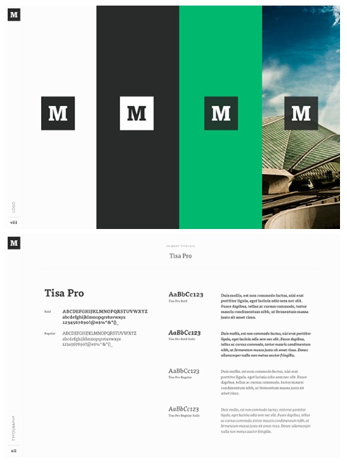
Medium - Brand Guidelines
Medium focuses on both typography and color palette in its brand guideline. If you are looking for a brand that gives direct visual examples, Medium is an ideal one, including details of the company’s purposes and product principles. Not only providing examples, but Medium also gives specific explanations to let you read through and understand the concepts better.
Wolf Circus Jewelry - Brand Guidelines
As you know, Wolf Circus Jewelry provides precious products that are all about appearance. Then, its brand guideline is so, which means all elements included within the style guide is for advertising purposes. It consists of a mission statement, product principles details, typeface, logo, color palette, etc.
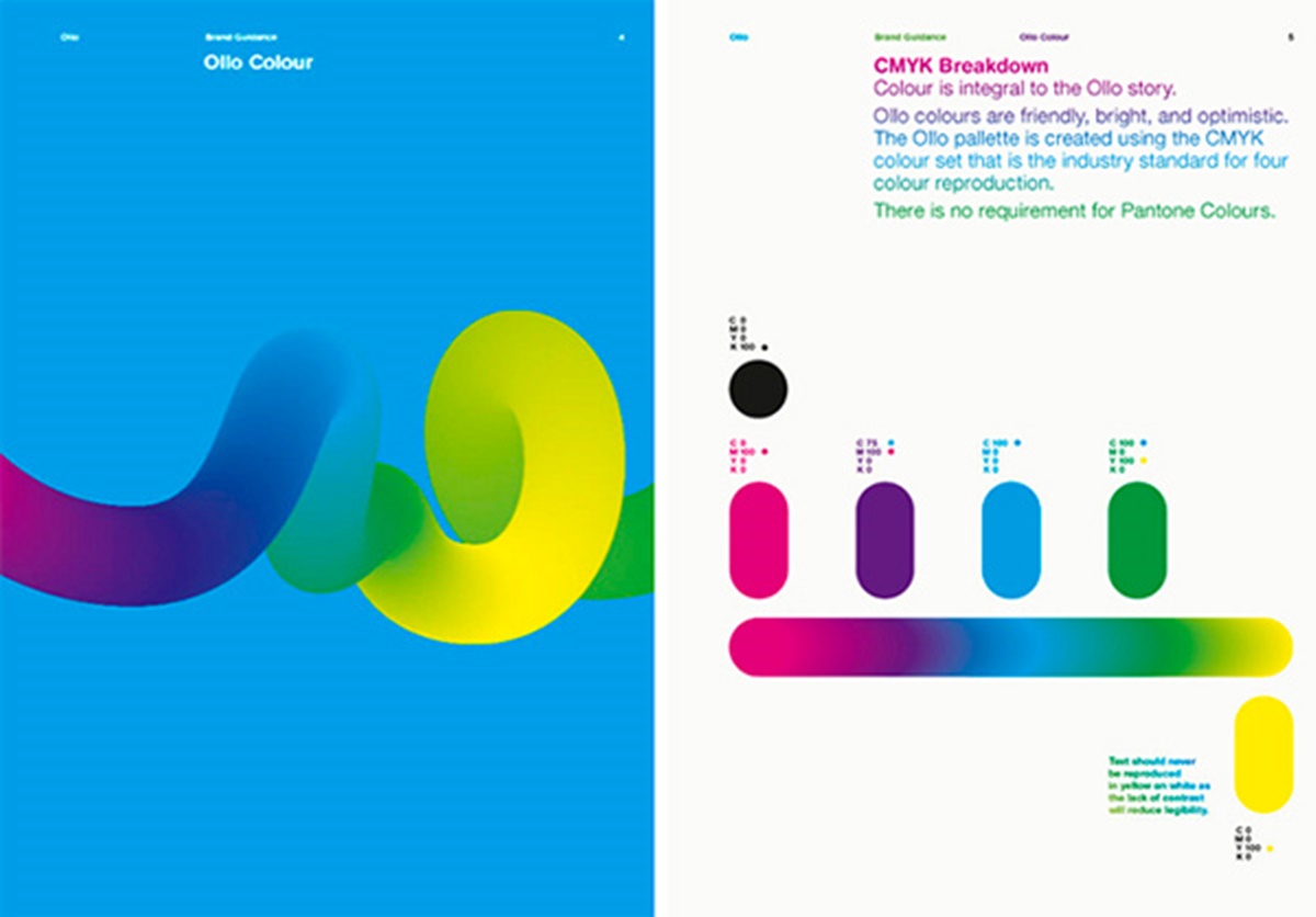
Ollo - Brand Guidelines
Ollo is an inspiration for a creative brand that keeps a balance between visual content and informative one. It provides a tip for you when making a brand guideline not to include too much text content or graphic one on one page. Ollo’s pages are packed with information and visual examples at the same time, which prevents it from being overwhelming and helps the examples easy to understand. Well combining color and typography turns Ollo’s guidelines into a game.
Skype - Brand Guidelines
Skype is a global video chatting platform that is now owned by Microsoft also has an amazing brand guideline focusing on product phrasing and logo positioning. One impressively strong point of Skype’s style guide includes its signature tone in instructions and explanations. In this way, the brand can strengthen the tone itself as well as enhance the information. Skype’s humor and friendly tone is an example for you to figure out your brand’s tone and introduce this to the manual in a unique way.
Barre & Soul - Brand Guidelines
Barre & Soul provides a brand guideline that includes a diversity of logos, logo spacing, secondary logos, supporting images, and a color palette of five most noticeable colors.
Spotify - Brand Guidelines
Spotify is so familiar to music-lovers around the world with its easy-to-recognize logo of a lime green circle. However, Spotify’s style guide is rather than that green color. Its simple color palette includes three color codes. As you can see, the remainder of the company’s branding style guides bases on logo variation and album artwork. Instead of wasting time recreating the logo, its guideline lets you download the logo’s icon version directly to symbolize the brand.
Jamie Oliver - Brand Guidelines
Having an all-encompassing style guide, Jamie Oliver covers logo positioning across all of its products. If the company you are about to launch deals with a large number of photographic elements, let’s check out Jamie Oliver since it includes a palette of multiple colors. Not only does the company run through the basics of branding, but it also goes deeply into the specific images used in communication.
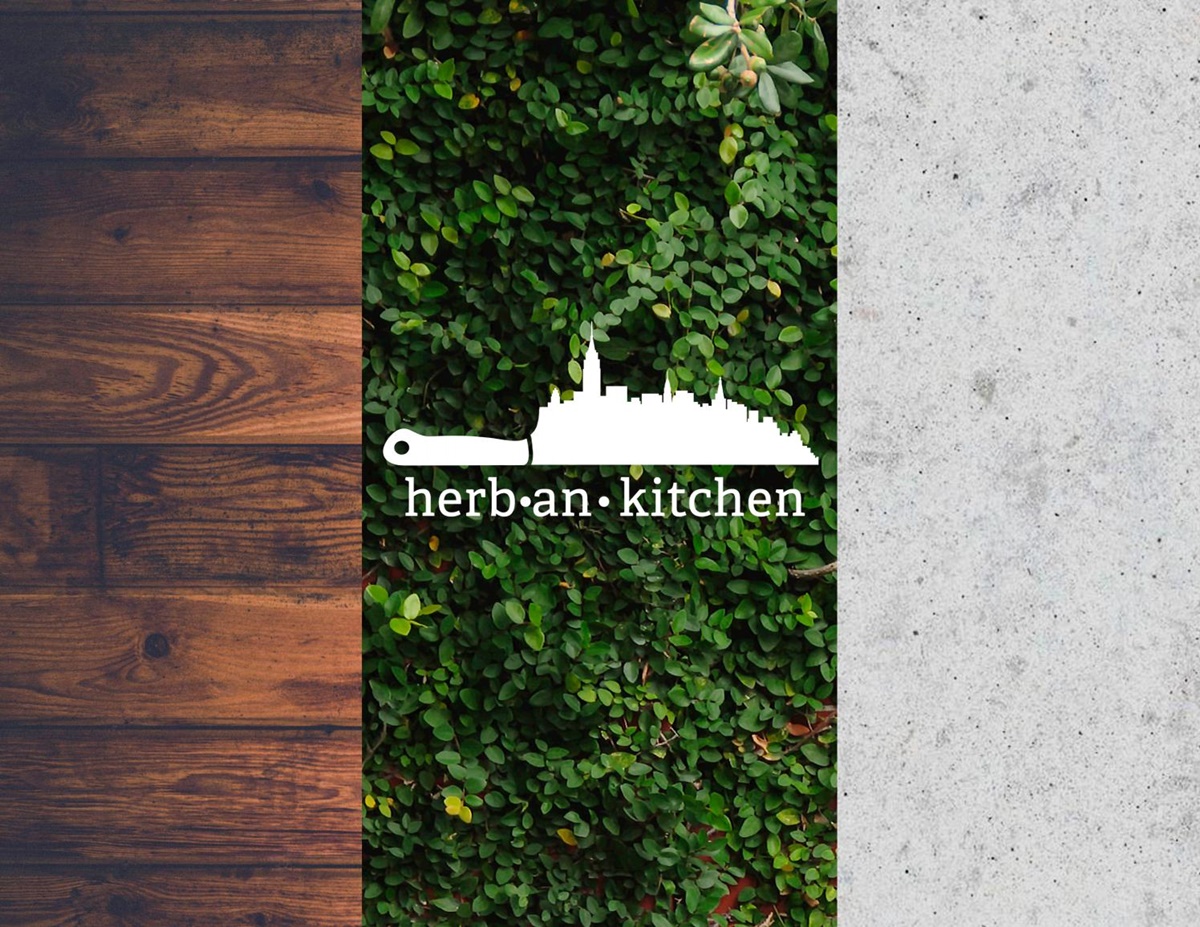
Herban Kitchen - Brand Guidelines
Herban Kitchen offers harmonizing and professional vibe with a color palette as well as a texture palette within the manual itself. Herban Kitchen’s style guide lets you show how the logo appears and how the target customers will see it from the outside.
Urban Outfitters - Brand Guidelines
If you concern about keeping hip and relevant, Urban Outfitters is one of the best-inspired brand guidelines for you. The brand includes every detail in its style guide from photography, color, tone to texture content about its logo and brand face. Moreover, Urban Outfitters assumes that the need and preferences of consumers change very often, so it always tries to rebrand every six months. Being a lifestyle retailer with edgy designs, the brand refreshes itself to attract modern customers.
Love to Ride - Brand Guidelines
Love to Ride is a cycling company which is all about color variation in its visual guideline. The brand’s attractive style guide provides a palette of nearly 10 color codes and many details about its subordinate logos and images.
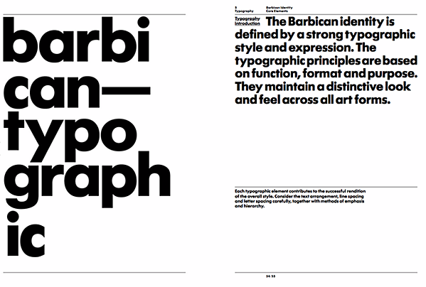
Barbican - Brand Guidelines
Barbican, which is an art and training center in the UK, has a simple brand style guide focusing mostly on its logo, texture content, and supporting typefaces.
I Love New York - Brand Guidelines
Widely famous for its simple T-shirts with memorable designs of one sentence, “I Love NY” and two basic colors, I love New York also has a brand guideline. The brand begins its manual with an entire mission statement, goal, story, target audience, and tone of voice. The company digs into its logo placement within various merchandise.
Cisco - Brand Guidelines
Cisco’s brand guideline is more than a normal guide but rather a brand book. As a website visitor, you will be led through the page to page, including the brand’s vision, mission, strategy, and promises prior to its logo and typeface. If you are wondering whether Cisco has a color palette like others or not, the brand has a separate webpage for only color variation.
University of the Arts Helsinki - Brand Guidelines
University of the Arts Helsinki offers a creative branding album, so if you are looking for a traditional style guide, it might not work for your company. On the other hand, its guideline presents tons of contexts in which you can see this school’s provocative logo and animations.
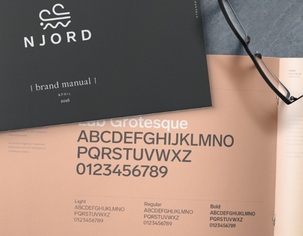
NJORD - Brand Guidelines
It is an inspired, famous brand with minimalist style guide and a palette with few and basic colors. However, it is enough to bring you everything about designing by using the branding logos and the same colors for both web and printing materials.
Espacio Cultural - Brand Guidelines
As a cultural center in Argentina, Espacio Cultural has such a complicated color palette. Moreover, it is its right move to break down every last color code and logo positioning, from the building to the advertisements or the artistic workshops it hosts.
Alienware - Brand Guidelines
Alienware interacts with partner brands like Star Wars, which you must have known before. If you are a video gamer, the brand is also famous for its game-friendly computers. However, what makes it famous globally is its brand’s sleek aesthetic. The brand guideline is developed with four parts including voice, design, photography, and partner.
Netflix - Brand Guidelines
Remarkable for the signature classic red color, the brand guidelines bases on the treatment of its logo. As you can see, its logo offers a simple set of rules, size, spacing, typeface placement, and especially a single color code in the company’s palette.
Scrimshaw Coffee - Brand Guidelines
Scrimshaw Coffee provides a palette of five neutral colors but stays friendly and modern at the same time. It also has many backup logos for multiple situations.
NASA - Brand Guidelines
NASA owns Graphics Standards Manual, which is very complex. Its official brand guidelines include over 200 pages when the guide shows multiple logo positioning, color variation, and supporting designs. What’s more, NASA’s space shuttles, of course, own their branding rules.
New York City Transit Authority - Brand Guidelines
New York City Transit Authority, also known as NYCTA, also has itself Graphics Standards Manual, which includes fascinating typography rules for the numbers, arrows, or public transit symbols. These contents are what the public commuters take for granted daily.
Asana - Brand Guidelines
Unlike some brand creation style guides randomly, Asana has its own story and meaning behind it with a specific strategy. Asana seems to tell users reasons why they designed like so, even the logo’s three dots. What these three dots stand for is the unlimited potential of human collaboration. The company promises to present a sense of clarity, balance, and purpose-led design.
Nusr-Et - Brand Guidelines
If you are going to a startup in the restaurant industry, Nusr-Et might be a perfect guideline for you to get motivated. Knowing that picture plays an important role in food companies, the brand includes many product photographs in their style guides. They use dark backgrounds to highlight the food and make it look like in high quality, especially one with many details like meat. This branding shows that the company focuses on the minimality, sophistication, and dedication to the craft.
Wolf Circus - Brand Guidelines
Wolf Circus is an E-commerce company whose brand style guides covering all brand contents, from the reason to build Wolf Circus to the typeface system. As you can see, its color palette is the key indicator of the brand design with blue-grey, pastel pink, and nude act as supporting colors. Moreover, the brand guidelines also let customers see what their promotional products are.
Google Marketing Platform - Brand Guidelines
You must have known about Google Marketing Platform, which is a collaboration unifying its DoubleClick advertiser products and the Google Analytics 360 Suite. This brand is said to focus on being professional and insightful while maintaining the existing approachability of Google. Their new visual guideline is so simple but powerful that users find it easy to read and understand.
Uber - Brand Guidelines
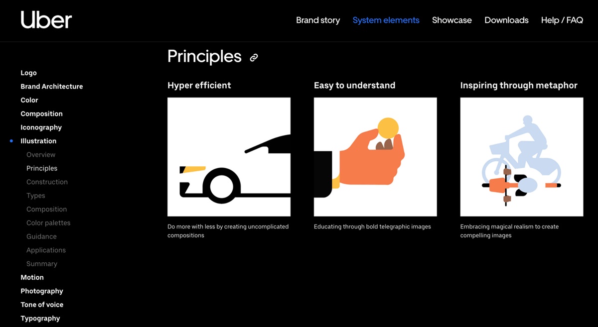
Uber is a famous ride-hailing brand with its online app. They develop their brand guidelines via nine main elements, including logo, composition, color palette, icon, illustration, motion, photography, tone of voice, typography. In each page, Uber provides an overview of each element as well as examples to make readers understand.
Audi - Brand Guidelines
As a familiar name around the globe, Audi’s brand guidelines are so widely recognized in tons of countries. That’s why its style guides are specific with many guidelines for its presentation in user interfaces, media, branding, sounds, motion images, motorsports, etc.
Carrefour - Brand Guidelines
Not only does Carrefour bring about the reliability, but it also instills a sense of familiarity and warmth. Reasons for that are that the brand is from the food-retail industry, aiming to make its customers feel an open and friendly environment as well as the company’s dedication. Carrefour’s brand guidelines include a color palette with multiple colors and dynamic layouts, which show all about the brand’s history.
Shazam - Brand Guidelines
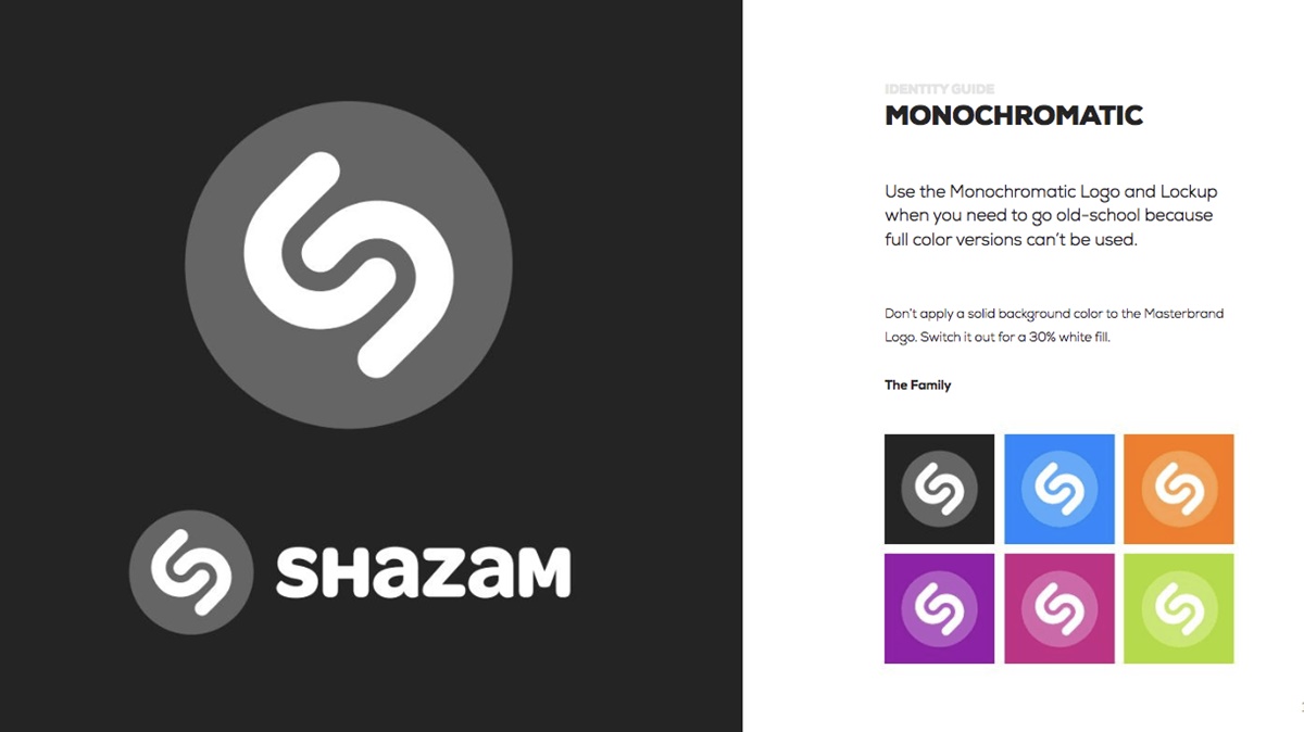
Shazam is an online app that is now owned by Apple used to identify songs based on a random melody that you hear somewhere accidentally. Shazam defines the reasons why the logo takes such an important role in identifying the brand as well as explains how to combine the logo with the watermark.
Foursquare - Brand Guidelines
If you are looking for a brand style guide that brings about detailed rundowns for the rules, let’s check out Foursquare, the most trusted, independent location data platform for understanding how people move through the real world. It also provides guides to each of the designing elements.
AMD - Brand Guidelines
AMD (Amanda Michiru Designer) did it well when building a perfectionist style guide for her brand. Her brand guidelines are short but easy to understand, ranging from logo placement and primary palette to the secondary ones. It is a great inspiration for those who just start creating a style guide for personal companies.
Animal Planet - Brand Guidelines
Animal Planet has undergone a rebranding process in 2016, which concentrates on the childlike happiness and wonder experienced by interacting with animals. Its famous new logo is a blue elephant that makes it distinctive and presents the brand’s history. This identity logo seems to be suitable for both digital and non-digital platforms.
Apple - Brand Guidelines
Apple is another example of how detail-oriented huge brands can be. Its brand guidelines are well-maintained due to painstaking set of styles, concise explanations on the uses of Apple set.

Argento - Brand Guidelines
Argento Wine gives you one tip of including enough detail, which is important in your brand style guide to ensure the right application. Argento Wine has its logo be displayed in many areas, but it still digs concisely into sizing, colors, and logos within its brand guideline.
Barnes & Noble - Brand Guidelines
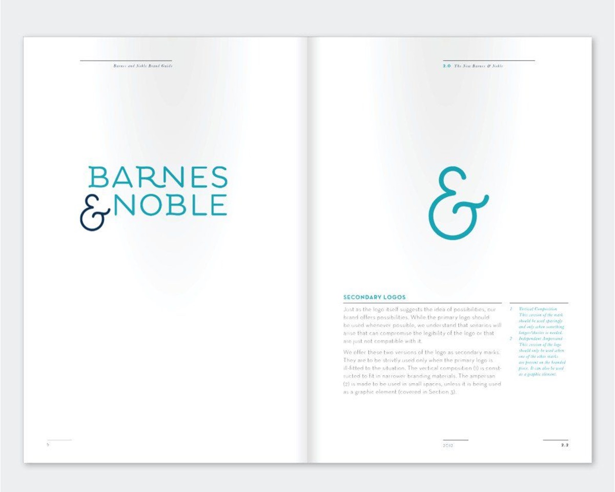
It is instead a project made by Carolina Pistone for her industrial designing class than an official brand guideline of Barnes & Noble. However, its fictional and meticulous style guide turns it into a worth-a-read example before launching. Similar to any detail-led guideline, the brand fully explains the logo, signatures, and sub-brand logos.
Bing - Brand Guidelines
You can read through Bing’s manual if you are searching for a strong set of style guides. Being a competitor of a huge searching engine like Google, Bing does very well in organizes and explains completely all about its facts and history, right down to the search bar dimensions and composition. However informative it is, Bing can make sure it’s manual understandable and easy to replicate.
Black Watch Global - Brand Guidelines
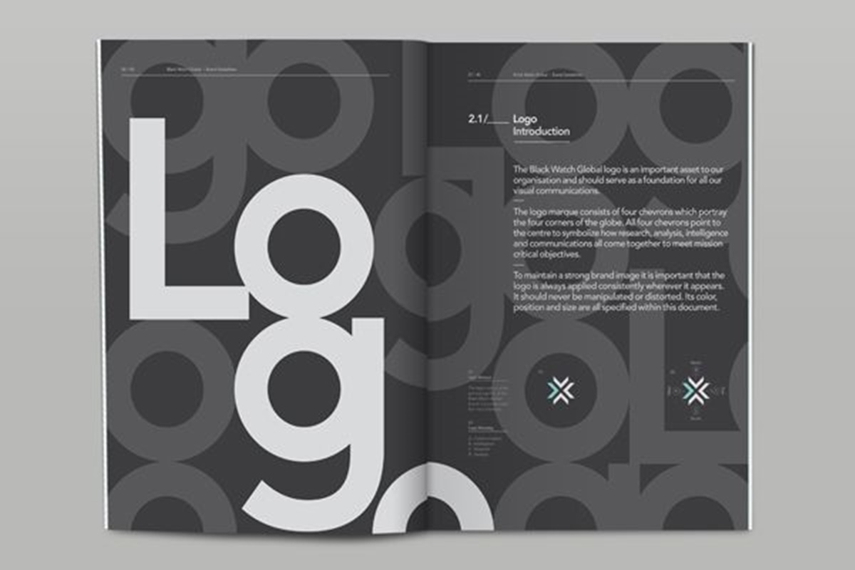
It is undoubtedly right that the main purpose of a brand style guide is providing information. That’s why the function is valued over the form most of the time. However, you do not need to make your guidelines indistinctive. Back Watch Global is an example of an informative but interesting-to-read manual that includes large types ranging from page to page, dynamic typography, and colorful displays.
Bosphorus - Brand Guidelines
Different from the previous manual with big types and unique colors, Bosphorus’s style guide made by Mike Collinge will provide such a more formulaic layout, including a clear format, which makes it easy for readers to digest information. These simple guidelines are suitable whether your company is a minimal approach or not.
Big Lottery Fund - Brand Guidelines
Big Lottery Fund takes its style guide designs under risk by executing it as a poster. Luckily, it turns to be successful because the guidelines do concern the brand’s internal communication. It might be an example for your company if you find it suitable. Designers do not expect to open such an A2 paper, but in this situation, the poster size is perfectly useful.
Calgary Chamber - Brand Guidelines
Calgary Chamber provides a super-detailed style guide. When reading its manual, you will surely find all explanations of every element displayed in an extraordinary way, which makes it so unique, clear, and strong. It is useful for any designer, thanks to color combinations, type combinations, sizes, weights, etc.
Cemento - Brand Guidelines
If your company expects something simple, let’s read through Cemento’s guidelines, a concrete distributor. A minimal palette together with big bold headlines makes it easy for us to read through the manual. Conspicuous from the guidelines, the Cemento trademark is constructed carefully, which turns it into a large part of the brand. One tip drawn from this instance is that focusing on whatever important elements to your company.
Channel 4 - Brand Guidelines
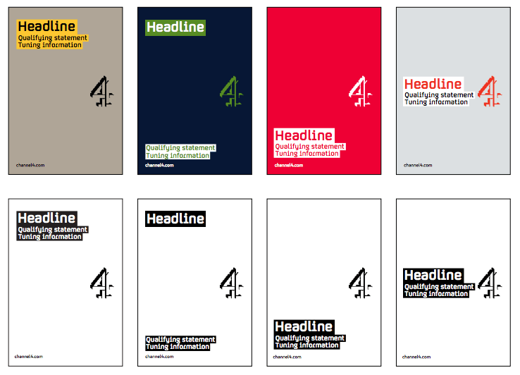
Being simple and informative at the same time, Channel 4 gets as much attention as many other complex brands. In general, the brand guidelines are very minimal, but the company focuses on adding details on the instructions and brand rules. This makes it comprehensive but interesting.
Child of Light - Brand Guidelines
Where there’s a brand, there’s a brand guideline. However hard it is to imagine, video game brand like Child of Light still has a manual for itself. What’s more surprising is that its style guides are as meticulously detailed and compiled as any corporate brand. In the manual, you will see that all decisions are explained and organized understandably, with some lights shed on the process.
Double Knot - Brand Guidelines
Double Knot is also an example of making its brand style guide the brand rules. The company tends to puts all the content at the forefront and uses a well-settled color palette and typesetting rules within its brand guidelines.
Don’t Use Me - Brand Guidelines
Don’t be hesitant to put on as many visuals as possible because the more it is, the more understandable it becomes. Don’t Use Me is a charity organization that sketches out both the do’s and don’ts as well as diagrams and visual examples that make it clear and concise.
easyGroup - Brand Guidelines
When creating a brand guideline, we tend to make it short and clear. It is such a hard job for a manual covering a big brand with many groups. Let’s check out easyGroup as a great company making it well when covering a large quantity of subgroups like easyJet, easyMoney, easyAirtours, etc. but still including clear explanations and detailed information.
Firebrand - Brand Guidelines
There are no other brands more suitable than Firebrand if you are looking for sophisticated manual combining between form and function. Firebrand provides a clean, clear, but detailed style guide that complements the sleek design and is easy to read through.
FittLab - Brand Guidelines
FittLab also owns a sophisticated brand style guide that deconstructs the designing elements to make it easier for readers. In this way, the company can explain how to develop the logotype, spot irregularities or regulate logotype kerning, etc. Remember to cover your base completely because an all-encompassing base can make your final result stronger and avoid any inconsistencies.
Heineken - Brand Guidelines
It has a meticulous and well-arranged set of style guides highlighted with a Heineken green gradient, which makes the brand guidelines strong and easy to identify.
Nike Pro Services - Brand Guidelines
Nike Pro Services offered by Nike and designed by Manual Creative is a first-class invitation service that allows runners to approach expert attitudes and other services supplied for professional athletes. This brand guideline includes just one division of the Nike group, a perfect combination of beautiful designs and informative content.
Read more:
- How To Name Your Brand?
- Brand Development: Definition, Process and Examples
- Brand Extension: Definition, Strategies and Examples
- Brand Audit: Step-by-step Guide
Summary
It is critical to have a reliable brand guideline to build brand recognition and open door for higher preferences, trustworthy experiences, more profits, and enormous potential for the company’s success. It is an ideal tool to stick your brand’s content and messages to your target customer’s minds.
As a member of any business, you should spend time and effort searching and creating the right brand guide style that spells out all your company elements.
We hope this post of introducing strong brand guidelines of 55+ companies will give you more advice on how to create your brand style guide as well as motivation to start compiling right now.
Good luck!
New Posts

