How to Build the Perfect Shopify Homepage?
Your website’s homepage is generally the first impression of your brand that a lead will get. Here are some fool-proof tips for making a perfect Shopify homepage.
Your homepage and landing pages are oftentimes the first impressions that a lead makes of your brand, so it’s essential that you have a homepage that leaves visitors wanting more. Most people spend 10-20 seconds on a website’s homepage, which means you’ll need to show visitors the best side of your brand and ferry them to where you want them to be.
While it is becoming increasingly common for people to land directly onto one of your product pages via Instagram or a search engine, your homepage is still an essential component that glues your brand together in the mind of the customer.
Fortunately, there are some very simple best practices for creating a homepage that will convert. In this post, we’re going to outline what you need to be asking yourself when designing your perfect Shopify homepage and then some essential things that you need to include in it to maximize your conversion rate.
What to ask yourself when building your homepage
You’re going to have people landing on your homepage who are familiar with your brand, as well as those who are getting introduced to it for the first time. It’s important that your Shopify homepage is tailored to meet both their needs.
Ask yourself:
- What do you want the visitor to do?
- How easy is it for them to do it?
- How many actions do they have to take to do it?
- Can you remove any of these actions?
You want to get your visitors to the collection or product page that you want them on as quickly as possible to get them through the checkout. Or perhaps you’re looking for email subscription sign-ups, so you’ll want to get them to do this in just one or two steps.
It’s important that you know the purpose of your homepage so that you can design it to meet these requirements.
How to create the perfect Shopify homepage
There are lots of things to consider when building the perfect Shopify homepage. Fortunately, they can be broken down into bite size chunks that are easy to digest.
When designing your homepage, you’ll save a lot of money that you’d otherwise have to spend on hiring a web developer by using a Shopify page builder apps. We recommend that you use PageFly Advanced Page Builder thanks to their simple drag & drop mechanism that makes building the perfect Shopify homepage a breeze.
Once you’ve got your page builder up and running, you’re ready to begin designing your new high-converting homepage.
1. Leverage ‘above the fold’ content
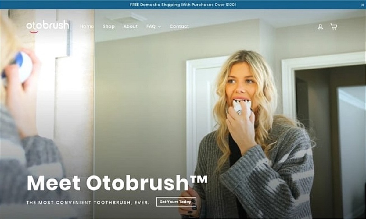
Above the fold content is the first thing that visitors to your site see when they land on your homepage. It usually consists of a bold and attention-grabbing headline, followed by a sub-heading against a backdrop of a colorful image that says something about the brand.
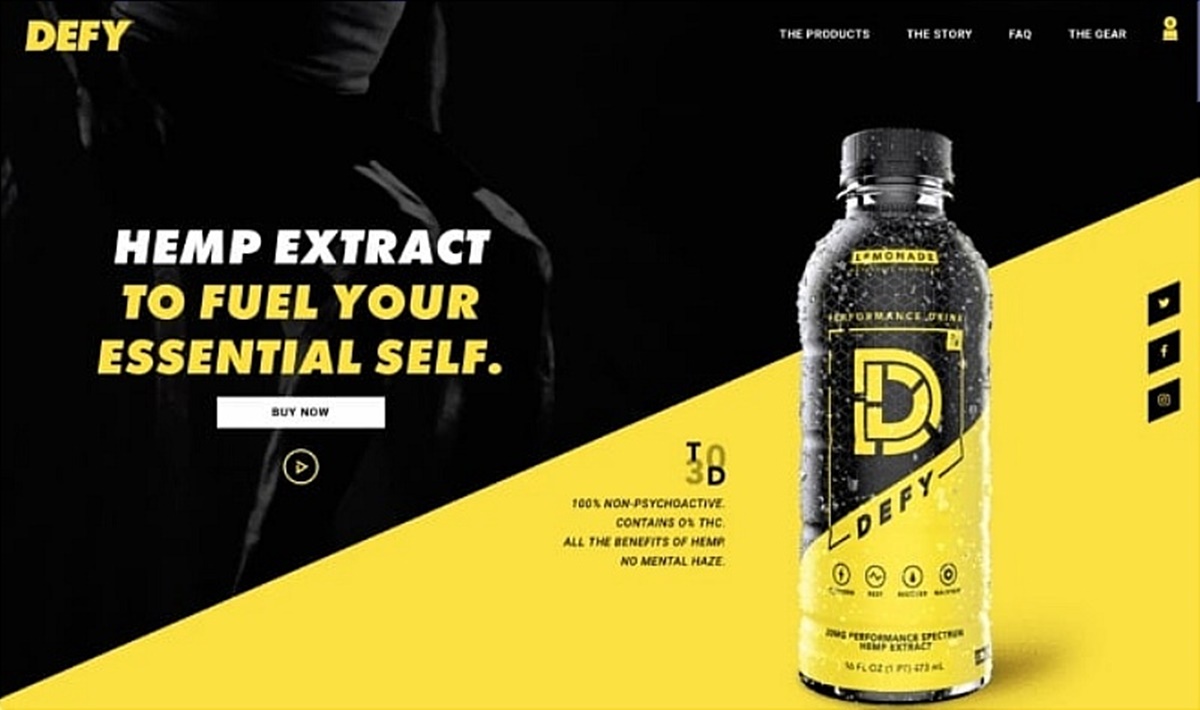
Think of the way that newspapers like to paste a massive headline across the top third of the front page - that’s essentially the same thing, just in a different context. You should also have a high-resolution image here that allows visitors to visualize what your brand is all about.
Ultimately, this space is there to convince the visitor to stick around - so you’ll either want to make them scroll down, or you’ll want them to follow a Call to Action (CTA) button which will take them deeper into your website and closer to the checkout.
A clear CTA is a great way to capture your visitor’s attention - but make sure that you’re keeping it simple. Something like ‘Shop Men’s’ or ‘Go to Sale’ is enough. ‘Start Here’ is another very good option. Also, make sure that the color of the button fits the general color palette of your website, while still standing out immediately.
In short, the above-the-fold content is your way to grab your visitor’s attention and personalize your homepage. It’s like the handshake at a party, so make sure it’s firm.
2. No-nonsense navigation
An important rule of thumb is that when someone lands on your homepage, they should be able to reach the checkout page within three clicks. Any more than this and you’re just putting obstacles in their way. The best way to ensure this is by having no-nonsense navigation.
Your menu navigation should be clearly visible at the top of the page and should ideally stick when you scroll down through the homepage. This allows customers to easily get to your products from anywhere on your website.

You should use no more than seven menu navigation categories to keep things from getting cluttered. The human brain isn’t what it could be - the average person is only able to hold seven points in their short-term memory. Bear this in mind when designing your menu navigation.
If you have a large number of collections, then simply build a drop-down menu. This makes things much more streamlined.
One more thing: regularly check whether your menu to see if any of the pages it leads to aren’t generating conversions. If that’s the case, then either change that page or cull it.
3. Invest heavily in visuals
Human beings are very visual creatures. Having great photography on your homepage will not only make your website look a lot more professional, but it’ll also give you the chance to visually display what your brand is all about.
If you can’t afford a photographer, then you can use Shopify’s own Image Picker in the theme menu to get access to a massive collection of free stock photos. Having a stand-out picture with some direct copy and a CTA over it is a very effective way to grab your lead’s attention and bring them one step closer to the checkout.
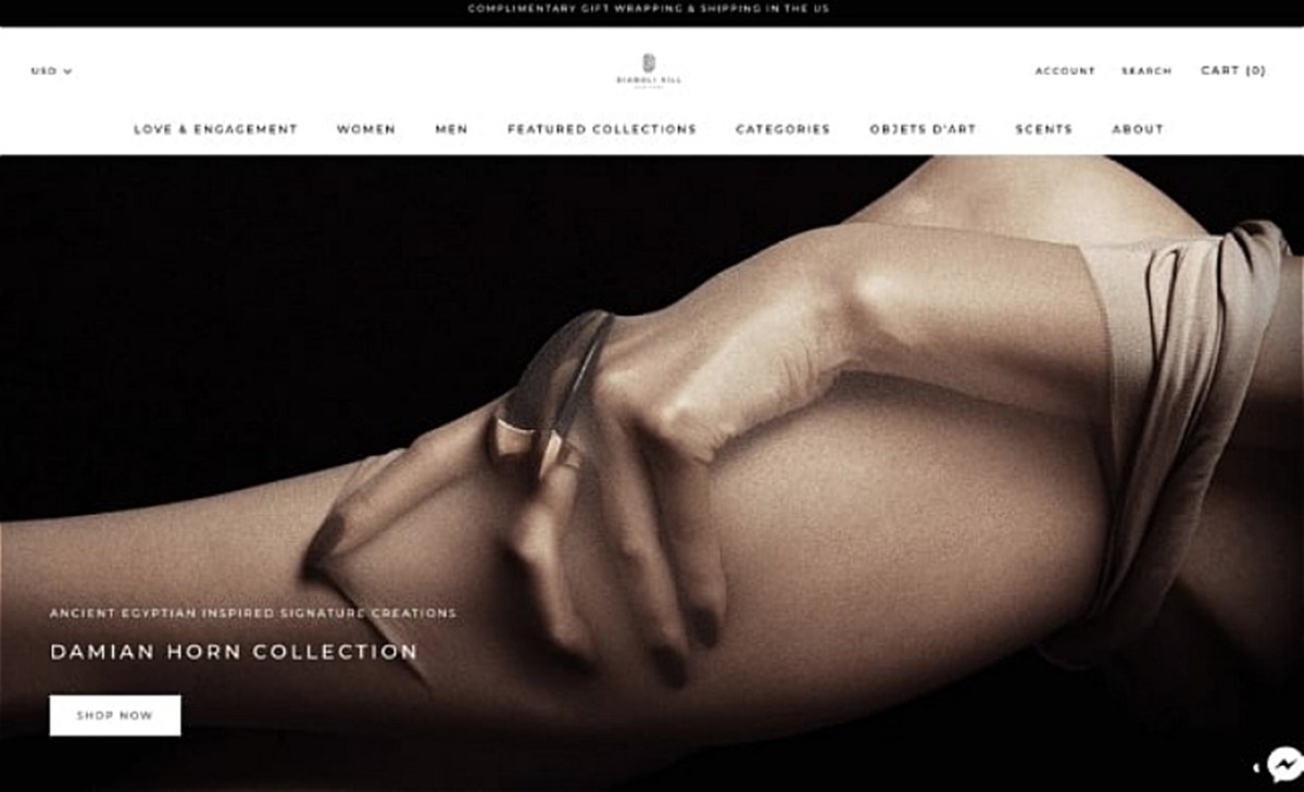
Having a single, static photo in the above-the-fold section is standard procedure, and it’s the cleanest way to organize your homepage. That being said, brands that sell a wide variety of products in various different categories will often opt to use a slideshow of images, with the first one being the primary image, and the others highlighting different products or collections. A go-to for the primary image could be promoting a sale - you’ve no doubt seen this many times before on eCommerce websites.
Aside from photography, it’s also a great idea to incorporate some video content into the above the fold area to demonstrate a product in action and really get your visitors interested. In short, you’re going to want to capture the attention of your leads as quickly and as completely as possible by playing on as many senses as you can.
Know how to add content effectively to your homepage doesn’t take much research and it can make a huge difference to how your homepage comes across.
4. Make the cart easily accessible
The cart abandonment rate for 2019 was on average 77.13%. This makes cart abandonment arguably the biggest threat to your conversion rate once a lead has landed on your website. There are some strategies that you can use to reduce your cart abandonment rate, but one very simple and effective way is to simply make the cart easily accessible. This is especially effective for returning visitors who have already added something to the cart and then forgotten about it.
One great way to remind people of what’s in their cart is to put a ‘slide-out’ cart on your website. This stays with you the whole time you’re browsing the website in the corner of the screen and it’ll constantly remind potential customers that they have something waiting for them in the cart.
5. A clear Call to Action
We’ve mentioned the importance of having a great CTA already, but this shouldn’t just be limited to your above-the-fold content. You can use calls to action after your visitors scroll down to take them a particular collection or product that you want to sell more of.

You could lead people to a sign-up form so that they can receive your newsletter, or you could direct them to a video where they can see one of your products in action. CTAs are one of the most effective ways to direct visitors to where you want them to go. That being said, you don’t want to use so many of them that they stop standing out altogether.
6. Make it easy to learn more
Your homepage should provide the most essential information to your customer - in short, it should show them who you are and what you’re selling. But there will always be someone looking for more information - and it’s your job to make sure that they can access it easily. This could be in the form of a FAQ section, a contact us page, or a live chatbox.

The more you can answer any questions that a customer might have, the easier it is for them to make a purchase, and the more they’ll come to trust and respect your brand. This is a relatively simple way to build a phenomenal UX for your website and increase your conversion rate at the same time.
7. Showcase user-generated content
User-generated content (UGC) is anything that the customer can create for you. This includes reviews, testimonials, Facebook posts, unboxing videos, Instagram posts, and much more. People are beginning to trust brand marketing less and less - and for obvious reasons considering a company will never say anything bad about their own product.
UGC builds a lot of trust in your brand. It’s also a goldmine for SEO, as people tend to leave a lot of keywords in reviews, and Google considers this fair game when it’s judging how high up your website should rank in the search listings.
Showing reviews and testimonials at the bottom of your homepage demonstrates that you’re comfortable with the feedback you receive and it’ll do a lot of good for your conversion rate.
You can also link your social media channels to your homepage. A great example of this is by displaying an Instagram hashtag feed that shows people using your product. You could incentivize people to share posts related to your product by entering them into a raffle or by offering them a discount coupon.
The wrap-up
Your homepage is the front page of your website, and while it’s becoming less common for people to land on your website via your homepage, it’s still the most important page on your website. By following the tips outlined above, you can make your brand look more professional and increase your conversion rate.
When it comes down to it, no one wants to spend money on a website that looks like it was designed by a 13-year-old. If you want to flip your products, then you’re going to have to make sure that your Shopify homepage is up-to-scratch. Learn more about how to build the perfect Shopify homepage here.
New Posts


