How To Calculate Conversion Rate Of Website? 20+ Proven Tips To Increase Conversion Rate
Conversion rate is considered one of the most effective methods to measure the effectiveness of your advertising strategies. This rate shows how excellently your marketing campaigns make people do what you want them to do. The higher your conversion rate, the more successful your marketing is.
So how do you calculate the conversion rate of your site?
Please read the article below. We’re going to show you the directions to calculate the conversion rate of your website and 20+ proven tips to increase conversion rate.
What exactly is a conversion rate?

To put it simply, your conversion rate is the percentage of people visiting your site or page that meet a specific goal. Several common conversion goals can be:
- Make a purchase
- Submit information (a prospect)
- Call business
- Sign up for a letter
- Create an account
- Download an asset (different forms of content like eBook or guide)
- Get engaged with your website (time on site, visits to specific pages, page count)
To choose a certain conversion goal, you have to depend on the certain nature of your business. Casper and Quip choose a purchase goal for eCommerce brands, whereas a signing.
Understanding the average website conversion rates by industry is crucial for evaluating the effectiveness of your own site’s conversion strategy. For instance, B2B and E-commerce platforms tend to exhibit distinct average conversion rates due to the differing nature of their transactions and customer behavior. By analyzing where your site stands in comparison, you can fine-tune your approach to match or outperform these industry benchmarks closely.
How do you calculate conversion rate and examples?
There are three different formulas to calculate conversion rate:
- Conversion Rate = Total number of conversions / Total number of sessions * 100
- Conversion Rate = Total number of conversions / Total number of unique visitors * 100
- Conversion Rate = Total number of conversions / Total number of leads * 100
Notice: These formulas are accurate. To choose the best way to calculate the conversion rate, you need to depend on what you’re determining as your conversion event and how you’re going to measure traffic. The numerator will indicate your conversions, and the denominator shall be what you decide as your total traffic or pool (typically session count, one-time visitors or potential customers)
Now let’s take an example to clarify this process. In this example, you own an eCommerce website that offers Game of Thrones T-shirts: Targaryen’s Tees.
The conversion goal is to have a person go through your funnel and buy a shirt.
The website has 100,000 one-time visitors in February. It’s possible for you to sell T-shirts (your conversion event) to 2000 buyers.
What is the conversion rate?
| Visitors | 100,000 |
|---|---|
| Conversions | 2000 |
If you said 2%, you’re right!
| Conversion Rate Formula = Visitors / Conversions * 100 | 100,000 / 2000 * 100 = 2% | |——————————————————–|—————————|
Related posts
Definition of a good conversion rate

As you know, conversion rates differ significantly depending on your traffic quality, industry. Business, what you’re offering and even the particular conversion action you’re tracking. Consequently, while you can search for broad conversion rate statistics out there, your business and your marketing plan will decide a good conversion rate.
Besides, you need to note that a conversion is not always the same thing as a purchase. Conversion rate is a handy metric, whereas the aim of marketing mostly is not to create conversion - it’s to increase sales.
For instance, imagine that you cooperate with a law company that has $3500 of revenue on average per new paying customer with a 50% profit margin. You carry out five marketing campaigns where conversion is a person who turns in a prospect form on your landing page.
Below are your results:

Campaign 3 and campaign 4 lead to the lowest conversion rates. That means they may need some improvement. However, this data does not provide us any insight into the profitability of these plans. Are there prospects converting into sales? We’re not sure.
Look at the return-on-investment (ROI) for your plans to answer that above question:

It’s transparent to see which campaign is literally enhancing your company the most. Despite having the best conversion rate, campaign 1 has a far lower than campaign 4. Campaign 4 leads to the most costly leads whereas you’ll receive $7.52 if you invested $1.00 in campaign 4.
So now, what is the best campaign?
You need to understand that conversion rate data does not tell the whole story. A high conversion rate may badly affect your business if you cannot make these conversions into sales.
Why is conversion rate important for your business?
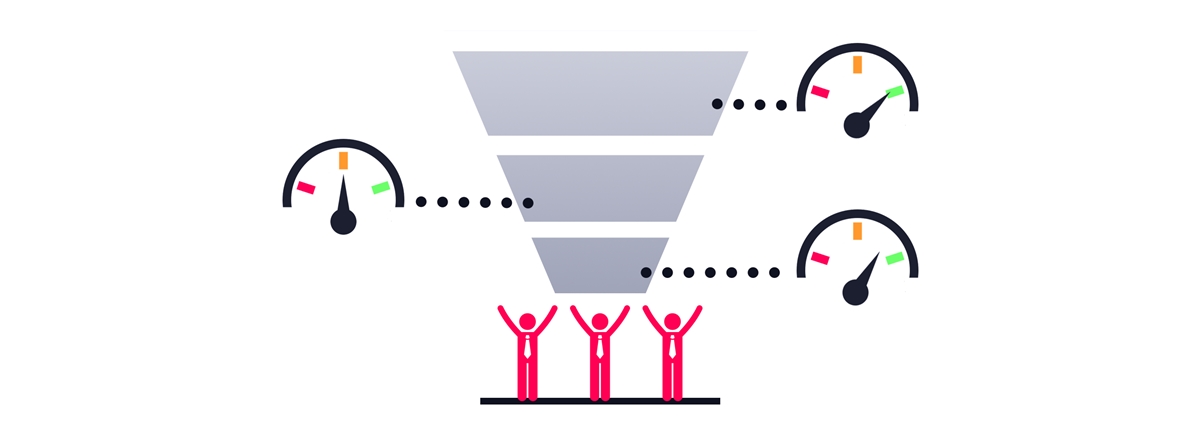
The conversion rate is a metric that a lot of digital marketers favor. This can be explained that conversion rates are an excellent way to directly measure how your site can impact on your business goals. While visitors or page views can be a great measure of effectiveness if your business objectives are to stick to the number of people reading your pages (such as businesses operating on advertising revenue), if your website has another aim (such as gaining prospects or increasing sales), understanding your conversion rate is much more beneficial.
Your conversion rate also assists you in gauging success for your site. If you’ve adjusted the layout of your website or posted a product description, you can see the change in your conversion rate to know if the change left a positive or negative effect on your bottom line.
Furthermore, you can use conversion rates to compare the value of various audience segments and channels. While it’s to measure effectiveness with the total quantity of conversations created from each segment or channel, doing so may lead to some missed chances.
For example, you invest $100 into both Google Ads and Facebook Ads. As a consequence, 1000 people visited your site from Google and 7.5% of them decided to purchase ( 7.5% conversion rate), and 1500 people arrived your site from Facebook, 5% of them decided to purchase (the conversion rate would be 5%)
Let’s crunch the figures and you’ll see that 75 visitors finished conversion from each channel (1,000 x 7.5% and 1,500 x 5% both equal 75). Two channels seem to be very good at creating conversion.
What occurs when we invest more to attract 500 more visitors from each channel? If these conversion rates are the same, you would generate: (1,000 + 500) x 7.5% = 112.5 sales (38 more than before, rounding up) from Google;(1,500 + 500) x 5% = 100 sales (25 more than before) from Facebook.
Comparing the figures, you can clearly see that the better investment in this situation will be Google Ads.
20+ Tips for increasing conversion rate
Build a strategy that is based on data
If you get data about your site from a tool such as Google Analytics, you are in good shape. Let’s examine the data to get patterns. Then you can depend on these patterns to deploy a conversion rate optimization (CRO) strategy.
A report of behavior flow can support.
You’ll see pages that stimulate visitors to keep reading as well as pages from which people leave quickly.
“Sticky” content is what marketers really need. You would like people to spend much time on the page or go to other pages on your website to discover all you provide.
When you have basic information on the performance of your site, you can recognize which pages are not effective and optimize them.
Create new content, update old references and statistics, draw a strong CTA, or consider a redesign. These updates will build the foundation of your CRO.
Do A/B testing
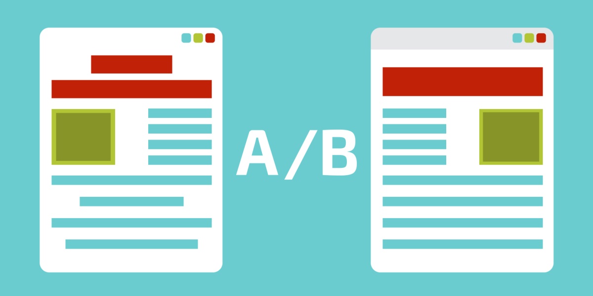
A/B testing (also known as split testing) is a tool for enhancing the conversion rate of your website. You can use recordings and visual reports to do A/B testing. For instance, you generate two different versions of the same landing page and change one variable, such as the CTA.
As showing one version to half of your audience and another version to another half, you’ll find which one converts better.
Optimize page design

People often evaluate a site by its visual design only. Hence, it’s essential for you to make your site look professional. You should take notice of layout, typography, photos, consistency problems, etc. in order to build a high-quality design for your website.
Moreover, to keep visitors to stay with you, one thing you have to know is to remove distractions. If you make people arriving at your site process many visual inputs and action options, they will not likely make a conversion decision. To improve the conversion rate, reduce distractions like unimportant product options, links and irrelevant information.
You should remove options that are not related to visitors taking action on your landing pages and product pages.
- Reduce the menu
- Discard sidebars and big headers
- Get rid of irrelevant photos
- Consider removing navigation on landing pages
Optimize conversion funnel and sales funnel

To optimize conversion fuel, you can try some following ways:
- Provide essential free home advice through your blogs, videos, free reports, and whitepapers
- Try to become the trusted advisor of your customers
- Offer them suitable reasons to sign up to your email list (in exchange for some good information)
- Free dip content video course through email
- Send them to your sales copy and ask for the sale
Test multiple form types
Forms usually become a stopping point for customers. They won’t want to spend time filling out the fields.
To decrease friction, you can remove unnecessary form fields, convert fields into checkboxes or other elements, and enable autofill. Nevertheless, it’s also important for you to test.
You can try to run a recording of a landing page with a form, or use a long landing page so that users have to scroll to go to the form. Do the majority of visitors click away after accessing the form? You might have an issue.
For example, Quicksprout uses a simple form which is created for both prospect generation and prospect qualification.
If you sell an expensive product or service, you would want to qualify your prospects. Yet, if it’s not essential, do not gather information about things like budget.
Test different CTAs at different points of the page

Regarding calls to action, there’s no particular CTA for businesses. It’s crucial to test different iterations.
For instance, an authoritative statement of Quicksprout is an appealing call to action. It says “Grow my traffic”.
In addition, it’s possible for you to write a CTA starting with “Yes”. Psychologically, it works well as it gives the offer in a positive way.
Speed up your website

It is claimed that a one-second delay in page load speed can lose 7% of your conversions.
Let’s think about how customers surf the web. They might have opened some browser tabs simultaneously. They’re multitasking because they want to take the most advantage of the time they have in a day.
If your website loads slowly, they are likely to leave. They will not wait to see what you are going to provide.
You can use Google’s PageSpeed Insights to test the speed of your site. It also offers you some concrete tips to speed up your website.
Build and increase trust

According to sales guru Zig Ziglar, people often don’t want to buy from you because of 4 following reasons:
- No need
- No money
- Not in a hurry
- No trust
In fact, we cannot do anything about the first 3 reasons, but we can gain trust. Make your website become trustworthy and see your conversions accelerate.
Here’s the list that can help your website gain trust from customers:
- Make it simple to check the accuracy of the information on your website: To increase the reliability of your site, you can offer third-party support, such as citations, testimonials, articles in famous publications) for information you talk about, particularly if you link to this evidence. You will still be confident in your material even if visitors do not follow those links.
- Prove that your website belongs to a real organization or company: Simply, you just add your physical location to your site. It’s also a good idea to upload a photo of your offices and list membership with the chamber of commerce.
- Make the expertise outstanding in your company, in the content and services you offer: Does your team have experts? Are they your contributors or service suppliers? Remember to give their credentials. Are you cooperating with a famous organization? Add this information to your site. However, you should not add unreliable external links that can make your site less credible.
- Prove that there are many honest and reliable members behind your site: You can consider showing their credibility through photos or text.
- Make contact easy and simple: It’s important to add your contact information, including phone number, email address, physical location.
- Make it useful and simple to use your site: Some website operators forget about visitors when they focus on the company’s ego or present the dazzling things they can do with web technology.
- Update content on your site frequently: Sites that have been often updated or reviewed will gain trust from users. If you have a blog or a news section, remember to update them on a regular basis.
- Limit promotional content: Hype, popups and blinking banners are often associated with scam and spam. If you could, avoid advertisements on your pages. If you must have ads, make it clear to differentiate the sponsored content from your own.
- Avoid errors: Spelling errors and broken links will likely reduce a site’s credibility. Also, make sure your site keeps fast and functional.
- Provide a money-back guarantee: Customers will not put their money at risk if they are not sure about what they’ll pay for. A money-guarantee aims to mitigate fears and move past objections. It’s a great idea to enhance your conversion rate.
Make it easy to buy

Your users should not have to find out how to purchase from you or where to click. Check the following list to improve your site:
Instruct your users what to do next. On each page, always show users the action you want them to do. Make the main next step more necessary than other links.
Do not provide users too many choices. It’s stated that the more options you present to your users, the easier it is to select nothing. Option paralyzes. If you have a number of products, create better filters so that your customers can choose the right one for them quickly.
Ask consumers to fill as few fields as possible. The more fields you include in your sign up form, the fewer people will fill it in. You should consider adding the option to sign up using their Facebook or Google account. Do not request anything that you unnecessarily need to know to finish the order.
Do not require registration to make a purchase. Allow them to check out as a guest. Customers will feel much more comfortable and happy.
Provide free delivery. Free shipping is one of the most common factors that stimulate buyers to make a purchase from your site.
Provide enough information
It’s critical to upload images, videos and reviews to your products. Take Amazon as an example - they choose to provide sufficient information for most products they have, and consequently they sell millions of them.
Add the price after you talk about the value. Or else, customers might make quick evaluations on the price without paying attention to the value of your product.
Some extra tips:
Provide different payment methods
Not everyone likes Paypal. Think about offering various payment options to content the preferences of your prospects.
Offer live chat
A chat tool helps to answer questions and assuage any concerns from your leads.
Make sure your copy’s reading level matches your audience
You should not use difficult or abstract language or language that’s too simple. A great tool like Readability Score can help you do this task.
Test out different content lengths
According to your niche, product and readers, you have to consider using short copy or long copy. Remember to test different lengths to choose the right one for your website.
Use professional-quality photos
Generic and tacky stock images can make your consumers misunderstand about your brand. So make sure all the photos you use are high-quality.
Test different color combinations on your landing pages
Colors can show different things to different people (for instance, light blue can be calming, whereas red can signify feelings of tension or anger). Test out a number of palettes to choose the one which helps increase your conversion rates.
Satisfy the expectations of your PPC visitors
If customers are visiting your landing page through a PPC advertisement, you should ensure that that ad is compatible with your landing page copy. That ad should show them accurately what they’ll see when they go to your site.
Get your visitors interested
Emotionally-charged language and interesting storytelling can help make your visitors feel curious and excited to try your product.
Add a clear value proposition
Show your leads to the outstanding features of your product. Tell them how your products differ from other ones on the market.
Add stock numbers
If you offer a tangible product, add the quantity of remaining stock to your product description. For instance, “Only 3 items left. Buy now or never”
Conclusion
This post has provided you with not only the knowledge on conversion rate but plenty of amazing ways to boost your conversion rates as well.
Hope all that information can help to build an appealing and effective website for your business. If you have any questions or know other tips to improve the conversion rate, please share it with us in the comment. We’re very happy to receive your feedback.
Thank you all for reading!
You Might Also Like:
New Posts


