How to Design an Email Newsletter: Steps, Tips, and Templates
Quick question: How many emails are you subscribed to right now? Too many to remember?
We hear you.
Eventually, all of those emails will become a blur, but if you desire to make your newsletter outstanding, you will need to learn how to design a highly converting email newsletter.
Whether your list size is 10 or 10,000, a polished email newsletter will give you an edge over other rivals, while making your subscribers excited when they see your name pop into their inbox.
That’s also the purpose of this guide. This post will guide you how to design an email newsletter, including the necessary steps, tips, and templates. Buckle up!
Firstly, what is an email newsletter?
You have probably seen an email newsletter in your inbox before. It is a type of email that informs your subscribers of the latest news, information, updates, or tips about your product/service or company. This is actually a cost-effective way for businesses to communicate with their customers.
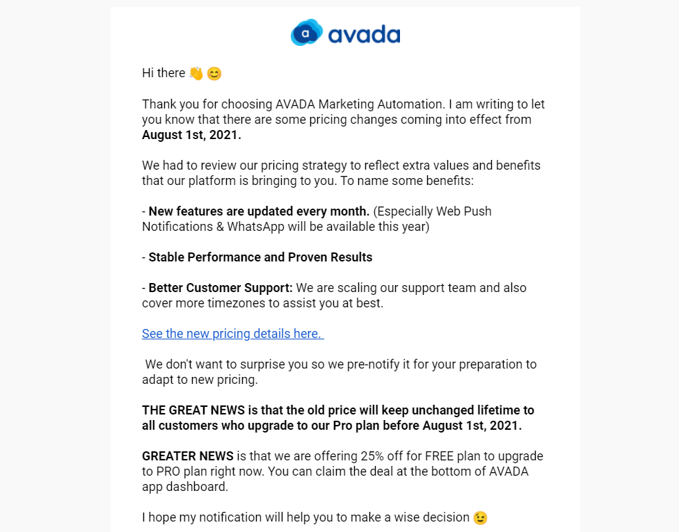
For example, if you are a business like AVADA Commerce, your newsletter informs customers of the latest pricing plans and gives them a sneak peek at new unique features.
If you are a content site, your newsletter includes an enticing headline for each new article to get recipients to click over to your site and read more.
As long as you offer content that your customers find useful, you can leverage email newsletters to your brand fresh in their minds.
Actually, the purpose of an email newsletter will depend on your business. You can use it to:
- Drive sales through featured products and coupons
- Connect with customers through useful tips and information
- Even boost your social following or traffic to your website
Keep in mind that good email newsletter campaigns are tailored to your needs and the needs of your customers.
9 simple steps to design an email newsletter
In this section, let’s look at the process of designing an email newsletter, step by step.
1. Choose a goal
The goal of your newsletter varies depending on its purpose.
You may try to increase your email open or click-through rates, improve brand loyalty, increase sales, or create a channel for the flow of information.
Understanding what you want to share and what your customers want to get from your newsletter can help you decide on your layout and design.
2. Determine newsletter size and dimensions
It is recommended choosing a fixed width for your newsletter, instead of a fluid/ liquid layout. This will help you understand exactly how much space you have available to fill. Besides, it will prevent horizontal scroll bars on some devices, which pop up when you do not use the entire width of the screen.
The ideal width for your newsletter is between 550 and 600 pixels. Besides, ensure that the most important information is within the top 300 to 500 pixels. This is the size of an average “preview pane” for more email clients on a desktop computer.
3. Set up your document
You can use any graphic editor tool to create your newsletter template document. One of the most common is Adobe Photoshop, but there are a number of other similar free and paid tools for you to choose from.
Make your document bigger than your actual newsletter’s size, such as 800px (w) x 1000px (h). This creates a background frame to add a 600px-wide centered container for your header.
4. Include viewing options
When designing an email newsletter, accessibility is key.
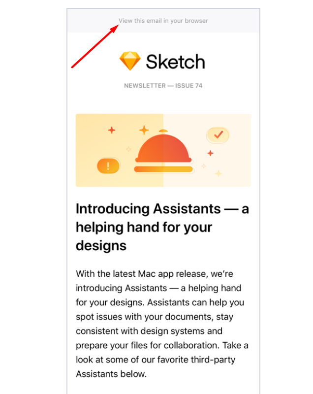
Consider including a line near the top of your template, which invites recipients to view your newsletter outside of their email client. Something simple like “View this email in your browser” can let readers know they have options to view your content in a preferable way for their needs.
5. Create your email newsletter header
The header is an essential part of your email newsletter, where you can do the most branding. Using fonts, graphics, and colors that you already use in other channels can help promote brand recognition.
Consider using elements from your website headers, like your logo or colors and fonts, and incorporate them into your email newsletter design. This will encourage continuity across all your campaigns and platforms.
6. Create the body of the newsletter
Once you have completed the header, you can create another 600px-wide container below the header for your body content.
Here, you will likely include information from your blog or website about recently released posts, upcoming products or events, coupon codes, or any other information to share with your target audience.
7. Add social links
Near the bottom of your email newsletter, you can add a place for social media links and other options to share your content. Consider creating a button that includes a CTA (call to action) like “Share this newsletter with friends!”
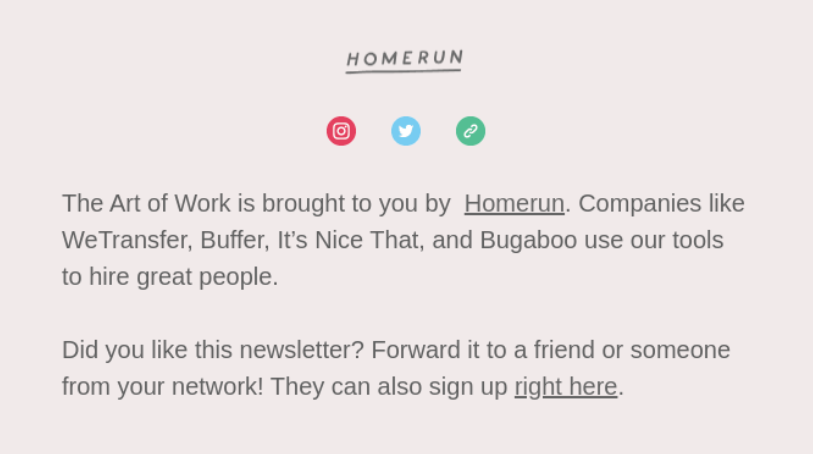
This gives your subscribers an option to forward your content to others, as well as lets you track this kind of information for your metrics. Besides, you can create a section for your social media icons and handles to motivate people to connect with you on other platforms.
8. Include a footer
The footer often goes below your CTA button and social media links. It aims to hold additional information that is expected in an email newsletter.
You can add a “Contact Us” link that leads to the contact information on your website. Also, you should add an unsubscribe link so readers can opt-out of communications if they want.
9. Review your final product
Once you have finished your design, look back and review each section. Check for misspellings, typos, unintended changes in color scheme, and any other mistakes.
This will save you a lot of time from having to go back in and adjust after testing before sending it out to your subscriber list. Make sure to keep the design in a format that is compatible with your email marketing program for a better uploading experience.
9 tips for designing an email newsletter
In this section, we will show you 9 tips and tricks on how to design an email newsletter, as well as make it look the way you planned.
1. Stay on your brand
You should stay brand-consistent through all of your emails. This will help your subscribers easily recognize your messages among tons of others.
-
Color palette. Your newsletter should use the same color palette used for the rest of your branding. Consistency is key. While it might be quite tempting to jazz up your newsletter with splashes of color, it’s ideal to stay tried and true to your brand’s colors.
-
Branded imagery. Adding branded imagery to your email newsletter is a helpful strategy to stay on-brand while reminding your reader who you are. A header or email signature with an image of yourself or your logo is the easiest way to jog your recipient’s memory.
2. Choose an appropriate font
Your font choice is essential for your email newsletter design.
A legible font prevents people from clicking off your newsletter and keeps them reading for longer.
Let’s look at 2 examples to illustrate the impact a clear font has on readability.
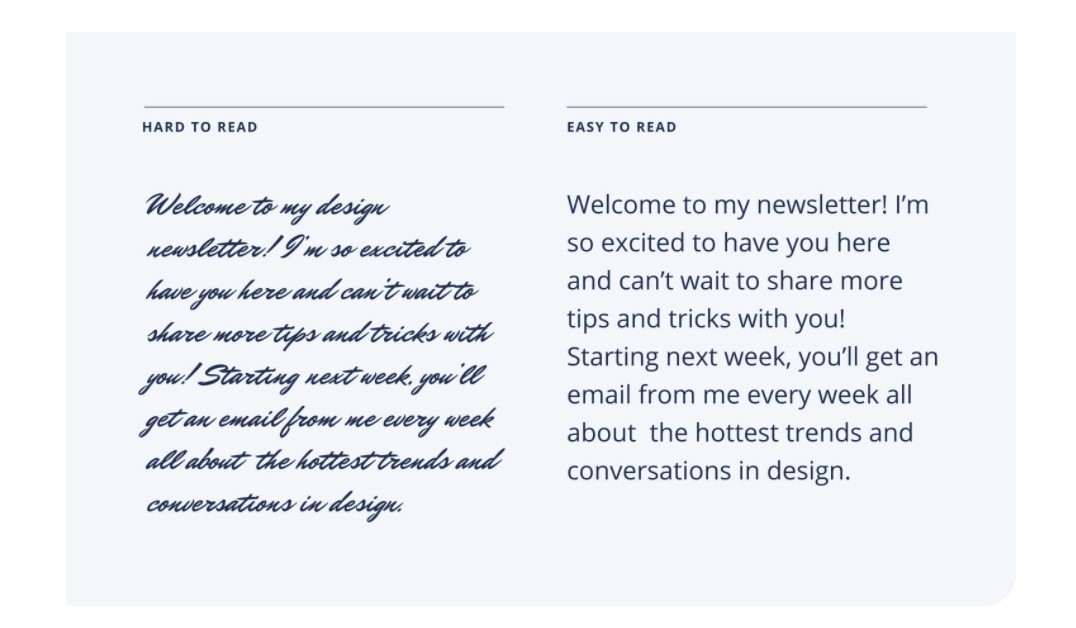
You should also consider sticking to web-safe fonts for your email newsletter. Web-safe fonts are often pre-installed by most devices; thus, you can be confident that your audience can view your email newsletter precisely how you designed it.
Some standard web-safe fonts include:
- Arial
- Verdana
- Times New Roman
Read more:
3. Pay attention to your email size
The preferable HTML email size is often 100 KB for Gmail and Yahoo. That’s why all email clients “scale” their newsletters before sending them to your contact list.
What makes HTML files big?
The 3 biggest factors are:
- Fonts and styles you apply to your email newsletter
- Interactive elements embedded into HTML code
- Their quantity
Therefore, ensure you pay attention to the total size of your newsletter, as it should be 1 MB or less. It is also strongly recommended that you compress images for your newsletter. This way, your images will not lose in quality.
Also, if your newsletter takes longer than 2 seconds to download, it will probably be deleted. After all, you need to respect your subscribers’ time, and slow emails are one of the biggest offenders.
4. Use interactive elements
One of the hottest trends recently is interactive elements. Those elements can be image carousels, embedded videos, games, surveys, and search buttons. They can enliven your emails, grab readers’ attention, as well as get them more involved in your email newsletters.
But do these emails get through spam filters?
As a general rule, Gmail blocks emails containing <iframe> elements, and some email clients and mobile devices aren’t technically capable of transferring and displaying them. As a consequence, you need to set a fallback to these elements.
For instance, rather than embed videos, you can insert links to them, and many marketers add a preview image to it. Alternatively, instead of using image carousels to display your products, consider inserting a GIF where the items’ snippets will interchange. So, don’t be afraid to put your bold ideas into action, as you may set a fallback for all the email elements you are unsure about.
5. Emphasize your CTA
You should give close and thoughtful attention to your CTA.
After all, it is the driving force behind your website traffic, sales, and promotion of your products or services within your newsletters.
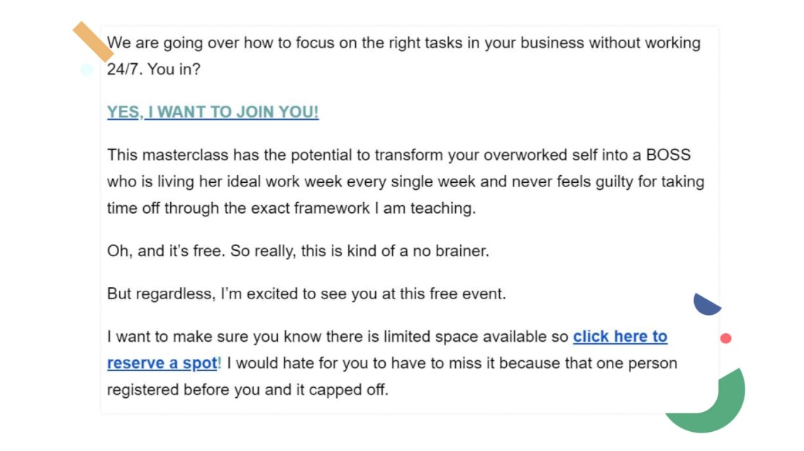
To have your readers engage with your CTA, you should place it within your content near your email’s top and bottom.
If you place only one CTA near the bottom, you may lose people who don’t read your newsletter in its entirety. Let’s see an example from A Branch of Holly. The brand creator has added the CTA multiple times in her newsletter, so readers can sign up for her masterclass easily.
6. Divide your newsletter into short paragraphs
Never underestimate the power of white space.
White space can make your content much easier to read and digest. And when your content is much easier to read, more of it is actually read.
Have a look at the email newsletter from Carly.
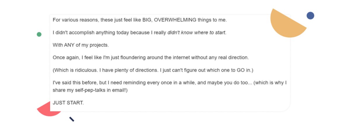
You can see that short paragraphs are much easier to read and digest than chunky blocks of text!
7. Optimize for mobile devices
Most people have their email accounts linked to their mobile phones to check their messages from anywhere.
Consider how your email newsletter looks on various mobile devices. Single-column newsletters often work better because they do not require a horizontal scroll bar.
Optimizing for mobile devices can help you receive more conversions from people that only check their emails on their phones.
Related topic: 11 Best Mobile Email Marketing Practices
8. Keep the unsubscribe link visible
Unsubscribers are inevitable and beneficial. When someone unsubscribes, they make room for others who are engaged and excited to receive your email newsletters.
Instead of trying to disguise and hide the unsubscribe link, keep it right in the open!
Actually, some email marketing laws require you to include an unsubscribe link, so this part is not negotiable. Unsubscribe links generally appear at the bottom of the email newsletter, along with your physical address.
9. Test your newsletter
After completing your email newsletter design, you have one last task before hitting the “Send” button.
It is a good practice to test your email newsletter on different devices. Testing will ensure your newsletter looks great regardless of the device your subscriber uses to read it.
9 high-converting email newsletter templates
If you want something for inspiration, this section is for you! We’ve compiled 9 high-converting email newsletter templates, so let’s explore now!
1. Welcome event email newsletter
Before you send an email newsletter to new subscribers, we would recommend sending a customized welcome email.
This type of email reportedly has an 86% higher open rate than the standard newsletter email, so it’s essential to set the tone and build a relationship that will hopefully lead to a sale.
This welcome email from AVADA Commerce is short and sweet.
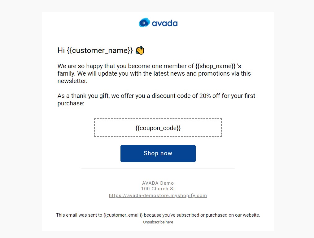
AVADA Commerce offers 5 workflow templates to welcome new subscribers, even combining emails and SMS to reach out and show gratitude towards your subscribers in the best way possible. But you can start with the most straightforward way by welcoming your subscribers with one email template.
This makes sense, especially if you deliver a well-written welcome email while your brand name is still bouncing around in subscribers’ heads. This will ensure that recipients have a good first impression of your company right from the start. Be sure you have a good onboarding email strategy as well to extend beyond your welcome email.
More welcome email templates are right here.
2. E-commerce newsletter
This E-commerce email newsletter template from AVADA Commerce provides a simple, clean design for spotlighting your products.
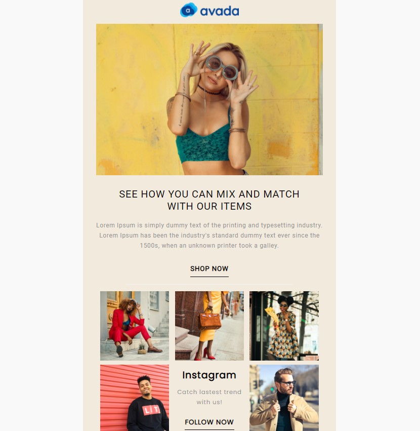
It gives you a hero image box front and center in order to feature your product, as well as supporting boxes to add complementary products or links to other relevant blog posts.
Curious about other E-commerce email newsletter templates on AVADA? Click here for free!
3. Product launch newsletter
To say that Cotton Bureau used a bold font on this email newsletter may be putting it lightly. This is a bold font that you can’t ignore when it lands in your inbox, especially in the header.
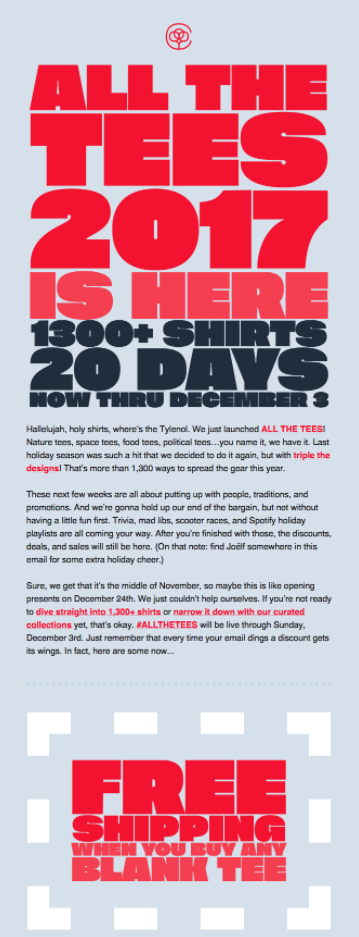
The email header uses this font to bring you into the message, but we think the best use of it lies in the “Free Shipping” offer. This is actually an easy hack to put the recipient in the right state of mind before they read all the other information. Now they know that they’ll be getting free shipping before even looking at the shirts or reading more about the company.
4. Holiday newsletter
Each holiday only comes around once per year, meaning you need to do your best to capitalize on the moment.
These holiday-focused email newsletters will help you do that by capturing the feeling of the day with particular colors and themes. Give them a try to make sure your subscribers know this is not their typical weekly or monthly newsletter - it is a special holiday promo.
Let’s have a look at this Halloween email newsletter.
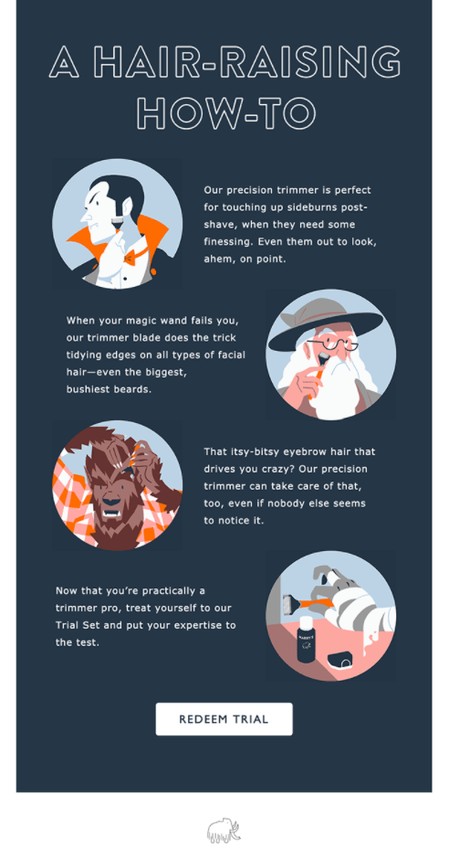
Embrace the holiday spirit with a newsletter template that is the right balance between Halloween nerd and customer-centric. With this holiday template, you can spotlight your annual deals or even have fun by mentioning spooky-good recipes and Halloween events.
5. Monthly email newsletter
If an email newsletter every day or week seems too much for both you and your audience, slow your cadence down to once per month.
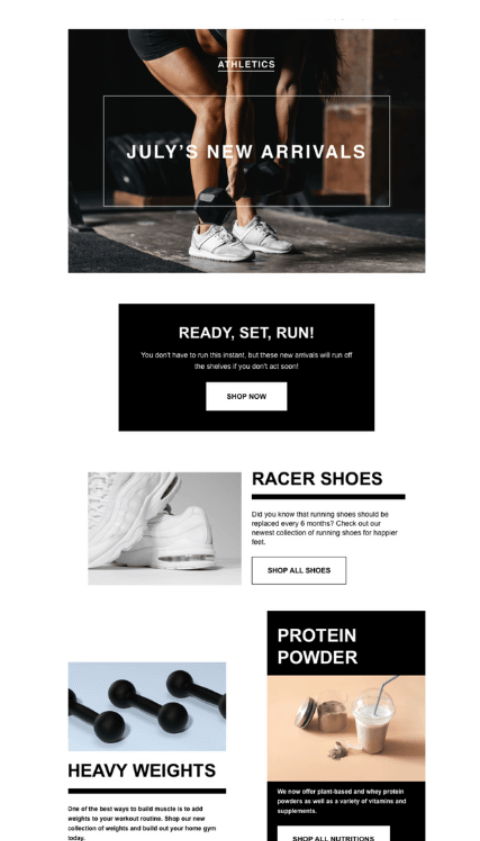
This monthly email newsletter template uses an interesting collection of different-sized squares to feature content in a collage-like style. You can swap out the black and white backgrounds for something more on-brand.
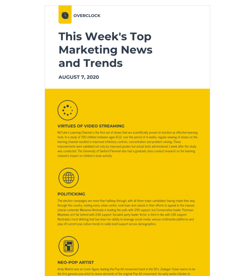
6. Industry news email newsletter
You need to know one thing: Don’t make your recipients work to get the information they need. Instead, you should use designs to highlight your key points.
Icons are an excellent way to illustrate information as well as emphasize points in your newsletter. By placing an icon beside your headers, you can attract readers’ eyes, like the example below.
7. Nonprofit newsletter
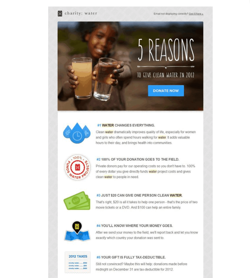
Nonprofit and charity organizations are all about people and humanity. However, it can be challenging to engage donors, convince them to donate, and keep them coming back to your cause.
Nonprofit email newsletters are essential to get compelling visuals and stories in front of them to keep them engaged. This is a great example of a nonprofit email newsletter. In this case, Charity Water uses a simple list infographic design to make key points straightforward and easy to read.
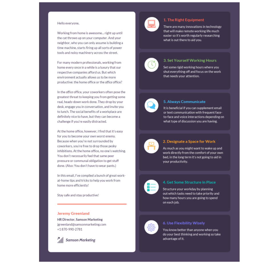
8. Remote working guide newsletter
Keep your staff up to date with your remote work expectations, or any other company updates, news, and guidelines.
Studies show that you can add up to 59% more growth in revenue per employee, and excellent communication is vital to getting there. Using an email newsletter to keep your employees in the loop is a simple yet effective tactic.
9. Event newsletter
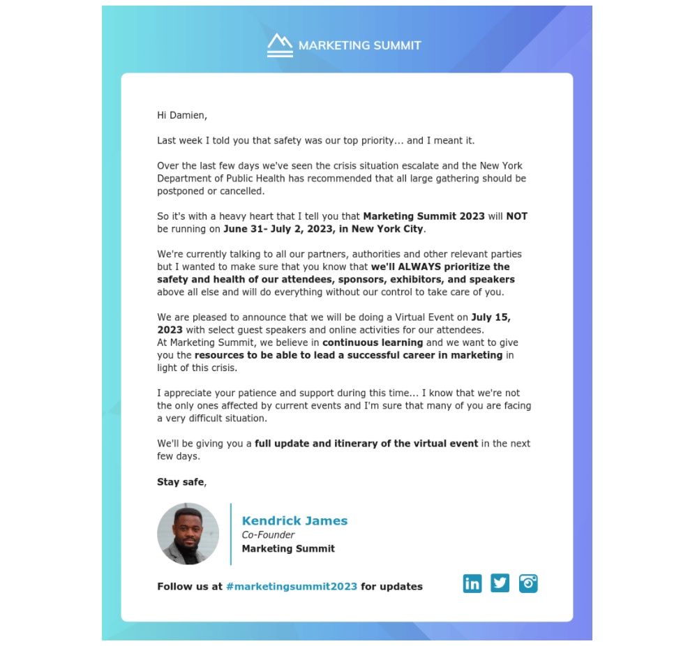
Recently, many events have been organized online due to the COVID-19 pandemic. Virtual events often work differently than in-person events in terms of communication. Many people don’t clear their schedule for it so that they will have a lot of impulsive joiners or last-minute absentees.
Consider tailoring your email communications accordingly. Ramp up your message 48 hours before the start time, along with reminders of key speakers and “how to join” information.
The bottom line
That’s it for the ultimate guide of designing an email newsletter!
Well, we know it is a bit long, but we hope you will find it helpful for your business. You can use our table of contents to jump into any section that interests you most. Thanks for reading, and don’t forget that we are always here to help you with email marketing!
New Posts
