10 Best Easy-to-read Fonts That You Must Try On Your Website
Key Takeaways
- Selecting the right fonts contributes to readability, ensuring your audience’s content is easily consumed and understood.
- The choice of font style on your website can have a powerful psychological influence on your site’s visitors.
- Making informed font choices helps align your website with your brand’s identity and create a cohesive and visually appealing online presence.
No matter how persuasive the vocabulary is, no one can comprehend what you are trying to say if the prose is unreadable. The concept applies for handwritten letters and doctor’s notes and fonts used in paper papers or online web sites. Although no font can force your reader to agree with you, you can follow a few simple rules to guarantee that your reader or audience can read your letter. This article will point out the reasons why you need an easy-to-read font for your website and 15 fonts for you to choose from.
10 Best Fonts To Select For Your Website
1. Roboto
Link Download: Roboto Font Download
Features
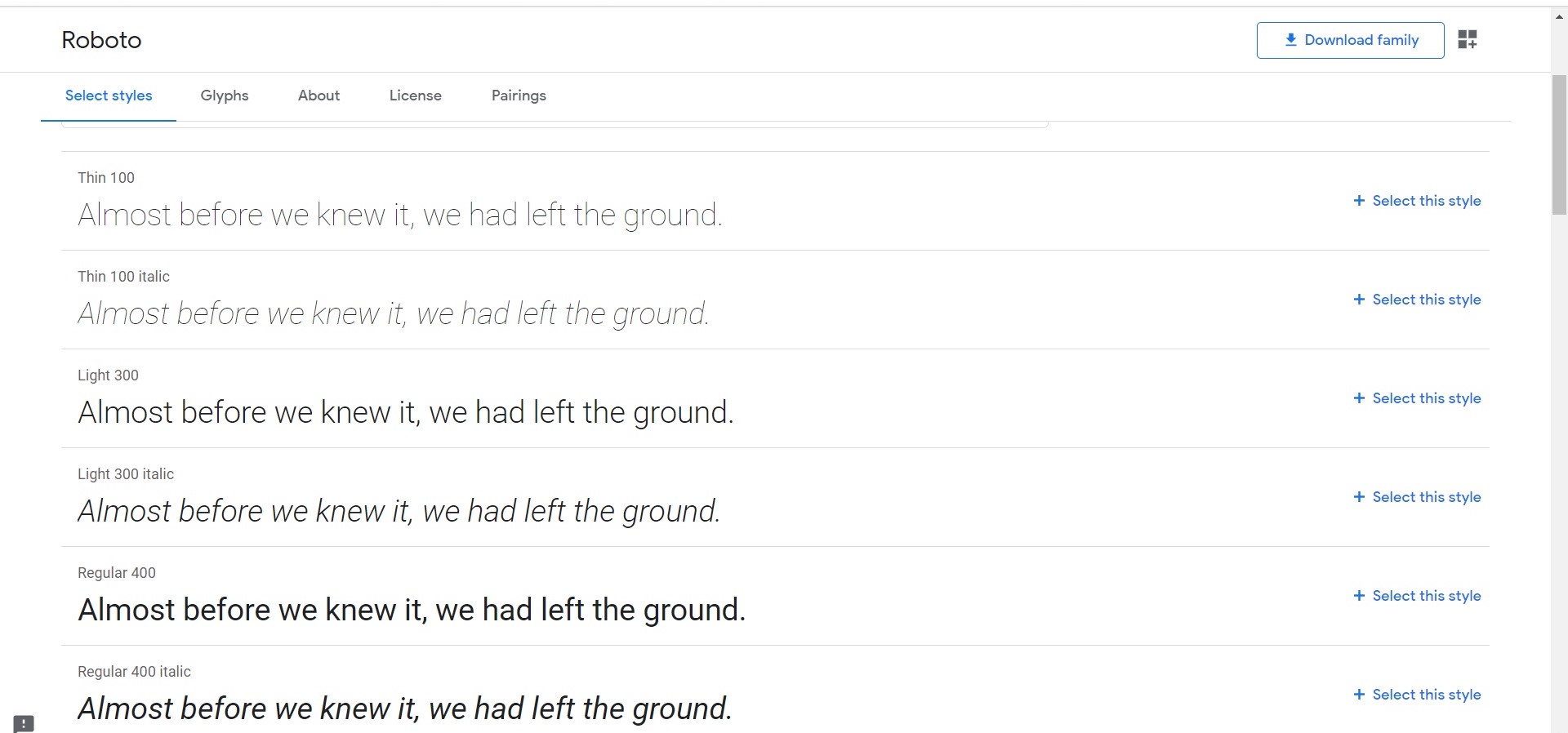
Roboto is a versatile and widely used sans-serif typeface designed by Christian Robertson. Its unique dual existence combines a mechanical skeleton with geometric shapes. This balance is achieved by blending precise, angular lines and open, friendly curves. Roboto stands out by maintaining a sense of structure while offering a humanistic touch, making it suitable for various design applications.
Pros
- Clarity: Roboto’s geometric design and consistent letterforms make it exceptionally clear and legible, both in print and on screens. This clarity is instrumental in conveying information effectively.
- Versatility: This font is highly versatile, offering various weights (Thin, Light, Regular, Medium, Bold, and Black) and styles (Regular, Italic) to suit different design needs. Whether you’re creating a website, poster, or document, Roboto has a style that fits.
- Modern Aesthetic: Roboto’s clean, contemporary appearance gives design projects a modern and professional touch. It’s popular for websites, mobile apps, and other digital interfaces.
- Readability: The font’s open curves and balanced letter spacing contribute to comfortable and relaxed reading, making it an excellent choice for long-form text in print or on screens.
- Free and Widely Available: Roboto is open-source and free font available for personal and commercial use. This accessibility has contributed to its widespread adoption.
Cons
- Ubiquity: While Roboto’s popularity is a testament to its versatility, its widespread use means that it may not always stand out or provide a unique identity to a design. Designers seeking something more distinctive might explore less common typefaces.
- Limited Character Sets: Some variations of Roboto have limited character sets, which may be a limitation for projects requiring extended language support or special characters.
Who is it best for?
Roboto is an excellent choice for various design projects and audiences. It caters to those seeking a modern and clean aesthetic, making it suitable for:
- Web Designers: Roboto’s legibility on screens and multiple weights/styles make it a popular choice for web interfaces, ensuring a pleasant reading experience.
- App Developers: Its versatility and modern appearance make it a go-to font for mobile application design, contributing to a cohesive user experience.
- Graphic Designers: Roboto’s various weights and styles offer flexibility for creating logos, posters, brochures, and other print materials.
- Content Creators: Bloggers, writers, and content creators appreciate Roboto for its readability in long-form content, enhancing the user’s reading experience.
- Startups and Small Businesses: Given its open-source nature, Roboto is cost-effective for small businesses and startups looking for a polished and professional appearance.
In summary, Roboto’s geometric yet humanistic design, combined with its versatility and accessibility, make it a solid choice for a wide range of design projects and is particularly well-suited for digital applications.
2. Open Sans
Link Download: Open Sans Font Download
Features
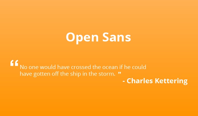
Open Sans is a versatile humanist sans-serif typeface designed by Steve Matteson, the Type Director at Ascender Corp. This font is known for its extensive character set, containing 897 characters. It encompasses the standard character sets for ISO Latin 1, Latin CE, Greek, and Cyrillic scripts, making it suitable for various languages and applications.
Key features of Open Sans include:
- Humanist Design: Open Sans follows a humanist design approach, incorporating subtle variations and organic shapes in its letterforms. This design choice adds a touch of warmth and approachability to the font.
- Neutral Appearance: The font maintains a neutral yet pleasant appearance, making it suitable for various design contexts. It doesn’t impose a strong personality, allowing it to adapt well to various visual styles.
- Upright Tension: Open Sans features upright letterforms with even stroke widths. This contributes to a balanced and harmonious appearance while maintaining readability.
- Outstanding Legibility: One of Open Sans’ strengths is its exceptional legibility, both in print and digital formats. This makes it a reliable choice for conveying information.
- Versatility: Open Sans was designed with many applications in mind, including print, online, and smartphone interfaces. Its readability and comprehensive character set make it a versatile font for various communication needs.
Pros
- Multilingual Support: Open Sans’s extensive character set ensures excellent support for multiple languages and writing systems, making it a valuable asset for international projects.
- Readability: Its humanist design and balanced letterforms contribute to outstanding legibility, even in small text sizes, making it ideal for digital and print media body text.
- Web-Friendly: Open Sans is a popular choice for web design due to its clarity and easy readability on screens of all sizes.
- Accessibility: Its neutral appearance and high legibility make Open Sans an accessible choice for documents, websites, and apps, ensuring content is easily digestible for a broad audience.
- Print and Digital Use: Open Sans is suitable for various design projects, including corporate branding, editorial design, signage, and more, thanks to its versatility and clarity.
Cons
- Lack of Distinctiveness: Some designers may find Open Sans a safe but somewhat generic choice, lacking the unique personality of more specialized fonts.
- Overuse: Open Sans is widely used due to its popularity, which can lead to a lack of visual distinctiveness if not combined with other design elements.
Who is it best for?
Open Sans is ideal for various design projects and audiences, particularly those seeking a balanced and highly readable font. It is well-suited for:
- Web Designers: Open Sans’s legibility and web-friendly design make it a preferred font for websites, ensuring a pleasant reading experience for online users.
- Graphic Designers: Its versatility suits various design applications, from corporate branding to magazine layouts.
- Content Creators: Bloggers, writers, and content creators benefit from Open Sans’s readability, ensuring their written content is easily accessible and engaging.
- Multilingual Projects: Open Sans’s extensive character support is invaluable for multiple language projects, making it a practical choice for international businesses and organizations.
- UI/UX Designers: Its clarity and neutral appearance make Open Sans an excellent choice for user interfaces and app design, enhancing user interaction and understanding.
In conclusion, Open Sans’s extensive character set, readability, and versatile design make it a reliable choice for various design projects, especially those requiring multilingual support and exceptional legibility.
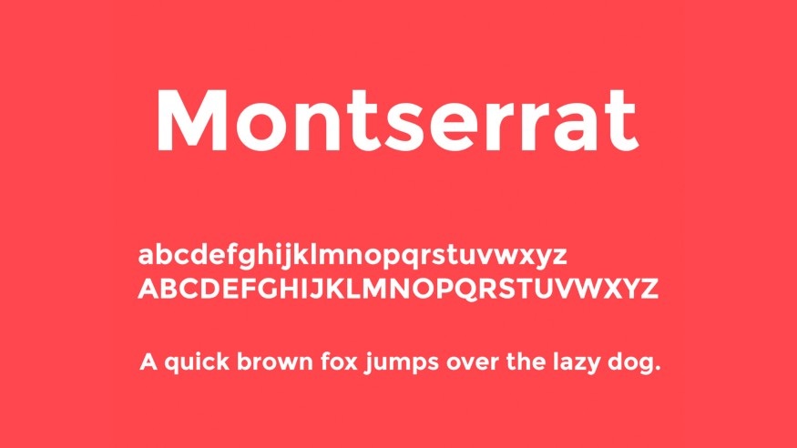
3. Montserrat
Link Download: Montserrat Font Download
Features
Montserrat is a typeface designed by Julieta Ulanovsky, inspired by the vintage posters and signage found in Buenos Aires’ traditional Montserrat neighborhood. The font seeks to capture the unique charm of urban typography from the early 20th century, which is gradually disappearing due to modern urban development.
Montserrat represents a blend of work, commitment, care, color, contrast, light, and life, all elements that characterized the typography of that era.
Key features of Montserrat include:
- Urban Aesthetic: Montserrat’s design is rooted in the historical typography of Buenos Aires, reflecting the character and charm of the Montserrat neighborhood.
- Multiple Styles: Montserrat offers various styles, including the normal family, Alternates, and Subrayada. The Alternates family introduces special letterforms, while Subrayada incorporates a unique underlined style integrated into the letterforms.
- SIL Open Font License: Montserrat is released under the SIL Open Font License, making it freely available for personal and commercial use.
- Easy Readability: Montserrat is designed for easy readability, especially on screen displays. Its clear letterforms make it suitable for a wide range of design applications.
Pros
- Historical Charm: Montserrat’s design pays homage to the historic urban typography of Buenos Aires, making it an excellent choice for projects aiming to evoke a sense of nostalgia or classic aesthetics.
- Versatility: With its various styles, Montserrat is suitable for a range of design projects, from posters and signage to digital interfaces and branding.
- Free License: The SIL Open Font License allows users to download and use Montserrat for free, even in commercial projects, making it a cost-effective choice.
- Readability: Montserrat’s readability, particularly on screens, ensures that content is easily accessible to a broad audience.
Cons
- Limited Character Sets: While Montserrat is suitable for many Latin-based languages, its character set may be limited for projects requiring extensive multilingual support.
- Niche Appeal: Montserrat’s distinct historical charm may not be suitable for every design project, particularly those seeking a more modern or minimalist aesthetic.
Who is it best for?
Montserrat is an ideal choice for designers and projects seeking to capture the nostalgia and charm of vintage urban typography. It is well-suited for:
- Graphic Designers: Montserrat’s historical aesthetic makes it a valuable asset for creating posters, signage, and branding materials with a classic touch.
- Web Designers: Its screen readability and diverse styles make Montserrat suitable for websites, blogs, and digital interfaces.
- Content Creators: Writers, bloggers, and content creators can use Montserrat to add a unique visual element to their text, enhancing the overall reading experience.
- Nostalgia Projects: Projects aiming to evoke a sense of nostalgia or pay tribute to the past can benefit from Montserrat’s historical charm.
- Cost-Conscious Users: Montserrat’s free licensing makes it a budget-friendly choice for designers and businesses looking to save on font expenses.
In summary, Montserrat’s homage to the typography of Buenos Aires’ Montserrat neighborhood, along with its versatile styles and readability, makes it a compelling choice for designers seeking to infuse a touch of vintage charm into their projects.
4. Lato

Link Download: Lato Font Download
Features
Lato is a sans-serif typeface family created by Łukasz Dziedzic, a designer based in Warsaw, Poland. “Lato” is Polish for “Summer,” reflecting the font’s warm and friendly characteristics. Lato was initially developed in the summer of 2010 and was later released under the Free Font License in December 2010 through the collaboration of its foundry, Poland, and Google.
Critical features of Lato include:
- Ease of Readability: Lato is known for its high legibility, making it a reliable choice for various design projects, from body text to headlines.
- Consistent Design: Lato offers a constant and harmonious design across various weights and styles, ensuring a cohesive look within a project.
-
Classic Proportions: The font incorporates classical proportions, especially noticeable in uppercase letters, to provide a sense of familiarity and elegance.
- Semi-Rounded Letterforms: Lato’s semi-rounded letterforms add a touch of warmth to the font’s overall appearance, making it inviting and approachable.
- Versatility: Lato’s versatility allows it to be used in small and large sizes, adapting well to various design needs.
Pros
- Readability: Lato’s high legibility is one of its standout features, making it an excellent choice for body text in print and digital media.
- Consistency: The consistent design across different weights and styles ensures a cohesive and professional look in design projects.
- Elegance: Lato’s classical proportions and clean lines add an element of elegance, making it suitable for a wide range of applications, including corporate branding and editorial design.
- Warmth: The semi-rounded letterforms give Lato a friendly and inviting appearance, making it approachable for readers.
- Free Font License: Lato is available under a free font license, making it accessible for both personal and commercial use without additional costs.
Cons
- Limited Distinctiveness: While Lato is a versatile and reliable choice, it may lack more specialized fonts’ distinctive character or unique style.
- Less Suitable for Highly Creative Projects: Lato’s classic and neutral design may not be the best fit for projects that require highly creative or experimental typography.
Who is it best for?
Lato is an excellent choice for various design projects and audiences, particularly those seeking a clean, readable, versatile font. It is well-suited for:
- Graphic Designers: Lato’s versatility and consistent design make it a valuable asset for creating logos, brochures, posters, and other print materials.
- Web Designers: Its screen readability and various weights and styles make Lato popular for websites, blogs, and digital interfaces.
- Content Creators: Writers, bloggers, and content creators benefit from Lato’s legibility and warm appearance, enhancing the reading experience.
- Corporate Branding: Lato’s elegance and professionalism make it suitable for corporate branding, ensuring a polished and cohesive visual identity.
- Budget-Conscious Users: Lato’s free font license makes it a cost-effective choice for designers and businesses looking to save on font expenses.
In summary, Lato’s readability, consistency, and versatility, along with its warm and elegant design, make it a dependable choice for many design projects, especially those prioritizing readability and professionalism.
5. Georgia

Link Download: Georgia Font Download
Features
Georgia is a classic serif typeface originally designed by Matthew Carter in 1993. The font was proposed to Microsoft by Tom Rickner. It was created specifically to provide a serif font that would maintain its elegance and legibility even on low-resolution screens. Georgia draws inspiration from 19th-century Scotch Roman typefaces and is based on the same model that Carter worked on when Microsoft approached him. It was initially slated for release under the name “Miller.”
Key features of Georgia include:
- Serif Design: Georgia features traditional serifs with small decorative strokes at the end of characters. These serifs contribute to its classic and timeless appearance.
- High Legibility: Designed with legibility in mind, Georgia ensures that text remains clear and readable, even in challenging conditions like low-resolution screens.
- Elegance: The font embodies elegance and sophistication, making it suitable for various formal and professional contexts.
- Inspired by Scotch Roman: Georgia’s design is influenced by 19th-century Scotch Roman typefaces, known for their sturdy, legible, and timeless characteristics.
Pros
- Legibility: Georgia’s high legibility, particularly on screens, is one of its most significant advantages. It makes reading content effortless, even at smaller font sizes.
- Classic Appeal: The serif design and inspiration from Scotch Roman typefaces give Georgia a classic and timeless appearance, making it appropriate for formal documents and printed materials.
- Screen-Friendly: Georgia was explicitly designed for screen readability, making it an excellent choice for web design and digital content.
- Versatility: While initially designed for screens, Georgia is versatile enough to be used in print, ensuring a consistent visual identity across different media.
Cons
- Limited Distinctiveness: Georgia’s classic design may not stand out or provide a unique identity compared to more distinctive typefaces, especially for creative or branding-focused projects.
- Not Ideal for Creative Design: If you’re looking for a font with a modern, edgy, or creative aesthetic, Georgia’s traditional serif design may not be the best choice.
Who is it best for?
Georgia is an excellent choice for various design projects, especially those requiring readability, formality, and a touch of classic elegance. It is well-suited for
- Web Designers: Georgia’s screen-friendly design and legibility make it a popular choice for website text, ensuring a pleasant reading experience for online users.
- Content Creators: Bloggers, writers, and content creators benefit from Georgia’s readability, enhancing the overall reading experience for their audience.
- Print Materials: Georgia can be used in print materials such as business reports, resumes, and formal documents, conveying a sense of professionalism and elegance.
- Academic Documents: Its legibility and classic appearance make Georgia suitable for academic papers, research documents, and scholarly publications.
- Classic and Traditional Projects: Projects that evoke a sense of tradition, history, or formality can benefit from Georgia’s classic serif design.
Georgia’s combination of classic elegance and screen-friendly legibility makes it a reliable choice for many design projects, particularly those emphasizing readability and a timeless aesthetic.
6. Oswald
Link Download: Oswald Font Download
Features
Oswald is a bold and attention-grabbing sans-serif typeface with a distinct geometric design. Vernon Adams created it, initially released in 2011 as part of the Google Fonts project. Oswald’s design is influenced by the style of the early 20th century, mainly the lettering found on posters and signs during that era. Critical features of Oswald include:
- Geometric Construction: Oswald’s letterforms are constructed with geometric precision, featuring clean lines, sharp angles, and even stroke widths. This gives it a modern and bold appearance.
- Variety of Weights: Oswald comes in multiple weights, including Regular, Light, and Bold, providing versatility for different design applications.
- Uppercase Dominance: The uppercase letters in Oswald are particularly distinctive and dominant, making it an excellent choice for headings and display text.
- High Contrast: The contrast between thick and thin strokes in the characters adds to Oswald’s visual appeal and readability, especially in larger sizes.
Pros
- Bold and Modern: Oswald’s bold design makes it stand out and suitable for creating impactful headlines and titles.
- Readability: Despite its boldness, Oswald maintains good legibility, making it versatile for both print and digital use.
- Variety of Weights: The availability of different weights allows designers to use Oswald in various design contexts, from bold headings to lighter subheadings or body text.
- Free License: Oswald is available under an open-source license, making it accessible for both personal and commercial use at no cost.
- Contemporary Appeal: The geometric construction and high contrast give Oswald a contemporary and stylish look, making it a popular choice for modern design projects.
Cons
- Limited Styles: While Oswald offers multiple weights, it is primarily a display typeface and may not be as suitable for extended body text in smaller sizes.
- Not Suitable for Every Project: Oswald’s bold and dominant appearance may not be appropriate for all design projects, especially those requiring a more subdued or traditional typeface.
Who is it best for?
Oswald best suits designers and projects looking to make a bold and modern statement. It is well-suited for:
- Graphic Designers: Oswald’s boldness and various weights make it an excellent choice for creating attention-grabbing logos, posters, banners, and promotional materials.
- Web Designers: Oswald is famous for web headings and titles due to its readability and contemporary appearance, making websites visually appealing.
- Advertising and Marketing: Designers working on advertising campaigns can use Oswald to create impactful and memorable headlines that capture the viewer’s attention.
- Modern and Stylish Brands: Businesses and brands aiming to convey a contemporary and stylish image can use Oswald in their branding materials, such as logos and marketing collateral.
- Editorial Design: Oswald can be used effectively in editorial design for magazine covers, feature articles, and other design elements that require a bold and modern typeface.
In summary, Oswald’s bold and geometric design and various weights make it an ideal choice for projects and designs requiring a modern, impactful, and visually striking typeface.
7. Literata
Link Download: Literata Font Download
Features
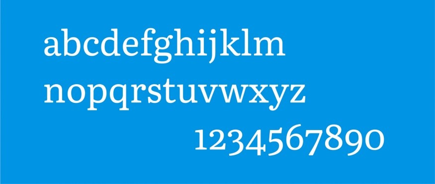
Literata is a typeface designed by Type Together, created explicitly for Google Play. It was developed to establish a graphic identity for Google Play and became the default font for its digital books in May 2015. Literata is primarily designed for digital display, making it an excellent choice for readability on websites and screens. The font draws inspiration from two distinct sources: Scotch Roman 2 and Humanes.
Key features of Literata include:
- Digital Readability: Literata is optimized for on-screen readability, ensuring that text remains clear and legible when viewed on various digital devices, including e-readers and websites.
- Influences from Scotch Roman and Humanes: The font combines elements from Scotch Roman, known for its classic and sturdy design, and Humanes, which adds a touch of warmth and humanistic character to the typeface.
- Versatile Styles: Literata offers a range of styles, including Regular, Italic, Bold, and Bold Italic, providing versatility for different design contexts.
- Serif Design: Literata features serifs, which are small decorative strokes at the ends of characters. These serifs contribute to its classic and timeless appearance.
Pros
- Digital Readability: Literata’s primary strength is its readability on digital screens, making it an excellent choice for websites, e-books, and other digital content.
- Hybrid Design: By combining Scotch Roman and Humane’s elements, Literata balances classic elegance and humanistic warmth, appealing to a broad audience.
- Variety of Styles: The availability of Regular, Italic, Bold, and Bold Italic styles allows designers to use Literata effectively for both body text and headings.
- Google’s Endorsement: Choosing as the default font for Google Play’s digital books is a testament to Literata’s readability and suitability for digital content.
Cons
- Limited Print Application: While Literata excels in digital applications, it may not be the first choice for print projects that require a more traditional or distinctive typeface.
- Less Versatile for Creative Designs: Literata’s classic and structured design may not be suitable for projects that demand highly creative or experimental typography.
Who is it best for?
Literata is best suited for designers and projects focused on digital content, particularly those that prioritize readability and a balance between classic and humanistic design elements. It is well-suited for:
- Web Designers: Literata’s readability on screens and various styles make it an excellent choice for web content, ensuring a comfortable reading experience for online users.
- E-Book Publishers: For e-books and digital publications, Literata is a reliable choice to maintain text clarity and legibility, enhancing the reader’s experience.
- Content Creators: Bloggers, writers, and content creators can benefit from Literata’s readability and classic design, ensuring their written content is accessible and engaging.
- Digital Advertising: Designers creating digital ad campaigns can use Literata for headlines and body text, delivering clear and professional messaging.
- Educational Materials: Literata’s readability and classic appeal make it suitable for educational materials presented on digital platforms.
Literata’s focus on digital readability, hybrid design, and Google’s endorsement make it a strong choice for digital content, particularly for websites and e-books, where readability is paramount.
8. Playfair Display
Link Download: Playfair Display Font Download
Features
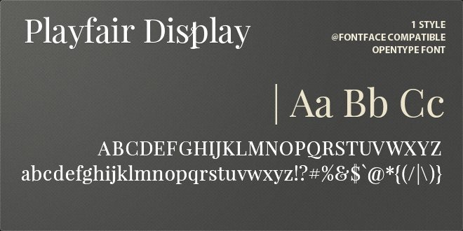
Playfair Display is a typeface that falls under the transitional style category. It takes inspiration from the significant shifts in writing instruments and typographic technology during the European Enlightenment in the late 18th century. During this period, pointed steel pens replaced broad nib quills, and advancements in printing technology allowed for producing high-contrast letterforms with delicate hairlines.
Moreover, Playfair Display embodies the characteristics of this era, featuring elegant and high-contrast letterforms. While it is not a direct revival of any specific design, it draws influence from John Baskerville’s designs and the ‘Scotch Roman’ typefaces.
Key features of Playfair Display include:
- Transitional Style: Playfair Display is characterized by its high contrast between thick and thin strokes, as well as its graceful, delicate hairlines, which are hallmarks of the transitional style.
- Influence from John Baskerville: The font design is influenced by the work of John Baskerville, a prominent typographer of the 18th century known for his innovations in typeface design and printing.
- Versatility: Playfair Display is suitable for various design applications, especially at larger sizes, where its elegance and details can shine.
- Small Caps and Ligatures: The font family includes small caps and various ligatures, offering additional typographic flexibility.
Pros
- Elegance: Playfair Display’s high contrast and delicate hairlines lend it an elegant and timeless appearance, making it a suitable choice for projects that require a touch of sophistication.
- Versatility: While it excels in larger headings and titles, Playfair Display can also be used effectively in smaller sizes for body text when paired with complementary typefaces like Georgia.
- Influence from Typography History: The font’s connection to John Baskerville and transitional typefaces adds a sense of historical significance and authenticity to design projects.
- Small Caps and Ligatures: The availability of small caps and ligatures enhances typographic creativity and sophistication in various design contexts.
Cons
- Not Ideal for Screen Use: Playfair Display’s delicate details and high contrast make it less suitable for use on low-resolution screens and in small sizes, where readability may be compromised.
- Limited to Certain Styles: Its elegant and traditional design may not be the best fit for every design project, particularly for those seeking a more modern or edgy aesthetic.
Who is it best for?
Playfair Display is best suited for designers and projects that evoke a sense of historical elegance and sophistication. It is well-suited for:
- Editorial Design: Playfair Display shines in editorial design, such as magazine layouts, book covers, and feature articles, where its high contrast and elegance can enhance visual appeal.
- Branding and Identity: Businesses and brands aiming for a classic and refined image can use Playfair Display in their logos, packaging, and marketing materials.
- Wedding Invitations: The font’s elegance makes it a popular choice for wedding invitations and stationery, adding a touch of sophistication to the design.
- Historical or Classical Projects: Projects related to history, literature, or classical themes can benefit from Playfair Display’s connection to typography history.
- Typography Enthusiasts: Designers and typographers interested in exploring transitional typefaces and historical influences in typography can use Playfair Display to create visually appealing and authentic designs.
In summary, Playfair Display’s elegance and historical influence make it a valuable asset for projects requiring sophistication and connection to typography’s rich history.
9. Karla

Link Download: Karla Font Download
Features
Karla is a versatile, grotesque typeface family with Latin and Tamil script languages. The Latin script portion of the family features Roman and Italic styles in two weights: Regular and Bold. Karla is designed to be a highly legible font, making it well-suited for extended reading. Its design incorporates smooth curves, which contribute to a comfortable reading experience.
Key features of Karla include:
- Versatile Styles: Karla offers both Roman and Italic styles and two weights (Regular and Bold), providing a range of options for various design applications.
- Dual Language Support: Karla supports the Latin and Tamil scripts, making it a valuable font choice for multilingual projects and diverse audiences.
- Legibility: The font’s design prioritizes legibility, especially for extended text, making it suitable for body text and readability on screens and in print.
- Smooth Curves: Karla’s letterforms incorporate smooth curves, creating a visually comfortable reading experience.
Pros
- Multilingual Support: Karla’s ability to support Latin and Tamil scripts makes it versatile for projects requiring text in multiple languages.
- Legibility: The font’s emphasis on legibility ensures that content remains clear and readable, making it a reliable choice for body text in various design contexts.
- Variety of Styles: With both Regular and Bold weights, as well as Roman and Italic styles, Karla can be used effectively for a wide range of design projects, from editorial layouts to web design.
- Readability: The smooth curves in Karla’s design contribute to a comfortable reading experience, reducing visual strain during extended reading.
Cons
- Limited Distinctiveness: While Karla is a versatile and legible typeface, it may not offer the unique or distinctive character in more specialized fonts.
- Not Ideal for Display: While suitable for body text and readability, Karla’s design may not be as attention-grabbing for display or headline use compared to more stylized fonts.
Who is it best for?
Karla is best suited for various design projects and audiences, especially those focused on readability and multilingual support. It is well-suited for:
- Web Designers: Karla’s legibility on screens, versatility, and multilingual support make it a practical choice for websites and digital interfaces, particularly for content-heavy websites.
- Graphic Designers: Karla can be used effectively in graphic design projects such as brochures, magazines, and posters, where readability is essential.
- Content Creators: Writers, bloggers, and content creators can benefit from Karla’s readability, ensuring their written content is easily accessible and engaging to readers.
- Multilingual Projects: Karla’s support for Latin and Tamil scripts is valuable for projects targeting diverse audiences.
- Editorial Design: Its legibility and smooth curves make Karla suitable for editorial design, including book layouts, newspapers, and magazines.
In summary, Karla’s versatility, multilingual support, and emphasis on legibility make it a dependable choice for various design projects, particularly those requiring readability and support for multiple languages.
10. Rubik
Link Download: Rubik Font Download
Features
Rubik is a modern and versatile sans-serif typeface designed by Philipp Hubert and Sebastian Fischer. It was created as part of the Google Fonts project and is known for its clean and geometric design. Rubik offers a contemporary appearance with a touch of playfulness. Some key features of the Rubik font include:
- Geometric Design: Rubik’s letterforms are constructed with precision, featuring geometric shapes and even stroke widths. This gives it a modern and balanced look.
- Variety of Styles: The Rubik font family includes various styles, including Regular, Italic, Bold, and Bold Italic, providing flexibility for different design needs.
- Distinctive Characters: Rubik’s letterforms have unique characteristics, such as the rounded corners on some characters and the playful curves on others, giving it a friendly and approachable feel.
- High Readability: The font is designed for readability, making it suitable for both digital and print applications, including body text and headings.
Pros
- Versatility: Rubik’s clean and modern design, along with the availability of various styles, makes it suitable for a wide range of design projects, from web design to branding.
- Readability: The font’s legibility ensures that content remains clear and accessible to readers, making it an excellent choice for body text, headings, and user interfaces.
- Unique Character: Rubik’s distinct letterforms add a touch of personality and creativity to design projects, making them stand out.
- Multiple Weights and Styles: The availability of different weights and styles allows designers to create visual hierarchy and emphasis in their designs.
- Free Font: Rubik is available for free through the Google Fonts project, making it accessible for both personal and commercial use without additional costs.
Cons
- Not Ideal for Every Project: While versatile, Rubik’s design may not be suitable for projects that require a highly traditional or formal typeface.
- Limited Distinctiveness: In some cases, Rubik’s design may not stand out as much as more unique or decorative fonts, depending on the design context.
Who is it best for?
Rubik is well-suited for a wide range of design projects and audiences, especially those seeking a clean, modern, and readable typeface with a touch of creativity. It is a good choice for:
- Web Designers: Rubik’s readability and versatility make it a practical choice for websites, blogs, and digital interfaces, ensuring a pleasant user experience.
- Graphic Designers: Rubik can be used effectively in graphic design projects, including logos, posters, brochures, and branding materials, where a modern and distinctive font is needed.
- Content Creators: Writers, bloggers, and content creators can use Rubik’s to enhance their written content’s readability and visual appeal.
- Corporate Branding: Businesses looking for a modern and approachable typeface for their branding materials, including logos and marketing collateral, can consider Rubik.
- User Interface (UI) Designers: Rubik’s clear letterforms and multiple styles make it suitable for designing user interfaces for apps, websites, and software.
Rubik’s versatility, readability, and distinctive design elements make it a valuable asset for designers and projects prioritizing modernity, readability, and creativity.
Related posts:
- The Best Fonts For Email Marketing
- How to Change Font on Checkout Page in Shopify
- How to Add Fonts to Shopify Theme
How to Choose a Font For Your Website?
Selecting the right font for your website is a crucial design decision that can significantly impact user experience and the overall perception of your brand. Here’s a step-by-step guide on choosing a font that aligns with your brand, caters to your audience, and enhances readability:
1. Start With Your Brand:
Brand Personality: Begin by understanding your brand’s personality and values. What image do you want to convey? Is your brand formal, playful, modern, or traditional? Target Audience: Consider your target audience. Who are they, and what are their preferences? Your font choice should resonate with your audience’s expectations.
2. Pick Fonts for Your Readers:
Balance Personal Taste: While it’s essential to align your font choice with your brand, also consider your readers’ preferences. Balance your personal design preferences with the needs and preferences of your audience.
Audience Demographics: Ask questions about your audience, such as age group, gender, profession, and income level. This information will help you select a font that appeals to them.
3. Consider Readability:
Prioritize Readability: While aesthetics matter, readability is paramount. Choose a font that is easy to read, especially for longer text blocks. Avoid overly stylized or complex fonts that hinder comprehension.
Test for Readability: Assess your font choices for readability in various sizes, styles (italic, bold), and weights (thickness of lines). Ensure that characters, numbers, and punctuation are clear.
4. Put Your Font Through Its Paces:
Examine Variations: Test your chosen font in different sizes, cases (uppercase and lowercase), styles (italicized), and weights (thin to bold). Pay attention to the overall appearance of each character.
Check for Details: Look closely at individual characters and symbols, ensuring they align with your design preferences and brand identity.
5. Explore Font Pairing and Hierarchy:
Pairing Fonts: Consider using more than one font on your website. Pair fonts that complement each other in weight, style, color, and size. Ensure they create visual harmony without overpowering each other.
Hierarchy: Establish a font hierarchy to organize your content. Use larger, bold fonts for headings and more negligible, softer fonts for body text. This hierarchy guides users’ attention to important information.
6. Use Web Safe Fonts:
Web Safe Fonts: Opt for web-safe fonts that are universally installed across all devices. This ensures faster loading speeds for your website, enhancing user experience and benefiting your website’s SEO rankings.
What is font’s readability & legibility?
There are two key terms you need to fully understand before choosing typography. It might involve readability and legibility. Why do you need to know it while you can randomly decide whatever you like? It can be understood base on the psychological fields. You like it but it does not mean everyone does. So an easy to read font should satisfy both of the factors above.
Font’s Readability
Readability refers to how on a written page or webpage, you set out your chosen font. By selecting a legible font and then organizing the font in a readable manner, you can make the words easy to read. For starters, all the techniques used to make fonts readable are white space between letters and lines and paragraph breaks and photographs or offset quotations. Choose fonts that suit the intent, which should be transparent, sans-serif, light typeface, open-counter fonts when it comes to conveying details or text-heavy messages.
Researchers discovered that the spacing between characters played a significant role in whether or not readers thought that a font was easy to read in a study published in ‘Behavior and Information Technology, Volume 21, in 2002. To ensure its readability, use fonts with generous x-heights like Tahoma and Verdana and sufficient space between letters like Georgia. Compare them in the style tester software if you are trying to determine between various fonts for readability.
Font’s Legibility
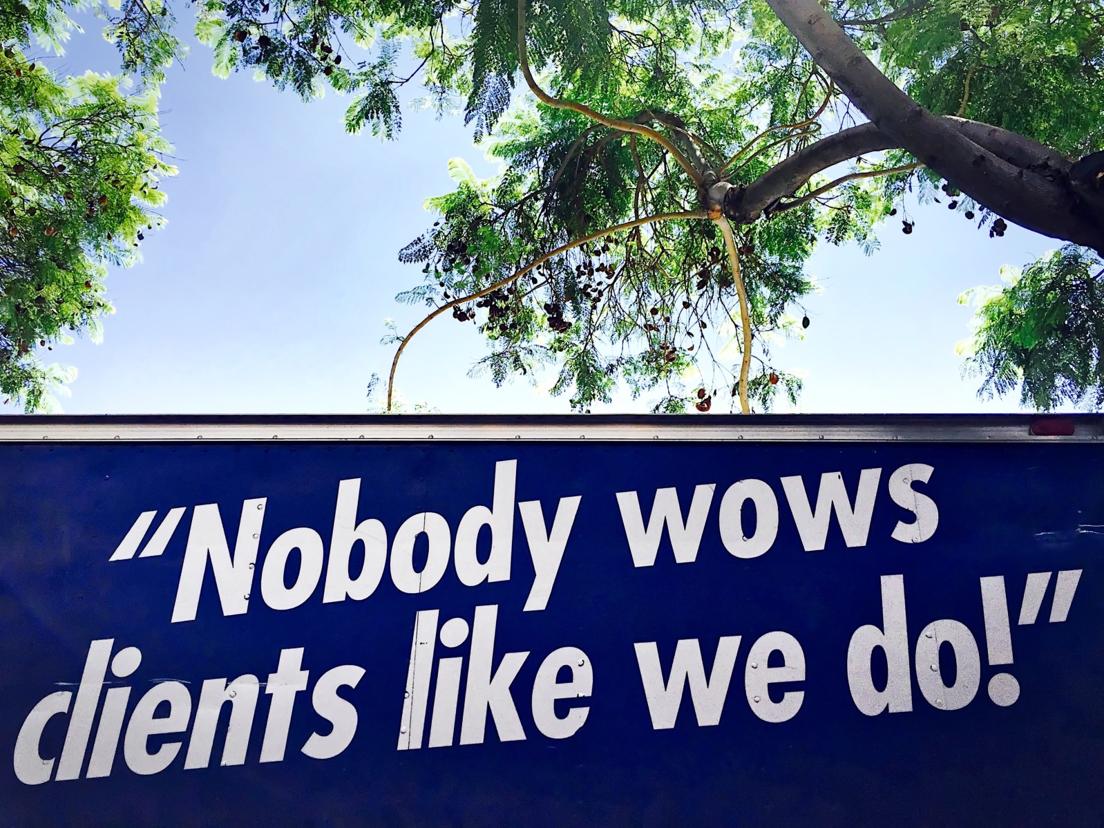
Legibility extends to the style of a given font. Style brings a font personality, character and lets it stand out. The composition of a font enables mood and sentiment to be expressed such that it interacts with the letters selected to shift your reader to action or response. Generally speaking, the more form a font has, the more legible it is.
Legible fonts do not draw attention to themselves; they become opaque to the viewer so that the viewer only reflects on the words spelled by the letters and does not stop to understand the actual letters’ look and sound. Legible fonts are not bright or bold in abundance and have little or no serifs on them. In deciding legibility, researchers found that font size was important. For legibility, Scale 14 in sans serif fonts such as Arial and Courier and serif fonts, such as Comic and Times were nice fonts.
Why should you choose easy to read fonts?
1. 90 percent of the Template Fonts Account for Website Fonts
Since a substantial majority of the material available is in written format. The text is the largest percentage of the website’s majority. The supporting function is provided by other components, such as hue, history, site layout. In other words, your target buyers come to your site to read the text, not to see the template of your website. So an easy to read font should be chosen and the viewers will find more comfortable spending time on your website.
Therefore, it is of particular significance to spend ample time learning the history and values of font design, which sort of message a font should send to your goals. Different fonts express diverse emotions to visitors to your site. Just as easily as website colors and graphics, the website font will provide the viewers with a hint of your business culture.
If you have decided, depending on the brand character, for the proper font such as aesthetic font or sans-serif font, some tasks appear to become less of a hassle.
2. Your Font Preference Defines the Brand’s Cognition
This is a fact that most seasoned developers and advertisers alike recognize. It’s better said than done, alas. There are a lot of advertisers who are well aware of the message of their brand, what they want in their fonts. However, they are not willing to collaborate with the designers to pick the best font for their website.
For e.g, if you’re working for a charitable agency like Oxfam, it may not be the best idea to use a romantic font like a calligraphy font or a quirky font like a meme font. Likewise, Times New Roman will make things look very dull if you’re creating a website for a retro fashion brand. What if you receive a bank statement that uses a fancy and playful font? You’re not too likely to take their company seriously, no matter how good the interest rate this bank gives you.
Each font has its own distinctive character that can be created years away from its history. Font designers inject the font they make with those meanings. This suggests that when a website designer chooses a font, a certain type of emotion is elicited.
The Serif font family, for instance, is considered more conservative, a natural match for well-established brands with a rich history. In the other hand, Sans-serif appears to reflect friendliness. So maybe it can be used in the hospitality industry with products.
Both advertisers and programmers should be well aligned with the role of website design. In order to get a unified view on what they want their font to bring to their target audience, these two classes of people should collaborate closely with each other. However, the final goal must be easy to read fonts and suitable for the site.
3. User interface increases readability
There are moments where readers only have to get closer to the windows to decipher those very tiny messages. This means that font selection will have a negative or positive effect on the user interface. If the font is too little, the readers will be switched off, and they will leave the web earlier than they want. An easy to read font will contribute to the depletion of the company’s selling opportunities.
Many designers really love the challenge of selecting the correct pictures from stock image sources while creating a website and/or working with a talented photographer to get the right images for their blog. These activities are, indeed, give the designers an enjoyable experience.
However, choosing the correct font for your site is just as critical and should not be overlooked. In certain other instances, it’s even more critical. It is important to ensure that the chosen font is readable regardless of how small it needs to become on your web. Designers also have to go through multiple stages of training to be able to do this.
4. The right choice of font will help you grow your company
User experience is strongly linked to prospects for business. If your readers feel relaxed reading the material on your website, they will remain longer than scheduled on your site. This, in turn, allows you to establish faith with your guests (especially the new ones). Like a domino effect, the confidence will lead to greater market prospects, which will then equal profits.
For instance, your client is considering moving from conventional, commercial skincare products to natural or organic skincare products. A few thousand results were submitted to her by the search tools. She selected and searched a few pages for their content. Those websites that supplied her with entertaining content written in a premium, consistent font will grab your eye and then hold it.
The explanation is that you, like many others, have no idea who to trust in this sense of a cluttered market of many so-called “organic” skincare commodity vendors and retailers. In this particular case, and many other similar cases, the website font plays an incredibly important role in the development of your company, or at least the ability to develop in a highly competitive industry.
Read more:
Conclusion
In conclusion, choosing a font for your website should take time so that you can find out which is the best for you. Not only it is easy to read font for you but it must be for everyone. Moreover, the interface of the website and the message of the brand would come from the text - the main content of the web, so we hope that this article will provide you some recommendations so you can find out the best.
FAQs
The answer is either yes or no. If you're obtaining your font from sources like Google Fonts, there's no need to fret because those fonts come with licenses that cover personal and commercial usage. However, you might have to select the appropriate license or acquire a separate commercial license on other websites.
A personal font license grants you the right to use the font for personal purposes and on private projects. But if you plan to use the font to generate income, such as designing cards or tote bags, then you'll require a commercial license.
New Posts

