11 Email Design Best Practices for Marketers
Building a successful email marketing campaign is quite straightforward. Once you’ve secured an email marketing platform, collect email addresses, put together your internal process, and lock down good content, and you’re ready to go.
Right? Not really!
You can’t overlook a seemingly simple but essential part of the process: email design.
A fast-loading, properly-designed website can affect everything from your SEO to sales. Similarly, a clean, well-conceived email design can affect whether recipients continue to your site to buy your products (or perform your desired call to action), or bounce altogether.
In this guide, we’ll cover the 11 best email design practices, and we hope you will find them useful. Let’s get going!
What is email design?
Email design refers to the process of strategically designing and creating an email, which resonates with your brand’s target audience, specifically your current email subscribers and customers.

Email recipients usually scan information and abandon emails that don’t offer value to them or simply appear to be too dense. Having great email design is critical - it’ll help you capture the attention and engagement of your email recipients.
Why does email design matter a lot?
Think about the last email you’ve received from a business. How long did it take you to read the email?
Most people spend an estimated 15 secs reading an email. If your message is not well-designed, it could take less than a minute for it to go straight in the trash bin. But a well-designed email could entice a new subscriber in those same 15 secs.
Design can facilitate your ability in order to build your brand and express it clearly and effectively to your recipients. For instance, studies show that if you plug video content into your emails, you can boost your conversion rate by up to 300%.
Email design best practices can combine the knowledge of good graphic design with the technology of digital marketing. It goes beyond simply making sure that your text is legible and your layout is inviting. Let’s explore how to implement email design in our next section!
11 Email design best practices for marketers
1. Start right from your envelope content
First impressions often count for a lot in the world of marketing, and your emails are no exception.
You can spend all the time crafting compelling email copy, but if your envelope content can’t hit the mark, it’s unlikely that your target audience will click through. Your envelope content consists of 3 key elements: sender name, subject line, and preheader.
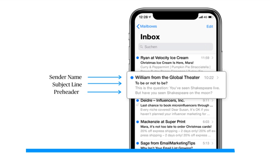
Sender name
The main goal of the sender name email field is to inform the recipient of who the message came from. However, that’s not all. This field also has the power to reinforce your subject line and preheader, thus increasing your email open rates.
Your sender name needs to be recognizable, reliable, and it absolutely cannot be deceptive. Provided that your recipients have positive experiences with your business, they will be more prone to open messages with your sender name next to it.
So, what should you put in your sender name? Below are some of the popular patterns you could follow (with examples):
- [Name of your company] - AVADA Commerce
- [Name of the person] from [Name of your company] - Haley from AVADA Commerce
- [Name of your company] [Name of the message/ topic] - AVADA Commerce Newsletter
- [Name of the department] at [Name of your company] - Content at AVADA Commerce
- [Name of your company] Team/ Community/ Crew - AVADA Commerce Team
- [Name of the employee] - Haley Tran
Subject line
Just like a good movie trailer, your email subject lines need to be interesting, engaging and provide enough information in order to convince your recipients to open up your email. As email inboxes tend to be hectic places, it won’t hurt if your email subject line also stands out in some way.
Below are some of the elements you can use in your email subject lines in order to make them more visible:
- Personalization (i.e., your recipient’s name)
- Numbers
- Emojis
- Questions
- Puns
- Idioms
- Terms related to your brand
At the same time, it’s better to avoid the following:
- Writing your subject lines in all caps
- Using excessive punctuation
- Using phrases commonly associated with spam (i.e., “Buy Now,” “$,” “Free gift,” etc.)
- Deceiving or tricking recipients into opening your emails
If you add too many characters in your email subject line, it may get truncated in some of the email mailbox providers. Therefore, to make sure your message comes across, you will want to keep your subject lines relatively short (below 60 characters).
Related posts:
- How to Write Best Subject Lines for Open Rates
- The Ultimate Guide for Email Subject Line Testing
- 101 Killing Email Headlines Examples
Preheader
Finally, we’ve got the preheader text, which is the short snippet of text that immediately follows the subject line when you view an email in an inbox.
You can think of the preheader as the extension of your email subject line. It’s your additional chance to offer more value or something else interesting that you couldn’t fit into your email subject line.
The best approach here is to create these two elements in a pair so that the preheader can build upon and enhance your subject line. For example:
Subject line: It’s now or never!
Preheader: Only 5 hours left on these Halloween deals!
One more thing to keep in mind is that it may be difficult to estimate how much your preheader will be shown in the email client. It depends on the email client itself, the device your recipient is using, and the length of your subject line. So, make sure your most important message is placed at the very beginning of your preheader.
2. Keep your email on-brand
When your recipients open your message, they should know that the email was sent from your business. That means your email should be branded.
In order to keep your email on-brand, consider following these tactics:
-
Use a tone in your emails that can complement your other content and marketing materials (like your website and social media channels)
-
Incorporate the same fonts and colors that you use in your other branding and marketing materials
-
Include your brand logo, a link to your website, links to your social media accounts, and CTAs (calls-to-action) that are highly relevant to your products/ services. This is a great way to increase your brand awareness while also boost conversions
Related topics:
3. Think about your layout
No one wants to read a cluttered and unorganized email, as this makes recipients feel overwhelmed and can lead to increased abandonment. Your email layout should help your recipients consume your message with ease and in the right order.
There are some popular email layouts you are likely going to use:
One-column
As its name suggests, all your email content is placed within a single column, one after another. Actually, this is a simple, mobile-first approach that ensures all your information will render perfectly on mobile devices as well as other larger screens. It is also great for focusing audiences’ attention on the places you’d like them to look at.
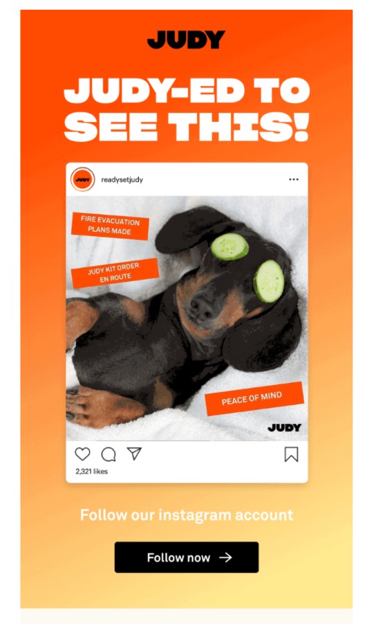
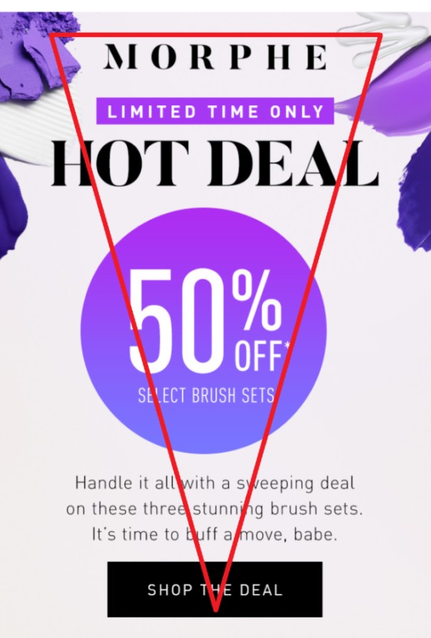
Inverted pyramid
This framework makes it even easier to drive the focus and clicks in the areas you want your recipient to be. By placing your wider content (often the header or a banner) at the top and slimmer content at the bottom (your CTA), the audience’s eyes are automatically taken to the place directly tied to your conversions.
Zig-zag
This interesting layout takes your viewers’ eyes from one side of the screen to the other back and forth as you scroll down the message. It can be an attractive option if you show off your products then follow them with a description and CTA leading to your product page.
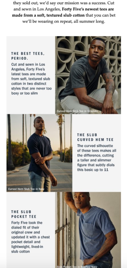
However, there is a small caveat with this layout. If each element in your message is a separate block (like a product image or description), and it goes from left to right, and then from right to left, this order on mobile devices may not be ideal.
Your description or CTA will sometimes precede the image, which may be confusing for your audience.
Two-column
This layout is often used by brands that heavily focus on using imagery in their emails. Generally, it includes a wide, single-column header at the top - featuring the main offer or product - and then several blocks underneath split into two columns.
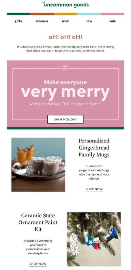
It’s actually kind of a mix between the one-column and zig-zag layout. Because of that, it consists of some of the pros and cons of these layouts.
Whichever layout you opt for, your content should be arranged to tell a story that guides your reader toward the action you want them to take.
Additionally, it’s better to pay attention to:
-
Email width. If you want to ensure that your emails look good on most devices, it’s recommended to keep your email template width at 600px (max 640px).
-
Email length. There are no obvious guidelines as to how long your emails should be. Some prefer to design their emails so that they are short and sweet, directly leading to their website. Others would love to convey as much information as possible, and then let the email do the talking. So, it’ll depend on your business purpose.
-
Spacing and padding. All of the elements in your email need to fit together, but there also needs to be some “breathing air” between them. By that, we mean whitespace. Whitespace makes reading and clicking through your emails much easier and more intuitive. In fact, there is no specific number as to what the appropriate spacing or padding should be. You need to test this yourself and determine what looks good in your opinion.
4. Pay attention to your images
Great images always matter in all aspects of marketing, including emails.
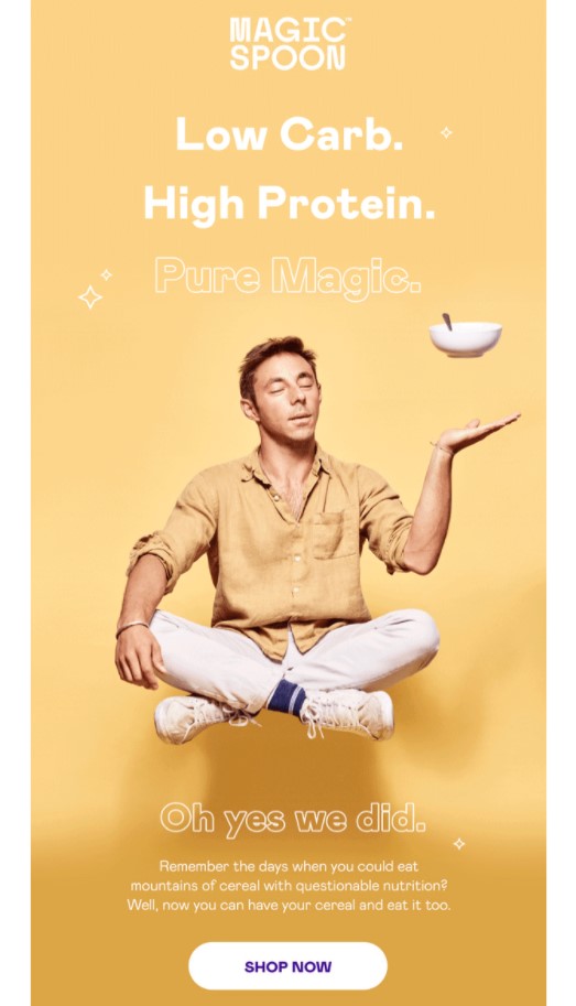
Typically, recipients may quickly scroll past text - but they will stop for a compelling image. But what makes an email image engaging?
High resolution
First, your images should be clear and high-resolution, but not so big that it takes a long time to download. Shoot for around 1MB in size and not larger than 5MB.
If your images are too big, they could take a long time for your audience to load, or even worse, they could send your emails to the SPAM folder. But if they are too small, they will look pixelated and your email seems unprofessional.
Stock or custom-made images
When it comes to choosing between stock or custom-made images, there is no right or wrong way to go. Just make sure that the approach you choose fits your overall visual identity and helps you create the right feel for your brand.
Well-lit
Ensure that you add photos with good lighting to your emails. Paying attention to this detail helps colors pop in your images.
A really fun design trick is to use softer shades of the same colors in an image for the background in some of your content blocks. Clever design can actually pull the entire email together and make it look more professional and streamlined.
When your images are too dark, you force your recipients to spend time trying to figure out what is going on. Spoiler alert: they won’t. They might even unsubscribe instead.
Read more: How to Master Using Images on Email Marketing?
5. Keep body copy simple
When writing your emails, make your message easy to skim.
It’s much harder to write a couple of sentences than paragraphs; however, your emails will look and read better if your text is concise. Most people are not going to allocate a lot of time to digest a complicated email, even if you have a lot to share. They will appreciate a clear and straightforward message that makes sense.
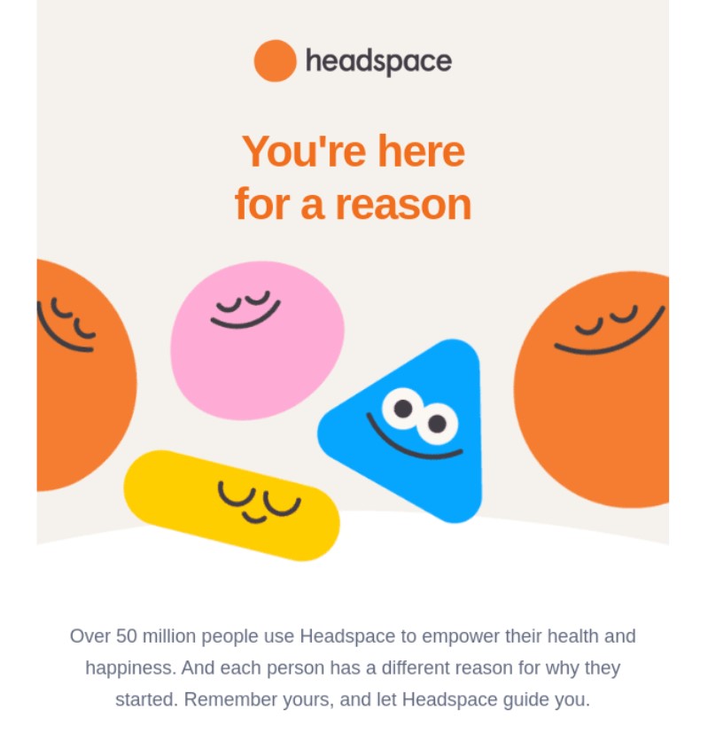
It’s much easier to read a bulleted list or short paragraphs. You will also want to avoid clichés or inside lingo that may confuse recipients. Be careful to not use slangs that may have more than one meaning. And while you are at it, double-check for any typos.
Plus, carefully check any links you add to your email. Broken links not only detract from your design and frustrate your customers, but they also give the impression that your brand is unreliable.
6. Optimize your email with CTAs
If you’d like to drive clicks in your emails, you will need to use CTAs. They serve as an arrow for the reader to follow.
The words on the CTA buttons tell them what to do next - like “Learn more” or “Buy now.” Whatever the text you apply, the idea behind it is the primary reason you’re sending the email in the first place.
To make your CTA effective, you will want it to be highly visible. Ideally, use a contrasting color and provide plenty of whitespace around your button, so that your audience can see it, while tapping on it with their thumb or finger.

It’s essential to limit the number of CTAs or links in each email. If you have ever eaten at a restaurant with a phone book-sized menu, you may know how confusing it is when presented with too many options. CTA buttons aren’t about giving the recipient a bunch of options. Rather, they should be singular and clear - asking the recipient to do one specific thing.
7. Use a responsive design
A responsive design means that your email changes format to fit the screen it’s being viewed on, whether it is on a desktop, laptop, or mobile device.
Most email clients automatically adjust layouts for mobile devices, but some still don’t. Make sure that your emails are responsive by using flexible layouts, templates, and cascading style sheet (CSS) code.
If possible, stick to a one-column layout, and never use more than three columns. Make your fonts and CTAs large, clear, and easy to click on (46 x 16 pixels is ideal for mobile-friendly CTAs). Plus, always test your emails on different email clients and devices to make sure they are rendering correctly.
8. Don’t forget the footer
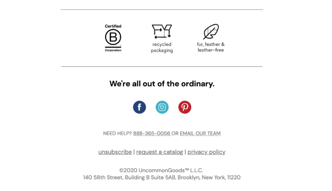
While usually overlooked, the footer is one of the most vital elements of your marketing emails.
This section provides an opportunity to include particular information that is required by legislation like the CAN-SPAM Act without messing with the overall design. Some mandatory information in the footer includes:
- Your company’s name and physical address
- An “Unsubscribe” link
- A way for your recipients to update their profiles
- Your company’s privacy policy
- Details about the service provider
Keep in mind that a classic bad move is to hide the “Unsubscribe” button. Don’t try to make the font of your “Unsubscribe” link super small or even the color blend into the background. This trick won’t work. People that aren’t interested in your products or services will unsubscribe anyway.
When you frustrate recipients this way, it’s more likely that they will report your emails as spam. Instead, consider unsubscribing as an act of kindness. In this case, more is not necessarily merrier if your email list is filled with those who have already decided not to do business with you.
Certainly, if youkle with your email footer design and then use it to build a positive brand experience and reach additional goals. For instance:
- Emphasize your unique selling proposition
- Collect feedback from your audience
- Promote your blog, podcast, or other content
- Promote a special offer visible only to the most engaged fans
- Promote your app, useful links, and phone numbers
- Show the more human side of your company
9. A/B test your design
Similar to other marketing efforts, email design is an iterative process. You might determine necessary changes and updates to get the most out of your email design.
Whether it is modifying your colors, images, layout, tone, or CTAs, don’t be afraid to A/B test email designs. By doing so, you can determine which one works best in terms of the ability to reach, resonate with, as well as convert the greatest number of recipients.
10. Design an email signature
A great email signature is another way you can establish a professional and personal feel over email. Your email signature shouldn’t just include your name - it should contain other defining and memorable characteristics about you, your company, your role, and contact information.
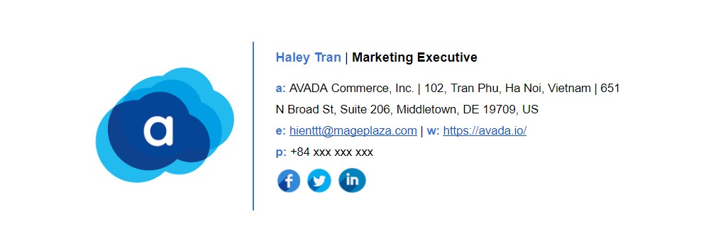
Here are several specifics you can include in your email signature:
- First and last name
- Contact information
- Job title/ role
- Company name
- Social media links (i.e., LinkedIn profile)
And here’s a guide to creating an email signature for you.
11. Don’t be afraid of using emojis
At first, emojis seem like an unnecessary or unprofessional addition to an email. While this may be a fair assumption, it is actually untrue in a number of scenarios.
In fact, studies show that adding emojis to your email subject line and/ or email copy can increase your open and click-through rates. However, remember that when using emojis for marketing purposes, ensure you know the meaning and connotation of the specific one(s) you incorporate.
The bottom line
With great email design, you can reach and resonate with your audience members more effectively, allowing you to grow better. Impactful and eye-catching emails will help you build healthy relationships and convert more people into paying customers and brand advocates.
Therefore, begin designing your emails while keeping the best practices we reviewed in mind.
New Posts


