6 Practicable Email Marketing Case Studies to Inspire You
We’d venture to say that transparency is hot right now, but not in email marketing.
Many brands show the number of their Twitter followers. They even blog about their audience growth and share their subscriber count as social proof.
However, no one talks about open, click rates, ROI, or impact on the bottom line. It seems to be taboo in the email marketing world. That makes it quite hard to find email marketing case studies.
We’d like to make it much easier for you to read stories about great email marketing campaigns, so we collected 6 practicable email marketing case studies. Below is the criteria for the case studies we compiled:
- They are real case studies, not best-practice pieces
- They include real data/ outcomes to impress you
Now, let’s explore!
6 Practicable Email Marketing Case Studies to Inspire You
1. Digital Marketer: increased open rates by 3X with subject lines
Is it possible to increase your open rates by 3X whenever you send a newsletter?
The answer is yes. Digital Marketer did.
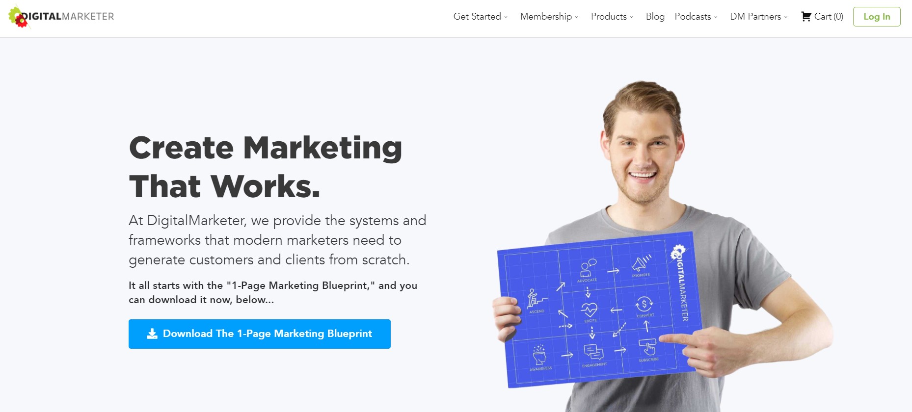
A responsive, engaging email list of customers is the only bulletproof approach to building a sustainable business. If you only concentrate on Google and organic search, you may not be able to build a sustainable business.
Digital Marketer is considered one of the leading marketing blogs out there. The company boasts of making money once their emails arrive in recipients’ inboxes. However, they don’t do this only for the money - that would just drive email subscribers away.
Instead, they engage subscribers via email, teach them how to do a specific thing (i.e., increase Facebook ad conversions) and enhance trust.
Sending millions of emails per month helps Digital Marketer understand their customers and prospects. This allows the company to segment subscribers by interest, pinpoint the exact solutions they are looking for, and deliver awesome value that these subscribers will never find elsewhere.
As a result, they got impressive results with their email marketing campaigns. Just look at their statics:
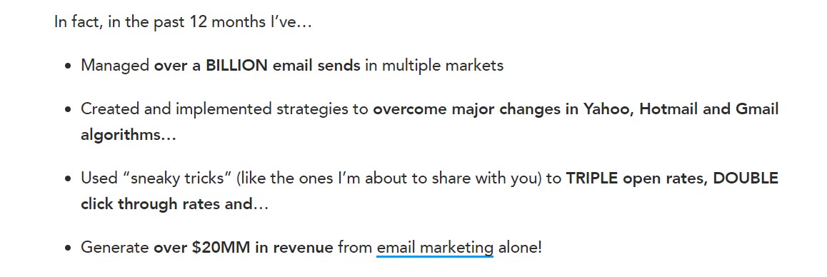
We will analyze how Digital Marketer increased its email open rates by 3X right below:
1. Use proven email subject lines
Subscribers will not open all of your marketing emails, it’s the truth. Most of your audience are also subscribed to other email lists, too.
Therefore, you have to differentiate your email subject lines from the generic ones.
According to Richard Lindney - the author of the Digital Marketer case study - their successful email subject lines fall into one of the following four categories:
- Direct or benefit-driven
- Urgency or scarcity
- Proof or credibility
- Blind or curiosity
Let’s explore each of these subject lines!
1.1. Benefit-driven email subject lines
This type has only one purpose: to directly state the benefit that the recipient will get by opening the email. For example:
- Catch these email templates…
- Start building your landing pages for $1
- 7 ways to write blog posts that convert
1.2. Urgency or scarcity-based email subject lines
If there is a need to act right now - let’s say, a discount that expires in a few hours - you may want to use this urgency subject line style.
It communicates urgency and motivates people to act immediately. If recipients fail to act now, they will miss out on something great. And people don’t want to miss out.
Actually, the fear of loss is much more powerful than the joy of gain. That’s why urgency subject lines often outperform direct or benefit-driven subject lines.
Digital Marketer recommends using urgency or scarcity-based subject lines to get more opens. Some examples include:
- You’re going to miss this?!?
- 85% off sale ends at midnight
- Final Notice [just hours left]
- Closing down soon!
Related topic: 7 Artificial Scarcity Creating Methods
1.3. Proof or credibility subject lines
We know that you have results you can share with prospects, and many people or businesses have benefited from your products and services. That’s why you should apply proof/ credibility subject lines now.
You can simply speak about other people’s success in your email subject line. Craft it in a way that will get your recipients to believe those results are possible for them, too.
This type is best written as a case study. And don’t forget that case studies are one of the 15 types of content to drive traffic, sales, and revenue for entrepreneurs.
Below are some of the proof/ credibility email subject lines that helped Digital Marketer boost their open rates by 3X:
- This guy makes 6 figures per month?
- Mom of two “makes” $10K in 4 days
- 23,234 leads in less than 30 days
1.4. Blind or curiosity-based email subject lines
These email subject lines have a magic-like ability to make people open. After all, if you hint that you hold a secret, people will want to know it.
The curiosity gap is actually a robust copywriting technique that can dazzle your audience. It has been proved to lead to a 927% increase in clicks on a pricing page (Wow!).
Some of your recipients are lazy. If they get the idea behind your email, they will delete it or otherwise move on. Thus, use these subject lines to tease your recipients. Below are some typical examples:
- Just one last thing to say…
- Check out the letter inside…
- Why he paid Facebook $30,500
- 1,356,789 free clicks from…
2. Using Unicode symbols and personalization
2.1. Unicode symbols
To make emails outstanding, Digital Marketer suggests that you use Unicode symbols - emoticons, objects, etc.
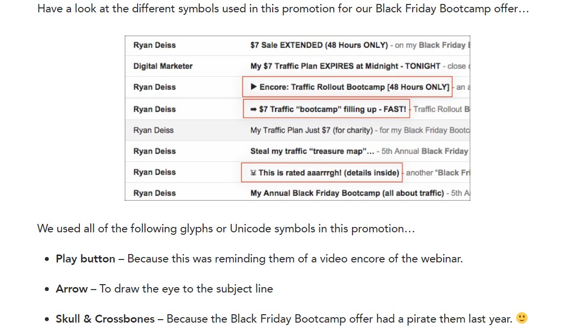
Richard says that “You should not overuse symbols in your subject lines, but don’t ignore them either.” These symbols will add flavor to your email subject line. It might look funny, but humor is one of the common reasons why content gets opened, forwarded, and shared.
2.2. Personalization
People decide to join your email list, not because they love getting emails but because they feel they can benefit from them. According to a survey, 38% of responders opt-in to an email list to receive relevant emails that can improve their lives and business.
One of the most common methods to make your emails relevant is to personalize them. Now, let’s look at these two subject lines:
“You will lose $3,000 in a week if…”
and
“John, you will lose $3,000 in a week if…”
Obviously, the personalized version with the recipient’s name “John” will outperform the generic one. For more tips on personalization, please read our Complete Guide to Personalized Email Marketing for Business.
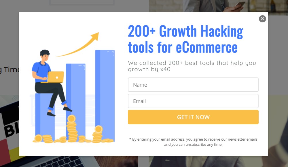
Note: To make personalization much easier, effective, and systematic, you should create opt-in forms to collect first name and email address, like AVADA Commerce does:
2. Dell: increased revenue by 109% with a GIF
Dell is faced with a unique problem.
The company was actually in the process of launching the XPS 12 Convertible Ultrabook, which is a laptop with a hinge design that enables it to transform into a tablet.
“That sounds like a cool product. What is the problem, by the way?” you may ask.
We will let David Sierk from the Email Strategy & Analytics department at Dell explain.
“No one knows what a convertible is yet. It is not synonymous with products like the tablet is now or anything along those lines.”
So, how did Dell solve this problem?
They innovated their way through the problem.
Instead of traditional email marketing tactics, Dell decided to create a GIF of the product that would complement their creative tagline, “Go from dreaming to doing in a flip.” The GIF showcased the convertible flipping from a laptop to a touchscreen tablet capable of running Windows 8.
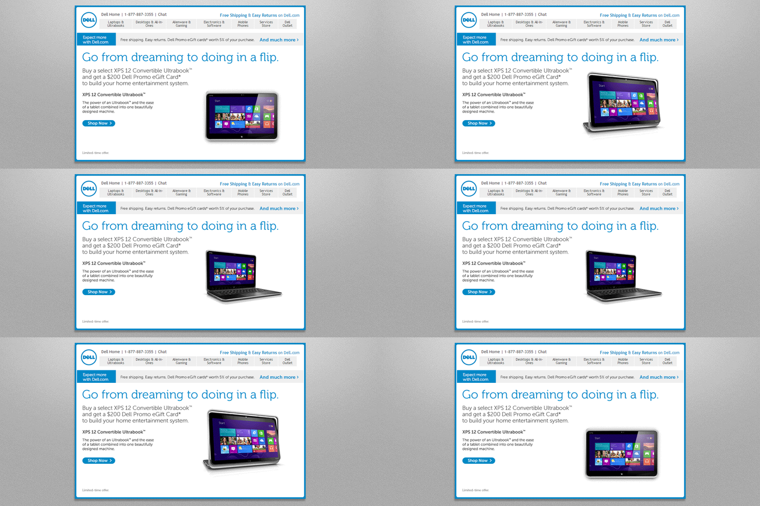
This explained to customers exactly what the convertible was, as well as how it could impact their technological lives.
Besides, the GIF was paired with high-converting email copy:
“XPS 12 Convertible Ultrabook - The power of an Ultrabook and the ease of a tablet combined into one beautifully designed machine.”
“Buy a select XPS 12 Convertible Ultrabook and get a $200 Dell Promo eGift Card to build your home entertainment system.”
The results were really spectacular.
- 6% increase in email open rate
- 42% increase in click rate
- 103% increase in conversion rate
- 109% increase in revenue
Impressive, right?
So, what can you learn from this email marketing case study?
While some of you may think that the main message behind this case study is to start using more GIFs within your email campaigns, we disagree.
We think the best thing we can learn from Dell is the power of innovation.
The marketing team of Dell knew that simple text and images would not cut it. They also understood that linking to a Youtube video or some kind of product tour would likely yield a lower conversion rate. Hence, they tried to innovate their way out of the problem by using a GIF.
Do we recommend using GIFs in your email marketing campaigns?
Yes, absolutely. They are an amazing way to quickly convey your message and entertain readers.
However, if there’s one key takeaway from Dell’s success, it is that intelligent risk and innovation can lead to significant results.
If there is a marketing tactic that you’ve been dying to use but are afraid that it’ll eat dirt, give it a shot anyway. The worst that can happen is not that bad.
And who knows, you might even realize a 109% increase in revenue yourself!!!
3. Charity Water: increased donations by $800,000
Most companies, especially non-profit organizations and charities operate their email marketing campaigns under the “set it and forget it mindset.
After a donation or transaction has concluded, donors will often be sent to a thank-you page and receive a short “Thank You” email. This email generally does nothing other than to provide the donor’s transaction details, thank them for their purchase, and perhaps try and get them in on an upsell.
While there’s nothing inherently wrong with this approach, there is a better way.
Charity Water has been crushing it in their email marketing campaign by taking an unconventional approach to their follow-up emails. Rather than follow the traditional route, Charity Water has created an email marketing campaign designed to take their donors on a journey.
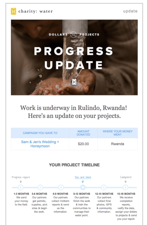
With any non-profit organization, there is a long road from the time a donation leaves the donors’ wallet to the time that the project is completed.
For starters, the donation has to be sent to partners in the field and used to source supplies, transportation, and permits for volunteers and staff. Then, projects can take from 6 to 18 months, depending on the scope and size of the work. And most non-profit organizations leave their donors out of this process completely.
But Charity Water didn’t do that.
The organization sends you regular email updates, which explain where to use your money and how much progress to be achieved on the project. They even show you photo updates from the project site, which country your donation is impacting, and regular information on progressions within the organization itself.
They make their donors a part of the story.
So, what can you learn from this email marketing case study?
Perhaps the biggest takeaway that we’ve gleaned from Charity Water’s email marketing campaign is that you need to build a sustainable relationship with your audience through regularly connecting with and updating them.
You might think this will mean increasing the frequency of sending out emails.
However, things don’t stop there.
This is not just about delivering more emails and trying to sell them new products or services. It is about building an authentic relationship with customers for life.
We know that this seems a bit mystical and woo-woo, so let us give you a practical example of using this in your business. Suppose you’re running an online fitness company and you’re promoting the “8-Week Fat Loss Challenge 2.0.”
By learning from Charity Water, you could try out the following strategy:
-
At the beginning of the week, send one email presenting a challenge to all of your recipients (i.e., most weight loss, biggest athletic improvement, best diet, etc.)
-
At the end of the week, send a follow-up email showing the challenge winner and progress pics from other participants. Plus, finish the email with a tip or trick to help them get more out of your product.
-
After they’ve completed the 8-week challenge, send regular follow-up emails asking how they’re doing and providing exclusive free content.
This strategy will generate a deeper level of engagement with your audience and build a community around your brand. And if you execute it properly, it’ll lead to an increase in open rates, easy upsells, and lifelong loyalty.
Related topic: Email Marketing for Non-profits: The Essential Guide!
4. Dropbox: created a $10 billion empire
A trend that we’ve noticed among many of the A+ players in the email marketing game is that they’re reducing their focus on fancy copy and increasing their focus on generating incredible designs.
Of course, long-form copy works great for email marketing. If you run a company built around your personality, we recommend you focus on well-written email copy.
Nevertheless, suppose your company’s success isn’t contingent on your consumers buying into you as a brand leader. In that case, creating beautiful and straightforward designs to sell products is a good way to go.
Let’s look at a typical email marketing case study for this - Dropbox.
Dropbox is a wildly common online storage service that has skyrocketed in growth and become an empire worth $10 billion. That is worth almost as much as Snapchat and even more than the GDP of many countries!
Something that has made Dropbox outstanding for years and helps them reach their impressive wild levels of success is the great simplicity behind everything they do.
From the signup process to the navigation and layout of their website, everything runs simply. One of the most typical examples of this simplicity in action lies in their “Baby come back” email.
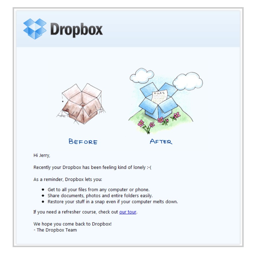
We know it seems like a stretch to actually appreciate a company for sending an email after someone has canceled their subscription. However, by combining poignant and straightforward cartoons with a tongue-in-cheek emoticon, as well as some very simple copy, Dropbox admirably accomplishes this goal.
Dropbox basically ignores its copy and focuses almost on the design of the cartoon. Their email copy is short and product-based, instead of the long-form, benefit-focused copy you see from most companies.
So, what can you learn from this email marketing case study?
Implementing this concept is quite straightforward.
Step out on a limb with your upcoming campaign and focus on design instead of copy.
If you’re not the artistic type, consider hiring an outside contractor with a proven track record as well as an eye for design, who can help you develop a campaign that catches your customers’ eyes.
Try your best to limit your copy to 100 words or less, and let the images within the article speak for themselves.
5. Hammock: increased open rates by 48% with less content
The typical rule of blogging and sending marketing emails is that you will get more traffic and, ultimately, more revenue if you deliver more content. More emails and more posts mean more traffic.
Well, while this isn’t wrong, the reality is that most businesses really don’t care about traffic. They care about their revenue. They would take 10 visitors/ 5 leads over 50 visitors/ 2 leads any day.
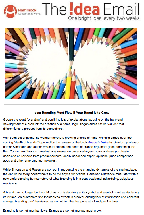
That’s the thought process Hammock had in mind when they decided to stop sending too much email content. Hammock is a B2B company creating marketing content and media for its clients, and collaborates with them to develop content strategies. They reduced emails to once every 2 weeks and reduced email content to about 350 words per email. To bring focus to these changes, Hammock decided to rename it “The Idea Email.”
The results?
Hammock realized a 48% increase in open rates, but more importantly, a significant increase in their lead quality. The right customers started contacting them after reading their emails. And that is really the entire purpose of an email marketing campaign.
So, what can you learn from this email marketing case study?
-
Be intentional with email content. The first thing that Hammock did was cut the copy down to 350 words, which was really difficult despite their dedication to a minimalist approach. They recommend focusing on cutting email copy down to make it more targeted and less about the product.
-
Test subject lines and assess necessary changes. Hammock writes 3 headlines for each newsletter, and all of them are tested for every send. Which one has the highest open rate in the first hour is applied for the rest of the list.
-
Establish a repeatable editorial process. Often, the writing process of Hammock is done by Lavey and Rex Hammock - the founder and CEO, and they ensure it is engaging. Once the article is written, it’s handed off to other members to edit. It’s essential that the process of developing the idea is repeatable.
6. Doggyloot: increase CTR by 750% by personalizing emails
“Personalized” emails don’t always have to target a person. Email marketers can “animalize” them and see amazing results.
That’s what Doggyloot did.
The marketing team at Doggyloot segments and personalizes their emails based on “doggy data,” not people data. For instance, subscribers receive emails customized to the size of their dogs. Someone with a Chihuahua is offered different products than someone with a Rottweiler.
The results?
With its dog birthday emails, Doggyloot got:
- Open rate: 28.1%
- CTR (click-through rate): 750% higher than the company’s average
- Contributes up to 16% of total daily revenue
Besides, we’ll describe some tactics Doggyloot used to power its campaigns. You can learn something useful here, for sure.
1. Collect new subscribers
Doggyloot’s homepage is dedicated to generating subscribers. Its headline and subheadline emphasize the value of joining their list:
- Headline: “Daily deals for dogs and their people”
- Subheadline: “Discover chews, toys, treats, and more at up to 75% off”
The first question is “How big are your dogs?” greets visitors as soon as they arrive in the sign-up process. Once they register, the website reveals current flash sales.
2. Personalize by “style”
Since it doesn’t make sense to offer a 10-pound bone to a 5-pound dog, Doggyloot segments its email lists into 3 groups:
- Small dogs (under 20 pounds)
- Medium dogs
- Large dogs (over 40 pounds)
The team uses this data to choose products for promotional emails. In a typical campaign, they send the same email template to every subscriber, and the products vary by the size of the dog. For instance, only the email for owners with a large dog will offer a 3-foot duck chew.
As a result, the promotional emails targeted to large dog owners have a CTR 410% higher than the company’s average.
3. Happy dog birthday email
Wishing someone’s dog a happy birthday seems bizarre, but not at Doggyloot.
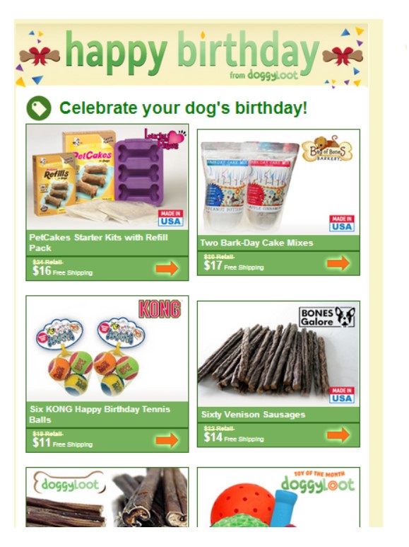
As the company has the birthday of a subscriber’s dog, they schedule an automated email to send about 2 weeks before the date. This email features birthday-related products, treats, and toys under a “happy birthday” header.
4. Emphasize urgency to abandoners
The company earns amazing results with cart abandonment emails. By automatically reaching customers who add items to a cart and leave, Doggyloot earned an additional day’s worth of revenue per month.
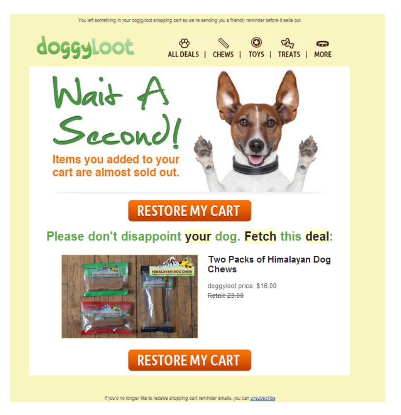
This abandonment email reaches subscribers about 1 hour after they leave the website. It aims to win a sale with the following features:
-
More urgency. The subheadline mentions that the items in the shopper’s cart are “almost sold out.”
-
Clear CTA. Two large CTA buttons encourage recipients to “restore my cart.”
-
Product images. Products from the shopper’s cart are featured with a lower “Doggyloot price” and higher “retail” price.
Final thoughts
When it comes to creating a valuable and memorable experience for your email subscribers, there are some experts and case studies for us to learn from.
We hope these 6 practicable email marketing case studies have helped you a lot. Keep learning from the best till you become one of the best.
So, what is your favorite email marketing case study? Please leave a comment so that we can talk about it together. Thanks for reading and have a nice day!
New Posts


