Email marketing landing page: 10 best practices and Examples
Email campaigns are fantastic. They’re all about how to win clients with eye-catching email subject lines and appealing content. You may first entice your audience, but it is an optimized landing page that will most likely impact their purchasing choice.
I mean, email marketing landing pages allow us to guide our target audience to the required action while also collecting data on campaign factors that influence their decision - what could be better?
Email marketing services have been shown to outperform other marketing channels in terms of return on investment. Landing pages are often used in email marketing campaigns for maximized conversions. In this article, I will share with you 10 best landing page practices for email marketing as well as some examples to inspire your next campaign.
How email marketing campaigns and landing pages work together
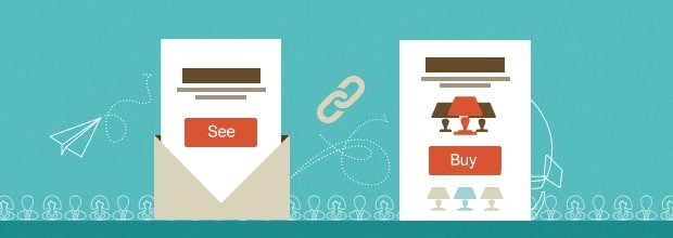
Landing pages and email marketing should go together like peanut butter and jelly, macaroni and cheese. Typically, landing pages can be used to collect email addresses, which is a vital step in creating your email list.
When you’re ready to start sending emails to your new subscribers, you’ll need an email marketing sequence that creates trust and nourishes your relationship. Without the other, neither can function successfully. You will be able to do the following by linking your landing page and email marketing:
- Make a good first impression by welcoming new subscribers to your email list.
- Customers should be onboarded with customised communications that are tailored to their specific demands.
- Nurture high-quality leads and turn their enthusiasm into increased revenue.
- Send personalized suggestions depending on your email segmentation strategy.
- Recover abandoned carts to make it easier to close the sale.
- Engage inactive users who may require additional help with your product.
We’ve only scratched the surface of what your landing pages and email marketing can do. You may construct a landing page that easily connects to your email marketing to earn more sales, whether you are launching a new product or service, assessing interest in a business idea, or developing an evergreen sales funnel for an existing offering.
It might not all happen at once. You’ll need to keep testing your offer and improving your call-to-action, but let’s start with a solid base.
10 landing page best practices for email marketing conversions
Marketers who incorporate constructing landing pages into their campaigns claim a significant return on investment (ROI). So, Why is that? Because, like email design, landing page design is important. Conversion rates can skyrocket if you make the proper decisions and adhere to best practices. Here are 10 best practices for creating conversion-focused landing pages to help you figure it all out.
1. Know your audience

Marketers should always envision an ideal or representative customer. What are their ages? What are their pain points? This notion is also known as the buyer persona. It is much easier to create an enticing lead-capture page when you know what type of audience you want to attract.
You can also make changes, such as utilizing larger fonts when selling to an older demographic or employing youth-oriented language when marketing to Generation Z. If you have a large enough subscriber list, you may want to create unique landing pages based on demographics such as age or gender.
2. Create complementary emails and landing pages
Matching the messaging on your email and landing page is critical because they are two components of a single campaign. Don’t make any promises in your email that you can’t back up with a real offer on the lead-capture page. Charity: Water’s email below has a simple and straightforward message that goes right to the point.
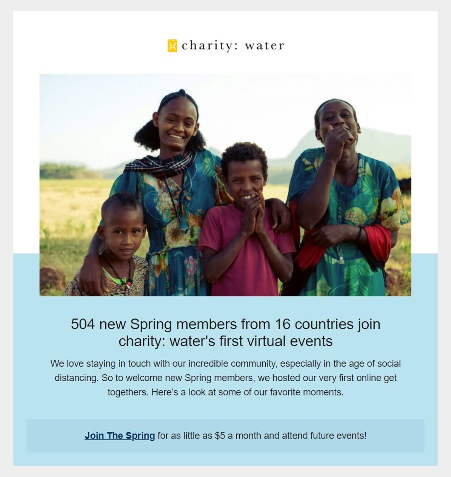
Let’s examine this example from Charity as an example. Their Water email complements its landing page not only in messaging but also in visual cues. They employed sans-serif fonts, white space, and blue as their primary colors. When a subscriber clicks “Join The Spring,” they are directed to a landing page that appears to be an extension of the email. It provides rapid assurance that they are on the right course, giving them the confidence to take the appropriate action.
3. Lead with a compelling subject line
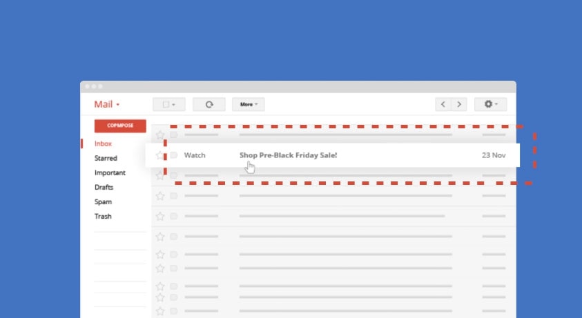
Page headers, like email subject lines, must stick out. That foot in the door is what keeps the possibility of conversion alive. Consider the headline of an email landing page to be your second first impression.
Eight out of ten consumers will be able to see the title on your landing page. What those readers do next is determined by the power of your words. Your emails will entice readers to open links, but page headlines will assist them evaluate whether or not your brand is worth their time. You must ensure that your headlines are immaculate if you want readers to read the rest of your material, click on a page’s CTA, or talk about you on social media.
4. Make your CTA irresistible
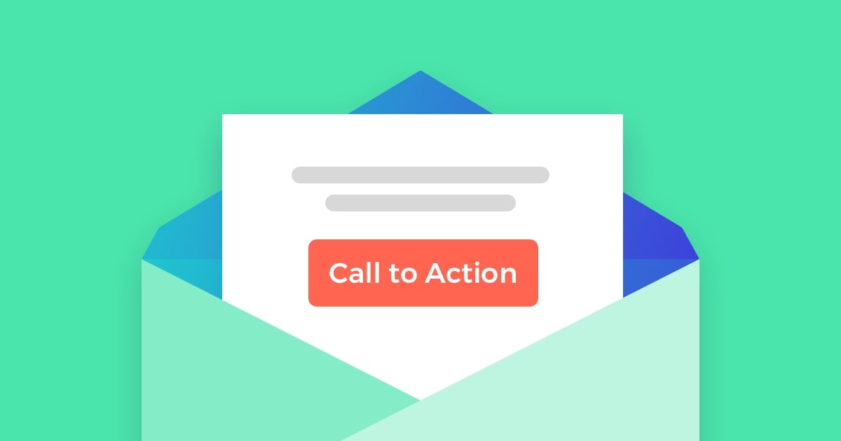
Convincing headlines and persuasive copy need to complement a great CTA when creating email landing pages that convert. It’s tempting to include multiple CTAs to direct users to different portions of your website that require attention, but this often muddles the point and dilutes your audience’s focus. Longer landing pages, on the other hand, may benefit from multiple CTA buttons.
Consider placing your primary CTA above the fold and utilizing power words. As a lead magnet, you can provide consumers with something they want — anything from a downloaded guide to an in-store discount will work.
5. Don’t ask for too much information
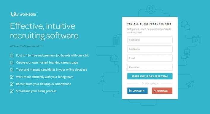
An email landing page’s basic format includes a form with one or more fields to fill out before consumers can claim an offer or sign up for an event or mailing list.
You certainly want to learn more about your audience — but that can wait. Resist the impulse to include too many fields for data collection. Forms with up to three fields work best, with an average conversion rate of 25%. The more fields you include, the less likely it is that the form will help convert.
Landing pages and emails complement each other nicely because they portray a streamlined procedure. Don’t jeopardize your marketing campaign’s effectiveness and efficiency by using a form that will tire out prospective prospects.
6. Keep the page short and simple
Brevity and simplicity make pages easier to traverse, reducing the possibility of human error. According to statistics, long-form content outperforms short-form material in terms of ranking. The method, however, only works for blogs and articles, not landing sites. Keep your landing page’s main copy around 500 words.

The Charity: Water landing page information shown above demonstrates the email’s “Join The Spring” CTA. After clicking “Donate Monthly,” you will most likely be prompted to fill out a second form, which is standard for activities that involve payment information.
What’s notable here is how simple it is for individuals to donate to Charity: Water. Buttons with suggested monetary amounts and a spot to type in a custom number, together with a short text in fine print explaining how your donation would benefit, are great features of an uncomplicated design.
7. Add images or videos
Significant visual components can draw attention and transmit a great deal of information in a fraction of the time it takes people to process words. Customers are 80 percent more likely to read marketing information that is interspersed with colorful and eye-catching graphics.
Conversion rates improved by roughly 80% when videos were incorporated on landing pages. This is hardly surprising given that the human mind processes visuals approximately 60,000 times faster than pure text. Explainer films, such as the one shown in the Charity: Water landing page snapshot below, require less time to comprehend than pages of content.
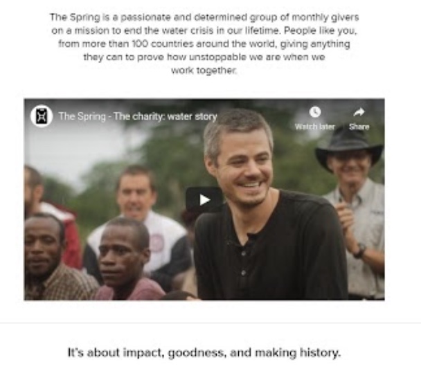
However, keep an eye out for display difficulties or poor loading times. More than 85 percent of online consumers will not return to a website if their initial experience is bad.
8. Reduce the number of navigational links
This practice is used by less than 20% of landing pages. The majority of lead-capture pages have a navigation bar or a number of non-CTA links. Though it may appear to be paradoxical, having more navigational links can hurt your conversion rates.
Why? Aside from your CTA, each exit from your landing page is a path to non-conversion. If you must include extra links, keep them out of the way and consider placing them near or towards the bottom of the page.
9. Consider including customer testimonials
This is also known as leveraging social proof. Customers want firms to boast about themselves and why their products are so fantastic, so it’s no surprise that the language is positive. When clients offer positive feedback or express how pleased they are, the result is more persuasive. Allow your success to speak for itself by allowing your consumers to do so.
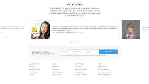
As seen in the Charity’s landing page detail above, the concept remains the same for organizations. Multiple donor testimonials in a carousel near the bottom of the landing page – just above what appears to be an email signup form – can persuade people to join the nonprofit’s community.
10. Always test your landing pages
We noted the low ROI of landing pages at the start of this list. Did you know their average conversion rate is less than 2.5%? Landing page conversion rates can be increased by up to 300 percent with testing and targeting.
Too many organizations construct landing pages and then fail to A/B test them using a consistent technique, thus it stands to reason that this best practice will be the game-changer in terms of raising metrics.
10 Examples of great landing pages to inspire your next email marketing campaign
1. Airbnb
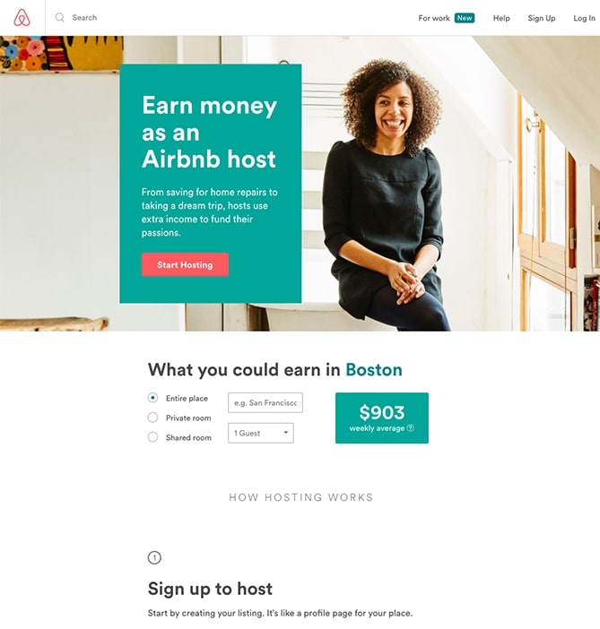
Airbnb offers some appealing customisation to help convert tourists into hosts: an estimated weekly average earnings prediction based on your location. You can enter more information about your potential accommodations in the fields to get a more personalized estimate. If you arrive at the website already convinced, the obvious call-to-action at the top of the page makes it simple to convert right away.
2. Industrial Strength Marketing
This landing page immediately draws me in with a gripping, snappy header: “Don’t Make Me Zoom.” It speaks directly to a typical experience that most of us have experienced while browsing on our phones or tablets – and it’s a touch sarcastic, too.
But that isn’t the only thing that keeps me coming back to this landing page. The color red is intentionally positioned at the top and bottom of the form, pushing you even closer to the conversion event.
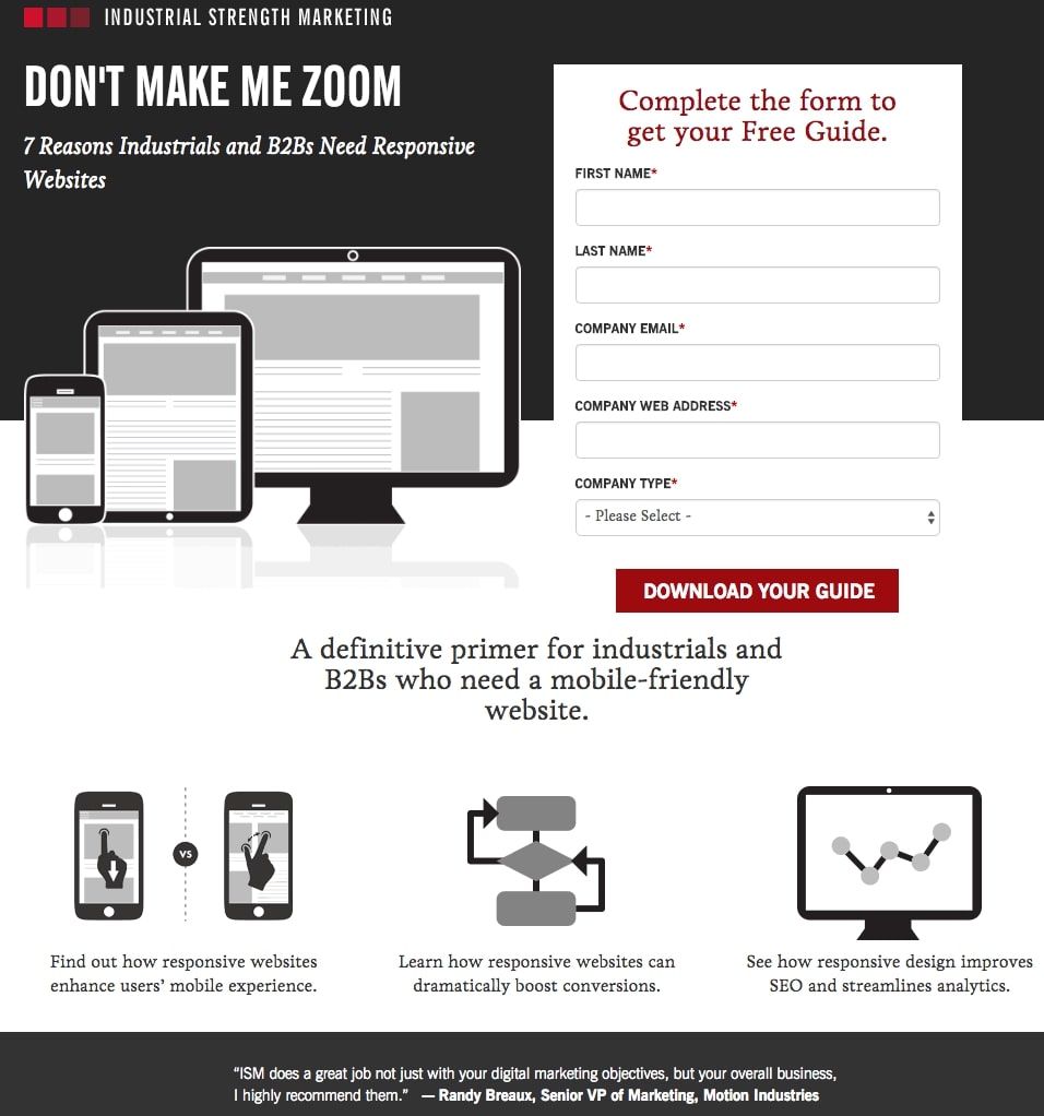
Furthermore, this design is meta: it looks and operates excellent on mobile as well. Keep in mind that many people will be visiting your landing pages on their smartphones or tablets, and if the design of your website does not perform properly for them, they may abandon your page.
The team at Industrial Strength Marketing designed the fonts and form fields large enough so that visitors don’t have to pinch-to-zoom to read and interact with the content.
3. IMPACT Branding & Design
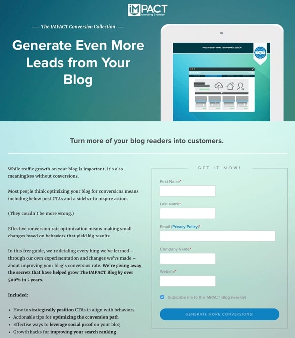
The landing pages of IMPACT have long served as a source of design inspiration. I like the page’s straightforward style, from the huge headline content and detailed featured image to the outline that surrounds the form and the eye-pleasing colors and fonts.
The free guide available for download from IMPACT also does not emphasize the download itself on the blue button that permits you to submit your completed form. Rather, IMPACT is urging you to “generate more conversions” focusing on what you stand to gain from reading the book.
4. Shopify
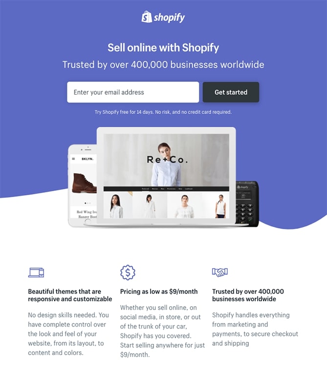
Shopify’s trial landing page, like many of the other landing pages in this post, is straightforward. The user-friendly headline, for example, is only a few words long, and the page relies on simple bullets rather than paragraphs to describe the trial’s contents and benefits. Before you begin, there are only a few fields that must be completed. All of this makes it easy to get to the point: selling online with their tool.
5. Uber
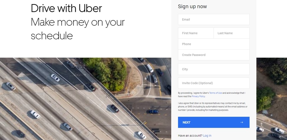
A great example of less is more is Uber’s landing page. This landing page meets its purpose – attracting drivers to sign up – thanks to its basic design and clean, concise, and appealing language.
In terms of landing page language, Uber’s is award-winning because it promises readers two of life’s most coveted things: income and freedom. The sign-up form is user-friendly because it contains a few simple fields to fill out, making the procedure simple and quick.
6. Workable

Workable always creates swipe-worthy lead generation landing page examples if you’re seeking for one of the greatest lead generation landing page examples. Marketers are always looking to be ahead of the curve when it comes to trends, which is why Workable’s minimalistic landing page design was created.
Furthermore, their target audience consists of super-busy HR managers and recruiters who want to get right to the point. Workable nailed this one by analyzing their target demographic and building their landing page with their needs in mind.
The clear and easy-to-complete sign-up form is just another indication that the Workable team knows what they’re doing – and who they’re doing it for.
7. Trello
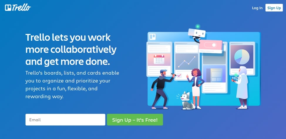
Collaborating on a project is never easy, especially when the team includes people who live in different locations. Trello is among the best tools on the market for overcoming this obstacle. That is the first issue they address on their landing page.
One of the finest aspects of Trello’s landing page is how the design and all of the elements on the page work together to create a friendly and welcome atmosphere. Unlike typical landing pages, which put users under duress to sign up, Trello used a more relaxed approach.
8. Jacob McMillen
Jacob McMillen, a freelance writer, has started a mastermind group with the sole objective of assisting other freelance writers with their copywriting companies. The landing page for the aforementioned group is an excellent example of a long-form landing page.
For starters, the color scheme and typography were so well-executed that the landing page is easy on the eyes (unlike most designs that are loud). In terms of copy, he nailed the nail on the head by addressing the most typical issues that authors confront, such as:
- Loneliness
- Scaling their businesses
- The struggle to hit 6 figures
And if there is one thing a landing page must excel at, it’s dispelling people’s misgivings about your product and creating enough faith in them that they’ll gladly take the next step. This landing page example accomplishes just that, using social proof from some of the most well-known figures in the writing world.
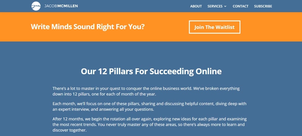
Another effective tactic used on this landing page is exclusivity. The bright orange CTA with the phrase “join the waitlist” suggests that the organization is elite and not open to everyone. What was the end result? The fear of missing out effect (FOMO), kicks in, causing readers to sign up quickly.
9. Netflix
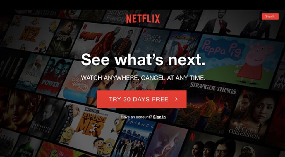
Netflix is one brand that has mastered marketing with over 150 million users. Their high-converting landing page is one component of their marketing machine that has contributed to their huge success.
One of the best features of Netflix’s landing page is that it is simple but contains a lot of information for the viewer. It’s also worth noting that this could have easily been a long-form landing page, but the designers chose to make it a simple three-step journey. With a landing page like this, it is no surprise Netflix has grown and continues to expand at such a rapid pace.
10. Designli
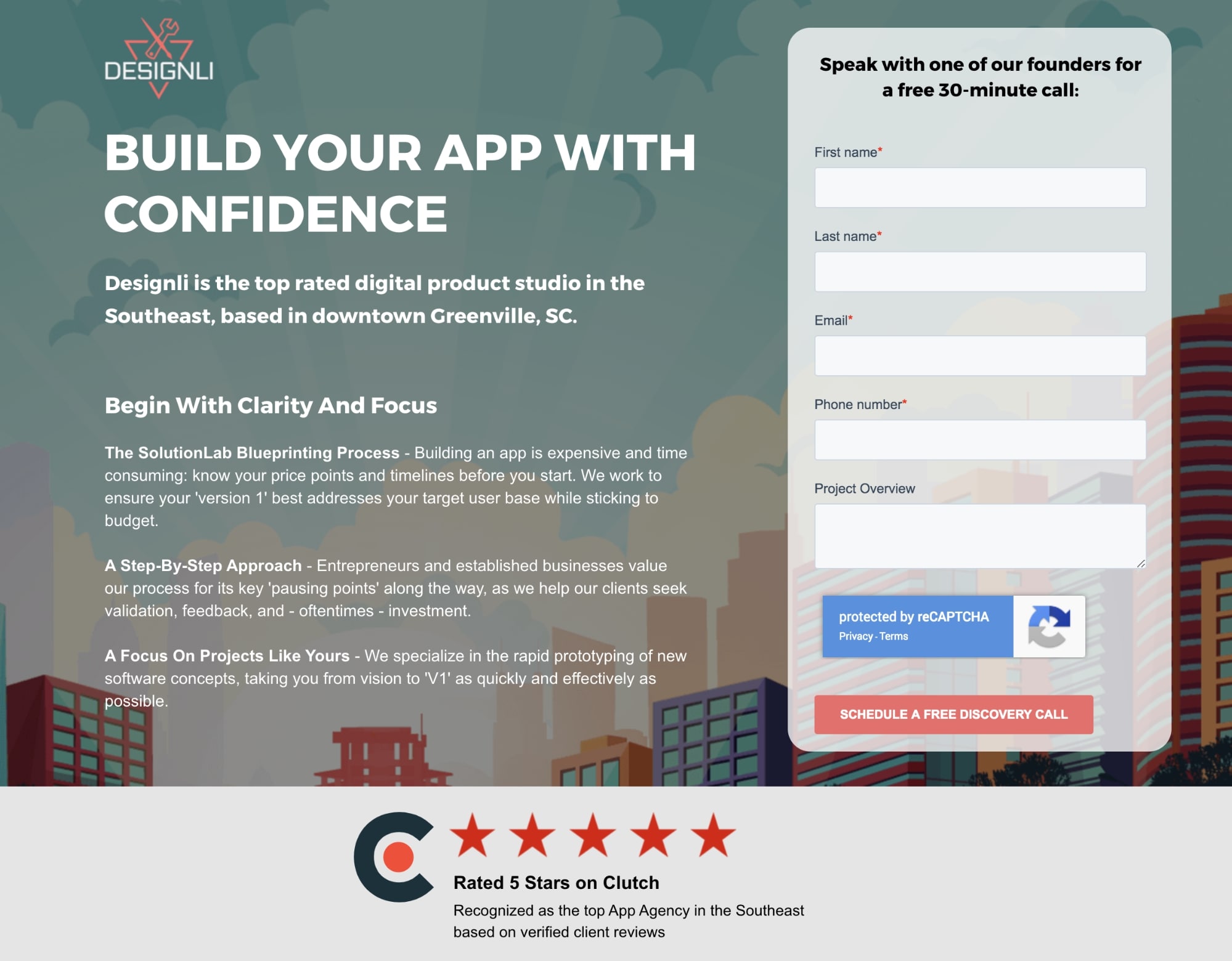
Although the offer is only a consultation call, Designli deserves credit for nailing this email capture landing page with a lot of excellent practices:
- No distractions – There’s no navigation menu and superfluous links.
- A compelling, action-oriented headline communicates a clear value proposition.
- Simple form – Once again, the form sits beautifully atop the page, with actionable language. It begins with Speak with… and concludes with a button reading, Schedule a no-cost discovery call.
- Social evidence – Before I browse, Designli informs me that it has a 5-star rating on Clutch. When I go down, I come across customer testimonials and an additional button that allows me to request a free call.
Final words
That’s it! I hope that this article has provided you with valuable information and tips about how to use landing pages for email marketing campaigns. Please feel free to leave comments below for further discussion on this topic!
.
New Posts

