32 Exit-intent Popup Case Studies For Every Online Store
Many marketers and business owners are terrified of using popups on their online stores, fearing that they may annoy visitors. But do you know what is even scarier? Let people walk out of your website and never come back. Without exit-intent popups, visitors will just walk out the door without anything holding their feet to stay.
If you are in the business of selling online, you know that you are missing out on many leads if you let that happen. Suppose your visitors are leaving from your website or landing page. In that case, exit-intent popups will be your secret weapon to stop them and help you gain at least something - their email addresses, subscription, or accepting your sweet offers and eventually purchase.
With that power in mind, here are 32 exit-intent popup case studies that you can learn from to improve your conversion rate and make potential customers stay on the site longer. Let’s dive into the subject!
What is an exit-intent popup?
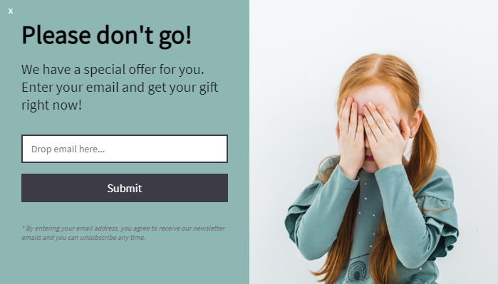
Exit-intent is when a visitor is about to leave your website. By using technology, you can track mouse movements and scrolling behaviors of website users to see when they are about to bounce (leave your site).
This is when exit-intent popups come into play. They are popups displayed right at the moment the visitors decide to exit - including a final message right at the pivotal moment to make them take the desired action.
You can use exit-intent popups to collect more forms, gain more email subscribers, attract more buyers, and also reduce cart abandonment. Now, some people do find popups annoying, which is true. But, data is showing that popups really work.
According to Conversion Sciences, you can save 10-15% of lost visitors by using exit-intent popups with well-crafted messages. Also, exit-intent popups are the more customer-friendly approach to communicate messages to your visitors. They are better than normal popups because they don’t interrupt the browsing experience; they only appear when your visitors decide to leave your online store or switch to another window.
How do exit-intent popups work?
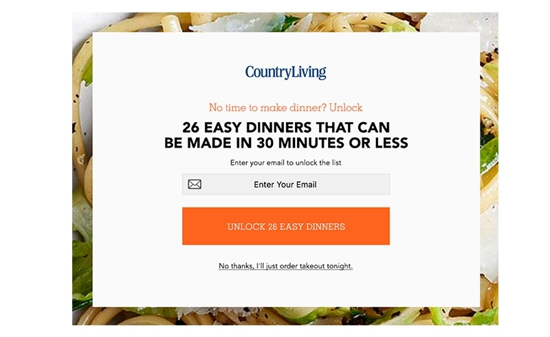
VIsitors’ exit intention is an excellent opportunity for you to present an exclusive offer if you target the right pages, the right audience, at the right time. Landing pages, commercial websites, and eCommerce stores can all take advantage of exit-intent popups to have a higher conversion rate.
Let me clarify this:
When a user visits your eCommerce website and decides to leave without taking any action, you have a zero conversion rate. If you show an exit-intent popup with an irresistible offer that provides high value, the visitors are more likely to purchase from your store, or at least take action.
Or if a visitor comes to your online store and adds a few products to the cart. Then, they leave to do some research about the same products on your competitors’ sites. Right at that moment, your exit-intent popup appears and offers a “20% off” coupon code that expires within 15 minutes if they don’t buy immediately. Congratulations, you have a new order!
With exit-intent popups, you can save abandoned carts and increase your revenue by having the right messages at the right time.
Furthermore, exit-intent popups can work on mobiles. You can trigger them when visitors scroll up quicker than down or hit the back button on the mobile browser. Exit-intent popups can come in to save the day, preventing them from going back to the results page and staying on your eCommerce site.
32 exit-intent popup case studies worth checking out
The best way to learn is by looking at how professionals are doing it. So, let’s accelerate our learning process by looking at these 32 exit-intent popup case studies. Whether you are looking for a new idea for your very first popup or examples from other industries to tweak and test, here are the best examples that have worked tremendously well for these companies.
Personalize the popup
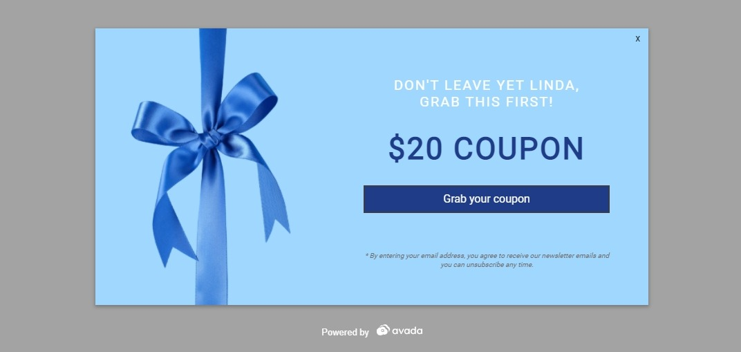
Don’t let your exit-intent popup be generic. Addressing visitors by name is a powerful move to add a touch of personalization to your offer. A new promotion or offer can receive more attention if people see their names on it. You can do this with users that have already opted into your website.
In order for them to opt in, you can get the visitor’s name when they subscribe to the email list, sign up for a customer account, or give their names in a previous popup. Then, when that visitor is about to leave or abandon a cart, your popup will appear like a friendly offer that says:
“Wait, Jim, you forgot something in your cart. How about 10% off to buy what you want?” Now, that is much more compelling for someone to complete their transaction.
Add a progress bar
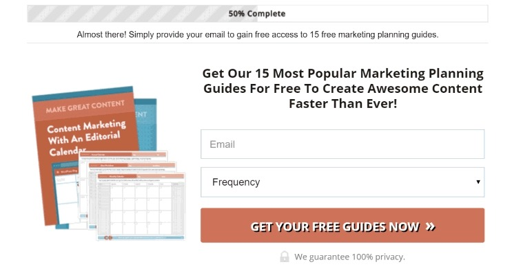
When a visitor clicks on your popup to accept the offer, they are really invested. A progress bar that shows the completion progress can trigger the Zeigarnik effect - which is the nagging effect that one gets when they haven’t completed a task.
This simple progress bar will persuade your visitors to complete the process they are already partly invested in. For example, in the popup above from CoSchedule, visitors can see that they are halfway through. They just need one more step before they exit, entering the email address, to receive the special reward.
Spin to win
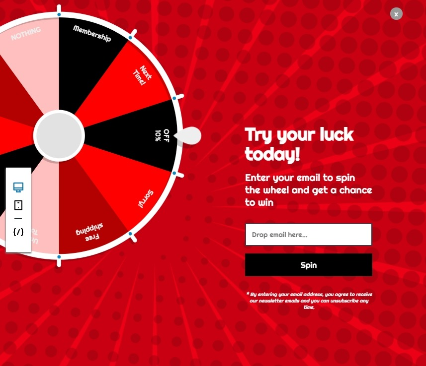
A little bit of gamble is always exciting, especially when visitors know they can get some sweet deals. A spin to win exit-intent popup wheel is a great fun way to engage with users that are about to leave. All they need to do is enter the email address to get a random reward, which you can adjust for your own preferences.
This kind of exit-intent popup is fun, exciting, and rewarding. You can change the required action of your exit-intent popup as well, from subscribing to the email list to simply just spinning for a reward and starting to buy.
Use social proof
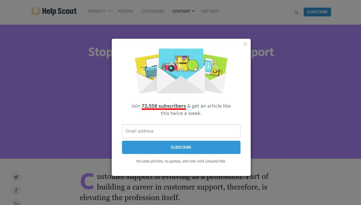
Social proof usually works because we tend to follow what others have done to decide our actions. Many stores use the number of users of subscribers to wow their visitors, letting them know many people have joined the boat. Then, the visitor may be kicking themselves to ask why they haven’t joined your community sooner.
But you don’t necessarily have to use big numbers to make this work. In fact, you don’t even need to use your own store’s number to leverage social proof. You can simply use fact-backed numbers or results as an example. Your social proof element is there to show what others have done and how your visitors can follow the lead.
Unlock a secret
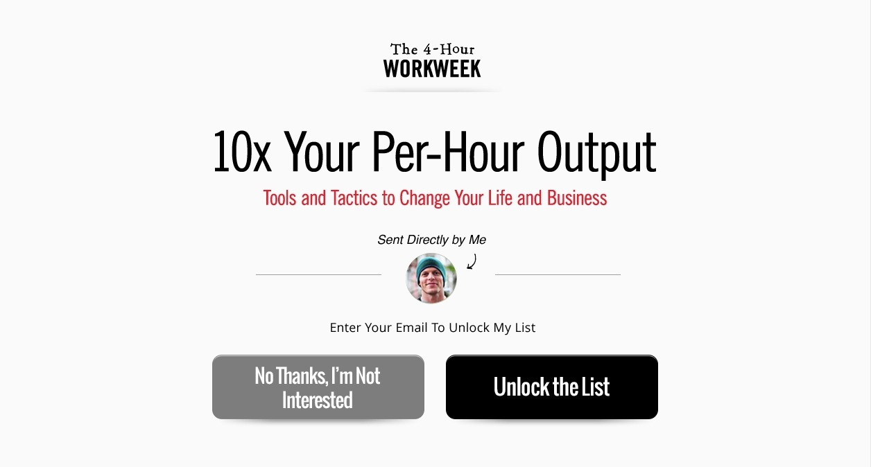
The word ‘unlock’ is especially powerful for your offer to feel exclusive. Visitors will know that they are receiving the privilege of opening something extremely valuable that not many can put their hands on.
In this exit-intent popup example, Tim Ferris uses the popup to capture the visitor’s attention. Just when visitors are about to leave, they know that they have an opportunity to unlock special tools and tactics to unlock the power of their business and even change their lives. Pretty powerful, isn’t it?
Join the newsletter
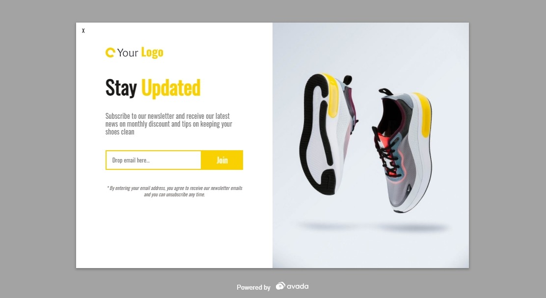
Your newsletter is actually something users would love to have if your site provides much useful content. So why not suggest them to join the group of subscribers. The word ‘join’ can leave a feeling of access or oneness. We all like to feel included, especially in the best community.
Your popup can show why they should join your large group of subscribers and receive the best social media content on the web. Or you can briefly demonstrate the benefits of subscribers, like receiving exclusive offers, articles, or products.
Send messages based on the referral source
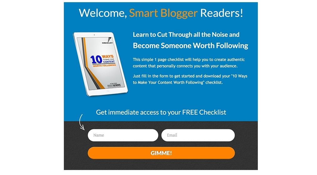
Personalization is the key to making popups more friendly, relevant, and more accessible. One smart way to increase the personalization is by changing the popup based on the referral source.
For example: If your visitor lands on your site through a guest post on a specific website, you can personalize your exit-intent popups for that particular group of audience. You can use technology to detect when a visitor is coming from a specific domain and use that information to customize the popup.
Another possibility is to personalize the exit-intent popups based on which social media channels the traffic is coming from. For example: If your visitors come from Facebook, you can invite them to join the conversation on Messenger or join your Facebook group. There are many personalization options for this type of popup that you can take advantage of.
Add some authority
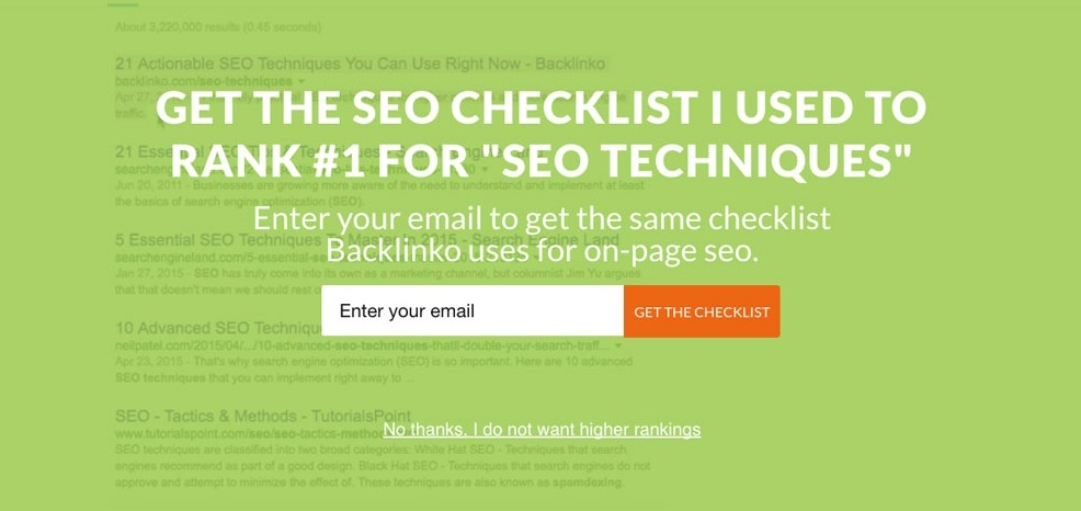
If your offer has an authorized source or case study, it immediately has much more credibility. Much like this article, when you see that the stores have used exit-intent popups and gain success, you naturally want to try using the popups as well.
So, if you are an expert in the field or have proof that your offer is the fool-proof way of achieving something, don’t be afraid to show that in your popup. For example, Brian Dean of Backlinko is a famous SEO guru that has had many achievements in an area that many people are attempting to accomplish. He then becomes an authority on the subject, and doesn’t mind showing that in the exit-intent offer.
Content upgrade opportunity
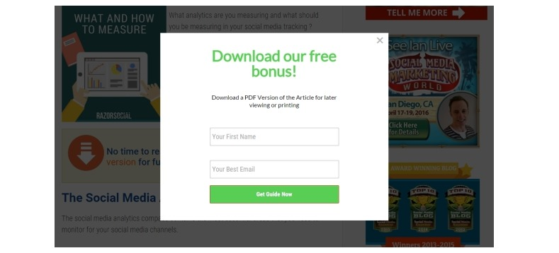
If your visitors are on the blog section, why not present your leaving users with an option to upgrade the content they were just reading. A content upgrade is simply a higher-value or a more in-depth version of your normal blog post. Your content offer can be in the form of a PDF file, an ebook, a training course, Youtube videos, and more.
For example: if your eCommerce blog post is about how to cook a Jamaican meal, you can present visitors with a free download of a PDF with easy steps to follow. You can take the opportunity to showcase your products and how they can help users achieve the meal.
Provide a few choices
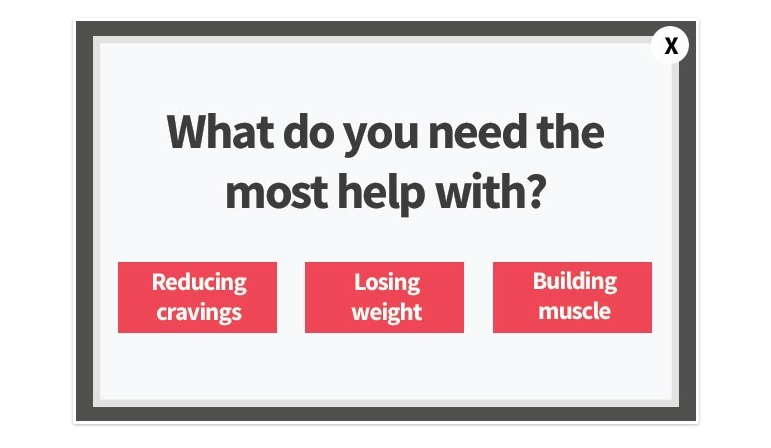
An exit-intent popup doesn’t always have to be an offer. It can be a navigation tool for visitors as well. For example: If your traffic comes from a Google search result, they are only presented with your blog post and will leave right after finding what they were looking for, without checking for more.
Then, your exit-intent popup stops them from leaving by leading them to other topics of interest. Like in the image above, visitors can see that they have more topics to explore on the site simply by clicking on one of the options.
Provide an useful reminder
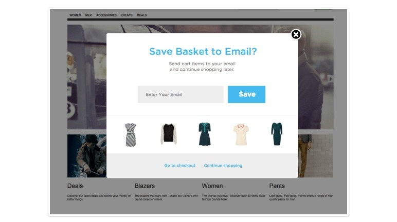
If a visitor browses your products, adds some items to the cart, and then proceeds to abandon the transaction; what can you do? That is right, you can use an exit-intent popup to show them the items and remind them to finish. Better yet, you can help them save the chosen items to their carts, simply by clicking on one button. Some visitors are just not ready to purchase right then, so this type of popup is really helpful for them to continue shopping at your store when they feel right to.
Instant sales offer
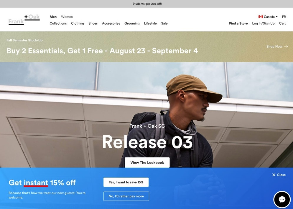
The word ‘instant’ in your offer lets visitors know that they can have a good deal right at the moment. For example, they can receive a 10% off of their cart when they take a simple action like subscribing, immediately. Stating exactly what they can benefit creates quick actions because the next step is explicit. Whatever you can do to lend your visitor’s confidence, your exit-intent popups will reduce friction and increase the conversion rate.
Address the objections
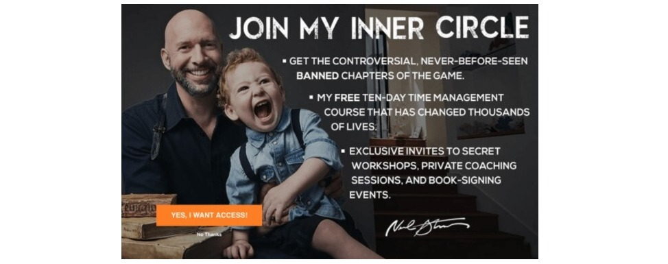
This is one of the best hacks for your exit-intent popups. If your potential customer is on the verge of purchasing but having one small objection, a solution will be the perfect last nudge for them to make a purchase. The potential objections can be regret for buying, uncertainty, and lack of support.
Do research to find all the possible objections that your buyers may have, then check if you can thoroughly cover them in your exit-intent popup. This will give your visitors the confidence they need to claim what you have to offer.
Offer a free trial
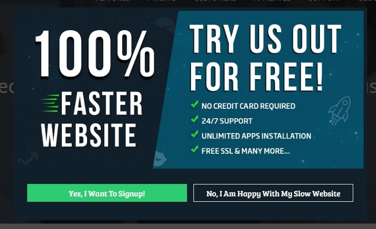
It takes about 7 touchpoints for a customer to make a purchase, so a free trial is necessary to get the buyer’s foot in the door before eventually purchasing. If your eCommerce store has services that can offer free trials, don’t hesitate to include the offer in the exit-intent popup. Once visitors have explored your product, they are more likely to commit with their money.
Collect data by a survey
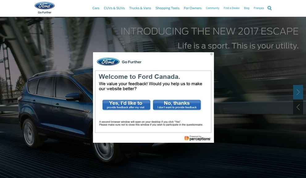
Just because the visitors are about to leave, you still have a chance to learn more about them. A survey is a great way to collect data and see how you can improve your eCommerce experience. Make sure that your exit survey is not on the homepage or any irrelevant page. Also, don’t expect the visitors to fill out a survey for nothing. In exchange for their effort, give them a gift as a thank you note.
Give a quiz
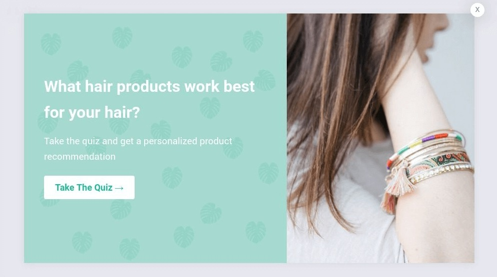
You can create an irresistible lead magnet with quizzes because it immediately becomes relevant with personalized information based on the users’ responses. It is our natural desire to see our own biographies with answers that only we can give. Also, quizzes are the opportunity to reaffirm what we have made of ourselves. You can use a quiz popup for visitors to feel curious about what kinds of products that suit them, or what type of users they are. It is like the first time we knew about our astrology signs, we felt really excited. By using a WordPress quiz plugin , you can engage your audience in a fun and interactive way, enhancing their experience while gathering valuable insights about their preferences and needs.
Use some humor
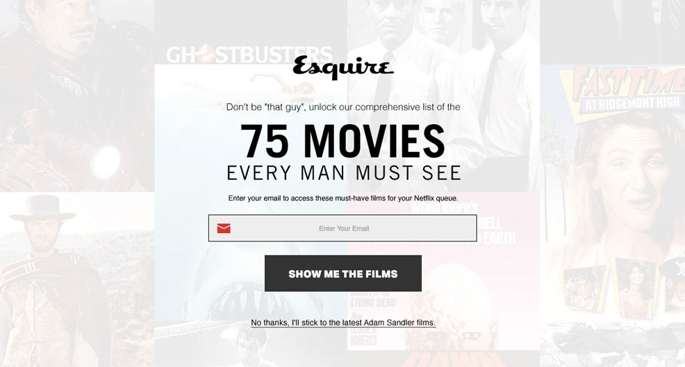
Another reason for visitors to bounce is that they are simply bored. If you can entertain them and make them laugh, it will be hard for smiling visitors to pass up on your offer. A bit of humor can create a memorable interaction between your brand and potential customers, but make sure it is something that matches your band’s personality.
In the image, Esquire invites visitors to opt in and receive a list of the 75 movies that every man must see or stick to latest Adam Sandler films. Well, some of Adam’s recent films are actually pretty good, but you get the humor.
Chat before going
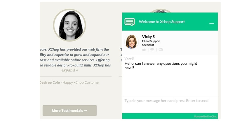
You’ve probably come across this already, seeing a chatbox popup right before you were about to leave a sales page. This lets your prospects ask any questions they have in mind before purchasing your products or services. And, also, you let buyers know that you are there to help them. You don’t have to be online 24/7 for this to work, too. Just use the chatbox as a lead magnet to schedule a time to chat later and receive the prospects’ email addresses or any other chat service.
Suggest related products
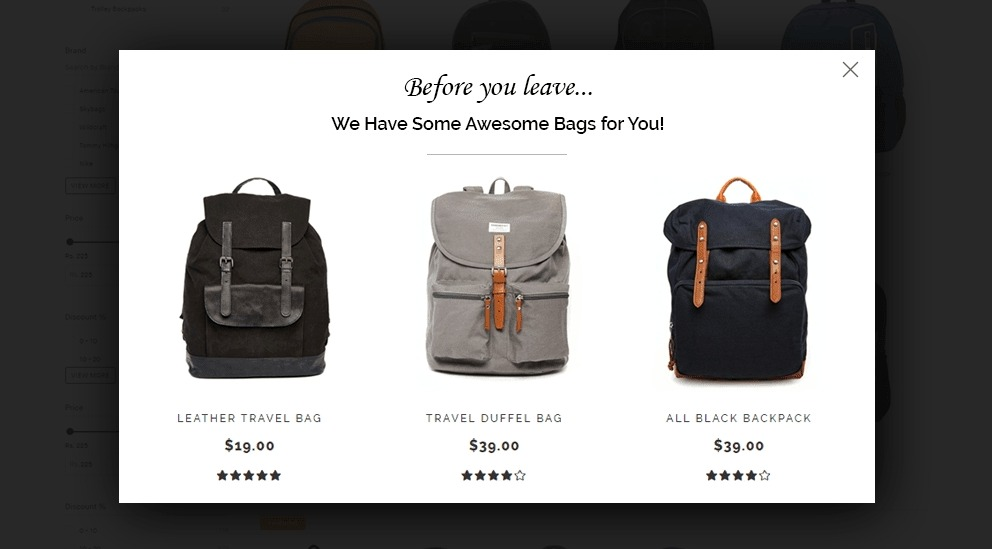
Having the option to explore other products can help keep visitors stay on your eCommerce website longer. Your exit-intent popup can show visitors other items that they may be interested in based on the previous products that they have browsed. It is extremely beneficial to have recommendations like this, since the products visitors are looking at may not be the right one, but a similar product may very well be.
Suggest related content

Just like related products, you can also recommend related content for your visitors. Your objective here is to simply reduce the bounce rate, whether by having visitors browsing longer on the product pages or blog pages. You can have exit-intent popup that suggests posts related to the one they were just reading.
Remember that there are many different reasons why people exit your website, and it doesn’t mean they are bored of your content. They may simply get distracted, so your popup reminds them about the information they came to find. The key to create this type of popup is to have highly clickable headlines. Also, some enticing images can draw attention much more effectively.
Use ‘wait’
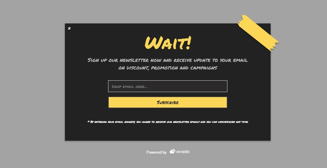
Perhaps it is in the word itself, but there is something about the word ‘wait’ that just stops us from leaving. What am I missing? So mysterious! The word ‘wait’ just simply grabs the attention of visitors so well that it is hard to not use it in exit-intent popups. You can do the same thing on your product pages or landing pages. Remind visitors of what they will miss out if they leave now.
Give only yes or no choices
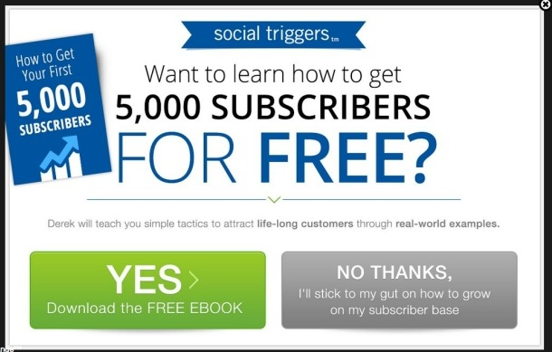
Choices give us more control to feel more powerful. When we feel in power, we tend to act more impulsively, and that is why a simple yes or no question is powerful in getting visitors to click on the exit-intent popup. For this to work, you need to have a right choice and a wrong choice, which is so obvious that they don’t even have to think about it. What you need is to highlight the right choice with popping color and use the right copy to make users feel that they have a choice.
Opt in in two steps
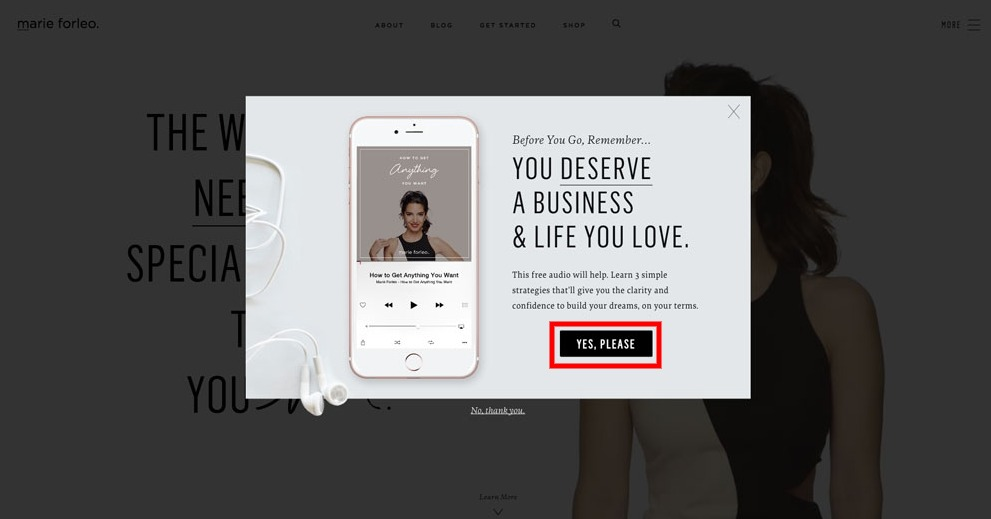
Researches have shown that a two-step opt in can perform better than a one-step opt in. Which means visitors prefer to click on a button to opt in and then provide the email address in the second step. For example, visitors on Marie Forleo must click on ‘Yes, Please’ and then can enter the email address. By first agreeing to subscribe, they can feel their own desire before completing the opt in process. This results in much better lead quality since visitors actually want the offer.
Show testimonials

We all know how testimonials can affect buyers’ decisions on the sale pages, but how about the exit-intent popups? The truth is, your popup can act as a mini sales page. You are expecting the visitors to take actions, whether it is giving the email address or following your social media account. So, using recommendations from your subscribers and customers can be convincing to drive home the value of visitors becoming your company’s customers.
Make use of urgency
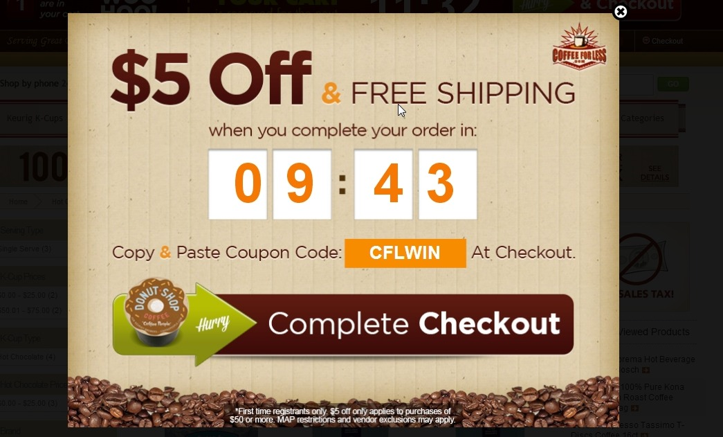
It is our human nature to procrastinate. Whether it is entering an email or making a purchase, we tend to avoid making difficult decisions until the very last minute. Adding a bit of urgency will show visitors that they have a deadline, either they get the deal before this time, or nothing at all.
Win a freebie
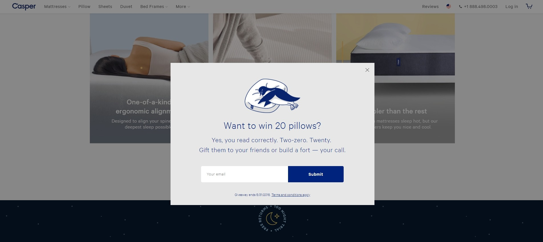
Sometimes, you need a little extra incentive to win potential customers, especially with first time visitors. Free digital downloads are a way to go, but real and physical items have a much higher perceived value. You don’t need to give a freebie to everyone. You just need to give visitors a chance to win if they sign up.
You can encourage them to take other actions as well, like sharing your brand on social media or referring to a friend. Giveaways are highly effective to drive traffic, so putting them in your exit-intent popup is a good idea.
Use striking images
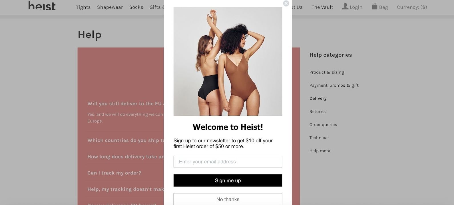
Sometimes, all you need is an awesome image to grab visitors’ attention. A dramatic or unexpected image in your exit-intent popup will stop visitors from leaving right in their tracks. In the example, Heist used a stunning model image to present the offer, which would immediately grab any visitor’s eyes.
Use contrast colors
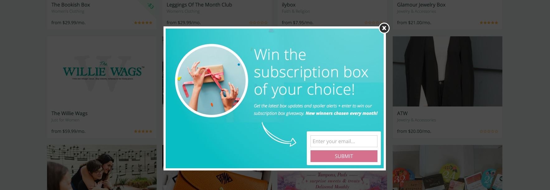
People often scan pages when reading online, looking for cues to see what’s important and what to ignore. With that in mind, contrast colors are much suitable for an eye-catching exit-intent popup. You have only seconds to persuade visitors, so it is important that your elements are easy to scan and understandable.
Create curiosity
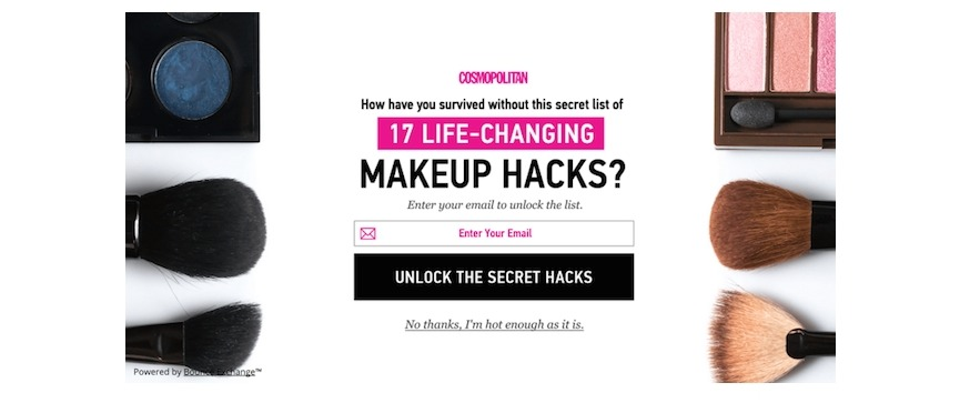
Curiosity is when we realize there is a gap between what we know and what we don’t know. It is an itch that we have to scratch, and so do visitors. If you want visitors to stick around longer, incite curiosity and let them wonder what good things they are missing out on. A good way to do this is by asking a question, like in the image above.
Be mobile-friendly
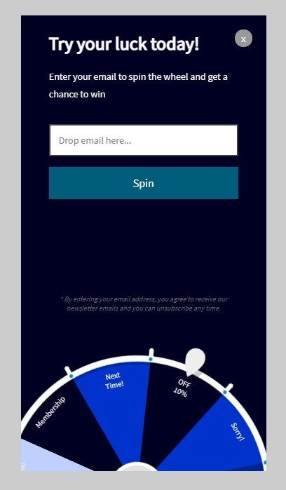
By now, you must have realized that a large part of your site’s traffic comes from mobile devices. This means if your exit-intent popups are not optimized for mobile, they would become an annoying nuisance for many of your potential customers. A better user experience always leads to a better conversion rate, so don’t ignore having a mobile version for your popups.
A/B test popups
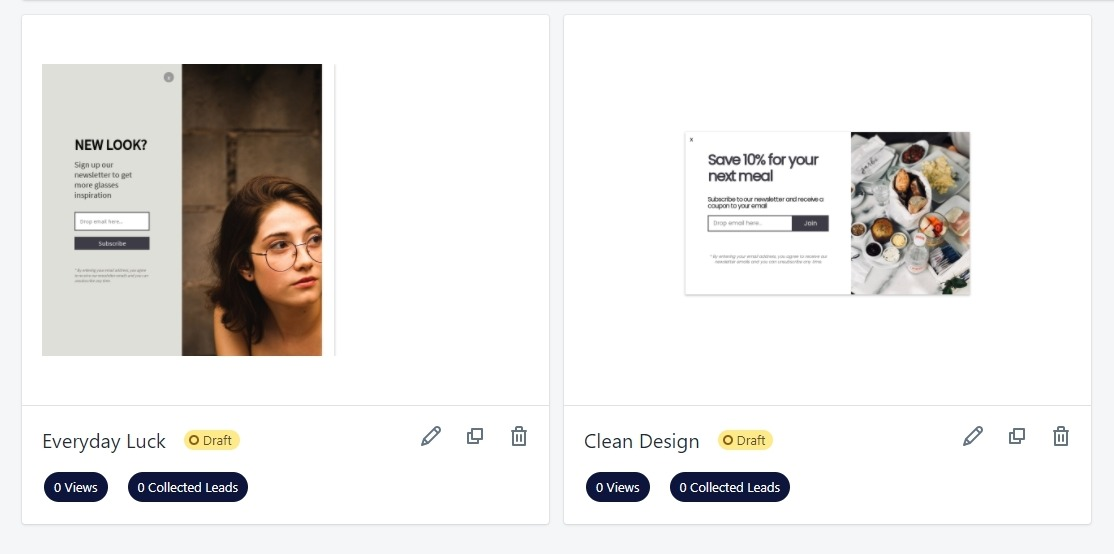
To get the most out of your exit-intent popups, you should continuously optimize through A/B testing. Much like other parts of your website, you can improve the conversion rate of popups by testing different images, offers, colors, and copy. A popup building tool like AVADA Email Marketing allows users to test different variations to see which performs best.
Understanding your visitors

The best way to get a good result with your exit-intent popups is by putting yourself in the visitors’ shoes. Then, you can offer exactly what they need at the right moment. Ask yourself, for what reasons can your visitors leave the site or other pages? Then, select the most likely reasons and solve the problem for them with your popup.
Become their hero, like how CountryLiving understands that their visitors are looking for some easy meal ideas for dinner. So, their popup offers not one, but 26 recipes to cook an elaborate meal in under 30 minutes.
How to create exit-intent popups for your online store?
Now, let’s learn how to create an exit-intent popup using AVADA Email Marketing. With our tool, you can use over 14 templates to create stunning popups, and you can easily edit them by dragging and dropping. Plus, you can control how and when your popups are shown, as well as the target audience for each campaign.
If you don’t have an account yet, sign up now because AVADA Email Marketing is free to start using. Now, let’s begin the creation process.
Create an exit-intent popup campaign
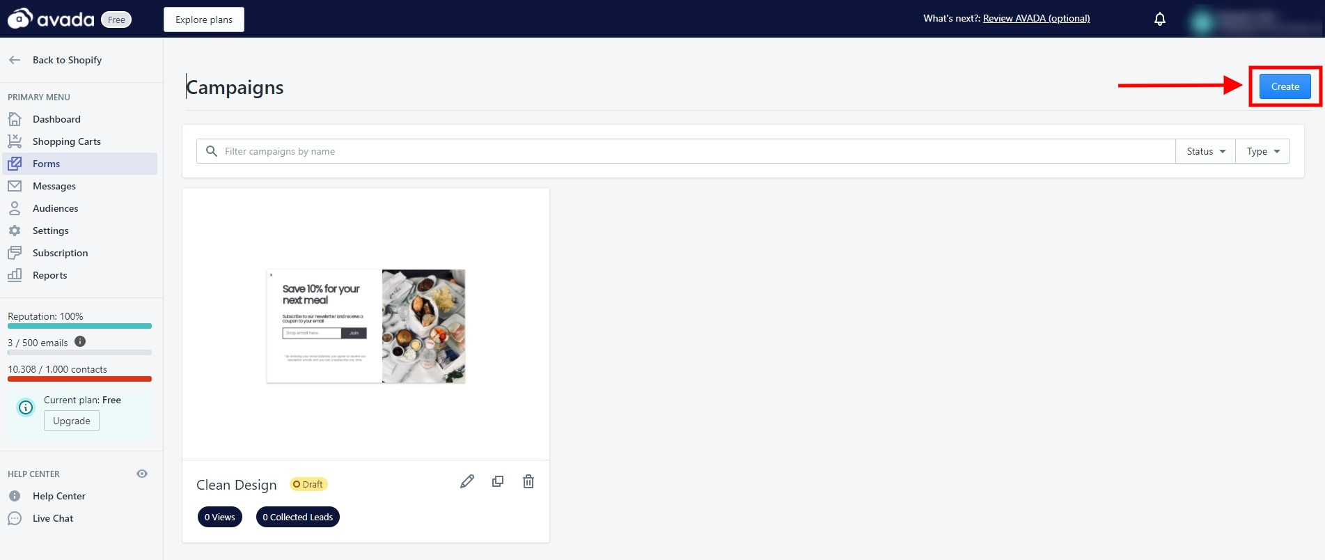
Login to your account, then click on ‘Forms’ at the left tab of the dashboard. Just click on the blue ‘Create’ button to start making your popup.
Select and edit a template
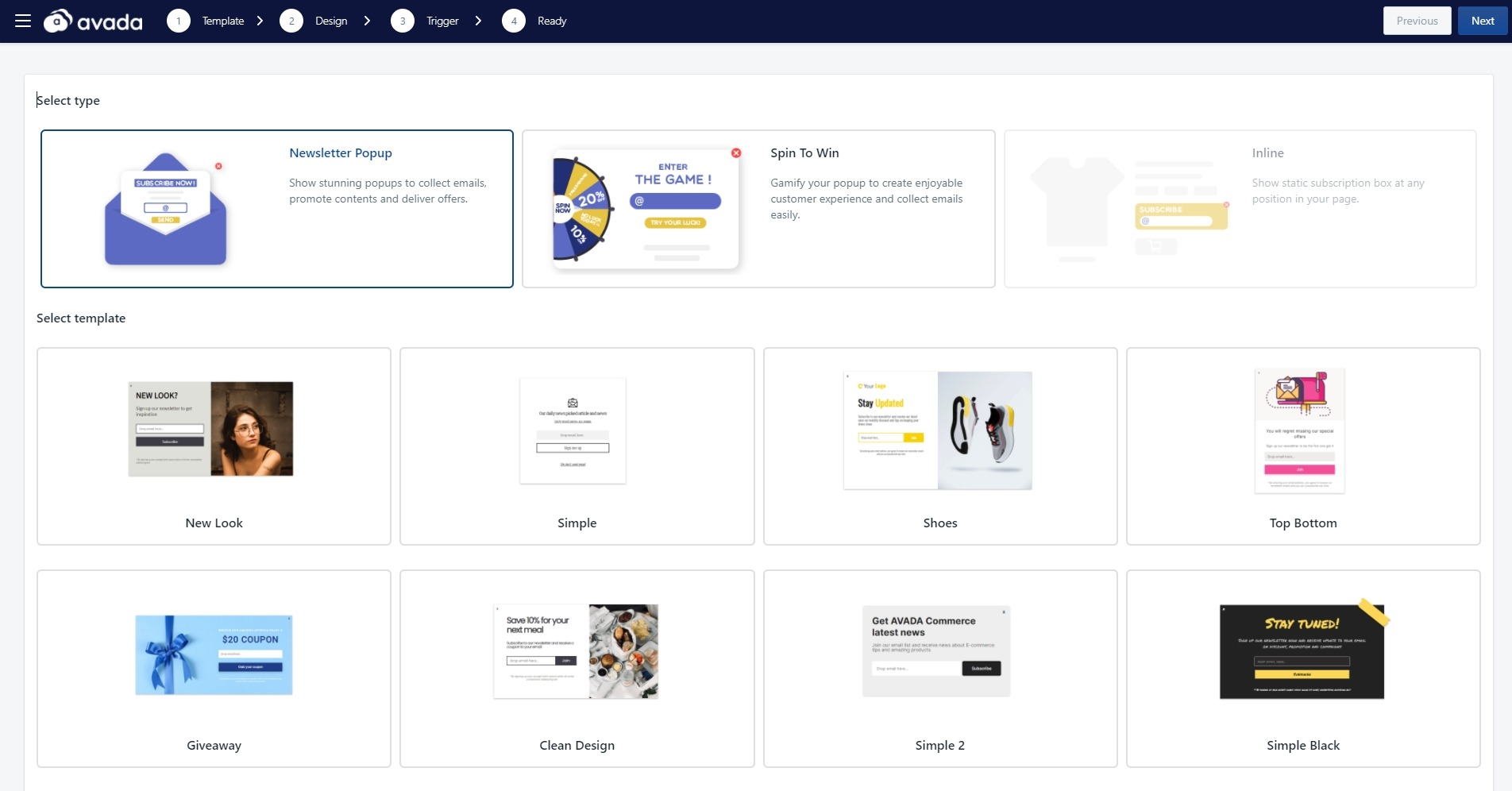
At this first step, you can select a suitable template for your exit-intent campaign. We have some pre-made templates that you can use to collect new subscribers or let customers play a spin to win and earn rewards. After picking your template, you can see three versions of teaser, subscribe, and thank you template.
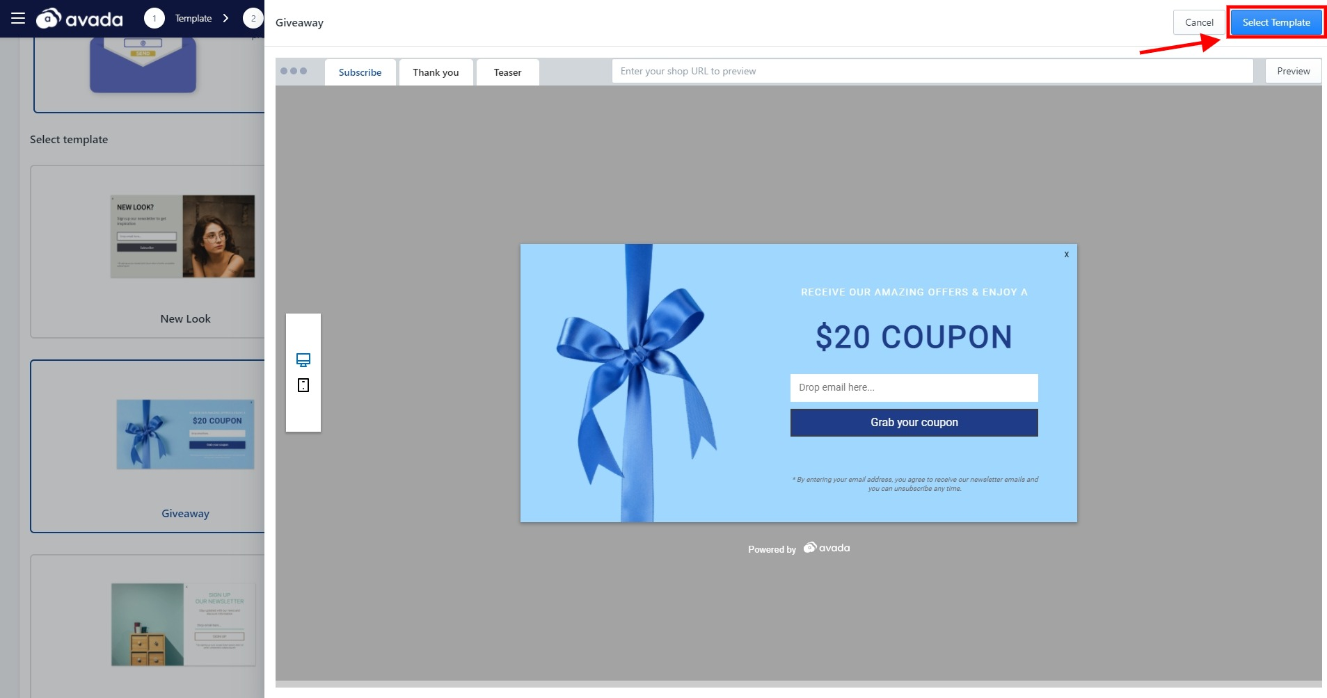
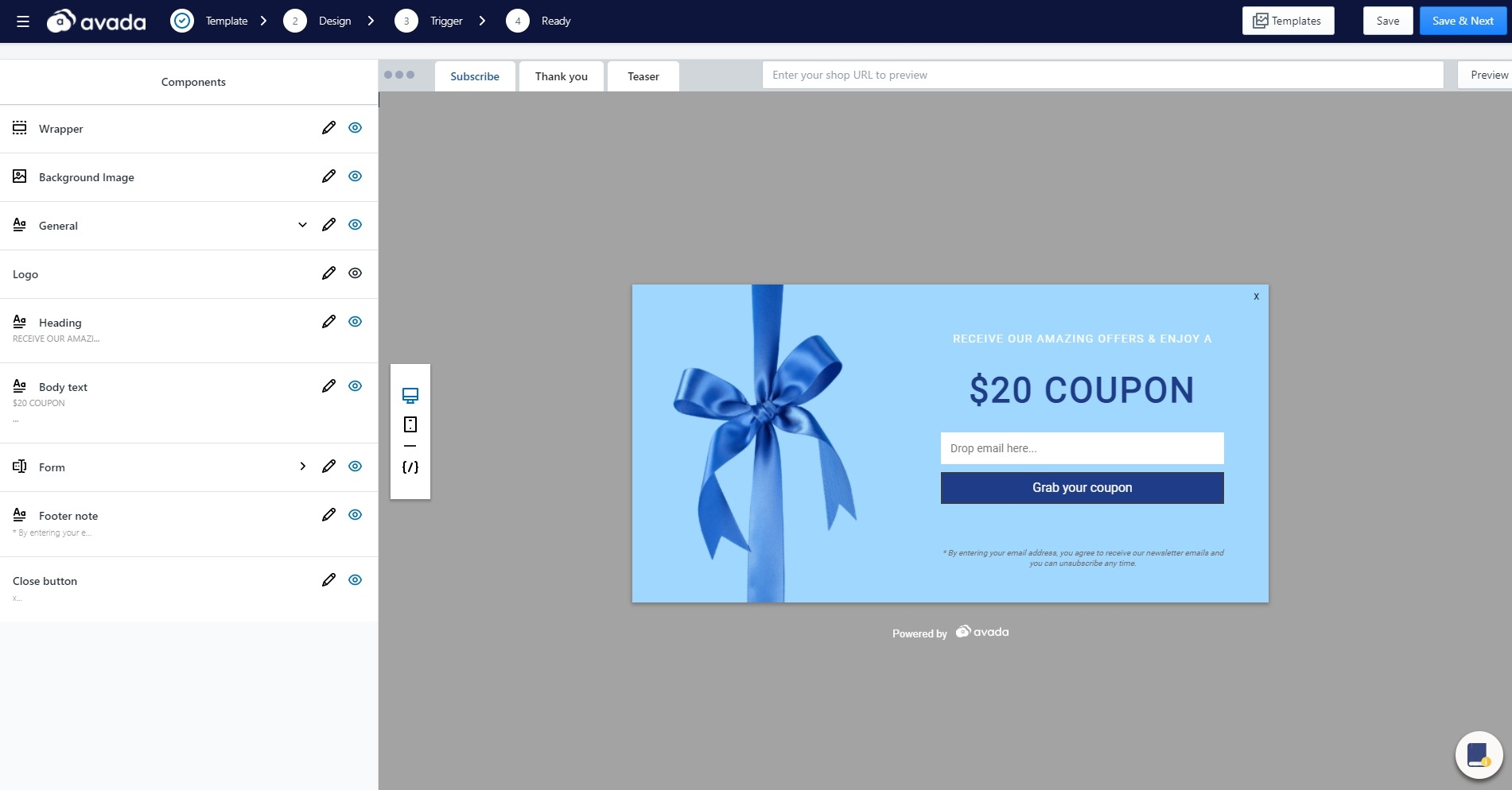
In the popup editor, you can customize the elements by simply clicking on them or through the left tab. If you are not familiar with what to do, the little book icon at the bottom right will be the guideline you need. Also, if you want, you can always change the template by clicking on the button ‘Templates’.
For editing, you can change the popup’s colors, copy, images, and hide or unhide any element. For example, if you just want to offer a coupon without collecting the visitor’s email address, simply hide the ‘Form’ element. When you are done editing your popup, click on ‘Save & Next’.
Choose the trigger

At this stage, you can when your popup is displayed in front of visitors. Since we are talking about exit-intent popup here, let’s select ‘On exit intent’ and ‘One time - No show again’ so our popup won’t annoy visitors. You have other options for the timing, such as after the page loaded, after x seconds, after scrolled x percent, or a custom click trigger.
After that, you can select where to show your exit-intent popup. I’m selecting ‘All pages’, but you can insert any page’s URL so your popup would only show on that specific page. With that out of the way, let’s click on ‘Save & Next’.
Finish and launch
At this last step, give your popup campaign a recognizable name and you are good to go. Click ‘Save’ to launch the exit-intent popup campaign, then you can see your data on conversions, impressions, and conversion rate.
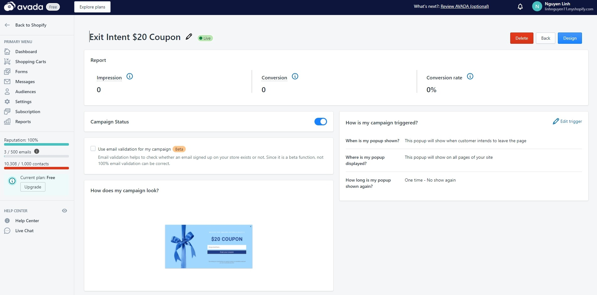
After that, you can create specific audience segmentation and email campaigns to amplify the results of your popup campaign. Read the guide below to know how to do that.
How To Create An Exit-intent Automation Email Campaign
Tips to optimize exit-intent popups
Below are some fool-proof and best tips to optimize your exit-intent popups to increase conversions:
- Pay attention to the design: If you fail to impress with your design, your potential customers won’t be able to feel connected with your offers. Your popup should also have a transparent background to make the website visible. And a full-screen popup is sometimes more effective than a popup window.
- Put the offer into context: Display a popup that is relevant to your user’s session and play out a situation that your visitors can feel related to.
- Polish your copy: Craft a short but bold copy that can convey your message in as few words as possible.
- Always include a quit option: Your exit-intent popups should always have some kinds of a close button, clear and evident.
- Don’t be annoying: If your visitors often click to close the popup window, don’t reshow the same popup in at least a month.
- Play with formats: With the popup tool, test out different options and analyze how your audience reacts to them.
Final words
An exit-intent popup can be handy to capture leads and increase the conversion rate in many areas of your website. With this article, now you know the best case studies and how to create an incredible exit-intent popup with AVADA Email Marketing. If you have any questions about the app, leave them in the comments and I will support you!
New Posts


