How to Design an Email Signature: Top-notch Tips and Tools
They often say it is essential to create great first impressions, but what about last impressions?
If you conduct business via email marketing, your email signature is typically one of the final points of communication that a consumer has with your brand.
A great email signature should be simple, informative, professional, and put the information at the storefront. However, this doesn’t mean that your email signature has to look boring.
There are many valuable tips to get the most out of your email signature design. So, in this guide, let’s run over 16+ easy tips and 6 helpful email signature tools.
What is an email signature & why do you need one?
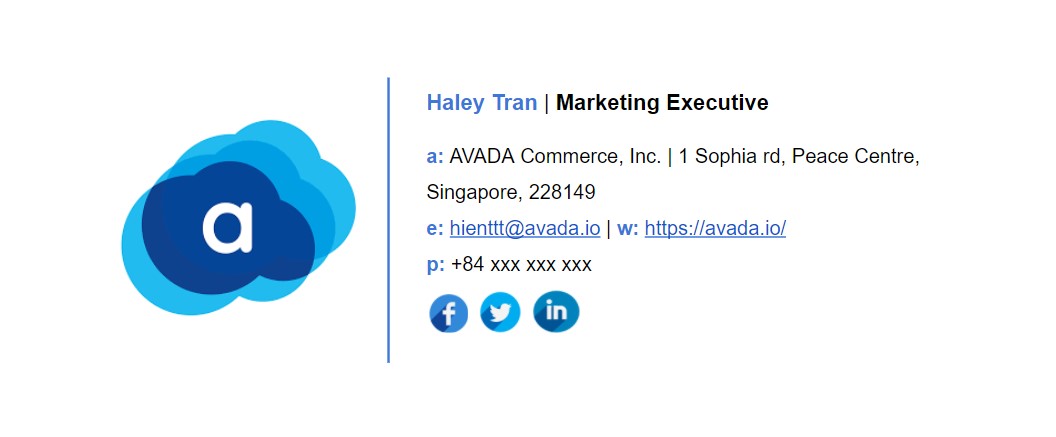
An email signature is a short text at the end of each email, which provides the reader with basic information about the sender.
In their email signature, people can add anything they believe important, such as their full name, company name, position, contact details, photo or company logo, etc. Generally, an email signature is considered a business card in digital form.
You might think - why do I need to design an email signature? Doesn’t the other person already know who I am? Well, it’s not that simple. There are several good reasons why you need it:
-
People can find your contact information easily and quickly with your email signature.
-
Including your company name in the email signature can give recipients a chance to research your company and products better before they get back to you with an answer.
-
Email signatures help drive traffic to your company website and social profiles.
-
An email signature gives people a chance to contact you in case your message was forwarded. When the direct recipient hovers over the sender’s name, they can see your name and email. However, if they forward your email to their business partners, they won’t know how to contact you. Adding an email signature will actually give them the information they need to contact you.
Furthermore, you should remember one more thing - it is a standard of professional email correspondence. If you use emails to build connections, pitch your products, or any other professional communication, recipients will expect to see a signature. An absence of one might make them doubt how serious you’re about what you do.
Related topic: How to Create an Email Signature in Gmail?
16+ top-notch tips for designing an email signature
1. Include only essential information
A common mistake people make is treating email signatures like a mini-autobiography by jamming them full of information, links, and quotes. By including an excess of information, you make your signature look long and bulky, which deters most people from looking at it, reading it, or clicking your links.
Thus, instead, try to keep your email signature to the point and tailored to your brand.
Below are the most popular details to include in your email signature:
- Full name
- Company name
- Job position
- Office address
- Mobile/ Office phone number
- Profile picture and/ or logo (or both)
- Social icons (optional, but recommended)
2. Keep the color palette small
When devising a color palette, a common rule of thumb is “less is more.” To be more specific, “try to only use 23 colors,” and this tip is especially true for your email signature design.
When you use too many colors, you’ll increase the risk of selecting clashing colors, and your email design will quickly become overwhelmed and distracting. Therefore, you should limit your palette and be intentional about what colors you use and when you use them.
A good technique of choosing your color palette is to sample from any graphic elements you’re including (i.e., your brand logo).
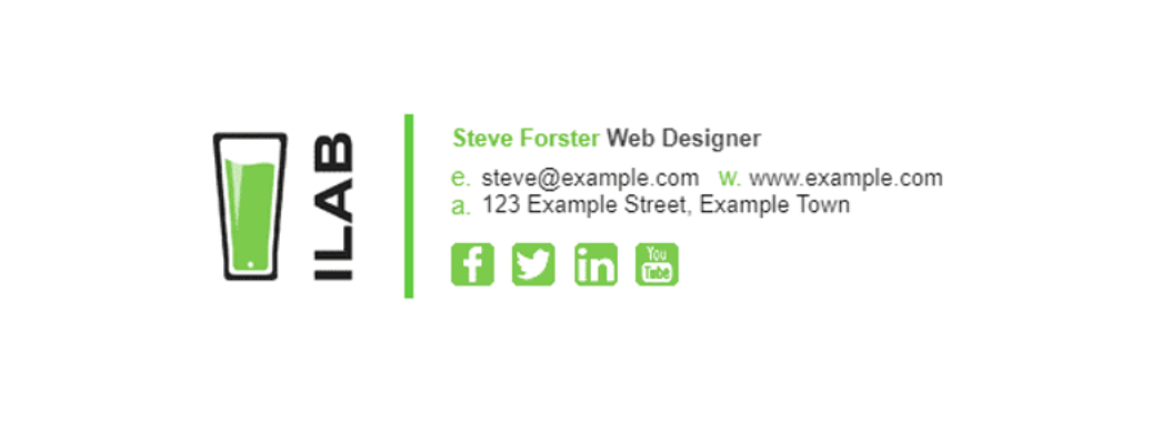
Let’s look at the example from Zippy Sig. They use the signature green color from their brand mark in order to highlight other elements throughout the signature. This technique not only helps to keep the color palette simple and small, but also creates a much more cohesive design. Moreover, it reinforces to readers the tie between this shade of green and the brand.
3. Keep the font palette small
So, we have mentioned that you should keep your color palette small, but what about the font palette? You guessed it - keep your font palette small, too.
A common reason why people use too many fonts is that they just want to highlight specific titles and pieces of information, so they introduce a new font into the mix. However, a simple solution to this hurdle is to instead use a more flexible typeface.
Instead of using a completely new font, find yourself a simple typeface with a few weight and style options, and mix up your type size, weight and/ or colors when needed.

Once you have found a suitable typeface, you can create a myriad of different typographical effects by using highlight colors, different weights, and sizes, while maintaining a simple, clean design.
Of course, using more than one typeface isn’t totally off the table. If you choose to add more than one font to your repertoire, try to limit it to only one additional font to keep your design neat and cohesive.
4. Use design hierarchy
Having a strong hierarchy is essential to communicate important information. And because your email signature is made up of important details, design hierarchy is critical.
When designing your email signature, use scale, color, and font weights to visually signal to your recipients which information they should read first. Perhaps it is your name, or your brand/ company name, either way, make sure to put this key piece of information in the top hierarchical position.
Let’s look at the example right below. From there, the email author used a large font size for her name, and then gradually reduced the text size, starting from her job title to contact details.

To increase contrast, she gave her full name a deeper red color than her job title. Plus, she put her contact information in grey to further increase contrast. To top it off, she used a line divider in order to separate her professional information from her contact information.
5. Use beautiful and professional images
In some sales-based roles (i.e., real estate agents) where you deal directly with the public, adding an image of your face can add a personal touch to your email signature. If you are not too fond of using a profile picture in your email signature, you can use your company logo.
Besides, only use high-quality images, which have been professionally taken.
Use PNG or JPEG formats for maximum compatibility, and make sure you compress them. PNGs work best for logos, especially when you need transparency in your images. Meanwhile, JPEGs are best for profile images where the color quality needs to be perfect.
Avoid using GIF animations (we’ll talk about this later!).
6. Take advantage of space dividers
When you have lots of content and a small area, space is often a luxury. Therefore, by using dividers, you can fit a lot of information into a compact area without making things complicated or busy.
Using space dividers in your email design, as in the example below, is a brilliant way to do this. You can use glyph dividers (the vertical bar symbol) in this case.

By using the glyph dividers, you can save a lot of space, avoid awkward line lengths, and increase the readability of your design. Besides, this is a simple way to cut down on the number of graphic elements if you are not a fan of graphic dividers.
7. Keep an eye on image size
When it comes to designing an email signature, there are two sizes to check, including the size in pixels as well as the size in kilobytes (KB).
Size in pixels
The size in pixels visually determines how big your email signature is, and whether it fits mobile screens or not. Keep in mind that email signatures look better on mobile screens because of screen sizes and scaling.
For desktops and large screen sizes, the recommended maximum signature size is 700(w) x 300(h) pixels.
For mobile phones, the recommended maximum signature size is 320(w) x 600(h) pixels.
It’s so simple to check the size of your email signature. Open your signature in a web browser like Google Chrome, right-clicking on it, and choosing the “Inspect” element. Then, you can hover over the outermost table, and it will show you the height and weight of the signature.
Size in KB
This is the amount of disk space that your signature will take up when it is stored on a mail server.
Let’s say, if you send 30 emails per day, your signature will be stored 30 times on your server, which can take up significant space in the long run. And that is only with you sending emails. If you have other staff send emails, it can add up very quickly.
You should keep your email signature under 50KB in size. Generally, there isn’t a need to have an email signature that is any larger (even when you have a promotional banner).
8. Use social media icons to drive traffic
Does your business have a good handle on all things social media? Well, you should show that savviness off by adding hyperlinked social media icons in your email signature. Including links to your social media pages drives traffic to your online content, while helping your recipients find new avenues of contacting and following you.
If including links to your social media pages has piqued your interest, consider using icons instead of hyperlinks or URLs.
Why?
As studies confirm, it takes only 150ms (microseconds) for the human mind to process a symbol, and 100ms to attach meaning to it. So fast! Plus, with icons, you can save a lot of space and avoid clunky URLs.
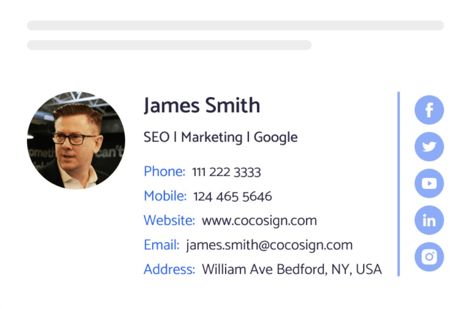
If you are going to include social media icons in your design, take the time to hunt for some that complement the rest of your signature design and fit within it.
9. Align your design
The difference between a neat, organized signature and one that looks crudely thrown together is alignment. By aligning your graphic, information, and icons simply and logically, you can instantly bring order and harmony to your design.
A majority of email signatures are left-aligned, because left alignment is often easy for the eye to navigate and read, just like the example below.

10. Include an international prefix in your phone number
If you work with people worldwide, remember to include the prefix for your country’s code when you list your contact number.
Many people ignore this if they are not used to dialing international prefixes themselves. However, it is really helpful for your international colleagues and clients to have it right there. Here is a list of country codes in case you don’t know yours.
11. Make your design mobile and dark mode friendly
As time flies, the number of people opening their emails via a mobile device is increasing. Studies show that 85% of customers use smartphones to access emails.
There are many technical aspects to consider when making your email signature mobile-friendly and responsive, but let’s talk design.
The first thing for you to keep in mind is scale. Mobiles are much smaller than desktop setups, so ensure that both your information and imagery are legible when scaled down onto smaller screens. If you have problems with your own brand marks, consider replacing your brand logo with a simpler version or a scalable logo signature.
Secondly, ensure that your links are “tappable.” That means ensuring that your links are not too small or positioned too close together; otherwise, a thumb may try to tap a Facebook icon, but trigger an adjacent icon and be taken to the Twitter page.
The example below positioned social media icons neatly to ensure easy navigation. The brand mark, information, and graphic elements are also scalable and easily read on smaller screens.

This is not to say that you must scale every element up in your email signature, but rather keep in mind that not everyone will view your design at the exact same size that you’re sending it. Screen sizes change, and it is always a good idea to anticipate that change and plan ahead.
And another essential thing is the dark mode, which is used commonly by email users recently. For that, you should use a light stroke or glow in the font, and choose images with a transparent background. For more useful tips, please read our Best Practices for Dark Mode Template Design.
12. Don’t use inspirational quotes
There is not enough room for them, and in fact, you should keep your email signature clean and clutter-free. Avoid using inspirational quotes in your email signature, unless it is something like a CEO quote that enhances the brand image.
13. Check for spelling mistakes
This is just common sense. Misspelling in the email body might come through as human, but mistakes in an email signature show that you are absent-minded.
14. Consider multiple signatures
Sometimes, a “one size fits all” signature won’t work across a whole company. Different employees and departments sometimes have different goals and purposes for their email communications.
So, an alternative approach is to design a few different signatures for different roles in the company. Sales might want a different email signature than the support department.
Another alternative is to create your fancy desktop signature, while offering a simpler and smaller mobile-only email signature for employees replying “on the go.”
15. Preview and test your email signature
When you think your email signature is ready, ensure to preview it within the context of a “normal” message in your own email client. Step back and consider how the average sender and recipient of this signature will view and respond to it. This will give you better perspectives and help you see blind spots.
Also, it is a great idea to test your email signature on various platforms. Outlook is often an issue because it follows its own rules when it comes to interpreting HTML code. You should test your signature on mobile devices as well!
16. Make everything easy with an email signature tool
We have shown you some email signature examples that you can draw inspiration from. Looking at what others have included in their signatures and arranged elements is a good place to start.
However, if you have little or no designing skills, but still want to quickly create a professional email signature, you should try using an email signature generator. We will list 6 best ones in the next section!
6 email signature tools to help you design
1. Designhill
Designhill offers a number of design packages and services with a hefty price tag, but it also offers aesthetic, professional-looking email signatures for free. It has been highly appreciated by many prominent brands, such as Forbes, HuffPost, Entrepreneur, and so on.
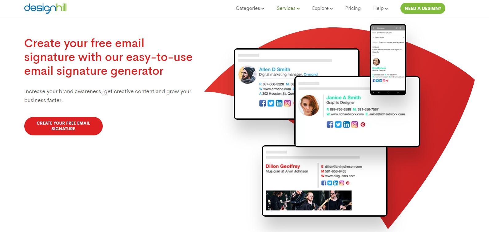
To design an email signature on Designhill, you just need to fill up a form, which includes your name, company details, social media links, and CTAs. Once you are done, save and embed it into your email account.
Many of its templates have free and paid versions for you to choose from as per budget for small or large businesses.
2. MySignature
This email signature tool is really comfortable, easy to use, along with slick and beautiful designs. MySignature offers up to 86 social network icon options!
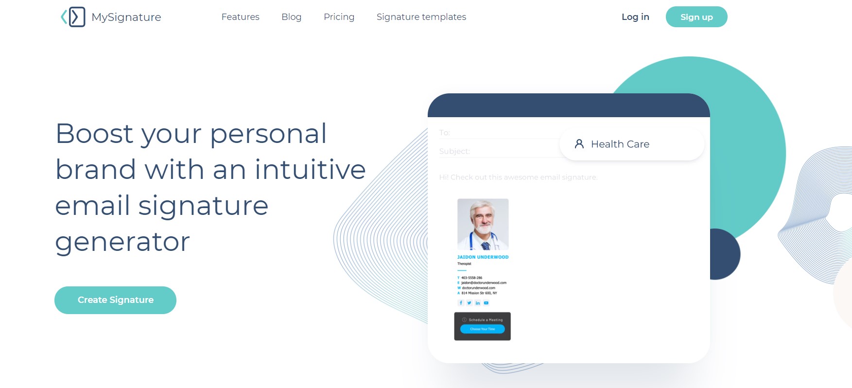
Once you register, you can unlock lots of features that make your signature look amazingly professional. All email signatures are optimized for desktop, tablet, and mobile. Plus, its templates are compatible with the most popular clients, such as Outlook, Gmail, Apple Mail, etc.
3. WiseStamp
WiseStamp is another excellent email signature generator on the market. You just need to complete the fields, choose an email service provider you’re going to send with, and test your email signature.
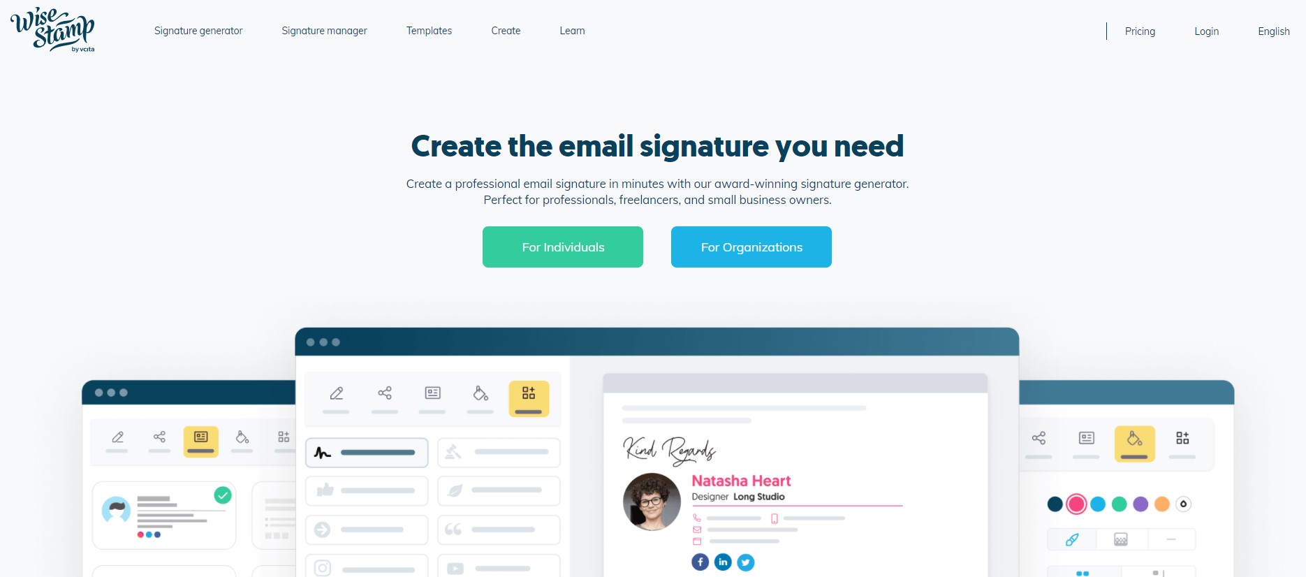
WiseStamp allows you to add signature fields, links, and social profile icons. You can also change the font, photo size, and social icon sizes. If you upgrade to its Pro plan, you can take advantage of many other features.
However, unless you upgrade, WiseStamp branding will be shown after your signature. Its free plan is not advertised openly and only covers a very basic signature.
4. Newoldstamp
This is a professional email signature generator for enterprise and medium-sized companies. It enables you to easily create, manage, and distribute email signatures across the whole organization.
It offers 29 templates available in the preview. You can change and transform every single element in your template. The designs are great, and there are many options for customization. The only problem is, there are no free plans or trials!
5. HubSpot
HubSpot has multiple awesome tools, and one of them is its email signature tool. With a simple design, HubSpot offers 6 templates for you to get started.
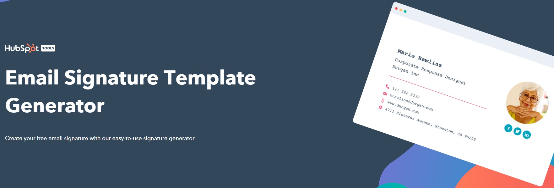
You need to complete its information form and add the necessary links to your social networks. Then, you’re able to customize by choosing your fonts, colors, and theme. Like many free options, HubSpot does not allow you to save your signature to edit it later.
6. Si.gnatu.re
This tool is definitely worth a try. It is simple to use and offers professional designs. You can do anything with your email signature, such as change font size and type, upload your logo, add social icons, change the signature width, text, background, logo colors, and much more.
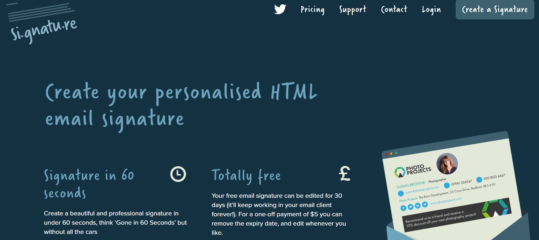
If you desire your signature to be automatically added, you will need to pay. However, if you don’t mind manual copy-pasting, you can bypass this. Its one-off payment model is also a big plus, making it one of the most affordable services on the market.
The bottom line
There is no complicated science behind designing your email signature. Nevertheless, it does take some time and experience to achieve a satisfactory result.
We hope this guide of 16+ tips and 6 email signature generators helped you a lot! So, do you have any other valuable tips for designing a professional email signature? Or, do you want to recommend another tool to do so? We’re always happy to hear from you, so feel free to contact us! Thanks for reading!
New Posts


