9+ HTML Email Best Practices
When you create an email with a drag-and-drop or a module-based tool, you’re basically creating an HTML email.
There are two main types of email that users can send and receive: plain text emails (exactly what that sounds like - any email containing just plain old text and no formatting) and HTML emails, which have format and are styled with HTML and inline CSS.
HTML emails are actually very easy to spot - most multimedia marketing emails that look a bit stylish in your inbox are probably HTML emails.
As an email marketer, you’ve probably already made some HTML emails and realized its benefits compared to plain text emails. That said, HTML emails aren’t necessarily better than plain text emails, just that both types can be suitable for different situations and a part of a successful email marketing strategy.
This article will show you the 10+ HTML email best practices, regardless of your experience level and knowledge in coding, and share some free resources for HTML emails that you can use. Sounds good? Then let’s dive in.
What is a HTML email?
An HTML (HyperText Markup Language) email is an email using a type of HTML to provide semantic markup and formatting abilities that are not possible when using a plain text email. The HTML codes help marketers create stunning emails that can drive more sales and increase subscriber engagement.
In an HTML email, texts are fitted into the viewing surface’s width instead of breaking after 78 characters of every line. In addition, HTML emails allow the insertion of colors, tables, charts, diagrams, and even mathematical formulas as images.
Why are HTML emails important?
HTML emails first appeared in the early 2000s, and marketers were in a state of mayhem. At the time, not all email clients could render such an email format correctly for HTML emails, and mobile devices certainly lacked the proper rendering capabilities for complicated emails.
But, since then, responsive design in general and more sophisticated emails have been only rising. With rich visual, interactive, and media elements, HTML emails have everything from animated GIFs, beautifully formatted content to attention-grabbing CTAs.
In fact, 64% of people respond that they prefer HTML emails over plain text emails. The high approval rating is due to the following benefits:
-
Higher conversions: HTML emails let marketing departments tweak their messages to have stand out CTAs, provide relevant links, and make it easier for recipients to engage with emails.
-
Better design: HTML emails allow email marketers to customize templates with colors and logos of their brands. Also, they can include clickable CTAs and images inside their emails. All these capabilities help improve the design and performance of marketing emails.
-
Tracking: Having an email marketing software suchs as AVADA Email Marketing helps manage HTML emails and provides users with campaign analytics to evaluate subscriber engagement level and identify messages that work well with the target audience.
-
Higher engagement: Visuals often send out information faster and more effectively than words, so HTML emails enable email marketers to convey messages better. As a result, brands can demonstrate their products better with more appealing angles and earn more actions from consumers.
How to create a fantastic HTML email?
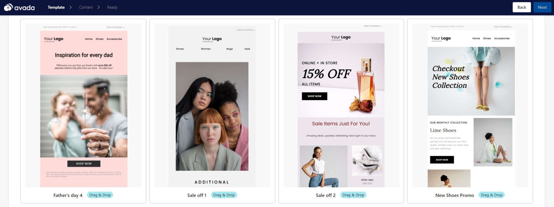
The good news is that you don’t actually have to learn coding to create an HTML email.
A tool like AVADA Email Marketing, built to create and send automated emails, will offer ready-to-use and pre-formatted HTML email templates that help you design awesome emails without ever needing to access the back-end codes.
As you make changes in the AVADA email editor by dragging and dropping, changes will be automatically coded into the final email campaign. Having an email-building tool like this is an ideal option if your team lacks an email designer, but you still want to have professional-looking emails.
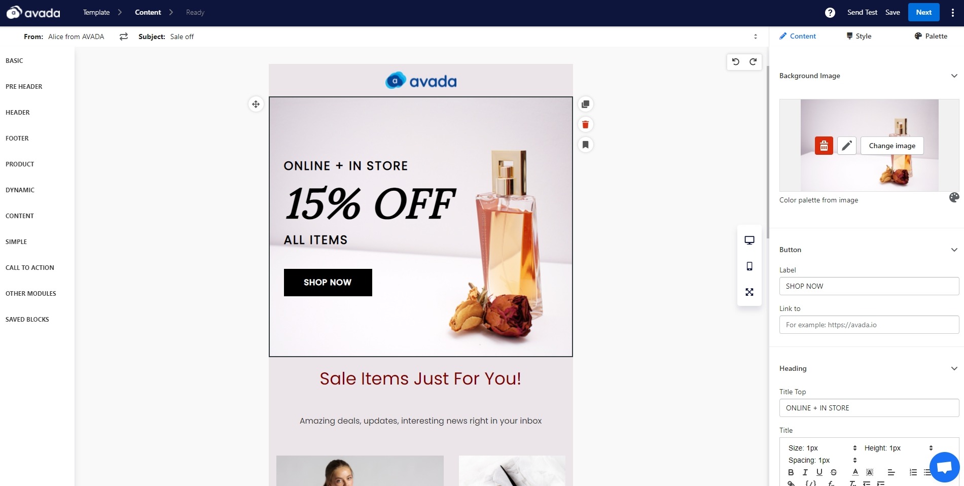
If you have some HTML knowledge or want more control over the code of your emails, you can also import HTML files directly into AVADA Email Marketing for use as custom email templates. If you know your way around tweaking an HTML file, you have a straightforward way to adapt many email templates of your choice into the app.
Because the process of building an HTML email from scratch can be quite challenging, I recommend you work with a developer or find a pre-made HTML email template instead. Or, more simply, just use AVADA Email Marketing, it has pretty much all the necessary email templates for an eCommerce store such as transactional, cross-sell and upsell, order confirmation, etc.
9+ HTML email best practices
With all that being said, it can actually be hard to create an HTML email that both has a look and the conversion rate you desire. So in this section, I will take the guesswork out of the email designing picture for you - here are HTML email best practices for all the different elements of an email campaign for creating gorgeous emails.
No matter what method you want to use when creating HTML emails, these best practices will help you improve your email campaigns’ design, user experience, and deliverability rate.
1. Design for different devices and screen sizes

41.9% of all email opens are accounted for by smartphone devices since tablets and smartphones have made checking inbox so easy for everybody now. This means if you want to create an interactive email, you can no longer ignore the idea of designing emails for more devices.
One of the most obvious and biggest factors on your HTML email’s look is the screen size of the device users are being it on. An email that looks well-formatted and fantastic on a desktop can easily render into a tangle of overlapping and illegible text and images if not properly created for a smartphone screen.
To make sure your HTML email looks the way you wanted it to on multiple screen sizes, the best thing for you to do is keep your layout easy to understand and simple. As you start adding more complex elements such as multiple columns and floating images, your email formats can become more difficult to translate for different screen sizes.
If you decide to build a more complex layout, make sure you’re actively addressing how elements will be rearranged to accommodate different screen sizes. For example, if your email shows up as multi-column on desktop, that same structure may not work on mobile - so you’ll need to use a media query to determine how email elements are displayed on different screen sizes.
Remember, building responsive HTML emails really goes beyond the format and structure of your message. Think about the overall user experience and how your recipients will perceive your emails across different devices. Make sure your font choice is as easy to read on mobile as it is on desktop, and use mobile-friendly buttons or CTAs instead of hyperlink text (have you tried pressing into a small line of hyperlinked text on mobile devices? It’s not easy).
WIth AVADA Email Marketing, you can view your HTML email in real time both on desktop and mobile, giving you the full overview of your message design.
2. Control the loading time of the HTML emails
How long it takes to load your emails could very well be the difference between earning a new customer and losing a frustrated recipient. While it can be tempting to use all the different styling options inside an app and incorporate every image that HTML emails can hold, it doesn’t matter if your emails take too long to load.
As you build your HTML email, be aware of how long your emails will take to load - especially if people are opening your message on their morning subway ride with a weak data connection. Here are some small things you can do that will help you improve your HTML email load times.
-
Use standard web fonts: Custom fonts are fantastic for spicing up your landing pages, but they can be an extraneous layer of complexity when being added to an email. Email clients handle font style elements differently, so you should use standard web fonts to make sure the email client your subscribers use supports that particular font.
-
Use not too many images: Less images can actually bolster the message you want to send to customers more. Also, remember to use an image compressor to reduce the email image file size as much as possible. Most image compressors won’t compromise the image quality while significantly reducing the size, so you won’t hurt your email visual by taking this extra step.
-
Use an HTML minifier: An HTML file minifier automatically removes unnecessary codes in an HTML file. Extra and repetitive elements will be edited out, but the actual rendering of your HTML email will remain the same. Each line of code impacts on the email’s loading time, so take some time to remove junk code to have a positive effect on the load time.
There are many stylistic, user-friendly, and web-safe fonts for you to choose from, such as Arial, Tahoma, Verdana, Trebuchet MS, Lucida, Courier, Georgia, Times New Roman, Palatino, and more. These fonts will come preloaded on most computers and render consistently over 90% of the time.
3. Make sure your styling can work in different email clients
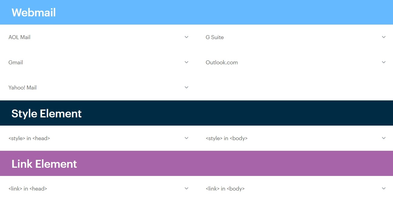
Another big factor that heavily influences the way your HTML emails appear in the subscribers’ inboxes is which email client they’re using to open your messages. Email clients load emails slightly differently, so an email that has a certain look in Gmail can look quite different in Outlook.
Luckily, if you understand how most popular email clients render particular HTML and CSS elements, you will be able to create a pretty consistent experience across all users’ inboxes. It’s all about knowing to avoid unsupported tags and adapt accordingly. You can read this comprehensive guide from Campaign Monitor to understand how most popular email clients (including Gmail and Outlook) support and render different email CSS styling elements.
4. Plan for end-user problems
The email client and screen size aren’t the only factors that can affect the way your HTML emails render in the subscribers’ inboxes. Elements like the email client version, user operating system, unique user settings, security software, and whether or not enable automatic images loading can all impact how your emails perform.
As you can probably guess by looking at this hefty list of factors, it’s very challenging to solve all of them (every single time you send an email campaign) and you would probably throw your computer across the room if you dare to try.
But you don’t have to be completely frustrated in the face of these problems - you just have to do a little planning before sending your HTML emails.
First, consider creating a webpage version of your HTML email.
This acts like a fail-safe button for your email. If for some reason (like one of the many factors discussed above) your beautifully designed email shows up as an absolute mess when a recipient opens it, at least they will have the option to view the email as a web page and see the message as you intended it to be.
Since web browsers can render style elements much more consistently than email clients, you’ll be able to have more control over the look of your web page version email message. In AVADA Email Marketing, there’s always a linked hypertext at the top right corner of an email as an option that will generate a web page version automatically.
Secondly, you should create a plain text version of your HTML email.
A plain text version is what it sounds like — another version of your HTML email that only renders in completely plain text. Having a plain text version of the HTML emails is essential because some email clients or user settings choose not to or can’t load HTML codes.
If this is the case, the client will be able to render a plain text alternative version of your HTML email for the users. If one doesn’t exist, the recipient’s email server can signal that your emails may be spam or potentially dangerous
An email marketing software like AVADA Email Marketing will automatically provide a plain text version for your email if a recipient’s email service requires it. If you are building an HTML email from scratch, you need to create a multipart MIMe message - which is an email that contains both an HTML version and a plain text version of the same email. This process requires advanced knowledge of coding, so you should work with a developer on it.
Thirdly, make sure that your HTML emails still make sense even if the images don’t load.
Some users turn off automatic image-loading, which means your email will render without images when users open it. For this reason, don’t rely only on images to get the meaning of your email message across, and always include alt-text to the images you have inside the email. Alt-text will appear even when images don’t, so your recipients can get the general idea of what the email visuals stand for.
5. Optimize HTML text
HTML text is good for areas with a lot of copy to make sure it’s legible and crisp in all inboxes – mobile and desktop (HTML text will scale depending on device width). Keep in mind that the minimum legible HTML font size for most smartphone inboxes is 13px.
When including a coupon code, you can type it out as HTML text so the recipient can copy and paste it easily. This will also help it display properly when images are turned off in their inbox. If you have to use a copy as an image, send a test email to yourself first before you hit send to ensure that it’s rendered correctly.
Although not related, I recommend you to avoid JavaScript, Flash, and complex HTML/CSS when building an HTML email. JavaScript and Flash are unsupported across many different email clients. Make sure that your email is written in CSS2 instead of CSS3, and HTML4 instead of HTML5, and inline CSS instead of
6. Know the size of your elements
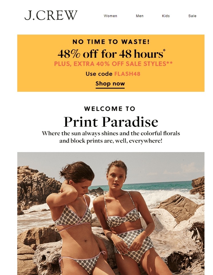
As mentioned, the minimum legible HTML font size for mobile devices is often 13px. There are multiple other elements within your HTML email where you need to consider the size. From the proper image sizes to the character limitation of the subject line - you need to pay attention to these elements’ sizes.
The ideal HTML email width is 600px wide, you keep that width for your email to render properly on all browsers and devices. Also, keep your images sharp but optimized for load time by having a resolution of 72 dpi. Your subject line and preheader should be under 65 characters so they fit no matter what browser, email client, or device subscribers are using.
7. Use the right button
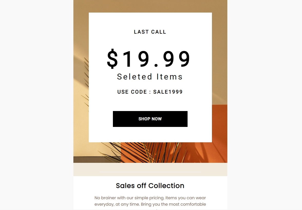
Eye-catching and high contrast CTA (call to action) buttons are what let subscribers know to click through and complete the action you desire from them. Your CTA buttons should be an essential part of your HTML design. Make sure they are easy to see (at least 40px by 40px) and tell recipients what the next step is, whether it is to shop, read, review, learn, etc.
Try switching-up the words in your CTA buttons. “Learn More” and “Shop Now” can work well, but you can play around with more creative options to show some personality and lure users into clicking-through.
By making CTA buttons HTML rather than images, they become bulletproof to maximize clicks. This is because they will still display when images are turned off in the user inbox. You just need to make sure that you are using a web-safe or Google font.
If you want to create image-based buttons, design so that when they shrink for mobile devices, the buttons are still large enough to be readable and clickable.
Although red is often considered to be the best color for a CTA button, it’s not a must. What matters in the end is the overall email design. Make sure you have enough white space around your call to action button and the email colors are mixed well. Let your CTA buttons contrast with the whole email design to be really eye-grabbing.
8. Design the navigation well

On mobile, you should move the navigation to the bottom of the email and stack it nicely above the footer to save space while keeping the tabs clickable. Many companies choose to remove the navigation in the header of the mobile version of an email, you can try that as well.
9. Keep the background image simple
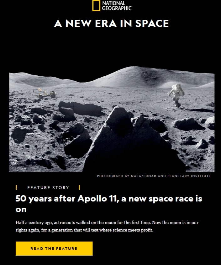
If you want to use a background image in your HTML email, try to keep it simple. Using a simple grid layout is the best approach, and you shouldn’t include complicated graphics that can distract readers from the copy on top.
Since background images can’t display when users turn off images for emails, don’t let them include any important information related to the goal of your message. Remember to write an alt text which will provide context if your images are blocked. Also, use a complimentary back-up background color to display for the images.
10. Conduct testing your HTML emails
Finally, you should test your HTML emails at every stage of development to make sure they work across different email clients, device types, and operating systems. Don’t wait until the day you hit the send button to test out your email — testing as you are working is the best way to identify inconsistencies between different email clients and ensure the most consistent experience possible for your subscribers.
AVADA Email Marketing offers in-app testing and sending tests within the email builder to make your process as smooth as possible. If you’re building your emails from scratch, you can use a tool such as HTML Email Check or PreviewMyEmail to have a better idea of how your HTML email will appear in different email clients and devices.
Create free HTML emails today
HTML emails are an engaging and efficient way to share your business’ messages and keep subscribers coming back for more. With the introduction and best practices in this article, you’re well on your way to building beautiful HTML emails without needing to write a single line of code.
AVADA Email Marketing can be your perfect start, offering a selection of free HTML email templates that can provide a smooth and responsive user experience. You can easily add pictures, text, and buttons in an intuitive drag and drop email builder, and you can be fully confident that your HTML designs will be fully displayed on any device.
Give AVADA Email Marketing a try by clicking on the picture below!
New Posts


