What is the Ideal Email Image Size for 2021?
Designing an email campaign can be enjoyable and creative, but it can also be riddled with technical difficulties. You may come upon some very specific questions when you develop your email marketing plan, such as how you should use your images inside the email. From a design standpoint, which alignment appears the best? What image size is optimal for email visuals?
While copy and design needs may vary depending on your brand and message, there are some fundamental factors to consider when determining the ideal image size for email, especially if you’re in a hurry to send out a campaign.
In this article, let’s see all you need to know about email image size, including some best practices, image dimensions, and the best tool to design email without worrying about the wrong image size. All information is the most up-to-date, so you can be sure of your campaign before sending it.
What’s the best width for an email image?
Microsoft Outlook was the lord of the email client hill over a decade ago, and the typical desktop monitor was 1024px. Marketers all over the world just had to adjust their emails to accommodate these restrictions. The email width restriction of 600 pixels was born out of these constraints, and it has generally been widely agreed upon since then.
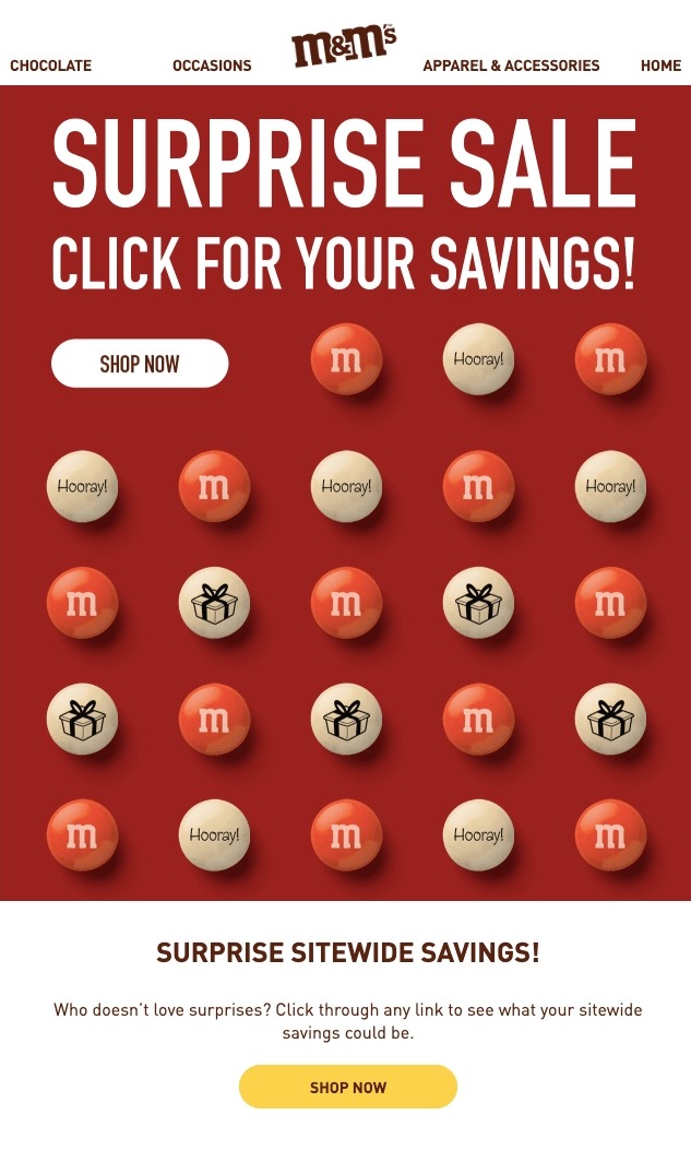
We agree entirely, as there are now more possibilities than just a standard 600px width, however it is still the typical size for email newsletters. Take a look at this fantastic HTML email example, which uses a 600px standard email width.
But a lot has changed since then. Take a look at these numbers:
-
The majority of screens share a resolution of 1024x768 pixels or greater.
-
At the time of writing, the most popular resolution was 1366x768.
-
Mobile devices account for 53 percent of all opened emails, with 26 percent on the iPhone alone.
We’ve heard that some email clients don’t render emails with widths more than 650px correctly. However, I’d like to point out that 600 pixels is only an average email size, not a requirement. More and more email marketers want their campaigns to look like websites and are testing various email image widths.
Another urban legend is that the maximum width of Yahoo! Mail emails should not exceed 650 pixels. In this email client, however, my email, which had a width of 860 pixels, was full size and displayed normally.
If you choose a width other than 600px, simply test your email before sending it using an email testing tool, which will show you exact images of how your email will appear in various email clients and on various devices.
That said, if your email marketing app has email templates that are 600 pixels wide, it’s best to size your email images with that maximum width in mind.
What’s the best height for an email image?

The email image height is, of course, limitless. You may use as many rows as you need to display all of your stuff. However, keep in mind that the longer an email is, the less likely it is to be read all the way through.
A web page’s entire height is 960px, which is frequently insufficient to present all of the information you’ve prepared to convey via email. It’s impossible to avoid scrolling. The most typical email length is between 1500px and 2000px. It’s frequently sufficient to include all relevant content in a single email that users can easily scroll through.
Fun fact: When compared to emails from other industries, emails from the tourist industry are the longest. Because marketers always advertise too many products in one email, regardless of the fact that product cards are usually fairly compact and don’t require much space, eCommerce emails are also quite long.
So, you can make your email image as high as you want. You just need to consider the overall length of your email since this will increase the amount of scrolling a reader has to do. If you worry that your email can be too long on mobile devices, your email marketing app should be able to help you hide some elements.
The best email image size in conclusion
In my opinion: The ideal image size for email is still 600px to 650px.
Stretching your photos to a width of 1000px and beyond isn’t a smart idea.
You might want to experiment with full-width photos. Maybe your goal is to develop email campaigns that resemble landing pages. Then, you can extend your photos to widths of 800px or 900px depending on the subscribers’ devices and email clients. You should also consider that your email marketing app may not support these widths.
Keep in mind that many email apps offer navigation menus and adverts, which may cause your picture distribution to be disrupted. It’s critical to develop distinct emails for subscribers based on individual email clients and browsing habits if you want to experiment with image sizes.
How to decide the best image size for your email?
Here are a few steps you can take to decide the best image size for your email.
1. Use high-resolution images
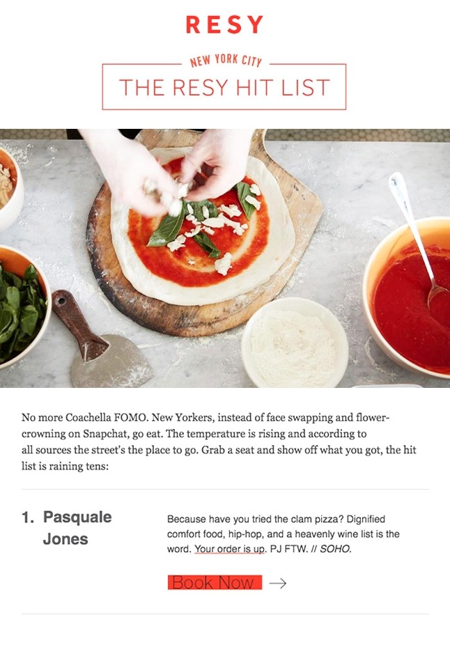
When sending images over email, it’s critical to use the correct size. However, before resizing your photographs, choose one that will retain its visual integrity after resizing. To put it another way, high-resolution photographs will make your job easier.
It’s easy to reduce the size of a high-resolution image, yet the quality loss is generally imperceptible. Attempting to expand a small image, on the other hand, frequently results in pixelated visuals. This might have a negative influence on your campaign and potentially cause your brand to be delegitimized.
Fortunately, high-resolution photos are simple to find and use. You may be able to take images with your phone or camera and simply upload them to your computer, depending on the quality of your phone or camera. This is a fantastic alternative for marketers that need to keep track of their time and money.
Another low-cost alternative for marketers is to use stock photo sites. Stock photography is mostly free on sites like Pexels and Unsplash, and there are a variety of additional sites that offer free, paid, and premium-priced images.
If you’re running a specialty campaign, you might want to hire a photographer. The majority of professional photographers use digital equipment. As a result, you’re almost certain to have a large number of high-resolution images taken specifically for your business. Furthermore, if your business evolves, you can continue to edit and use these photos.
You can use graphics instead of images if you want a more personalized look. Illustrations and images might be incredibly stylized, which may suit your business well.
Once you’ve got your image or photographs, you’ll probably need to downsize them and possibly convert them to another file format. Photos will often be converted to JPEGs, while graphics will be converted to PNGs.
2. Find the right dimensions
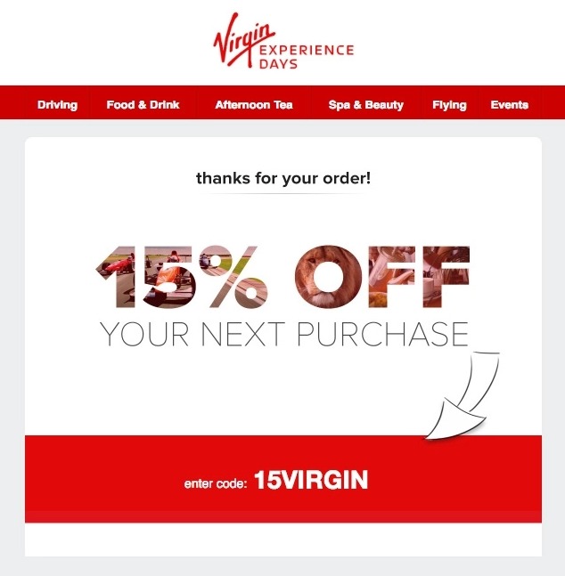
Because you’re seeking the best image size for email visuals, keep in mind that the size of an image is determined by two factors: aspect ratio and quality. Because most photos have different aspect ratios (think portrait, landscape, square, and so on), keeping image size consistent helps your email look visually balanced. Do a lot of homework on your email platform and the dimensions it supports.
Keep in mind that the bigger the image, the more likely it is to be blocked by an email filter or firewall.
If you use AVADA Marketing Automation, I suggest keeping the email image width under 600 px and height under 1000px.
3. Pick the right file format
Your newsletter will almost certainly require a certain file format, depending on the visuals you use. JPEGs, PNGs, and GIFs are the most widely used file types.
JPEGs have the lowest quality of the three file kinds, but when employed, they retain color. Because PNGs are higher-quality photos, they may take up more storage space. GIFs are probably all too familiar to you. Image and animation looping is possible with this file type.
Here is a breakdown of each file format:
-
JPEGs: While JPEGs have a lower resolution than PNGs, they are heavily compressed files that take up little space. JPEGs are also “lossy,” which means they can exhibit a wide range of colors. As a result, JPEGs are frequently the best choice for images. JPEGs are a natural choice for showing photos with a wide range of colors. Furthermore, when photographs are converted to JPEG, any loss in image quality is hidden from view.
-
PNGs: JPEGs are great for photos, but they’re not so great for logos, graphics, or text. PNGs, on the other hand, offer a clear, sharp alternative to all three. PNGs also allow you to use a translucent background in your email if your logo or graphic has one.
-
GIFs: Because, unlike JPEGs, GIFs maintain image quality, they can be utilized for a wide range of images. GIFs are most typically used for animated content, and they’re a terrific way to spice up your emails. If you want to present multiple photographs of products in succession, animate an illustration, or just boost visual appeal, you can use a GIF.
While all these types of files can have the same dimension or size, different formats can negatively or positively affect the deliverability of your email. Overall, your email image size should not make your email too heavy or email clients may refuse to send them.
5 Best practices for email image size
Here are some general best practices for your email images.
1. You can play around with the length
While a 600px width is the ideal image size for email, you can experiment with the length. Many brands create stunning vertical visuals that “flow” smoothly as users scroll through their emails. Simply consider the overall file size in MB and the amount of material you intend to include when determining length.
However, don’t use one large image for the entire email.
For starters, many users have email images turned off entirely. Consider the possibility that your content will be disabled before your subscribers have a chance to read it. Furthermore, if it works but takes too long to load, you risk losing your readers.
2. Always include relevant ALT text
Adding alt text to your photographs is a fantastic idea. Alt text is required for accessibility as well as for users who may have difficulty downloading your photos. It can also aid in the optimization of your landing pages for search engines.
Keep your ALT texts simple and short—just a few words of relevant material will work.
3. Consider the email clients of your subscribers
Understanding email clients is your best line of defense when it comes to crafting the perfect email.
Don’t put any restrictions on yourself: Sort your subscribers into groups based on whether they use Outlook, Gmail, or another email service. You can also divide them into groups based on their preferred browser (if that’s how they usually read your emails).
4. Keep your image low weight
In this case, 1MB or less is the optimal image size for email. It’s fantastic if you can get away with a considerably lighter image.
It’s advisable to stay away from photographs that are too big, both in terms of file size and pixel measurements.
The goal is for your email to load as rapidly as possible. Because large photos take a long time to load, your subscribers may abandon your site.
Furthermore, more than half of all emails are opened on mobile devices, and this number is steadily increasing. Don’t waste your subscribers’ data by uploading large, high-resolution photographs.
5. Find ways to test your email image size
Feel free to explore a little if you’re not comfortable with the 600px width restriction as the optimal image size for email. Simply make sure you test on a variety of devices, email clients, applications, and browsers.
This may sound obvious, but you don’t want that annoying tiny scroll bar to appear when your subscribers open your emails. You want it to load correctly on every screen without the subscriber having to do anything.
Also, side note, test load speed. Make sure to check through your landing page links to make sure they’re loading quickly and looking good on different devices. You want a seamless user experience from beginning to end.
The best tool to not worry about email image size
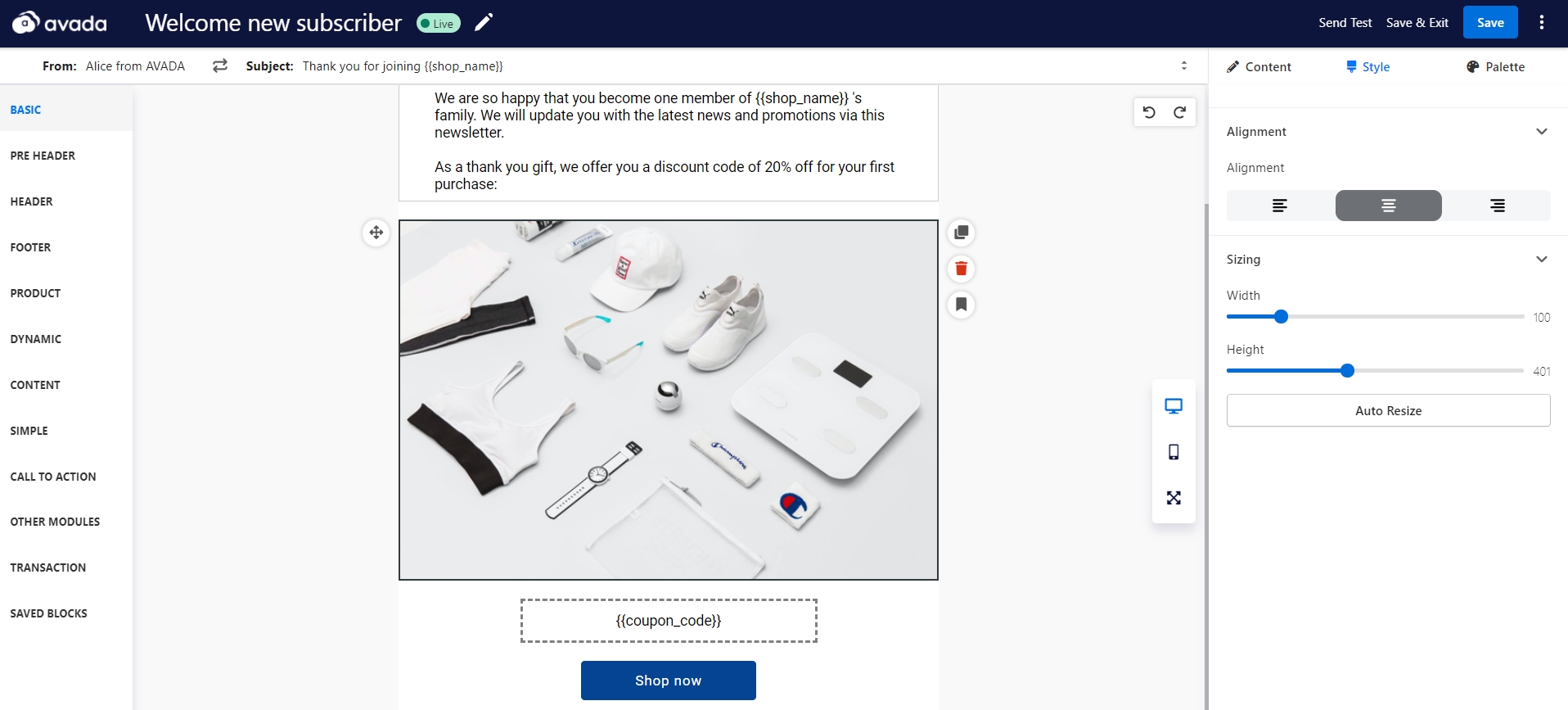
At AVADA, we’re proud to provide you with AVADA Marketing Automation - an industry leading app that lets users create email marketing campaigns using a powerful drag and drop email builder.
When you choose to insert an image into email with AVADA Marketing Automation, you will have control over sizing, alignment, alt text, and also link to make your image a solid experience for subscribers. You can even pull a color palette from your image right inside the app to better style your overall email. We also support all types of image files like PNG, JPEG, and GIF.
We do have restrictions on the email image width which is under 600px. But with any image that you upload, there is an Auto Resize button that helps you resize the image to perfectly fit the email design. Not to mention we also have live view for mobile and desktop, so you can easily see if your image works on multiple devices.
Modern marketers are leading a revolution in email marketing and you can join them to push the boundaries with AVADA Marketing Automation. Click on the link below to create an account and try out the app now for free!
New Posts

