How to Improve Shopify Store to Increase Sales?
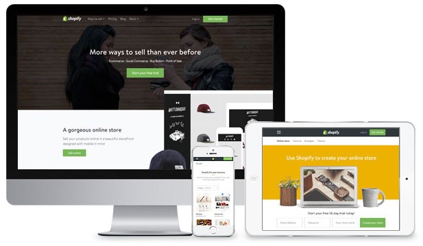
Today, about 375,000 online shops are using Shopify to sell their goods. The platform itself provides a host of features that can meet the requirements of both new retailers and established brands, but still stays simple enough for the average non-technical entrepreneurs to start a business and earn additional income.
These days, however, the market is so fierce that cutting the noise and producing sales can be difficult. And if you’re one of those who are dealing with this problem, you’re not alone. There are many store owners out there who have been scratching their heads, wondering what they can do to earn larger revenue.
This is why, in this article, I will address practical Shopify website optimization tips on how to drive more sales to your eCommerce store. Let’s jump right into the details!
Before reading:
- 9 Best Shopify Speed Optimization Apps
- 13 Ways to Speed Up your Shopify store
- How to Increase Conversion Rate for Shopify Store?
- 22+ Best Shopify Increase Conversion & Sales Apps
How To Improve Your Shopify Website: General Optimizations
Do Keyword Research For Your Shopify Store
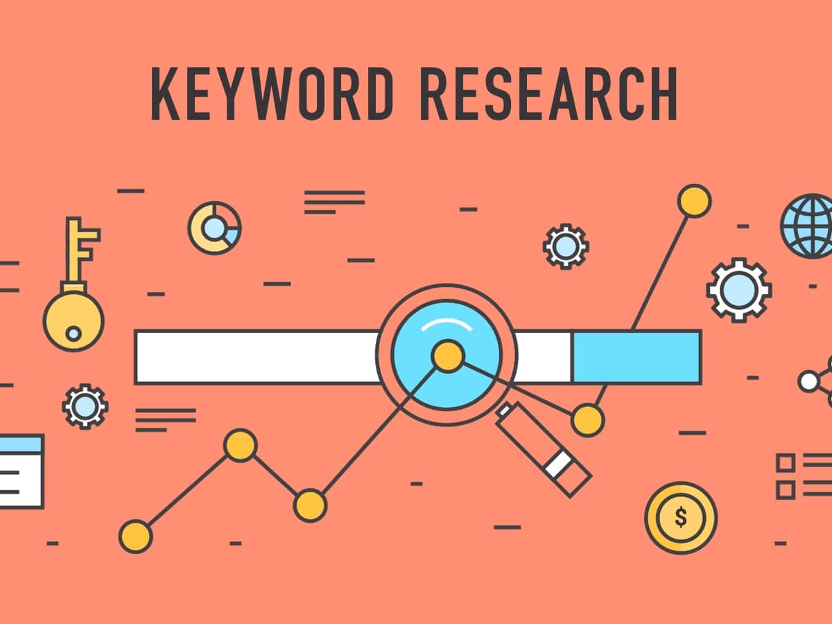
To attract the right shoppers and generate more sales, you need to know your ideal customers. Learning the search terms that your target audience uses is a step in the right direction to achieve further product sales. Also, a brand has to structure its website from the research and data it has acquired. Otherwise, search engine top results won’t appear. “Organic traffic” won’t come to you either. So when researching keywords, finding, and using the right words and phrases is important.
Keywords are the core of every search campaign. There are many SEO keyword tools available to help you find relevant keywords:
- Google Keyword Planner– Google Keyword Planner is a perfect place to start looking for keywords.
- KWFinder– KWFinder is an outstanding tool for long-tail keyword analysis. It allows you to monitor search length, pattern, CPC, and difficulty levels of keywords in its results. It also lets you dig into local keyword research — letting you target cities, states, or countries.
- Moz’s Keyword Explorer– This tool gives you a better understanding of why certain websites rank on SERPs based on links and social data. It also lets you know how important a keyword is to your campaign, and gives you a mix of keyword metrics to prioritize.
Use a “flat” website architecture
Flat-site architecture is great for SEO. Such architecture means search engine crawlers and users can access any page on your site in just four clicks or less. But why is that important?
First of all, a flat site architecture makes it easy for search engine crawlers to search all site web pages. Second of all, link authority tends to flow from pages that receive many backlinks (such as your homepage) to other pages on your web that you want to rank (such as your product page). That’s why you need it to be properly designed so that your target customers can access your content quickly and easily.
Build backlinks
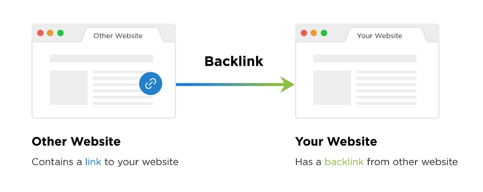
Search engines typically use backlinks to rate an eCommerce website’s current status. This means if there are many high-quality and reputable sites that have links to yours, your website will also be viewed as important in a larger community and will be well-positioned. Meanwhile, a lack of backlinks can hinder your rankings. It’s about building a healthy backlink approach.
Do on-page SEO
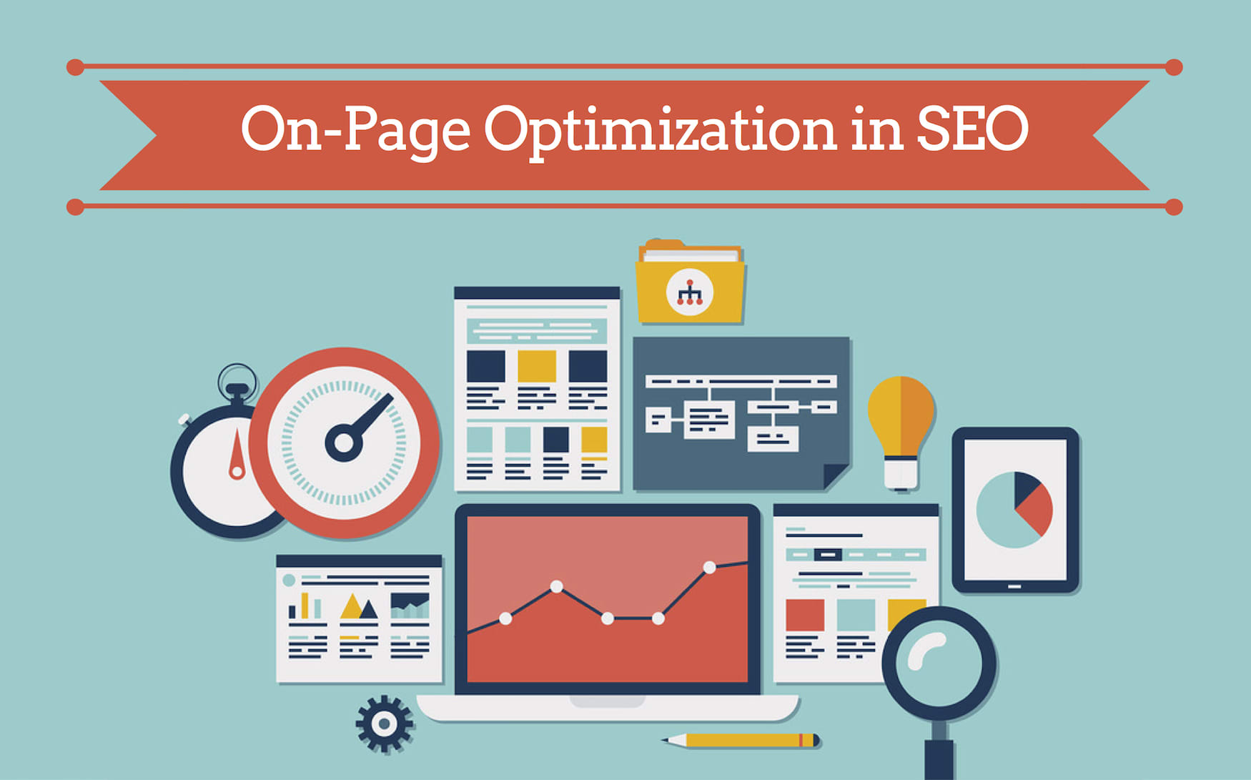
On-page SEO is the effort to optimize individual content pages (whether text, images, or video) on your eCommerce site for the same keywords you have previously researched. It also affects your search rankings.
Practical ways to do on-page SEO on your website:
- Upload robots.txt. This will make it easier for Google bots to crawl into your website.
- Have an XML sitemap. It’ll help Google with your site’s overall architecture.
- Set up Google Analytics on your site.
- Validate HTML / CSS.
- Get a certificate SSL, then update it to HTTPS.
- Check and correct any crawl errors.
- Place target keywords in the title and Heading 1 for your content.
- Optimize meta-descriptions as it impacts click-through levels significantly.
- Optimize image size, alt text, and file name.
- Optimize headings (H1, H2, H3).
You need to update your content periodically. Thus, you can target keywords with the most conversions. SEO continuously evolves. Changes are required as search algorithms improve. Besides that, the desires, expectations, and behaviors of the customers are continuously changing as well.
Optimize the loading speed of your website

You should prioritize the site loading speed before anything else. It’s because approximately 40% leave a page if its loading takes longer than 3 seconds. Just a one-second delay in your site causes the conversion to decrease by 7%.
For your eCommerce shop, this can trigger thousands of missed sales per year. Remember that most Internet users are growing increasingly frustrated these days. Slow loading is terrible for your company. That’s why maximizing your store’s loading speed is essential.
Here are some helpful tips to increase your loading time:
- Compress images.
- Keep limited redirections.
- Enable browser caching.
- Minify code (JavaScript, CSS)
- Get insights into visitor behavior in your Google Analytics account
For the overall user experience, loading speed is important. It’s also Google’s most critical ranking factor. So aim to grow a site faster without losing elements that offer an ideal user experience.
Create High-Quality Content

One of the most common mistakes Shopify users make is to concentrate too much on product catalogs — the keywords they use, images, and descriptions. They seem to neglect one key aspect of SEO, producing high-quality, insightful content.
Take, for example, this ibmk: Best Driftwood for Aquariums: this Institute of Marine Biology educates its customers through “buying Guides,” providing its consumers with a tech tutorial and enabling them to learn more about the various types of items, accessories, and add-ons before reaching the purchase page. Moreover, those that continue to do well on search are those sites that generate in-depth, highly detailed posts that most users are usually interested in.
Do off-page optimization
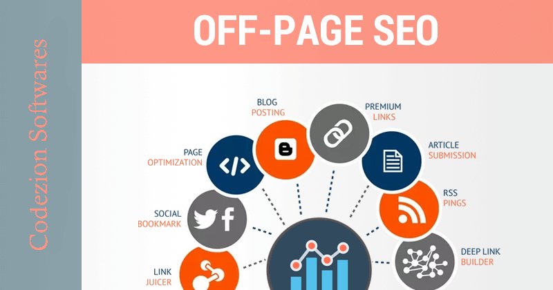
Doing on-page optimizations is just part of the whole process. Equally essential is your off-page presence. Off-page SEO optimizes the online and offline footprint of your brand through content, relationships, and connections that create an optimal experience for prospective customers and search engine bots. It boosts positive brand names, traffic, search engine rankings, and conversions.
Links
Links are critical in improving page rankings and traffic. Ideally, try avoiding low-quality websites, link schemes, and paid links.
Here are some suggestions for high-quality links:
- Let the media talk about you.
- Join top-quality directories.
- Network with other bloggers and industry influencers.
- Interact on forums.
- Develop high-quality blog posts and connect to bloggers and websites.
- Ask vendors, associates, and customers to exchange links.
Build Social Media Profiles
Keep in mind that not every social media platform is a good fit for your brand. Ideally, consider identifying where your potential customers hang out online and concentrating on those places. When you know where your customers are, produce videos, posts, and other media forms to build up a connection with your audience.
Get Local
Make sure that your profile is present on YellowPages.com, Yelp, Google My Company, Bing, Yahoo, local directories in your city, and reviews. Don’t forget to mention your site’s location.
Affiliate and Email Marketing
Affiliate marketing and email marketing can help raise your brand awareness. A secret to any off-page strategy is getting your name and goods out to the right people to talk about.
Optimize your website for mobile devices

Mobile now accounts for nearly 60% of all searches. So if you don’t have a mobile-friendly website, it’s unlikely you’ll end up on top rankings. According to Alexa rankings, 80% of top websites are mobile-friendly. Now, wonder if your e-commerce platform has adjusted to this requirement.
If your response isn’t yet, this could be the key reason you don’t hold the coveted top spot on search results. Optimizing your web app will help you generate more traffic from users browsing their smartphones and mobile devices.
Use Shopify SEO apps
Using Shopify SEO tools can make your website as search-engine-friendly as possible. Some apps help you search for keywords as alternatives to Google Keyword Planner. Other tools also help improve photographs and videos. Used correctly, these make it easier for you to shape your eCommerce store.
Just like Shopify SEO software, there are other applications to help optimize your eCommerce platform. You can use them to identify issues on your website. These apps work like WordPress’ Yoast SEO app. There’s no Yoast Shopify app available. One thing to keep in mind is you need to update these apps frequently as SEO constantly evolves.
Speaking of SEO apps, we have built a dedicated app for SEO called Shopify SEO Suite. This app will help you optimize your website images and structure with a single click - no coding experience required to use this app.
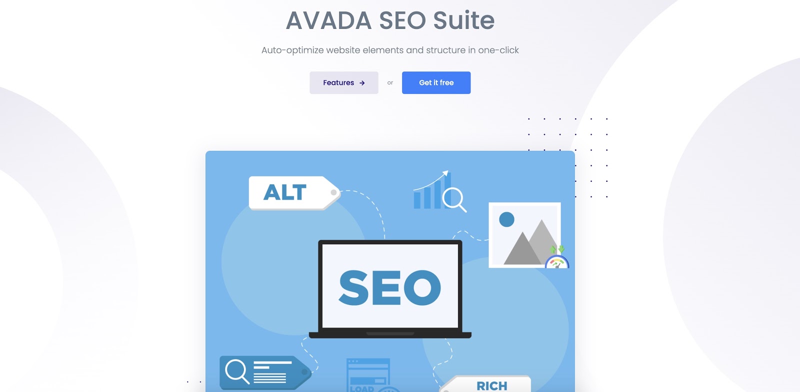
Using our SEO Suite will improve the loading speed of your website and make your website friendly to search engines. More importantly, this app is completely free! You can download it at this link.
How To Improve Shopify Product Pages
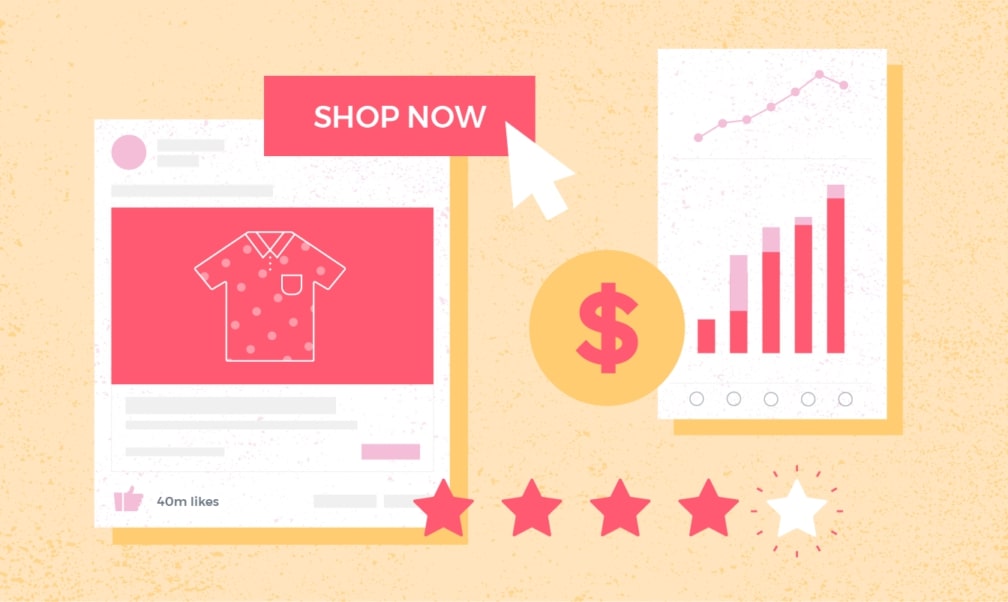
As an eCommerce shop, getting traffic to your website is just half the fight. That’s a huge mission in itself, but so much more needs to be done to boost revenue. Take a moment to put yourself in customers’ shoes.
They’re interested in whatever you offer. Maybe they’ve found you from an online quest for a product they need, or maybe they’ve clicked a PPC ad. They can find your site from a social media campaign. It doesn’t matter how they find you. What’s crucial is they landed on your site due to their interest.
You’ve done a fantastic job setting up the website navigation, making it easy for searchers to find what they’re looking for, and, finally, they are taken to the product page. Here’s what you need to know. When a searcher lands on your product page, they are just a click away from the buying decision. But this won’t happen if those landing pages aren’t conversion optimized. Failure to properly design and customize product pages is a mistake I see eCommerce websites often make. This is why you need to optimize your product page.
Before we move to the next point, I want to make sure you understand exactly what needs to be included on your product page. All pages should have the same elements.
- Product
- Branding
- Design
- Copywriting
Second, the product must always be the center of attention. While this may seem obvious, I’ve seen several eCommerce sites put their goods in a post-thought way. Branding will be available on the website. Although on your homepage or other interior pages you might have branding, you can’t forget to apply that to your product pages. Based on where the traffic comes from, not everybody on a product page can see the homepage.
Website design is a core aspect of a web website. If you have all the features in the words, but the website is not user-friendly, then it’s pointless.
Finally, you won’t be able to sell anything without a good ad copy. Therefore, the sales copy is important. Writing will flow well with your design and branding to tie it together. Now that you know what’s needed on your product pages, let ‘s look at some more detailed tips for optimizing the product page.
Make sure that you have a clear CTA
Why does someone buy a product from your website? They need to click on the button to check out. If the button is hard to find on the website, you will lose conversions. Look at Blenders Eyewear’s web page.
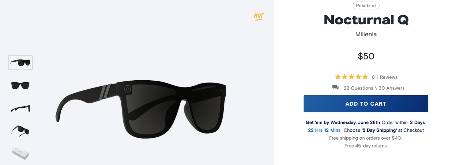
On this whole page, only one button can be clicked — it’s the “add to cart” button. It’s big and bold. As you can see, apart from the product itself, the CTA here is the page’s most prominent component. Can’t be overlooked.
Go to your website and see your product pages. See if your CTA is as noticeable as this one. If your visitors can’t find the button instantly, it’s a problem. Your CTA has to attract attention instantly. When visitors have to find it, that will hurt your conversion rate.
Don’t put CTA conversion near other CTAs on your web. For instance, the “buy now” button shouldn’t be placed next to a “subscribe” button. Although it’s necessary to collect emails, it doesn’t belong above the fold on your product page, and it definitely shouldn’t be anywhere away from your transactional CTA.
You don’t get fancy with your call-to-action. Anything like “buy now” or “add to cart” is perfect. Trying to be imaginative will confuse your customers.
Use professional photography
Unlike brick and mortar retail, online customers rely heavily on photographs for buying decisions. Your smartphone may take a fantastic picture, but you shouldn’t use it to take product images. You should have all your photos taken by professionals.
It’s really a great thing to have a photographer take charge of your photoshoots with professional equipment and edit tools. It’s worth investing money in this stuff to get the best photos. You must take pictures from any viewpoint. You do need to make sure you take the “right” photos for your product pages.
Let’s presume you ‘re selling something like a wristwatch. A watch picture alone on a table doesn’t really add much value to the customer. But if you place it on someone’s hand, it gives them a better idea of how the product looks if they buy it. Have a look at the photos on MVMT’s web page.
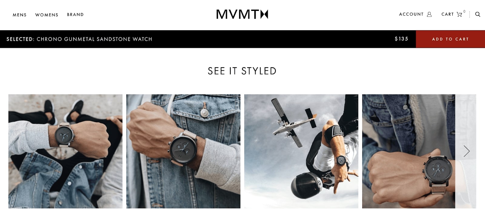
That’s very well-done photography. They used “right” photos as all shots show the product on a person’s hand. You can see it from any perspective. The first picture demonstrates how it looks from a first-person perspective to check the clock.
And it has several other shots from the view of someone else. They also show how the watch looks if you fall off a plane. Such pictures tell the entire product tale. It’s trendy, looks fantastic, and can be worn as casual and active wear.
Show social proof on your website
No matter how independent or special an individual claims to be, consumers will still follow others’ lead. Why buy a commodity if nobody else does? They can’t say if your product is nice, useful, or just a waste of their time. If these questions cannot be answered, they probably won’t buy. Therefore, you need social evidence on your web pages.
We have a dedicated app to show social proof on Shopify website, and it’s free! Go and grab it!
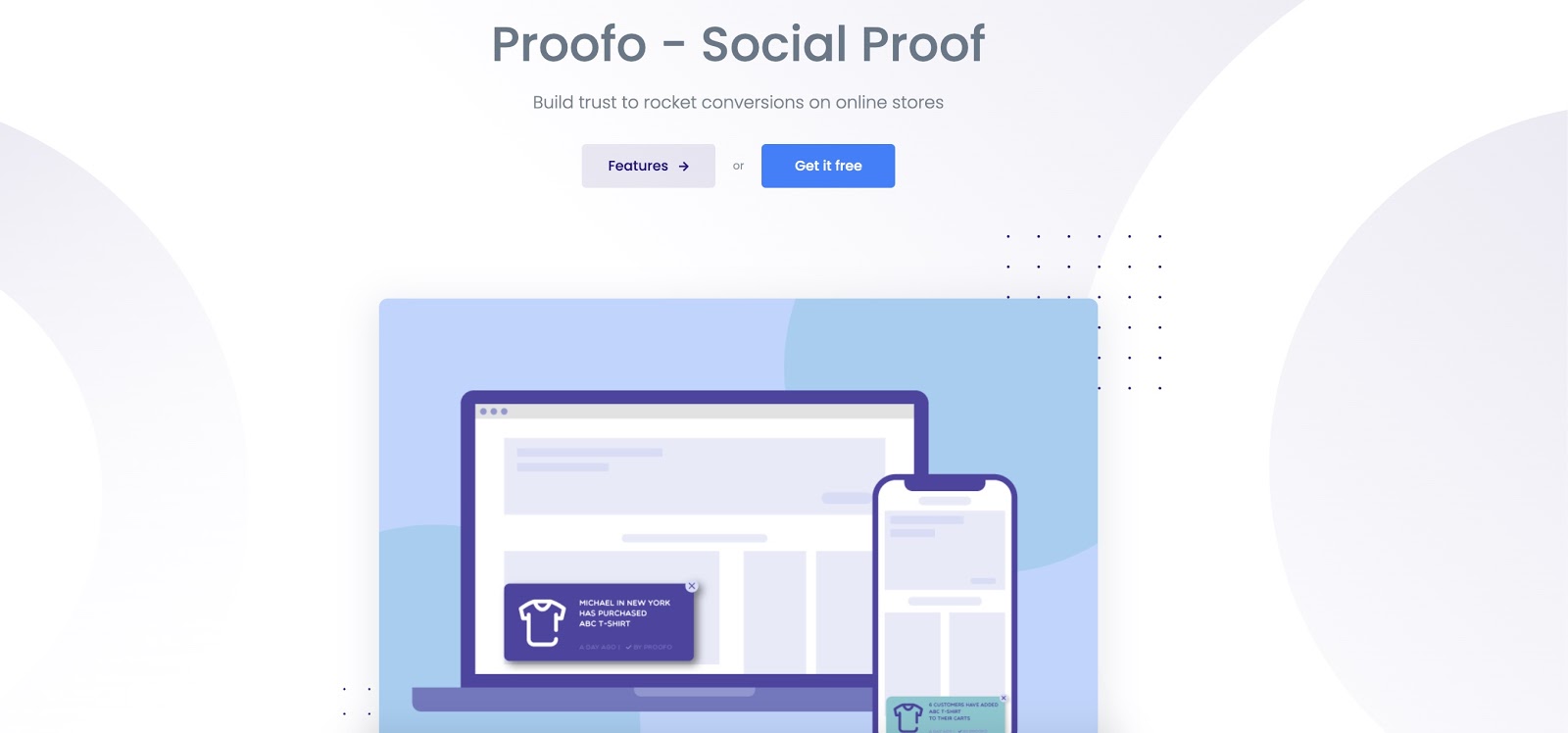
84% of online buyers trust an online review as much as a friend’s recommendation. Upon reading between one and six reviews, 68% of consumers form a brand or product opinion. After making a purchase, send a follow-up email asking them to rate or review the product. The more feedback you get, the more reliable your brand will be.
Nevertheless, 49 % of consumers claim they value the number of online reviews when evaluating a company. Another thing we looked at earlier, Blenders Eyewear had comments on their web page. Only make sure the comments don’t stop the consumer from purchasing. Here’s another example from Brooks.
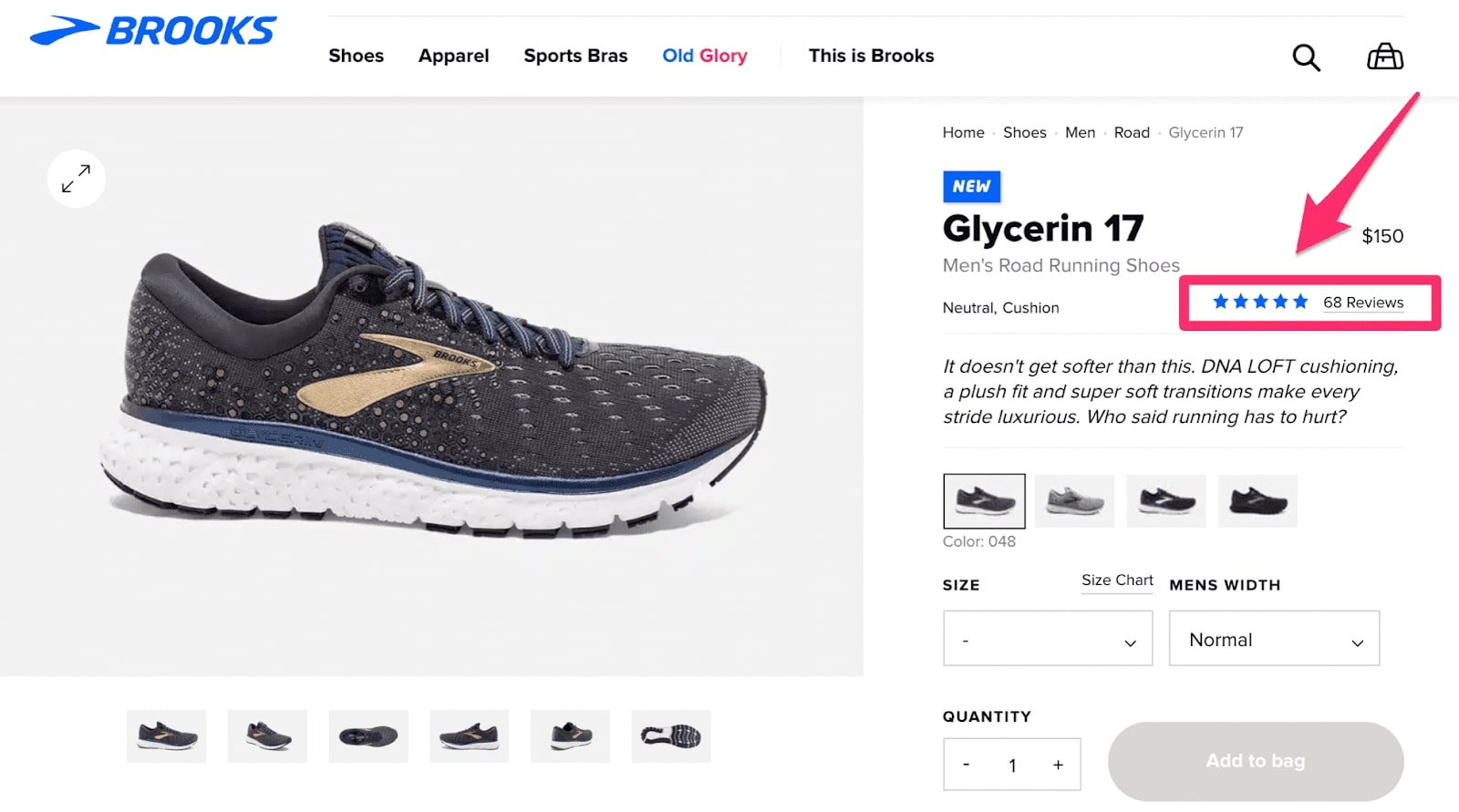
This pair of shoes has 68 ratings, and its customers rated 5/5 stars. You can see these details above the fold and below the definition. Yet the real comments aren’t seen here. Clicking them will carry you to the review section.
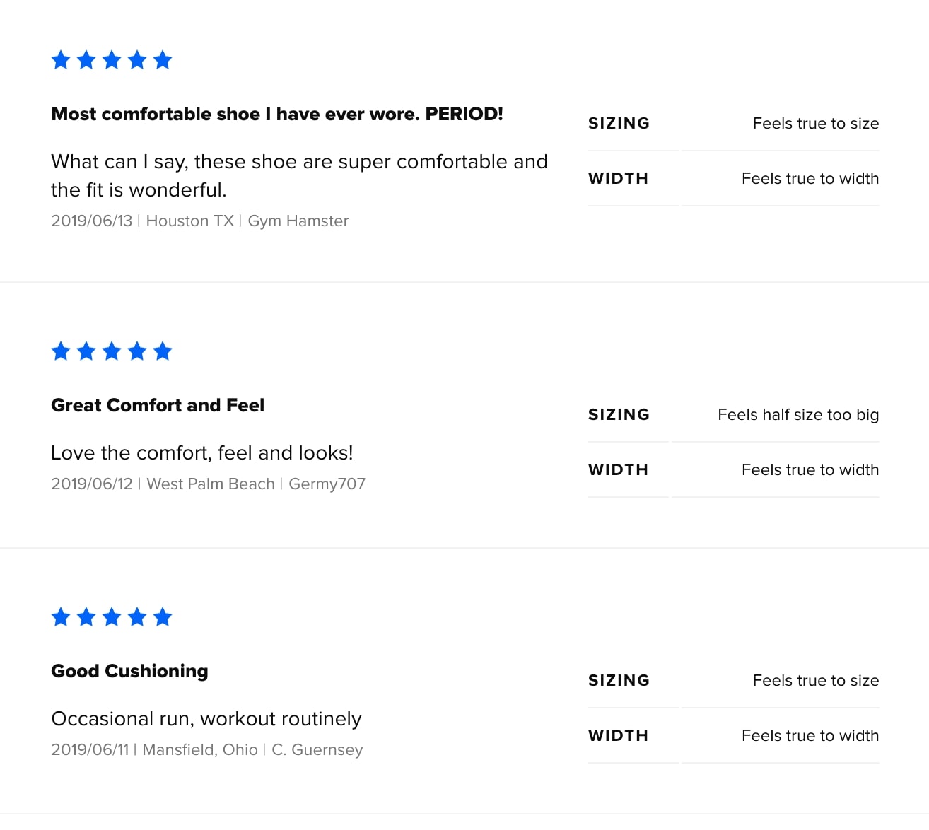
Provided these were put elsewhere on the website, the product and CTA would be less visible. But by providing some information above the fold and offering consumers quick access to find and read feedback, it improves the chance of them making a purchasing decision. Visitors can have everything they need without going to another landing page or third-party review pages.
Add videos to your product page
A video is worth more than a ton of pictures. I explained earlier the importance of allowing your customers to better understand your goods with photos. But a video really gives your prospects a closer look and highlight your product much better than photos.
Indeed, 90% of people say product videos are helpful during the purchasing process. 70% of Advertisers say videos convert faster than any other content. After viewing a video, 64 % of consumers are more likely to purchase a product.
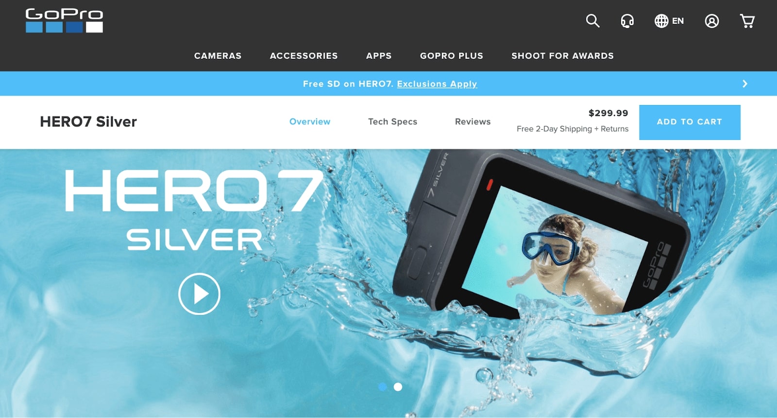
It’s a different method from any of the other cases we’ve looked at so far. Videos are particularly relevant because they sell a camera on this website. The video reveals precisely what kind of material this camera captures. Videos are useful for those of you with items that require further clarification. It’s not important to sell anything basic, like a plain shirt.
Yet you should also have videos, even though you sell something straightforward. Allbirds is a clothing brand with photos walking in their shoes on their web pages. For those of you with a product a little more complicated and need more clarification, adding a “how-to” video or product presentation may be quite beneficial to the user.
Write appealing product descriptions
The poor product description is one of the most common errors in eCommerce product pages. Everything looks amazing until visitors get to the description. While your product page should be visually appealing with photographs and videos, you do need some text on the website. Keep it short. Don’t throw long paragraphs overboard. Nobody wants to read lengthy text blocks. You can use bullet points to simplify content, making reading easier for people.
Understand the audience and write your description from their point of view. When your target audience is business professionals over 50, the definition would be different when you wanted to attract college students. Look at Dr. Squatch’s product pages, an eCommerce brand selling men’s soap.
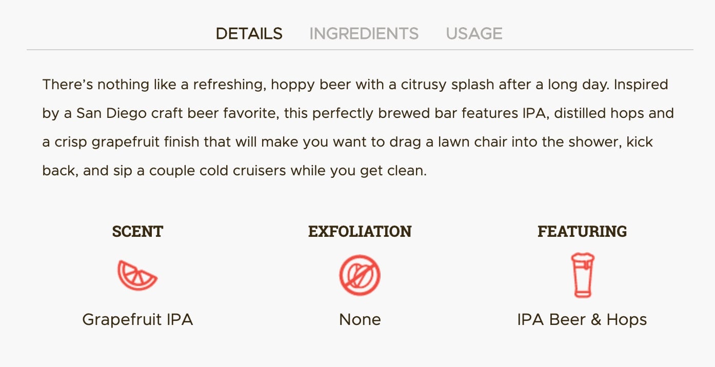
The beer fragrance inspired this particular soap bar. Look closely at some text in this summary. They use “drag a lawn chair into the pool” and “sip a couple of cold cruisers.” Their product isn’t for everyone. They’re confident using slang to reach a particular audience. Normally, I’d steer clear of this phrasing. Yet in this situation, it’s part of the overall branding plan.
Understand the client and what they want. Then convey that in the description. Don’t just hurry through the process.
Justify your pricing
Your pricing strategy is a crucial part of your product page as the price is obviously on display. That’s your chance to explain pricing and demonstrate the importance of your offering. The definition, photos, images, and everything else on the website will describe precisely why the product is priced anyway. It applies particularly to those of you selling goods at higher prices. Look at Lululemon ‘s example.
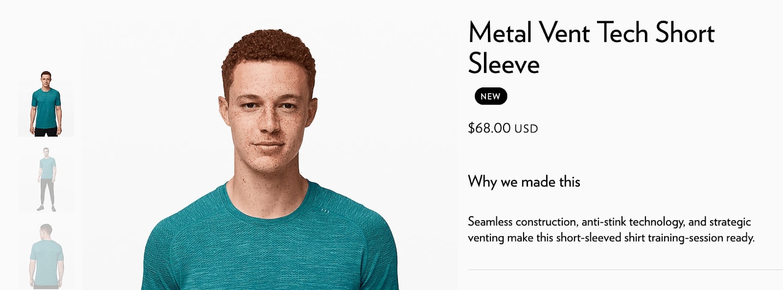
They have an explanation directly below the item, “why we made this.” In short, it describes that the product has no seams, is made with anti-stink technology, is ventilated, and for training. It’s not just a standard t-shirt for bed or house wearing. The $68 high price tag for a relatively basic shirt is justifiable.
Without that detail, consumers may be more reluctant to purchase. Truly, you won’t know for sure if your product page is completely configured unless you try various approaches. That’s why every page item should be A/B tested and optimized constantly.
- CTA wording
- CTA placement
- CTA color
- Description
- Review placement
- Price placement
- Price size
Related posts:
- What is a Good Conversion Rate for Shopify?
- How To Choose A Domain Name
- Mobile Ecommerce For Online Business
- Drop Surfing Ecommerce
Final Words
This is a long guide indeed, but it contains everything you need to make your Shopify one of the best out there. Now it’s time to put what you have learned in this article into action! Please feel free to leave comments below for further discussion.
New Posts


