7+ Opt-In Email Examples And How To Use
Getting people to give you their contact information is difficult. However, if you want to expand your business, you must find a technique to generate leads.
This is why you must have an email opt-in process in place. We’ve got the best opt-in email examples and recommendations to assist you in successfully growing your own email contact list (the most straightforward way).
In this article, we will show you:
-
The best opt-in email examples
-
The best tool to insert opt-in email (even free)
So, if you, like many other marketers, are struggling to get more leads into opting in for your emails, it’s time to change. Continue reading to see the 7+ best opt-in email examples to grow your list with quality subscribers.
What should you look for in a good opt-in email
An opt-in email form does not need to shine with animation and sprinkles; it simply needs to function well.
Some of the most effective email opt-in examples use few words. Some have more words than others. It will vary depending on the theme of the content, but the basic rule of thumb is: simpler is better.
When it comes to writing copy for an email sign-up form, quality should always take precedence over quantity.
Newsletter form sign-ups, lead magnet opt-ins, and interactive opt-in email examples are some opt-in email examples that I will show you in the next section. But, if you would like to learn more about opt-in email, check out our article on What is Opt-in Email Marketing & Best Practices.
7+ opt-in email examples
Now, for a reason you’re presumably reading this in the first place, here are 7+ excellent examples of opt-in emails.
#1. Greats
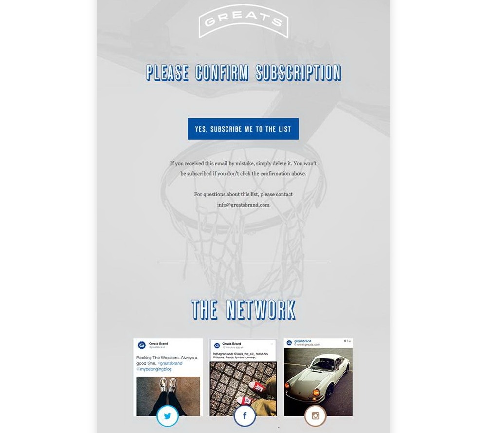
People are instantly drawn to any social media icon in an era governed by social media. Greats, a well-known shoe manufacturer, does an excellent job of including social network symbols in their opt-in newsletter.
I really like the minimalist design of Greats’ email, reminding customers about their basketball shoe line. So, the main CTA for this email is the confirmation button. If you don’t know, this is a subscription confirmation email, or a part of a double opt-in.
Beside that, Greats draw attention to some of their social media posts on all three platforms, Facebook, Instagram, and Twitter. This shows that the brand has a large following with many customer reviews and feedback. I would like them to add the number of likes and comments, making the posts look more authentic.
#2. Content Verve
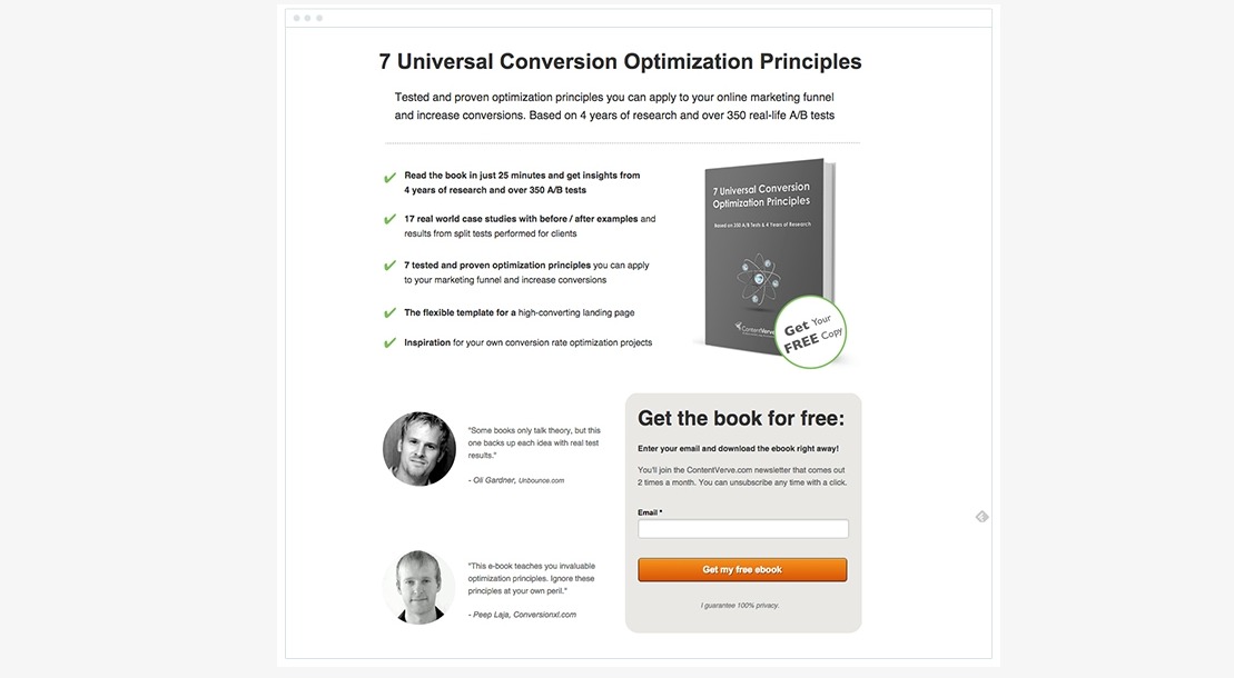
Nobody wants another email clogging up an already cluttered inbox, which means your entrance cost is higher. That implies your offer has to be fantastic.
If you want higher conversion rates, your button wording and value proposition must be on point—rather than the standard call-to-action buttons and the “subscribe” links, which can turn consumers off.
Persuade them that they can’t leave without this bargain, and that providing you their email is a no-brainer given the value they’ll receive in return.
Content Verve inspired more signups using the same idea. Their offered value as a free ebook on conversion optimization principles. With a short paragraph explaining the book’s strengths and some reviews, the company shows that customers only need to provide their emails for this amazing free ebook.
The CTA button is popping with color and the words “Get my free ebook.” You don’t have to use their exact words, though. Always test your CTA copy to see which tone and offers can resonate well with your leads.
#3. Search Engine Journal
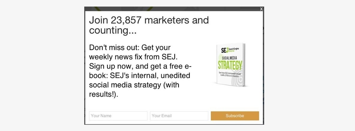
Exit intent opt-in are pop-up-style functions that display when a user moves their mouse to close a current window. For example, if you arrived at a website, visited a few pages, and then moved your cursor to close the tab, the website would launch a pop-up to lure you to stay.
Unlike lightboxes or immediate pop-ups that appear when you initially visit the site, they appear only when users are about to depart, reducing the danger of bothering them while also providing you one more chance to drive a sign up. There is almost no drawback because consumers are going to leave your site.
Keep exit-intent pop ups simple, as Search Engine Journal does. Search Engine Journal entices consumers to acquire a free eBook with valuable content in exchange for a simple email exchange by leveraging social proof of their own(“Join 23,857 marketers and counting”).
#4. Ted

Marketers unanimously agree that personalization is critical to the success of a campaign.
Personalization has been found in studies to boost consumer engagement by up to 72 percent.
But the difficulty is, how can an opt-in message be crafted to allow customers to do whatever they want?
After completing the first two stages, the user will be directed to an opt-in form. The designers at TED have created an inventive style to gently guide users to click on what they want for the opt-in email. The copywriters have cleverly included topics like the future, self-improvement, new perspective, entertainment, etc., for subscribers to choose from.
#5. Upworthy
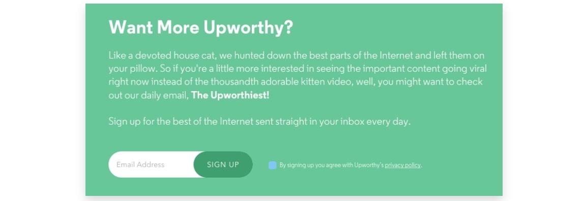
Upworthy does an excellent job of keeping things simple while also instilling a sense of urgency in its readers. The copy is beautiful in every way, equating themselves to those of a smart and equally bright cat discovering the greatest parts of the internet.
The copy encourages the customer to sign up with their email address in order to receive important content that is going viral. Users won’t be able to find this kind of resource anywhere else and will have to continue watching adorable kitten videos instead.
The color design really catches the eye as well, making the opt-in seem reliable with a distinctive style.
#6. I will teach you to be rich
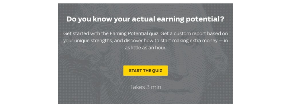
Not every opt-in email needs to be in a form type. You can lead the visitors down a quiz to help them discover more of your services and even their own insights. The opt-in from “I will teach you to be rich”, engage with visitors in a unique way, and promise not to waste subscriber’s time, so it’s already above the average.
Next, the opt-in has a compelling headline that asks a question to bring out the curiosity in visitors. Who wouldn’t want to know their actual earning potential? The opt-in then offers a motivating lead magnet that gives people a long life-term benefit. Discovering your unique strengths and learning how to make extra money is a pretty good deal for a three-minute quiz.
The opt-in email from “I will teach you to be rich” shows that there are more creative ways to create an opt-in form. And you can get that creative too.
#7. Acustom Apparel
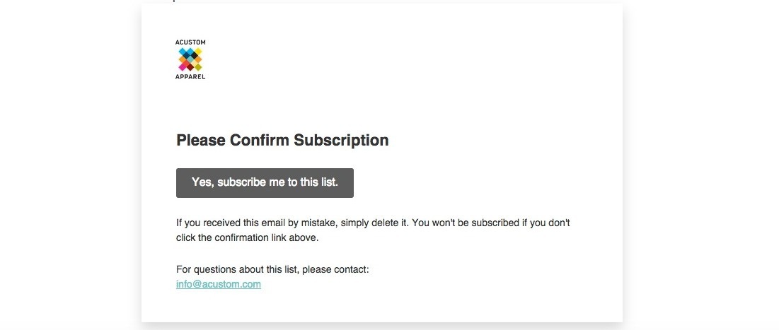
Although it is intriguing to have a blend of various colors in the email, Accustom Apparel’s designers have demonstrated that a simple and minimalistic style is equally eye-catching.
The overall design is clean and uncomplicated, with a prominent subscribe button in the center. Like Greats’ email example, this is a subscription confirmation email, which is a part of a double opt-in.
Double opt-in is the most effective technique to ensure that your subscribers are committed and eager to receive your campaigns. With a single opt-in method, anyone who knows your email address can use it to sign you up for undesired lists. Most people are now cautious of organizations that still use the single opt-in technique.
A confirmation step in your subscription process is not only good practice; it may also be required by law. According to the European Union’s new GDPR legislation, double opt-in is the simplest approach to demonstrate “clear affirmative action” before sending marketing emails to a new list member.
#8. AVADA
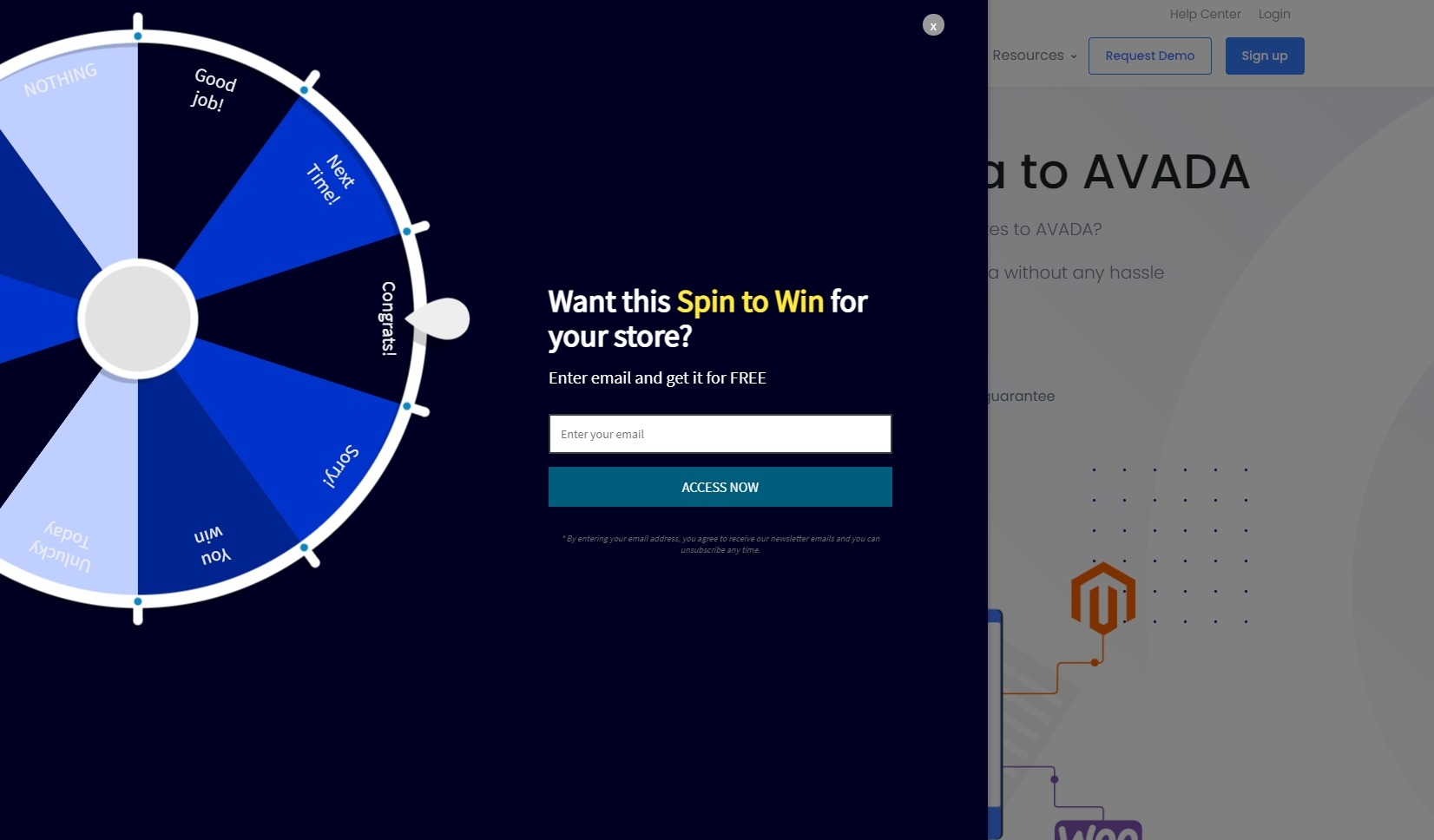
Spin-to-win wheels can be a great method to keep your clients interested. Spin to win wheels offer excitement to your popups, whether you’re attempting to reduce shopping cart abandonment, improve user experience (UX), or capture new leads. Gamifying your store also makes the shopping journey more fun.
On AVADA website, we implemented a spin to win wheel popup that visitors can enter their email address to receive the feature in our app - AVADA Marketing Automation (I will talk more about this in the next section). In a normal eCommerce store, this spin to win feature lets visitors earn a reward by giving their email address or signing up an account.
You can achieve success by including a spin to win wheel that attracts your audience’s interest, rewards them with a fun prize, and collects their email address all at the same time!
How to use an opt-in email (the best tool)
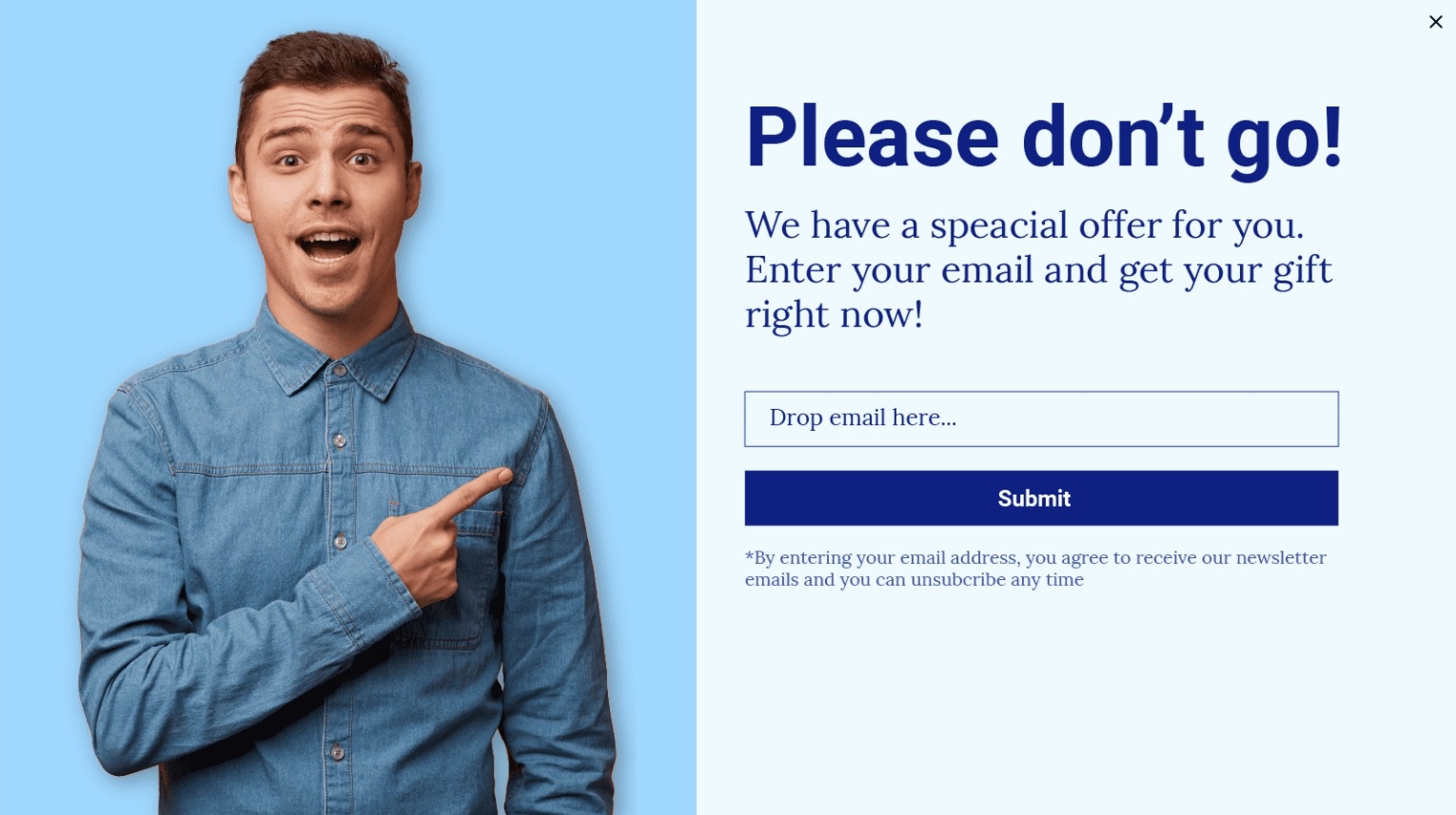
Now that you have seen some good opt-in email examples, let’s see which tool you can use to implement them. Introducing AVADA Marketing Automation - an email marketing focused app that has opt in forms built in to attract and increase the number of subscribers.
Now, I will show you you can use the app to insert opt in forms into your own website. But remember to sign up for AVADA Marketing Automation first, do it now because it is free to start using!
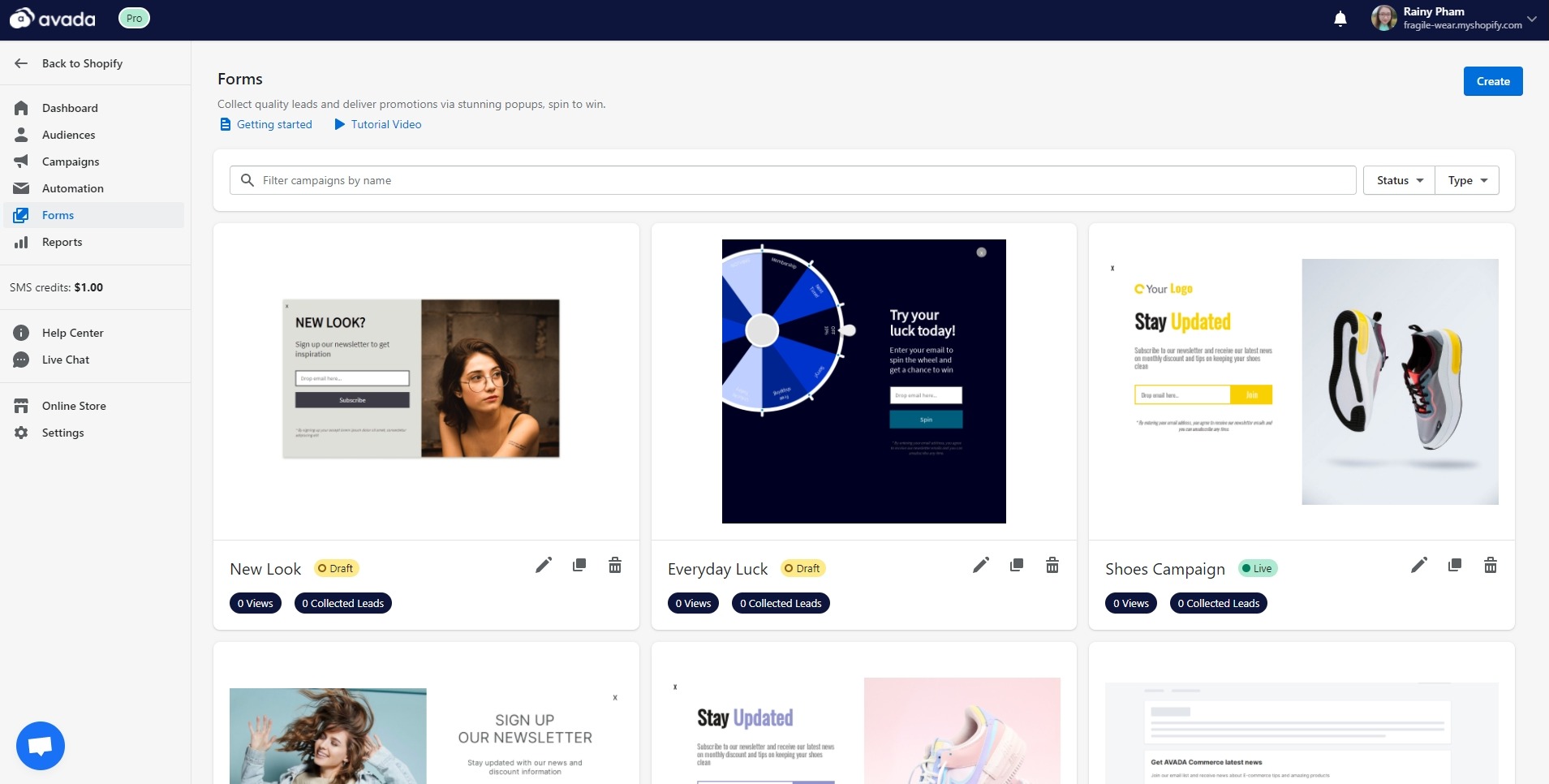
Inside AVADA Marketing Automation, you will find all the opt-in templates at the Forms section. We call it Forms since it is easier to say (and more simply to write). As you can see, our forms can match many styles and products of eCommerce stores. The spin to win wheel that I mentioned above is right there for you to try out.
You can also create an opt-in email of your own by designing for yourself. If you have some ideas but don’t know how to execute the form’s design, you can connect with our support team to help you out.
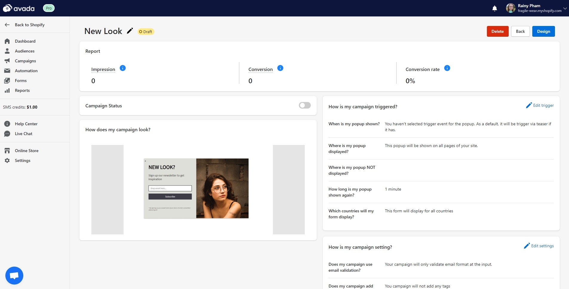
After designing the opt-in, you will be able to set triggers for the form, such as exit intention or product page. You can also adjust settings for countries, validation (single opt-in or double opt-in), tag adding, re-engagement, and more. These forms act as pop ups which appear at the center of your website’s homepage, immediately capturing the visitor’s attention.
However, this is not the only place that you can place your opt-in email. There are many other places to place your forms and get creative, such as blog posts, about page, header, or landing page. You can also control which pages to show your opt-in with AVADA Marketing Automation, optimizing your opt-in lead capturing ability.
I will have a more detailed guide on adding opt-in email using AVADA Marketing Automation in the future, so look forward to that.
If you are looking for a tool to use opt-in email and also automate your email marketing campaigns, AVADA Marketing Automation is the best tool to check out. Our paid plans start at only $9 per month, highly affordable compared to other email marketing services on the market.
Conclusion
Email is a critical sales generator for a large number of firms all around the world. When compared to other marketing strategies, it gives a large ROI. However, none of this matters if you can’t get people to sign up for your email list. People nowadays receive hundreds of emails per day simply at work, not to mention all of the promotional information they receive from businesses.
With the opt-in email examples in this article and a tool like AVADA Marketing Automation, you can reinvent your email subscription process and bring an exciting experience to your visitors. Spin a wheel to win prizes, who wouldn’t like to try that?
Sign up with our app to elevate your opt in today!
New Posts


