The Principles of Email Marketing Design & Best Practices
It makes no difference what you do or what industry you work in - if you own a business, you have news to communicate with your customers. Perhaps there is an upcoming sale and you want to publicize it. Or maybe you just want to say hello to your consumers and thank them for their purchases. Emails are one of the best ways to disseminate information about your business to the target audience.
However, not all emails are the same. Amazing content is just one thing required to maximize the efficacy of your email marketing. You will also need an excellent design. Beautifully designed emails will ensure that your readership enjoys opening your emails - and may even look forward to getting more of them! Not only that, but it ensures that your message is presented in an easy-to-understand and memorable fashion.
Effective email design accomplishes three major goals: convincing users to open your message, entice them to read the entire email, and persuade them to take action.
You will understand the principles of email marketing design for high-performing campaigns by reading this guide. You’ll also get tools and resources to help you easily design high-converting email campaigns that achieve business outcomes. Let’s get started.
The importance of good email marketing design
There are so many ways to reach your target audience these days, from social media platforms to influencer marketing and sponsored advertisements. Email marketing may appear dated in contrast, but make no mistake -it is far from dead.
In reality, it is still one of the most efficient ways to cut through the clutter and communicate directly with your customers. It’s quick, simple, and most importantly, it works.
With email marketing’s enormous potential comes strong rivalry. With more than 70% of companies using email marketing to communicate with clients, it is essential than ever to make your emails stand out. While the email subject line will, of course, get your emails opened in the first place, a well-designed newsletter will assist in holding the reader’s interest. If they like the content they see, they will most likely return again and again.
Your email design is also an opportunity to showcase your brand’s personality and value. Unlike social media, there is a lot of flexibility to experiment with different typography, colors, and visuals.
However, when it comes to email design, deliverability and readability should also be high objectives. Emails that are overly visual or contain enormous photos are generally a one-way ticket to the recipient’s junk mail bin. You’ll also want to make sure your email is designed in a way that allows readers to swiftly scan the main points.
Email marketing design principles

You can send a variety of email campaigns with the purpose of increasing conversions, such as announcement campaigns for the introduction of your latest product, newsletters summarizing your current content, or invitation emails for an upcoming event, among others.
The primary action you expect your subscribers to perform, regardless of the sort of campaign, is to click-through from your emails to the destination you’ve selected to drive them to. The principles below will assist you in developing a high-performing campaign that boosts the number of readers that click-through from your emails to your desired destination.
1: Create an easy reading structure
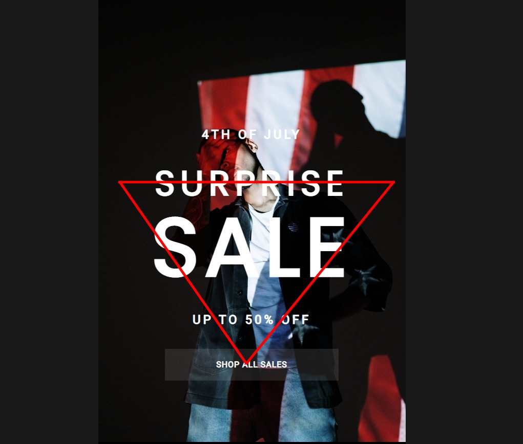
According to studies, an adult’s attention span is eight seconds on average. With such a short attention span, you may presume that individuals are scrolling through your campaigns seeking for something of interest rather than reading them word for word.
As a result, creating lengthy, text-heavy email campaigns is not the best method. Structure your emails to entice consumers to read your content while directing them to the email’s CTA.
The inverted pyramid model is a good technique to accomplish this. As shown in the sample above, emails that adhere to the model include a brief headline that highlights the campaign’s primary message and supporting information and visuals to persuade readers of the benefits of clicking-through.
The reader is then presented with a clear call to action button that tells them exactly what to do next. The inverted pyramid approach is especially effective for campaigns that have a single message and a single call to action like announcements and marketing offer campaigns.
Creating well-organized email campaigns like this is simple for AVADA Marketing Automation customers using the drag-and-drop email builder. Many pre-designed templates are constructed with this exact concept in mind.
After you’ve started a campaign in AVADA Marketing Automation, you’ll be sent to our template library, where you may choose from a variety of pre-designed email templates. Drag and drop photos, text, buttons, and spacers wherever in your email to build a high-converting layout that properly matches your content goals.
You may even preview the email to see how it will appear in all inboxes and on mobile devices.
2: Always be relevant to the recipients
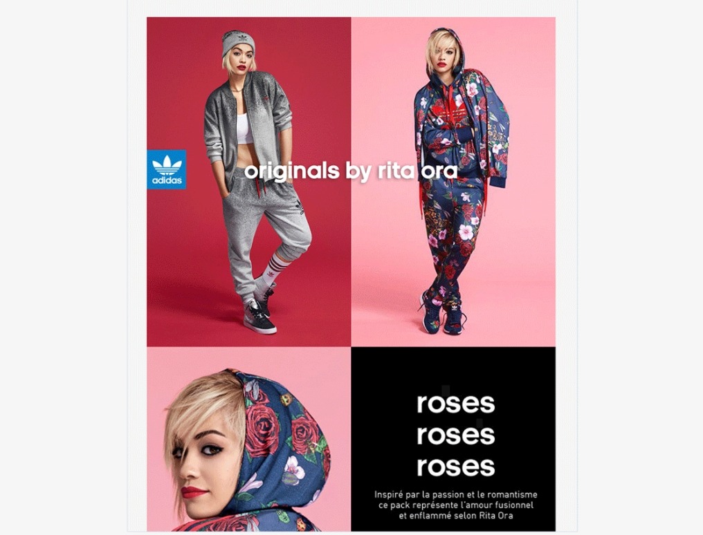
According to studies, email marketing that is distributed to targeted audiences and contains relevant information can improve the income of campaigns.
While this may appear to be a staggering statistic, it stands to reason that someone is much more likely to read your email that appears to be relevant to them. Your members could be male or female, live in different countries with different interests, or be at a different stage of purchasing your goods.
Given these distinctions, delivering them the same campaign will result in the content being irrelevant to many subscribers.
Instead of sending a single campaign to everyone, divide your lists and send just relevant offers and material to each individual segment.
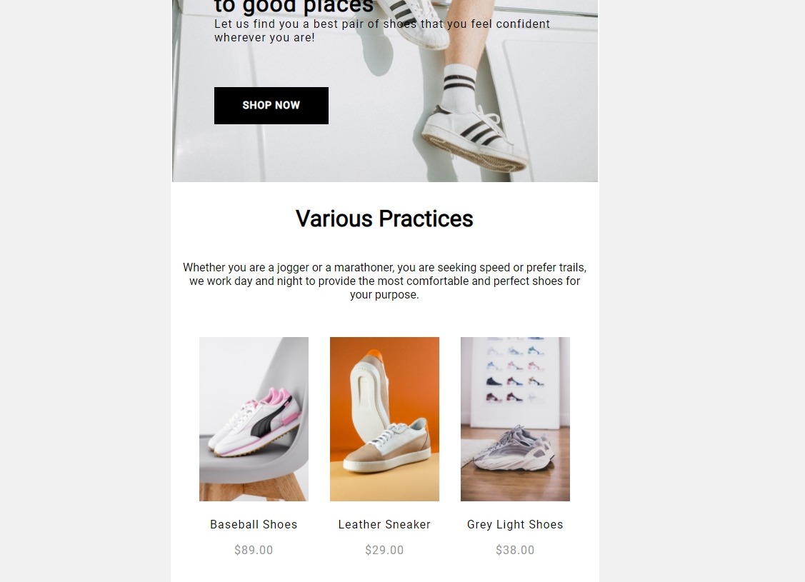
If you use AVADA Marketing Automation, you can easily make your campaigns relevant to each subscriber by using Segments and Dynamic Content.
Clothing shops, for example, might use segmentation to categorize their list based on unique data factors about their clients, such as gender, geography, past spend amount, and buy history.
Once the list has been segmented, dynamic content can be utilized to adjust the content of the emails so that certain sections (for example, menswear) only appear to specific subscribers. This guarantees that the email’s content is relevant to each individual subscriber and raises the likelihood that they will click-through from the campaign.
3: Design for responsiveness
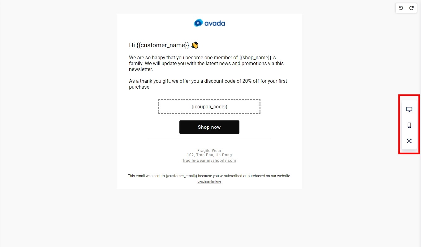
To encourage your subscribers to click through from your email marketing, make it as simple as accessible for them as possible. If your campaigns aren’t optimized for all devices, you’re making it unnecessarily tough for your subscribers to convert.
If you use AVADA Marketing Automation, ensuring that your email campaigns are responsive is handled automatically, and any emails you produce in the drag-and-drop email builder are instantly responsive and guaranteed to look beautiful on all devices and in every mailbox. The builder also includes a simple preview option that allows you to see how your campaigns will appear on desktop and mobile devices.
4: Represent your brand through email design
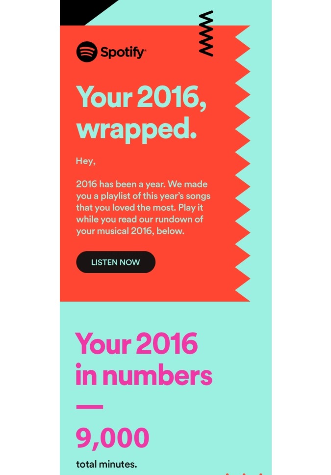
It’s likely that your email campaigns aren’t your subscribers’ only interaction with your company. In fact, your subscriber most likely came to your website or social media page just to sign up for your email.
As a result, it’s critical that your email campaigns match the colors, typefaces, and branding you use across all of your other client touchpoints.
This ensures that your subscribers know the campaign is coming from you and builds trust and credibility in your campaign, reassuring people that it is safe to click through. Nobody wants to open or interact with an unfamiliar email.
With the flexibility to select your brand’s precise hex color and a selection of designer-selected, professional fonts, AVADA Marketing Automation lets you develop high-converting email campaigns that instill trust by being consistent with all other places your subscribers encounter with your brand.
5: A/B test your email marketing design
Email design, like most marketing efforts, is an iterative process. You may discover that you need to make modifications and revisions in order to get the most out of your email design.
Whether you’re changing your CTA, colors, photos, layout, or tone, don’t be hesitant to A/B test email designs to see which one performs best in terms of reaching, resonating with, and converting the most recipients.
An email marketing tool that lets you A/B test your design will be the key to maximizing your campaigns’ performance. As you may already realize, AVADA Marketing Automation also has an A/B testing feature for users to see which design best suits their target audience.
Email marketing design tool
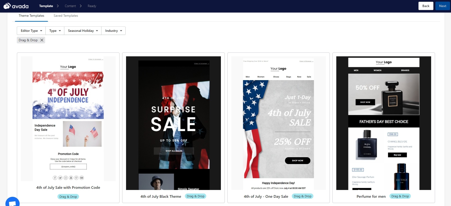
Since I have mentioned the app multiple times, it is only reasonable to recommend AVADA Marketing Automation as the best tool for email marketing design.
When it comes to designing high-converting email marketing campaigns, solutions like AVADA Marketing Automation’s drag-and-drop email builder make it incredibly simple to insert text and photos, target them at particular segments of subscribers, and guarantee they look beautiful on all devices.
Our pre-made templates are especially popular with newcomers who have never used pictures in an email before. They provide a wonderful base, but I recommend that you adjust any template you choose so that your voice is heard clearly. Still, there’s no design involved for you.
You just need to pick a template and tweak it until your voice and brand image comes through as one.
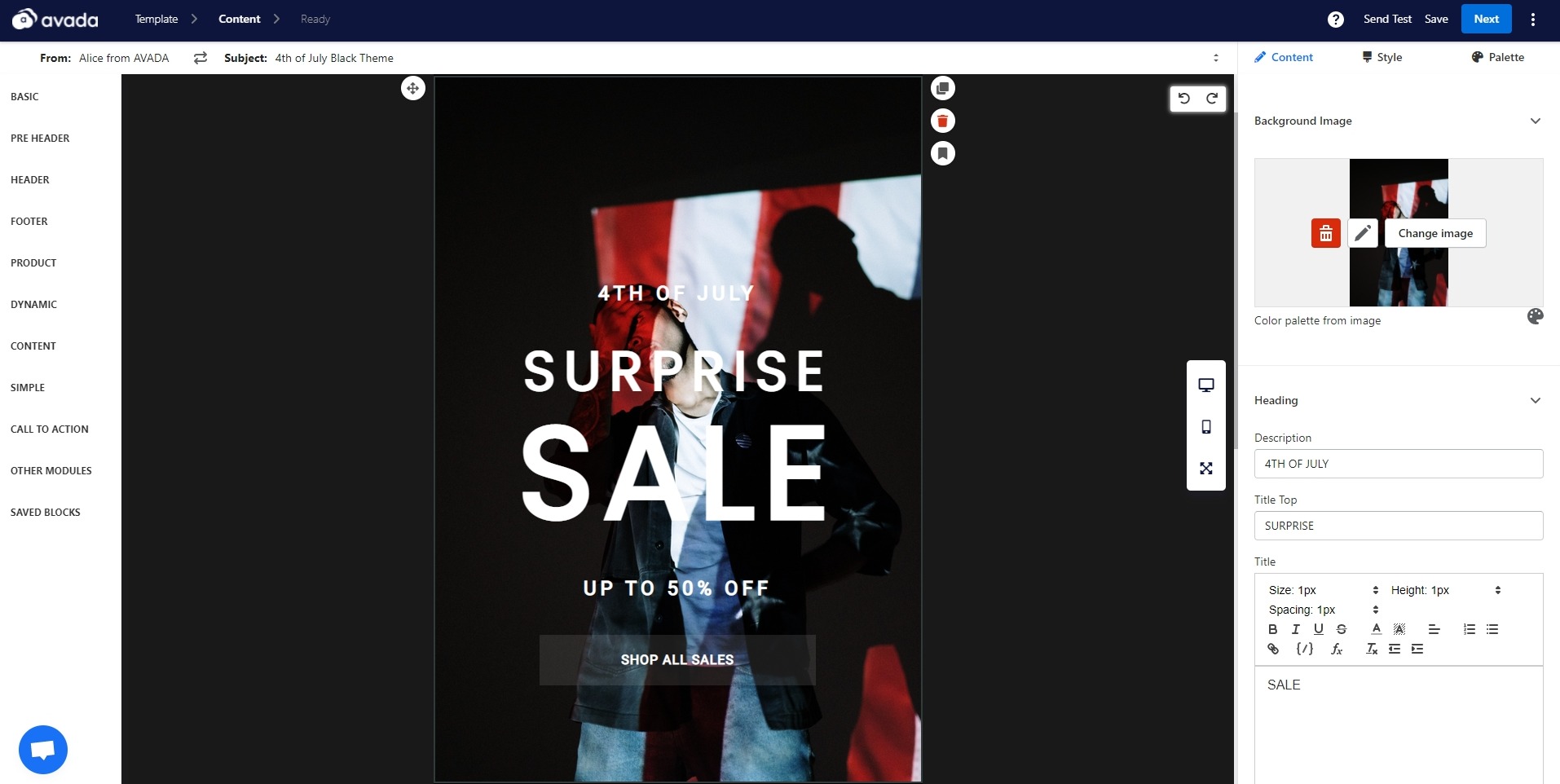
As a recap, here are the features that AVADA Marketing Automation has for email marketing design:
-
Pre-made email templates for newsletters and automated campaigns.
-
A drag and drop email campaign builder that lets users change text, button, spacing, photos, etc.
-
Responsive email design with live preview for different devices.
-
Segmentation to diversify recipients and have relevant messages or offers.
-
Dynamic content to show exclusive products for segmented audiences.
-
Professional email editor to make emails a part of the brand experience.
-
A/B testing feature to improve email marketing design.
A good news is that AVADA Marketing Automation is free to start using with all of the design aspects. The only paid feature that lacks from the free plan is the Dynamic Content. That said, the paid version starts at only $9/month, making the app highly accessible for all tiers of users.
Email marketing design examples
Not sure where to start with email marketing design, here are some examples from the pros for your inspiration:
The Stylish City
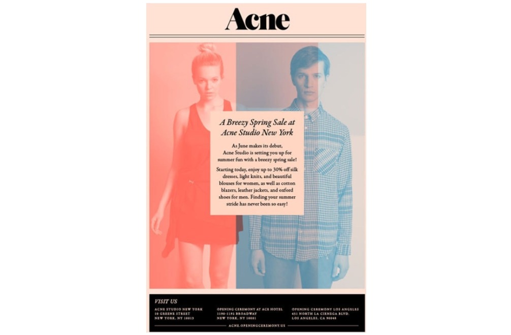
The color blocking and stunning gradient used in this example from The Stylish City are extremely eye-catching.
The soft color palette, combined with pink and black, produces a modern and classy look. The layout is engaging and one-of-a-kind, resembling a newsletter and a fashion editorial rolled into one. Despite this, the font manages to draw attention to itself by being front and center and on top of the image.
Tiffany & Co
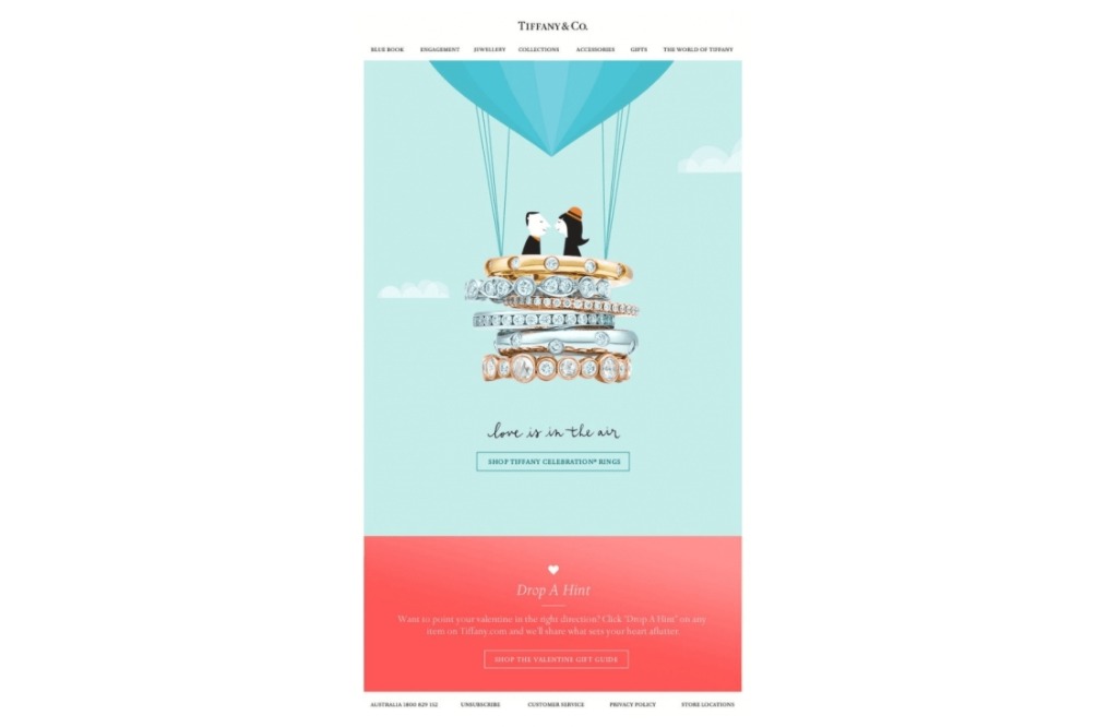
Email newsletters are an excellent method to generate buzz and drive sales for new products—but you must be unique! Rather than displaying a product photo in their email, Tiffany & Co. incorporated their Tiffany Celebration rings directly into the design, changing the photo into the basket for an illustrated hot-air balloon (with the oh-so-cute slogan “love is in the air”).
Moreover, not only does this color blocking style allow the product photo/hot-air balloon basket to focus, it also clearly separates messages in the email (the blue section directly mentions shopping rings; it is a “hint” to make your loved one know which ring would make the perfect gift for Valentines).
Burberry
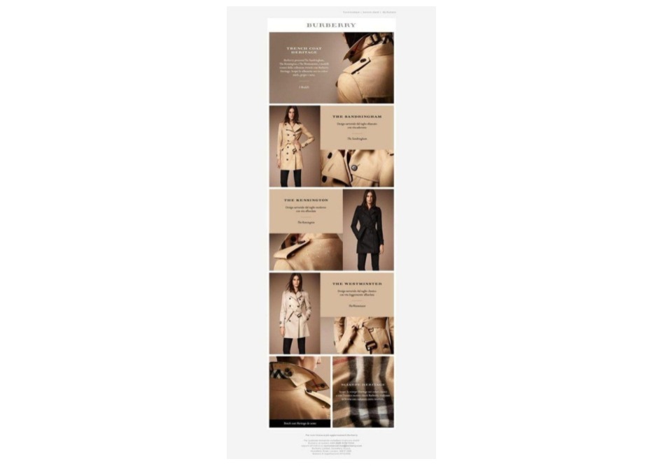
Burberry’s email design is a wonderful visual option for showing their trademark trench coat and reinforcing brand awareness. Because of the tan color scheme and varied shots of the distinctive coat, the design achieves quick recognition.
The typefaces are clean and clear, and the continuous grid makes it easy for the reader to follow the visual tale. Overall, it’s a straightforward, clean, and instantly identifiable design.
This is the email marketing design that you will find in many of AVADA Marketing Automation’s newsletter templates too. Users can easily change the images and colors to match their branding while still showing multiple features of the products.
Email marketing design resources
Because most marketers lack a development background or Photoshop abilities, I wanted to share a few resources that can help you create high-quality photos and graphics to add to your email marketing campaigns and make them look fantastic and convert better.
-
Stock photo sites: Stock photos are a fantastic resource for your email marketing campaigns to have beautiful images. However, many stock photo sites only have cheesy and corporate photos that don’t really go well with modern brands. A few good resources for stylish images are Unsplash, Gratisography, or Death to the Stock Photo.
-
Image creation: Stock photos aren’t always the best option. Sometimes, you need to create new and unique images for your email campaigns. A tool like Canva will be good even on the free plan to easily edit images and other elements such as frames, text, banners, and buttons.
-
Icon libraries: Icons are how you add visual flairs to your email campaigns. There are many places to find icons, such as Dry Icons, or The Noun Project.
-
Email design library: Really Good Emails is a fantastic resource for inspiration with nearly 9,000 email designs from all kinds of brands and industries. They also show the email’s code so you can edit campaigns in HTML.
-
Illustration resource: If you are a tech company or simply enjoy modern designs, your email design needs illustrations to create the desired visual representation. Some good resources for illustrations are =Ouch! from Icons8, Stubborn, UnDraw, and Humaaans.
Email marketing design tips
Are you ready to start creating your own email designs? Check out our helpful hints to keep you on the right track.
-
Include your logo in the same location: Build your brand with every campaign you send by including the brand’s logo in all of your email communications. The best practice is to have the same location (in the header or somewhere else) for the logo; just don’t take the whole screen.
-
Use color to emphasize: It can be tempting to use a lot of colors in your email design, but start with your company’s colors and use other colors for emphasis purposes. Use them to call attention to important things - such as the CTA buttons.
-
Limit the number of typefaces: A good rule of thumb is to use no more than two typefaces in your email campaigns - one for the body and one for the headlines and subtitles. Standard fonts like Arial, Verdana, and Times New Roman have the best readability.
-
Show your points quickly: Design your emails so you can get to the point quickly. Most readers scan the emails, so don’t take them more than one second to know what the email is about.
-
Whitespace is your friend: White space is the resting place for recipients’ eyes. Make sure that readers have plenty of space to read your headlines and content inside the email.
-
Keep the design simple: Less is more with email marketing design. Your goal is to make recipients take action, such as buying, visiting websites, getting more information, etc. A well-designed email campaign will make your recipients pay attention and easily take the desired action.
There are many more designing aspects of designing an email campaign; read this guide on the 11 best email design practices to learn more.
Final words
With amazing email design, you will be able to contact and resonate with your target audience members more efficiently, allowing you to expand more proficiently. Emails that are visually appealing and impactful will assist you in** developing long-term relationships and converting more individuals into paying customers** and brand evangelists.
Try using a tool like AVADA Marketing Automation to have the best approach with email marketing design. Also, make sure to save this article while you are designing your very first email campaign.
New Posts


