8+ Best Shopify Facebook ads case study
Although Facebook has been around for more than a decade, it is still a great platform for businesses that want to raise brand awareness. With more than 2.38 billion active monthly users, you can use the platform to spread your business word in various ways — from photos or videos to paid advertisements.
Millions of companies are running ads on Facebook, and there are tons of case studies that you can learn from. A good case study will cover the marketing challenge of a brand, its goals, the main aspects of a campaign, and its outcomes. This offers you a real-life snapshot into what guided a marketing team to make Facebook advertising success. Case studies will also help you prevent or tackle the growing problems that other businesses encounter when doing a new Facebook strategy.
To help you choose your next Facebook strategy, I’ve compiled a list of 8 great case studies of Facebook advertising done by Shopify stores. This will show you how a number of different companies have succeeded in the social media platform. Now let’s jump right into the details!
Exclusive Offer: Get Shopify 33 days for just $1 + The Online Store Starter Kit
Start your 3-day free trial, and enjoy your first month of Shopify for $1 plus the premium package designed especially for new Shopify merchants!
Related posts:
- How to Promote Shopify Store on Facebook?
- 8 Best Shopify Facebook Pixel Apps
- How to Schedule a Post on Facebook?
- How to Change a Facebook Page Name?
- How Do I See Who Is Following Me on Facebook?
Shopify Facebook ads case study on brand awareness
Pandora Facebook ads case study

In the 2017 holiday season, Pandora’s jewelry company was hoping to increase awareness of the brand in the German market. They also wanted to see if video advertising could have the same impact as their other Facebook ad types. They started this experiment by working with Facebook to tailor a successful TV commercial to the platform. Here’s the following look at the original commercial:
The commercial was trimmed down to a 15-second clip that shows a woman getting a Pandora necklace from her boyfriend. This was also developed into a square format for smartphone devices. Pandora then launched an ad targeting German viewers between the ages of 18 and 50. This ad appeared in users’ news feeds and as an in-stream video ad.
Results:
According to the final report, the video advertisement raised brand awareness during the holiday season, with a 10-point increase in favor. Although Pandora or the case study did not disclose how they calculated their favorite score, they noticed that the raise indicated that more customers preferred Pandora over other jewelers because of the commercial. Financially, the initiative also generated ROI with a 61% rise in sales and a 42% increase in new customers.
Lessons learned:
Video can be vivid, emotional, and compelling. Although the Pandora case study states that Pandora has already had success with advertisements and sales, the jeweler saw that a video format could further improve brand awareness.
In only 15 seconds, Pandora was able to tell a story that their target audience could relate with while still showing off their product. The rise in favorability suggests that people who saw the commercial were linked to it and favored the jeweler over other companies because of the marketing strategy.
Part of Pandora’s success may also be attributed to the video’s adaptation for the Facebook platform. While they didn’t produce a new video for the Facebook website, they picked up a commercial that had already resonated with TV viewers and tweaked it to catch the attention of fast-paced Facebook users. It is a perfect example of how a company can be resourceful about the content it already has while also catering to its online audiences.
Shopify Facebook ads case study on Reach
Buffer Facebook ads case study
See the details of the case study here.
In early 2016, Buffer began to see a decrease in their brand awareness and engagement on Facebook due to algorithm changes that favored individuals rather than brands. In an attempt to keep their relevancy and prevent numbers from slipping any further.
The company agreed to reduce their frequency of posting by 50%. With less time spent on multiple topics, they may spend more energy on producing fewer, better-quality topics that are solely geared towards interaction. For example, instead of posting traditional links and fast captions, they started experimenting with different formats, such as multi-paragraph captions and videos. Since launching the plan in 2016, it continued through 2018.
Here’s an example of one interview that was shared exclusively on Facebook.
The Results:
By 2018, Buffer estimated that the average weekly production had almost tripled from 44,000 at the beginning of the experiment to 120,000. The average regular obligations on the website have doubled from around 500 a day to around 1,000. In 2018, Buffer reported that their posts had reached between 5,000 and 20,000 people, while those from before the experiment had reached less than 2,000.
While Buffer began the project before significant improvements to the Facebook algorithm, this case study was modified in 2018, arguing that this technique has undergone network shifts and still provides them with a high degree of outreach and engagement.
Lessons learned:
It can be easy to post too much on a social network and just hope it works. But you could waste your time and money on constant posts that don’t reach or engage. They could make your page look petty.
What Buffer found out was that less is more. Rather than wasting your time sharing whatever you can, you can take time to brainstorm and plan insightful posts that relate directly to your target audience.
Shopify Facebook ads case study on video views
Tomcat Facebook ads case study
Tomcat, a rodent extermination business, was preparing for Halloween in 2016 to experiment with a puppet-filled, horror-themed, live video event. The story, created in part by their publicity department, tells the tale of several oblivious teenage mice on holiday in a haunted cabin in the woods.
Throughout the height of the plot, viewers were asked to use the comments to select which mouse puppet would die next or how they would die. Before the video event, Tomcat also rolled out movie posters with the event date, a picture of the scared mouse puppets, and a headline saying, “Spoiler: they all die!”
Results:
It turned out that a lot of people like killing rodents. Live video has received over 2.3 million unique views, and 21 percent of them have participated actively. As an added bonus, the video also increased Tomcat’s Facebook following by 58% and won them a Cyber Lion at the 2017 Cannes Lions Awards.
Lessons learned:
This example illustrates how innovative content marketing can help even the most logistical companies to acquire brand engagement. While pest control can be a dry subject for a video, the brand has highlighted it in a creative and humorous way.
This study also emphasizes how interactivity can provide enormous bonuses when it comes to views and engagement. Even though many of the viewers realized all the rats were going to die, many nevertheless participated only because it was fun.
Not only could this raise brand interest from people who haven’t thought too deeply about pest control, but engagement can also help out a video algorithmically. When more people comment, post, and respond to live videos, there is a greater chance that they will be pushed to more feeds, and more people will see it.
Shopify Facebook ads case study on app installs
FoxNext Games Facebook ads case study

See the details of the case study here.
FoxNext Games, a video game brand owned by 20th Century Fox, aimed to increase the number of software downloads for one of its newest games, Marvel Strike Force. Although FoxNext had previously advertised other Facebook video ad games, they decided to test the swipe-able photo carousel ad format. Each picture, designed as a playing card, illustrated a different aspect of the game.
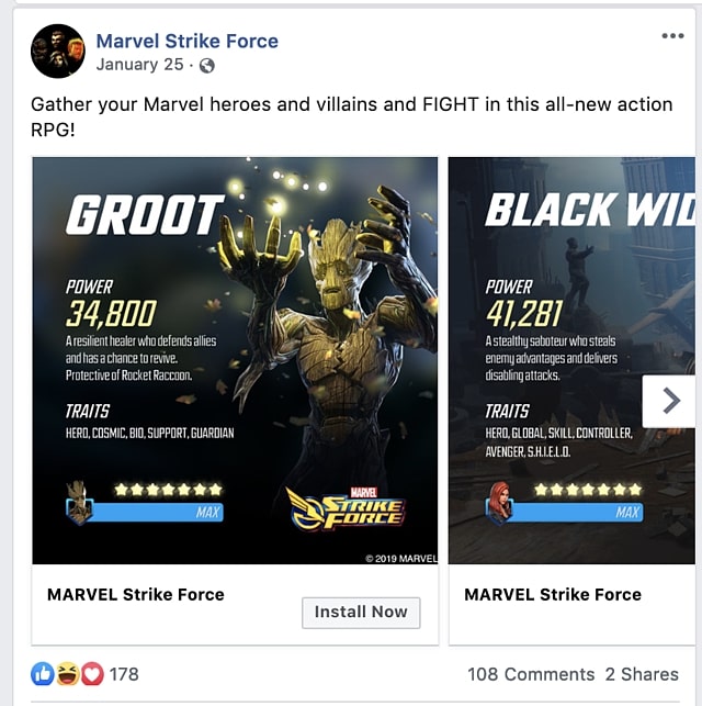
The ad gave a call-to-action button that said “Install Now” and led to the app store where it can be downloaded. FoxNext has launched it on both Facebook and Instagram.
Results:
The photo ads, according to Facebook, delivered a 6% higher return on ad spend, 14 percent more revenue, 61 percent more installs, and 33 percent lower cost per app install.
Lessons learned:
If your product is visual, using a carousel can be a perfect way to show off the various parts of it. This case study also demonstrates how the design of advertising around your audience’s interest will help each post stand out. In this case, FoxNext needed to advertise a superhero game. They realized their fanbase was interested in games, adventure, and comic books, so they created carousels that looked more like playing cards to broaden the game’s visual narrative.
Shopify Facebook ads case study on lead generation
Major Impact Media Facebook ads case study
See the details of the case study here.
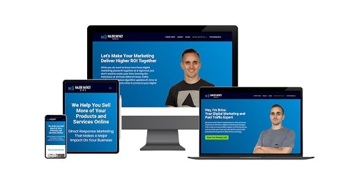
In 2019, Major Impact Media published a case study on a real-estate customer who wanted to acquire more leads. Before working with Major Impact, the brokerage (the client) hired another firm to create an online lead generation funnel that earned them no leads during the two months it was run. They turned to Major Impact in search of a process with which they could acquire more online leads.
As part of the lead generation process, Major Impact has made a series of Facebook ads with a generation-leading target. Huge Impact also enabled the organization to develop a CRM that could catch these leads when they came in.
Results:
Within a day, eight leads were received for $2.45 each. In the following 90 days, the marketing firm claimed that the ads generated more than 370 local leads at an average cost of $6.77 each. Each lead acquired gave the company their name, email, and phone number.
While these outcomes seem to be great progress, the readers of this case study should bear in mind that no amount of potential leads or ROIs have been published. Although the study notes that lead has been obtained, it is unknown which of these contributes to actual sales — if any.
Lessons learned:
This illustrates how Facebook ad targeting can be useful if you’re searching for leads from a particular audience in a local region. Minneapolis’s initial marketing and social media campaigns were unsuccessful as they were aiming at a very limited group of prospective buyers in the local region.
Ad targeting enabled their posts to be put on news feeds of people in the area who may be searching for real estate or have interests related to the purchase of a house. This, on the other hand, could have brought them more success in gaining leads.
Shopify Facebook ads case study on engagement
Hawkers Facebook ads case study
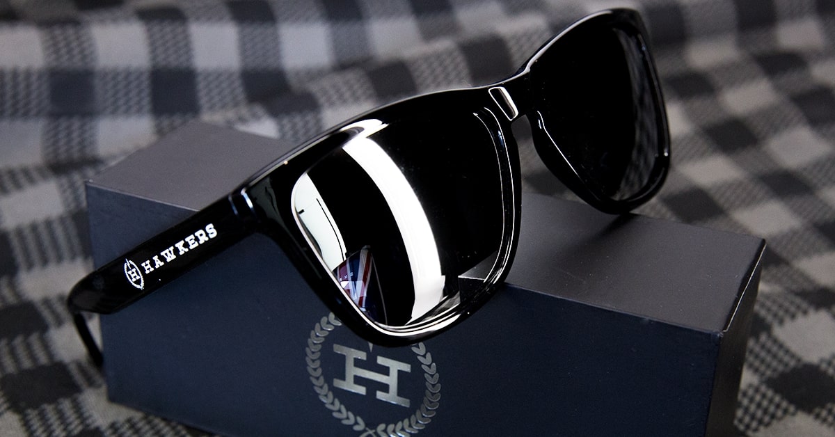
When Hawkers ‘eyewear company collaborated with the Spanish clothing brand El Ganso for a joint line of sunglasses, Hawkers’ marketing team decided to see which Facebook ad format would earn the most commitment. Between March and April 2017, a mix of regular advertising and Facebook ad collections was released.
Although their regular ads had a picture, a caption and a call-to-action connection to their site, the advertising had a header or video, accompanied by smaller photos of the sunglasses below.
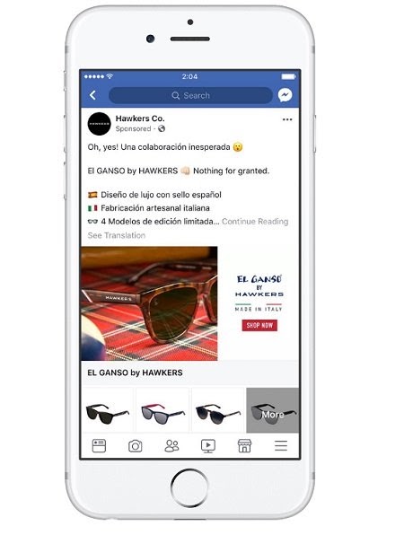
To check the marketing efficacy of the various ad styles, Hawkers approached half of its audience with regular picture advertising, while the other half with a set format. The company has used the Facebook Community Lookalike feature to reach their followers and related users in Spain.
Results:
The collection ad boosted engagement by 86%. The collection ads also saw a 51% higher rate of return than the other ads.
Lessons learned:
This study illustrates how an ad that displays various elements of your product or service could be more appealing to your audience. For a series of advertisements, viewers can see a bunch of items as well as a main picture or video of the line of sunglasses. For a typical single picture or video, the number of items you are displaying can be reduced. Although some users may not react well to a single picture or video, they may engage if they see a variety of different items or styles they like.
Shopify Facebook ads case study on conversion
Femibion from Merck Facebook ads case study
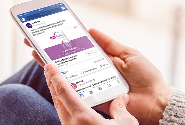
See the details of the case study here.
Femibion, a German family-planning brand owned by Merck Consumer Health, aimed to create leads by providing a free baby planning book called “Femibion BabyPlanung” for their target audience. The company chose Facebook ads to launch a multi-stage campaign mixing conventional images and connecting advertising with carousel advertising.
The campaign started with a series of carousel advertisements featuring tasteful pictures of “baby-making places” or locations where women could conceive a child. Later advertisements were a more traditional format that featured a picture of the book and a call-to-action.
When the first advertisements were released in December 2016, women’s audiences in Germany were targeted. Throughout 2017, during the latter stages of the campaign, regular advertisements were targeted to women who had never interacted with carousel advertising. For this approach, people who have already shown interest will see more advertising for the free product offering. It could make them remember the offer, or click when they saw it a second time.
Results:
By the time the campaign ended in April 2017, the conversion rate had risen by 35 percent. The company also generated 10,000 leads and reduced the cost of the sample distribution by two times.
Lessons learned:
This case study illustrates how a business has successfully managed to get leads via a great funnel. By targeting women in Germany for their first series of creative “baby-making” ads, they gained the attention of a large audience. Then, by concentrating their next round of ads on women who had already shown some kind of interest in their product, they reminded those viewers of the deal that would have helped them to turn to leads.
Shopify Facebook ads case study on product sales
Samsung Facebook ads case study

See the details of the case study here.
In an attempt to boost the demand among its Latin American market, Samsung supported the launch of the Galaxy S6 smartphone in Argentina in 2015 with a one-month Facebook campaign. The advertisement featured three videos that highlighted the phone’s design, camera, and long battery life.
One video was released every week, and all of them were aimed at men and women in Argentina. Samsung launched a more conventional video and photo advertising for the product in the fourth week of the campaign. Such advertisements were clearly aimed at people who had engaged with the video in some way and their lookalike viewers.
Results:
Samsung gained 500% ROI from the month-long campaign and a 7 percent increase in new customers.
Lessons learned:
Similar to Femibion, Samsung implemented a marketing strategy where targeting became more specific as promotions continued. I have seen the advantages of targeting advertising to consumers who have already shown interest in the first rounds of advertisements. This approach certainly seems to be one that might be useful in seeking to achieve more qualified leads
Read more:
Nine tips for running Shopify Facebook ads
Tip #1. Your funnel can have the most impact
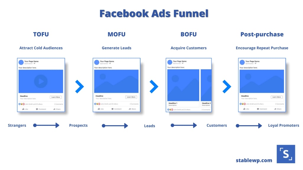
Your marketing funnel, the entire process of getting your customer to discover your product until they made a purchase, is more critical than your Facebook ad. You could make the biggest Facebook ad in the world, but if your funnel sucks, it won’t convert.
So, how should you optimize your funnel? To start off, optimize your product page. Installing a countdown timer on your product page might work well. Though it doesn’t make your website look beautiful, it helped create a sense of urgency when people were taken from an ad to that page.
You do want to make sure that you’ve got upsells to raise the average order value when someone orders. So have an exit popup when someone is about to leave your shop without purchasing it. The cart page and the abandoned cart emails need to be done correctly as well. We have this article on how to upsell effectively for your further study.
The quality of your Facebook advertising depends more on how well your store is designed than on how successful your ad is.
Tip #2. Spend more time optimizing your landing page than your ad
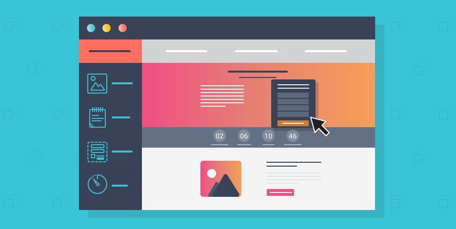
When you need to choose between tweaking your product page or tweaking your Facebook ad, always select your product page. Why Is that? Since your product page is what converts, not your Facebook ads. Your customers might send your landing page to their friends. Or maybe your product page will turn up in a search query.
Facebook Advertising is only one channel to get leads. Although ads are necessary, your product page needs to be a conversion engine. And if you’re going to obey the 80-20 rule, you’d like to spend 80 percent of your time tweaking your website and 20 percent of your time tweaking your Facebook advertising.
Ask yourself, at least once a week, ‘What can I improve on my product page to make more sales? ‘You shouldn’t do it blindly, of course. It’s a great approach to do some A/B testing to see what works best.
Tip #3. Drive traffic to your product page
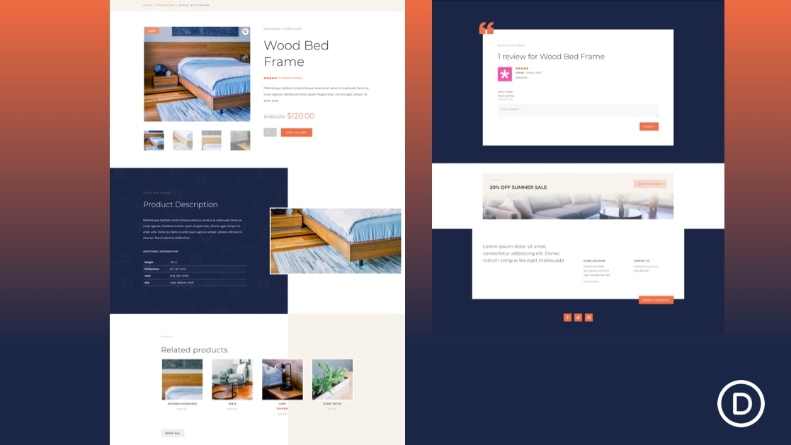
So, you’ve probably noticed that I keep mentioning product pages. That’s because they’re more likely to convert than direct traffic to a product collection or homepage. This is the one mistake I see people make most often.
Often, new store owners don’t even know what their homepage or collection page looks like. And every time, without fail, the homepage has lost pictures and is loaded with the placeholder text. Directing traffic to your homepage is almost never going to convert, because the homepage is designed to be a place to showcase products, not to introduce them.
Creating an ad that directs customers to the product page works well for several reasons. First, you can create an ad for a particular product and find out which product brings the most sales. Second, when a customer sees an ad about the product they want, they want to end up on the same page for that product. They won’t waste time searching the website to find it.
Tip #4. Facebook ad engagement is Important
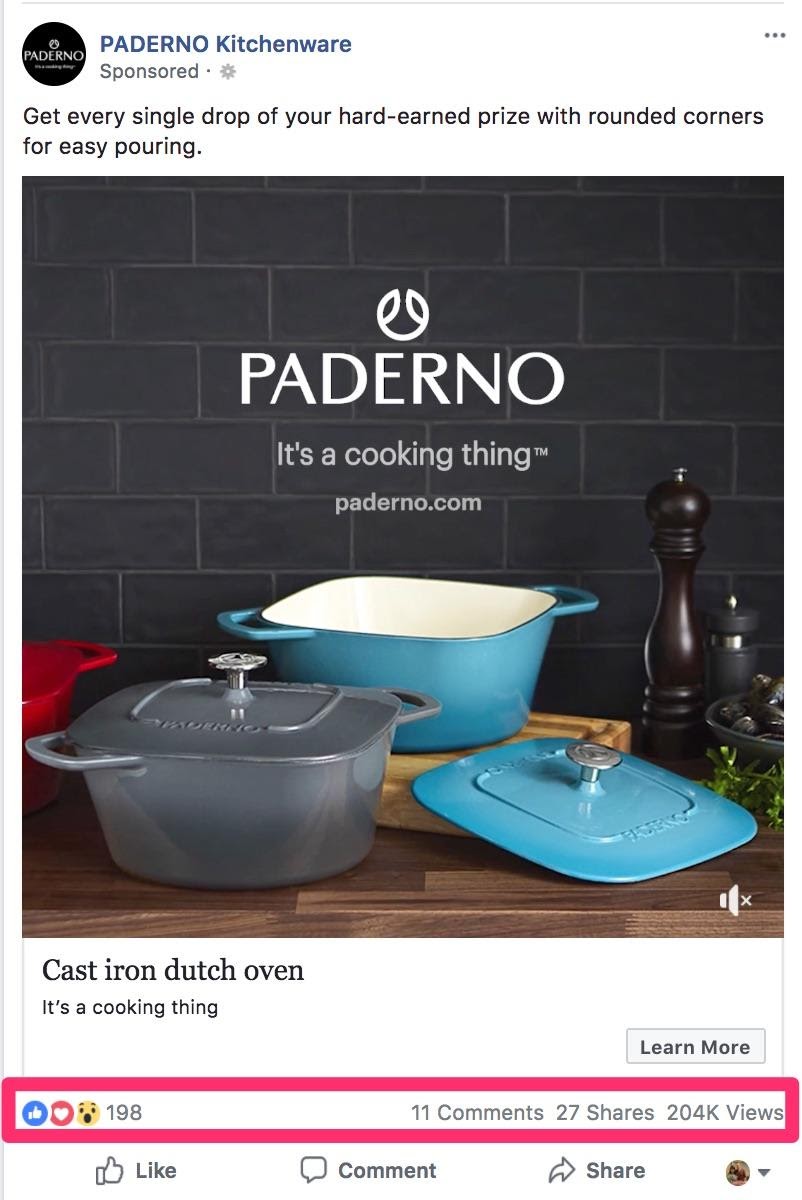
Ad engagement can play a major role in the success of your Facebook ads. When your ad has people leaving comments or tagging their friends in the comment section or has a lot of shares, it’s a signal to Facebook that there are people liking to see your advertising. And you’re going to be rewarded with lower ad costs. And, if people are engaging with your commercial, you will get to hit an even wider audience. Wider audience leads to more sales.
Tip #5. Simple ads do best
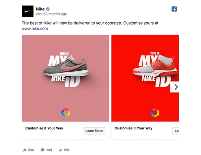
Carousel, video, or canvas advertisements may be fun to play with. And you might find that they work best for you. However, I’d say that a basic ad with a product image and a copy to the point worked best. Keep things simple.
Lead your traffic to a particular product. Choose the most visually appealing picture for this product. Write a short sentence to advertise the commodity such as “50 percent off TODAY only”.
I’ve figured out that our carousel and video advertisements have had quite a few views. At the end of the day, however, the goal is to increase sales. And the simple Facebook ad is what has generated the best results. How did it work so well?
These types of advertisements appear like normal posts instead of advertisements. The Carousel ad looks like an ad, but the standard ad looks more seamless on the Facebook platform.
Tip #6. Running Facebook ads is 80% testing and 20% optimizing
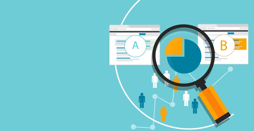
When you’re just starting out, it may take a while to find the winning product and create the best-performing ad. Most of the time spent on Facebook advertising was spent on testing. Testing is often in the form of creating a range of advertisements for various products to find out which things have performed best.
When you find a winning product, don’t stop there. Keep testing different items so I wouldn’t rely on one successful ad. You should also test ad copy, photos, offers, and targeting criteria to see what worked best.
Tip #7. Scale once you succeed

Scaling your ads could be a little tricky. A significant part of our success in Facebook Advertising came from our ability to scale. And here’s what you can do:
Take a look at your ad Breakdown, which target option brings the lowest conversion cost at the lowest number of impressions? Take that list and create separate new ads for these specific targeting options, but keep everything else the same.
For instance, if you noticed that Greece had the lowest conversion cost but the fewest impressions, you would have produced an ad where only Greece was targeted. You should also consider dropping Greece from your initial commercial.
When you keep doing this, you’ll find that you’re beginning to increase the number of advertisements for your most effective advertisement, enabling you to scale quickly without ‘breaking’ your original ad.
Tip #8. Scaling is not 1:1
Scaling isn’t as simple as doubling your sale. When you get 10 sales from a $50 ad, that won’t necessarily mean you will get 20 sales from a $100 ad. You’re likely to get more sales with a larger ad budget, but it’s not going to double what you’re getting now. Scale it slowly. When you have a successful ad, add $5 a day to the ad to help prevent your sales from being dramatically reduced.
Also, bear in mind that the more you spend on an ad, the harder it’s to scale. This means you would be able to double your conversions if you increase from a $5 ad to a $10 ad. Yet you’re certainly not going to be able to do that if you go from a $500 ad to a $1000 ad.
Tip #9. Have a budget for retargeting
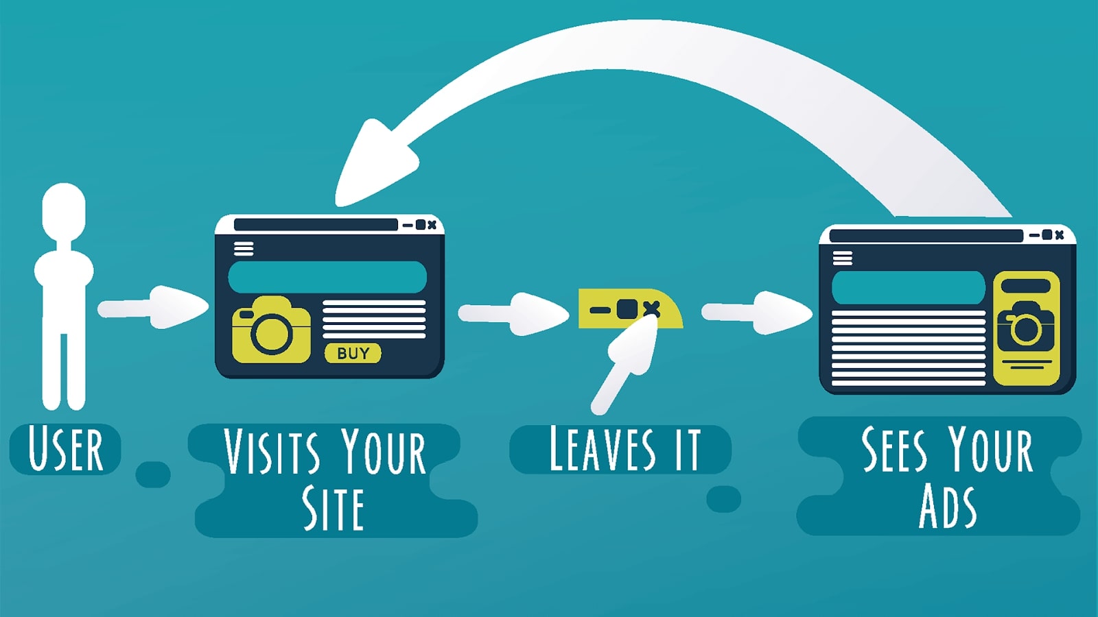
Retargeting is when you show ads to customers who visit your website and leave without making a purchase. The ad you show is for the same product they were looking at in your shop. Retargeting ads work very well on conversion because consumers already know your brand.
As a reference, you’d want to spend one-fourth of your overall advertisement budget for retargeting. If you’re marketing expensive products, you’re likely to want to spend a greater portion of your ad budget in retargeting. Because customers probably need to see your product a few more times before they’re ready to buy it.
A commodity under $50 can be affordable enough for the customer to be willing to buy at the first or second time they see it. But a product that costs $150 may take a few more advertisements to make the consumer realize that they’re ready to buy it.
If you are not really familiar with running Facebook ads, you can study our comprehensive guide on how to execute a successful Facebook ad campaign for your Shopify store.
Final Words
That’s it! I hope the case studies in this article and the tips provided will help you run better Facebook ads or your Shopify store. Please feel free to leave comments for further discussion. :-)
New Posts
