Shopify Parallax Theme Review: Striking Parallax Effect for Your Store
Your online store is the face of your brand. It will make your visitors feel welcome and encourage them to explore all the products you offer. An attractive design shows customers that you care about their experience and helps build trust, which can increase conversion rates.
In addition, if your website is responsive, you will be able to ensure that visitors on mobile devices can enjoy a smooth shopping experience, which is also profitable. Due to the increasing use of mobile devices, many people use their phones and tablets to search for their online purchases. According to some studies, the conversion rate also increased.
Luckily, Shopify has a lot of attractive and responsive themes. And in this article, AVADA will introduce Shopify Parallax Theme which brings a striking parallax effect for your store.
You Might Also Like:
What is Shopify Parallax Theme?
Shopify Parallax Theme designed by Out of the Sandbox is a bright and beautiful theme by animations along with nice effects.
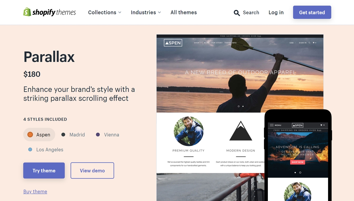
The most special thing in this theme is the extremely sophisticated scroll effects. This effect is widely known and has become a trend in the web design community recently. This is the effect that makes the website background image move slower or faster than other elements. This design helps bring a sense of movement and depth to the web as you scroll.
Parallax Theme for Shopify with advanced design decorated with parallax effect on the homepage or other elements such as footer or header. It gives the website a “fashionable”, modern and novel look. One of the useful aspects of this effect is the ability to emphasize and separate different parts of the homepage to help readers distinguish each part more clearly.
It would be ideal to choose Shopify Parallax Theme if you run a furniture store. This theme is fully responsive and comes with support for multiple layouts as well as special landing pages for individual products. It is also easy to set up and customize thanks to detailed documentation. In particular, the Parallax theme is also fully integrated with Google Maps and MailChimp.
Shopify Parallax Theme has four different styles that are Aspen, Vienna, Madrid, and Los Angeles. Maybe these four names will remind you of the familiar feeling because they are named after four famous cities in the world. In particular, the combination of different striking colors paints beautiful pictures of four separate cities.
Different audiences will love different styles, depending on each person’s preferences and website style orientation. However, the Parallax theme is quite popular, so you can use it for almost any field. This awesome theme can perfectly match with trendy catalogs and products that require high-quality images.
To see the great elements of Parallax Theme along with the sophisticated scrolling effect of the theme, you can check out the demo for this theme.
Parallax Theme Aspen Style
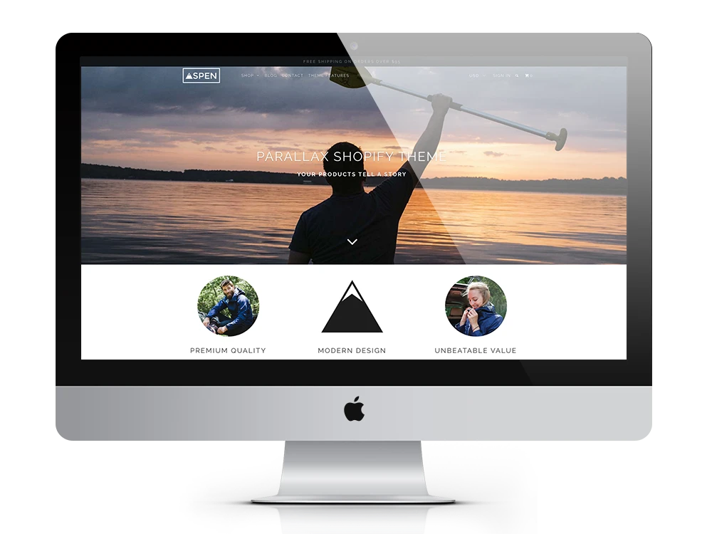
If you want to find a fully-featured theme for many purposes, you should look to the Aspen Style of Parallax Theme. It offers many different layouts with a modern, intuitive, and elegant appearance. The scrolling is a distinctive effect that helps you make stories stand out more to attract readers.
There are many premium features in Aspen Style that every user wants such as slideshows, bold, large images, and videos. In addition, you can take advantage of many home page options such as Google maps, newsletter signups, logo lists, and testimonials. Moreover, with a multitude of styles for portfolio sites and blogs, and even a “long-format homepage” design available, this theme becomes extremely flexible and highly customizable.
Parallax Theme Madrid Style
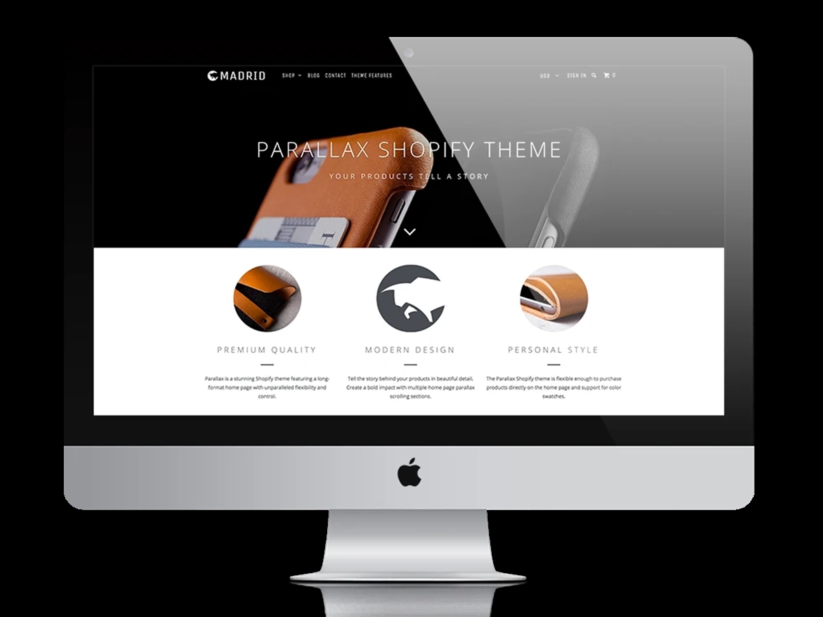
Madrid Style is also an attractive style of Parallax Theme that can be used for many purposes. It looks clean and moderate. With parallax effects, you can see it in many areas like the cover photo or the heading. With parallax application design and streamlined layout, each part of the website is easily identifiable and prominent.
Comes with meticulous telling, you can customize almost every element with Customizer or Shortcode, so it becomes appropriate to your style. Besides, all the advanced features needed by a business site such as Quick Shop, Product Filtering, Promotional banner, etc. are available for you.
Parallax Theme Vienna Style
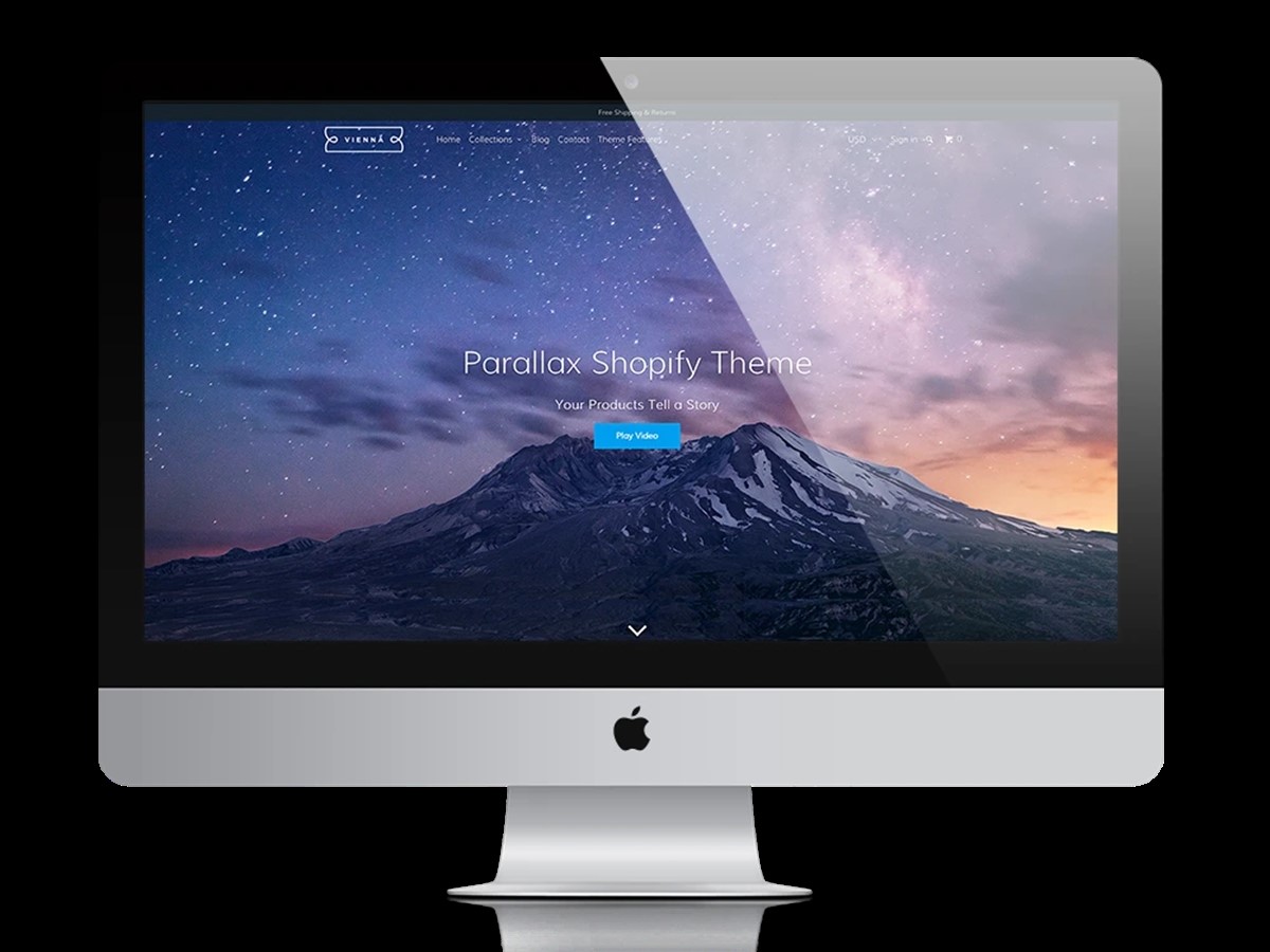
From a personal point of view, Vienna Style is different from the above styles thanks to its classic-looking beauty through the distinctive colors, fonts, and thin lines of this style. Multi-colored areas with parallax effect play an important role in creating highlights and dots for the home page. Along with the parallax effect, various effects have been utilized to release the energy and vibrancy of Vienna.
You can use this beautiful theme for many purposes for businesses, corporations, organizations thanks to its good customization capabilities. In particular, you can apply parallax effects to different areas and customize page scrolling effects.
Parallax Theme Los Angeles Style
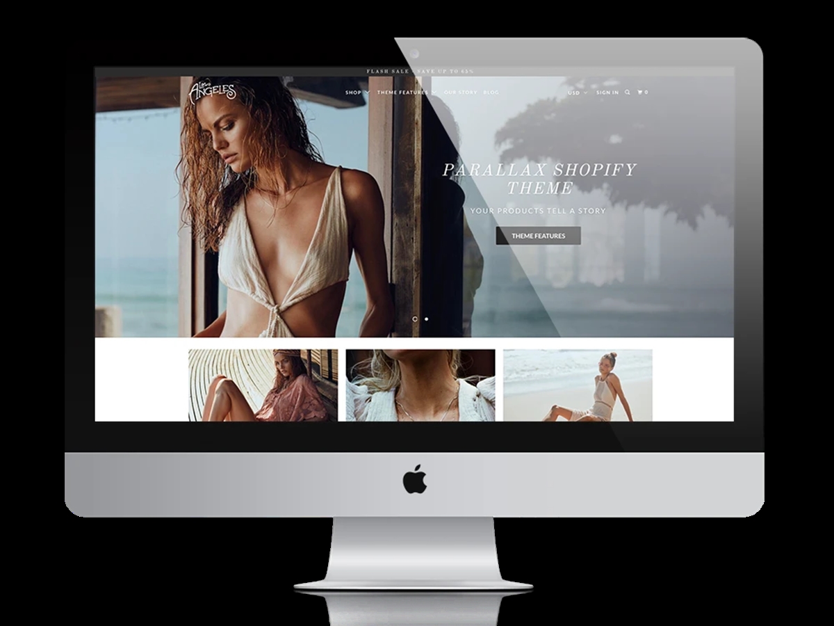
Los Angeles is an extremely suitable style for online magazines or a fashion store because of the creativity it brings. At first glance, you will probably be surprised by the full-screen video slider with parallax effect. The parallax effect is also found in the header of the article page, so no matter which page it is, it makes the design beautiful and extremely unique. Along with that, this style is also strong in the rich-featured image system, making your website different and new.
This is an easy-to-use theme style because you do not need to know too much about the code or technology to customize, install, and use it properly. Moreover, Los Angeles is known as a perfect tool for presenting your online magazine thanks to features such as multilingual, responsive design, SEO standards, etc.
Parallax Theme Main Features
Parallax Theme brings your online store on Shopify with a great appearance and extremely convenient functions. This makes it easy for you to operate the store and attract more customers. Here are the outstanding features of the Parallax Theme:
Parallax Theme Effect
From the beginning of the article up to now, we have gone through a lot of the words “parallax effect”. This is a scrolling effect that makes your online store look fresh and unique. It even makes your customers unable to take their eyes off. Of course, engaging the audience is what any shop owner wants.
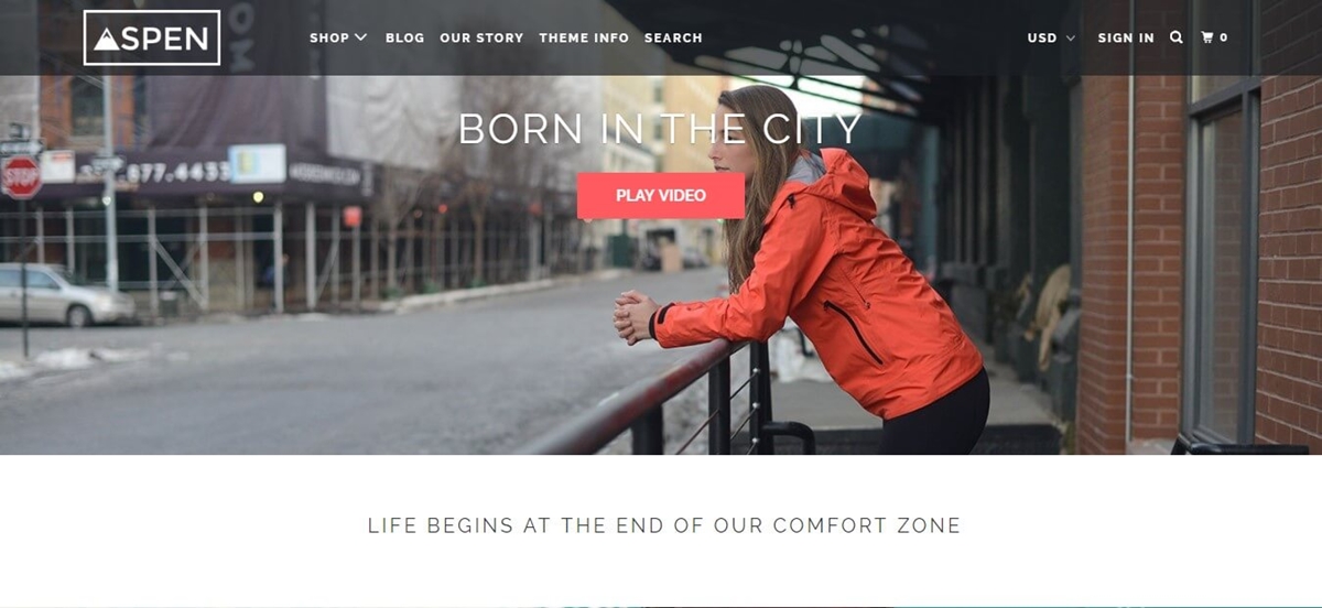
The parallax effect is very popular and is a trend in website design. It makes any web page content such as background images scroll at a faster or slower speed than other content. By leveraging Parallax scrolling, your website will have a depth effect. This will make a lasting impression in the minds of your customers and make them love your store.
Beautiful Homepage
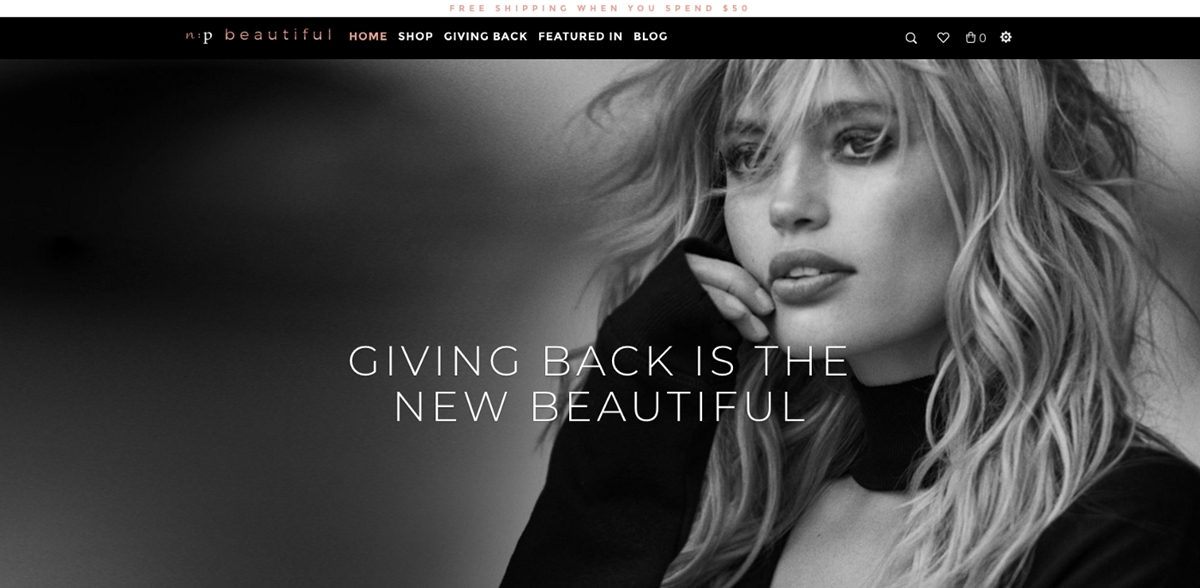
Parallax Theme has a stunning and beautiful homepage. We all know that the first place customers reach the website is the homepage. Therefore, a home page needs to ensure beautiful, impressive, and impressive website art elements to attract users to continue to visit, search for information, and come back later. With the homepage that Parallax Theme brings, your audience will be convinced to stay on your site longer. In particular, this is also the impetus for them to buy some products.
This homepage gives your Shopify store a unique look. You can customize the drag and drop function to refresh the text and images of the landing page just in a blink of an eye. The design of this homepage is perfect for you to convey your message or story in an inspiring way and showcase your product effectively.
In addition, there are other parts of the website that Parallax Theme also takes care of.
With images, you can take advantage of them to highlight promotions, ads, or links. In particular, the number of ads displayed in a row can be adjusted by a slider. You can upload unlimited images with a slider to customize the number of images per row.
With the logo section, each uploaded image may have an optional click-through link. This section has a suggested size of 600 x 600.
In the slideshow section, the maximum number that Parallax allows to show is 12 slides at a time. You can customize to adjust the time to rotate the slide automatically.
The text is similar to the above, it allows the text content, a title, images, and buttons.
Clean Collection Pages
Collection pages are where online customers spend their time the most. Therefore, they are considered the most important landing pages. You should make sure the collection pages look neat, minimal, and clean. All the details on these pages must be product-oriented, take your products as a center, and highlight them. Parallax provides you with optimized collection pages and features that knowledgeable customers are familiar with:
- Each page can have products adjusted between two and fifty.
- Each row may have products adjusted between two and four.
- Parallax allows you to filter by tags and sort collections, show/hide collection titles.
- You can customize to display a gallery of featured images as a banner as you desire. You are allowed to enable parallax scrolling for this banner. You can also do the same thing with optional overlay text.
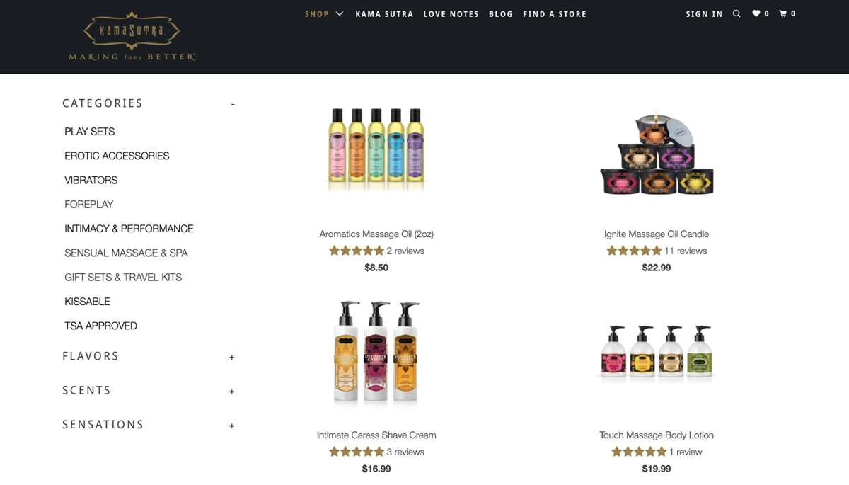
The best feature the gallery page offers is the optional sidebar content. You can enable this feature to use any of the following combinations of content to create sidebar navigation for your collections:
- Collection list
- List of suppliers
- Card list
- List of product types
- Menu and Text page
A protip for you: Optimizing the data uploaded on Shopify will allow you to use this sidebar as a filter for customers. This helps customers navigate the store’s items easily and find exactly what they are looking for just in a blink of an eye.
Customization Options
The parallax theme provides sellers with many customized options to customize their website interface. Many sellers love it because it helps them turn this theme into their own, with the style and orientation they desire. Below is a list of the most notable customize options:
Color
You will be completely creative in the color. Use your store’s color palette and have fun with it. You can adjust the color throughout the webpage including links, text, buttons, and background.
Font
Parallax allows you to choose the font you want to use Google Fonts. You can customize the font on the main menu, headlines, sub-headlines, banner titles, and body text.
Product grid
This is one of the best features of Parallax. You can use the product grid settings to customize how your products appear on gallery pages. With grid settings, it’s easy to specify how products will display on mobile devices (one or two per row). Furthermore, you can do the same with the height of the product image (between 150 and 400 pixels). If your product has variations as well as the location of the product thumbnail, you can drop down the Choose or choose between color swatches. QUICK SHOP feature can be displayed on scrolling through collection pages if you want. You can also enable product reviews (which are directly linked to Shopify’s free and available product review app) so customers can leave a few comments.
A protip for you: If you want your product to be sold out regularly, use the product form which is located in the product grid of the main topic setting. It will help you add a form to the product detail page when out of stock. To make sure not to miss customers when your store is out of stock, ask them to leave an email by notification. You can then notify them via email they provide when the product is back in stock.
Note: Remember that this feature does not function as an inventory application. So when the item returns in stock, the email will not automatically be sent. Instead, you are the one responsible for managing this.
Pop-Up
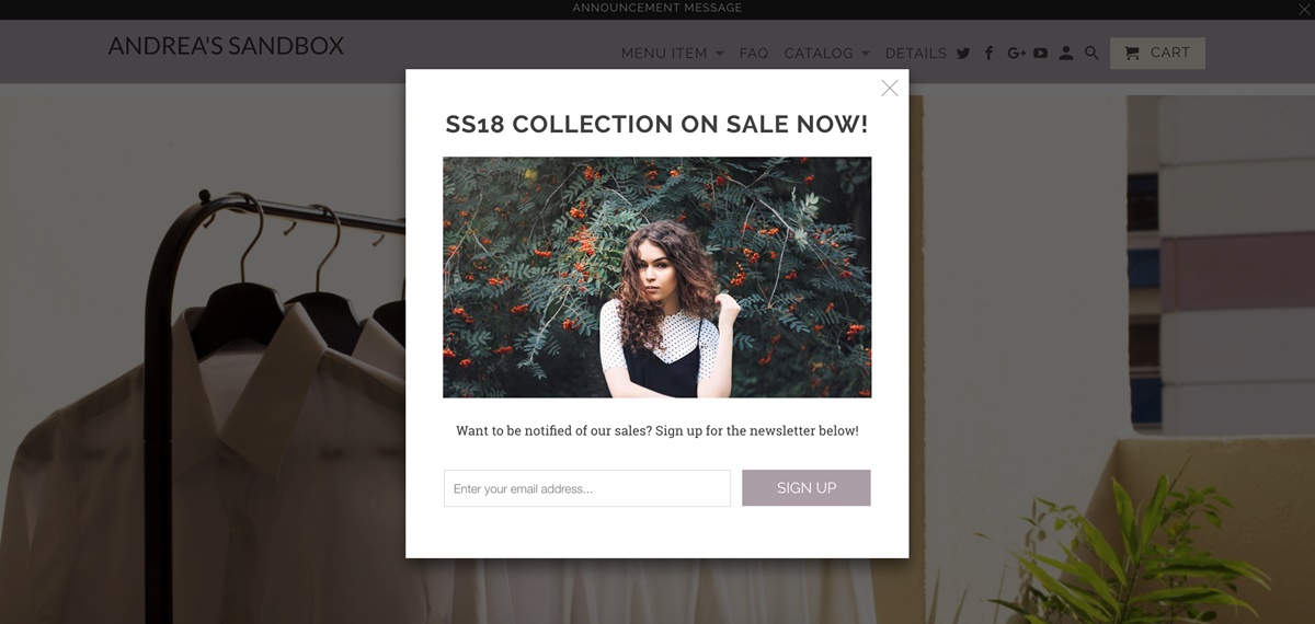
To motivate your customers to sign up for email marketing, and email popup is a powerful feature. It is considered as an additional way to call to action. You can turn the popup window off or on at any time by going to the general theme settings. When using the integrated email signup popup for Parallax, you can take advantage of the following features:
- Picture
- Link
- Title
- Set the number of days for the popup window to be displayed again (between 2 to 365 days)
- Optional first and last name collection
- Pop-Up delay (2 to 120 seconds)
- Set the maximum width to within 400 to 800 pixels
A protip for you: Are you using an email marketing platform like Klaviyo or Mailchimp? Collect first and last names will help you create a gender segment to target your email marketing platform. In other words, if you sell products to teenagers, this segment can be leveraged to send a targeted email to the only teenager.
Neat Product Pages
Many features provided by the Parallax theme to display or hide on product pages include Suppliers, Product types, Product tags, SKUs, Breadcrumbs, Collections, Related Products, and Social Sharing.
Besides, the product description position can also be adjusted to be above the Add to Cart button. You can customize the display of your item image to the right or to the left of your description. Product pages are like collection pages in that there is an optional sidebar. This is where you can optionally display different content from the gallery page, such as: Collection list, Product type list, Card list, Supplier list, a Text page, and Menu.
A protip for you: To display a menu of useful pages such as Returns and Exchanges, Shipping Policies, Size Guides, etc. for first-time visitors, you can use the sidebar.
Customer Reviews on Parallax Theme
In the previous section, we have learned about the Parallax theme, four attractive styles of this theme, and its key features. Now, I will give you some practical reviews from my point of view based on each of the factors: Design, Price, Quality, and Customer Service.
Design
Almost all Parallax theme users love the theme’s design. The number of satisfaction must be up to about 99%. Design is the most valuable plus point for Parallax because they really focus on it. Take a look at the four great styles that Parallax has to offer. They are really elegant, stunning, and impressive. For many users, they consider that Parallax is the source of inspiration and captivating visitors.
Price
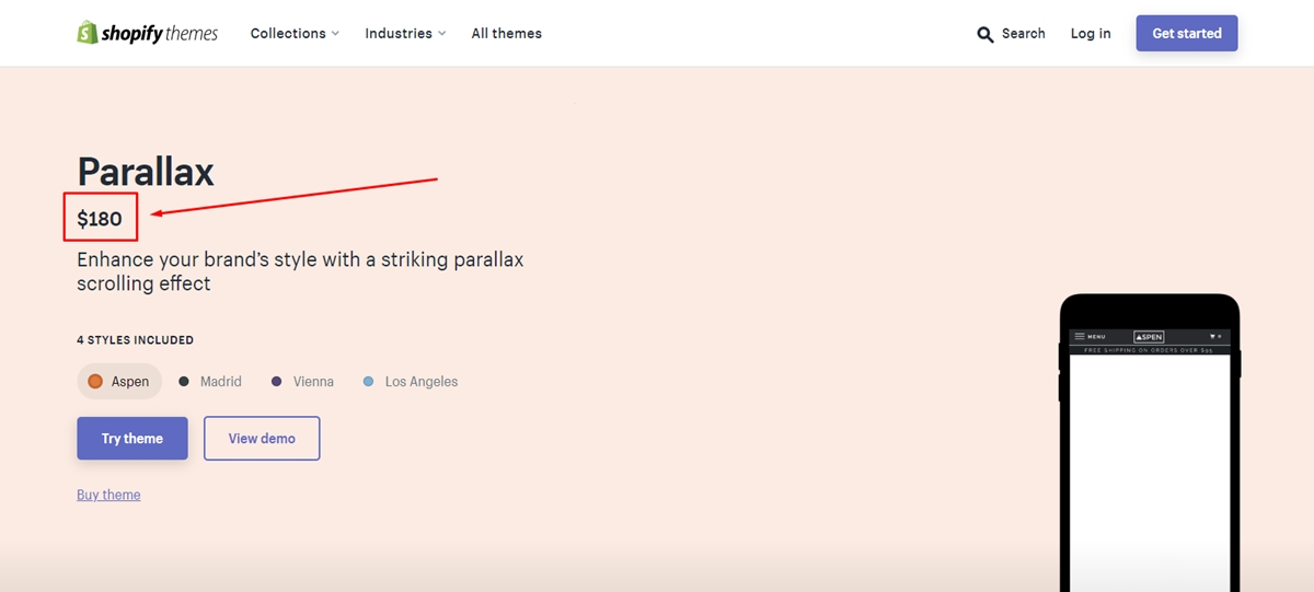
Currently, the price of the Parallax theme is $ 180. At this price, you can own an eye-catching theme and have many optimal functions. In particular, you use the Parallax theme trial version to have the opportunity to experience it for free. Surely you will be fascinated by the beauty it brings to your store.
Quality
In Parallax Theme Main Features, I have mentioned in detail the key features of this theme. As you can see, these features are well suited to running a website. Many users consider that the Parallax theme works perfectly for their website. In particular, with great capabilities such as drag and drop of site parts, you can change the overall look of the website easily. With Parallax, you can make this theme your own, why not?
Customer service
Although the three elements of design, price, and quality are all good, in the customer service part, I think it still needs a little improvement. Out of the Sandbox has provided many tutorials on their website. However, there are still a few users when encountering a problem, they have not received specific and clear instructions.
Conclusion
With the different purposes and styles that you pursue, you can choose for yourself a suitable theme. However, if you have not chosen a theme yet, Parallax Theme would be a great choice because it is popular and suitable for most types of businesses. Shopify Parallax Theme will help your business website optimize. With the clever and appropriate use of the parallax effect, make your website more beautiful, attractive, and “cool” than ever before.
Other Shopify Theme Reviews:
New Posts
