10 Inspiring StoryBrand Website Examples For You To Apply
Every movie has a script to let actors know what they are going to do and say in a particular scene. So is BrandScript, when its duty is about guiding customers instead of guiding actors. Especially in these uncertain times, those businesses that have clarified their message and built a sales funnel are much more likely to survive.

This time, I will show you some important elements included in a StoryBrand website and some examples to make a website “StoryBranded”. I hope this 10 Inspiring StoryBrand Website Examples For You To Apply article today will provide you a useful guide with tips and ideas for you and your own website design.
What is a StoryBrand website?

A StoryBrand website is a pivotal marketing tool based on Donald Miller’s framework. It effectively enables businesses to articulate their value proposition and illustrate how they address their customers’ challenges. By presenting a lucid message complemented by a prominent call-to-action button, a StoryBrand website amplifies conversion rates. Consequently, it dispels any ambiguity, laying bare the essence of a business, the services it provides, and the inherent significance it brings to the table
What are included in a StoryBrand website?
To define what is included in a StoryBrand website, I have to admit that there is no one “official” way to create a StoryBrand website. Below are some common practices that were taken into account to build factors in a StoryBrand website.
1. The Brandscript
Developing a BrandScript is essential for a StoryBrand website as it helps clarify and streamline your messaging.
2. The Front Page

The front page serves as the sales pitch of your website, aiming to convert visitors into customers. A long scroll layout is standard optimized for mobile viewing.
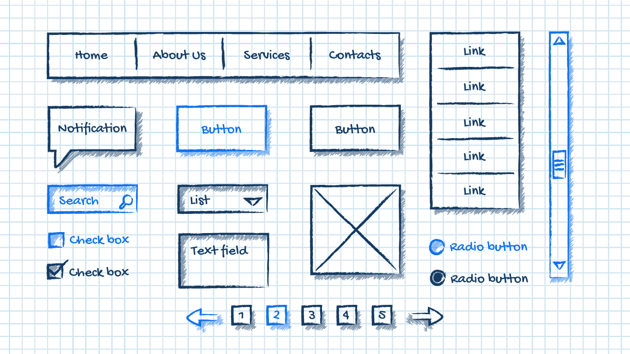
3. Wireframe
A wireframe outlines the sections and content order of the front page, providing a basic design framework.

Typical sections in a StoryBrand website may include:
- Hero Image Section: Featuring a headline, subheadline, and call-to-action button.
- About Us: Showcasing your expertise and how you can solve customers’ problems.
- Authority Signifiers: Displaying logos or testimonials to establish credibility.
- Value Stack: Highlighting quick-hit value propositions.
- 3-Step Plans: Outlining the process of working with your business.
- Agreement Plan: Communicating promises and business philosophy.
- Other BrandScript elements: Character, Problem, Failure pieces, and Call to Action incorporated throughout the sections.
It’s important to note that while these elements are common, there’s flexibility in how they are organized within a StoryBrand website.
10 Real-Life StoryBrand Website Examples
So now you know what StoryBrand is and what is included in it, but I guess it is still hard for you to find your own way unless there are examples of great StoryBrand websites online for you. Below are 10 examples that I consider to be the best StoryBrand websites using a good framework to clarify their message. I have divided them into categories so that you can find the way for your business and apply.
The Friday Habit

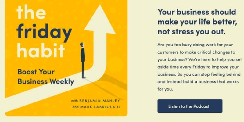
Leveraging the StoryBrand framework, “The Friday Habit” is a podcast centered on productivity, skillfully weaving a narrative that resonates with its listeners. Its Squarespace-designed website adeptly highlights the challenges faced by its target audience, addressing their concerns and elucidating the advantages of their product or service. With captivating headlines, minimalist imagery, and a visually appealing layout, the website stands out as a testament to effective design.
The founders, Benjamin and Mark, adopt empathetic statements like “we know how hard it can be to make your business a priority,” effectively positioning themselves within the context of their audience’s struggles. Furthermore, the seamless UX and the website’s vibrant yet straightforward color scheme harmoniously intertwine with the StoryBrand-oriented messaging. Phrases like ‘we’ and ‘you’ are strategically utilized, fostering a personal, engaging dialogue with the customer.
Indulge Right
Indulge Right offers sugar-free, allergen-free treats, rich in prebiotic fiber and suitable for diabetics. Drawing from Miller’s StoryBrand framework, their website centers on the customer, asserting, “You have the power to make informed choices and support your family’s greater health.” Recognizing challenges like weight management and the pursuit of tasty, healthy snacks, Indulge Right empathetically positions itself as the solution.
ZenFounder
ZenFounder, under the adept leadership of Dr. Sherry Walling, is dedicated to productivity. Its Squarespace-crafted website boasts a plethora of articles, book links, and retreat information. Dr. Walling skillfully employs the StoryBrand framework, greeting visitors with the assertion that “burnout and isolation are not part of your job description,” seamlessly identifying her core audience: entrepreneurs.
By pinpointing and addressing their unique challenges, Sherry positions ZenFounder as the ultimate solution, offering both consulting services and a podcast tailored to assist entrepreneurs in navigating burnout and feelings of isolation.
Mary-Meduna Gross

Dr. Mary Meduna-Gross, a life coach rooted in Nebraska, is adept at weaving engaging narratives. Her WordPress-driven website exudes a genuine, relatable tone that immediately resonates. Mary astutely recognizes and addresses her customers’ challenges, whether they pertain to stress reduction, confidence enhancement, or energy boosts.
By leveraging the StoryBrand narrative approach, Dr. Mary allows her brand’s ethos and values to shine through, utilizing pointed questions and heartfelt language to connect with her audience.
The Happy Sleeper
The Happy Sleeper offers on-demand sleep courses through its sleek Squarespace website. This site efficiently uses the StoryBrand framework, outlining new parents’ challenges in clear bullet points without overwhelming text. Founders Julie and Heather have seamlessly integrated bold CTA buttons into the design, making course access a breeze for users.
Lovejoy & Numbers
Lovejoy & Numbers, an accounting firm, prominently employs the StoryBoard framework. Its standout CTA even includes the word ‘story’. The firm portrays clients’ accounts as ‘the numbers’ and encourages its audience to take charge of them. Their website maps out a lucid three-step process, showcasing the firm’s expertise and using striking visuals of stressed entrepreneurs to further its narrative.
Motivated Mornings
Motivated Mornings, aiming to boost employee productivity, presents its mission through a Squarespace website. The site, with its professional yellow and black design, adeptly applies the StoryBoard framework. It identifies the issue, offers a plan, and prompts user action. The blend of storytelling with effective design choices optimizes user engagement.
Tie Boss

Tie Boss is a multi-purpose tool designed to help hoist, haul, and tie down loads. Its website was built around the famous ecommerce site builder Shopify and used the StoryBoard framework significantly.
Tie Boss is adept at nailing its customers’ pain points and telling the story of its product by attempting to thread it into the tapestry of its customers’ lives. The company allows customers to picture the product in their day-to-day lives and match it to their lifestyles.
Made to Impact
Made to Impact is an employee benefits program with a twist. Rather than dole out freebies, it incentivizes employees to save money and better plan their financial future. The company’s website harnesses compelling statistics to determine employees’ current financial state of play.
Moreover, Made to Impact utilizes an aesthetically pleasing ‘block’ layout to illustrate the benefits of its program and straightforward colors, concise copywriting, and bordered buttons for its CTAs (calls-to-action).
Nephesh Pilates
Nephesh Pilates, founded by Elisha, provides a personalized exercise experience. The Squarespace website resonates with the studio’s ethos and uses the StoryBrand messaging brilliantly. Elisha shares her Pilates story, emphasizing its positive impact on her life. Her site weaves design, CTAs, and user concerns for a holistic user experience, guiding visitors through the Nephesh Pilates narrative efficiently.
How to Get Started with StoryBrand

Here are some basic steps to implement the StoryBrand framework into your website:
1. Understand the Seven-Part Framework
The StoryBrand framework consists of seven elements:
- A Character (The Customer): Define who your customer is and what they want.
- Has a Problem: Identify the problem that your product or service solves.
- And Meets a Guide (Your Brand): Position your brand as the guide who can help the customer.
- Who Gives Them a Plan: Provide a simple plan that outlines how your product or service solves the problem.
- Call Them to Action: Ask the customer to take the following steps.
- That Helps Them Avoid Failure: Highlight what is at risk if the problem isn’t solved.
- And Ends in Success: Show customers the happy ending they could have by using your product or service.
2. Customer Research
Conduct customer research to find out what your target audience wants, what problems they face, and how they talk about those problems.
3. Craft Your Message
Using the framework, craft a compelling message that places your customer as the hero and your brand as the guide. Develop the narrative that will flow through your website.
4. Homepage
On the homepage, you should:
- Clearly state what you offer (The Character and What They Want).
- Identify the problem you solve (Has a Problem).
- Introduce your brand as the guide, perhaps through testimonials or credentials (And Meets a Guide).
5. Products/Services Page
Detail your products or services and how they solve the customer’s problem (Who Gives Them a Plan).
6. Call to Action
Incorporate clear, compelling Calls to Action (CTAs) throughout the website (And Calls Them to Action).
7. Articulate the Stakes
On a dedicated page or in a section, lay out what’s at stake—the adverse outcomes the customer will avoid by choosing your solution and the positive results they will gain (That Helps Them Avoid Failure and Ends in Success).
8. User Experience and Design
Ensure your website is easy to navigate, aesthetically pleasing, and supports your crafted StoryBrand narrative.
9. Test and Refine
After implementing, test different elements like CTAs, headlines, and page layouts to see what most effectively engages visitors and converts them to customers—iterate based on this data.
10. Consistency
Ensure your StoryBrand message is consistent across all platforms, including social media, email marketing, and offline materials. Following the above instructed steps, you can create a compelling website that tells a story and converts visitors into customers.
FAQs
In Summary
After seeing the storybrand website examples we’ve provided, it’s understandable to feel overwhelmed. You may think that creating a good-looking online presence is impossible or that your business couldn’t possibly incorporate storytelling practices into its website. However, this is different! The formula for storytelling is quite simple:
- Establish the character/hero (your customer)
- Introduce the problem (their pain point)
- Present yourself (or your company) as the hero’s ‘guide.’
- Lay out the plan (how your business can solve the problem).
- Call them to action (convert them)
- Help them avoid failure (outline the consequences of not seeking your help).
- Guide them to success (and turn them into a lifelong customer!)
Furthermore, while these sites look fantastic, yours can look better. Most of the best StoryBrand website examples we’ve included here have been created with website builders such as Wix, Squarespace, GoDaddy, BigCommerce, and Shopify. These builders make it easy to construct a website and start storytelling through it.
Bottom line
Finding the right one for your needs is essential. Before diving in, compare the best website builders on the market and weigh their key features and benefits.
New Posts


