Visual Branding Strategy: Definition, Types, Important, Examples & Best Strategies
No matter how great your product or service might be, your business won’t be able to take off if you don’t do your branding properly. In a Report, 66% of customers surveyed would rather stick to their chosen brand than to a rival brand that claims to be more creative. In the meantime, 75% said they value trust more than trendiness.
In today’s highly competitive market, businesses must stand out to prosper. A visual branding strategy that emphasizes the brand’s image that you want to communicate (like trustworthiness) is the most powerful way to be heard in the noise.
Your brand is, after all, a representation of who you are and what your company stands for. That’s why customers are supporting and buying from your business. Your brand covers everything from visual identity to name recognition. This recognition takes time to cultivate and develop, but you can launch a powerful brand that attracts audiences and inspires them to learn more about you with time and effort.
In this article, I’ll share everything you need to know about visual branding strategies and how you can use them to develop your brand.
Let’s jump right into the details!
What is visual branding?
Visual branding is an integral part of any marketing campaign. It consists of all the visual elements that are used to reflect your brand’s personality, from your logo to the font and color on your business card. Each part works together to build your brand’s overall look and feel.
Why is it important to have a visual branding strategy?
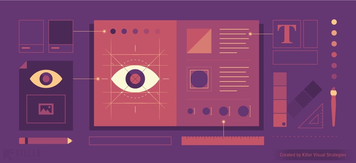
In reality, as consumers shop around for companies to hand over their money, they do judge the book by its cover. In other words, businesses are judged on the basis of their visual branding. Why? Well, in many ways, how a brand presented visually echoes the experience of the client.
If a prospective customer finds a brand where quality and detail matter, they will expect the same degree of quality and attention to detail for your goods or services. If your visual branding, however, is on the sloppier side, they probably won’t expect top-notch service.
When your audience comes across visuals that mean a playful, fun brand personality, they’re looking forward to having a blast with your company. When they see a more buttoned-up brand, they’ll know that you’re taking important issues seriously. Your approach to visual branding can also tell a lot about your position in your market. This is regarded as the positioning of your brand.
By representing your brand through high-end graphics and custom design work, you’re showing that your audience should expect to pay a premium. This is why having a visual branding strategy is important; it helps you communicate who you are as a brand to your target audience and what they should expect when doing business with you.
Types of visual branding

A logo is just the beginning when it comes to visual branding. There are also many other factors that contribute to a visual identity that stands out. Some essential elements include:
- Logos
- Image styles
- Typography
- Memorable color patterns
- Composition styles
It is important (as always) to know your audience if you want to select the right visuals. This means that you should prefer the images that appear to your customers rather than to yourself, for which reason it is often suggested that you ask for a second opinion. As popular startups always want to point out, ask the laymen for their opinion when you’re stuck. This also holds true for visuals. Only ask people who don’t know your brand about what associations your logo should invoke.
Logos
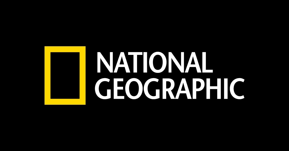
Many of the largest brands in the world have some of the simplest logos. They’re even identifiable for that. On the opposite, simplicity makes the evolution of the logo a much easier process than complex designs do. One of the best examples of this is National Geographic, which has expanded globally without losing its visual identity.
Typography
When it comes to typography for visual branding, many businesses will opt for anything that provides depth and is exclusive. However, you have to be sure that the balance is eye-catching without being too complex.
Marvel is one of the brands that should not be overlooked in this aspect. It is very specific in that it features a basic font and a one-colored background that can be easily produced. It is precisely the simplicity that makes for additional experimentation, as outlined below:
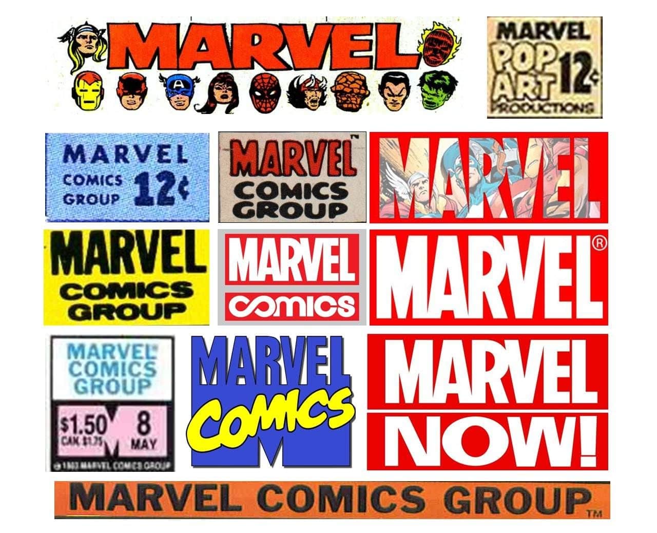
Image styles
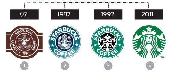
More complex designs have been known to evolve. The trick is to keep them identifiable. When you create an image, you also create a particular design of the image. One way to do that is to do as Starbucks has done: add subtle improvements over time and maintain its original shape and design.
Composition styles
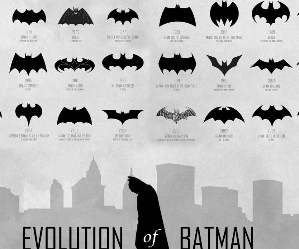
Some brands have as many logos. This is when combining different ingredients to produce a specific style of composition really comes into play. Our favorite example is Batman, who seems to have undergone every possible change imaginable, mixing several different types, and remains equally identifiable.
Memorable color patterns
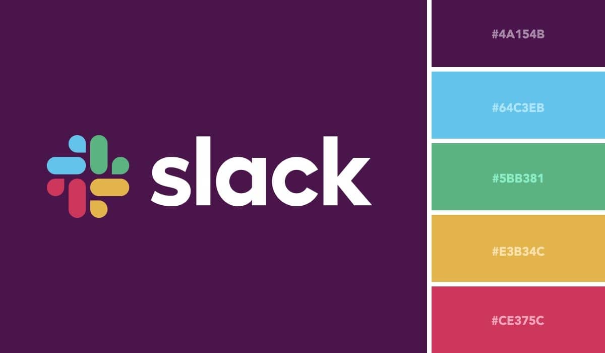
Take your time to choose the right color palette and the right shapes. Visuals should be consistent over time, so dramatic changes of any sort are not the best ideas. Your graphics need to be both identifiable and versatile enough to be able to tolerate the changes needed over time.
Best Strategies For Creating Your Visual Branding Assets
How should you design your logo for your visual branding?
In logo design, natural symbols are often preferred over abstract objects. The Research Center for Management and Economics – CEGE (Catholic University of Portugal) found that natural symbols outperformed abstract objects when it came to designing preferences.
Researchers have categorized a group of logos as having an abstract or natural design that, in turn, may be cultural or organic. Cultural was a form of organic design that featured produced objects or cultural symbols, whereas organic designs featured biological objects from the natural world.
Since natural objects are more familiar and part of our daily experiences, they become more identifiable than their abstract counterparts. Keep this finding in mind when you determine which symbols you are going to use for your logo.
How to choose the shape of your logo?
The shape of your logo can affect how your brand is perceived to be. That’s what four researchers noticed when they ran five experiments to explain how this simple layout variation (whether the logo is circular or angular) is linked to different brand perceptions.
According to their results, circular logos were correlated with more comfort (a softness-related attribute), whereas angular logos contributed to more favorable perceptions of durability (a hardness-related attribute).
Whether your brand is automatically related to softness or hardness may influence product decisions and some perceptions of experience. Take this idea into account when you determine what kind of look makes sense to your company’s visual representation.
Learn more:
Top 12 FREE Logo Maker Software How to Create a Logo for Business?
How to influence your customers’ perception of your brand’s quality?
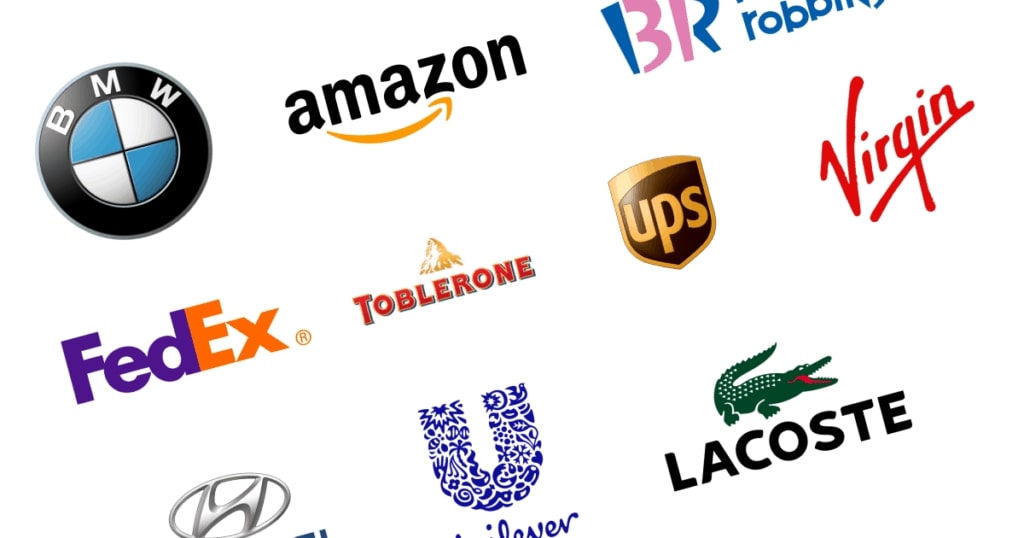
Your logo’s design can influence the way your customers perceive the quality of your brand. You do not think that visual choices affect your business or product’s actual output, and you may be right. However, in a world where customer perception plays a crucial role in measuring results, you want to be fully aware of the effects that an appealing visual icon (i.e., logo) may have on the way your brand experience is viewed.
A group of researchers asked theater visitors to assess the company behind the play in relation to its success and existing logo. What they found was that logo attributes such as beauty and recognizability are linked to customer expectations of the actual performance of the company. The next time you consider the possible effect that a redesign may have, take into account the indirect effects that it might have on the consumer’s view of brand experience as a whole.
How to influence your customers’ perception of your product?

A study carried out by the American Marketing Association looked at how various packaging designs were correlated with customer brand experiences. Dividing package designs into five styles (massive, contrasting, natural, delicate, and nondescript), the researcher team found that massive packages are linked to over-average robustness, contrasting packages generate enthusiasm, natural designs are linked to sincerity, and delicate designs are correlated with elegance.
They concluded that brands that want to be seen as sincere should have natural package designs, while exciting brands should have contrasting designs, professional brands should have delicate designs, sophisticated brands should have natural or delicate designs, and robust brands should have contrasting or large designs.
How to trigger customer interest in your product?
How critical is it to pick the right font for your brand’s visual identity? According to this study by researchers at the University of Wales, it’s very critical since that helps trigger higher interest in your product. In the study, brands were selected twice as often when they were in the right font compared to when they were not. This impact demonstrates the significance of adopting a type of family that is compatible with the brand’s identity, offerings, and values.
How to make your brand visually stand out?

Just as packaging designs can have an impact on brand personality preferences, the type of fonts you use have associations that can promote those characteristics. In a series of studies on the effect of type on brand personality expectations, researchers found that naturalness, flourish, and harmony were the most significant characteristics of type font, in the sense that they evoked higher levels of most brand personality dimensions.
More specifically, the fonts that were harmonious (symmetrical/balanced), natural (organic), and had a certain flourish (serifs) seemed to equate the brand with a sense of enthusiasm, honesty, elegance, robustness, and competence. In addition, researchers found that more weight (a bolder font) increased robustness, whereas a lighter font indicated seriousness and sophistication.
How to choose the right visual branding color for your product?
Functional products benefit from using functional colors, while sensory products benefit from using sensory colors. There are several ways to describe products, but a clear distinction emerges when you look at what kind of need the product/service needs to fulfill. Functional goods are those that fix or avoid issues, while Sensory-social products allow us to express ourselves and to communicate our values. A study at Cardiff Business School used this approach to show how these two types of products could benefit from the design of a brand that featured similarly functional or equally sensory color choices.
The study also shed light on the types of colors that customers themselves classify as “functional” or “sensory” where gray, black, blue, and green are related to the former, while red, yellow, pink, and purple to the latter. The researchers have found that customers believe that functional colors are more suitable for functional items and that sensory colors are the same for sensory products. Properly selected colors will add instant value to your visual branding and its position.
How to communicate your brand’s quality via visuals?
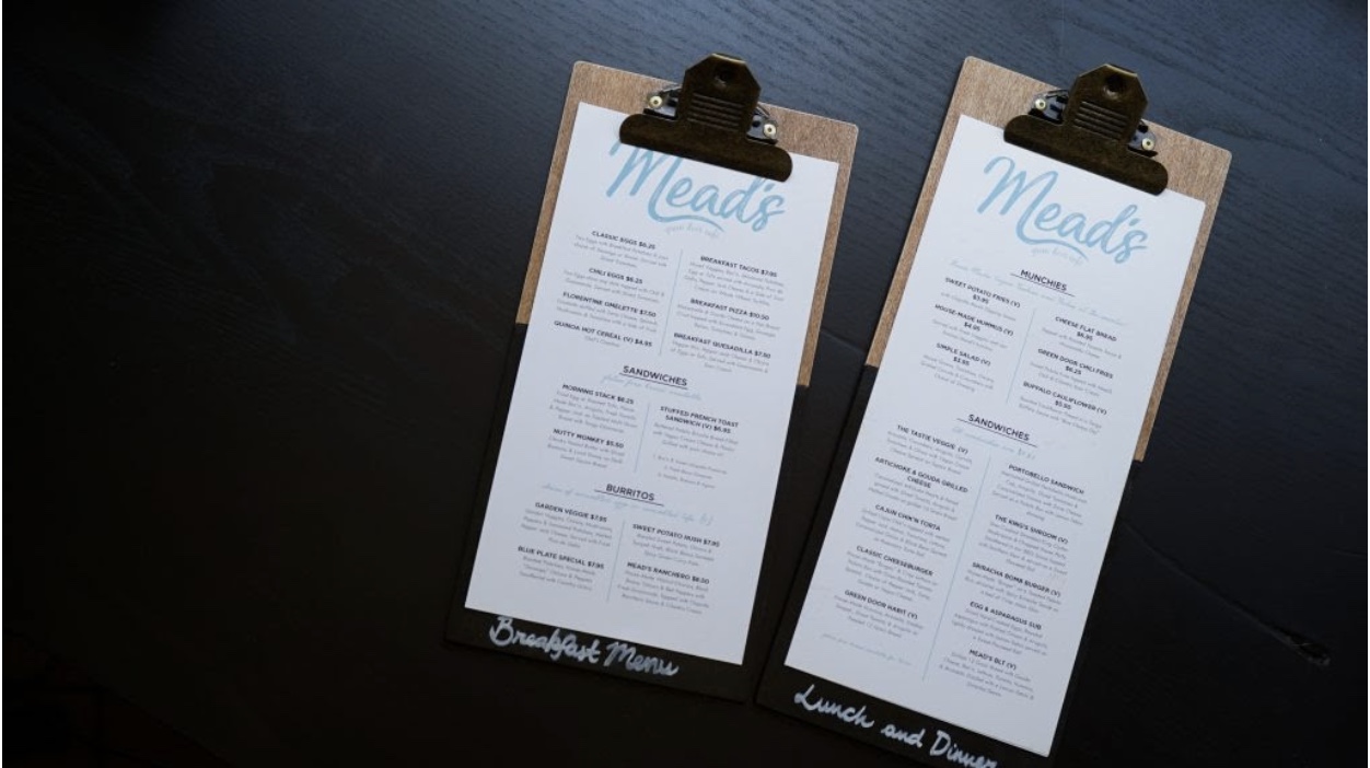
Print branding materials can communicate quality with typography and paper type. You may have intuitively grasped the importance of some brand cues: sophisticated fonts and fancy paper may have caught your attention while in a restaurant. A research analysis on the influences of some menu design decisions found that italicized fonts and heavier menus affect how high-quality the brand is considered to be, as well as the level of service quality that can be predicted. When making decisions about your brand’s stationery products, remember how paper type and font selection will play a part in your potential customer’s perceptions of your brand and its quality.
How to generate trust via your logo?
Logos create higher credibility when they are simple, harmonious, and consistent with your website design. The design of your logo will help your brand catch your customers’ interest and establish trust in split seconds. Research published in the International Journal of Human-Computer Interaction has shown that logos designed to convey reputation traits (such as expertise and trustworthiness) have led to positive conclusions about how trustworthy a business is, resulting in a greater willingness to engage and interact with that brand.
The paper contained several recommendations on the kinds of logos that can express this kind of credibility:
- Include, if possible, an image or symbol that is indicative of the field of expertise of the company.
- Use color schemes that convey reliability or safety.
- The concept of the logo should be simple and easy to read. Watch out for problems such as lack of readability and low contrast.
- Make your logo compatible with the design of your website, as it communicates reliability.
With all of the visual branding assets you have just created, let’s move on to what visual branding strategies you can follow to develop your business!
Best Visual Branding Strategies For Developing Your Business

Visual branding strategy is a set of ideas and approaches that use visuals as an essential element of your branding campaign. In this section, let’s go through the best visual branding strategies that you can follow to grow your business.
Let Your Customers Tell Your Brand Story
If you want to make someone happy, make them the center of attention. So, that’s just what you’re doing for your clients. You’re making them the core of your brand journey. Let their voices make up your story. Incorporate photos and videos to share the brand impressions of your actual consumers on your eCommerce website, product page, dedicated sites, etc. That’s how you can build a credible brand image where your customers spread words about your brand via their brand experience stories.
Provide A Friendly Customer Experience
In addition to being customer-centric, there are other visual aspects that contribute to creating a strong brand image. The user-friendly interface for your website is a significant factor. When you provide graphics as part of your website’s content, you increase the probability of customer interaction with your website. Let your customers have a customized experience through photos and videos at your eCommerce outlet that will make them revisit your online store for their next shopping session.
Be Mobile-Responsive
Being mobile-responsive these days is no longer an option; it is a requirement to stay competitive. With 54 percent of total visitors coming from mobile devices and 30 percent of total transactions made via mobile devices, the visual side of your eCommerce store must be mobile-responsive if it is to survive and succeed. Your graphics need to be tailored to fit various mobile screens. Make shopping with you as easy as a few clicks for your customers. So, make sure you refine your visual content to make it suitable and seamless for mobile users.
Create A Visually-Engaging Customer Journey
Help your customers out during their buying journey with engaging visuals. Your customers will not know very well what they want to purchase when they first visit your website. So, lead them through their shopping journey with visuals.
Place related visuals of customer feedback and testimonials on your homepage to win user confidence. Put high-quality graphics on other websites to better describe the products you’re selling. It helps your users to better imagine how your goods will be when they use them, and make educated choices when purchasing.
Turn Your Social Media Channels Into Sales
Your social media channels can help you transform your branded or user-generated content into buyer confidence and increase eCommerce sales. Shoppable Posts are today’s trends that you can build on visual marketing platforms such as Pinterest and Instagram. They’re helping you close the gap between exploration and purchase.
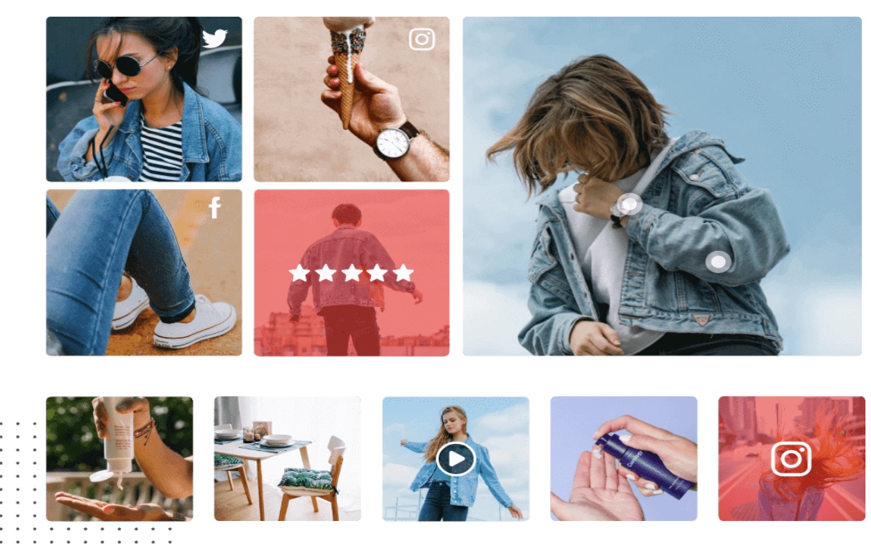
All you need to do is discover your earned media on the Internet, tag your goods with these social shares, and link them to your website. Selling goods by turning your user-generated social media posts into Shoppable Social Media Content is a perfect way to create user trust and push them to the final point of purchase. This removes the need to guide the users to several pages to purchase a product. This avoids misunderstanding and cart abandonment.
Employ UGC Branding
User-Generated Content is the most critical aspect of any branding campaign for visual content. UGC Branding is the perfect way to apply a visual marketing approach to your brand promotion strategy. UGC, a.k.a User-Generated Content, also known as the earned media, contains a wealth of visual branding assets such as social media posts, photos, videos, testimonials, comments, etc.
These are intentionally generated by the customers themselves. They are also the most reliable type of brand marketing. They are reliable, engaging, and meaningful visuals that boost your brand branding to a completely different level.
Align your visuals with brand image & identity

Visuals are engaging and you’re willing to include them in your branding campaign, but doing so without due consideration and coordination can lead to negative outcomes for your visual marketing strategy.
The main point to remember is that people associate the colors, themes, photos, videos, etc., you choose with your brand as you immediately associate red with Coca-Cola. So, it’s important that you strategically match your visual content with your brand theme and identity. Focusing on this will help you create a strong presence among customers and encourage brand awareness through visuals.
Use social media to showcase your visuals
Social media is one of the most critical aspects when it comes to visual branding. If you’re going to have a good visual campaign, social media needs to be one of the channels in your frontline. Millions of people worldwide log in to their social media accounts on a regular basis and consume content, particularly in visuals. That’s why Instagram & YouTube are the two most successful websites. It is therefore important that you ensure that your visual content branding strategy is implemented on a major social profile and that you also utilize social visual content on other branding channels.
Best Visual Branding Examples
Wayfair

Wayfair is an American brand that sells furniture & home products. This is a perfect example of visual branding where they use Instagram to promote and sell their products.
They use captivating photographs and captivating videos of well-planned and pleasing home decor settings showcasing their items. The presentation of their goods is so flawless and visually pleasing that they instantly catch the interest of consumers immediately. If color scheme, product aesthetics, practical approach, etc. are all perfectly matched.
National Geographic
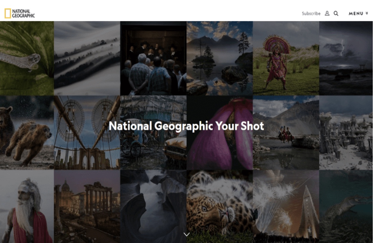
The visual branding environment is dominated by a television network of more than 130 million followers on Instagram & 46 million on Facebook. The earth discovery channel and its adventures do the same with their social profiles. First, they have a breathtaking gallery of images and videos taken by talented photographers with the power to display the “magic and truth of the earth” with just a snapshot.
They build an interface around their visuals of cultures, people, locations, animals, etc. that engages millions of users, broadens their reach, and much more. NatGeoYourShot, a NatGeo profile where users share user-generated visual content, is also very popular with more than 3 million followers.
Nike
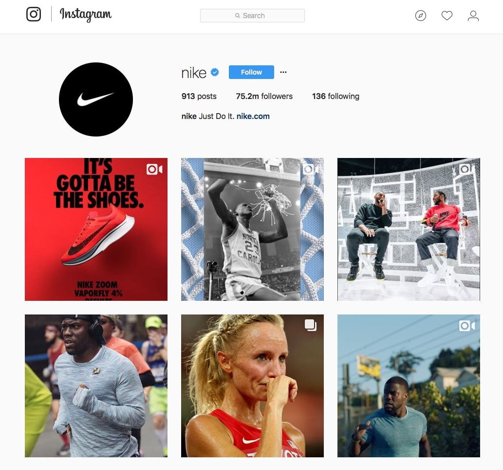
As you’ve known the name, you may have remembered a Nike commercial featuring captivating video, sports & athletes, inspirational music & words, fascinating sound, and maybe more. Nike was at the forefront when it comes to using visual storytelling for ads.
They’re creating immersive video advertising loaded with emotions that attract their audience’s attention. The highlight is that their videos can be talking about different topics, but it all comes down perfectly to their “Just Do It” tagline, leaving viewers excited and awe-inspired at the end of the day.
Final words
That’s it! Having a visual branding strategy is important to stay competitive in today’s market. I hope that this article has provided you with valuable information about this topic. Please feel free to leave comments below for a further discussion on this topic!
New Posts


