13+ Inspiring Welcome Email Design Ideas
Consider a welcome email to be your customers’ initial impression of your business. The delivery, open, and click-through rates for welcome emails are the highest, so you know it’s important. After all, the first impression often lasts very long.
Your welcome email should be warm, inviting, and educational, and it should “wow” your audience by thanking them for subscribing! Send a welcome email to your audience as soon as they sign up so they know who you are and what they can anticipate from your business. Then, you can start to establish trust with them and gain more loyal customers.
Building a fantastic email sequence starts with the welcome email. So, in this article, I’ve put together the most essentials of a welcome email, including 10+ best examples that you can use to make your welcome emails even more engaging.
Let’s begin!
Why you should design your welcome email with great care
One thing to keep in mind is that open and click rates do not indicate the success of your welcome email.
To improve conversion, you’ll want to change subject lines and body copy. However, the main goal of the welcome email is to guide visitors through the onboarding process.
In fact, according to data from Invespcro, welcome emails have these important statistics:
-
A welcome email’s average open rate is 50 percent. This makes it 86% more effective than traditional newsletters.
-
Welcome emails can generate 4x more opens and 5x more clicks than a regular email marketing campaign.
-
After subscribing to your list, 76% of consumers expect to receive a welcome email right away.
-
Users that receive a welcome email are more engaged with the brand by 33%.
-
On average, welcome emails can generate 320% more revenue than other promotional emails.
So, depending on your product or service, you should think hard about what your welcome email aims to do. Whether it is encouraging users to complete their profile, make a purchase, download content, or complete an action, the welcome email must deliver the value and make the readers act.
With that in mind, let’s see some examples of fantastic welcome emails.
Related:
13+ inspiring welcome email design ideas
1. Allbirds
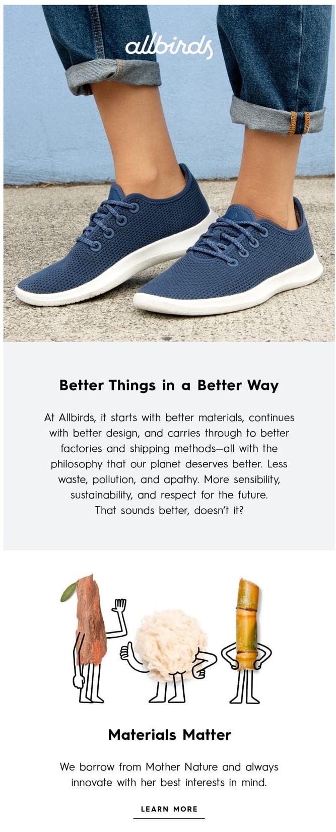
The world’s most comfortable shoe brand, Allbirds, produces a distinct atmosphere that can be felt at every part of the email.
Welcome email from Allbird includes modest animated GIFs that are consistent with the overall welcome and employs colorful wording to promote values.
The subject line of the email is also outstanding. “Welcome to the Flock” is a great copy that focuses on the brand’s lighthearted, pleasant tone-of-voice while making you feel like you’re a part of something bigger.
All of these factors work together to create a genuine and memorable brand identity.
Allbirds, you’ve done a fantastic job!
2. Away travel
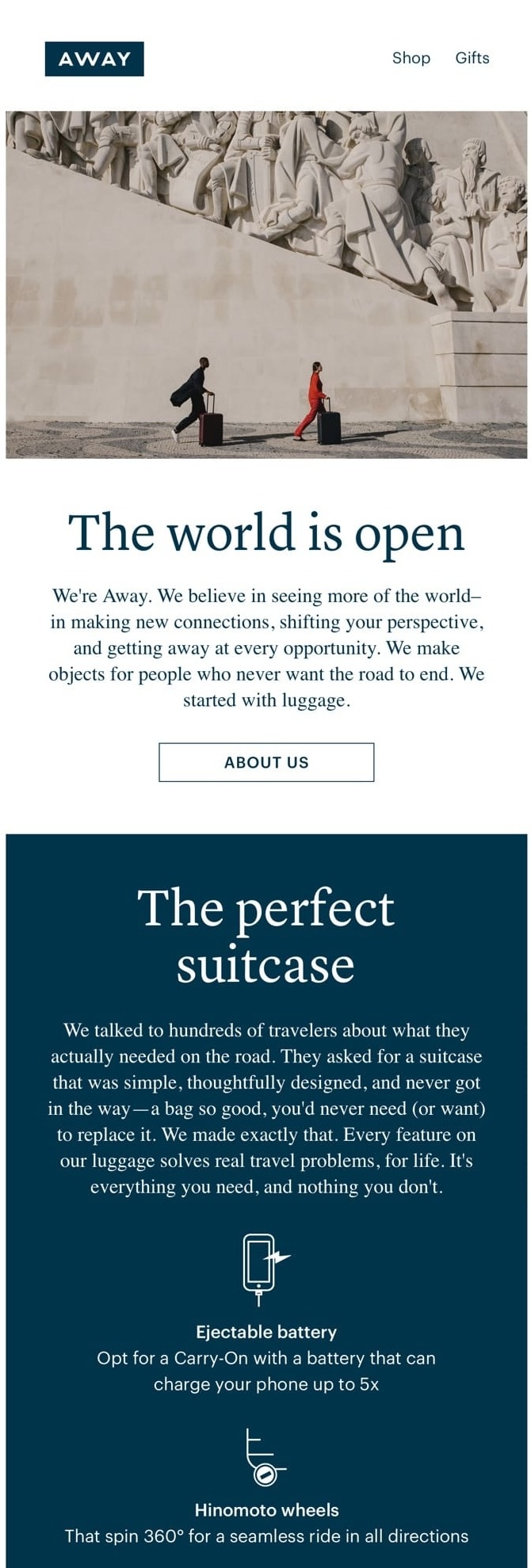
Away Travel, the first-class luggage company uses a welcome email to describe and promote its ideals and genuine love of travel. And they exhibit a customer-first approach right away by chatting to travelers about what they required while on the road.
Away’s welcome email lists five compelling reasons to purchase their solution, while also providing a 100-day trial to ease your mind. Away’s luggage also feels intelligent and bulletproof because of the story.
This welcome email matches the company’s corporate image and motivates you to book your next vacation.
3. IKEA
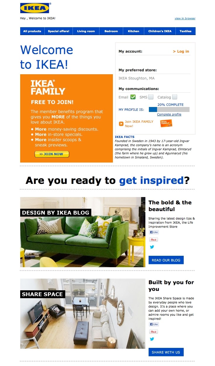
IKEA’s welcome email may not be the most visually appealing on this list, but that doesn’t mean it isn’t effective.
Instead of going for the hard sell (e.g., “Buy stuff now!”) or explaining what they do (which IKEA likely assumes most people already know), IKEA uses its welcome email to introduce people to its other, lesser-known programs and content channels.
For example, right at the top is a call-to-action that explains the value of its member benefits program. There are also invitations to visit their design blog and contribute to their collaborative “Share Space” website.
If none of that appeals to you, IKEA’s welcome email also makes it simple to log in and begin shopping (a login area is located near the top of the page).
4. Helloprint
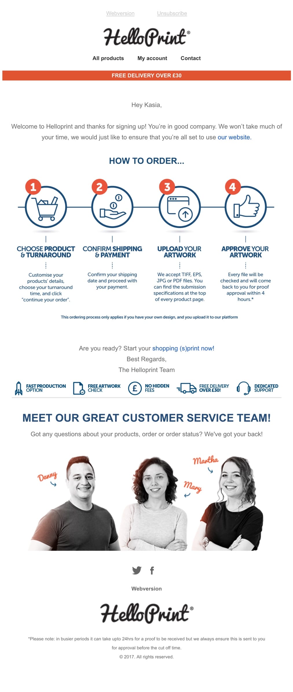
The introduction to Helloprint’s support team members in their welcome email is a lovely example of making the brand feel personal, warm, and welcoming.
Helloprint ceases being anonymous, and you know it’s Mary, Martha, and Danny who are looking after you.
It’s a simple move to give your brand a face right away, making it more approachable and personal.
5. Tattly
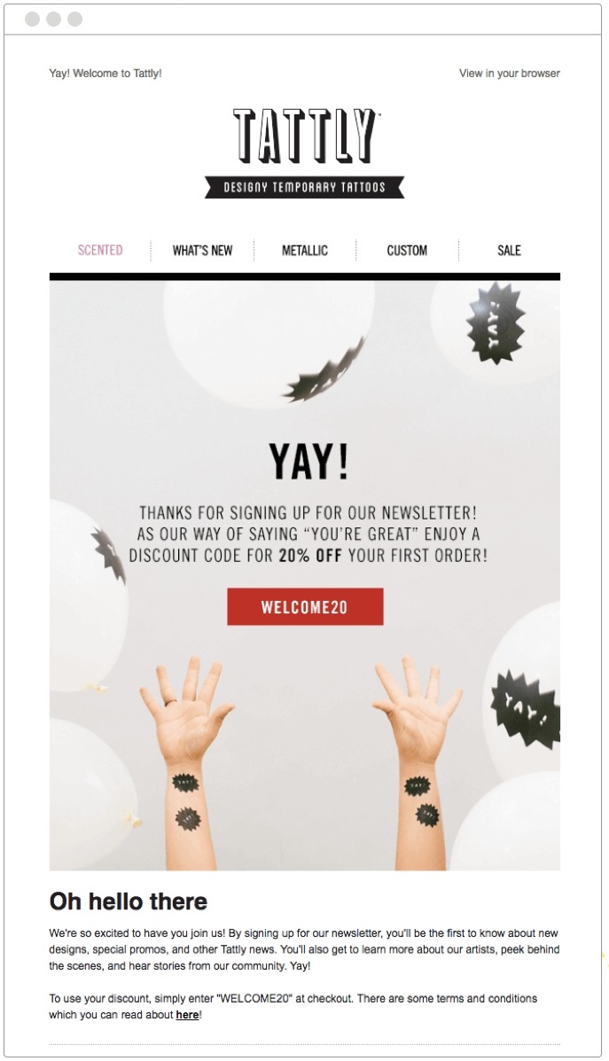
Tattly’s casual welcome email template style exudes anticipation. The design is lighthearted, and the use of the word “YAY” throughout suggests a relaxed attitude.
Tattly offered newcomers a 20% discount, which was a brilliant and economical technique to convert recipients into customers. Conversion may be easily monitored by using the code “Welcome20.”
The email also provided three different products for recipients to check out. This technique aids in the discovery of the customer’s preferences.
It’s also a good idea to encourage customers to use the hashtag #tattly to develop a community and raise brand awareness.
6. Funfit
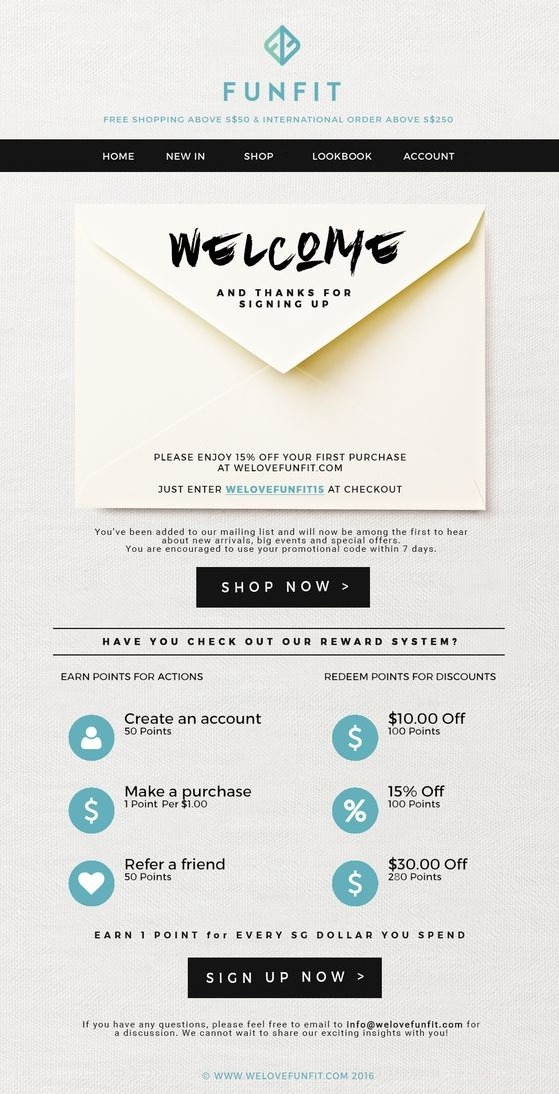
Thanks to the envelope, this eCommerce welcome email design template from Funfit is extremely charming and effective. We send more electronic letters than traditional letters these days, which is probably why I really like it.
The most crucial details are printed on the envelope itself. And because it draws the eye, the main message is efficiently delivered. The CTA button is also effectively highlighted, making it easy for customers to start shopping with Funfit.
7. Kate Spade
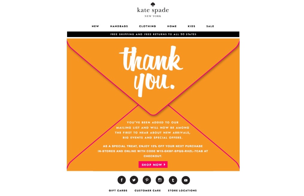
Let’s face it: as internet users, we’re continuously overwhelmed with requests to sign up for and subscribe to various email newsletters. As a result, it’s a huge deal when someone takes the time to filter through all of the confusion in order to sign up for your email marketing messages.
Kate Spade uses a simple — but effective — strategy in their welcome letters to express their gratitude to those who actually take the time to subscribe: “Thank You” is written in large, bold letters. Kate Spade recreates the experience of receiving a genuine thank-you letter in the mail by writing “Thank You” on an envelope. (The 15% off coupon code is the bonus for their effort).
8. Moo
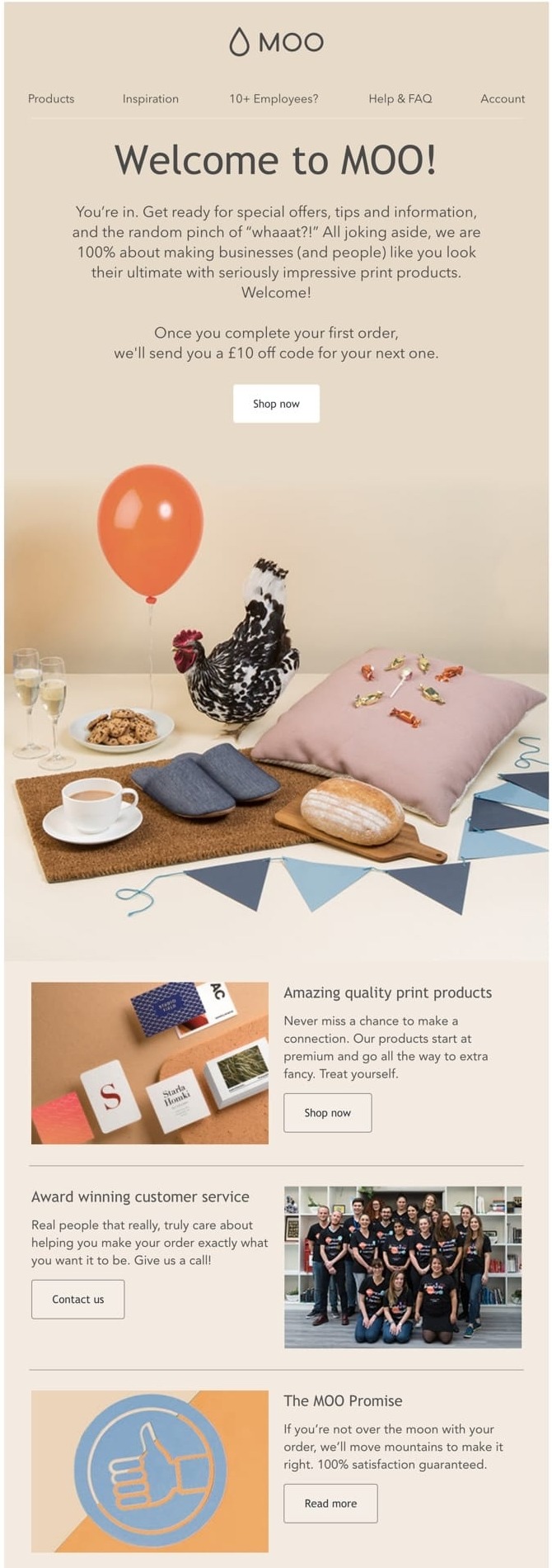
With a humorous picture and a fresh color combination of green, blue, and yellow, Moo’s innovative welcome email design gets your attention.
MOO creates gorgeous graphics and prints for customers all across the world, as evidenced by this lovely, imaginative welcome email.
Following the greeting, they pique your interest with a strong promise, a humorous image (perhaps showcasing some of their works), and a vibrant color scheme.
If you purchase their print products, Moo promises that you will impress everyone, and that “if you aren’t over the moon, they will move mountains to make it right.”
‘Award-winning customer service’ sweetens the deal — when you buy Moo’s products, you can expect to be served by over-achievers and to have an experience that exceeds your expectations.
9. UGmonk
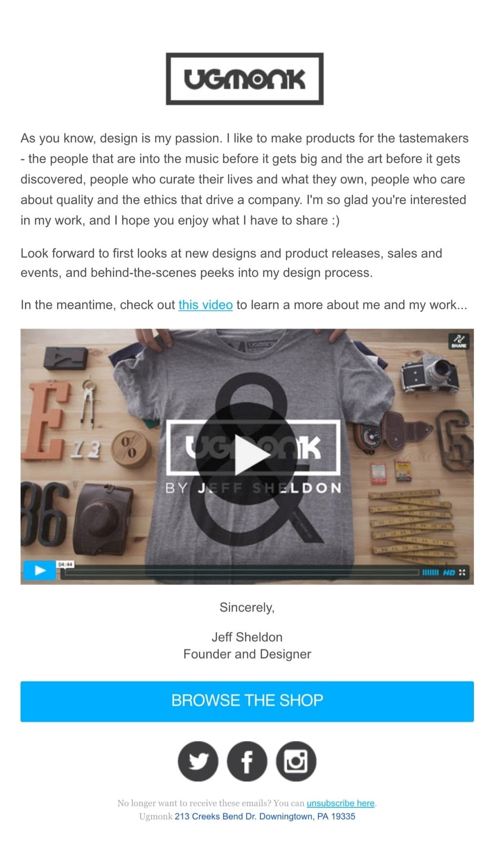
The form of Ugmonk’s welcome email is the first thing that catches my eye.
UGmonk greets you with a personal note from the founder, Jeff Sheldon, as well as an interview-style video.
This story follows the day-to-day activities of a dedicated designer who came up with an idea and then saw it transform into something different.
Jeff offers an amazing story that delves into the specifics, principles, and motivations for launching a design firm. The fact that you can relate to Jeff and the brand’s story helps to establish a connection and resemblance with the user.
With its genuine feel, this welcome email, fueled by a passion for design and creativity, will undoubtedly capture the hearts of artists, artistic spirits, and tastemakers.
10. Food52
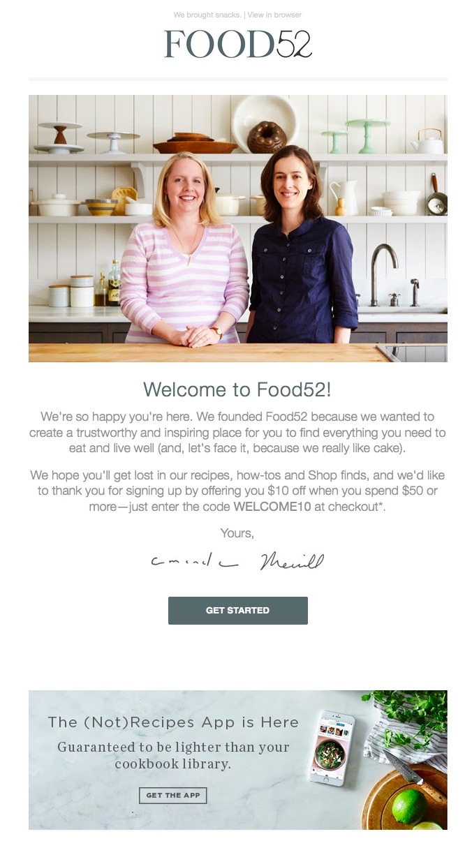
Even the simplest details in a welcome email can convey a lot about a company. And in the case of Food52’s welcome email, the preview wording at the top of the email, “We brought snacks,” does this admirably.
Preview text is the copy that is extracted from the body of an email and displayed next to (or underneath) the subject line in someone’s inbox. It is also known as a pre-header or snippet text. So, before you even open Food52’s welcome email, you get a flavor of their brand’s personality.
The welcome email from Food52 also does a wonderful job of establishing confidence by putting a face (or two) to their name. When you open the email, you’ll find a photo of the company’s founders, as well as a welcome message from them.
11. Casper

When we talk about email marketing, we have to mention Casper a lot, simply because they do it so well with their email marketing campaigns.
Casper greets users with an elegantly designed email. A relaxing aura is created around the brand by perfectly matched night colors and sleepy language.
They use awards to demonstrate the superiority of their products and gain your trust. Casper’s welcome email also implies that they are involved in some high-tech stuff and that they take your sleep very seriously.
The 100-night trial lowers the barriers to purchase; it feels less like a commitment, and buyers can change their minds later, making the decision to buy easier.
“Let’s get sleepy” is a hilarious CTA that matches the copy, implies action, and it’s always refreshing to see something new like this to make a mesmerizing first impression.
12. Drift

There’s no sophisticated design work here. There are no videos available. There are no photographs. After signing up for Drift’s newsletter, you’ll receive a welcome email that is a lesson in simplicity.
The email begins with an honest assessment of the email’s current situation. “After you join their email list, most people have incredibly long welcome email sequences,” Dave from Drift writes, before adding, “Good news: we aren’t most people.” The following is a collection of the company’s most popular blog posts, organized by bullet points. The product is only mentioned once, in a brief postscript at the end.
This is an excellent example to follow if you’re aiming to write a welcome email that’s non-intrusive and laser-focused on adding value rather than fluff.
13. Eve Sleep
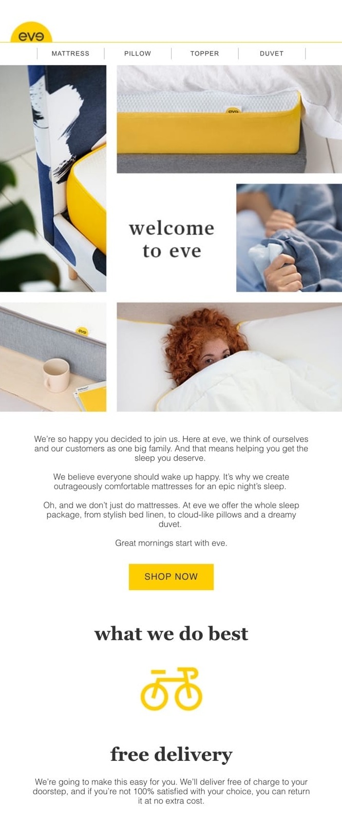
While the subject line of Eve Sleep’s welcome email makes you feel right at home, the introductory sentence establishes the brand as human and caring, with a higher good and purpose.
We believe that everyone should be joyful when they wake up. It’s why we make unbelievably comfy mattresses for an unforgettable night’s sleep.
Nothing else matters after that; you know you’ve arrived at the correct place to find your ideal mattress!
Eve jumps right to the most important benefit their products provide: waking up pleased after a restful night’s sleep. That’s a fantastic emotional opener!
The first paragraph ends with a traditional call to action, “Shop Now.” It’s fine to keep your call to action simple after such an amazing and imaginative paragraph.
The second section of the welcome email contains incentives to encourage the reader to make a purchase. 100-night trial. 10-year warranty. Free delivery.
Eve not only offers a quality shipping package but they also make it super comfy. No frustrations, no trouble.
Welcome email design best practices
Consider your objectives before launching your welcome email campaign. Do you want the recipients to fill out their profiles? Do you want them to buy your product right away? Why did the recipient sign up for the newsletter? What are their expectations?
When designing a welcome email, or the first email in a welcome series, there are several best practices that you should keep in mind:
-
Make your value proposition clear from the start. You don’t want to bombard customers with advertising messages when you only have a few seconds to make a good first impression. Remember, before you can expect to receive, you must first give. Discounts, advice, and other customer-focused content can provide value while also enticing users to make a purchase later.
-
Personalize your welcome email with content that your users would appreciate. To add dynamic content to your emails and push notifications, track customer data on your site and have appropriate groups for them.
-
Create an automated workflow to help you visualize and develop your welcome email and subsequent customer journey steps. This way, you can keep track of your campaign’s progress and spot areas for improvement fast.
-
Make use of high-quality, eye-catching graphics. The pictures in your welcome email should be eye-catching, whether it’s product photos or unique illustrations.
-
Consider strategically how you’ll use the call to action in your welcome emails. Think about your overarching goal. What action do you want folks to take as a result of what you’ve said? If your email becomes too long, don’t be afraid to add more CTAs in key places.
-
When writing content for your emails, experiment with language and keep it fresh. Introduce yourself and make sure your tone of speech matches your brand’s. Keep it short and sweet, and only mention one item at a time.
-
Make your emails more attention-grabbing. To communicate fast, use headers, subheadings, bullets, and other techniques. Also, keep your message concise to hit the right buttons and inspire the reader’s imagination.
-
To make each step clear for the subscriber, use the 1-2-3 formula. Make it simple to get started by being helpful.
-
Don’t be afraid to use some true facts and storytelling to make your brand more authentic and relevant. To make your brand more personable and inviting, introduce your employees using actual images.
-
Make your welcome email’s subject line as enticing as possible to increase open rates and reach even more people.
Best welcome email design tool
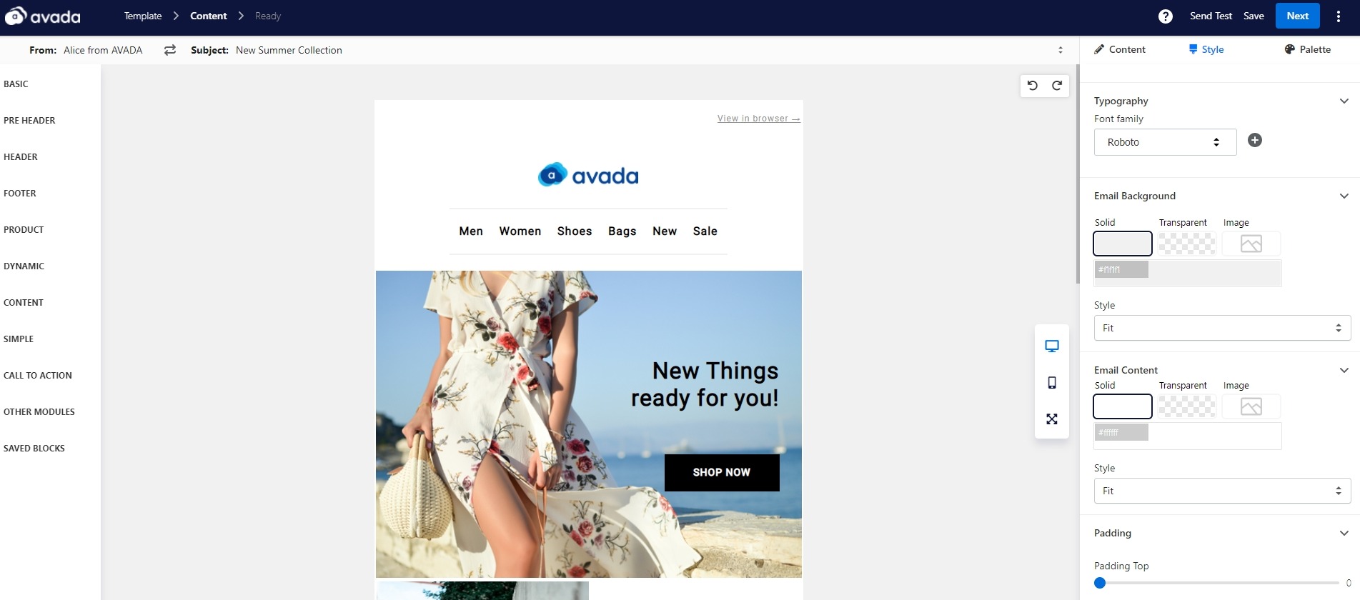
If you’re trying to come up with a non-intrusive welcome email that’s laser-focused on adding value, you need a good tool for that. And voila, we have AVADA Marketing Automation with a rich-feature email editor that lets you customize your welcome email, only by dragging and dropping.
Not only that, you can also create an automation workflow for your welcome email. This means your new subscribers will automatically receive an email from your address. This saves you a lot of time and makes your store feel much more professional.
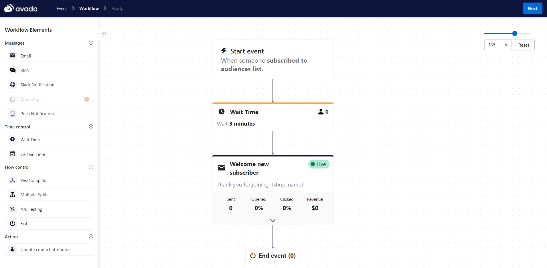
The app is simple to incorporate into your Shopify or Magento store, and you can do a lot to send out amazing emails with it. We provide many email templates even on the free plan (and it is free forever!) so you can make sure that your welcome email will always look amazing.
If you are interested in giving AVADA Marketing Automation a try, click on the image below or go to our homepage. Our support team is always more than ready to give you all the details and guidance. See you there!
New Posts

