11 Welcome Email Templates That Always Win Your Customers
We all know how important it is to make an excellent first impression; it can make or break a whole relationship right from the start. You don’t want to be late for an interview, have a bad breath, or leave a bad feeling about your business in the consumer minds. This is also true for email marketing, where welcome emails play a critical role.
When you send a warm welcome email to a newsletter subscriber or a new customer, you create the first impression on behalf of your brand. A good welcome email can do these three things:
- Thank the new subscribers for joining in and remind them why they joined.
- Invite some first engagements, such as an exclusive offer or a call to action.
- Set the tone and some expectations for future email communications.
If done correctly, a welcome email can turn your brand into The Great Gatsby - who everyone would like to be friends with just after the first handshake. To help ensure you can make the best first impression possible, I created this guide to show you how to create an effective welcome email campaign, as well as welcome email templates that always win customer loyalty.
So, let’s raise the glass and say hello in the most charming way!
What is a welcome email?
A welcome email is the first interaction a company makes with a new blog subscriber, newsletter subscriber, or customer via email. Welcome emails can include a special offer, a sign-up form, a video guidance, or simply a friendly greeting to establish a new relationship with the new contact.
According to statistics from Campaign Monitor, welcome emails are exceptional with high effects, such as:
- Welcome emails have an incredible 91.43% open rate.
- Welcome emails can create a 196% lift in the unique click rate.
- Welcome emails have a 26.9% click-through rate.
- A welcome email campaign has 4x the open rate and 5x the click-through rate compared to a standard email campaign’s rate.
- Welcome emails with offers can boost a store’s revenue by 30% per email.
- Welcome emails have more than 3x the transactions and revenue per email over regular promotional emails.
However, many marketers still haven’t used welcome emails yet, which is a waste of opportunity. Like people often say: “It’s all about the list”. Your relationship with your email list can definitely bring a new stream of revenue if you haven’t tapped into its power yet.
Read more:
- How to Create an Email Marketing Campaign?
- How to Improve Email Click-through Rate?
- Best Abandoned Cart Email Practices!
- Email Marketing vs. SMS Marketing: Which One Is Better?
Why are welcome emails important?
If the numbers above haven’t impressed you enough, here is another essential reason to use welcome emails.
Your welcome emails set the tone of the relationship with each of your list's subscribers
This is important because you are introducing users to your way of doing business, giving them a good reason to read your emails and engage with your proposals. By having a clear understanding of your audience, you can connect with their problems. The three main key factors for a good welcome email are:
- Understanding customer demand: Most of the time, you would try to turn subscribers into customers or get them to do something. But first, you should know if they are able to buy and willing to buy. If you want to turn them into customers, you will need both criteria. A good welcome email will help you confirm.
- Knowing the target audience: What is the specific group of people that you are trying to reach? It would help if you had a detailed understanding of your audience’s psychographics and demographics. This understanding gives you the necessary vocabulary to show customers that you understand them.
- Showing solutions to their pain and problems: The customers’ pain points and problems are a good indication of why they subscribed to your email list. A great welcome email reminds recipients of their problems, pointing to solutions provided by your business that can fix them.
Many marketers make the mistake of sending a confirmation email, thinking they are sending a welcome email. But they are not the same thing. Confirmation emails only alert the action a subscriber has already made, like subscribe, join the newsletter, verify the email address, etc.
Welcome emails serve other purposes, which are:
- Set subscriber’s expectation: Welcome emails can sort subscribers right from the beginning by letting them set expectations on message frequency, email content, sending time, format, and even length. Setting these expectations to help customers determine to be a part of your list or move on while you find their biggest demands and act on them.
- Re-confirm the benefits of being a subscriber: When you understand your subscribers, you know what is important to them. Welcome emails can reassure the benefits they are getting, and prompt them to receive more by taking actions.
- Get readers to make small commitments: Hard-selling from the start turns the customers away, but a small yes sequence builds a relationship with subscribers - making saying “yes” a habit. Your welcome emails are the start of this relationship, leading them to gradually bigger commitments, finally being a loyal customer.
- Create interest and draw attention: With the welcome emails, you can point readers to the engaging content you produced. This increases sales naturally when combined with a good understanding of your customers.
When used well, your welcome emails are an incredibly effective start to increase subscriber’s engagement and lead them to become customers.
Best welcome email practices that work
In this section, I will show you the best practices in creating welcome emails, so you can be on your way to make highly nurturing and effective emails for your subscribers or customers.
Send a welcome email right the way
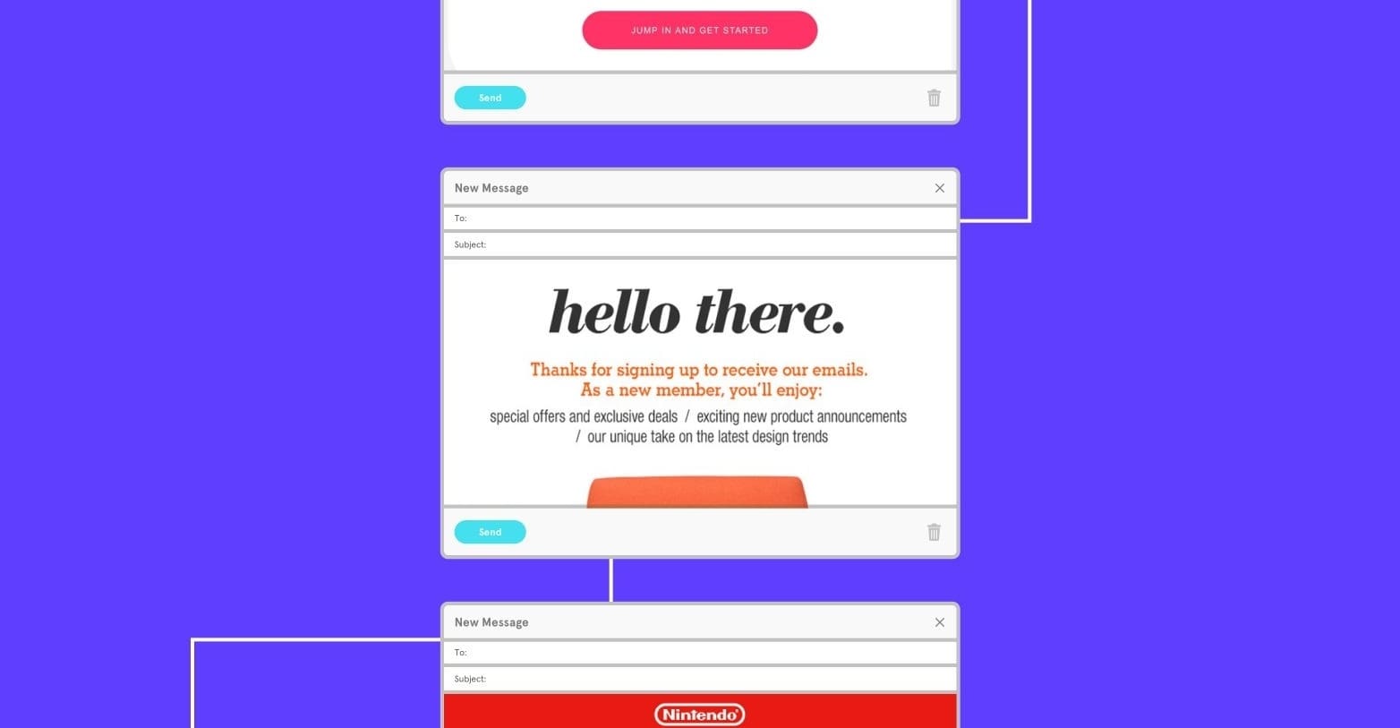
Failing to send a welcome email means you risk losing opportunities to sell. If you hook subscribers with an appealing welcome email to confirm the subscription, you can increase open rates, click-through rates, and transaction rates. But if your email arrives too late, there is a good chance that subscribers won’t even open it anymore because they no longer care about the offer.
But, how soon should you send your welcome emails? In my opinion, you should send welcome emails right the way when someone just opted into your email list. Please take advantage of their hot interest in your business and send a pleasant, friendly reward as thanks!
That said, many other companies send their welcome emails within several hours after subscription, or even up to a day. It is entirely up to you to test and decide. You can also customize the timing of your welcome emails based on how subscribers opted in and what value you can provide.
For example: If a user subscribed to receive free content, you should send an email with the link to the content almost immediately. If it is not, you should wait until you have something really valuable to send the welcome email.
Optimize the welcome email’s subject line

Before your welcome emails can influence your subscriber’s purchase decision, you must get them to open the email. That’s where the catchy subject line comes in. The subscriber gave you an email address and now you have the opportunity to wow them with something in return.
Big brands often use the subject lines to thank their subscribers and welcome them to their community. Something as simple as “Hello and Welcome” may be enough to convince the subscriber to open the email as they may have expected to receive a confirmation of their opt-in.
But. you can use language to create a stand-out impression, such as “What’s next?” or “Important information for you”, but make sure you don’t overstate your welcome! A call-to-action can also encourage opening, like “See what you can do with our products” or “Get started with our brand now”.
A good email subject line should be short (no longer than 10-15 words) and has a clear motivation. Avoid using words like ‘free’, ‘help’, ‘perfect’, ‘% off’, ‘deals’, ‘great’, ‘reports’ and other other similar words, as they can negatively impact your open rates due to the spam nature.
And since first impressions are important, make sure your sender information is also personalized. Submit from someone’s name or your brand name - whichever name is more recognizable.
Write the right copy
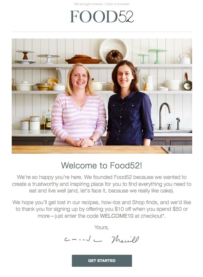
The content in your welcome email will change based on what your subscribers have opted in to.
- For a service-based business, make sure that you direct your readers to the most prominent (and important) sections such as FAQs, archives, and membership pages.
- For a product-based business, guide your readers to receive rewards if they decide to buy, check out your products, and understand your offers.
- For blog and magazine newsletters, the editor’s choices are a great starting point, along with a personalized introduction from the blog owner or business owner.
Regardless of the business type, your copy should get right to the point and not waste the time of subscribers. Focus your welcome on them, their story, their pain, their dreams and whatever you do, make them heroes on their own journey. You are not here to save them - you are here to help them take action and solve their problems.
Insert a clear call to action
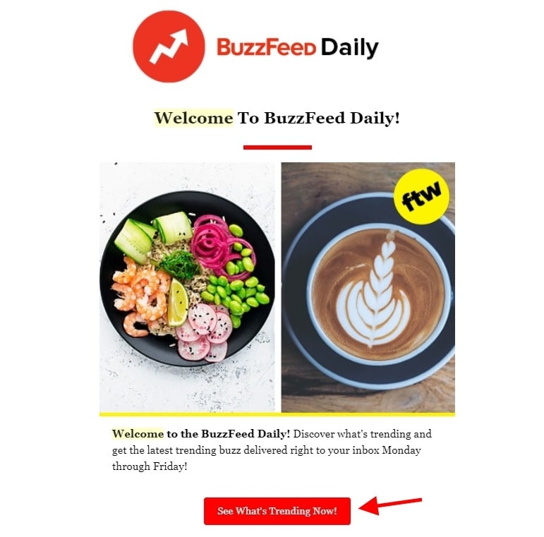
The best way to get people to do what you want is to let them know exactly what to do. That’s what calls to action or CTA exist for.
Remember that not every CTA has to be a direct selling call. Ikea uses simple CTAs like ‘get inspired’, ‘join now’, and ‘read our blog’. Simple, effective messages like these help guide readers to the parts of the website that best match their interests. Other examples that you can use are “download apps”, “log in”, “explore”, or “start”.
You can also simply ask your new subscriber to confirm the subscription and get them to ensure their form submission was not a mistake. This technique is effective to keep quality leads on your list and avoid unsubscribing.
Whichever CTA you choose, make sure that they send subscribers to optimized, easy-to-read landing pages and an opportunity to navigate to other pages. The longer they stay on your website, the closer they are to the final purchase.
Keep your promises
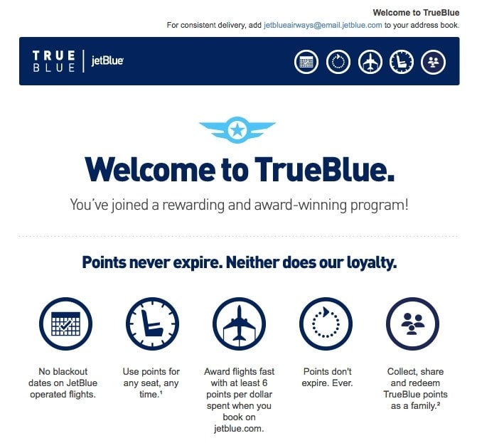
It is a common practice to gain new subscribers with a promise, such as receiving their email addresses in exchange for access to rewards, discounts, restricted content, news updates, or e-books.
As a welcome email best practice, you must honor this promise. So in your first email, let subscribers know how they can achieve what they were looking for in the first place. Include the coupon, discount code, or download link inside your email. Don’t let users take any more steps for their rewards, otherwise you risk losing them.
Tell subscribers their benefits
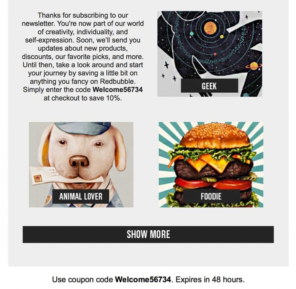
In addition to giving them the reward subscribers signed up for, you should make sure that they understand the benefits of being a part of your community. Will they regularly receive news, special discounts, VIP membership benefits, or premium content? Give your subscribers a solid reason to look forward to future contacts from you.
In addition to offering the types of content your subscribers can expect from you, your welcome email should also state how often they’ll hear from you. Creating a clear expectation among your subscribers - and then meeting it - is the best way to keep people on your list.
Gather information for customization
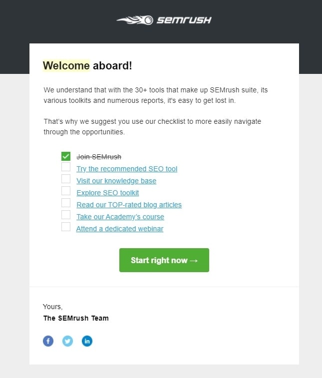
Many marketers consider email the best tool for customer retention because it is easy to customize emails and personalize the message to meet the expectations of your subscribers.
For best results, you’ll need to segment your email list based on readers’ online interests and habits. To collect this information, your welcome email may include a survey or link to a subscription options page, which subscribers can use to provide you with more information about their interests. This information makes it possible to give each subscriber the information they are looking for.
This step doesn’t have to be intrusive or time consuming; even just getting their answers to a simple question is enough to help you segment your list effectively.
11 welcome email templates to win customers (real-life examples)
Let’s take a look at 11 welcome email templates from other companies that are hitting all the right notes in earning new subscribers’ trust and encouraging them to engage. You will discover their different strategies for sending welcome emails as well. Let’s dive in.
1. Special: AVADA’s welcome email template
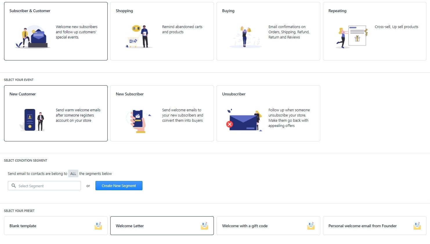
If the template above is a bit hard for you to copy, then AVADA Email Marketing provides many ready-to-use welcome email templates that you can edit, customize, and set timing. We have many templates, such as:
- Welcome Letter
- Welcome email with a gift code
- Personal welcome email from the founder
- Welcome subscribers
- Blank template for customization
If you sign up for the app, you will see all the templates available for free right inside the dashboard. As you can see in the picture above, you can segment recipients as new customers and new subscribers as well. Here is an example from our template of a welcome email with a gift code.
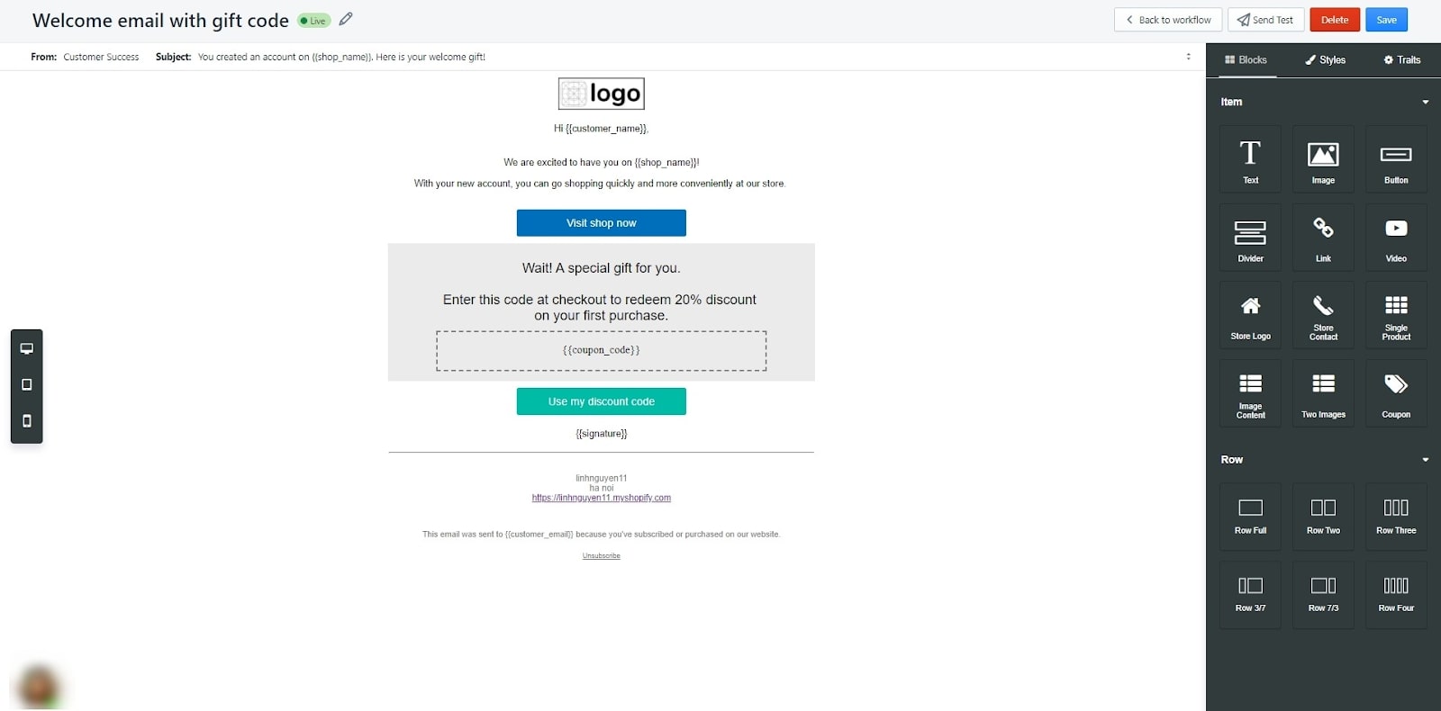
Once you click to edit an email template, you are taken to an editor - where you can customize your email to your wishes. There are options to add blocks of elements like text, image, button, video, link, and more - all you need for a welcome email. Also, you can insert your own brand’s logo, gift codes, and copy. In general, you can change the email to fit your brand while making sure the goal is met.
2. Virgin America
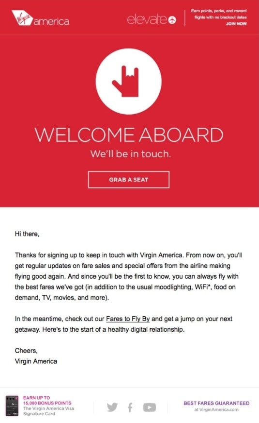
A welcome email is the perfect opportunity to introduce yourself with interesting and unique characteristics. For Virgin America, they use a hand symbol of “I Love You” right at the front and center. This small detail can touch the customers and show how folks at the company really care about their subscribers. The playful copy of “Welcome abroad” and the CTA “Grab a seat” help project a hip and fun-loving brand.
3. Nextdoor
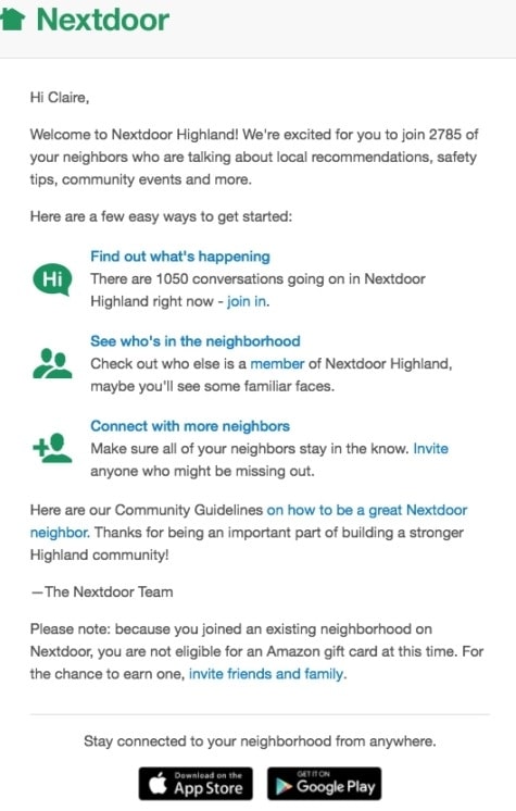
Nextdoor takes a straightforward yet effective approach to the welcome email that gets recipients straight to business. They outline the three easy ways to start using their service. There is no need to scroll, and the message is clear with not too many images. The tone is welcoming and the text is concise, not much more to ask from a welcome email!
4. Monday.com
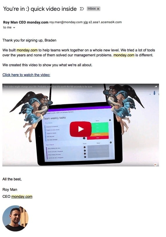
The welcome email from Monday.com keeps it friendly and simple so recipients can focus on the introductory video instead. The subject line and copy has a conversational tone, like the brand is talking to readers as a friend. It also helps that the email is sent from Roy Man, the company’s CEO, making the email more personal. If your company has many details to inform a new customer, try Monday.com’s approach and embed them all in a video, rather than listing them out in the email.
5. Asana
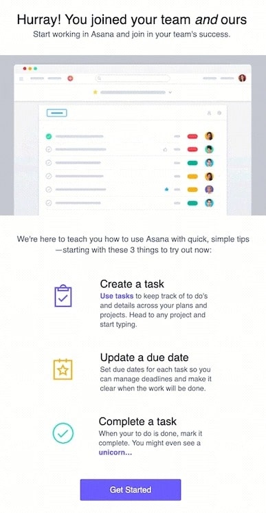
Asana as a project management tool does two things right in their welcome email. First, they have an eye-catching gift that demonstrates users completing tasks using their product. This is a great way to help recipients visualize the product. Secondly, The email feels like the tool itself. 3 quick description shows how a new customer can use the tool, and a big purple CTA of “Get Started” gets the new user to start as easily as reading the email.
6. Sephora
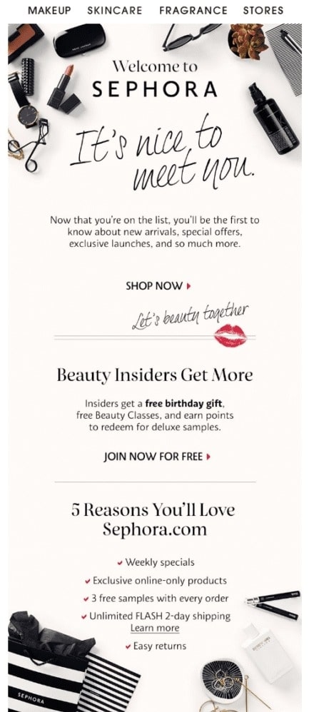
Sephora hit all the right marks with this welcome email. It opens with a stylized greeting design of “It’s nice to meet you”, then reminds you why you signed up - for special offers, new arrivals, and much more. The CTA provides a free birthday gift and engages further with customers. Lastly, a section highlights all the glamorous offers Sephora has that you can receive. The design of the email is fashionable with the company’s products, while the tagline “Let’s beauty together” is just sweet and feminine.
7. Wayfair

In this formatting of Wayfair’s welcome email, the email alternates the images and texts from the left to the right column. This creates an interesting visual as the reader’s eyes scan the email, bouncing back and forth. The imgade helps you visualize all the possible products to buy with Wayfair, inviting you to engage with their emails frequently. This design is easy to steal as well.
8. Kate Spade

Understanding that users are constantly bombarded with all sorts of emails, Kate Spade shows a big thank you in their welcome email. The ‘Thank you” text is big and bold, placed on an envelope, making readers feel like they are actually receiving an actual thank-you letter. Also, they offer a 15% discount code, enticing recipients to engage more.
I can say that I’m a fan of the brand, I even wrote an article analyzing Kate Spade’s advertising strategy, you can check it out!
9. IKEA
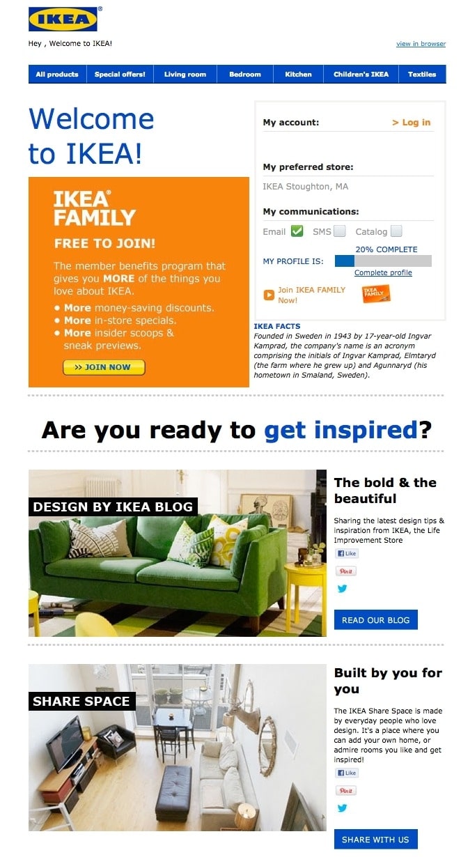
IKEA’s welcome email is just like the brand, not flashy, but compacted and effective. Instead of offering for a discount code or explaining what they do, IKEA uses the welcome email to direct folks to other programs and lesser-known content channels. There is a call to action right at the top that invites the user to become a member of the IKEA family. There are also invitations to visit the blog and the collaborative Share Space site. Or you can simply log in and start shopping.
10. Lyft
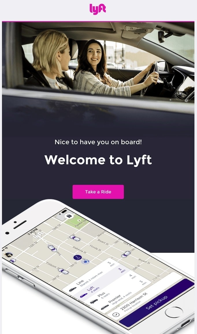
If there is any prime example of a simple welcome email, Lyft is definitely the one. It has an ideal welcoming attitude that immediately invites users to take the next step. The email focuses entirely on the look and feel of the transportation app, delivering a warm and smooth design as a car ride. The call to action button has a bright pink color with the text “Take A Ride”, making users feel less pressured to take the first step.
11. Medium

Medium is an online publishing platform, so they use the welcome email to list all the benefits of subscribing to Medium, and provide articles at the bottom of the email so users can start reading right away. If your company also doesn’t require much to start after signing up an account, you can take the same approach and provide more contents in your welcome email. This gives subscribers a taste of the material they will receive, and you can also collect data on which type of content they click on first.
How to make a welcome email campaign?

With AVADA Email Marketing, it is easy to create a welcome email campaign, since the workflow is already available, you just need to adjust a bit. Let’s get started through each step. First, let’s make a new automation campaign, click the ‘New Campaign’ button like in the image above.
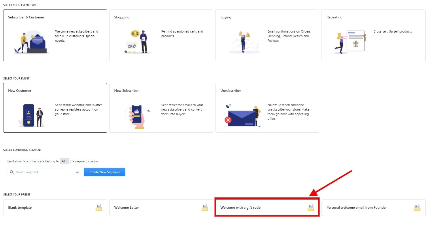
Here, we will select Subscriber & Customer -> New Customer -> Welcome with a gift code. I will show you how to make an email series, since the other options are pretty straightforward. After this, you will see the email campaign’s workflow.
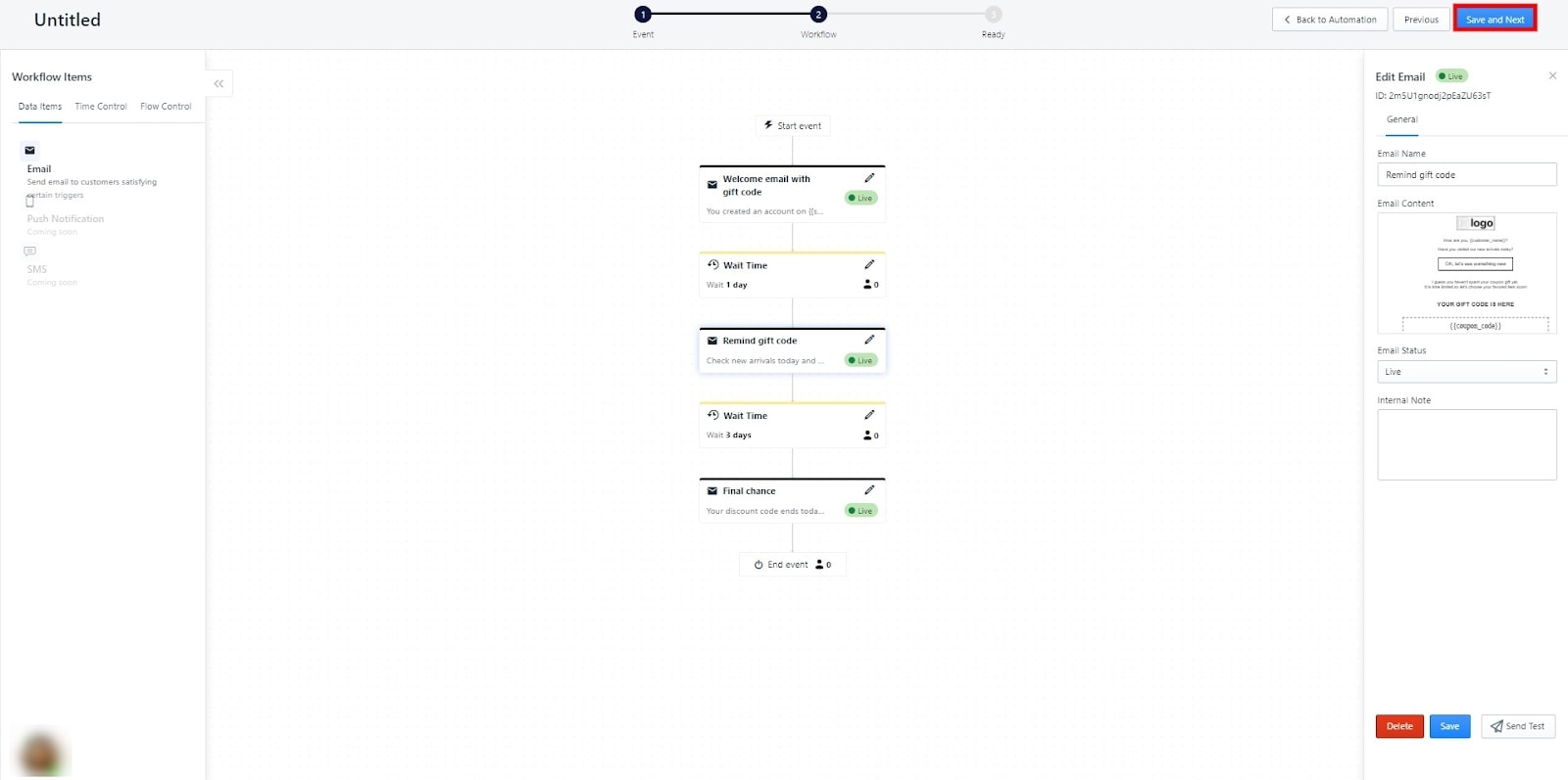
As you can see, we have created a workflow to use right the way. When the customer creates an account, an email will be sent to welcome with a gift code. Then, if the user hasn’t redeemed the code within a day, another email is sent to remind them. Then, if after 3 days and the user still hasn’t redeemed the code, you can send the final email to remind them of the last chance to get the discount code. You can, of course, edit these timing to make your own workflow.

If you are satisfied with the workflow, hit ‘Save and Next’. Here, you can write in the campaign’s name, description, and tags for better management. Once you are done and the campaign goes live, you can check the campaign’s results with data for more adjustments. You have data on sent emails, converted customers, revenue, and more. Just like that, your welcome email campaign is finished!
Related posts:
- Awesome Shopify Abandoned Cart Email Templates
- Best Confirmation Email Templates
- Best Upsell Email Templates
Final tips to make killer welcome emails
As welcome emails are the first email to your subscribers, it is a great chance to set the stage for your brand with message, design, tone, and a little introduction of who you are. Here are some more tips to make amazing welcome emails:
- Keep your welcome emails a direct reflection on your brand and website.
- Limit the scroll and get to the point quickly. Deliver your value right the way and include only one CTA if possible.
- Be inviting and encouraging! Let them know how thankful you are and a great experience awaits them.
- Images can be distracting sometimes, if your copy is strong, there is no need for unnecessary images.
- But copy can be boring too. Don’t use too much exposition, jump right in and start providing your information or offer.
- Welcome emails are great with automation! Use AVADA Email Marketing to automate them like in this guide!
Lastly, have fun with your welcome email campaigns! Test your knowledge about customers and try new concepts to keep your new subscribers engaged right from the first step. If you are interested in learning more about email marketing, head to our blog, I have plenty of articles there. Thanks for reading!
New Posts


