How to change Add To Cart button color in Shopify
In this post, I’ve prepared a detailed guide for you to change Add to cart button color in Shopify. The meaning of colors always plays an important part in making customers feel good and motivating them to make a purchase. Many people rely on color to decide to buy a product. This number is very large and can become your customer to help you grow your store sustainably. For online stores like yours, the add to cart button will be the one that customers most notice when they experience shopping. Therefore, changing the color of the add to cart button is very necessary. This will bring more benefits than you think. Find out how to do this and the benefits it brings below.
1. The importance of colors to use for a CTA

CTA is the abbreviation for a Call To Action. They can be displayed through colors to encourage viewers to act with mouse clicks. Thus, in simple terms, CTA is responsible for creating a conversion rate from users to potential customers. Colors are really important for CTA. Many marketers will tell you that color has a huge impact on shoppers’ psychology, it will impact the way people perceive your business, how they respond to your marketing campaign, and impact your sales, touch on how they interact with your product.
Colors speaking a language word CANNOT be copied. It strikes the client’s FEELINGS so extremely effective in persuading. Color can affect buyers and each color has its list of meanings that you can leverage in CTA. One thing you need to keep in mind when changing your add to cart button color is to choose a color that stands out from the background of your store but still has to be in harmony. Here, we will go through the top 3 most commonly used colors and I will share with you an analysis of the best situations to use which specific color and meet your goals. However, you can still use other colors that match your preference.
-
Blue: The safest color is blue. Any combination of blue will work. Blue is the favorite color of most people irrespective of age gender. Also, it is the color that people associate with credibility and trust. A full study indicated that 57% of men and 37% of women said that blue was their favorite color. You should choose this color when you like safety and want to attract a large number of users from both genders, demographic diversity.
-
Green: The main meaning of green is growth. That is the meaning that most people consider green. Also, green is one of the colors that the human eye easily processes. When people think of green, they automatically think of health, excitement, growth, and nature. When choosing this color, you are probably the one who pursues the idea of development and wants to create a sense of health or freshness. In particular, you should choose this color if your store has products related to food, health, and nature.
-
Orange: This is the color of the great call to action button. If you notice, many effective CTA buttons are orange. If you want to convey a sense of adventure or want to emphasize low-priced products, use this color for your Add to cart button.
2. How to change Add to cart button color
Why and what is an Add to cart button
When customers want to add a product to your store that they are interested in their shopping cart, they will tap on the Add to cart button. So have you ever wondered whether to replace the Add to cart call to action with Buy It Now or Purchase Now? Below, I will show you why I should use Add to Cart instead of the other two call to actions.
I would like to give an analysis of a company. In their test using 3 buttons including Add To Cart, Buy It Now and Purchase Now on 43,000 customers within 2 weeks. The results are as follows:
With the use of the Buy Now button, the conversion rate decreased by 9.61% and the Purchase Now was 14.50%. Pretty big number. So, what is the cause?
-
Add To Cart: With this button, the customer implies adding an item to the cart and not having to buy it right away, but can continue shopping and buy it once. And if you do not want to buy it, so the psychology of customers with this button simply does not affect their wallet, they can return to not buy at any time and so also reassuring but click more. Therefore, Add to cart will help you increase the conversion rate more. -
Buy It Now: With this button, customers will understand that once they click, they will go to the payment page and proceed with the payment immediately, so if not sure if they want to pay, why do they click this button? Right? And if they press this button, they want to buy more? There will be messy payment multiple times? This makes them quite embarrassing to click. However, Buy It Now will be more powerful, if you only sell one product, use Buy it now instead of Add to cart. - Do not use
Purchase Nowbecause its power is not strong enough compared toBuy it Now.Step-by-step guide
Add to cart button in product details
You can change the
Add to cartbutton color in product details by following these easy steps: - Step 1: Make sure that you are in the admin page now. Then, go to the
Online Storesection in the menu on the left of the page. Afterward, tap on theThemebutton.
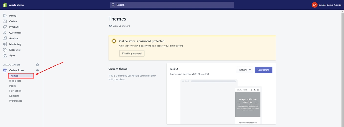
- Step 2: In this step, you need to click on the
Edit codebutton.
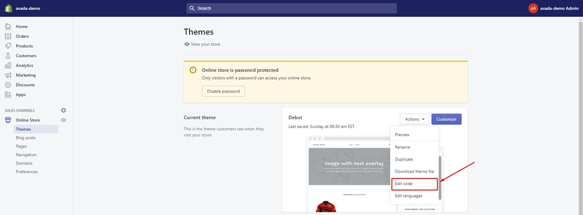
- Step 3: Choose the
theme.scssin theAssetsdirectory.
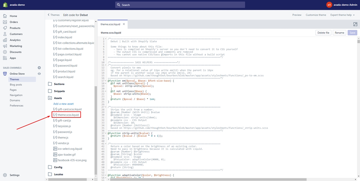
Next, copy the code below and paste it at the bottom of the file.
.btn--add-to-cart {
    background: gold;
    border: none;
    color: white;
}
- Step 4: You can change the color you expect by replacing the word
whitein the code. Finally, clickSaveto save your change successfully.
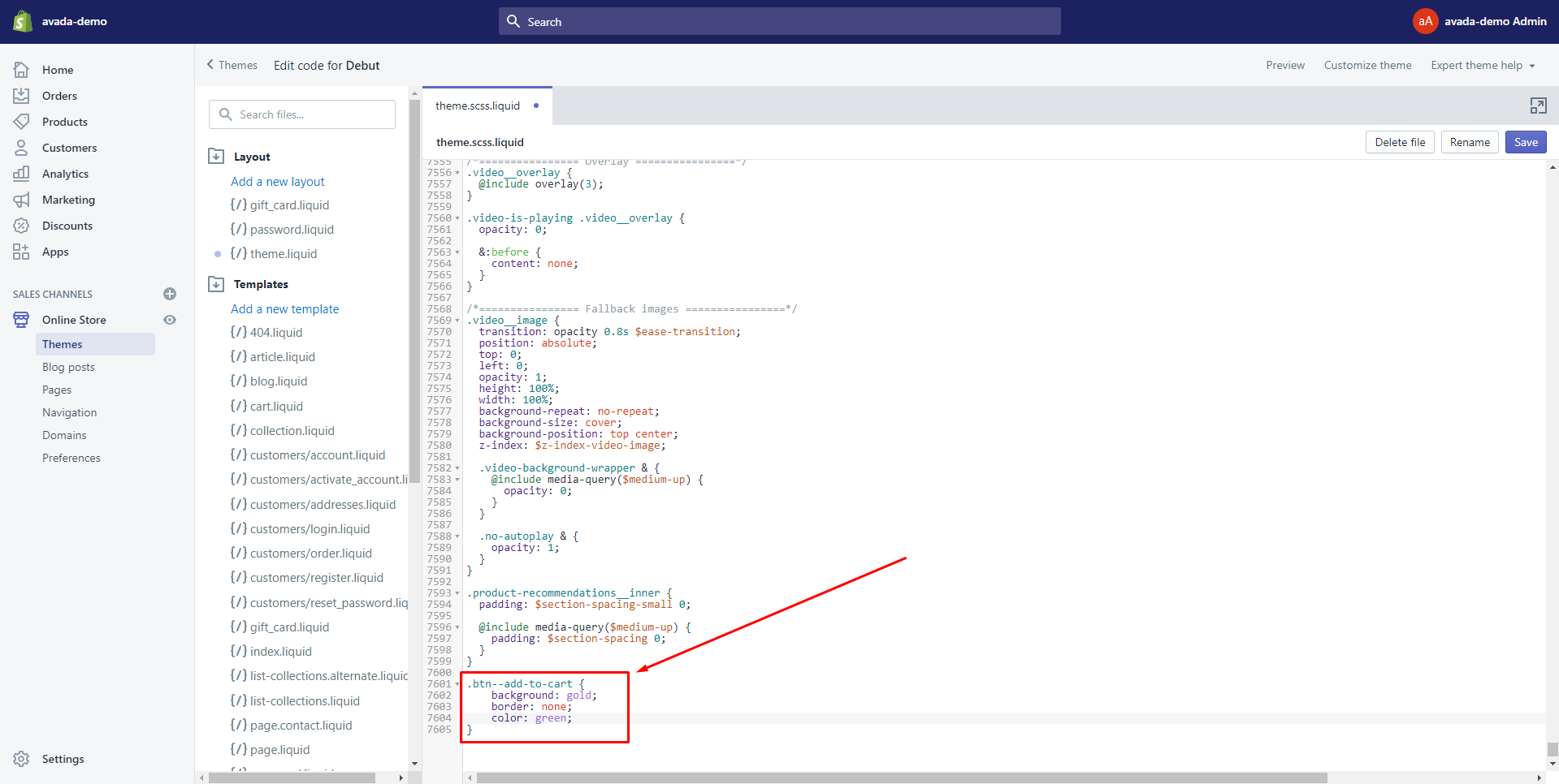
Add to cart button background color and the color of the text
I will take you through how to change Add to cart button background color and the color of the text below.
- Step 1: Select
Online Storein your admin page.

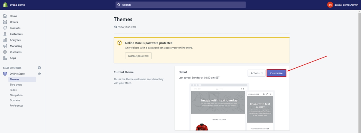
- Step 2: You will be direct to the
Themefield. Make sure to find your current theme. Then, tap on theCustomizebutton next to the theme name.
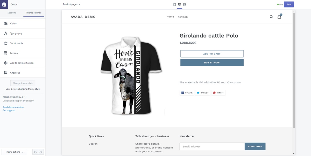
- Step 3: Here comes a new page that allows you to customize everything about the theme. If you want to change the
Add to cartbutton background color and the color of the text, you just need to click onTheme settingsand customize them as you expect.
Changing the color of the add to cart button on debut theme
Below is just a few easy steps for you to change the color of the Add to cart button on debut theme in a blink of an eye.
- Step 1: Find your current theme and tap on the
Actionsbutton beside its name. Then, chooseEdit codein the drop-down menu.

- Step 2: Select the
theme.scssfile in the Assets directory. Afterward, find the following code: ```
.product-form__cart-submit { display: block; width: 100%; line-height: 1.4; padding-left: 5px; padding-right: 5px; white-space: normal; }
```
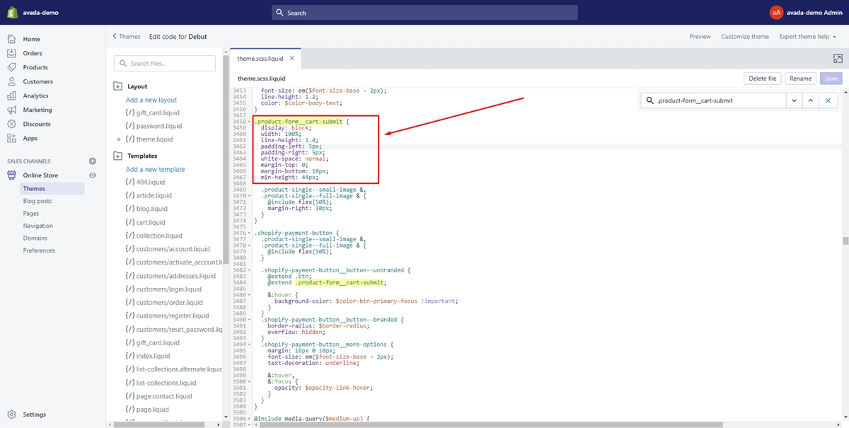
- Step 3: Add
background-color: #000;and change#000to the color you want.
Make your Add to cart button attract more clicks
We all know the Add to cart button is important in driving customers to make a purchase. Therefore, if you have a boring and unattractive Add to cart button. You will probably miss a lot of potential customers. Below, I will show you a few helpful tips that you can apply to help your Add to cart button draw your customers’ attention at first glance.
Use color and contrast to make your button stands out
First of all, color is one of the most important factors that make your Add to cart button awesome and eye-catching. Colors make customers aware of your brand easily and create great emotions. This will help increase the number of orders significantly. To achieve this desire, you need to select a color that contrasts with the background for the Add to cart button to make it stand out. Moreover, you can convey some meaning through this color. Note that you choose contrasting colors but still need to be harmonious not to backfire.
Make sure your button is large enough
Secondly, the Add to cart button needs to be large enough for your clients easy to see. You probably don’t want your customers to want to buy your product, but they can’t find the Add to cart button anywhere because it’s too small. This will create a bad experience and they will tend to skip the product and not buy anymore. Hence, make sure this button is big enough to catch the viewer’s attention.
Utilize design details
Finally, usually shop owners use the basic design of the Add to cart button, which is written in a rectangle. They are only creative using different colors and writing. So, if you use unique and unique invent design details, you will make a big impression on your customers. They will enjoy the new creativity and shopping experience in your store more.
3. Some well-known Add to cart buttons you may recognise
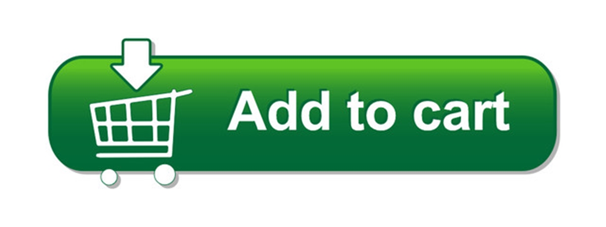
It is said that the button Add to cart button plays an important role in optimizing conversion rates. This means more customers will interact and buy products on your site. There are many successful companies like Amazon that combine these buttons with carefully built specific strategies. They contribute greatly to the success of the strategy and help your store grow strongly. Here are some well-known “Add to cart” buttons you may recognize.
- Orange button: this button can be used for all stores including fashion, food, cosmetics, etc.
Orange is an extremely prominent color, making your Add to cart button stand out on your website. Surely viewers will not be able to ignore such an eye-catching thing. It will prompt customers to click to make a purchase.
- Blue and Green button: they are mostly used by credit report websites. Financial-related issues require credibility. Therefore, these two colors will be an ideal choice because these two colors are very popular, they are related to nature and can create a sense of trust for customers.
The above buttons are taken from reputable credit report websites. As we can see, they give customers a sense of reassurance and confidence in the services these websites provide. It would be great if the effect is enhanced by circular fonts and pastel tones.
- Buttons and A / B Testing: You can take a look at the images below. Do you find any common between two pictures?
These are the two Add to cart buttons that Ikea uses for the same product on different versions of their website. They provide furniture for British and French customers in different ways, due to the results of A / B testing.
- A Ghost in the Machine: See-Through Marketing: this is a popular button recently. They are used exclusively for secondary CTAs. This ghost button is extremely sophisticatedly designed to highlight an option. It has a transparent color and has a border color that matches perfectly with the text inside. This ghost button breaks the 1-1-1 rule which is one value proposition, one clear message, one action. However, they provide an extremely effective way to structure numerous options without drawing attention away from the main goal.
4. Summary:
In conclusion, you will know how to change add to cart button color in Shopify thoroughly after reading this post. Furthermore, there is much other useful information shared with you, such as the importance of colors to use for a CTA and some well-known Add to cart buttons you may recognize. Hopefully, you can customize yourself with the best Add to cart button in both visual and meaningful terms.
Do you expect to increase sales from selling digital items? Let’s visit our writing How To Sell Digital Downloads On Shopify.
Related Posts:


