12 Best Abandoned Cart Email Practices that you can apply!
You can have a successful store with a healthy amount of traffic and still see a huge number of lost sales. This is a reality for eCommerce businesses, and a big reason is because of cart abandonment. About 60-80% of online shopping carts are abandoned before a customer completes a purchase. Which means your sales may be as little as a third of what they might have.
So it is worth putting in the effort to remind potential customers about all the great products that they left in the carts. And you have a convenient tool to do that - which is an abandoned cart email. By crafting great email marketing campaigns, you can resolve many lingering hesitations and persuade a lot more purchases than you imagine.
In this article, I will zoom in on every little detail of an abandoned cart email among various industries, with relevant examples, so you can understand the essential characteristics to create your own campaign and recover your lost revenue. Read till the end to find out!
What is an abandoned cart email, and why is it a must-have?
An abandoned cart email is an email sent to customers who added a product to their cart but didn’t check out.
It is a very effective sales recovery tactic but underused in eCommerce. 43.4% of all abandoned shopping cart emails are opened and 21% of the emails are clicked on to return to the website. How about the conversion rate? A cart recovery email campaign can lead to 10.7% recipients completing their purchase!
You should understand that many customers often abandon their carts without direct attention. For example, the site may crash, the checkout process may be too complex, or they just simply have other sudden things to do. So if you are not sending an email to remind them about their abandoned carts, you are leaving money on the table.
Even if you do just the basics well, you will start to see your revenue increase, and your overall return on investment goes up.
Ok, now you are sold that abandoned cart emails are a must-have, let’s see the most important ingredients of them to pull back reluctant customers.
Read more:
- How to do targeting on your email marketing campaigns?
- 10 proven email automation workflows that highly convert
- The ultimate guide to maximize Email Marketing ROI
- 9 Tips To Succeed Your Abandoned Cart Emails
12 Excellent abandoned cart email practices
In this section, we will see 12 best practices to use in your abandoned cart email campaign. By the end of the article, you will be able to use the practices and create your own campaign, so you can start recovering revenue from shoppers who left items in their carts. Let’s get started!
1. Subject line
47% of people open an email based on the subject line, whereas 69% of them report email as spam based on the subject line. If you want your message to be opened in someone’s inbox, you need your message to be instantly understandable. A big part of that depends on the email tone, so think friendly and think conversational.
The information that you should include in your abandoned cart emails’ subject lines are:
- Customer Name: Email personalization can help you get opens
- Company name: Make sure they know who is contacting them
- Product name or details: What did they leave in their cart? Remind them.
- Friendly tone: If you can’t imagine a friendly neighborhood saying it, rephrase your subject line
- Simplicity: Because the decision to open is made within seconds
- Urgency: If they can lose the items in their cart, let them know
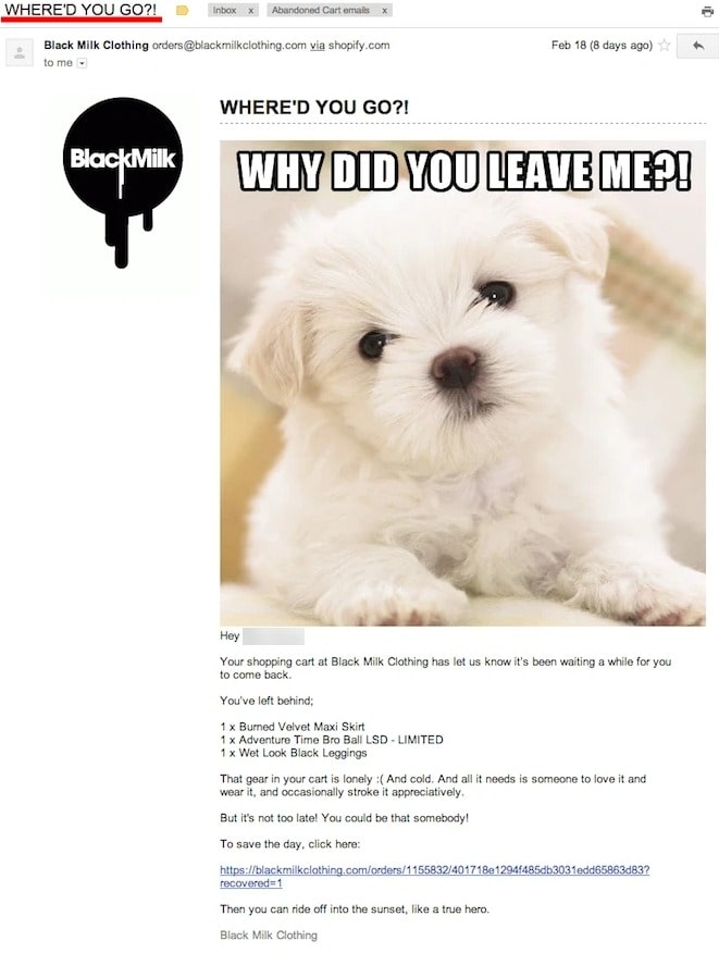
An example that I absolutely adore is the abandoned cart email from Black Milk Clothing. They used a bold subject line “WHERE’D YOU GO?!”, and when people click in, they can see a sad dog looking straight into their eyes - saying the cart is lonely. And all they need to do to save the day is to click on the link and go back to the cart.
2. Call-to-action
A call to action (CTA) in an email is a link or button designed to get quick action from the person who sees it. But remember this: ask what you want nicely because people don’t like taking risks. That means making your CTA have lower stakes when asking your potential customer.
In general, avoid words like “pay now” or “buy” in your CTA. These are too strong words because they suggest doing something the person may not be ready to do.
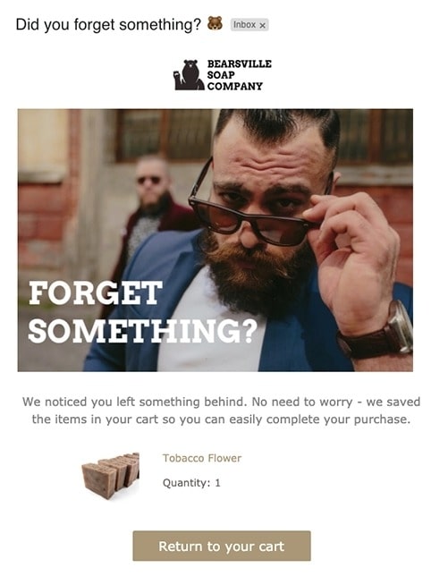
A CTA like “return to your cart” helps people easily take the next step before deciding to buy again. See the image above for an example.
The CTA in this abandoned cart email has low-friction words, encouraging the customer to finish the checkout process only if they’d like to. The little bear emoji in the subject line helps the email stand out while appearing as a friendly reminder. The email used the imagery of a fashionable bearded man, which helps sell the idea of a person that uses their products.
Who wouldn’t recheck their carts with an email like this?
3. Email copy
Some ingredients for a good email marketing are Headlines that catch attention, Good copy, and Beautiful images.
Treat your abandoned shopping cart email as a marketing opportunity. So pay attention to making all of your marketing materials compelling. Also, due to the purpose of abandoned cart emails, your words will be the main tool to convince potential customers that they forgot something they really liked in the carts, and they should return to complete their purchase.
As with your CTA, use a friendly tone that suits your brand’s personality in your copy. One thing you don’t want to do is burst into your prospect’s inbox with lack of respect and a bad attitude.
Your personality should exist in every piece of your abandoned cart emails. Recover sales by being instantly recognizable in a cluttered inbox.
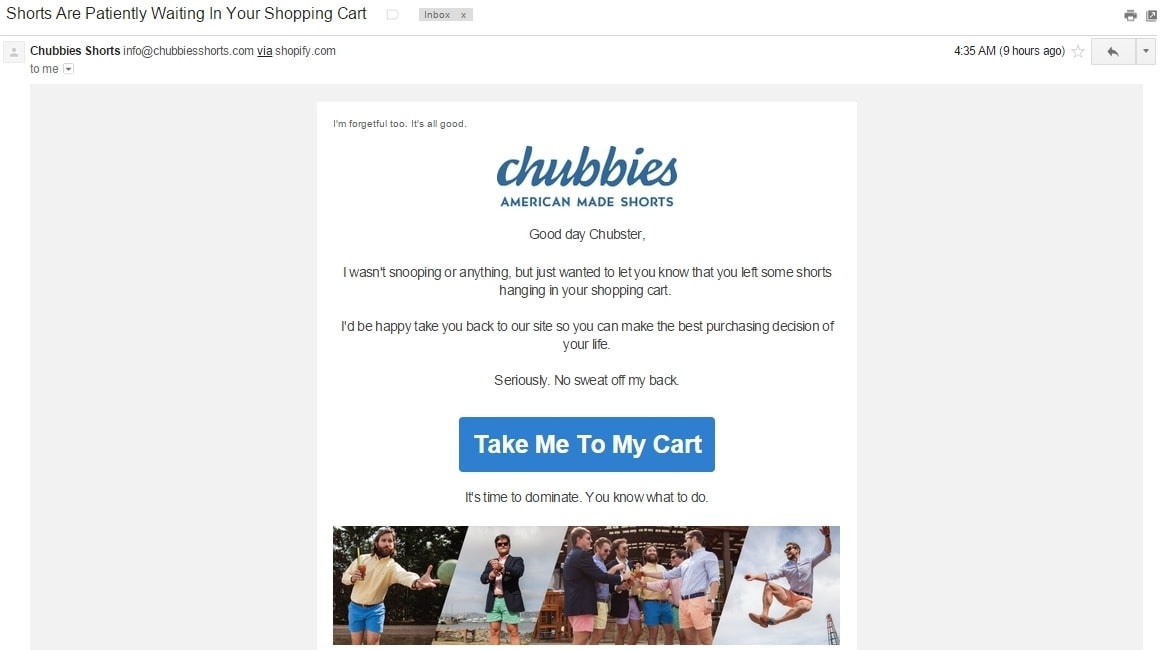
In the example, Chubbies clearly knows the target audience and uses humor throughout the copy to encourage readers to go back to the cart. The subject line is funny too, which says: “Shorts are patiently waiting in your shopping cart.” The CTA is simply unmissable, with eye-catching images of gentlemen having fun in their shorts at the end of the email.
4. Product
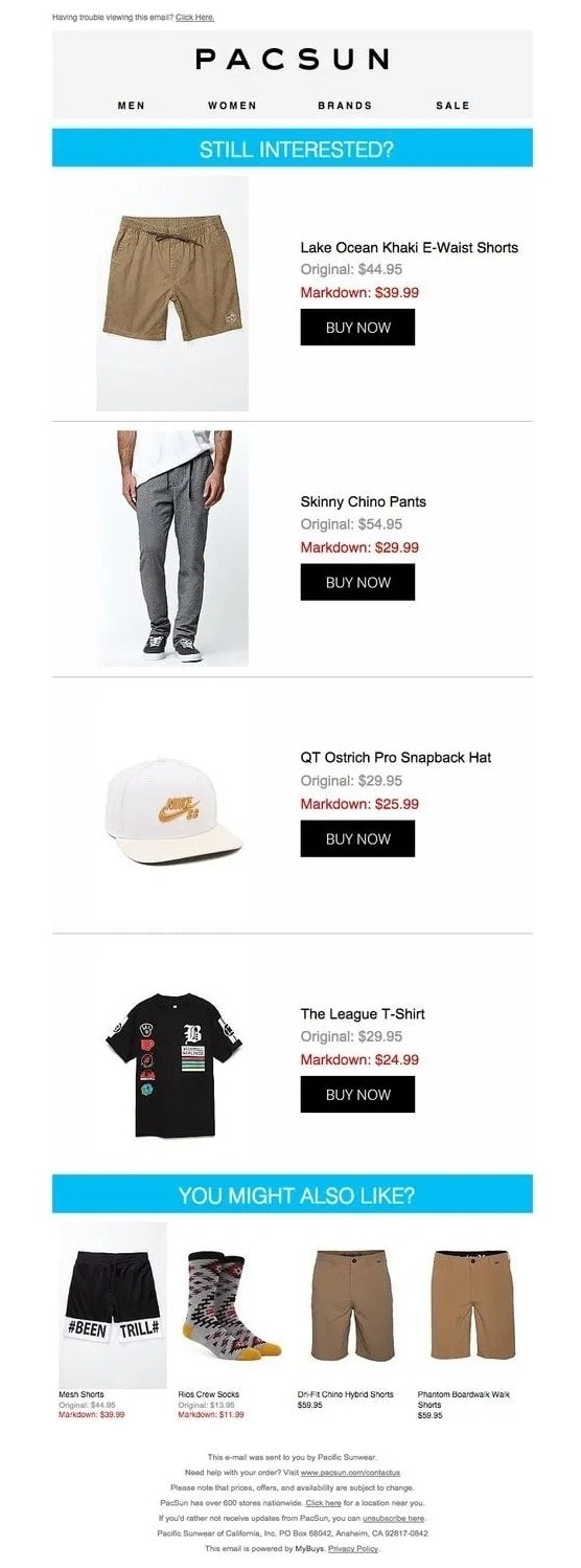
One thing the email in the previous example can improve is showing the product that the customers left behind in the carts. Don’t conceal that information, reveal it, and make the readers remember why they put items in the carts in the first place.
People may not remember the products they added to the cart. And if they open your email and are confused, they’ll probably ignore your email - which is a lost potential sale.
Here is an example from Pacsun. You can see how simple the email design is with large images of the abandoned items that readers can’t miss. The hook line of “Still interested?” and “You might also like” use curiosity to encourage recipients. The part of relevant items that customers may also like is great since they can check out more items and convert better.
5. Graphic designs
Your subject line, email copy, and CTA can influence the ability to convert abandoned users into customers - but graphic elements will remain an important first impression on your audience. And first impressions are important among all the emails a person receives within a day.
Some tips for great email design are:
- A dynamic design: You can use animated GIF or slide show - which adds energy and excitement to your emails.
- Use your website theme and brand guidelines to design your emails: A consistent look will reinforce your branding.
- Graphic elements are better than stock images: Generic photography has become mundane, so use elements created especially for your brand are better.
- Make good use of colors: Colors influence mood, and certain colors evoke a certain response. If you can play with colors, you can make recipients act much faster. Hire a graphic designer if you need one.
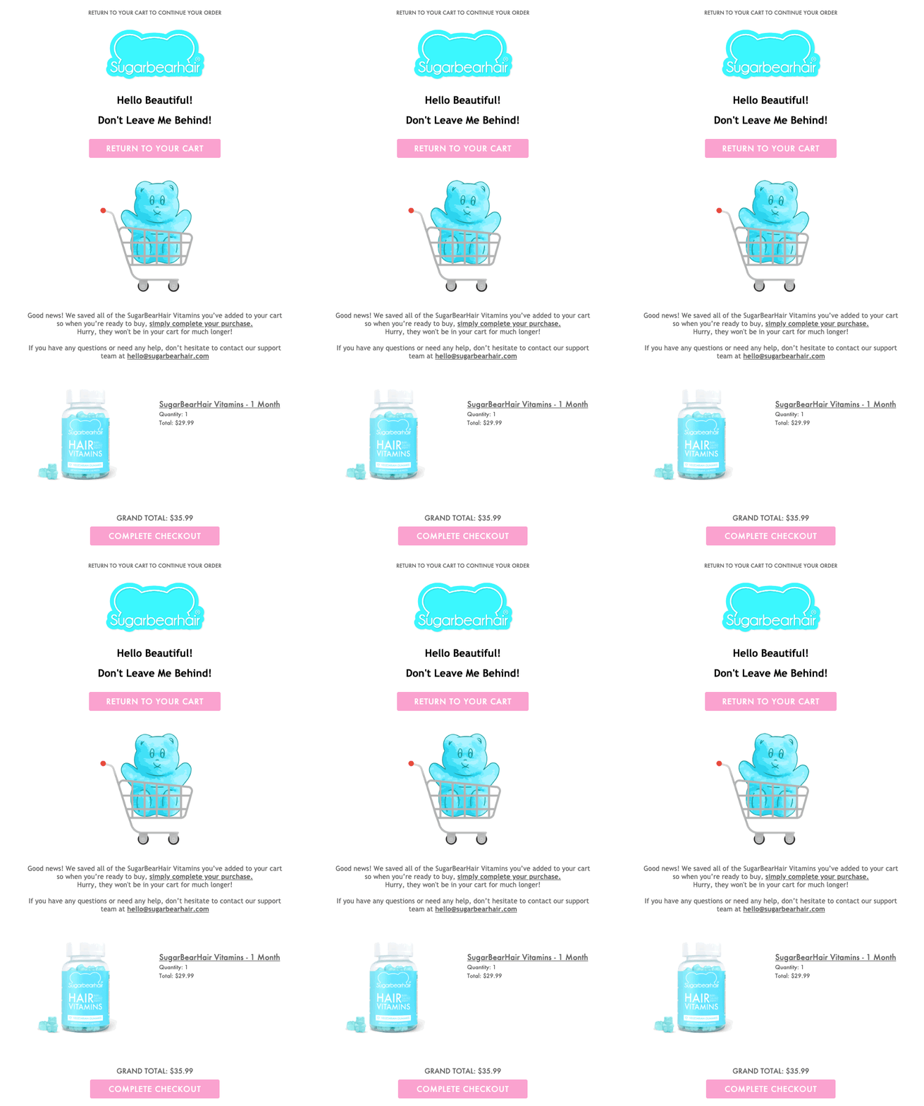
SugarBearHair makes their abandoned cart email stand out with playful graphics and illustrated GIF, which keep readers looking. The colors used are simple yet effective, with blue uniting the design with the color of the product, and the color pink just naturally popping out. They also offer customer support right at the beginning, which is smart for health products.
6. Reviews & Social proof

91% of buyers read online reviews. Social proof is proven to affect online purchasing decisions. It is like when your dad sees your neighbor getting a louder speaker, he just has to compete. So, use reviews and social proof to convert the un-buyers into buyers.
You can do this by:
- Go through your product reviews and insert the best ones in your abandoned cart email.
- If you haven’t had any reviews, you can reach out to your customer base.
We have an interesting example from Adidas for this category. The “Is Your Wi-fi Okay?” is just hilarious and engaging, which starts the email in a good way. Scroll down and you will see selected reviews from past customers on the products. The images look also like they were submitted by the customers, which really honed on the message of making readers recheck their cart.
7. Coupon
One of the most popular strategies to recover abandoned carts is to include coupons, but since this is a popular tactic, many customers have come to expect it. SO it can actually be counter-intuitive if you don’t use discounts right. Some reasons for this are:
- You may send the wrong signal that your product is not worth your price.
- You may trade your margin and lose money for little returns.
- You may offer a coupon to a customer who was already happy with the full price.
Here is how you use coupons without devaluing your product or decreasing the revenue:
- Offer coupons to repeating customers as an appreciation. You can remind them about their abandoned carts and build loyalty at the same time.
- Add value before considering coupon: There are many ways to show your product’s value like free shipping, killer reviews, money-back guarantee, loyalty program, etc. Use discounts as the last resort.
- Generate coupon & Save coupon for the last email: In your email sequence, save the coupon for the very last email - as the last shot to convert the customer.
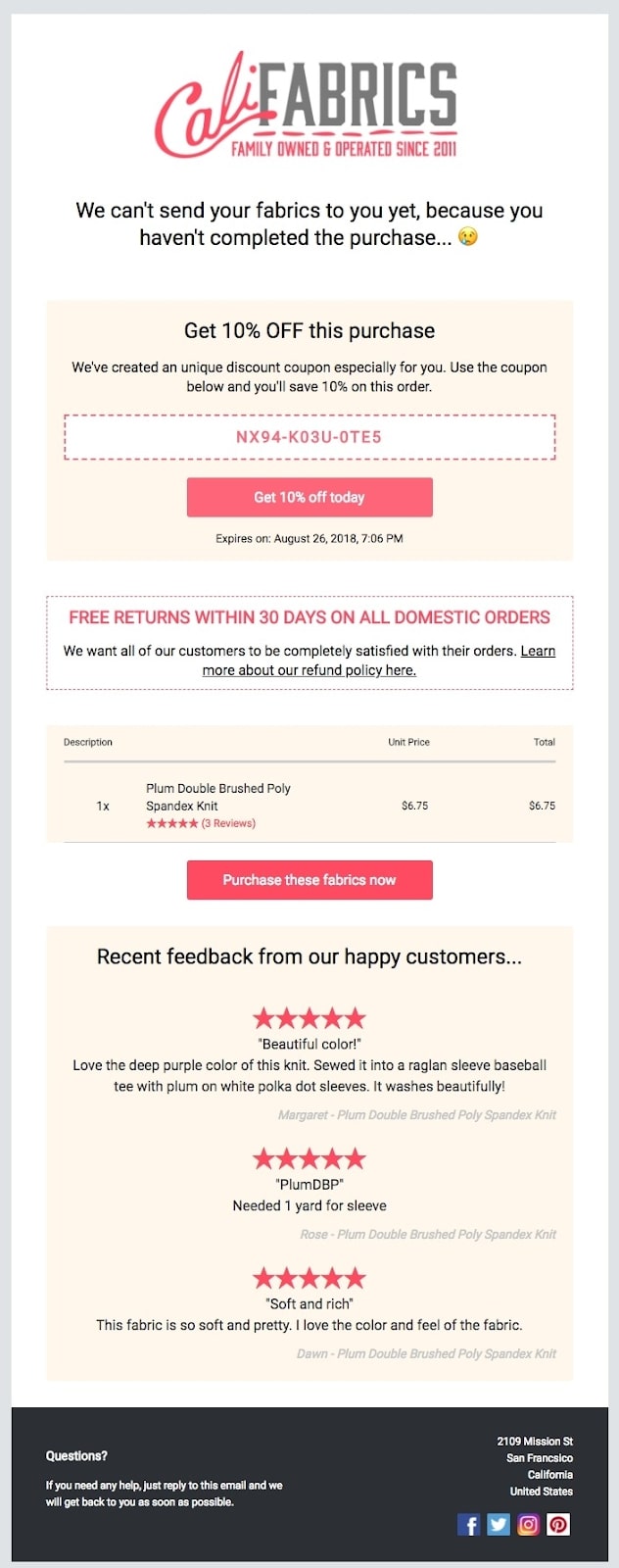
Cali Fabrics send an elegant abandoned cart email with a unique and personal coupon that expires in just a day. But they don’t just send a coupon, they accompany it with product ratings, reviews, and a reminder of the returns policy to move all the uncertainty out of the way and make the customer come back.
8. Urgency elements
People pay more attention when they feel like they might be missing out on what they really get. That is FOMO (Fear Of Missing Out). So if you can alert customers that an item might be gone soon, it is a great way to tap into the scarcity feeling and make them act quickly. But remember to be honest.
Here are some ways you can add urgency to your abandoned cart emails:
- Have a countdown timer to show the limited time
- Let readers know their item can sell out soon due to popularity
- Make clear that your item is limited and won’t be restocked
- Show how many other people already buy the item.
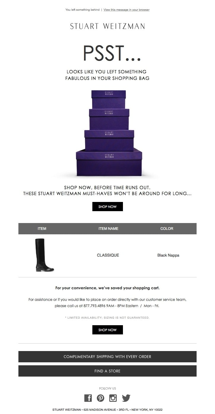
In the exemplary image, you can see how Stuart Weitzman “quietly” reminds a customer that they have something left in the cart. Next, they kindly remind that the must-have item won’t be around for long, which means the reader should act fast. They also offer assistance right below to support customers with their available hours. The design is also simple and elegant, which represents the high-quality of the brand.
9. Alternative offers

People may abandon carts because they didn’t really like their choice. So they left the item in the cart to rethink it later. So, you may help them and show similar items that they may have missed the first time browsing.
But don’t try to add too many items and overwhelm them. This may be counterproductive and make you lose the customer completely. Your alternative offers should support their great taste in products.
Here are some ideas for alternative offers that can help recover the abandoned carts:
- Show different colors or patterns of the item
- Offer accessories for the item
- Add some popular sellers that customers can add to reach free shipping thresholds
Take a look at the abandoned cart email from EyebuyDirect. It showed the brand cared about customers and thought they may also like the other options. Note how they don’t use the word “instead”. The layout of the email looks beautiful too, the products just pop out nicely, while the CTA just stands out enough.
10. Discount
While a discount is not too different from a coupon, you can include the abandoned item in a promotional campaign to make the discount less like a direct sale attempt. Discounts are easy to create, but you have to decide carefully if they make sense for each situation.
The better way to think of discounts is to leverage a loyalty and reward program. In which, instead of offering a discount or a coupon, you highlight the fact that customers have loyalty points that can be applied to get some percent off the items in the cart. This tactic can convert incredibly well and give your conversion rate a massive boost.
You are nudging loyal customers to use the points they have earned, and this feels very right.
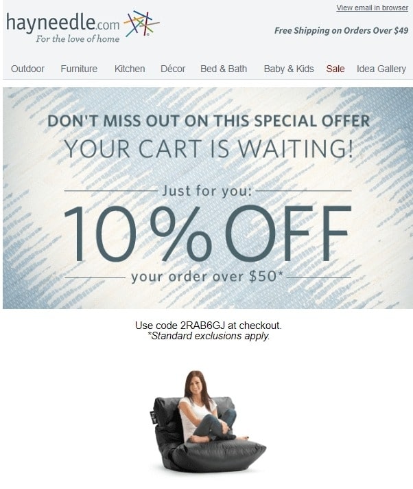
See the example from home furnishings retailer Hayneedle and see how they sweeten the deal for shopping cart abandoners. The email highlights the discount in the subject line and the first image, which is followed by a reminder of what’s in the cart. The offer is obvious too, it is because the customer’s cart value is above $50.
11. Objections removal
There is always a reason for the buyers to abandon their carts. If you can remove all the reasons against buying before people think of them, they are more likely to come back and check out.
You can address potential objections with customer research and website testing. If you understand what your customers’ concerns are, you can find ways to address these issues in your abandoned cart emails.
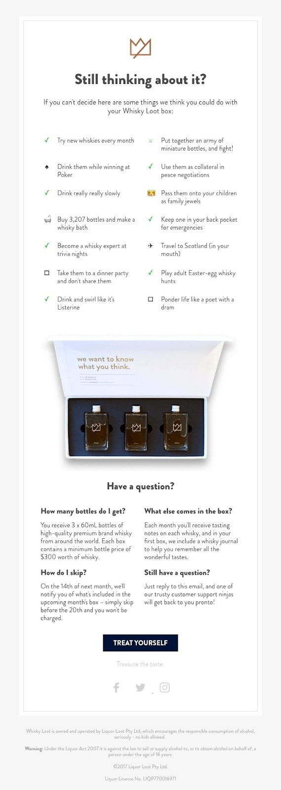
Whiskey Loot thinks of every objection that you can have and addresses them directly in the email. The copy is just delighting to read, it made me forget it is about cart recovery for a moment. You can read the whole email body in an uncluttered, appealing, and entertaining way. In the end, you can click on the CTA “Treat Yourself” to come back to the abandoned cart.
12. Simple is the best
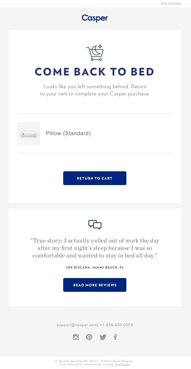
Last but not least, you should always strive for simplicity. It can be tempting to throw in all the flashy elements available in your email builder but don’t do that unless you want a colorful cake that people can’t see any beauty in. You can’t use every strategy in your abandoned cart email.
Try adding just one single strategy at a time, then track the result to find what works best. Some best practices to keep your emails simple are:
- Try using only one CTA - it can also show your confidence in the product
- Think of designing your emails for mobile devices: You have less space, you have to save space in every pixel
- Responsive design is important, so if you have too many columns or copy, the design can break
Not much more to say about the abandoned cart email from Casper. It is simple, funny, and the CTA pops with a clear message that invites readers to come back.
Related posts:
- How to send Abandoned Cart Emails in Shopify?
- Best Shopify Abandoned Cart Recovery Apps
- How to Edit the Abandoned Checkout Recovery Notification on Shopify
- Enable Automatic Abandoned Checkout Recovery Emails
Conclusion
Now that you’ve seen 12 excellent abandoned cart email practices, it is time to create your own email marketing campaign and recover the lost sales. To do that right, you will need good timing and an effective email sequence, which can maximize your conversion rate.
You will find all the tools you need to craft the best-abandoned cart email campaign in our app, AVADA Email Marketing. By using the app, you can:
- Trigger automated emails when a cart is abandoned.
- Create an email series with automated scheduling.
- Integrate with eCommerce platforms like Shopify and Magento.
Quickly change your prospects’ decisions from “maybe” to “buying” with an abandoned cart email campaign right now!
New Posts


