10 Best design tips for your newsletter emails (Plus 5 successful examples)
We all probably have been there. It’s when you have a great experience with a brand, product or service, so when you notice the “Subscribe to our newsletter” button on their website, then you think to yourself: “Hey, why not?” Quick forward a couple of months, and you’ve got an email inbox clogged with email newsletters that you haven’t even opened, and your initial passion for the brand is all but gone. You feel discouraged by the email newsletter design they sent you, and you just don’t have the time or desire to make the effort anymore. By the minute, the unsubscribe button becomes more and more appealing.
That’s maybe exactly how your email subscribers feel when they receive your email if you don’t have great email newsletter design. How can you prevent this from happening by designing beautiful email newsletters? From this article, you can learn 10 design tips that enable you to create email newsletters that you subscribers want to look at. Let’s jump right into the details!
10 best design tips for your newsletter emails
1. Find the right tool
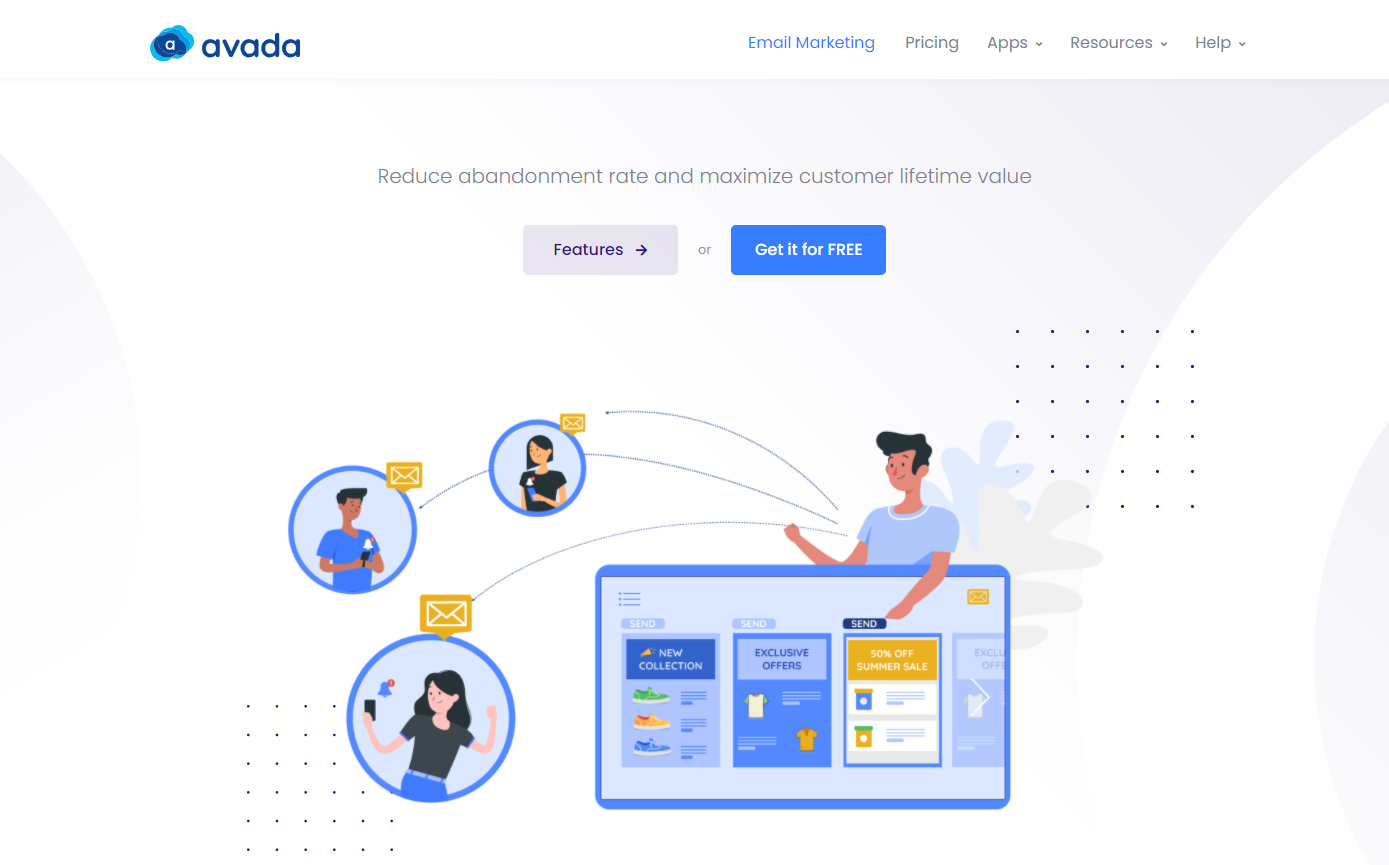
You’ll need a way to distribute your newsletters easily before you get started. A good user-friendly email app allows you to create beautiful templates with the drag-and-drop tool, as well as provides well-designed templates.You can have access to all of this in AVADA Email Marketing. This app can bring your idea into life with a few drags and drops, and you don’t have to know a single line of code to create aesthetic email designs.
AVADA Email Marketing also comes with many pre-made templates so if you don’t have time to come up with your own, using them will already be sufficient. You can download this app on the Shopify app store at this link, and it’s FREE!
2. Figure out who it’s aimed at
There are several ways to take advantage of newsletters, depending on what industry you’re in. You may want to remind people of a new service that you are providing, or an upgrade to an existing one. You may want to inform of promotions, previews, or discounts. Before you step into your newsletter design, it’s important to nail down exactly what it’s trying to do.
Your recipients have opted to receive your updates, so make sure they are your priority. Learn who your subscribers are and keep them in mind when you create your newsletters. What do you think they’re really interested in? What would you like to share with them? Think of how you would speak to the recipients if you were with them. Newsletters are usually a fun, informal variety of digital communications, so write down how you would speak to them. This will make your email newsletter simpler and more friendly for readers to absorb.
3. Decide on your format
After you’ve gone through the two previous steps, you’ll be able to determine how your email design is going to look, and how you’re going to construct it. There are several ways to create an email newsletter template. How you do this depends on a variety of things:
- What email platforms would you like to mainly support? Gmail, or Outlook or what else?
- Do you want your email design to appear differently on your smartphone and desktop?
- Do you want your email to be text-heavy or visual-heavy? etc.
Referring to other newsletters is a smart way to help you decide what’s best for your brand and your audience. Think about what makes those you like perform better than others. A great website to see a lot of email design examples is Real Good Emails.
4. Keep it focused
If you’re aiming for a corporate style that blends in with strict branding guidelines or something more innovative, make sure your newsletter doesn’t come across as a vehicle for as much content as possible. Too many brands are trying to make every link from their website to the newsletter. It often is very annoying for the reader to come across too many links in an email. Keep your focus tight – Decide what message would you like your reader to take away and just stick with it only.
5. Give your email some personality
Traditional advice is to keep newsletters simple. What is more critical, though, is that your newsletter design reflects your brand style, your business and your message. AVADA Email Marketing allows for personalizing Newsletter emails by adding customer information such as name, email, shopping cart… These are the elements that can give your email the personality of your brand.
6. Get the header right
The header will appear in every newsletter you send out, so you’ll want to spend time on making it right. The most important thing is that it has your company name or logo, so the reader can know who the email is from. Beyond that, the header should immediately express the brand’s values visually, and hopefully generate an emotional reaction in the subscriber that makes them feel like they’re having a beautifully crafted gift, not just a piece of unwanted spam.
7. Don’t forget the footer
The footer is in many ways as critical as the header, giving the template a rounded feel and a sense of completeness. This is where the reader is supposed to find contact information. It may also provide a simple way for subscribers to share newsletters or part of the content with friends, via email or social media. And it should certainly have a link that allows them to unsubscribe.
Making it difficult for people to unsubscribe is a bad practice to use when designing emails, and it won’t make your newsletter any more likable. It’s much more helpful to know that those who signed up still want to receive your newsletters, and it’s also much more likely that those subscribers will be actively engaged. It’s better to have a small number of newsletters that are actually read and engaged, rather than a big number but all end up being marked as spam.
8. Use images
A text-filled newsletter can be really dull to look at, and photos can be a perfect way to express what you’re about to your readers. If you have a good photo of events, the staff or your products, add them to your email. If you don’t have one, think about the next time there’s a new launch or event.
Pictures can be genuinely evocative. Choose the ones you love and feel that represent you and your business. Take the time to make the pictures look as fantastic as possible with some help from Photoshop, or have an illustrator involved. These days some businesses are embedding video in their newsletters, but this can be a technological minefield, so think about what kind of audience you’re aiming for carefully, and what kind of technology they’re likely to use before getting too far down this route.
9. Use Web-Safe Fonts
One thing to pay attention to when looking for email newsletter design inspiration is typography. The fonts you select can have a major effect on how your newsletter is viewed. Here are a few email newsletter design tips on fonts to help you create email newsletters that look fantastic.
First, since email newsletters appear differently on different email platforms and web browsers, your best choice for a consistent look is to use web-safe fonts. Second, don’t use too many of them: less is more. You need text fonts for the header and body, and maybe one more for occasional contrast.
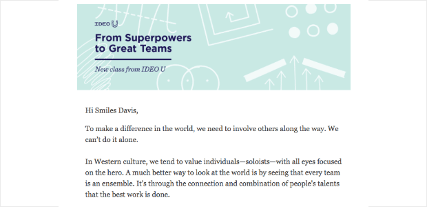
Some people use the regular and bold variants of the same font for body text and headlines, while others use different fonts. Whatever you prefer, keep it easy and opt for readability rather than attempting to make your newsletter look fancy. You’ll also want to prevent your email newsletter from being cluttered and uncoordinated. For example, Ideo U uses only two fonts in its monthly email newsletter:
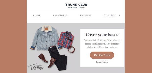
Third, if you already use certain fonts as part of your branding, keep them consistent and use the same fonts in your email newsletter. This is going to help with brand awareness. Here’s an example from the Trunk Club; because they are a Nordstrom company, they use the Nordstrom font in their header.
10. Test before sending!
Before you send out your newsletter, first double check it by mailing it to yourself. Display this in various email apps, on different browsers and on different mobile devices. There may always be stuff that can go wrong, whether they have to do with the wording, the photos or the technological execution. If you put yourself in the eyes of the subscriber, you’re more likely to find mistakes.
Examples of great email design
1. Tock
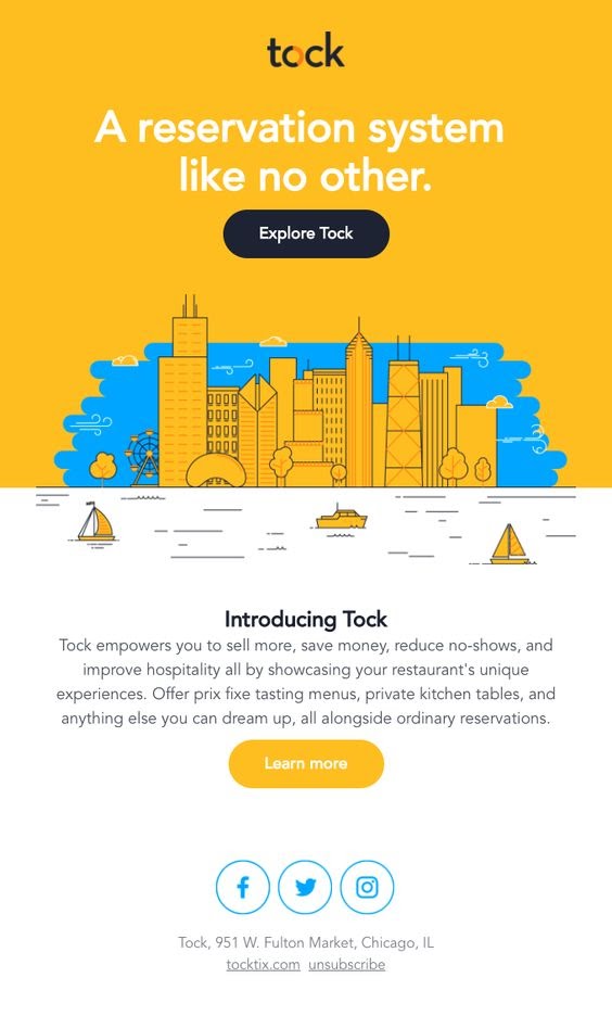
Why this design works: Right at the beginning, ]Tock establishes itself as the perfect option to book reservations for readers by talking about the various facets of their product and the solutions it provides.
Design: Contrast colors like yellow and blue get the reader’s attention, they also happen to be Tock’s brand colors, which I think was intentional. At the core of the email is a clear image of the city to illustrate the hustle and bustle of the restaurants across the city. They chose to adapt the color of their buttons or designs to the colors of their company, with the aid of a contrasting background color for yellow and dark blue and yellow and white.
Placement: Two CTAs are put in the email: “Explore Tock” and “Learn more.” If anyone is ready to use Tock’s services, they are more likely to click the first CTA. If they’re still in the awareness process of getting to know the brand, they’re more likely to read more about what Tock has to offer. They use one email template to talk to two types of readers, both in the first stage of their welcome email. You may also adjust the color of an email template depending on a new product, season, or fit the new look and feel of a marketing campaign.
2. Harry’s
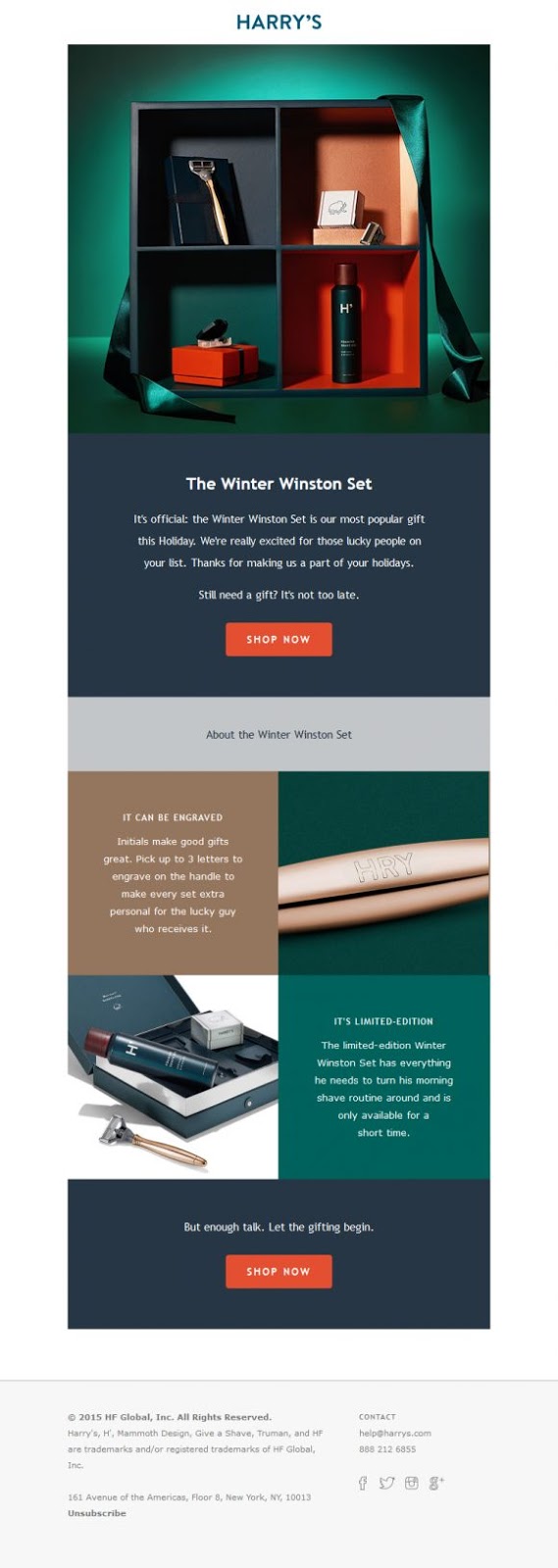
Why this design works: The copy for this email focuses more on the recipient than the product itself, which is a perfect way to softly sell a product. This helps potential customers to imagine what it would be like to own or gift this piece. As you scroll down the email, you start dreaming about the benefits of purchasing this commodity as a gift, such as the possibility of engraving the initials for a lucky recipient. The end provides a sense of urgency by using the words “Limited Edition” and telling the reader that it is only available for a short time because winter lasts too long.
Design: The email imitates a product marketing funnel structure that takes the reader to each CTA with “Awareness, Consideration, and Action” as the key stages. Harry used a color block style to direct the reader through each step of the email. Color blocking helps direct the reader through your edition, making it easy to read with a pleasing style.
Placement: There are two CTAs, one at the top of the email and the other at the end of the email. The first CTA works well for readers who may be impulse shoppers, and the second CTA is for readers who have taken the time to read through the email and may have skipped the first CTA as some readers prefer to skip through the information. You may also try using monochrome in your email template if color play seems a little too much.
3. Miss Selfridge
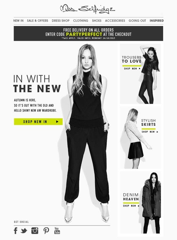
Why this copy works: There’s lots of text in this email, which isn’t necessarily a bad thing. Each text is personalized with a product image, along with a CTA. The code for free delivery is put in yellow to contrast with the monochrome look to attract the reader’s attention.
Design: Using minimal colors in your emails means that you need to choose your colors wisely. Miss Selfridge made sure that she added colors to highlight her deals and the “Buy New In” CTAs so that they didn’t blend in with the rest of the content.
Placement: From top to bottom, and for each piece of clothing advertised, a CTA was in position to take the reader to their desired product. This is an effective way to ensure that if you add more than one product to your email, the reader can easily be taken to an item or category without having to look for your website.
4. Beauty Bay
Why this design works: often less is more. Beauty Bay found a fun way to take readers to their website with a one-line headline, “This way, follow me, come on.” Automatically pointing the direction with the lipstick moving around the screen.
Design: The GIF and the copy go hand-in-hand, forwarding the email. Why does this email work? The element of surprise. How much do you open an adventurous lipstick email? Not too much.
Placement: The email is crafted with just one CTA at the top. Again, the animation, copy, and placement go hand-in-hand, leading you to the end of the email to drag, click, click.
GIF email designs aren’t new, but they’re more common with B2C emails. They give readers a different kind of experience as compared to static images or text. Your subscribers have more and more emails vying for their attention every day. Studies today show that advertisers have just 10 seconds to catch an audience because their attention span is getting shorter and shorter. So it’s time to roll up your sleeves and get imaginative by adding a few GIFs and images.
Emails that include videos or GIFs can increase your open rate by 19 per cent and click-through rate by 50 per cent. This is because videos are 12 times more likely to be viewed than text is to be read. With video, you can express a feeling or message far better than text so that readers can take action more easily.
You can learn how to add GIFs to your email in this article.
5. Hunter Original
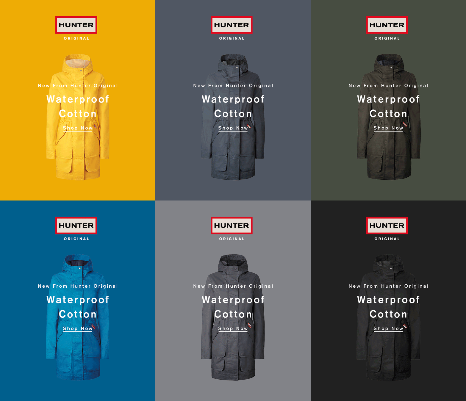
Why this design works: Let your GIF do most of the talk so that your copy can get straight to the point. This email copy from Hunter Oringinal simply informs the reader that Hunter has a new waterproof product, time to shop.
Design: The GIF shows the various colors that shoppers can get their raincoats in, so they can easily determine which color they want to make their own.
Placement: As most emails are GIFs, they’re already eye-catching. Copy and CTA are put in the center of the email so that the reader can easily locate and take action without much search.
Final Words
That’s it! I hope this article has provided you with valuable tips for designing your newsletter emails. Please feel free to leave comments below for further discussion on this topic.
New Posts
