27+ Best Practices for Email Marketing to X8 Your Result
Email marketing is incredibly powerful and remains a must-have channel for both big and small companies.
A third of consumers reported to have visited a website or purchased a product just from seeing an email inside their inbox – without ever opening the email. That’s how powerful email marketing can be.
Whether you are selling products online, collecting sales leads, or running a blog, everybody should have a healthy email list to leverage the power of email marketing.
But how can you make sure your emails are engaging to subscribers? How do you turn email recipients into frequent customers? By following best practices for email marketing.
Consider the following tips as your complete guide to create an excellent email marketing program that can boost open and click-through rates, reduce churn, and increase the subscriber lifetime value!
Make sure to bookmark these best practices for email marketing so you can view them later. Let’s get started!
Email marketing writing best practices
First, let’s begin with the things that started email marketing, words. Back in the days, emails only contained words much like their predecessor - letters. By following these best practices for email marketing writing, you can make sure that your email’s copy is crisp, clear, intriguing, and convincing.
#1. Spend time on your subject lines

Email subject lines are critically necessary. These are the first words that will convince your subscribers that your email is worth opening. Because of that, you should do everything you can with the subject lines to set yourself up for success.
Best practices for email subject lines include:
-
Your recipient’s name
-
30-50 characters tops
-
A playful emoji or two
-
An irresistible and clear value proposition that matches your email’s content
-
Action verbs
-
A sense of urgency
-
Consistency (Some emails such as blog newsletters can perform best having the same subject line every time - which helps readers know what they can expect from the newsletter so they look for it in their inbox)
There is something that you should NOT do with the email subject lines either, which are:
-
All uppercase letters
-
Spammy keywords (urgent, buy now, win, free)
-
Overuse of emojis
-
Typos
-
Deceptive subject lines that don’t match the email content (these lead to unhappy subscribers who unsubscribe and grow to resent you as a brand)
Remember: your subject line’s goal is to get the audience who cares about the content inside your email to open, not to get a high open-rate at any cost.
#2. Optimize the email’s preview text
Optimizing your email’s preview text can be highly beneficial. The preview text is basically a snippet of your email body’s copy that is typically displayed right next to the subject line. Using a good preheader can boost almost 22% in both open and click rates.
By default, email preview text displays the first several words of your email body and shows it next to the email subject line before the subscriber opens it. The problem is that custom email templates usually display conditional statements like “not displaying correctly?” or “can’t see images?” from the top banner, and they don’t mean much for the open rate.
So, instead of leaving your email campaign’s effectiveness to luck, it’s much better to write an enticing preview text that accompanies the email subject line. In this way, you can make your emails more appealing to open and expect to catch the readers’ attention quickly.
#3. Don’t forget the sender’s name
The “from” field can make or break your email campaign, so don’t forget to pay attention to the words you use in the sender’s name.
Sender names often perform best by being personalized. Instead of using your company name, try using a real person’s name, like “Alice from AVADA”. And don’t use the default option name of “No-Reply @ Company” - it’s impersonal and frustrating if readers want to contact for support. Use a real name and then assign your team members to respond to emails.
#4. Personalize the email greeting
Many of us often read emails that begin with “Dear Member”, and that is a boring way to say hello.
You can segment your email recipients depending on the type of customer like a member, user, subscriber, etc., but these names shouldn’t be the first thing readers see in your messages. Instead, you should personalize your email campaigns with your contacts’ first names and grab the attention of each recipient right away.
Don’t worry, you don’t have to manually write 50 different emails from now on to personalize your emails’ greeting lines with 50 recipients’ names. Many email marketing tools allow you to configure the copy of your email campaign so you can automatically send emails with the name of your contact list’s recipients – so everyone can have a personal version of the same message.
#5. Include an email signature
Even if you only send newsletters to your contacts on behalf of your company rather than an individual, your email campaigns should still include a specific person’s signature. People are naturally more interested in reading emails if they know it is made by a human being, not just a marketing team.
Your email signature is a valuable ticket to the readers’ attention, and you can easily design your signature by including details about name, department, company name, office phone number, website URL, email address, and physical address.
Learn more: How to Create an Email Signature in Gmail?
#6. Keep the body simple with strong CTA
On to your email’s body. The goal of the email body is to grab your recipient’s attention quickly and follow up with one or two strong CTAs. Regardless of your desire for them to sign up, buy a product, or read your blog post, you should organize your email body into simple and easy-to-read sections.
Pick the places possible and limit your CTAs. You should keep it down to one main CTA and place it in the best position. Also, make sure your CTA is a bright, beautiful button that readers can easily find and click on - otherwise you would make people search for it and reduce the click-through rate.
#7. Make the emails skimmable
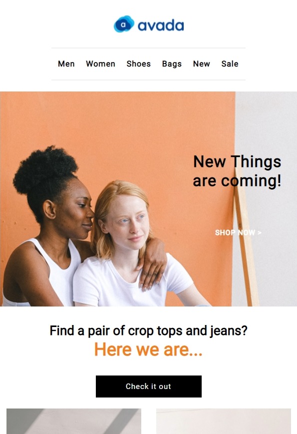
We’re all busy people and being distracted by different people, things, and marketing messages throughout the day. That’s why we want to choose the quickest and easiest path to get the job done. This approach also applies to reading emails for recipients
So if you want your emails to have a better conversion rate, you should make sure to communicate the message in your emails as quickly as possible. Structure your email’s content in a way that recipients can easily read and understand.
This means you should use headlines, bullet points, lists, and preheader texts to clearly state your main message while people can skim through what you have to say. If you do it well, you are likely to see an increase in the engagement metrics of your emails like the click or open rates.
Email marketing design best practices

Next, we will see the best practices in designing your emails. Emails don’t just contain words now, they can have pictures, gifs, and even videos. These next tips will make sure your emails are eye-catching and drive customers to more actions. Is a picture really worth a thousand words with designing emails, let’s find out?
#8. Use high-quality visuals
Let me give you the answer: a picture is truly worth a thousand words for email marketing, so your emails need to have eye-pleasing and stunning visuals. It goes without saying that your email visuals need to be high-quality and suitable for your brand (in terms of style, colors, etc).
The main aim of your email visuals is to reinforce the email copy and form an emotional connection with your recipients. GIFs and videos are also an option that you can consider. However, be extra cautious as these elements tend to impact your email’s tone and they aren’t always relevant. Not to mention they can affect the loading speed of your emails.
#9. Add alt text to buttons and images
Additionally, be sure to write ALT text for your images since it can help people with visual impairments and be life-saving for readers in case the email HTML does not render. Your alt text will be in the place instead of the blocked images and this can encourage subscribers to understand where to click and engage with your emails as originally intended.
Without alt text, recipients will just see a blank space where an image or button used to be. With alt text, you will ensure the email’s readability and message.
#10. Have clear CTAs
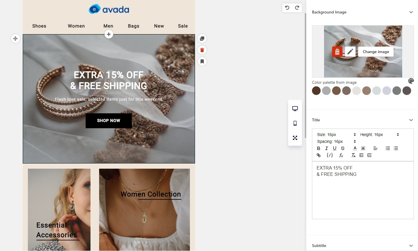
If you want to have a successful email marketing campaign, you must persuade recipients to take action. If you give them too many choices, they can take the wrong action, and worse, get confused then unsubscribe from your list.
Therefore, it’s essential that your subscribers understand what actions you want them to do next! In order to do that, you should seamlessly blend your email design with a beautifully designed CTA. Make it ridiculously clear what your users should do with the emails.
CTA placement and design play an equal role. Your CTAs should be visible as well as accessible, including for people using mobile devices. Plus, it’s advisable to place your main call-to-action button above the fold, as otherwise, many of your recipients won’t be able to see it.
For designing emails, the above-the-fold area is approximately 350 pixels high and 650 pixels wide. This is what your subscribers see first after opening any email message.
#11. Keep the email 500-650 pixels wide
If your emails are wider than 650 pixels, users will have to scroll horizontally to view your entire message. This is troublesome especially for recipients who read your email on a mobile device. The email’s pixel width is a critical factor to affect its lead-capturing ability.
#12. Put your logo in the right places
Eye-tracking studies suggest that readers instinctively look for logos in the emails’ upper left-hand side - often because it’s relevant to the placement of logos on most websites. However, you can also put your logo in the center of the email to align it with the content beneath.
Whether your logo is on the left-hand side or centered, branding your email’s header to remind your recipients that the messages came from you and they can expect more to come from your company email address.
#13. Use fewer than three typefaces
The less clutter your email has, the more conversions you will be able to experience. Don’t junk up the email with more than two fonts or typefaces. The maximum number of typefaces you should have for your email is three.
The same rule can apply to colors. Your email design should have only two to three colors, reinforcing your brand’s image and distinctive content.
#14. Optimize the design for mobiles
Many of us have spent time checking our emails while waiting in line at the coffee shop. Over half of all emails worldwide are now read on mobile devices, and you will only see the trend going up as people increasingly rely on smartphones over desktop computers in their daily lives.
This means you should design your emails to be easy to view, read, and click on mobile.
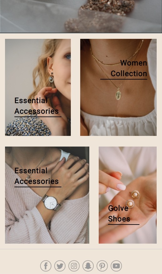
Your emails should load fast and it shouldn’t need too much scrolling to finish. Aim for the size of 300KB or less, which is why I warned you to carefully consider when adding a gif or a video.
Also, you should keep your emails as short as possible, and design with much imagery (while compressing the pictures to ensure optimal load times). Your CTA buttons and any links should be 45-57 pixels tall to match the adult fingertips’ sizes. Lastly, limit your email body’s width to be 650 pixels so it can display nicely on most phones.
#15. Make unsubscribing easy
One of your main goals as an email marketer is to grow the list. And while you may spend a lot of time and resources to get people to sign up for your emails, you should also understand that people can unsubscribe at some point.
There can be many reasons for this. But for whatever the reason is, there’s no need to hold a grudge and force people to stay on your list.
If you make the unsubscribe process difficult, you may make subscribers ignore your emails or move them to some folders they never open. In the worst-case scenario: recipients can report your emails as spam and make you lose the ability to send emails.
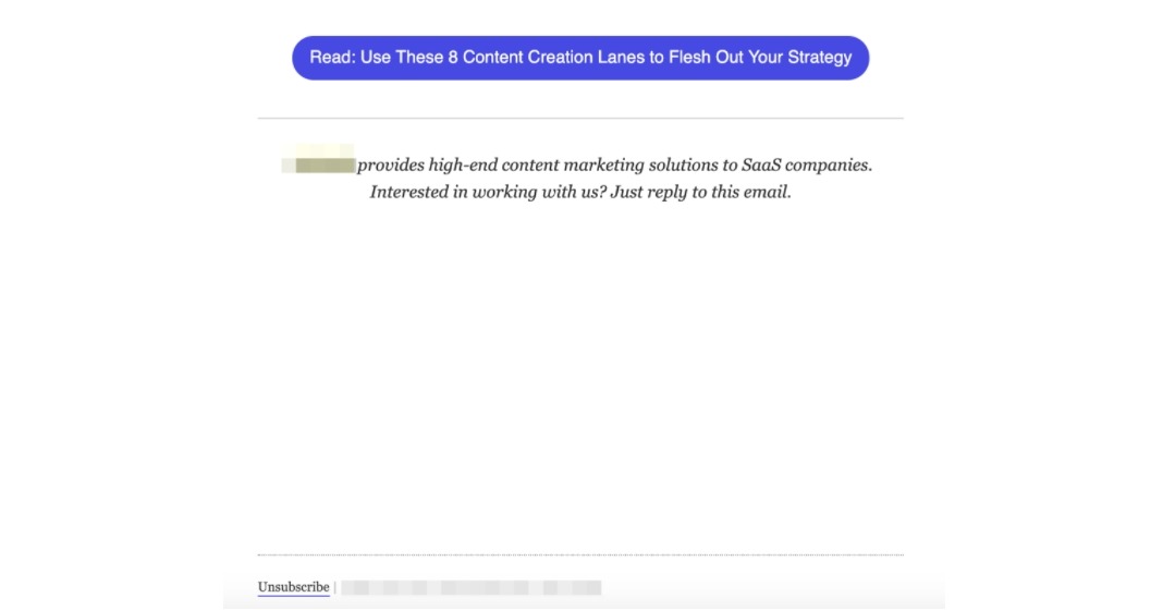
Therefore, when designing your emails, include a common phrase like “Unsubscribe” as a hyperlink text so readers can quickly find it inside the message. Also, make the unsubscribe button big enough so people using mobile devices can click on it easily. And by all means, don’t try to hide or push the unsubscribe button down far from your email content like the image above.
#16. Optimize the landing pages
Not technically about designing an email, but consumers nowadays expect to see interesting things when they click on your email’s call to action. So creating a seamless transition for readers clicking on your emails by optimizing the landing pages is essential.
Crafting a fantastic landing page that is aligned with your email content promotes a positive user experience and increases trust in the brand. A cohesive experience throughout the funnel is what turns your email subscribers into customers.
It’s also important to use tracking tools so you can measure which email campaigns and landing pages have the best performance so that you can create a winning strategy.
Email marketing sending best practices
Alright, now we have wonderful email campaigns with gorgeous images and sharp writing, it’s time to hit the send button. But mass sending emails is a losing way in the modern days, so you need to be sophisticated about the sending strategy. Here are the best practices for sending emails that you should know about.
#17. Say no to spam
This is kind of a no-brainer, but it’s so important for email marketing to work that you do not spam. Spamming can relate to poor writing within the email itself like irrelevant content or all-uppercase subject lines, but it mainly roots in how you collect and engage with the email list.
Buying email lists or sending people emails without their agreement is an absolute no-no. Also, if you send too many emails in a day or a week, you are being spammy too.
#18. Segment the audience
Your chances of generating sales with email campaigns are the highest when you send personalized content for individual customer segments.
Have you ever heard of the Pareto rule? It applies to email marketing too: 20% of the subscribers generate 80% of your email marketing’s revenue.
Therefore, try to identify key segments to see which most engaged subscribers are generating the most revenue and target them with email campaigns separately. If you can’t find that type of customer, stick to the customer segment that is right at the top of your head.
When your email campaigns hit the right tones with the right people – answering their needs and wants – you are likely to see an upwards shift in the email marketing results.
#19. Send test first
When you know how few people actually proofread their emails, you would know this is a big deal. Always send a test email to your marketing team or yourself so you can ensure that:
-
The images show up
-
There are no typos
-
All the links work
-
The format looks good on both your desktop and smartphone
-
There is nothing wrong with the email
#20. Time your email campaigns well
The best time and day to send your emails uniquely depends on your customer set. However, you can test and make some educated guesses based on the research other marketers have already done.
An Internet search indicates that Tuesday at 10 am is the answer. However, this information is written on some of the best marketing blogs so it has been circulating the web for many years. Inboxes of customers get bombarded on the day so it may have the opposite effect.
The easiest way to time your email campaign well is by collecting data through email tracking and experiment until you find the golden hour to hit the send button.
Read more: When is the best time to send marketing emails?
#21. Establish appropriate frequency
Speaking of timing, how frequently should you send your emails? Many emails are automated based on your customers’ actions (e.g. order confirmation, shipping notifications, and double opt-in confirmations), but you still should send at least one newsletter per week.
To support this, brainstorm an email calendar that can correspond to your event marketing, content marketing, and other promotional channels. Plan product launch announcements and sales emails ahead of time to build the hype. Help subscribers prepare for the holidays by messaging about gift guides and encouraging pre-order.
If you are not sure how much is too much for sending emails, test. If you begin sending more email campaigns and see a downward trend in the open and click rates but more number of unsubscribes, you can see that as a telltale sign of sending too much.
#22. Set up drip campaigns
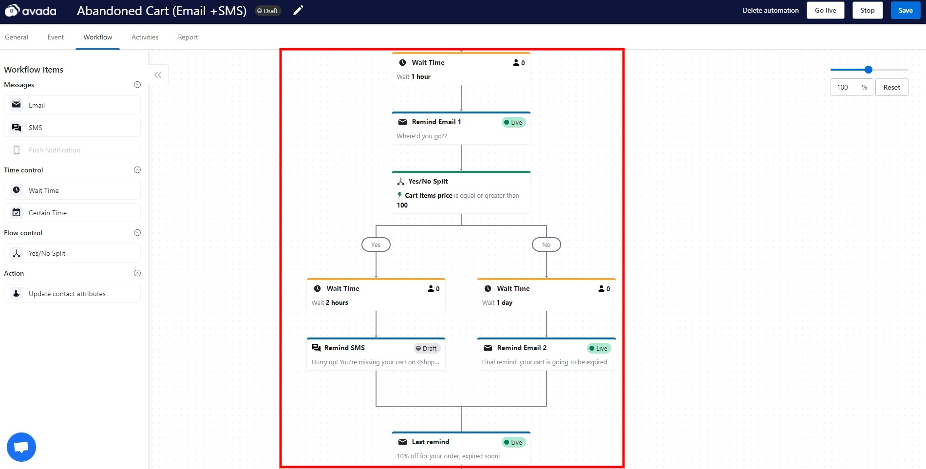
Drip campaigns are an essential sending strategy for your emails. Drip campaigns symbolize the water metaphor of a sales funnel. An example of a drip campaign can look like this for a new eCommerce subscriber:
-
A Welcome email: “Thank you for subscribing! Here’s a 15% off coupon to start!”
-
A few days later: “We hope you’re enjoying our newsletter. Here are some top articles you may have missed.”
-
One week after that: “We can see that you like our blog, so why don’t you try this whitepaper! It goes into more detail for your success!”
-
If the subscriber downloads the whitepaper, you can then send them a new drip campaign, or simply remind them about the coupon.
If you don’t know how you can create drip email campaigns, start by understanding your audience. Once you know the audience and define the user personas, you can start segmenting your email list. Different personas should receive different campaigns with send frequency, copy choices, and content created specifically to them.
Read more: What is drip email campaign? Benefits, examples & How to run?
#23. Automate the sending
To save time, drip campaigns are just one type of automated email you can create. You can set all sorts of behaviors to trigger different marketing emails with the app AVADA Email Marketing, such as:
-
Someone who buys an item can get notified of future sales in their product’s category, plus any new version of that particular item.
-
Someone who subscribes to your eCommerce blog can receive a welcome email and view your most popular articles.
-
Someone who abandons the shopping cart can receive a reminder of the products in their cart, with a discount coupon or an urgent call to purchase while supplies still last.
This way, you can send emails to subscribers and customers at the right time and notify them with relevant information.
#24. Reward the subscribers
If you want to keep your subscribers then make them feel special.
They invited you to their private email inboxes. They are invested in your brand. Lean into that and invite them to provide feedback via surveys.
Also, reward subscribers with exclusive access to your newest products. Give them special discounts and freebies. Your email should offer them something people can’t get in store, on the Facebook page, or anywhere else. Either way, remember that your email campaign should be a blast to open before sending.
Email marketing analysis best practices

Finally, all of your email marketing efforts should be tracked and analyzed so you can make changes to see better results over time. Here are some best practices to analyze your email campaigns like a pro and make your email approach sharper.
#25. Use a professional email marketing software
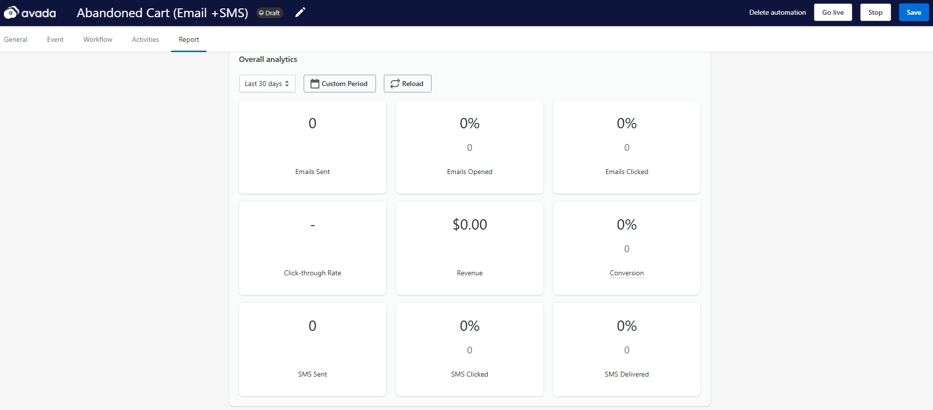
Your business grows, and so will your email list. At one point, you may start noticing recipients aren’t replying to your emails, even though they seemed interested in your offer just a moment ago. Their behavior changes may not be related to your sales offer being ineffective, but in how you send your email campaigns.
A professional mail marketing software like AVADA Email Marketing helps you not only make your emails stunning (with mobile-responsive templates and an email editor) but also helps you manage your workflows and deliver your messages automatedly and effectively.
Not to mention the fact that the app can help you measure email campaign’s performance and help you hygiene the email list. We will go into the metrics that you should track with the app in the next part.
#26. Analyze and review
You should review your analytics on the day, the next day, and a few weeks to a few months after to compare the email campaign’s performance against your predictions and similar campaigns you’ve sent. Metrics you want to review in the app’s analytics include:
-
Open rates
-
Click-through rates
-
Conversion numbers
-
A/B test results
-
Popular content
-
Overall review
You also want to dive into more detailed analytics of your email campaigns. For example, which CTA button style performed better? Did the buttons do better than the text links? How many clicked links from images? Should you adjust the content strategy? Or should you place the more conversion-worthy blog posts earlier in the newsletter? These are just some examples of questions you can ask about your email campaign.
#27. Test and test again
Most email marketing software has A/B testing functionality built-in, so does AVADA Email Marketing. There is absolutely no reason that you should not test your emails. Here are some ways you can use to test your email campaigns:
-
Sending times and days of the week
-
Subject lines combined with preheader text
-
Featured image or copy
-
Format and layout
-
CTA placements and other types of buttons
Conclusion
A lot of email marketing has been covered in this guide, so if there are any questions or comments about your email campaigns, feel free to leave them below. In my opinion, email marketing shouldn’t be a hassle. With the right tool, you can follow the best practices for email marketing easily, so make sure you try out our app AVADA Email Marketing.
That is all for now, keep these best practices in mind and email away!
New Posts


