9 Tips to Succeed your Abandoned Cart Emails
Shopping cart abandonment is a growing challenge for all retail marketers. Sleeknote reported that shopping cart abandonment is an ever-increasing challenge for all retail marketers. This is a shocking revelation, meaning that about 7 out of 10 shoppers fail to complete their transaction - a number that many eCommerce store owners find it hard to accept.
This is why marketers often turn to emails to help recover abandoned sales.
And there’s a good reason for that too: 46.1% of recipients open cart abandonment emails, 13.3% click on the links inside an email, and out of those clicks, over 35% end up buying again and convert into a customer. Nice!
Clearly, a good cart abandonment email campaign is so crucial for eCommerce marketers. With a great marketing automation strategy (including timing and message) combined with a robust tool, you can set up emails and have them recover sales on autopilot.
But if you’ve never set up a cart abandonment email campaign (as an email series) or you’re not happy with the current results, you might be wondering what makes a great abandoned cart email. That is what we are going to look at today. Let’s see the 9 essential tips to succeed your abandoned cart emails right now!
Why do customers abandon carts on your eCommerce store?
An abandoned shopping cart email is a follow-up message sent to a user leaving the site without purchasing the items in their shopping cart. The email reminding about the abandoned cart is often sent to people leaving in the middle of the checkout process.
What is the huge benefit of abandoned cart emails? The automation. You can set up a series of emails that goes out on scheduled time - and win back a lot of the revenue that would otherwise have disappeared.
Ok, you know that cart reminder emails are necessary. The next step is to understand why people gave up on the shopping carts in the first place.
- Common reasons for people to abandon online shopping carts include:
- Price or shipping cost
- Distraction from other activities
- Simply forgot to checkout
- Website issues (loading speed, connection, and more)
- Unsatisfied return or exchange policy
- Complicated payment process
- Just browsing
- Comparison shopping
Some shopping carts are abandoned where there is nothing you can do about it. Some people are just browsing or comparing shopping - they’ll never buy. Don’t worry about those people. There are other people you can reach out to gain back the cart’s value - people who were just distracted or confused by your checkout process.
Here are the top reasons to cart abandonment that you can do something about them:
- The extra cost is too high. Discover new ways to reduce shipping costs by using cheaper packaging or by changing mail carriers
- Long payment process. Is your payment process too complicated? Find what you can combine or even cut out completely.
- Can’t see the total cost. Displays the updated total of the shopping carts at each step of the checkout process
- Force to create an account. Many websites that offer an account creation option but don’t allow people to checkout as guests
- Don’t trust the site. Display your eCommerce security credentials or a trust badge. A large number of shoppers have abandoned a purchase because they don’t trust website security.
- Strict return policy. Generous return policy will compensate for the inconvenience of additional profits through an increase in sales that you’ll make over time.
- Site error or problem. Sometimes the problem is out of your control, but there’s no reason not to test your website on multiple browsers and devices.
- The estimated delivery is too slow. In the age of day or day delivery, customers expect a quick turnaround.
- Card declined. Most eCommerce platforms allow you to buy counterfeit goods with fake credit card numbers to check your payment process.
- Lack of payment options. Let people use PayPal or whatever payment options they prefer.
So how can you learn more about why people are abandoning shopping carts on your site? Try using these tools:
- Survey: Ask customers through an email survey of your checkout process and their buying intent to uncover difficult points you can tackle.
- Google analytics: Explore customer journeys on your website to find where they left off
- Research: Ask to know your audience and their expectations of similar products and purchase paths
- Heat and click maps: Find out how users actually behave by seeing where they click on the page, how much they scroll, and the graphical results of eye-tracking tests
Improve your online store to eliminate many reasons why people give up their shopping cart. When you have now correctly identified the remaining reasons, you will be able to convert that lost sales by reminding buyers an important question: Why did they put your awesome products in their online shopping carts in the first place?
Read more:
9 tips to succeed your abandoned cart emails
Now that you know better about why shoppers abandon carts, you can find the way to fix the problem with an effective email campaign. In order to be successful, there are some important things you should include in your cart abandonment emails. Let’s see the 9 best practices.
1. Use subject lines that highly convert
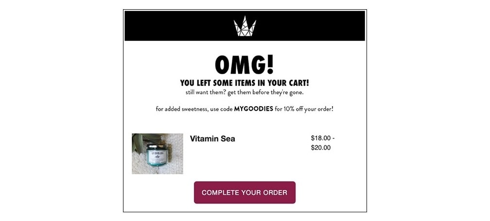
A beautiful subject line is able to capture the attention of your customers and increase open and click through rates. However, you don’t need to get fancy and over complicate your subject lines. 64% of people decide if they open an email based on the subject line. If you want to get noticed through a bunch of emails in someone’s inbox, you need to make your message instantly understandable.
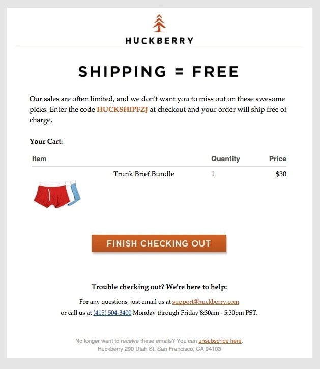
Discounts and offers like ‘free shipping’ for customers to complete their purchase can actually be in your favor. Check out these case studies for customer acquisition. With cart abandonment emails, it’s best to get straight to the point.
Some great examples of abandoned cart email subject lines are:
- Let me take you back to your cart. Free of charge.
- Have you forgotten about me already?
- Your favorite product is waiting (with free shipping)
- Your cart INSISTED us send this reminder
- Is your wifi ok?
What these subject lines have in common is that they don’t demand anything from the recipients. They just simply check in and remind them of the abandoned cart. For the upcoming Halloween season, check out our guide on creative subject lines to supercharge your campaign.
Read more:
- 32+ Best Halloween Email Subject Lines
- 33+ Best Thanksgiving email subject lines
- 101 Killing Email Headlines
2. Add a strong Call to action
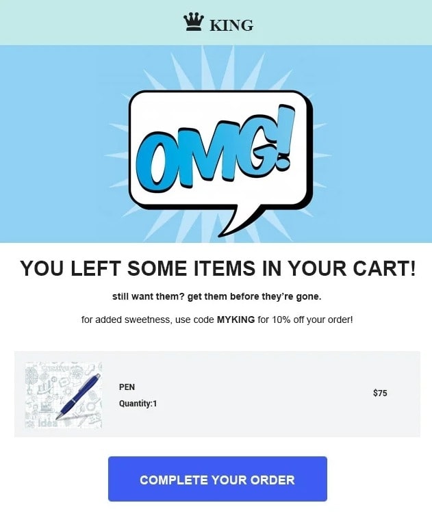
An email call to action (CTA) is a link or button designed to get a quick response from the person who sees it. Bold and engaging CTAs can quickly grab a shopper’s attention and motivate them to take the action you expect them to take. With the cart abandonment email, the action is pretty obvious: complete the purchase process.
Therefore, you should make it easy for the buyers. Let them know what they left in the carts, show the product with a large image, then place a bold, easy-to-see, contrasting CTA just below that product image.
Your button text CTA should be something like “Continue shopping” or “Return to your cart”. Try to avoid words like “buy” or “pay” in your CTA. These are “high friction” words, because they suggest doing something the person might not be ready to do.
A CTA like “Return to your cart” helps people take the next step (click) before making a sale. Then, you can persuade them to finish buying at the cart.
3. Create compelling visual
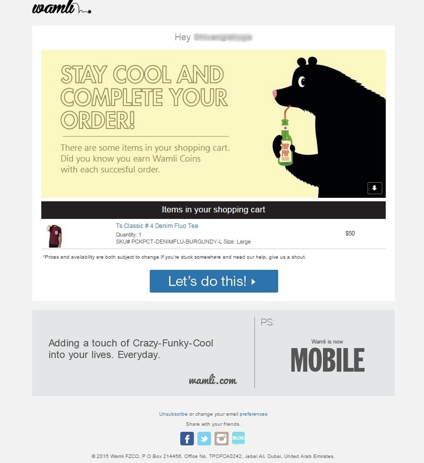
It can be hard to get your email noticed in a crowded inbox. Your subject line, email copy, and CTA can help you convert abandoned carts into more sales - but visual elements will often be the recipient’s critical first impression. And don’t just think of graphic design, other elements like customer reviews, GIFs, and even your logo can all provide a better click-through rate.
Here are some tips for you to design an appealing email:
- A dynamic design combining with a slideshow or an animated gif can add more interesting energy to your email.
- Use colors based on your brand guidelines and try to evoke the reader’s mood.
- Reinforce your branding by pulling your website theme and menu into the email design. A consistent look will make buyers feel like they are still shopping on your site.
- Use stock images carefully since people have got tired of generic photography. You should try using elements created especially for your email campaign.
4. Craft persuasive copy
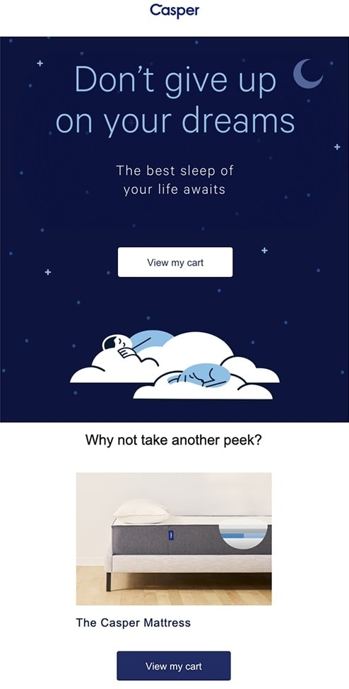
Besides compelling visual and contrasting CTA buttons, it’s essential for you to have a customer-focused copy that is convincing enough to ultimately drive conversions.
“Short and sweet” is the mantra for your abandonment cart email campaign, so you should get straight to the point. As with your CTA, use a casual tone in your copy. You don’t want to burst into your prospect’s inbox with a bad attitude and impression. After all, it is their inbox, you are just a guest.
Your brand personality should show up in every piece of your marketing content, including shopping cart abandonment emails. Recover the lost sales by being different in a cluttered inbox. Remember that the buyers already liked your product enough to put it in the basket, so you have a good chance of making them return to complete the purchase. You just need to find the right way to convince them.
5. Show the abandoned product
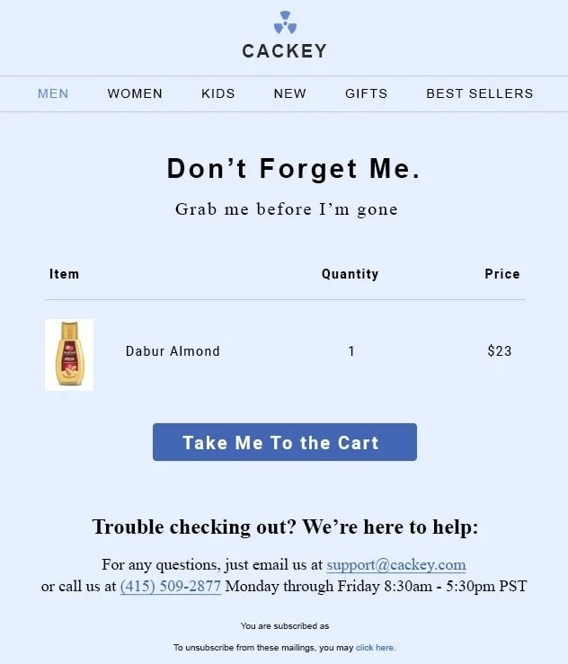
A great way to remind buyers of what they are missing out includes a reminder of the product and the image, size, color, features, patterns, etc. We have a pretty short memory, so the buyers may not remember what the product looks like, especially if they have a busy day. Imagine shopping on a Black Friday and trying to remember all you wanted to buy.
The image is a must, don’t think just the name of your product is enough. And, if possible, you should make your image large and attractive. Using an email template, you can easily design the email to make your item look the best. Conclusion this is important because if the user is still confused when they open the abandoned cart email, they may ignore the email and lose a potential customer.
Want to automatically show abandoned products on email, try AVADA Abandoned Cart Recovery free!
6. Get the right timing
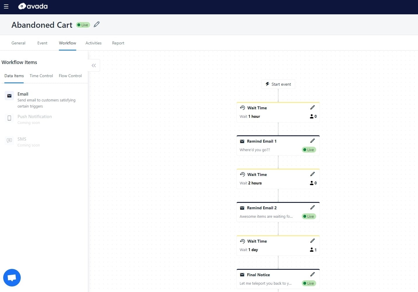
The timing of sending your cart abandonment email is one of the most important factors to succeed. Make sure to send your first email in the 24 hours after the abandonment. One hour is my preferred time to do it.
If you wait too long, you will lose the shopping urgency that made the shopper add an item into the cart in the first place. By sending early, you are still at the top of the shopper’s mind. So it is vital to strike when the iron is hot. The good news is that you don’t have to send abandoned cart emails manually every time a shopper leaves the cart.
By using AVADA Email Marketing, you can schedule emails to be sent after a preferred period of time. We made ready-to-use email templates for you too, you can schedule 1 or 3 emails right the way. According to Omnisend, cart recovery automatic emails have 154% more open and 176% higher click rates. So try our app now and automate your cart abandonment email campaign.
7. Provide support

Make sure to provide support or customer guidance with each cart abandonment email. After all, it’s possible that the shopper wasn’t able to complete the checkout process because of some technical problems. By letting them know you are there to help, you also have an opportunity to gain customer feedback to improve your eCommerce store.
It is also likely that they may have some questions about the product (shipping time, refunds, etc.) that are better responded by a real person. Give them that chance to talk directly to you. You don’t need to design a fancy button for support too, just a simple reminder in the P/S section is good enough.
8. Have urgency elements
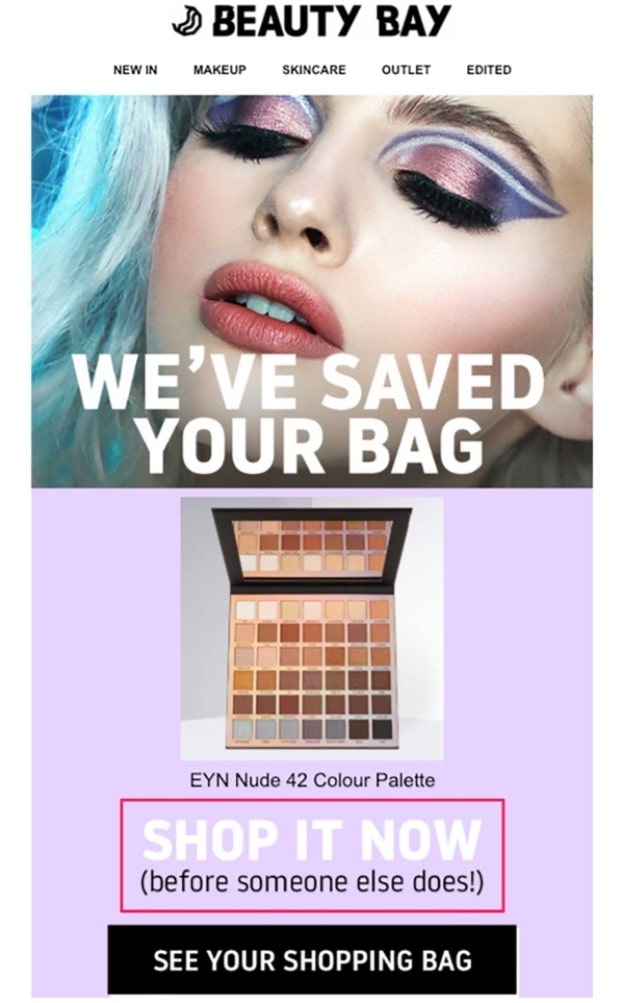
Buyers pay more attention to what they can miss out than what they already have. The FOMO effect is very real. Just ask yourself: Have you ever paid for a product because the sales were ending soon, rather than you really needed it? The same rule can apply to your cart abandoners.
Alerting the users that they might lose the items in their cart is an amazing way to tap into the FOMO effect of buyers. Seeing the scarcity of the product makes them act faster. It is a great marketing tactic as long as you are honest. Here are some popular ways to implement urgency elements in your emails:
Remind the buyers that you will reserve their cart only for a limited amount of time (with a countdown).
Let buyers know if their selected items will sell out soon due to popularity.
If the item in the cart is a limited edition, alert buyers that it won’t be restocked.
Include an alert showing how many other buyers have the item in their carts as well.
For a more convincing email, you can include customer reviews to prove that your product is loved by previous buyers. This tactic is especially useful for eCommerce electronics and technology stores.
9. Optimize for mobile
These days, more than 61% all emails are opened and read on mobile devices. So, if your abandoned cart emails aren’t mobile-friendly, it is probably going to be ignored right the way. And, even more than that, recipients may get frustrated and unsubscribe completely.
Test your emails on mobile because it is most likely that is where they will first see your message. People check their phones very often nowadays, and a well-designed email for mobile tends to stick in their minds. The best practices for mobile-optimized email design are:
- Use responsive design that can appear beautifully on every screen. Multiple columns or a too dense copy can break your email design.
- Make sure you have mobile-friendly content for easy reading. Oversized images won’t scale well and frustrate customers.
- Have space-saving menus to have a concise design. Less is more.
- Include a sticky CTA button that follows as readers scroll. This makes a frictionless cart return process.
Related posts
- How to master using images on email marketing?
- Why should you clean your email list?
- How Long Should A Cover Letter Be?
- 12 Mental Triggers in Email Marketing
Final tip
Abandoned cart emails are an essential tool for eCommerce marketers to regain lost sales on autopilot. Saving time and making more profit at the same time, what is not to love? By knowing the 9 excellent tips to succeed your cart abandonment email campaign, you can start maximizing your online store’s potential.
AVADA Email Marketing, is what you need to craft the best email campaigns that are mobile-friendly, highly convertible, and time-saving. With premade templates and an easy-to-use dashboard, you can quickly make a new email campaign and relax while automated scheduling takes the wheel. Check out our app right now!
New Posts


