What is Visual Merchandising? Can You Use Visual Merchandising Online?
When you sell things online, you may have heard of the term Visual merchandising. You know about it, but you may not have a good understanding of it. Therefore, we will provide you a simple answer to the question What is Visual Merchandising? Can you use visual merchandising online?
We will reveal to you a definition of Visual Merchandising, the elements of Visual Merchandising, the importance of Visual merchandising to store’s sales, and concluding whether or not visual merchandising can be used online and how.
Related Posts:
- How You Can Easily Find: What To Sell Online
- How to Start an Online Store from Scratch
- The Simple 5-Phase Process to Find Products for Online Business
What is Visual Merchandising?
Visual merchandising is the process of developing floor plans and three-dimensional displays to boost revenues to the highest level in the retail industry like stores. The display of both goods and services aims to highlight their features and benefits. The objective of visual merchandising is to attract, engage, and persuade the customer into buying a product.
Examples of successful visual merchandising:
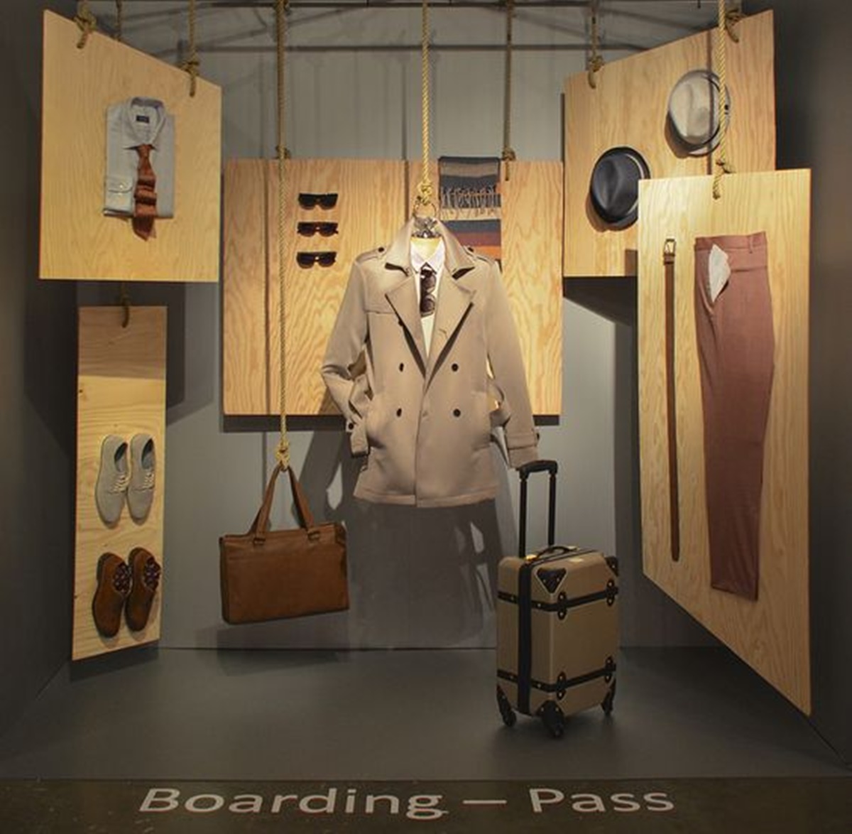
Though this exhibit at Seneca College’s Redefining Design does not have any mannequins, it can tell a lively story by assorting the classic elements of a fashionable gear. For instance, once you see the display for the first time, you may imagine a polite professional rushing to the airport, glancing at his watch to attend an important meeting. Through clothes, wooden boards, and rope; the story completely makes you immersed in it and motivates you to purchase the whole outfit.
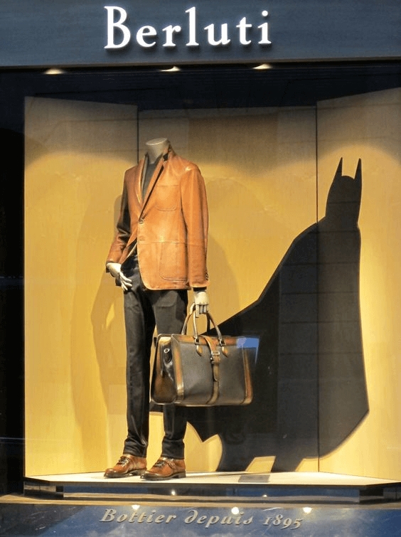
Almost everyone adores superheroes. Spiderman and Wonder Woman are civilians like us. However, if something comes up, they can become someone with extraordinary power to repel the criminals, defend their city, and protect the lives of other people. It is like they are living a double life.
A menswear retailer called Berluti came to recognize our passion for transforming the current selves. One of their outfits displayed with a Batman shadow can motivate potential customers to channel their inner-Batman.
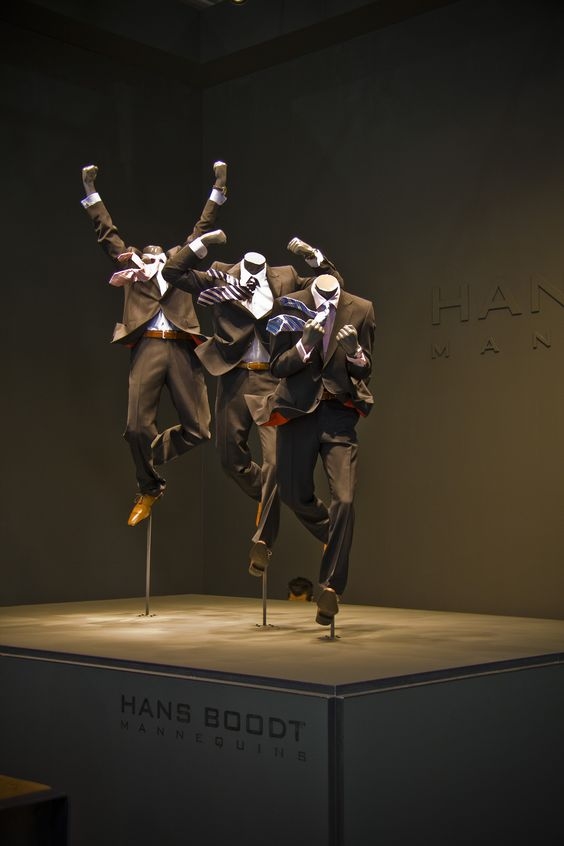
Most visual merchandising brands are B2C companies. However, that does not mean B2B businesses will not do the same. By designing the window displays, Hans Boodt Mannequins, who produces lifelike mannequins, can market their items.
By looking at the visual merchandising example above, you can imagine the extremely cheerful people who have achieved a goal in their careers like passing the job interview, getting promoted, and striking a deal with an important business partner, and many more.
By adding Hans Boodt’s mannequins into the visual merchandising, they can also raise the positive envision in their customers, and they will be more prone to buying the outfit.
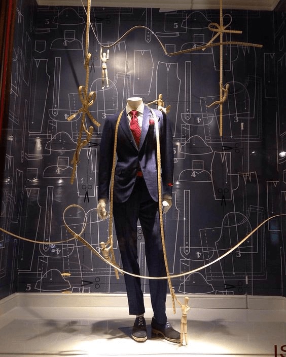
Hackett London is a formal menswear retailer. The brand is famous for the quality of their bespoke suits and a precise craft of every single detail of their menswear. They cleverly show little figurines diligently tailoring one of their suits. They skillfully show little figurines customizing one of their suits with diligence. With this sharp window display, Hackett London assured that menswear is trendy and of quality.
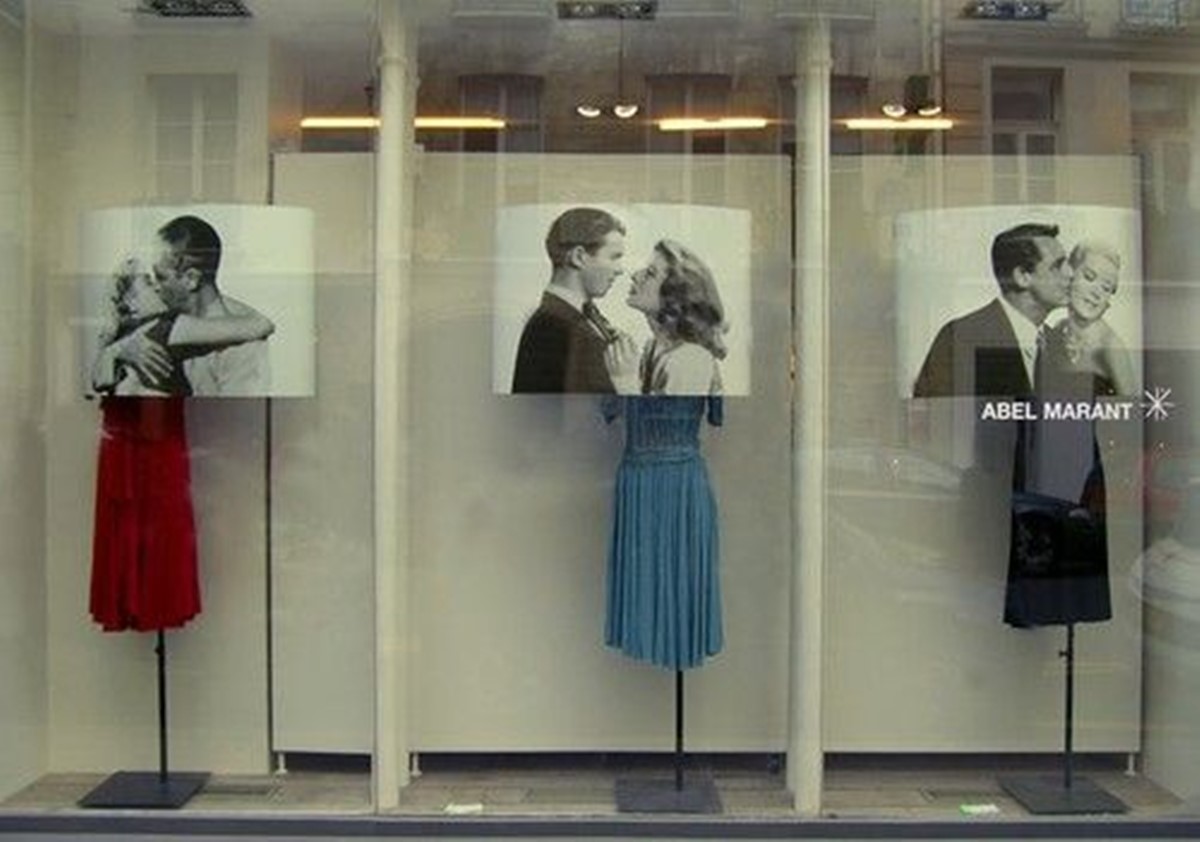
For most individuals, bond, particularly love, is the ultimate goal of life. We are biologically predisposed to hunt for it. By realizing that the best way to market their clothes is by offering a sense of love, Isabel Marant- a French fashion house, is indeed a success.
They draw their clothes from pictures of content couples who hug each other. And then they will be able to sell the feeling of love and eventually their product.

There may be a warning to you before you go shopping at IKEA since you may end up bringing a great deal of stuff home. You can enjoy a lot discovering each store with exciting showrooms. Designed with affordable IKEA furniture, each showroom can make the customer imagine their perfect dream home.
What are the elements of Visual Merchandising?
Color

The color palette is displayed in essence. It establishes the aura and on a subconscious level, communicates directly to viewers. Green stands for health and freshness, orange radiates a sense of cordiality, red expresses passion, black exemplifies elegance blue highlights reliability, and yellow inspires joy. The colors in a display can tell a lot about the brand. Therefore, you can make sure that the displayed colors with a distinguished color scheme should match the product.
Bear in mind that too much of one shade can be detrimental to the overall display, and too little of another may be ineffective. Too much out of one hue can be harmful to the underlying display, but too little is not recommended either.
Landscaping
The elevation of products is called landscaping. It is a fantastic way to get the attention of shoppers and to showcase products. You should take into consideration the displayed products’ shape and size when applying to landscape since these aspects can influence how noticeable the featured product is.
Texture
A display may be strengthened by contrast in texture. The textured pattern of manmade wire can compensate for the smoothness of natural wood. In addition to that, textures convey a message: wire possesses a modern and industrial sense, wood indicates a local and farm-fresh aura, and metal generates a sleek and durable appearance. The first and foremost thing is to realize the overall pervading aura that you intend to set up and evaluate which textures will support it so that you can gain the viewers’ attention.
Communication

Have you heard about the five-second magic? Well, studies have shown that signs have about five seconds to engage customers. Research studies have suggested that customer interaction with signs takes around five seconds. You should go for legibility and readability that are influenced by language, color, and font when you make signs. Not only it applies to large signs that feature new or featured items, but it also applies to the price tags and store-made product descriptions.
Decoration

In the process of visual merchandising, the final step is decoration. By performing decoration, you can strengthen the display’s overall theme without affecting it. You should take into consideration the size, number, and color while you do this.
Story-telling

To have a long-term engagement with your customers, you should not miss out on one of the most powerful and dominant merchandising techniques in retailing industry-storytelling. One typical example of storytelling is the eye-catching visuals and dialogues on the wall of a cafeteria.
You can provide a vivid answer to the question What is in it for customers? To show how beneficial it is when the customer owns our product, you can make use of powerful and sales-enabling signage. You can show three bullet points that convince the customers with the rationales they need to possess your product and how convenient their life will be once they use them.
Bear in mind that you should avoid presenting an essay and focus on writing a headline, powerful bullet points, and maybe a price proposal. To make your customers have a better understanding of your product and purchase it, you can tell a story. You can choose to incorporate lifestyle graphics in telling the story since “a picture is worth a thousand words”.
Empty space
Every retail store may not get the most out of a space which is the area between the displayed products and the ceiling. If it appears empty, then you must begin to use it for various purposes, like signage presenting information about merchandise or brands. You can also have the choice to present customer testimonials with the customer’s name and a picture or profile a designer or supplier.
You could also show lifestyle graphics so that your customers can realize the connection with your products. For instance, a clothing store with their recent summer collection could show an image of a group of young girls wearing their entire outfit and chilling at the beach. Or a convenience store could show a picture of a happy family having a lunch break together, emphasizing a harmonious lifestyle.
Being multifaceted, visual merchandising allows retailers to select from various ideas while the need to design displays. You should use them well to stand out from the crowd.
Visual Marketing Focal Point/Hotspot
You can create and concentrate on a hotspot or focal point in your display to make the viewers focus on it.
You can do that by reviewing your display from the customer’s point of view: the top, the floor, and both sides. Normally, the focal point is placed high so that the customers can easily notice. There should be regular checks of your displays to make sure this.
The hotspot is the product, not a visual element you apply or incorporate into the story. For example, if you sell teacups and saucers Limoges, you should place them as the focal point and not the rug.
Why is Visual merchandising so important to store’s sales?
Create positive shopping experience
Visual merchandising can work out with the following elements: lighting; signage and packaging, uniform and presentation, point of sale material and ticketing; colors; shapes and various textures. All of these can influence the appearance of your store and showcase a brand. A proper combination of them can create a positive shopping experience, resulting in more orders.
Balance number of products

A lot of visual merchandisers can find the newest product chances interesting and be committed to the collection and options that you offer. If the items you are selling to your customers is excessive, then you may run the risk of bringing complexity to your business and excess stocking. Therefore, a balance between the number of products is critical since too few options may discourage your customers, but too many can overwhelm them.
Also, you should evaluate your retail space to learn what the maximum number of items you can show at any time is. Product stocking can incur some costs; therefore, if it may not lead to the purchase of a high margin line, then you should remove it, and choose the most potential products that can yield more revenue.
Create and increase Brand Loyalty

Via the visual elements you select to surround and enhance your product, your customers can feel your brand. For example, if you are striving to market a clothing item to a younger audience, you can have the option to show this product with use pastels, scriptwriting, and soft imagery. In contrast, for the more mature audience, you may opt for colorless and dark displays with less striking signage and less sharp models. By doing this, you can incorporate the demographic as well as bring the customers closer to the brand. And building brand loyalty may result in repetitive sales.
Implement theme/message into store’s display
For brands to have better execution of visual merchandising, one of the fantastic methods is to add subject matters and themes into the displays. A theme can be a storyteller that motivates your audience to place an order. Normally, your theme comes with the latest product launch. Themes can have the power to enhance the brand with new colors, layouts, fonts, imagery, and design.
You can have the option to combine colors, group the products, and take care of a single motif. Besides, you can change the themes flexibly, but you should take into consideration the store, the season, the latest product, and the overall look and feel of the brand. You should also care about how the theme will enhance any other in-store promotions.
Can visual merchandising be used online and How?
Well, the answer is yes. But how can visual merchandising be used online? Let’s figure it out!
DO brand storytelling on your Homepage
No surprise the first place a new visitor goes to your site is the homepage. From here, they will start to have a sense of your brand. They will have the first impression of who you are and what type of product you are offering.
To have a good performance of brand storytelling on your homepage, you should add the following things into your visual merchandising of the page:
- Images and text
- Transparent storytelling line throughout the page. You can utilize the inverted pyramid that journalists normally apply. In other words, the key information comes first, and the level of detailed information will increase all over the page.
- Describe your product, how it works, why you should possess it. Remember the more visual, the better.
- Utilize social proof like customer reviews.
- Make use of authority proof like accolades from dominant media like Mashable, The New York Times, Racked, and many more.
- Liking proof, normally like social buttons or call outs.
- Have a clear call to action, which are CTAs throughout the site.
Collection-Based and Featured Products
A lot of brands tend to use both collections and featured / best-selling products on the homepage. By doing this, browsers can explore more into categories, or get access to a product page much speedier. Normally, these pages contain the hero image, collection grid, product grid, social proof, authority proof, and liking proof.
Use carousel images
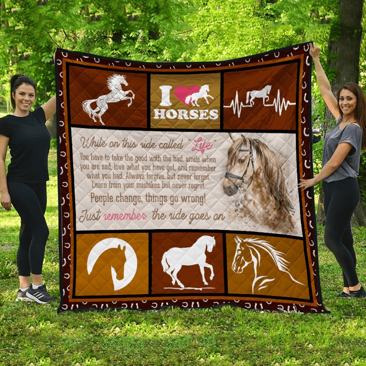
Use the carousel to drive people to collections. To work it out, each image must be eye-catching and relevant to the available collection. For instance, below are an image of the blanket item that the Gogistyle -an apparel brand uses to attract its audience.
Focus on products
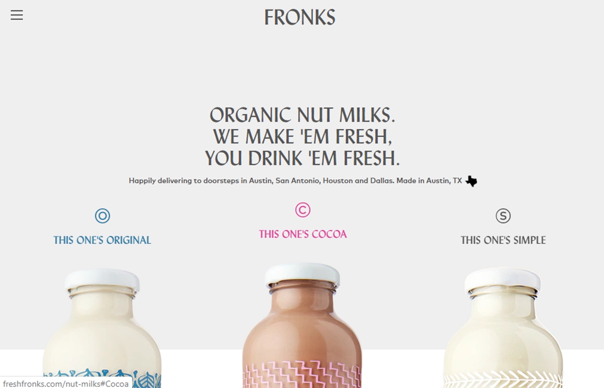
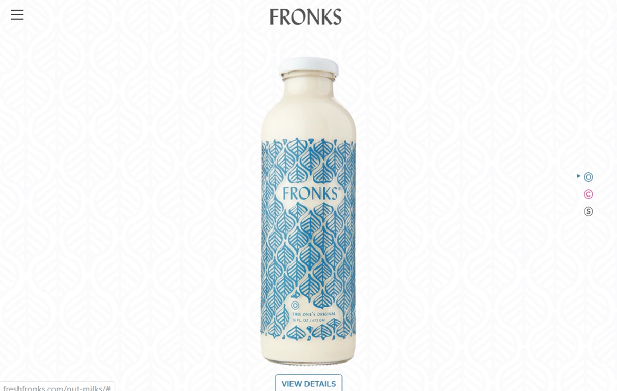
It may be ideal for sites that are related to offering food and cuisine. Take the site of Fresh Fronks- the original fresh, organic nut milks brand for instance. Once you click on the homepage, you will notice a stunning product image, which will direct you to an extremely attractive product page. It is, basically, a version of visual merchandising.
Wrapping up and Summary
Visual merchandising is, indeed, an effective strategy for any brand that wants to succeed in the fierce eCommerce competition. As you have had the answer to the question What is Visual Merchandising? Can you use visual merchandising online?, its importance and how to apply it to your store, we hope that you could create your own success story.
If you have any questions, comments, or concerns; do not hesitate to leave a comment below or directly contact us. We are always ready to help you out in case you need anything. Furthermore, if you find our article useful, then you can share it with your social network’s community. We would appreciate it if you could do that.
New Posts


