How To Create A Contact Page On Shopify: Our Step-by-Step Guide
Creating an effective contact page on Shopify is more than just providing an email address; it’s about fostering trust and opening communication channels.
What Information Should Be Included In A Shopify Contact Us Page?
Contact Form
A contact form offers several distinct advantages:
Firstly, contact forms are more convenient for customers. Instead of drafting an entire email, they can quickly fill in the necessary fields and hit submit. This ease of use can increase the chances of receiving feedback. Moreover, contact forms act as a feedback tool, providing insights into product or service quality. This can help businesses understand their customers better and enhance the user experience on the website.
Furthermore, a notable benefit of contact forms is the reduction of spam, especially when compared to openly displaying an email address. For instance, contact forms can be a barrier against unsolicited messages when integrating live chat functions.
Additionally, contact forms offer control over the information collected. Businesses require visitors to fill in specific fields to ensure they receive all the essential details.
Your Store’s Email Address and Phone Number
A store address and phone number are essential, even if the majority of your transactions happen online.
Some customers prefer buying from a physical store instead of online. Moreover, having a store address facilitates quicker product exchanges, eliminating the delivery wait.
Including a phone number is essential. It offers a rapid connection point for customers. Ensure you implement a click-to-call feature, enabling instant calls from the website.
A live chat box is another valuable addition. While traditional calls might be cumbersome for large businesses with a vast customer base, live chat provides immediate assistance. It can soothe frustrated customers, enhancing their shopping experience and fostering lasting relationships.
Additionally, live chat can expedite the checkout process and boost conversion rates. For instance, when customers seek more details about a product’s features, your real-time guidance can be pivotal in their purchase decision. Immediate support can heighten customer satisfaction and transform mere visitors into loyal buyers.
Other Information
- Physical Store Locations: Displaying a physical address can also enhance the credibility of an online store, making customers feel more secure in their transactions. This helps customers know if there’s a brick-and-mortar store near them where they can see products in person, make returns, or get customer service.
- Operating Hours: By specifying your hours of operation, customers know when they can expect to visit your physical locations or when customer service representatives are available. It can also help set expectations regarding response times for inquiries made outside those hours.
- Social Media Profiles: Social media profiles allow customers to engage with your brand on platforms they already use. They can stay updated with new product launches, promotions, or news. Displaying active social media profiles can help verify your business’s legitimacy, creating another touchpoint of trust.
- Live Chat Option: A live chat can provide real-time help to customers with queries, thus enhancing their shopping experience and potentially increasing sales conversions. Offering a live chat feature can differentiate your store from competitors by showcasing an elevated level of customer service.
- Sign up for Newsletters: Newsletters are an excellent way for customers to stay updated with your store’s latest products, offers, and news. It’s a direct line to their inbox, which can result in increased customer retention and sales. It helps businesses collect email addresses and other relevant customer information, which can be crucial for segmented marketing and personalized offers.
How To Create A Contact Us Page On Shopify
Here’s a comprehensive guide on how you can set up a Contact Us page on your Shopify store:
Creating a Contact Us Page on Shopify
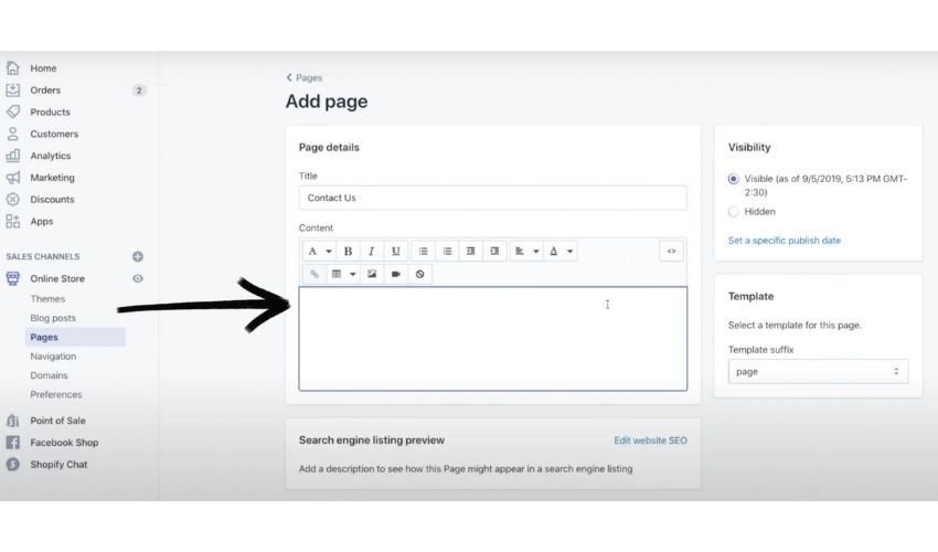
Step 1: From your Shopify Admin panel, navigate to Online Store > Pages
Step 2: Click Add page.
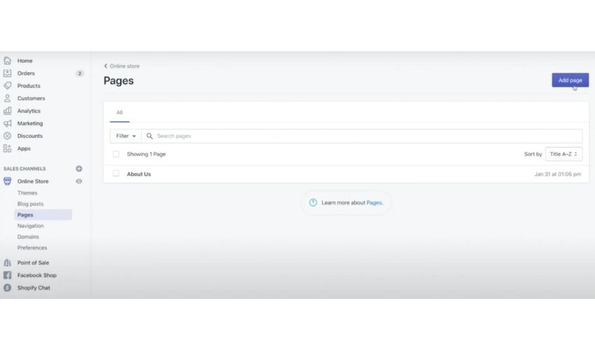
Step 3: Enter a title for your contact page in the Title box. You can use phrases like Get in touch or Contact Us.
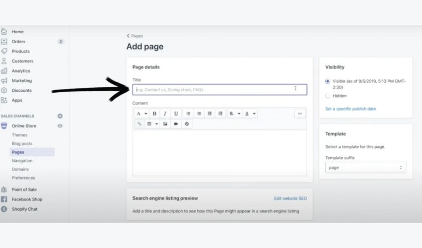
Step 4: In the Content box, you can type any information you want to display above the contact form. We suggest having at least the phone number and email address. You can add more information mentioned above to your preferences. Use reassuring texts like “We will respond as soon as we can.”
Step 5: Under the Template section, select page.contact from the drop-down menu. This action ensures a contact form appears on your page.
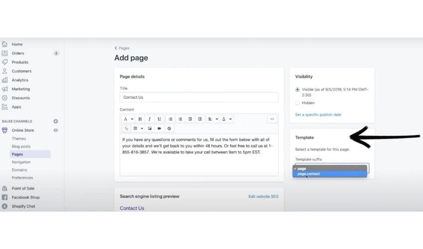
Step 6: Click Save.
Making the Contact Us Page Accessible
To make your contact page easily accessible to your customers:
- Go to Online Store > Navigation from your Shopify admin.
- Decide where you want the contact page link to appear and select the appropriate menu.
- Click Add menu items and type your page title in the Name box.
- To link it to your created page, open the Link box, go to Pages, and select the Contact page. Then, click Add.
- Don’t forget to Save.
To preview your work, click the eye icon beside ‘Online store,’ and you’ll be directed to the page.
How To View Contact Form Submissions
With Shopify, the process to access these submissions is relatively straightforward.
Whenever a customer or visitor submits a message through the contact form on your Shopify store, that message is directly sent to the sender email address linked to your store. This means you don’t need to log into your Shopify admin every time to view these submissions; instead, just keep an eye on your email inbox.
What if you want these notifications sent to a different email address? Here’s what you need to do:
- Log into your Shopify admin.
- Navigate to the Notifications settings page.
- Here, you can modify the sender’s email address according to your preference.
Note: While you can change the sender email, the subject line for emails dispatched through the contact form cannot be altered.
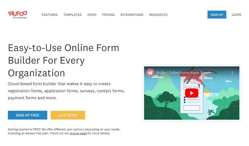
You have options if you’re looking for a more customized experience or want to use a different email address that isn’t directly linked to your Shopify notifications. Online services such as Wufoo or Jotform allow users to create custom contact forms. Once created, these forms can be embedded directly onto your contact page.
5 Tips To Build A Stunning Shopify Contact Us Page
Responsive Design
- User-Friendly Across Devices: Ensure that your contact page is mobile-responsive. With the surge in mobile shopping, many users will access your contact page from their smartphones or tablets. The design should adjust seamlessly across devices for ease of use.
- Efficient Loading: Optimize images and elements to load the page quickly, avoiding customer frustration.
Intuitive Layout & Clear CTA
- Ease of Navigation: Place the most critical information (like the contact form or phone number) prominently. Ensure customers don’t have to scroll excessively or search hard to find what they need.
- Bold Call-To-Actions (CTAs): Use noticeable buttons or icons for primary actions you want users to take. Whether it’s to “Submit a Query” or “Join Our Mailing List,” the CTA should stand out.
Personal Touch & Brand Consistency
- Aesthetics: The design, colors, and fonts should align with the brand identity. A cohesive look fosters trust and professionalism.
- Personalization: Add a brief note or message that connects with the user, perhaps something like, “We’d love to hear from you!” or “Got questions? Reach out!”
Incorporate Interactive Elements
- Map Integration: If you have physical store locations, embed an interactive map that allows users to zoom in/out and view store details.
- Captivating Imagery: Use high-quality images or visuals related to customer service, your products, or happy customers. This makes the page more engaging and less sterile.
Feedback & Assurance
- Success Message: Once a user submits a query or message, provide a clear acknowledgment that their message has been received. This could be a pop-up message or a redirect to a thank you page.
- Trust Elements: Add any certifications, customer testimonials, or trust badges to the contact page. It assures users that their personal data is safe and they contact a legitimate business.
Helpful Shopify Apps For Creating A Shopify Contact Us Page
Building a contact us page becomes easier than ever before with many apps from the Shopify App Store. Here are some of the best competitors.
Hulk Contact Us Form
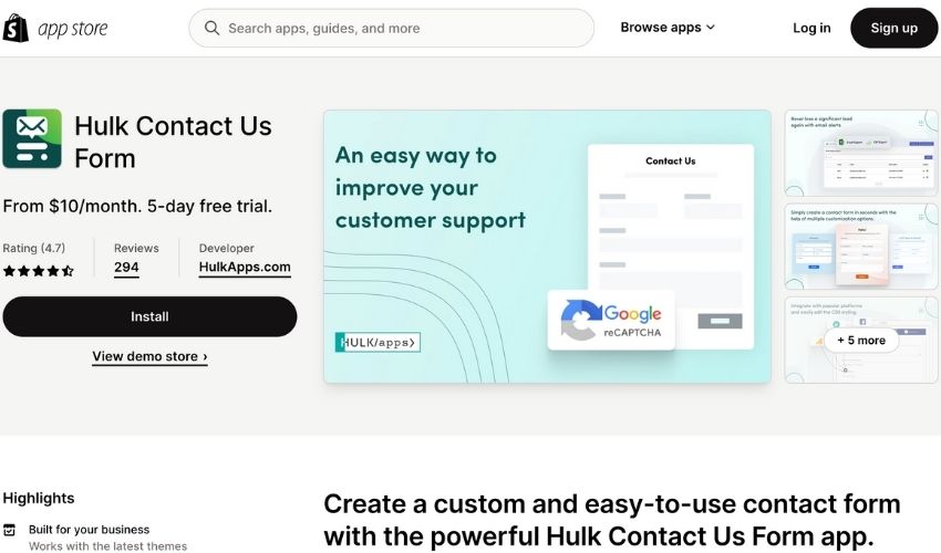
A responsive and customizable contact form is one of the cornerstone elements of any successful online store. This is where the Hulk Contact Us Form app comes into play.
Features:
- Customize your Contact Form with six customizable fields to match your store.
- Create the form by yourself and add it to your Contact Page.
- You can build a worthwhile email list through the easy contact form you create.
- Built-in reCAPTCHA element that protects against spam and abuse.
- Export your contact form submissions effortlessly in a date-sorted format.
Pricing and Plans:
The Hulk Contact Us Form offers a 5-day free trial, allowing merchants to understand its capabilities. Post the trial, the pricing starts from $10 per month.
POWR: Contact Form Builder
POWR: Contact Form Builder has been a game-changer for many Shopify merchants.
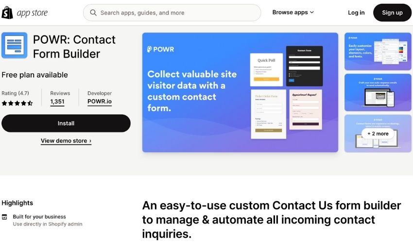
Features:
- Use conditional logic and get your form set up for different customer segments
- Enable instant email alerts for new form responses & sync with Google Sheets
- Centralize all your contacts and responses collected in your POWR dashboard
- Create interactive and multi-step forms for a unique customer experience
- Make quick & easy autoresponders to boost your customer engagement
Pricing: The POWR Contact Form Builder has a free plan and 3 paid plans priced from $9.99/month.
Powerful Contact Form Builder
The Powerful Contact Form Builder provides a range of features to aid merchants in creating professional and efficient contact forms with ease.
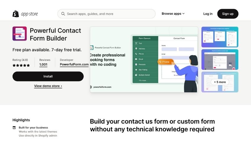
Features of the Powerful Contact Form Builder
- Create custom forms without the need for technical knowledge.
- Integrate with third-party applications such as Mailchimp, Klaviyo, Ominisend, and more.
- Display their custom forms on various pages, including product, collection, and cart pages.
- Allow customers to upload files or images through the form.
- Customize their registration form with unique fields, ensuring data relevance.
- Benefit from features like captchas for enhanced security, condition logic for tailored user experience, and many other form types like Feedback, Popup, and Wholesale Order forms.
Pricing: The app has a free plan with limited use of features. Merchants can opt for its paid plans with prices starting from $9.99/month to get more access to the features. It also offers a 7-day free trial, allowing merchants to test its capabilities.
3 Shopify Contact Us Pages Examples For Your Inspiration
Ēdn
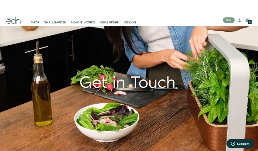
At first glance, the Ēdn’s Contact Us page appears straightforward – a mere contact form beckoning users to reach out. However, dig a bit deeper and begin to see the method behind the minimalism.
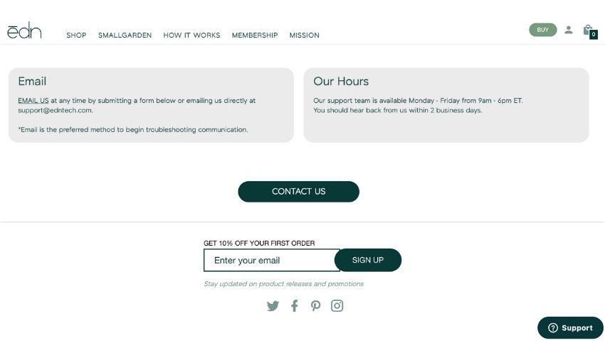
- Personal Touch with Brand Relevance: Unlike generic contact forms that prompt you for your name, email, and message, ēdn has incorporated an additional field labeled “your favorite plant.” This subtle touch embodies their brand identity and extends an olive branch, making customers feel valued and understood. It’s as though ēdn says, “We’re not just about business; we want to know more about you.”
- Strategic Streamlining: The nature of ēdn’s business model – currently at the pre-order stage – necessitates efficient communication channels. They’re probably swamped with inquiries ranging from product specifications to shipping timelines. By limiting their primary mode of communication to email, ēdn can centralize inquiries. This prevents them from being overwhelmed through various channels and allows for systematic lead generation and effective customer engagement.
Moreover, the company sets clear expectations regarding their response time, ensuring customers are informed and reducing potential frustrations. “You should hear back from us within 2 business days,” they state, setting a precedent of transparency.
Their Contact Us page also strategically promotes other aspects of their business. There’s a nod to their SeedPod Membership, urging users to explore it with a tempting offer code. Additionally, they highlight the seasonal relevance of their products by encouraging users to “Discover growing indoors this season.”
MVMT Watches
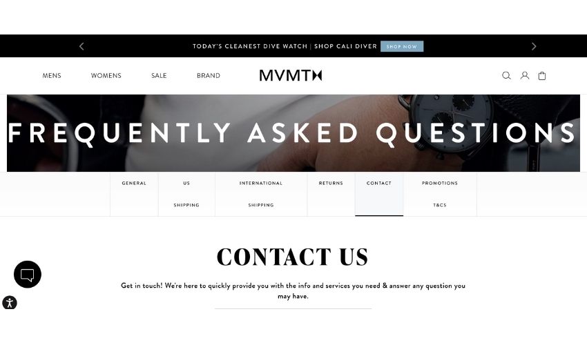
Instant Support with a Personal Touch
The first thing that captures attention on MVMT Watches’ contact page is the prompt invitation to get in touch. The brand ensures they’re always within reach by stating, “We’re here to quickly provide you with the info and services you need & answer any question you may have.”
Furthermore, MVMT offers a direct email form, encouraging customers to reach out with any inquiries. The comprehensive form allows users to fill in their first and last names, email addresses, order numbers, and even select a specific subject to streamline the query process. This immediate invitation for communication demonstrates a genuine interest in hearing from their audience.
Real-Time Assistance with Live Chat
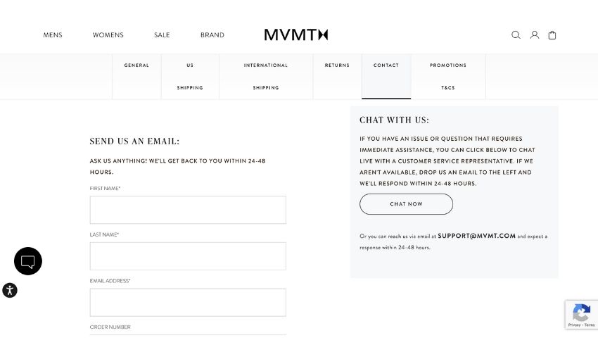
For customers who prefer instant communication, MVMT Watches offers a live chat option. If an issue or question demands immediate attention, users can click to chat with a customer service representative in real time. Should the chat representatives be unavailable, the brand thoughtfully prompts users to drop them an email, guaranteeing a response within a window of 24-48 hours.
Furthermore, for those who prefer traditional methods of communication, MVMT provides a direct email address, ensuring all customer communication channels remain open.
Engaging the Audience Beyond Inquiries
Apart from the direct communication tools, MVMT also engages its visitors by offering a 15% discount on their first purchase if they subscribe to the brand’s newsletter. This fosters a relationship with potential customers and keeps them updated on the latest products, special editions, and exclusive sales.
Ruggable
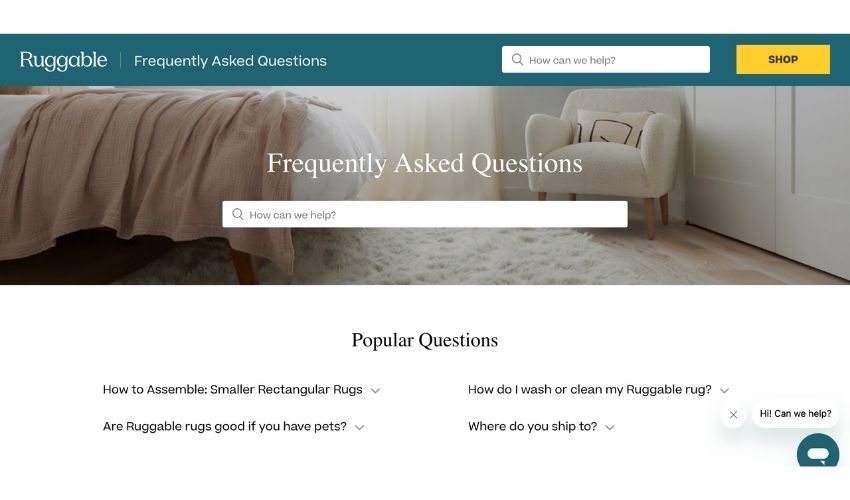
Comprehensive FAQ Section
Right from the onset, Ruggable establishes a connection with its audience by introducing an all-encompassing “FAQs Help Center” home page. They understand the criticality of addressing common queries, ensuring that customers don’t have to spend excess time looking for answers. By presenting the most “Popular Questions” like “How to Assemble: Smaller Rectangular Rugs” and “Are Ruggable rugs good if you have pets?”, they swiftly cater to the immediate needs of their clientele.
Interactive Demonstrative Videos
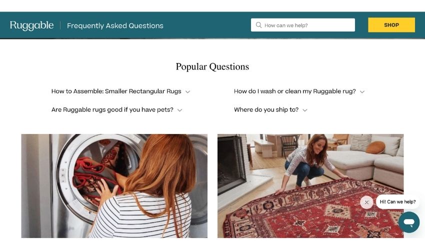
Ruggable goes the extra mile by offering visual demonstrations for the most common concerns of its customers. For instance, when pondering about rug maintenance, there’s a video available under “Care & Washability” that guides the viewer on how to effectively wash their rug. Another video under “How to Assemble” instructs on the right way to bring together the Rug Cover and Pad. Such interactive elements not only answer queries but also engage the user, fostering trust.
Categorized Inquiries
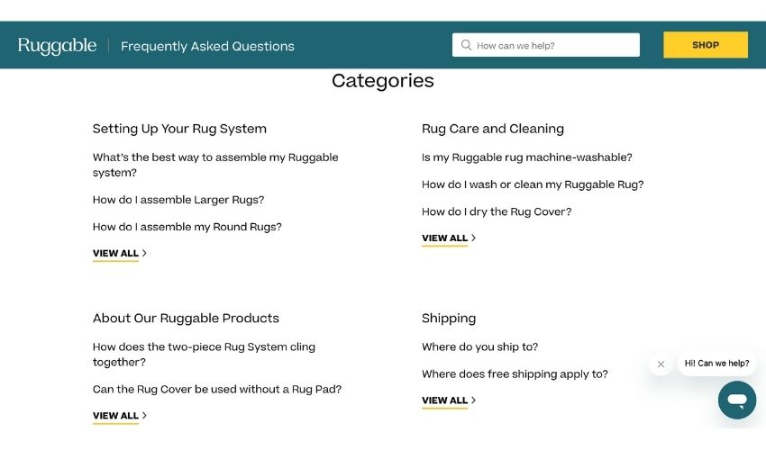
Navigating through a sea of information can be daunting. Ruggable has efficiently managed this by categorizing their FAQs. Whether a customer wants to know about “Setting Up Your Rug System”, “Rug Care and Cleaning”, “About Our Ruggable Products”, “Shipping”, “Returns and Exchanges”, or even about other products like “Levity Products”, there’s a dedicated section for each. This organized approach ensures users can swiftly find what they’re looking for without getting overwhelmed.
Prompt Communication Channels
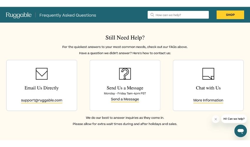
Despite a detailed FAQ section, Ruggable recognizes that customers might have unique questions. They’ve thus offered multiple avenues for communication. Whether it’s directly emailing them at “support@ruggable.com”, sending a message from Monday to Friday between 7 a.m. to 4 p.m. PST, or using the chat option, they’ve ensured that customers always have a way to reach out. Furthermore, they have set clear expectations regarding response times, especially during high-demand periods like holidays and sales.
Conclusion
Creating a contact page on Shopify is a straightforward process, and with the right steps, tips, and inspiration that we offer you in this article, you can craft an engaging and effective communication channel for your customers

